Rolling Pivot RibbonRolling Pivot Ribbon
This indicator displays historical and developing pivot levels across multiple days,
creating a dynamic "ribbon" effect as pivots roll forward through time.
DESIGNED FOR: Intraday timeframes (≤1D). Shows warning on higher timeframes.
USE CASE: Identify key support/resistance levels, track pivot evolution, and spot
price interaction zones with enhanced visual clarity.
WHY?
There comes a time in every Pinescript developer's evolution, they feel compelled to write a script that draws many lines, possibly triangles, into the future. This is mine. It's both totally useless, and a constant source of comfort to me.
KEY FEATURES:
• Multiple pivot calculation methods (Classic, Camarilla)
• Historical pivot tracking with configurable lookback period (default 4 days)
• Real-time "developing" pivots that update intraday based on current day's HLC
• Gradient fills between adjacent pivot levels for visual depth
• 13 pivot levels: PP, R1-R6, S1-S6
TASTY MODE (Advanced):
• Intelligent filtering: only shows lines that price has recently intersected
• Dynamic transparency: opacity adjusts based on intersection frequency
• Auto-cleanup: removes stale lines that haven't been touched in X days
• Smart extensions: lines that see more action project further into the future
• Focus mode options to reduce chart clutter
VISUAL CONTROLS:
• Toggle individual pivot levels on/off
• Customizable colors and transparency for lines and fills
• Flexible label positioning (left-align or right-align)
• Adjustable projection length for pivot lines (defaults to 1. Set to 0 for just a ribbon)
Bandas y canales

NSR Dynamic Channel - HTF + ReversionNSR Dynamic Channel – HTF Volatility + Reversion
(Beginner-friendly, pro-grade, non-repainting)
The NSR Dynamic Channel builds an adaptive volatility envelope that compares current price action to a statistically-derived “expected” range pulled from a user-selected higher timeframe (HTF).
Is this just another keltner variation?
In short: Keltner reacts. NSR anticipates.
Keltner says “price moved a lot.”
NSR says “this move is abnormal compared to the last 2 days on a higher timeframe — and here’s the probability it snaps back.”
The channel is not a simple multiple of recent ATR or standard deviation; instead it:
Samples HTF volatility over a rolling window (default: last 2 days on the chosen HTF).
Expected Range
HTF Volatility Spread = StDev of 1-bar ATR on the HTF
Scales this HTF range to the current chart’s volatility using a compression ratio :
compRatio = SMA(High-Low over lookback) / Expected Range
This makes the channel tighten in low-vol regimes and widen in high-vol regimes .
Centers the channel on a composite mean ( AVGMEAN ) calculated from:
Smoothed Adaptive Averages of the current timeframe close
SMA of close over the user-defined lookback ( Slow )
The three means are averaged to reduce lag and noise.
Draws two layers :
HTF Expected Channel (gray fill) = PAMEAN ± expectedD
Dynamic Expected Band (inner gray) = HTF Expected Range
Adds a fast 2σ envelope around AVGMEAN using the standard deviation of close over the lookback period.
Core Calculations (Conceptual Overview)
HTF Baseline → ATR on user HTF → SMA & StDev over a defined number of days
Compression Ratio → Normalizes current range to HTF “normal” volatility
Expected Band Width → Expected Range × CompressionRatio
Bias Detection → % change of composite mean over 2 bars → “bullish” / “bearish” filter
Overextension % → Position of price within the expected band (0–100%)
How to Use It (3 Steps)
Apply to any chart – defaults work on futures (NQ/ES), stocks (SPY), crypto (BTC), forex, etc.
Price is outside both the fast 2σ envelope and the HTF-scaled expected band
Expect some sort of reversion
Enable alerts – two built-in conditions:
NSR Exit Long – bullish bias + high crosses upper expected edge
NSR Exit Short – bearish bias + low crosses lower expected edge
Optional toggles :
Show 2σ Price Range → fast overextension lines
Expected Channel → HTF-based gray fill
Mean → MEAN centerline
Why It Works
Context-aware : Uses HTF “normal” volatility as anchor
Adaptive : Shrinks in consolidation, expands in breakouts
Filtered signals : Only triggers when both statistical layers agree
Non-repainting : All calculations use confirmed bars
Happy trading!
nsrgroup

SJ WaveTrendWaveTrend Indicator – Full English Brief for TradingView
Description:
The WaveTrend Oscillator (WT) is a momentum-based indicator originally developed by LazyBear, designed to identify overbought and oversold market conditions with high precision. It is conceptually similar to the RSI and Stochastic Oscillator but uses a wave-based mathematical approach to detect turning points in price action earlier and more smoothly.
⸻
🔍 How It Works
WaveTrend analyzes the difference between price and its moving average (typically the exponential moving average of the Typical Price).
It then applies multiple layers of smoothing to filter out noise and produce two oscillating lines — WT1 (fast) and WT2 (slow).
The crossing points between WT1 and WT2 are used to identify momentum shifts:
• When WT1 crosses above WT2 from below the oversold zone → Bullish signal
• When WT1 crosses below WT2 from above the overbought zone → Bearish signal
⸻
⚙️ Core Formula Concept
The WaveTrend calculation typically follows this process:
1. Compute the Typical Price (TP) = (High + Low + Close) / 3
2. Calculate the Exponential Moving Average (EMA) of TP over a short length
3. Determine the Raw Wave (ESA) and De-trended Price Oscillator (DPO)
4. Apply double smoothing to produce the final WT1 and WT2 values
These smoothed waves behave like energy waves that expand and contract based on market volatility — hence the name WaveTrend.
⸻
📈 Interpretation
• Overbought Zone: WT values above +60 to +70
• Oversold Zone: WT values below -60 to -70
• Crossovers: WT1 crossing WT2 signals a potential trend reversal
• Divergence: When price makes a new high/low but WT does not, it signals momentum weakening
⸻
🧠 Trading Insights
• Best used on higher timeframes (H1 and above) for trend confirmation, and on lower timeframes (M15–M30) for precise entries.
• Combine with ADX, EMA Cloud, or Volume Filters to confirm real momentum shifts and avoid false signals.
• You can highlight WT Diff (WT1 - WT2) to visualize momentum expansion and contraction; large positive or negative differences often precede strong reversals.

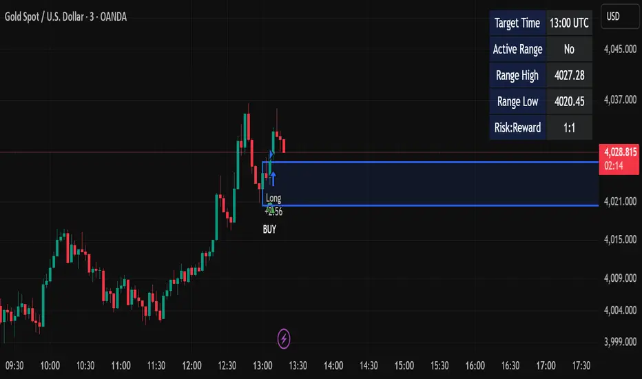
Candle Breakout StrategyShort description (one-liner)
Candle Breakout Strategy — identifies a user-specified candle (UTC time), draws its high/low range, then enters on breakouts with configurable stop-loss, take-profit (via Risk:Reward) and optional alerts.
Full description (ready-to-paste)
Candle Breakout Strategy
Version 1.0 — Strategy script (Pine v5)
Overview
The Candle Breakout Strategy automatically captures a single "range candle" at a user-specified UTC time, draws its high/low as a visible box and dashed level lines, and waits for a breakout. When price closes above the range high it enters a Long; when price closes below the range low it enters a Short. Stop-loss is placed at the opposite range boundary and take-profit is calculated with a user-configurable Risk:Reward multiplier. Alerts for entries can be enabled.
This strategy is intended for breakout style trading where a clearly defined intraday range is established at a fixed time. It is simple, transparent and easy to adapt to multiple symbols and timeframes.
How it works (step-by-step)
On every bar the script checks the current UTC time.
When the first bar that matches the configured Target Hour:Target Minute (UTC) appears, the script records that candle’s high and low. This defines the breakout range.
A box and dashed lines are drawn on the chart to display the range and extended to the right while the range is active.
The script then waits for price to close outside the box:
Close > Range High → Long entry
Close < Range Low → Short entry
When an entry triggers:
Stop-loss = opposite range boundary (range low for longs, range high for shorts).
Take-profit = entry ± (risk × Risk:Reward). Risk is computed as the distance between entry price and stop-loss.
After entry the range becomes inactive (waitingForBreakout = false) until the next configured target time.
Inputs / Parameters
Target Hour (UTC) — the hour (0–23) in UTC when the range candle is detected.
Target Minute — minute (0–59) of the target candle.
Risk:Reward Ratio — multiplier for computing take profit from risk (0.5–10). Example: 2 means TP = entry + 2×risk.
Enable Alerts — turn on/off entry alerts (string message sent once per bar when an entry occurs).
Show Last Box Only (internal behavior) — when enabled the previous box is deleted at the next range creation so only the most recent range is visible (default behavior in the script).
Visuals & On-chart Info
A semi-transparent blue box shows the recorded range and extends to the right while active.
Dashed horizontal lines mark the range high and low.
On-chart shapes: green triangle below bar for Long signals, red triangle above bar for Short signals.
An information table (top-right) displays:
Target Time (UTC)
Active Range (Yes / No)
Range High
Range Low
Risk:Reward
Alerts
If Enable Alerts is on, the script sends an alert with the following formats when an entry occurs:
Long alert:
🟢 LONG SIGNAL
Entry Price:
Stop Loss:
Take Profit:
Short alert:
🔴 SHORT SIGNAL
Entry Price:
Stop Loss:
Take Profit:
Use TradingView's alert dialog to create alerts based on the script — select the script’s alert condition or use the alert() messages.
Recommended usage & tips
Timeframe: This strategy works on any timeframe but the definition of "candle at target time" depends on the chart timeframe. For intraday breakout styles, use 1m — 60m charts depending on the session you want to capture.
Target Time: Choose a time that is meaningful for the instrument (e.g., market open, economic release, session overlap). All times are handled in UTC.
Position Sizing: The script’s example uses strategy.percent_of_equity with 100% default — change default_qty_value or strategy settings to suit your risk management.
Filtering: Consider combining this breakout with trend filters (EMA, ADX, etc.) to reduce false breakouts.
Backtesting: Always backtest over a sufficiently large and recent sample. Pay attention to slippage and commission settings in TradingView’s strategy tester.
Known behavior & limitations
The script registers the breakout on close outside the recorded range. If you prefer intrabar breakout rules (e.g., high/low breach without close), you must adjust the condition accordingly.
The recorded range is taken from a single candle at the exact configured UTC time. If there are missing bars or the chart timeframe doesn't align, the intended candle may differ — choose the target time and chart timeframe consistently.
Only a single active position is allowed at a time (the script checks strategy.position_size == 0 before entries).
Example setups
EURUSD (Forex): Target Time 07:00 UTC — captures London open range.
Nifty / Index: Target Time 09:15 UTC — captures local session open range.
Crypto: Target Time 00:00 UTC — captures daily reset candle for breakout.
Risk disclaimer
This script is educational and provided as-is. Past performance is not indicative of future results. Use proper risk management, test on historical data, and consider slippage and commissions. Do not trade real capital without sufficient testing.
Change log
v1.0 — Initial release: range capture, box and level drawing, long/short entry by close breakout, SL at opposite boundary, TP via Risk:Reward, alerts, info table.
If you want, I can also:
Provide a short README version (2–3 lines) for the TradingView “Short description” field.
Add a couple of suggested alert templates for the TradingView alert dialog (if you want alerts that include variable placeholders).
Convert the disclaimer into multiple language versions.
KVS-FF-AA-2-FibThis indicator combines an EMA (Exponential Moving Average) cloud with advanced Fibonacci levels. It displays EMA's from three different timeframes (Daily, Weekly, Monthly) to help you track primary trends across various periods. It also generates a dynamic cloud for a user-defined timeframe.
The integrated Fibonacci tool offers four different calculation modes: Static, Dynamic, ATH/ATL, and Price. Additionally, you can select from four Fibonacci level types: Standard, Percentage, FF-AA, and FF-AA-2. This tool automatically determines the trend direction and plots the Fibonacci levels on either a logarithmic or linear scale.

INDIAN INTRADAY BEASTThe Indian Intraday Beast is a precision-built intraday strategy optimized for the 15-minute timeframe.
It captures high-probability momentum shifts and trend reversals using adaptive price-action logic and proprietary confirmation filters.
Designed for traders who demand clarity, speed, and consistency in India’s fast-paced markets.

Ichimoku + Multi-Trend DashboardIchimoku + Multi-Trend Dashboard
A professional multi-indicator trend analyzer that fuses Ichimoku Cloud with volume, momentum, and price-based confirmations — all visualized in a dynamic dashboard.
🔍 Overview
The OSPL Ichimoku + Multi-Trend Dashboard is a comprehensive market-structure and momentum visualization tool built for serious traders who value clarity, precision, and confirmation.
It combines the powerful Ichimoku Cloud system with VWMA, SuperTrend, RSI, and VWAP to provide a 360-degree view of market direction, trend strength, and trade zones.
This indicator allows traders to instantly read multi-indicator alignment through a color-coded dashboard, helping filter out noise and improve timing for entries and exits.
⚙️ Core Features
🟢 1. Ichimoku Cloud Framework
Displays all major Ichimoku elements: Tenkan-Sen, Kijun-Sen, Senkou Span A & B (Kumo Cloud).
Detects Bullish and Bearish Tenkan-Kijun Crossovers.
Identifies Cloud Trend Bias (price above, below, or inside the Kumo).
Marks Buy / Sell / Wait Zones automatically based on price structure and line alignment.
⚡ 2. Multi-Indicator Confirmation Layer
Enhance trend validation using:
VWMA (Volume-Weighted Moving Average): Measures volume-driven price trend.
SuperTrend: Uses ATR to confirm trend direction and detect reversals.
RSI (Relative Strength Index): Gauges market momentum — above 50 indicates bullish bias, below 50 bearish.
VWAP (Volume-Weighted Average Price): Tracks institutional and fair value price zones.
Each of these indicators contributes to a synchronized dashboard view that instantly reveals market bias.
📊 3. Interactive Dashboard Display
Clean, modern bottom-right table summarizing indicator values and their current trend status.
Color-coded trend map:
🟢 Green = Bullish 🔴 Red = Bearish 🟡 Yellow = Neutral / Wait
Quick visual reference — ideal for active traders who rely on multiple confirmations before taking trades.
🌥 4. Kumo Visualization
Smoothly shaded Ichimoku Cloud fill highlights dominant market phase (bullish or bearish).
Dynamic transition coloring enhances visibility of potential breakouts or reversals.
🎯 How to Use
Use the dashboard as a trend alignment and confirmation tool:
Bullish Confluence Example:
Price above Kumo Cloud
Tenkan-Sen > Kijun-Sen
RSI > 50
SuperTrend below price
VWMA and VWAP trending upward
Bearish Confluence Example:
Price below Kumo Cloud
Tenkan-Sen < Kijun-Sen
RSI < 50
SuperTrend above price
VWMA and VWAP trending downward
When most indicators align in the same direction, the system provides high-probability trade zones.
It can be used across all timeframes, from intraday scalping to multi-day swing trading.
🧩 Why Use This Indicator
✅ Filters false signals by combining multiple trend tools.
✅ Eliminates the need to switch between multiple indicators.
✅ Offers an at-a-glance visual assessment of overall market bias.
✅ Adaptable to any asset: stocks, indices, forex, commodities, or crypto.
✅ Ideal for traders using trend-following, momentum, or confirmation-based strategies.
🧠 Professional Tips
Combine the dashboard signals with price action and volume breakouts for enhanced accuracy.
Use higher timeframe Ichimoku structure as a directional filter (e.g., check the 1-hour trend while trading on 15-minute).
Apply ATR-based stop loss and multi-timeframe confluence to further strengthen entries.
Works exceptionally well with Heikin Ashi candles for smoother visual trends.
💡 Suggested Use Cases
Intraday & Swing Trading
Trend Continuation & Reversal Identification
Multi-Indicator Confirmation System
Dashboard-Style Strategy Testing and Backtesting
⚠️ Disclaimer
This indicator is designed for educational and analytical purposes only.
It is not financial advice and does not guarantee profitability.
Always perform independent analysis and apply prudent risk management before executing trades.

OSPL Ichimoku + Multi-Trend DashboardOSPL Ichimoku + Multi-Trend Dashboard
A professional multi-indicator trend analyzer that fuses Ichimoku Cloud with volume, momentum, and price-based confirmations — all visualized in a dynamic dashboard.
🔍 Overview
The OSPL Ichimoku + Multi-Trend Dashboard is a comprehensive market-structure and momentum visualization tool built for serious traders who value clarity, precision, and confirmation.
It combines the powerful Ichimoku Cloud system with VWMA, SuperTrend, RSI, and VWAP to provide a 360-degree view of market direction, trend strength, and trade zones.
This indicator allows traders to instantly read multi-indicator alignment through a color-coded dashboard, helping filter out noise and improve timing for entries and exits.
⚙️ Core Features
🟢 1. Ichimoku Cloud Framework
Displays all major Ichimoku elements: Tenkan-Sen, Kijun-Sen, Senkou Span A & B (Kumo Cloud).
Detects Bullish and Bearish Tenkan-Kijun Crossovers.
Identifies Cloud Trend Bias (price above, below, or inside the Kumo).
Marks Buy / Sell / Wait Zones automatically based on price structure and line alignment.
⚡ 2. Multi-Indicator Confirmation Layer
Enhance trend validation using:
VWMA (Volume-Weighted Moving Average): Measures volume-driven price trend.
SuperTrend: Uses ATR to confirm trend direction and detect reversals.
RSI (Relative Strength Index): Gauges market momentum — above 50 indicates bullish bias, below 50 bearish.
VWAP (Volume-Weighted Average Price): Tracks institutional and fair value price zones.
Each of these indicators contributes to a synchronized dashboard view that instantly reveals market bias.
📊 3. Interactive Dashboard Display
Clean, modern bottom-right table summarizing indicator values and their current trend status.
Color-coded trend map:
🟢 Green = Bullish 🔴 Red = Bearish 🟡 Yellow = Neutral / Wait
Quick visual reference — ideal for active traders who rely on multiple confirmations before taking trades.
🌥 4. Kumo Visualization
Smoothly shaded Ichimoku Cloud fill highlights dominant market phase (bullish or bearish).
Dynamic transition coloring enhances visibility of potential breakouts or reversals.
🎯 How to Use
Use the dashboard as a trend alignment and confirmation tool:
Bullish Confluence Example:
Price above Kumo Cloud
Tenkan-Sen > Kijun-Sen
RSI > 50
SuperTrend below price
VWMA and VWAP trending upward
Bearish Confluence Example:
Price below Kumo Cloud
Tenkan-Sen < Kijun-Sen
RSI < 50
SuperTrend above price
VWMA and VWAP trending downward
When most indicators align in the same direction, the system provides high-probability trade zones.
It can be used across all timeframes, from intraday scalping to multi-day swing trading.
🧩 Why Use This Indicator
✅ Filters false signals by combining multiple trend tools.
✅ Eliminates the need to switch between multiple indicators.
✅ Offers an at-a-glance visual assessment of overall market bias.
✅ Adaptable to any asset: stocks, indices, forex, commodities, or crypto.
✅ Ideal for traders using trend-following, momentum, or confirmation-based strategies.
🧠 Professional Tips
Combine the dashboard signals with price action and volume breakouts for enhanced accuracy.
Use higher timeframe Ichimoku structure as a directional filter (e.g., check the 1-hour trend while trading on 15-minute).
Apply ATR-based stop loss and multi-timeframe confluence to further strengthen entries.
Works exceptionally well with Heikin Ashi candles for smoother visual trends.
💡 Suggested Use Cases
Intraday & Swing Trading
Trend Continuation & Reversal Identification
Multi-Indicator Confirmation System
Dashboard-Style Strategy Testing and Backtesting
⚠️ Disclaimer
This indicator is designed for educational and analytical purposes only.
It is not financial advice and does not guarantee profitability.
Always perform independent analysis and apply prudent risk management before executing trades.

Multi Pivot Trend [BigBeluga]🔵 OVERVIEW
The Multi Pivot Trend is an advanced market-structure-driven trend engine that evaluates trend strength by scanning multiple pivot breakouts simultaneously.
Instead of relying on a single swing length, it tracks breakouts across ten increasing pivot lengths — then averages their behavior to produce a smooth, reliable trend reading.
Mitigation logic (close, wick, or HL2 touches) controls how breakouts are confirmed, giving traders institutional-style flexibility similar to BOS/CHoCH validation rules.
This indicator not only colors candles based on trend strength, but also extends trend strength and volatility-scaled projection candles to show where trend pressure may expand next.
Pivot breakout lines and labels mark key changes, making the trend transitions extremely clear.
🔵 CONCEPTS
Market trend strength is reflected by multiple pivot breakouts, not just one.
The indicator analyzes ten pivot structures from smaller to larger swings.
Each bullish or bearish pivot breakout contributes to trend score.
Mitigation options (close / wick / HL2) imitate smart-money breakout confirmation logic.
Trend score is averaged and translated into colors and extension bars.
Neutral regime ≈ weak trend or transition zone (trend compression).
🔵 FEATURES
Multi-Pivot Engine — tracks 10 pivot-based trend signals simultaneously.
Mitigation Modes :
• Close — breakout requires candle close beyond pivot
• Wicks — breakout requires wick violation
• HL2 — breakout confirmed when average (H+L)/2 crosses level
Dynamic Color System :
• Blue → confirmed bullish rotation
• Red → confirmed bearish rotation
• Orange → neutral / transition state
Breakout Visualization — draws pivot breakout lines in real-time.
Trend Labels — prints trend %.
Trend Volatility-Scaled Extension Candles — ATR/trend strength based candle projections show momentum continuation strength.
Gradient Pivot Encoding — higher pivot lengths = deeper structure considered.
🔵 HOW TO USE
Use strong blue/red periods to follow dominant structural trend.
Watch for color transition into orange — possible trend change or consolidation.
Pivot breakout lines help validate structure shifts without clutter.
Wick mitigation catches aggressive liquidity-sweep based breaks.
Close/HL2 mitigation catches cleaner market structure rotations.
Extension bars visualize trend pressure — large extensions = strong push.
Best paired with volume or volatility confirmation tools.
🔵 CONCLUSION
The Multi Pivot Trend is a structural trend recognition system that blends multiple pivot breakouts into one clean trend score — with institutional-style mitigation logic and volatility-projected trend extensions.
It gives traders a powerful, visually intuitive way to track momentum, spot trend rotations early, and understand true structural flow beyond simple MA-based approaches.
Use it to stay aligned with the dominant swing direction while avoiding noise and false flips.

チャットGPTimport yfinance as yf
import pandas as pd
import requests
from bs4 import BeautifulSoup
# 株たんのスクリーニング結果URL(例:200日線以下)
url = "https://kabutan.jp/warning/?mode=3_1"
r = requests.get(url)
soup = BeautifulSoup(r.text, "html.parser")
# 銘柄コードと企業名を抽出
stocks =
for link in soup.select("td a "):
code = link .split('=')
name = link.text.strip()
if code.isdigit():
stocks.append({"code": code, "name": name})
results =
for stock in stocks : # ←テスト用に10銘柄まで
ticker = f"{stock }.T"
df = yf.download(ticker, period="1y", interval="1d")
# EMA200
df = df .ewm(span=200, adjust=False).mean()
below_ema200 = df .iloc < df .iloc
# 株たんの個別ページからPER・成長率を取得
stock_url = f"https://kabutan.jp/stock/?code={stock }"
res = requests.get(stock_url)
s = BeautifulSoup(res.text, "html.parser")
try:
per = s.find(text="PER").find_next("td").text
growth = s.find(text="売上高増減率").find_next("td").text
except:
per, growth = "N/A", "N/A"
results.append({
"銘柄コード": stock ,
"企業名": stock ,
"200EMA以下": below_ema200,
"PER": per,
"売上成長率": growth
})
# 結果をCSV出力
df_result = pd.DataFrame(results)
df_result.to_csv("割安EMA200以下銘柄.csv", index=False, encoding="utf-8-sig")
print(df_result)

YUSUF DMSmart liquidity-based supports and resistances,
t can adapt to the market and identify areas of peaks, troughs, and liquidity to draw support and resistance lines.

Session Highs and LowsShows the current and previous session highs and lows for the New York, London and Asian sessions

Awesome SuperTrend Zone Dynamic Alerts// created by © OmegaTools, upgrade to v6 and alert condition added
//@version=6
Awesome SuperTrend Zone Alerts with dynamic alerts

Awesome SuperTrend Zone Alerts v2// created by © OmegaTools, upgrade to v6 and alert condition added
//@version=6
Created dynamic alert conditions. Users can now select multiple conditions to be notified on 1 alert

VWAP & Band Cross Strategy v6 - AdvancedThese are a few updates made to the original script. The daily take profit and stop loss functions correctly for 1 contract but because of the pyramiding input even if not used you'll need to multiply the values by the number of contracts to keep consistent results. I have been unable to correct that function. Let me know if you test the script and have any recommendations for improvement. If trading an actual account I do recommend setting hard daily limits with your provider because there is still slippage from the original exit alerts even with the daily stop loss in place.
1. Real-Time Execution & Hard PnL Limits (The Focus)
The most critical changes were implemented to ensure the daily profit and loss limits act as hard, real-time barriers instead of waiting for the candle to close.
• Intrabar Tick Execution: The parameter calc_on_every_tick=true was added to the strategy() declaration. This forces the entire script to re-evaluate its logic on every single price update (tick), enabling immediate action.
• Real-Time PnL Tracking: The PnL calculation was updated to track the total_daily_pnl by summing the realized profit/loss (from closed trades) and the unrealized profit/loss (strategy.openprofit) on every tick.
• Immediate Closure: The script now checks the total_daily_pnl against the user-defined limits (daily_take_profit_value, daily_stop_loss_value) and immediately executes strategy.close_all() the moment the threshold is breached, preventing further trading.
• Combined Risk Enforcement: The user-defined "Max Intraday Risk ($)" and the "Daily Stop Loss (Value)" are compared, and the script enforces the tighter of the two limits.
2. Visibility and External Alerting
To address the unavoidable issue of slippage (which causes price overshoot in fast markets even with tick execution), dedicated alert mechanisms were added.
• Dedicated Alert Condition: An alertcondition named DAILY PNL LIMIT REACHED was added. This allows you to set up a TradingView alert that triggers the instant the daily_limit_reached variable turns true, giving you the fastest possible notification.
• Visual Marker: A large red triangle (\u25b2) is plotted on the chart using plotchar at the exact moment the daily limit condition is met, providing a clear visual confirmation of the trigger bar.
3. Strategy Features and Input Flexibility
Several user-requested features were integrated to make the strategy more robust and customizable.
• Trailing Stop / Breakeven (TSL/BE): A new exit option, Fixed Ticks + TSL, was added, allowing you to set a fixed profit target while also deploying a trailing stop or breakeven level based on points/ticks gained.
• Multiple Exit Types: The exit strategy was expanded to include logic for several types: Fixed Ticks, ATR-based, Capped ATR-based, VWAP Cross, and Price/Band Crosses.
• Pyramiding Control: An input Max Pyramiding Entries was introduced to control how many positions the strategy can have open at the same time.
• Confirmation Logic Toggle: Added an input to choose how multiple confirmation indicators (RSI, SMMA, MACD) are combined: "AND" (all must be true) or "OR" (at least one must be true).
• Indicator Confirmations: Logic for three external indicators—RSI, SMMA (EMA), and MACD—was fully integrated to act as optional filters for entry.
• VWAP Reset Anchors: Logic was corrected to properly reset the VWAP calculation based on the selected period ("Daily", "Weekly", or "Session") by using Pine Script v6's required anchor series.
Trading Day Filters: Inputs were added to select which specific days of the week the strategy is allowed to trade.

APXTradez - Intraday RSI (8)🔹 APXTradez Intraday RSI (8)
Purpose:
A fast-reacting momentum and bias indicator built for intraday options and scalping setups. This version of RSI (8) identifies immediate shifts in strength, momentum slope, and trend bias—allowing traders to spot reversals, momentum builds, or choppy zones within seconds.
What It Shows
RSI (8) → ultra-responsive short-term strength indicator.
Bias Zones:
- Bull Bias (Green) – RSI rising above 55 with slope up → intraday long setups favored.
- Bear Bias (Red) – RSI falling below 45 with slope down → short setups favored.
- Chop (Gray) – Neutral area between 45–55 → reduced edge, wait for direction.
- Background Color: Highlights current bias (green/red/gray) for quick visual confirmation.
- Dynamic Label: Displays live bias text on chart (Bull, Bear, or Chop).
How to Use
Apply on 1m–15m charts for day trading or scalping options.
Trade in bias direction:
- Enter long when RSI crosses + slopes above 55 (bull bias).
- Enter short when RSI crosses + slopes below 45 (bear bias).
- Avoid chop zones (RSI between 45–55 or flat). Wait for a slope confirmation.
Combine with APX Intraday VWAP + EMA overlay, APX TTM Squeeze, and/or the APX MACD to align direction with trend and volume pressure.
Overbought/Oversold: Above 70 or below 30 still mark exhaustion zones — use for exits, not entries.
Best Use Case
Intraday confirmation of trend bias and momentum strength — helping you stay on the right side of fast-moving setups and avoid low-edge chop.

APXTradez - Intraday Overlay (VWAP + EMAs)🔹 APXTradez Intraday Overlay (VWAP + EMAs)
Purpose:
A clean, real-time intraday framework built for options scalpers and day traders.
This overlay combines VWAP, 8/21 EMAs, Bollinger Bands, and Keltner Channels to visualize short-term momentum, trend structure, and volatility compression directly on your chart.
What It Shows
8 EMA (teal) → Fast momentum and micro-trend direction.
21 EMA (orange) → Short-term trend confirmation and pullback zone.
VWAP (aqua) → Institutional average price; key intraday bias level.
Bollinger Bands (lime) → Standard deviation volatility envelope.
Keltner Channels (fuchsia) → ATR-based volatility range.
Compression Highlight (orange) → Shows when BBs are inside KCs, signaling volatility contraction and potential breakout setup.
How to Use
Apply on 1-min to 15-min charts for intraday trading.
Trend bias:
Price above VWAP and 8/21 EMA stack = bullish intraday momentum.
Price below VWAP and 8/21 EMA stack = bearish bias.
- Compression zones (orange highlights):
Indicates low-volatility consolidation → prepare for breakout.
Wait for breakout direction confirmation before entry.
Combine with momentum indicators (like APX TTM Squeeze, APX RSI or MACD) for confirmation.
Best Use Case
Scalping or day-trading options during high-volume sessions where VWAP and EMA structure drive precision entries and exits.

APXTradez - MACD🔹 APXTradez MACD — Summary & Usage Guide
Purpose
- The APXTradez MACD measures momentum shifts and trend reversals using exponential moving averages (EMAs).
- It helps you see when momentum changes direction before price fully reacts — perfect for catching early entries or confirming strength behind a move.
Core Components
- MACD Line (Aqua / Orange)
- Calculated as the difference between the 12 EMA and 26 EMA.
- Shows short-term vs. long-term momentum.
- Aqua: Fast EMA above slow EMA → bullish momentum building.
- Orange: Fast EMA below slow EMA → bearish momentum dominating.
- Signal Line (Blue)
- A 9-EMA of the MACD line that smooths the momentum swings.
When the MACD Line crosses above it → bullish crossover.
When the MACD Line crosses below it → bearish crossover.
-Histogram (Green/Red Columns)
Represents the distance between the MACD Line and Signal Line.
Lime = Bullish momentum expanding.
Faded Lime = Bullish momentum fading.
Red = Bearish momentum expanding.
Faded Red = Bearish momentum fading.
The histogram visually shows when momentum is increasing or losing strength.
-Zero Line
Center baseline separating bullish (above) and bearish (below) momentum.
Crosses through zero often mark early trend reversals.
How to Use It
1️⃣ Identify Trend Direction
- MACD Line above Signal Line & Histogram above Zero:
→ Bullish momentum. Confirms uptrend or call-side bias.
- MACD Line below Signal Line & Histogram below Zero:
→ Bearish momentum. Confirms downtrend or put-side bias.
2️⃣ Spot Momentum Shifts (Crossovers)
- Bullish Crossover:
MACD (Aqua) crosses above Signal (Blue).
→ Potential start of new upward leg or reversal.
- Bearish Crossover:
MACD (Orange) crosses below Signal (Blue).
→ Possible start of new downward leg.
These are your “momentum pivot” moments — strongest when aligned with a squeeze fire or RSI midline cross.
3️⃣ Read Momentum Strength (Histogram)
- Growing Lime bars → momentum accelerating upward.
- Shrinking Lime bars → bullish side fading.
- Growing Red bars → bearish momentum accelerating.
- Shrinking Red bars → bearish side weakening.
When you see histogram bars shrink or color fade, it often signals a pause or pullback before a potential flip.
4️⃣ Combine with APX Squeeze & RSI
- MACD crosses up + TTM Squeeze fires + RSI > 50 → powerful bullish swing signal.
- MACD crosses down + Squeeze fires down + RSI < 50 → strong bearish setup.
This triple-stack alignment confirms momentum, volatility, and sentiment all pointing in one direction.
- The APXTradez MACD is your momentum confirmation tool.
- It helps you visually see when momentum flips, builds, or fades, giving you precise entry timing inside larger swing or intraday setups.
- Used with the APX RSI and APX TTM Squeeze, it forms one of the three core pillars of the APX Momentum Framework — confirming when volatility, strength, and direction all align.

APXTradez - Swing RSI🔹 APXTradez Swing RSI — Summary & Usage Guide
Purpose
- The APXTradez Swing RSI measures momentum strength and exhaustion in a stock’s price movement.
- It tells you when price is overextended, balanced, or reversing, helping you time entries, exits, and confirmation on swing trades.
This version is tuned for clean visual momentum tracking during 2-to-5-day swings or multi-week trends.
Core Components
-RSI (14-period)
- Uses a standard 14-bar calculation on the closing price (or whichever source you choose).
- Ranges between 0 and 100, showing how strong the recent price push has been.
- Smooth enough for swing trading; reactive enough to catch early turns.
- Color-Coded RSI Line
White = Neutral zone (healthy price action).
Lime = Oversold (< 30) → buying opportunity or short-covering zone.
Red = Overbought (> 70) → profit-taking or potential pullback zone.
Color shifts automatically as RSI crosses key thresholds, so you see sentiment flips instantly.
Horizontal Levels
70 = Overbought (red dashed line)
30 = Oversold (lime dashed line)
50 = Midline (gray dotted line, optional toggle)
These levels frame the RSI’s “zones of strength.”
How to Use It
1️⃣ Identify Momentum Regime
-Above 50 → Bullish Bias
Momentum favors buyers. Use this to confirm call or long positions.
- Below 50 → Bearish Bias
Momentum favors sellers. Confirms put or short setups.
- The 50 midline is your “momentum compass.”
Crosses above or below often precede trend reversals.
2️⃣ Spot Extremes (30 / 70 Zones)
RSI > 70 = Overbought
Price is stretched; risk of pullback or short-term cooling.
→ Good area to trim longs or watch for reversal candles.
RSI < 30 = Oversold
Price is washed out; potential bounce forming.
→ Good area to look for bullish reversal + volume confirmation.
3️⃣ Combine with APX TTM Squeeze and Overlay
- When RSI > 50 and rising + TTM histogram bright teal + Squeeze fires black dot up → high-probability long swing.
- When RSI < 50 and falling + TTM histogram bright yellow + Squeeze fires down → high-probability short swing.
- When RSI flat around 50 → trendless; wait for compression + momentum confirmation.
4️⃣ Divergences (Advanced Use)
- Bullish Divergence: Price makes a lower low, RSI makes a higher low → momentum turning up before price.
- Bearish Divergence: Price makes a higher high, RSI makes a lower high → momentum weakening.
- These signals are strongest when combined with a Squeeze firing or EMA crossover from your Swing Overlay.
Best Timeframes
Daily / 4-Hour: Ideal for swing entries and momentum tracking.
1-Hour: For fine-tuning entries inside larger setups.
- The APXTradez Swing RSI gives you a clean, visual read on who controls momentum and when that strength is fading or reversing.
- It’s not meant to predict exact tops or bottoms — it’s a confirmation and rhythm tool:
Use the 50-line for trend bias.
Use 30/70 for exhaustion.
Use color shifts for quick sentiment reads.
Combine with your APX Squeeze and Overlay for the complete swing-timing system.

APXTradez - TTM Squeeze🔹 APXTradez TTM Squeeze — Summary & How To Use It
What this indicator is
- This is a volatility + momentum engine built for options trading.
It does two jobs at the same time:
- Shows when price is coiling and ready to move (volatility compression using Bollinger Bands vs Keltner Channels).
- Shows which side has control (bullish vs bearish momentum, and whether that pressure is growing or cooling off).
- You use it to time entries on explosive directional moves (breakouts/breakdowns) and to avoid dead chop.
1. Volatility / Compression Logic (the dots)
- This script measures how tight price is by comparing:
- Bollinger Bands (BB): tracks standard deviation (volatility).
- Keltner Channels (KC): tracks ATR (true range / movement).
- When the Bollinger Bands get tighter than the Keltner Channels, price is literally getting bottled up. That’s what traders call “a squeeze.”
- This script splits that squeeze into tiers so you know how aggressive it is:
Orange Dot = High Compression
- BB are inside the tightest Keltner channel (kcMultHigh).
- This is the tightest coil. Energy is loaded.
- Translation: “Something is about to happen here. Pay attention.”
Red Dot = Medium Compression
- BB still inside KC, but looser than orange.
- Pressure building, not maxed.
Yellow Dot = Low Compression
- Still compressed, but wider than red.
- Early stage coil.
Black/Dark Dot = Fired / No Compression
- BB are no longer inside KC.
- The squeeze “released.”
- Translation: “The move is now happening.”
So visually, you’ll often see a sequence like:
yellow → red → orange → black.
That’s the life cycle:
Coil tighter and tighter.
Then BOOM: release.
That release is often where traders take entries.
How to trade the dots
- When you see orange dots stacking, you’re in max coil. You prepare, you don’t FOMO-enter yet.
- When the dots flip to black, that means volatility just expanded (squeeze fired).
- You only want to follow that release in the direction of momentum (see histogram section below). Do not blindly buy every “black.”
So:
- Identify compression (orange/red/yellow).
- Wait for “fired” (black).
- Then check: is momentum actually pushing bullish or bearish, or is it weak?
- That prevents chasing fake breaks.
2. Momentum Histogram (the bars)
- The lower histogram measures momentum using a linear regression on price and a smoothed EMA. In simple terms: it’s checking if price is pushing with force or fading.
It splits momentum into four readable states:
Bullish Side
- Bull Rising (Teal Bright)
- Momentum is above 0 and increasing.
Translation: “Buyers are in control and getting stronger.”
- This is the ideal bullish continuation / call side pressure.
Bull Cooling (Teal Faded)
- Momentum is above 0 but starting to slow down.
Translation: “Still bullish, but momentum is losing steam.”
- You can still stay in the trade, but be aware it’s not accelerating anymore.
Bearish Side
- Bear Pressing (Yellow Bright)
- Momentum is below 0 and getting more negative.
Translation: “Sellers are in control and pressure is increasing.”
- Great for puts / downside continuation.
Bear Cooling (Yellow Faded)
- Momentum is below 0 but starting to weaken.
Translation: “Still bearish, but selling force is easing.”
- Possible bottoming / potential reversal building soon.
- There’s also a zero line plotted. That’s your “neutral axis.”
Bars above zero = bullish regime.
Bars below zero = bearish regime.
Cross through zero = possible momentum flip.
How to read the histogram with the dots
- This is where it gets powerful.
Bullish breakout setup (calls):
- You’ve had compression dots (yellow/red/orange).
- Dots flip to black (squeeze fired).
- Histogram is teal and in “Bull Rising” (bright teal above zero and increasing).
→ That means volatility JUST expanded, and buyers are actually in control. That’s your A+ long/bullish continuation scenario.
Bearish breakdown setup (puts):
- You’ve had compression dots.
- Dots flip to black.
- Histogram is “Bear Pressing” (bright yellow below zero, getting more negative).
→ That means the release is to the downside with real selling pressure, not just a fake wick. That’s your A+ put/downside continuation scenario.
3. Timeframe and Trade Intent
This thing is designed to sit in its own lower panel (overlay = false). You watch it like MACD / Squeeze Pro, but cleaner and more obvious.
Recommended for:
- 4H and Daily: locating swings (2–5 day option plays).
- 5m / 15m / 1h: timing entries on liquid names if you’re doing intraday.
Flow is usually:
- Find the setup on a higher timeframe (Daily / 4H squeeze).
- Drop down one timeframe (1H / 15m) and enter on the first bullish or bearish “fire” in the same direction.
- This keeps you from randomly guessing entries.
4. Cheat Sheet (what to actually do)
Calls (bullish swing):
- You see clustered orange/red/yellow dots → stock is coiling.
- Then you get a black dot → squeeze fired.
- At the same time, the histogram turns bright teal (Bull Rising) and stays above zero.
-That’s your “calls / long continuation” look.
Puts (bearish swing):
- Compression dots first.
- Black dot shows up.
- Histogram turns bright yellow (Bear Pressing) and stays below zero.
That’s your “puts / short continuation” look.
Take profit / De-risk signs:
- Bullish but teal fades to dull teal → momentum is cooling.
- Bearish but yellow fades to dull yellow → selling is cooling.
- You’re still in trend, but gas pedal is coming off. That’s when you scale or trail.
5. Why this version is different from generic TTM Squeeze
-Most public squeeze indicators just tell you “in squeeze / out of squeeze” and show one color.
APXTradez version:
- Breaks compression into three levels (high / medium / low) so you know how “charged” the setup is, not just whether a squeeze exists.
- Shows the release (black dot) separately, so you instantly see “the moment it fired.”
- Splits momentum into four states, not two. You don’t just see “above / below zero,” you see:
- Building bullish
- Cooling bullish
- Building bearish
- Cooling bearish
That means you can tell:
“Is momentum gaining or dying?” instead of just “Is it green or red?”
Which is way more useful for options timing.

APXTradez - Swing Overlay🔹 APX Swing Overlay – Summary & Usage Guide
Purpose
The APX Swing Overlay is built for options swing traders who focus on 1–5 day directional moves.
It visually identifies trend strength, compression zones, and momentum buildup using a combination of EMAs, Bollinger Bands, and Keltner Channels — making it ideal for spotting breakouts early.
Core Components
8 EMA (Exponential Moving Average)
- Tracks short-term price action and momentum.
- Price above = bullish continuation; price below = short-term weakness.
- Acts as the first dynamic support/resistance level.
21 EMA
- Captures the mid-term trend (confirmation layer).
- When the 8 EMA crosses above the 21 EMA → bullish shift.
- When the 8 EMA crosses below the 21 EMA → bearish or consolidation signal.
Bollinger Bands (BB)
- Measures volatility around price.
- When the bands tighten, volatility is compressing → expect expansion soon.
- When the bands expand, volatility is releasing → breakout or breakdown in play.
Keltner Channels (KC)
- Uses ATR to show “normal” price movement range.
- When Bollinger Bands move inside the Keltner Channels, it signals a squeeze — price is coiling up for a potential breakout.
- Compression Highlights
- The overlay visually marks when BB are inside KC (low volatility squeeze).
- These zones are shaded or highlighted so you can easily see when a stock is building pressure.
- Once price exits that zone with momentum, it often begins a new swing leg.
How to Use It
Add to Chart : Apply the APX Swing Overlay on your daily or 4-hour timeframe.
Look for Compression:
- Watch for areas where the bands tighten and the compression highlight appears.
- This means volatility is low — expect an expansion soon.
- Wait for Expansion + EMA Confirmation:
- A breakout above both the 8 & 21 EMA, with bands expanding, signals a potential long swing.
- A breakdown below both EMAs with expanding bands signals potential short swing.
Ride the Trend:
- Stay in the trade as long as price respects the 8 EMA.
- Take profit when momentum slows or the 8 crosses back below the 21 EMA.
Best Timeframes
Daily Chart → Ideal for swing setups (2–5 day hold).
4H Chart → Good for early entry timing and breakout confirmation.
Quick Visual Interpretation
Signal Meaning
8 > 21 and expanding BB Bullish trend continuation
8 < 21 and expanding BB Bearish continuation
BB inside KC Volatility squeeze forming
Highlighted compression zone Potential pre-breakout setup
Price closing above 8/21 Confirmation to enter

Ripster Clouds (EMA + MTF)v6🧠 Purpose
This indicator combines Ripster EMA Clouds and Multi-Timeframe (MTF) EMA Clouds into one script.
It allows you to visualize short vs long exponential (or simple) moving averages as colored “clouds” to identify trend direction and momentum — across both your current timeframe and a higher timeframe (e.g., daily).
⚙️ Main Features
1. EMA Clouds (Local Timeframe)
Up to 5 separate EMA/SMA cloud sets (8/9, 5/12, 34/50, 72/89, 180/200 by default).
Each can be individually enabled/disabled in the settings.
MA type toggle → Choose between EMA and SMA.
Optional line display toggle for showing the short and long MA lines.
Color-coded trend clouds:
Greenish tones = bullish (short > long)
Reddish tones = bearish (short < long)
Configurable leading offset and global offset for alignment.
2. MTF Clouds (Higher Timeframe)
Two sets of higher timeframe EMA clouds (default: 50/55 and 20/21).
Uses request.security() to pull EMA data from a selected higher timeframe (default = Daily).
Optional line visibility toggle (Display Lines).
Blue and teal semi-transparent fills to distinguish from local clouds.
Each MTF cloud can be toggled independently.
3. Unified Controls
Master toggles:
✅ Show EMA Clouds
✅ Show MTF Clouds
Transparent cloud fills with dynamically changing colors based on EMA crossovers and slope.
No local-scope plot() or fill() calls — fully compliant with Pine v6 rules.
🎨 Color Logic
Each EMA cloud uses a unique color pair (5 total).
Cloud color changes dynamically based on whether the short EMA is above or below the long EMA.
Line color changes with slope:
Olive = EMA rising
Maroon = EMA falling
📊 Technical Structure
Written in Pine Script v6.
All plot() and fill() calls are at global scope to prevent compilation errors.
Uses helper functions only for math/color logic.
Performance-optimized for TradingView’s rendering limits.
🧩 Quick Setup in TradingView
Paste the script into the Pine Editor.
Add to chart.
In settings:
Toggle on/off any EMA or MTF clouds.
Adjust timeframe (Resolution), line visibility, or offsets.
Choose EMA or SMA as the base calculation.
✅ Result
You now have one unified, customizable Ripster EMA + MTF Cloud indicator, stable in Pine v6, with complete flexibility to toggle, style, and analyze multiple timeframe trends on a single chart.
Cora Combined Suite v1 [JopAlgo]Cora Combined Suite v1 (CCSV1)
This is an 2 in 1 indicator (Overlay & Oscillator) the Cora Combined Suite v1 .
CCSV1 combines a price-pane Overlay for structure/trend with a compact Oscillator for timing/pressure. It’s designed to be clear, beginner-friendly, and largely automatic: you pick a profile (Scalp / Intraday / Swing), choose whether to run as Overlay or Oscillator, and CCSV1 tunes itself in the background.
What’s inside — at a glance
1) Overlay (price pane)
CoRa Wave: a smooth trend line based on a compound-ratio WMA (CRWMA).
Green when the slope rises (bull bias), Red when it falls (bear bias).
Asymmetric ATR Cloud around the CoRa Wave
Width expands more up when buyer pressure dominates and more down when seller pressure dominates.
Fill is intentionally light, so candlesticks remain readable.
Chop Guard (Range-Lock Gate)
When the cloud stays very narrow versus ATR (classic “dead water”), pullback alerts are muted to avoid noise.
Visuals don’t change—only the alerting logic goes quiet.
Typical Overlay reads
Trend: Follow the CoRa color; green favors long setups, red favors shorts.
Value: Pullbacks into/through the cloud in trend direction are higher-quality than chasing breaks far outside it.
Dominance: A visibly asymmetric cloud hints which side is funding the move (buyers vs sellers).
2) Oscillator (subpane or inline preview)
Stretch-Z (columns): how far price is from the CoRa mean (mean-reversion context), clipped to ±clip.
Near 0 = equilibrium; > +2 / < −2 = stretched/extended.
Slope-Z (line): z-score of CoRa’s slope (momentum of the trend line).
Crossing 0 upward = potential bullish impulse; downward = potential bearish impulse.
VPO (stepline): a normalized Volume-Pressure read (positive = buyers funding, negative = sellers).
Rendered as a clean stepline to emphasize state changes.
Event Bands ±2 (subpane): thin reference lines to spot extension/exhaustion zones fast.
Floor/Ceiling lines (optional): quiet boundaries so the panel doesn’t feel “bottomless.”
Inline vs Subpane
Inline (overlay): the oscillator auto-anchors and scales beneath price, so it never crushes the price scale.
Subpane (raw): move to a new pane for the classic ±clip view (with ±2 bands). Recommended for systematic use.
Why traders like it
Two in one: Structure on the chart, timing in the panel—built to complement each other.
Retail-first automation: Choose Scalp / Intraday / Swing and let CCSV1 auto-tune lengths, clips, and pressure windows.
Robust statistics: On fast, spiky markets/timeframes, it prefers outlier-resistant math automatically for steadier signals.
Optional HTF gate: You can require higher-timeframe agreement for oscillator alerts without changing visuals.
Quick start (simple playbook)
Run As
Overlay for structure: assess trend direction, where value is (the cloud), and whether chop guard is active.
Oscillator for timing: move to a subpane to see Stretch-Z, Slope-Z, VPO, and ±2 bands clearly.
Profile
Scalp (1–5m), Intraday (15–60m), or Swing (4H–1D). CCSV1 adjusts length/clip/pressure windows accordingly.
Overlay entries
Trade with CoRa color.
Prefer pullbacks into/through the cloud (trend direction).
If chop guard is active, wait; let the market “breathe” before engaging.
Oscillator timing
Look for Funded Flips: Slope-Z crossing 0 in the direction of VPO (i.e., momentum + funded pressure).
Use ±2 bands to manage risk: stretched conditions can stall or revert—better to scale or wait for a clean reset.
Optional HTF gate
Enable to green-light only those oscillator alerts that align with your chosen higher timeframe.
What each signal means (plain language)
CoRa turns green/red (Overlay): trend bias shift on your chart.
Cloud width tilts asymmetrically: one side (buyers/sellers) is dominating; extensions on that side are more likely.
Stretch-Z near 0: fair value around CoRa; pullback timing zone.
Stretch-Z > +2 / < −2: extended; watch for slowing momentum or scale decisions.
Slope-Z cross up/down: new impulse starting; combine with VPO sign to avoid unfunded crosses.
VPO positive/negative: net buying/selling pressure funding the move.
Alerts included
Overlay
Pullback Long OK
Pullback Short OK
Oscillator
Funded Flip Up / Funded Flip Down (Slope-Z crosses 0 with VPO agreement)
Pullback Long Ready / Pullback Short Ready (near equilibrium with aligned momentum and pressure)
Exhaustion Risk (Long/Short) (Stretch-Z beyond ±2 with weakening momentum or pressure)
Tip: Keep chart alerts concise and use strategy rules (TP/SL/filters) in your trade plan.
Best practices
One glance workflow
Read Overlay for direction + value.
Use Oscillator for trigger + confirmation.
Pairing
Combine with S/R or your preferred execution framework (e.g., your JopAlgo setups).
The suite is neutral: it won’t force trades; it highlights context and quality.
Markets
Works on crypto, indices, FX, and commodities.
Where real volume is available, VPO is strongest; on synthetic volume, treat VPO as a soft filter.
Timeframes
Use the Profile preset closest to your style; feel free to fine-tune later.
For multi-TF trading, enable the HTF gate on the oscillator alerts only.
Inputs you’ll actually use (the rest can stay on Auto)
Run As: Overlay or Oscillator.
Profile: Scalp / Intraday / Swing.
Oscillator Render: “Subpane (raw)” for a classic panel; “Inline (overlay)” only for a quick preview.
HTF gate (optional): require higher-timeframe Slope-Z agreement for oscillator alerts.
Everything else ships with sensible defaults and auto-logic.
Limitations & tips
Not a strategy: CCSV1 is a decision support tool; you still need your entry/exit rules and risk management.
Non-repainting design: Signals finalize on bar close; intrabar graphics can adjust during the bar (Pine standard).
Very flat sessions: If price and volume are extremely quiet, expect fewer alerts; that restraint is intentional.
Who is this for?
Beginners who want one clean overlay for structure and one simple oscillator for timing—without wrestling settings.
Intermediates seeking a coherent trend/pressure framework with HTF confirmation.
Advanced users who appreciate robust stats and clean engineering behind the visuals.
Disclaimer: Educational purposes only. Not financial advice. Trading involves risk. Use at your own discretion.
