Moon Phases & Declinations - Chronos Capital [BETA]High-Precision Lunar Cycles: Moon Phases & Declinations (Swiss Ephemeris)
Overview
This indicator provides institutional-grade astronomical data directly on your chart. Unlike standard scripts that use basic sine-wave approximations, this tool implements the **Swiss Ephemeris algorithm**, the gold standard for high-precision celestial calculations.
By tracking the Moon’s phases and its **Maximum/Minimum Declinations**, traders can identify potential "turning points" or "energy shifts" in market volatility often associated with lunar cycles.
---
Key Features
Ultra-High Precision: Calculations are accurate to within *seconds* of time, ensuring that the visual plot aligns perfectly with astronomical reality.
Moon Phase Tracking: Distinct markers for New Moon, Full Moon, and Quarters.
Lunar Declination Peaks: Automatically identifies when the moon reaches its *Maximum North* and *Maximum South* points (Lunar Extremes).
Customizable Visuals: Toggle between background highlights, vertical lines, or plot signals to suit your trading style.
---
Technical Accuracy
This script is built using a ported version of the Swiss Ephemeris
Positional Accuracy: Within 0.1 arcseconds.
Time Accuracy: Within **~1-2 seconds** of official JPL data.
Algorithm: Integration of the *ELP2000-85* lunar theory for maximum reliability over decades of historical data.
---
### **How to Use**
1. **Reversal Zones:** Watch for the Moon’s *Max/Min Declination* points, which often coincide with local tops or bottoms in trending markets.
2. **Volatility Shifts:** Use the *New Moon* and *Full Moon* markers to anticipate periods of increased or decreased market liquidity and volume.
3. **Confluence:** Best used in combination with your existing price action or momentum indicators to add a "time-based" filter to your entries.
*Disclaimer: This tool is for educational and analytical purposes only. Lunar cycles are a study of time-based correlation, not a guaranteed financial signal.*
Ciclos

Time Window Highlight📌 What this script does
Time Window Highlight highlights a specific intraday time window directly on your chart using a background color and optional vertical lines.
It was built for traders who focus on behavior around the US market open, where volatility, positioning, and false initial moves often occur.
The script does not generate signals.
It provides visual structure and timing clarity.
⸻
⏰ Default Use Case
By default, the window is set to:
• 15:40 – 16:00 (Europe/Rome time)
This time range is commonly used to observe:
• post-open fake moves
• early reversals
• stabilization after initial volatility
All times are fully customizable.
⸻
🎛️ Features
• ✅ Custom start & end time (hours and minutes)
• ✅ Background highlight for the active window
• ✅ Optional vertical start & end lines
• ✅ Option to include the full end candle
• ✅ Option to shift the end line to the end of the end candle
• ✅ Optional weekday filter (Monday–Friday only)
• ✅ Clean chart logic (historical background, live-day focus)
⸻
🧠 Designed Philosophy
This script was intentionally built to:
• avoid repainting
• avoid signals or bias
• avoid over-engineering
It is meant to support discretion, not replace it.
Use it to:
• stay patient outside your key window
• focus only when your session begins
• avoid forcing trades at random times
⸻
⚠️ Important Notes
• The script uses the chart’s timezone
→ Make sure your chart is set to Europe/Rome (or your preferred timezone).
• Background coloring works on full candles only (TradingView limitation).
• Vertical lines are time-anchored and align precisely with the session window.
⸻
🧪 Recommended Timeframes
• 1m / 2m / 5m (intraday)
• Not intended for daily or higher timeframes
⸻
❗ Disclaimer
This script is a visual aid only.
It does not provide buy or sell signals and should be used as part of a broader trading plan.

Volume DI Diff + ADX Coloreado por AOInterpretationIf +DI > -DI (positive DI+ - DI- difference) → Upward trend pressure (bullish signal).
If -DI > +DI (negative DI+ - DI- difference) → Downward trend pressure (bearish signal).
Crossovers between +DI and -DI generate buy/sell signals, often filtered by ADX for reliability.
This setup is widely used in technical analysis to identify trending markets and avoid whipsaws in ranging conditions. It's part of the broader Average Directional Movement System (ADX/DMI).
Key ComponentsADX line: Measures overall trend strength (non-directional).
+DI line: Strength of upward movement.
-DI line: Strength of downward movement.
Trend direction is determined by which DI line is dominant:+DI > -DI: Bullish trend (upward pressure).
-DI > +DI: Bearish trend (downward pressure).
Crossovers between +DI and -DI can signal potential trend changes, but they are most reliable when ADX confirms sufficient strength.ADX Trend Strength Levels (Common Interpretations)ADX Value
Trend Strength
Recommendation
0–20
Weak or no trend (ranging/sideways market)
Avoid trend-following strategies; consider range-bound or oscillator-based trades.
20–25
Emerging or moderate trend (gray zone)
Monitor for confirmation; potential start of trend.
25–50
Strong trend
Ideal for trend-following strategies (e.g., moving averages, breakouts).
50–75
Very strong trend
High momentum; good for riding trends, but watch for exhaustion.
75–100
Extremely strong trend (rare)
Often overextended; risk of reversal or correction.
Rising ADX: Trend is strengthening.
Falling ADX: Trend is weakening (even if still high).
Customizable Macro If you’re strategy relies on time then this indicator allows you to customize specific time windows to show so you no longer have to manually keep track of the time.
Hicham XAUUSD Key Levels PRO (Custom Series) V2🔑 XAUUSD Key Levels PRO | 1H / 4H Structure + Psychological Levels v2
This indicator is designed specifically for Gold (XAUUSD) traders who want clean, institutional-grade key levels without chart clutter.
It combines market structure levels with true psychological price levels used by institutions, making it ideal for scalping, intraday, and swing trading.
📌 Features
🔹 Market Structure Key Levels
Automatic 1H & 4H High / Low detection
Based on swing pivots (configurable strength)
Solid lines for clear structure visibility
🔹 Gold Psychological Levels (XAUUSD)
Major levels: every 500$ (strong institutional zones)
Medium levels: every 250$
Minor levels: every 10$
Dynamic levels around current price
No line spam, optimized performance
🔹 Visual Clarity
Solid / dashed / dotted line styles
Custom colors & line thickness
Optional price labels
Works perfectly on M1 → H4
🎯 Best Use Cases
Liquidity sweeps & reactions
Premium / discount zones
Stop-loss & take-profit placement
Confluence with BOS / CHoCH
London & New York sessions
⚙️ Fully Customizable
Toggle 1H / 4H levels
Adjust psychological level spacing
Enable / disable labels
Clean & lightweight (no lag)
⚠️ Notes
Optimized for XAUUSD (Gold)
Best results when combined with price action & structure
Not a trading signal indicator
If you want:
Session-based levels
Alerts on key levels
Smart Money Concepts integration
Feel free to comment or DM 👊
Happy trading 💛📈
Open-source script
In true TradingView spirit, the creator of this script has made it open-source, so that traders can review and verify its functionality. Kudos to the author! While you can use it for free, remember that republishing the code is subject to our House Rules.
hichamfata
Disclaimer
The information and publications are not meant to be, and do not constitute, financial, investment, trading, or other types of advice or recommendations supplied or endorsed by TradingView. Read more in the Terms of Use.

50-Point Psych Levels (Multiples of 50)50-Point Psychological Levels (Multiples of 50)
This indicator plots static psychological price levels at fixed point intervals (default every 50 points) across the chart. These levels are commonly watched by traders as natural areas of reaction, balance, support, and resistance, especially on index futures such as NQ, ES, YM, and RTY.
The script automatically centers the levels around the current market price and draws them across a configurable range above and below price. All levels extend across the entire chart and are drawn once only, keeping the display clean and preventing redraw lag.
Key Features
Plots horizontal levels at fixed point spacing (default: 50 points)
Automatically anchors around the latest price
Configurable range above and below price
Customizable line color, width, and style
Lightweight, non-repainting, static reference levels
Best Use Cases
Identifying psychological support and resistance
Confluence with VWAP, EMA structure, ORB levels, and volume
Futures trading (NQ, ES, YM, RTY), indexes, and large-tick instruments

ADX Trend IndicatorThe Average Directional Index (ADX) is commonly known in English as the "Trend Strength Indicator" or "ADX Trend Strength Indicator".It measures the strength of a trend (regardless of direction: up or down), not the direction itself. Traders often call it a "trending ADX" or simply "ADX for trend" when focusing on its role in identifying strong trending markets (typically when ADX > 25).Quick Overview in English:ADX > 25 — Strong trend (good for trend-following strategies).
ADX < 20 — Weak or no trend (ranging/sideways market; avoid trend trades).
It combines with +DI (positive directional indicator) and -DI (negative directional indicator) to also show trend direction.

TASC 2026.01 The Reversion Index█ OVERVIEW
This script implements the Reversion Index as presented by John F. Ehlers in the January 2026 edition of the TASC Traders' Tips , "Identifying Peaks And Valleys In Ranging Markets”. This indicator was created to provide timely buy and sell signals for mean reversion strategies.
█ CONCEPTS
Ehlers came up with the idea for the Reversion Index following the development of the "Continuation Index" (featured in the September 2025 edition). While the Continuation Index provides indications for trend onset, continuation, and exhaustion; the Reversion Index serves as its counterpart for mean-reversion trading.
The raw Reversion Index value is calculated as the net change in price normalized to the sum of the absolute value of change in price over the same period; for clarity, it is then smoothed using Ehlers' SuperSmoother.
The Smooth Reversion Index value is led by a "Trigger" line, which is created by smoothing the raw data to half the smoothing period of the smoothed index.
Note: Ehlers suggests the smoothing lengths be left at 8 and 4 (Reversion Index & Trigger). For this reason these lengths are hard-coded in the script but can be easily modified in the code.
█ USAGE
In order to identify peaks and valleys effectively, the "Length" should ideally be set to half of that of the expected cycle of the data. If the expected cycle of your trading data is 20 bars, a 10 bar length should be set.
Note: The Reversion Index is intended to identify peaks and valleys within a cycle, not over a large sample period. Ehlers suggests that this would create an estimation of trend, which is not the goal here.
Once the length is set, peaks and valleys are interpreted as the cross of the "Trigger" and "Smooth" lines.

Highlighted Range (3 Sessions)3 session customizable range. All one color customizable for simplicity.

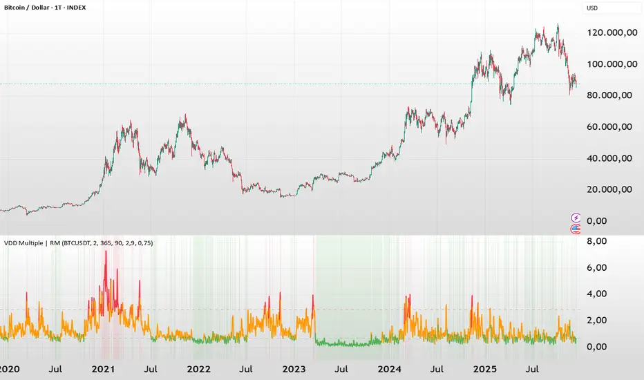
BTC - VDD Multiple (Approx)Overview & Philosophy
⚠️ Note: This indicator is optimized for the Daily (1D) Timeframe. Please switch your chart to 1D for accurate signal reading.
The BTC – VDD Multiple (Approx) is an advanced oscillator designed to identify market overheating and cycle tops by analyzing the velocity of value moving through the market.
In traditional On-Chain Analysis, Value Days Destroyed (VDD) is a premier metric for spotting macro tops. It multiplies the coin age (how long a coin was held) by the price at which it was moved. When old coins (HODLer money) move at high prices, VDD spikes, signaling massive profit-taking.
The Problem: Real "Coin Days Destroyed" (CDD) data is typically locked behind institutional paywalls or unavailable on standard TradingView plans.
The Solution: This script calculates a Deterministic Proxy. By analyzing the relationship between Exchange Volume, Price, and a Dormancy Constant, we can approximate the structure of the VDD Multiple without needing a premium data feed.
Methodology
The VDD Multiple works by comparing short-term market velocity against a long-term baseline.
1. The Proxy Calculation
Since we cannot directly access the age of coins on TradingView, we model the economic weight of the move:
Proxy Value = Exchange Volume * Price * Dormancy Factor
This creates a synthetic representation of "Value Throughput."
2. The Multiple
We compare the immediate heat of the market against the yearly trend:
• Short-Term MA (2 Days): Captures flash spikes and sudden liquidity exit events.
• Long-Term MA (365 Days): Represents the baseline "hum" of network activity.
VDD Multiple = Short Term MA / Long Term MA
How to Read the Chart
The indicator plots the Multiple as a line and uses background highlighting to signal extreme regimes.
🔴 The Red Zone (Overheated > 2.9)
Meaning: Current value transfer is ~3x higher than the yearly average.
Interpretation: Historically, sharp spikes into the Red Zone correlate with Local or Cycle Tops. This indicates that massive volume is changing hands at high prices—typically a sign of "Smart Money" distributing into "Dumb Money" FOMO.
Note: In strong bull runs, price can push higher even after a VDD spike, but the risk/reward ratio is extremely poor here.
🟢 The Green Zone (Undervalued < 0.75)
Meaning: Market activity is quiet and below the yearly baseline.
Interpretation: These are periods of apathy or accumulation. Historically, extended time spent in the Green Zone (the "flatline") has offered the best asymmetric buying opportunities.
🟠 The Orange Line (Neutral)
Meaning: The market is in transition or equilibrium.
Strategy & Context
This indicator is best used as a Macro Cycle Tool, not a day-trading signal.
• Exit Strategy: Look for "Clusters" of Red Spikes. A single spike often marks a local correction, but a cluster of intense spikes while price makes new highs (Divergence) is a strong Cycle Top warning.
• Entry Strategy: Historically the best entries occur when the indicator flattens out in the Green Zone for weeks or months. This suggests sellers are exhausted and the market has reached a floor.
Credits
This script is an approximation of the original VDD Multiple concept. Full credit for the underlying on-chain theory goes to the pioneers of this metric:
• Concept: The original Value Days Destroyed metric was popularized by Hans Hauge and Glassnode.
• The Multiple: The specific application of a Short/Long MA Multiple on VDD is widely attributed to analysts like TXMC and Bitbo.
This script adapts these concepts for the free TradingView environment using exchange volume proxies.
Settings
• Data Source: Defaults to BINANCE:BTCUSDT to capture high-volume liquidity.
• Short MA: Default is 2 Days to capture rapid velocity spikes.
• Long MA: Default is 365 Days to track the annual trend.
Disclaimer
This tool is an approximation based on exchange volume, not raw blockchain data. While exchange volume and on-chain volume are highly correlated during cycle extremes, they are not identical. This script is for educational and research purposes only. Past performance does not guarantee future results.
Tags
bitcoin, btc, onchain, vdd, cdd, valuation, cycle, top, bottom, Rob Maths
Dipy the MFT Super OscillatorDipy the MFT Super Oscillator
A multi-timeframe bandpass oscillator for mean-reversion and "buy the dip" strategies.
🎯 What It Does
Isolates market cycles within a specific frequency range to identify overbought/oversold conditions and reversal points.
⏱️ Multi-Timeframe
Set Signal Timeframe to calculate signals on higher TF while viewing lower TF chart. Example: 5min chart + 1H signals = noise reduction with precise timing.
⚙️ Key Settings
Bandwidth/BandEdge: Define the cycle range to capture
Cloud Type: None for thresholds, others for consensus cloud
Thresholds: Overbought/oversold levels for signals
💡 Best Use
Combine with trend indicator (only buy dips in uptrend)
Higher Signal Timeframe = cleaner signals
Cloud mode = more conservative entries
🔔 Alerts
Create ONE alert for all signals.
Derived from TASC 2025.04 Ultimate Oscillator by John Ehlers.

Key Levels: Volume Profile POCProfessional Intraday Key Levels (CST)
This is a comprehensive, institutional-grade Pine Script indicator designed for intraday traders (Futures, Stocks, Options) operating in the Central Time Zone. It automatically plots the most significant support and resistance levels used by algorithms and professional desks.
1. Core Levels Monitored
Daily Levels: Previous Day High (PDH), Low (PDL), Open, Close, and the 50% Midpoint (Equilibrium).
Volume Profile POC: Unlike standard indicators that use a simple average, this calculates the Volume Weighted Average Price (VWAP) of the previous day to determine the true "Fair Value" or Point of Control. Plotted with a thicker, distinct purple line.
Weekly Magnets: Previous Week High (PWH) and Low (PWL), which often act as major targets for breakouts or reversals.
Pre-Market Data: Tracks the High and Low established between 03:00 AM – 08:30 AM CST.
Opening Range (OR): Automatically captures the High and Low of the first 60 minutes of the regular session (08:30 AM – 09:30 AM CST).
2. Smart Visualization Features
Anti-Overlap Labels: If two levels (e.g., Pre-Market High and Previous Day High) are within 0.02% of each other, the script automatically merges them into a single label (e.g., "PDH & Pre-Market High") to prevent chart clutter.
Source Tracing: Trace lines extend backward from the current price level to the exact candle where that High or Low was formed (for Pre-Market and Opening Range levels), giving you instant context on when the level was created.
Clean Readability: Labels are displayed in bold, solid text without price numbers, ensuring a clean chart that focuses on level identification rather than data overload.
3. Technical Precision
Time Zone Locked: Hardcoded to America/Chicago to ensure Pre-Market and Opening Range calculations remain accurate regardless of your local computer settings.
Non-Repainting: Daily and Weekly levels are locked using closed-candle data (lookahead_on), ensuring lines do not shift during the trading day.
Buffer Safe: Optimized drawing logic prevents historical buffer errors, even on lower timeframes (1m/5m).
4. Customization
Toggle Everything: Every single level has an individual "Show/Hide" checkbox in the settings.
Label Sizing: Adjustable text size (Tiny to Huge) and offset positioning.
Compact Mode: Option to switch between full names ("Previous Day High") and abbreviations ("PDH").

Daily & Pre-Market Key Levels (v5)Plots:
- Today's high/low
- Pre-market High/Low
- Yesterday's high/low/close
- Day before yesterday high/low

Pivot Points High LowGaneshA Pivot Points High/Low indicator that:
Detects swing highs (ta.pivothigh) and swing lows (ta.pivotlow) using configurable left/right bar lengths.
Draws labels at the confirmed pivot points:
Down labels at pivot highs (potential resistance).
Up labels at pivot lows (potential support).
Lets you customize text color and label fill color separately for highs and lows.
It’s designed for overlay (on-price chart), with max_labels_count=500 to allow many labels.
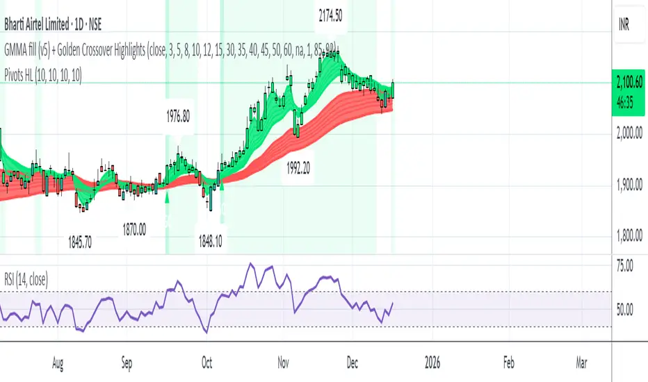
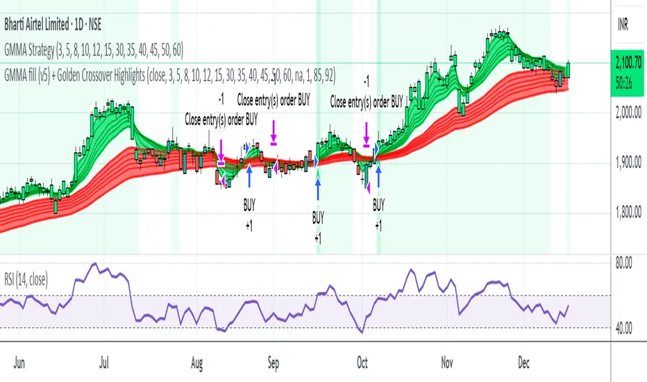
GMMA fill (v5) + Golden Crossover HighlightsGMMA Fill (v5) + Golden Crossover Highlights
This setup combines the Guppy Multiple Moving Average (GMMA) Fill version 5 with Golden Crossover signals to identify strong trend continuation and potential breakout points. GMMA provides layered moving averages for short- and long-term trend analysis, while the Golden Crossover highlights bullish momentum shifts, making it ideal for spotting entry opportunities in trending markets.
My RSI Fib Range Cloud//SOLO900q99This is basically the close price, optionally “stepped” if you set Bars Per Sample > 1.
2. Central Threshold Band (colored line)
• This is an EMA of the resampled price (default length 34).
• It turns:
• Green when RSI is in bullish fib zones,
• Pink when RSI is in bearish fib zones,
• Grey when RSI is in the middle/neutral area.
3. Sigma Range High (green line) and Sigma Range Low (pink line)
• These are an upper and lower band around price.
• The distance from price is based on how much price has been moving recently (average change).

GARCH Adaptive Volatility & Momentum Predictor
💡 I. Indicator Concept: GARCH Adaptive Volatility & Momentum Predictor
-----------------------------------------------------------------------------
The GARCH Adaptive Momentum Speed indicator provides a powerful, forward-looking
view on market risk and momentum. Unlike standard moving averages or static
volatility indicators (like ATR), GARCH forecasts the Conditional Volatility (σ_t)
for the next bar, based on the principle of volatility clustering.
The indicator consists of two essential components:
1. GARCH Volatility (Level): The primary forecast of the expected magnitude of
price movement (risk).
2. Vol. Speed (Momentum): The first derivative of the GARCH forecast, showing
whether market risk is accelerating or decelerating. This component is the
main visual signal, displayed as a dynamic histogram.
⚙️ II. Key Features and Adaptive Logic
-----------------------------------------------------------------------------
* Dynamic Coefficient Adaptation: The indicator automatically adjusts the GARCH
coefficients (α and β) based on the chart's timeframe (TF):
- Intraday TFs (M1-H4): Uses higher α and lower β for quicker reaction
to recent shocks.
- Daily/Weekly TFs (D, W): Uses lower α and higher β for a smoother,
more persistent long-term forecast.
* Momentum Visualization: The Vol. Speed component is plotted as a dynamic
histogram (fill) that automatically changes color based on the direction of
acceleration (Green for up, Red for down).
📊 III. Interpretation Guide
-----------------------------------------------------------------------------
- GARCH Volatility (Blue Line): The predicted level of market risk. Use this to
gauge overall position sizing and stop loss width.
- Vol. Speed (Green Histogram): Momentum is ACCELERATING (Risk is increasing rapidly).
A strong signal that momentum is building, often preceding a breakout.
- Vol. Speed (Red Histogram): Momentum is DECELERATING (Risk is contracting).
Indicates momentum is fading, often associated with market consolidation.
🎯 IV. Trading Application
-----------------------------------------------------------------------------
- Breakout Timing: Look for a strong, high GREEN histogram bar. This suggests
the volatility pressure is increasing rapidly, and a breakout may be imminent.
- Consolidation: Small, shrinking RED histogram bars signal that market energy
is draining, ideal for tight consolidation patterns.

Day of WeekDay of Week is an indicator that runs in a separate panel and colors the panel background according to the day of the week.
Main Features
Colors the background of the lower panel based on the day of the week
Includes all days, from Monday to Sunday
Customizable colors
Time Offset Correction
TradingView calculates the day of the week using the exchange’s timezone, which can cause visual inconsistencies on certain symbols.
To address this, the indicator includes a configurable time offset that allows the user to synchronize the calculated day with the day displayed on the chart.
By simply adjusting the Time Offset (hours) parameter, the background will align correctly with the visible chart calendar.

Multi-Trend + Credit Risk DashboardHello This is showing 20,50,200 as well as some other useful indicators. hope you like it, its my first! D and P is discount or premium to nav

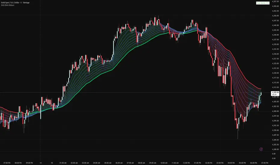
Danny Gee EMA Trend RibbonDanny Gee EMA Trend Ribbon - Multi-Timeframe Trend Analysis
A sophisticated 9-EMA ribbon system designed to visualize trend strength and direction with precision. This indicator creates a dynamic color-coded ribbon that adapts to market conditions, making trend identification effortless.
Key Features:
9 Customizable EMAs - Default periods: 8, 14, 20, 26, 32, 38, 44, 50, and 60
Intelligent Ribbon Coloring - Automatically displays bullish (green), bearish (red), or neutral (gray) based on EMA consensus
Smoothing Control - Adjustable smoothing period (default 2) reduces noise and false signals
Real-Time Trend Status - Live dashboard showing current trend state and EMA agreement count (e.g., "Bullish 8/9")
Visual Clarity - Color-coded EMA lines with the 60 EMA highlighted for key support/resistance
How It Works:
The indicator analyzes the slope direction of all 9 EMAs. When 7 or more EMAs agree on direction, the ribbon displays a clear bullish or bearish color. This consensus-based approach helps filter out weak or conflicting trends, keeping you focused on high-probability setups.
Best Used For:
✓ Identifying strong trending conditions
✓ Avoiding choppy, sideways markets
✓ Confirming trade direction with other indicators
✓ Multi-timeframe analysis (works on any chart timeframe)
Customization Options:
Adjust all EMA periods to match your trading style
Customize ribbon colors for personal preference
Toggle ribbon visibility on/off
Modify smoothing sensitivity
Perfect for swing traders, scalpers, and day traders looking for a clean, reliable trend filter that works across all markets - forex, crypto, stocks, and indices.
Selected Days Indicator V3-TrDoes the stock drop every Wednesday? Do March months always move similarly? Does the 1st week of the month behave differently?
Do you ever say "it always makes this move in these months"? Don't you want to see more clearly whether it actually makes this move or not? Don't you want to see and test periodically repeating price patterns?
Hisse her Çarşamba düşüyor mu? Mart ayları hep benzer mi hareket ediyor? Ayın 1. haftası farklı mı davranıyor?
Bazen "bu aylarda hep bu hareketi yapıyor" dediğiniz oluyor mu? Gerçekten de bu hareketi yapıp yapmadığını daha net görmek istemez misiniz? Periyodik tekrarlayan fiyat kalıplarını görmek ve test etmek istemiyor musunuz?
1. Problem
Some stocks or crypto assets exhibit systematic behaviors on certain days, weeks, or months. But it's hard to see - everything is mixed together on the chart. This indicator isolates the days/weeks/months you want and shows only them. Hides everything else.
2. How It Works
Three-layer filter: Day (Monday, Tuesday...), Week (1st, 2nd, 3rd week of the month), Month (January, February...). Select what you want, let the rest disappear. Example: Show only Thursdays of March-June-September. Or compare every 1st week of the month. View as candlestick, line, or column chart.
3. What's It Good For?
Test "end-of-month effect". Find "day-of-the-week anomaly". Analyze crypto volatility by days. See seasonality in commodities. Discover patterns specific to your own strategy. Past data doesn't guarantee the future but provides statistical advantage.

Box Theory StrategyHere is an explanation of the Box Theory trading strategy.
The Core Philosophy
This strategy is based on the idea that the market is a battle between buyers and sellers, and that these groups often defend the same price levels they used previously. Instead of trying to predict every move, this method focuses on trading only at the "extremes" where the probabilities are highest, while avoiding the middle of the chart where price action is random.
1. The Setup: Drawing the Box
To use this strategy, you must define the "playing field" for the day before you take any trades.
Top of the Box: Draw a line at the Previous Day’s High.
Bottom of the Box: Draw a line at the Previous Day’s Low.
Center Line: Draw a line roughly in the middle of these two points.
This box represents the established range where the market recently found value.
2. The Three Zones & Rules
Once the box is drawn, the chart is divided into three zones. Each zone dictates a specific action.
Zone 1: The Top (Resistance / Sell Zone)
What it represents: This is where sellers previously stepped in and pushed the price down. It is a known area of supply.
The Rule: NO BUYING.
If the price rallies to this level, you should look for Short/Sell opportunities.
Why? Buying here means purchasing at a price that was previously rejected. The probability of a reversal (price going down) is high.
Zone 2: The Bottom (Support / Buy Zone)
What it represents: This is where buyers previously stepped in and pushed the price up. It is a known area of demand.
The Rule: NO SELLING.
If the price drops to this level, you should look for Long/Buy opportunities.
Why? Selling here means shorting into support. The probability of a bounce (price going up) is high.
Zone 3: The Middle (Indecision Zone)
What it represents: This is the area of noise and confusion. Neither buyers nor sellers have clear control here.
The Rule: DO NOT TRADE.
Why? In the middle of the range, the odds of the price going up or down are roughly 50/50. Trading here is considered gambling because you do not have a statistical edge.
3. Execution: How to Trade
The Entry
Short Setup: Wait for the price to touch or slightly pierce the Top of the Box. Enter a short position when you see the price failing to break out (e.g., leaving a wick and closing back inside the box).
Long Setup: Wait for the price to touch or slightly pierce the Bottom of the Box. Enter a long position when you see the price failing to break down (e.g., bouncing off the level).
Stop Loss (Risk Management)
This strategy offers a very clear invalidation point.
For Shorts: Place your Stop Loss just above the box.
For Longs: Place your Stop Loss just below the box.
Logic: If the price clearly breaks out of the box, the range is broken, and you want to exit the trade immediately with a small loss.
Take Profit (Targets)
First Target: The Center Line. This is a safe place to take some profit or move your stop loss to breakeven.
Main Target: The opposite side of the box (e.g., if you sold at the top, target the bottom).
4. Handling Gaps (The "Cheater Box")
If the market opens significantly higher or lower than the previous day's range (a large gap), the original box may be too far away to be useful.
Adjustment: In this scenario, you can draw a new box using the highest and lowest price points of the current trading session so far.
Once this new range is established, apply the same rules: Sell the high, Buy the low, and avoid the middle.
