Manipulation Candle SystemThis indicator is based on One Candle Scalping Strategy by ProRealAlgos
## **Manipulation Candle System – Simple Explanation**
This indicator helps traders identify **potential market manipulation** during the **US stock market session (New York)** and highlights **key reversal signals**.
---
### **1. Daily ATR (Average True Range)**
* Measures the **average price movement** of the day.
* Helps determine if a move is **normal** or **abnormally large**.
* The indicator calculates **daily ATR** automatically.
* If 15 minute opening candle is more than 25% of Daily ATR, we can call it manipulation is happen .
---
### **2. 15-Minute Opening Candle Box**
* Highlights the **first 15-minute candle** of the US session.
* The box **extends for 2 hours** after the market opens.
* **Color indicates market condition**:
* **Red box** → the opening candle range is bigger than 25% of the daily ATR → potential **manipulation**.
* **Blue box** → the opening candle range is normal → **neutral session**.
* Helps traders visually spot when the market might be trying to **trap traders**.
---
### **3. 5-Minute Reversal Detection**
* Looks for **reversal candle patterns** on the 5-minute chart:
* Bullish engulfing or strong bullish pin → **buy reversal**.
* Bearish engulfing or strong bearish pin → **sell reversal**.
* Only checks during the **US session**, after 15 minute opening candle.
* Helps traders **time entries** in the direction of potential market reversals.
---
### **4. Buy / Sell Signals**
* Shows **triangle markers** on the chart:
* **Green triangle below candle** → buy signal.
* **Red triangle above candle** → sell signal.
* The signal text also indicates:
* `"BUY (Trap Reversal)"` → if the reversal occurs during manipulation.
* `"BUY (Normal Reversal)"` → if the reversal occurs during a neutral session.
* `"SELL (Trap Reversal)"` → if a sell reversal occurs during manipulation.
* `"SELL (Normal Reversal)"` → otherwise.
---
### **5. Info Table**
* Appears at the **top-right** of the chart.
* Shows:
1. Daily ATR value.
2. 15-minute opening candle range.
3. Session condition → `"MANIPULATION"` or `"NEUTRAL"`.
4. Current reversal signal text.
---
### **How a New Trader Can Use It**
1. Look at the **color of the opening box**:
* Red → be cautious, price may trap traders.
* Blue → normal market behavior.
2. Watch for **reversal signals** on the 5-minute chart.
3. Use the **info table** to confirm ATR, session bias, and signals.
4. Combine this with **risk management** before entering trades.
Volatilidad

Momentum Engine: Stage AnalysisOverview: This dashboard is a comprehensive momentum analysis tool designed for the Indian stock market (adaptable to others). It evaluates a stock's health by analyzing its trend structure, relative strength against a benchmark, volume activity, and price volatility.
Dashboard Metrics & Interpretation: Each row in the dashboard provides a specific diagnostic check for the stock.
Trend Structure: Identifies the current phase of the stock's life cycle.
✅ Power Trend (Stage 2): The strongest bullish signal. The stock is in a confirmed uptrend indicating powerful momentum.
⚠️ Stage 2 (Developing): The stock price is rising, but the momentum alignment is not yet perfect. It is positive but may be in the early stages or correcting.
❌ Mixed / Stage 4: The stock is either in a downtrend (falling price) or moving sideways without clear direction. It is technically weak.
RS vs BenchmarkCompares the stock's performance against a selected market index (e.g., Nifty 50, Sensex, Smallcap).
💪 Beating : The stock is outperforming the market. Even if the market is flat, this stock is rising. This indicates market leadership.
⚠️ Lagging : The stock is underperforming. It is weaker than the general market, suggesting a lack of institutional interest.
Tightness (VCP) Checks if the price action is "tightening" (Volatility Contraction Pattern).
✅ Tight (VCP): The price swings are getting smaller and calmer. This "calm before the storm" often precedes a major breakout.
❌ Loose: The price action is wide and choppy. The stock is "noisy," making it difficult to manage risk effectively.
The Final Verdict: The "Verdict" synthesizes all metrics into a single actionable status.Verdict 🚀 A+ BREAKOUT🟩 Green: The Perfect Setup. The stock is in a Power Trend, beating the market, has tightened up (VCP), and is sitting just below the breakout point. High probability.
💪 VOL MOMENTUM🟦 Blue High Velocity. The stock has strong trend and volume but might be imperfect (e.g., a bit loose or volatile). Suitable for aggressive traders riding momentum.👀
WATCH LIST🟧 Orange Getting Ready. The stock has a great structure but is not ready to buy yet (e.g., price is too far from the pivot). Keep it on your radar.
WAIT⬜ Gray No Setup. The stock is weak, lagging, or broken. Ignore it for now.
⚠️ WARNING & DISCLAIMER
Trading involves substantial risk of loss. This tool is a technical analysis aid only and does not guarantee future performance.
No Guarantees: A "Power Trend" or "A+ Breakout" signal does not ensure the stock will rise. Market conditions can change instantly due to news, earnings, or global events.
Not Financial Advice: This script is for educational and analytical purposes only. It is not a recommendation to buy or sell any specific security.
Use Caution: Always perform your own research (DYOR) and use strict risk management (Stop Losses) regardless of what the indicator says. The indicator is based on historical data, which may not predict future movements.

Trend Core Strategy v1.0 - GUMROADLog Regression Channel Pro Strategy
This is a trend-following pullback strategy built for TradingView (Pine Script v6).
It uses logarithmic regression channels to define the market’s primary trend, and looks for low-risk pullback entries within strong trending conditions.
Momentum and trend strength filters are applied to avoid ranging or weak markets.
This strategy is designed to be used when the market is clearly trending, not during choppy or sideways price action.
Best Used When
Strong uptrend or downtrend is present
Price is pulling back toward the regression channel
Volatility is sufficient (ADX confirms trend strength)
Suitable for 1H / 4H timeframes
Commonly used on BTC, ETH, and major crypto pairs
Key Characteristics
Non-repainting logic
Volatility-based risk management (ATR)
Designed for realistic backtesting
No martingale, no grid, no over-optimization
Gumroad Disclaimer (3 Lines)
This strategy is provided for educational purposes only and is not financial advice.
Trading involves risk, and losses may occur.
You are fully responsible for your own trading decisions.

GARCH Adaptive Volatility & Momentum Predictor
💡 I. Indicator Concept: GARCH Adaptive Volatility & Momentum Predictor
-----------------------------------------------------------------------------
The GARCH Adaptive Momentum Speed indicator provides a powerful, forward-looking
view on market risk and momentum. Unlike standard moving averages or static
volatility indicators (like ATR), GARCH forecasts the Conditional Volatility (σ_t)
for the next bar, based on the principle of volatility clustering.
The indicator consists of two essential components:
1. GARCH Volatility (Level): The primary forecast of the expected magnitude of
price movement (risk).
2. Vol. Speed (Momentum): The first derivative of the GARCH forecast, showing
whether market risk is accelerating or decelerating. This component is the
main visual signal, displayed as a dynamic histogram.
⚙️ II. Key Features and Adaptive Logic
-----------------------------------------------------------------------------
* Dynamic Coefficient Adaptation: The indicator automatically adjusts the GARCH
coefficients (α and β) based on the chart's timeframe (TF):
- Intraday TFs (M1-H4): Uses higher α and lower β for quicker reaction
to recent shocks.
- Daily/Weekly TFs (D, W): Uses lower α and higher β for a smoother,
more persistent long-term forecast.
* Momentum Visualization: The Vol. Speed component is plotted as a dynamic
histogram (fill) that automatically changes color based on the direction of
acceleration (Green for up, Red for down).
📊 III. Interpretation Guide
-----------------------------------------------------------------------------
- GARCH Volatility (Blue Line): The predicted level of market risk. Use this to
gauge overall position sizing and stop loss width.
- Vol. Speed (Green Histogram): Momentum is ACCELERATING (Risk is increasing rapidly).
A strong signal that momentum is building, often preceding a breakout.
- Vol. Speed (Red Histogram): Momentum is DECELERATING (Risk is contracting).
Indicates momentum is fading, often associated with market consolidation.
🎯 IV. Trading Application
-----------------------------------------------------------------------------
- Breakout Timing: Look for a strong, high GREEN histogram bar. This suggests
the volatility pressure is increasing rapidly, and a breakout may be imminent.
- Consolidation: Small, shrinking RED histogram bars signal that market energy
is draining, ideal for tight consolidation patterns.

MACD Signals - TradeMaster (Trend & Momentum Filter) 中文簡介
設計理念: 此指標是為了將經典的 MACD 策略「可視化」並「優化」而設計。傳統 MACD 在盤整震盪期容易出現頻繁的黃金交叉(假訊號),導致虧損。本腳本透過整合 OBV (能量潮) 與 TTM Squeeze (擠壓動能) 作為趨勢濾網,只有在動能與量能皆配合的情況下,才會標示為「✅ 有效金叉」。
核心功能與邏輯:
主圖純淨模式 (Clean Overlay):不顯示雜亂的 MACD 線圖,直接在 K 棒上下方標示買賣訊號,保持圖表乾淨。
MAM 濾網機制 (Smart Filtering):
OBV 趨勢:確認資金流向是否支持價格上漲。
動能擠壓 (Squeeze):結合 Bollinger Bands 與 Keltner Channels,避開無方向的盤整區間。
訊號分類:
✅ 有效金叉 (Valid Buy):MACD 金叉 + 通過 MAM 濾網偵測(高勝率 setup)。
❌ 無效金叉 (Fake Buy):MACD 金叉,但動能不足或處於盤整(建議觀望)。
🔻 死叉出場 (Sell):MACD 死叉,提示波段獲利了結或停損。
如何使用:
當出現 綠色標籤 (✅有效) 時,代表趨勢與動能共振,為潛在進場點。
當出現 灰色標籤 (❌無效) 時,代表僅是指標交叉但缺乏動能,建議忽略或謹慎操作。
當出現 紅色標籤 (🔻出場) 時,代表動能轉弱,建議離場。
English Description
Concept: This script is designed to visualize and optimize the classic MACD strategy directly on your main chart. Traditional MACD often generates false signals during consolidation periods. This indicator integrates OBV (On-Balance Volume) and Squeeze Momentum as a trend filter. It only marks a signal as a "✅ Valid Buy" when both momentum and volume confirm the trend.
Key Features & Logic:
Clean Main Chart Overlay: Instead of occupying a bottom pane with lines, this script plots actionable signals directly on the candlesticks, keeping your workspace clean.
MAM Filter Mechanism:
OBV Trend: Confirms if volume flow supports the price action.
Momentum Squeeze: Combines Bollinger Bands and Keltner Channels to filter out choppy, sideways markets.
Signal Classification:
✅ Valid Buy: MACD Golden Cross + Confirmed by MAM Filter (High probability setup).
❌ Fake Buy: MACD Golden Cross without momentum confirmation (Weak signal, usually ignored).
🔻 Sell Signal: MACD Death Cross, suggesting an exit.
How to Use:
Green Label (✅ Valid): Trend and momentum are in resonance. Potential entry.
Gray Label (❌ Fake): Crossover occurred but failed the filter test. Caution advised.
Red Label (🔻 Exit): Momentum is weakening. Suggested exit point.
免責聲明 (Disclaimer)
免責聲明
本腳本僅供教育與技術分析研究使用,不構成任何形式的金融投資建議。
過去的績效不代表未來的表現。
所有的交易訊號僅供參考,使用者應結合自身的風險管理策略(如停損設置)。
作者不對使用此腳本造成的任何盈虧負責。
Disclaimer
This script is for educational and technical analysis purposes only and does not constitute financial advice.
Past performance is not indicative of future results.
All signals are for reference only. Users should always apply their own risk management strategies (e.g., Stop Loss).
The author is not responsible for any trading losses incurred from using this script.

Wisenode QuantThis indicator uses a combination of DMI, ADX and ATR% to give quick easy visual representation of trend strength, trend direction and price action volatility.
This helps to quickly visually identify market environment for trade execution using quantifiable data.
Direction
Red LED = Bearish Market conditions
Green LED = Bullish Market conditions
Trend (Strength)
Red = 0-20 on the ADX (Ranging)
Green = 20-30 on the ADX (Emerging)
Green = 30-50 on the ADX (Momentum)
Volatility
Uses ATR% on a dynamic scale from top to bottom is low to high intensity. Colour will transition from green to red as the bar moves higher.
Trade Execution
Integration of a custom Murray math values to build entry, stop loss protection and take profit zones.
This is still a working progress to fine tune default settings but can be used for market environment identification for any sort of discretionary trading

Tailwind.(BTC)Imagine the price of Bitcoin is like a person climbing a staircase.
The Steps (Grid): Instead of watching every single price movement, the strategy divides the market into fixed steps. In your configuration, each step measures **3,000 points**. (Examples: 60,000, 63,000, 66,000...).
The Signal: We buy only when the price climbs a full step decisively.
The "Expensive Price" Filter: If the price jumps the step but lands too far away (the candle closes too high), we do not buy. It is like trying to board a train that has already started moving too fast; the risk is too high.
Rigid Exits: The Take Profit (TP) and Stop Loss (SL) are calculated from the edge of the step, not from the specific price where you managed to buy. This preserves the geometric structure of the market.
The Code Logic (Step-by-Step)
A. The Math of the Grid (`math.floor`)
pinescript
level_base = math.floor(close / step_size) * step_size
This is the most important line.
What does it do? It rounds the price down to the nearest multiple of 3,000.
Example: If BTC is at 64,500 and the step size is 3,000:
1. Divide: $64,500 / 3,000 = 21.5$
2. `math.floor` (Floor): Removes the decimals $\rightarrow$ remains $21$.
3. Multiply: $21 * 3,000 = 63,000$.
Result: The code knows that the current "floor" is **63,000**, regardless of whether the price is at 63,001 or 65,999.
B. The Strict Breakout (`strict_cross`)
pinescript
strict_cross = (open < level_base) and (close > level_base)
Most strategies only check if `close > level`. We do things slightly differently:
`open < level_base`: Requires the candle to have "born" *below* the line (e.g., opened at 62,900).
`close > level_base`: Requires the candle to have *finished* above the line (e.g., closed at 63,200).
Why? This avoids entering on gaps (price jumps where the market opens already very high) and confirms that there was real buying power crossing the line.
C. The "Expensive Price" Filter (`max_dist_pct`)
pinescript
limit_price_entry = level_base + (step_size * (max_dist_pct / 100.0))
price_is_valid = close <= limit_price_entry
Here you apply the percentage rule:
-If the level is 63,000 and the next is 66,000 (a difference of 3,000).
-If `max_dist_pct` is **60%**, the limit is $63,000 + (60\% \text{ of } 3,000) = 64,800$.
-If the breakout candle closes at **65,000**, the variable `price_is_valid` will be **false** and it will not enter the trade. This avoids buying at the ceiling.
D. TP and SL Calculation (Anchored to the Level)
pinescript
take_profit = level_base + (step_size * tp_mult)
stop_loss = level_base - (step_size * sl_mult)
Note that we use `level_base` and not `close`.
-If you entered because the price broke 63,000, your SL is calculated starting from 63,000.
-If your SL is 1.0x, your stop will be exactly at 60,000.
This is crucial: If you bought "expensive" (e.g., at 63,500), your real stop is wider (3,500 points) than if you bought cheap (63,100). Because you filter out expensive entries, you protect your Risk/Reward ratio.
E. Visual Management (`var line`)
The code uses `var` variables to remember the TP and SL lines and the `line.set_x2` function to stretch them to the right while the operation remains open, providing that visual reference on the chart until the trade ends.
Workflow Summary
Strategy Parameters:
Total Capital: $20,000
We will use 10% of total capital per trade.
Commissions: 0.1% per trade.
TP: 1.4
SL: 1
Step Size (Grid): 3,000
We use the 200 EMA as a trend filter.
Feel free to experiment with the parameters to your liking. Cheers.

Daily Dynamic Grid StrategyHi everyone,
This strategy is built around a dynamic daily grid concept, using an upper and lower daily range that is automatically divided into multiple grid levels.
The idea is to take advantage of daily volatility by executing DCA entries on specific grid levels, based on predefined conditions.
Key points of the strategy & feature:
I recommend using 1H or 2H timeframe for this strategy
Take profit by grid
When DCA is active (>1 entry), the exit condition switches to close above the average price
A hard stop loss is applied
Includes an optional Trailing TP / SL to help maximize profit during strong moves
Like most DCA-based strategies, it tends to have a high win rate, but during strong market dumps, losses can become relatively large
Can also be used for backtest on Forex markets such as Gold, where using the trailing option is generally more effective
And still trial for the webhook, may continue to improve and update this strategy in future versions.

NY Session Range & FlowNY Session Range & Flow is a rule-based intraday futures indicator designed for the New York session, with a focus on MNQ / NQ price behavior.
This indicator does not predict the market. Instead, it maps context, structure, and flow so traders can make disciplined decisions with predefined risk.
🔍 Core Concepts
NY Session Range & Flow combines:
Session structure
Range usage (ADR / AWR)
VWAP positioning & slope
Liquidity sweeps
Supply & Demand zones
Opening Range Breakouts
Mean reversion vs trend continuation logic
All signals are graded and throttled to reduce noise and overtrading.
📌 What the Indicator Shows
🕒 Session Logic (NY Time)
RTH (09:30–16:00 NY)
Trade windows (AM / PM)
Opening Range (09:30–09:45)
ETH session ranges (for context only)
📊 Range & Regime Awareness
ADR / AWR usage
Identifies expansion vs exhaustion
Helps avoid trading when range is already spent
📉 Flow & Bias
VWAP with optional ATR bands
VWAP slope filter for directional bias
Mean reversion distance rules
🧲 Liquidity & Structure
Prior Day High / Low
NY High / Low / Mid
Opening Range High / Low
Liquidity sweep detection
📦 Supply & Demand Zones
Higher-timeframe pivot-based zones
ATR-adjusted zone thickness
Last active zone tracking
🎯 Signal Types (Graded)
Trend Continuation
Sweep Reversal
Opening Range Breakout (ORB)
Mean Reversion to VWAP
Each signal is scored and graded (A+ → C) based on:
Structure
Liquidity
VWAP alignment
Regime context
Only signals that meet your selected quality threshold are displayed.
⚖️ Risk Visualization
Fixed Stop Loss & Take Profits in ticks
Supports SL + TP1 + TP2
Optional ATR trailing structure
Visual SL/TP lines for clarity (manual execution)
This is a decision-support tool, not an auto-trading system.
📋 Range Usage Table
Displays real-time usage for:
RTH
ETH
Weekly
Monthly ranges
Color-coded to highlight expansion and exhaustion.
⚠️ Important Notes
Designed for manual trading
Best suited for futures traders
Optimized for MNQ / NQ, but adaptable
Not financial advice
🔧 Recommended Use
Combine with strict risk management
One trade at a time
Respect session context and range limits

CT Market Fragility & Systemic Risk Monitor v1.0CT ⊕ Market Fragility & Systemic Risk Monitor v1.0
Systemic Stress & Market Regime Monitor
OVERVIEW
Wall Street-grade structural monitoring now open-source.
CT ⊕ Market Fragility & Systemic Risk Monitor v1.0 is a real-time systemic risk tool designed to detect fragility before it hits price. Built by former institutional traders, it delivers structural insight typically reserved for desks inside hedge funds and global macro desks.
This isn’t about finding entries or exits, it’s about understanding the environment you're trading in, and recognizing when it's shifting.
WHAT IT DOES
• Monitors six key market domains: Equities, Rates/Credit, FX (USD stress), Commodities, Crypto, and Macro
• Detects volatility stress, cross-domain coupling, and regime synchronization
• Classifies market structure into Normal → Fragile → Critical
• Shows a live dashboard with scores, coupling levels, and structural state
• Plots event markers (T1, T2, T3) for structural transitions
• Implements hysteresis logic to model post-stress 'memory
• Supports both single-domain ("Local Mode") and system-wide monitoring
HOW IT WORKS
This engine does not rely on traditional TA. No moving averages. No MACD. No patterns. No guesswork.
Instead, it measures how markets are behaving beneath price detecting when stress is:
• Building internally
• Spreading across domains
• Synchronizing into systemic fragility
T1 (🟠) — Early instability: acceleration in market coupling
T2 (🔵) — Fragile regime: multiple domains simultaneously stressed
T3 (🔴) — Critical regime: synchronized, system-wide stress
These are not buy/sell signals. They are structural regime alerts, the same kind used by institutions to cut risk before stress cascades.
WHY IT MATTERS
Most retail tools are reactive. They interpret surface-level patterns after the move.
This tool is different. It’s proactive – measuring pressure before it breaks structure.
Institutions have used structural fragility models like this for years. This script helps close that gap, giving everyday traders the same early warnings that pros use to reduce exposure and sidestep systemic blowups.
It’s not about finding the edge.
It’s about not getting crushed when the system breaks.
Whether you trade crypto, stocks, FX, or macro, this engine helps answer:
• Is the system stable right now?
• Are stress levels rising across markets?
• Is it time to tighten risk?
Institutions don’t wait for breakouts. They monitor structure.
Now, you can too.
KEY FEATURES
• Works on any asset class and any timeframe
• Fully customizable domain selection
• Three-tier structural alert system (T1–T3)
• Real-time dashboard: stress scores, states, and coupling levels
• Hysteresis modeling: post-stress “memory” detection
• Supports single-domain (local) or multi-domain (systemic) monitoring
• PineScript alerts built-in
RECOMMENDED USE
Active traders - all asset classes
Use the dashboard and T1–T3 alerts to stay aware of structural risk in real time.
Track multi-timeframe alignment to detect where risk originates and how it spreads across markets.
Crypto trader s
Monitor upstream domains (Equities, FX, Rates, Macro) to detect pressure before it reaches crypto.
Identify reflexive stress before Bitcoin reacts — and stay ahead of contagion events.
Macro & systematic traders
Use T1–T3 transitions as volatility filters, exposure governors, or dynamic risk overlays.
Build regime-aware models that adapt to shifting systemic conditions.
Examples & Visuals
Question: Would it have helped to know that at 9:30 on October 9th and again at 10:00 on October 10th that critical states were detected in the structural behavior of Bitcoin? Take a look:
30 min chart BTC shows two distinct T3 (critical) regime detections October 9th and 10:30 October 10th
5m BTC chart reveals high frequency instability for the same period, identifying instability, fragility, criticality
The 30minute BTC chart at 16:30 Friday October 10th,, a few hours after first detecting critical systemic risk
RISK DISCLAIMER
This is a structural analysis tool, not a predictive signal. It does not provide financial advice, trade entries, or forecasts. Use at your own risk. Full disclaimer embedded in the script.
Complexity Trading - From Wall St to Main St
No patterns. No repainting. No mysticism. Just logic, math, science and market structure - now made accessible to everyone.
Developer of LPPL Critical Pulse (LPPLCP), the Temporal Phase Model (TPM) and other
other advanced structural and attractor based systems inspired by Sornette’s LPPL framework and other differentiated thinkers.
Note on Methodology
This tool is not predictive, and not designed for academic publication.
It is a real-time structural monitoring system inspired by academically established concepts,
including LPPL attractor dynamics, cross-asset coupling, reflexivity, and phase regime transitions, implemented within the real-time constraints of PineScript, and intended for visual, exploratory, and diagnostic use.

Hybrid Strategy: Trend/ORB/MTFHybrid Strategy: Trend + ORB + Multi-Timeframe Matrix
This script is a comprehensive "Trading Manager" designed to filter out noise and identify high-probability breakout setups. It combines three powerful concepts into a single, clean chart interface: Trend Alignment, Opening Range Breakout (ORB), and Multi-Timeframe (MTF) Analysis.
It is designed to prevent "analysis paralysis" by providing a unified Dashboard that confirms if the trend is aligned across 5 different timeframes before you take a trade.
How it Works
The strategy relies on the "Golden Trio" of confluence:
1. Trend Definition (The Setup) Before looking for entries, the script analyzes the immediate trend. A bullish trend is defined as:
Price is above the Session VWAP.
The fast EMA (9) is above the slow EMA (21). (The inverse applies for bearish trends).
2. The Signal (The Trigger) The script draws the Opening Range (default: first 15 minutes of the session).
Buy Signal: Price breaks above the Opening Range High while the Trend is Bullish.
Sell Signal: Price breaks below the Opening Range Low while the Trend is Bearish.
3. The Confirmation (The Filter) A signal is only valid if the Higher Timeframe (default: 60m) agrees with the direction. If the 1m chart says "Buy" but the 60m chart is bearish, the signal is filtered out to prevent false breakouts.
Key Features
The Matrix Dashboard A zero-lag, real-time table in the corner of your screen that monitors 5 user-defined timeframes (e.g., 5m, 15m, 30m, 60m, 4H).
Trend: Checks if Price > EMA 21.
VWAP: Checks if Price > VWAP.
ORB: Checks if Price is currently above/below the Opening Range of that session.
D H/L: Warns if price is near the Daily High or Low.
PD H/L: Warns if price is near the Previous Daily High or Low.
Visual Order Blocks The script automatically identifies valid Order Blocks (sequences of consecutive candles followed by a strong explosive move).
Chart: Draws Green/Red zones extending to the right, showing where price may react.
Dashboard: Displays the exact High, Low, and Average price of the most recent Order Blocks for precision planning.
Risk Management (Trailing Stop) Once a trade is active, the script plots Chandelier Exit dots (ATR-based trailing stop) to help you manage the trade and lock in profits during trend runs.
Visual Guide (Chart Legend)
⬜ Gray Box: Represents the Opening Range (first 15 minutes). This is your "No Trade Zone." Wait for price to break out of this box.
🟢 Green Line: The Opening Range High. A break above this line signals potential Bullish momentum.
🔴 Red Line: The Opening Range Low. A break below this line signals potential Bearish momentum.
🟢 Green / 🔴 Red Zones (Boxes): These are Order Blocks.
🟢 Green Zone: A Bullish Order Block (Demand). Expect price to potentially bounce up from here.
🔴 Red Zone: A Bearish Order Block (Supply). Expect price to potentially reject down from here.
⚪ Dots (Trailing Stop):
🟢 Green Dots: These appear below price during a Bullish trend. They represent your suggested Stop Loss.
🔴 Red Dots: These appear above price during a Bearish trend.
🏷️ Buy / Sell Labels:
BUY: Triggers when Price breaks the Green Line + Trend is Bullish + HTF is Bullish.
SELL: Triggers when Price breaks the Red Line + Trend is Bearish + HTF is Bearish.
Settings
Session: Customizable RTH (Regular Trading Hours) to filter out pre-market noise.
Matrix Timeframes: 5 fixed slots to choose which timeframes you want to monitor.
Order Blocks: Adjust the sensitivity and lookback period for Order Block detection.
Risk: Customize the ATR multiplier for the trailing stop.
Disclaimer
This tool is for educational purposes only. Past performance does not guarantee future results. Always manage your risk properly.

DCT - Liquidity Heatmap - ProDCT - Liquidity Heatmap - Pro
Overview
This indicator maps liquidity concentration zones by analyzing volume distribution across price levels. It identifies areas where significant trading activity has accumulated, potentially indicating zones of interest for future price interaction.
Methodology
Volume Intensity Calculation
Each price level accumulates a normalized volume score calculated as:
- Volume Intensity = Current Bar Volume / SMA(Volume, lookback period)
- This normalization allows comparison across different volatility regimes and trading sessions
Level Construction
- Price levels are distributed symmetrically above and below current price using percentage-based spacing
- Each level maintains cumulative volume data, tracking both raw volume and normalized intensity
- Levels are visualized as zones with height proportional to the spacing parameter
Sweep Detection Logic
A level is marked as "swept" when price action crosses through it:
- Condition: Low ≤ Level Price AND High ≥ Level Price
- Swept levels stop accumulating new volume and can be styled differently (fade, hide, or preserve)
Color Intensity Grading
Zones are color-coded based on their normalized volume relative to the maximum observed:
- Purple: < 25% of max intensity
- Yellow: 25-50% of max intensity
- Orange: 50-75% of max intensity
- Red: > 75% of max intensity
Optional CVD (Cumulative Volume Delta) Mode
When enabled, directional volume is estimated using candle structure:
- Bullish candles: Buy pressure weighted by (Close - Open) / (High - Low)
- Bearish candles: Sell pressure weighted by (Open - Close) / (High - Low)
- Levels display green/red bias based on accumulated directional volume ratio
Adaptive System
The indicator includes a three-layer adaptive system:
1. Timeframe adaptation: Spacing, level count, and retention automatically adjust for M5 through Daily charts
2. Volatility adaptation: ATR-based adjustments widen spacing during high volatility and tighten during consolidation
3. Market type adaptation: Different imbalance thresholds for BTC/ETH, large altcoins, and small caps
Imbalance Detection
Buy/sell imbalance markers appear when the ratio of accumulated buy volume to sell volume exceeds a configurable threshold (default 1.5x for BTC/ETH, 2.0x for small caps).
What Makes This Implementation Unique
- Dollar-denominated liquidity display: Labels show estimated liquidity in USD (K/M/B format) rather than abstract values
- Three-layer adaptive logic: Combines timeframe, volatility (ATR), and asset-class adjustments simultaneously
- Memory-optimized architecture: Automatic cleanup of old swept levels prevents performance degradation on extended charts
- Forward projection: Active levels extend into future bars for cleaner visualization
- Granular visibility controls: Each intensity tier can be toggled independently
Settings Guide
- Dynamic: Enable adaptive adjustments (recommended)
- Spacing: Distance between levels as % of price
- Levels: Number of levels above/below price
- CVD: Enable directional volume analysis
- Forward: Project levels ahead by specified bars
Usage Notes
- Works on both Perpetual and Spot crypto markets
- Optimized for crypto assets; results may vary on other instruments
- Higher timeframes show broader liquidity structure; lower timeframes show granular detail
- Combine with your own analysis framework
Disclaimer
This indicator visualizes historical volume distribution and does not predict future price movement. Not financial advice. Use appropriate risk management.

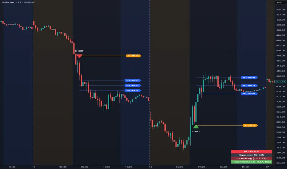
Opening Range Intraday IndicatorOpening Range Intraday Indicator
Summary
The Opening Range Intraday Indicator is a decision-support tool for intraday breakout entries. It combines an Opening Range Breakout (ORB) model with relative volume confirmation and a squeeze-style trend filter, then visualizes entries with clearly defined take-profit (TP) and stop-loss (SL) levels.
The indicator works on any ticker and any timeframe. However, its default parameters and internal logic are optimized for TSLA on the 15-minute chart, which is shown as a recommended context in the on-chart table for informational purposes only.
Core Logic
Opening Range Breakout
Establishes an opening range during the early session and monitors for confirmed breakouts above or below that range to generate potential intraday entries.
Relative Volume confirmation
Breakouts are validated using relative volume to help ensure participation and reduce low-quality signals during thin or inactive periods.
Squeeze / trend filter
A squeeze-style metric evaluates recent compression and directional behavior, helping to avoid entries during unfavorable or low-quality structural conditions.
Entry Visualization & Risk Levels
When a valid entry is confirmed, the indicator automatically:
Plots directional entry markers
Calculates and draws multiple take-profit levels
Draws a stop-loss level based on opening-range structure or ATR logic
Marks TP or SL hits directly on the chart for visual review
These visuals persist on the chart to allow traders to manually review trade structure and outcome over time.
On-Chart Table & Context Guidance
The indicator includes a compact on-chart table that displays:
Current squeeze value and short-term trend behavior
“No trade” conditions when structure is unfavorable
A recommended context message indicating whether the chart matches the optimized setup (TSLA on the 15-minute timeframe)
This message is informational only and does not restrict signals or functionality on other symbols or timeframes.
Flexibility & Controls
Users can customize:
Take-profit and stop-loss display behavior
Tight or standard stop-loss logic
Quiet windows near session close to suppress alerts
Visual settings and table positioning
This allows the indicator to be adapted to different instruments, volatility profiles, and execution styles.
Important Notes
This indicator does not execute trades and does not include automated backtesting or performance statistics.
TP/SL markers are visual aids only and are intended for manual review, not statistical validation.
Results will vary by symbol, timeframe, execution, and market conditions.
This indicator is intended as a research and decision-support tool for experienced intraday traders who understand execution risk, volatility, and position sizing. It should be used alongside proper risk management and independent analysis.
0DTE Credit Spreads Indicator0DTE Credit Spreads Indicator
This indicator is designed to assist 0DTE credit spread traders by providing rule-based PCS (Put Credit Spread) and CCS (Call Credit Spread) signals, dynamic risk levels, and an integrated performance summary — all within a single, cohesive tool.
What the indicator does
The script implements a complete intraday framework tailored specifically to same-day expiration credit spreads, combining market structure, volatility context, and trade management logic into one workflow:
Opening Range logic (15-minute)
A defined opening range is used to establish directional bias. Signals are generated only after the range is confirmed, aligning entries with controlled intraday structure rather than momentum chasing.
Optional Early Entry logic
An optional early-entry mechanism evaluates 30-minute RSI extremes during the opening phase only. This is intentionally constrained to the opening window and designed for early premium capture scenarios common in 0DTE trading.
Volatility-aware credit estimation
Expected credit is derived from current volatility conditions to provide realistic assumptions for backtesting, trade visualization, and partial-profit modeling.
Dynamic risk visualization
Each signal automatically plots:
A horizontal stop-loss level
A take-profit level based on user-selected credit percentage
A dynamic diagonal stop line from entry to end-of-day, modeling time-based risk specific to 0DTE positions
Partial profit and contract modeling
The backtest logic supports closing a user-defined number of contracts at the take-profit level, while allowing remaining contracts to run to end-of-day or stop loss. This mirrors real-world 0DTE trade management practices.
Flexible evaluation modes
Trades can be evaluated using either:
Intraday stop-loss crosses, or
End-of-day outcome logic
allowing users to align results with their execution style.
Backtesting and transparency
The indicator includes a live, on-chart backtest table displaying:
PCS and CCS signal counts
Wins, losses, and win rate
Total P/L (points or dollar-based per contract)
Contract and partial-TP configuration
A non-blocking “Recommended context” note indicating whether the script is running on the preferred symbol and timeframe
Signals and visuals will display on any chart. The recommended context is informational only and does not restrict usage.
Chart presentation
Full visual mode with labels, TP/SL levels, and diagonal risk lines
Clean Chart mode with arrow-only signals and a compact summary table
Automatic object management to prevent chart clutter.
Intended use
This indicator is intended as a decision-support and research tool for experienced traders. It does not place trades, does not guarantee profitability, and should be used alongside proper risk management.

Session HeatmapIntraday Seasonality
Overview
Analyzes historical patterns by time of day. Identifies when volatility, volume, and open interest changes tend to be highest or lowest.
Features
Multiple Metrics: TR (volatility), Volume, and Open Interest changes
Flexible Grouping: View patterns by weekday or month to spot day-of-week or seasonal effects
Heatmap Visualization: Blue (low) to Red (high) color scale for quick pattern recognition
Percentile Mode: Reduces outlier impact by using 5th-95th percentile range
Timezone Support: Display in UTC alongside your local time
Metrics Explained
TR: Volatility - when markets move most
Volume: Liquidity - when participation is highest
OI Increase: When new positions are opened
OI Decrease: When positions are closed
OI Net: Net open interest change
Usage
Set your timezone and preferred slot size (30min/1H)
Choose a date range (relative or custom)
Select a metric to analyze
Use "Group By" to see weekday or monthly patterns
Switch to Percentile color scale if outliers dominate
Notes
Chart timeframe should be equal to or smaller than Slot Size
OI metrics require Binance Perpetual symbols
DST is not automatically adjusted; consider seasonal shifts for US/EU sessions

Carry Stress Trigger (ZAR)A regime indicator for detecting stress in ZAR carry trades before price moves aggressively
Overview
Carry Stress Trigger (ZAR) is a regime-detection indicator that identifies early warning signals of carry-trade stress in the South African Rand (ZAR).
ZAR is one of the most widely used high-yield carry currencies, but its performance can reverse sharply when:
- Global risk sentiment deteriorates.
- Funding currencies (especially JPY) strengthen.
- Emerging market FX begins to underperform
This indicator combines risk, funding, and EM FX signals into a single Carry Stress Score, helping traders avoid being caught on the wrong side of sudden USDZAR or ZARJPY moves.
Indicator Logic (How It Works)
The model evaluates three independent conditions, each representing a core driver of carry trade behaviour:
Global Risk-Off Signal (VIX)
- Uses the VIX index as a proxy for global risk appetite
- Condition is triggered when:
VIX > its 20-period moving average
This captures rising volatility and risk aversion — a common precursor to EM FX sell-offs.
Funding Stress Signal (JPY Strength)
- JPY is the primary funding currency for global carry trades
- Condition is triggered when:
USDJPY < its 20-period moving average
A strengthening JPY often signals carry unwinds across EM FX.
EM FX Underperformance (ZAR vs USD)
- Measures whether ZAR is underperforming relative to the USD
- Uses a relative ratio:
USDZAR / DXY
The signal triggers when ZAR weakens beyond broad USD strength, isolating ZAR-specific stress rather than general dollar moves.
Carry Stress Score
Each condition contributes 1 point:
Score Regime Interpretation
0–1 Carry Friendly Risk-on environment, carry trades supported
2 Warning Stress building, caution advised
3 Carry Stress High risk of carry unwind / sharp ZAR moves
The score is plotted as a step line and optionally highlighted with background shading when stress rises.
How to Use It
USDZAR Traders
Score 0–1: Trend continuation and carry strategies more reliable
Score ≥ 2: Avoid fading USDZAR upside aggressively
Score = 3: Expect volatility expansion and fast upside spikes
ZARJPY / Carry Baskets
Score ≥ 2: Reduce exposure, tighten stops
Score = 3: Carry trades historically underperform
Risk Management
Use the indicator as a regime filter, not a standalone entry signal
Best combined with:
- Key USDZAR levels (support/resistance)
- SARB / CPI / Fed event weeks
-Volatility-based position sizing
Timeframe Notes
- The Lookback Length applies to the current chart timeframe
- On Daily charts, a length of 20 ≈ 1 trading months
- On Intraday charts, the signals become faster and more tactical
- For macro and swing trading, the Daily timeframe is recommended.
Important Notes
- This indicator is not predictive — it identifies regime conditions
- Carry trades can remain profitable even during early stress
- The strongest signals occur when Score = 3 aligns with key price levels or macro events
