XAUUSD Lot Size Calculator1. What This Indicator Does
This tool is a Visual Risk Management System. Instead of using a calculator on your phone or switching tabs, it allows you to calculate the exact lot size for your trade directly on the TradingView chart by dragging lines.
It automates the math for:
Lot Size: How big your position should be to risk exactly X% of your account.
Take Profit: Where your target should be based on your Risk-to-Reward ratio.
Safety Checks: It warns you if your stop loss is too tight for the minimum lot size (0.01).
2. Visual Features
🔴 The Red Line (Stop Loss): This is your interactive line. You can grab it with your mouse and drag it to your desired invalidation point (e.g., below a support wick).
🟢 The Green Line (Take Profit): This line moves automatically. You cannot drag it. It calculates where your Take Profit must be to satisfy your Risk:Reward ratio (Default 1:1) based on where you placed the Red line.
⚫ The Info Table: A high-contrast black box in the corner that displays your calculated Lot Size, Risk amount, and Trade direction (Long/Short).
3. How to Use It (Step-by-Step)
Step 1: Initial Setup
When you first add the indicator to the chart, you need to tell it about your account:
Double-click the Black Table (or the Red Line) to open Settings.
Inputs Tab:
Account Balance: Enter your current trading balance (e.g., 10,000).
Risk %: Enter how much you want to lose per trade (e.g., 1.0%).
Contract Size: Keep this at 100 for Gold (XAUUSD) or standard Forex pairs.
Risk : Reward Ratio: Set your target (e.g., 1.0 for 1:1, or 2.0 for 1:2).
Step 2: Planning a Trade
Look at the chart and identify where you want to enter (current price) and where you want your Stop Loss.
Find the Red Line on your chart. (If you don't see it, go to Settings and change "Stop Loss Level" to a price near the current candle).
Click and Drag the Red Line to your specific Stop Loss price.
Step 3: Reading the Signals
Direction: If you drag the Red Line below the price, the table shows LONG. If you drag it above, it shows SHORT.
Lot Size: Read the big green number in the table (e.g., 0.55). This is the exact lot size you should enter in your broker.
TP Target: Look at the Green Line on the chart. That is your exit price.
Step 4: The "Orange Warning"
If you place your Stop Loss very close to the entry, or if your account is small, the math might suggest a lot size smaller than is possible (e.g., 0.004).
The table text will turn ORANGE.
The Lot Size will stick to 0.01 (the minimum).
The "Risk ($)" row will show you the actual risk. (Example: Instead of risking your desired $100, you might be forced to risk $105 because you can't trade smaller than 0.01 lots).
Ratio

BTC - Satoshis Altcoin Graveyard OVERVIEW
The Satoshi's Altcoin Graveyard (SAG) is a macro-statistical engine designed to solve the problem of Survivorship Bias . It is a well-known phenomenon in the crypto markets that the "Top 10" list is in a constant state of flux. If you look at historical data from CoinMarketCap (CMC) year by year, you will see a revolving door of projects that once seemed "too big to fail" disappearing into obscurity. Meanwhile, Bitcoin has remained the undisputed #1 since inception.
While most traders have a "gut feeling" that Altcoins eventually depreciate against Bitcoin, I believe in measuring it and drawing it on a chart for better visibility. By locking in specific "Cohorts" of market leaders from the past, we can track their inevitable decay through the Satoshi Sieve .
THE 13-COIN STATISTICAL BUCKET
To ensure an objective, non-biased audit, each cohort (we look at 2018, 2020 and 2022) is constructed using a fixed market-cap methodology from the snapshot date (excluding stablecoins):
• The Core: The Top 10 non-stablecoin assets at that time by Marketcap.
• The Risk Alpha: Representative samples from the Top #25, #50, and #100 ranks. (By including lower-ranked "riskier" alts, we capture the full statistical decay of the market, not just the "Blue Chips.")
TECHNICAL ARCHITECTURE
This script is engineered to push the boundaries of the Pine Script engine. TradingView enforces a hard limit of 40 unique data requests . By tracking 3 cohorts of 13 assets plus the Bitcoin base, this indicator utilizes exactly 40/40 requests , providing the maximum possible data density in a single chart window.
THE SPS CONCEPT (Survival Probability Score)
The SPS measures the Breadth of Survival . It answers: "How many coins from this year (the year of the snapshot) are actually outperforming BTC?"
We use a binary logic system to determine if a coin is "Winning" or "Losing" against the only benchmark that matters: Bitcoin.
• The Status Formula: Status = Current_Alt_BTC_Ratio >= Entry_Alt_BTC_Ratio ? 1 : 0 . This means: Every single day, at the Daily Close , the script compares the current Alt/BTC ratio to the fixed ratio from the snapshot date. If the coin is worth more in Bitcoin today than it was back then, it is assigned a "1" (a Win). If it has lost value against Bitcoin, it gets a "0" (a Loss).
• The SPS Line: SPS Line = (Sum of 'Wins' / 13) * 100 This means: We add up all the "Winners" for that specific day and turn it into a percentage. For example, if the Aqua line is at 7.69% on your chart, it confirms that on that day , exactly 1 out of the 13 coins was successfully beating Bitcoin, while the other 12 were underperforming.
THE PERFORMANCE MATRIX
In the top-right corner, we provide a Weighted Portfolio Simulation . This answers the financial question: "If I swapped 1 BTC into an equal-weight basket of these 13 coins on the snapshot day, what is my BTC value today?".
• Value < 1.0 BTC: You lost purchasing power compared to holding Bitcoin.
• Value > 1.0 BTC: You successfully achieved "Alpha" over the benchmark.
HOW TO READ THE CHART
• The Waterfall: Lines generally trend downward as the "Satoshi Sieve" filters out assets that cannot maintain their BTC-relative value.
• Dynamic Winners: We dynamically print the names of the current survivors at the tip of each line. If a cohort shows "None," the graveyard is full.
HOW TO READ THE MATRIX
• The BTC Target: Any portfolio value in the matrix below 1.0 BTC represents a failed altcoin rotation.
• Class of 2018: A portfolio value near 0.15 BTC at the current date, means a 85% loss rate.
• Class of 2020: A portfolio value near 0.77 BTC at the current date, means an approx 20 % loss rate.
• Class of 2022: A portfolio value near 0.31 BTC at the current date, means an approx 70% loss rate.
DIFFERENCE FROM AN ALTCOIN INDEX
Standard Altcoin Indexes (like my ALSI Index ) "rebalance" by removing losers and adding new winners. This is deceptive. The Altcoin Graveyard never rebalances . It forces you to watch the "losers" decay, providing a realistic look at the long-term opportunity cost of "Buy and Hold" for anything other than Bitcoin.
CONCLUSION
The data revealed by the Satoshi Sieve leads to a singular, sobering "Lesson Learned": Picking the right coin to outperform Bitcoin is not just difficult—it is statistically improbable over a long-term horizon.
While the "Risk-Reward" of altcoins is often marketed as having higher upside, the Altcoin Graveyard proves that for the vast majority of assets, the reward does not justify the risk of total portfolio erosion in BTC terms.
• The Mathematical Odds: If you picked a Top 10 coin in 2018, your chance of outperforming BTC today is effectively 0%.
• The Rotation Trap: Most investors "HODL" these assets into the graveyard, hoping for a return to previous ATHs that never comes because the liquidity has already moved on to the next "Class" of winners.
The final conclusion is clear: Diversification into altcoins is often just a slow-motion transfer of wealth back to Bitcoin. If you cannot identify the 1-out-of-13 that survives the Sieve, your best risk-adjusted move has historically been to simply hold the benchmark.
DISCLAIMER
This script is for educational purposes only. It does not constitute financial advice. It is a mathematical study of historical opportunity cost and survivorship bias.
Tags
bitcoin, btc, satoshis graveyard, altseason, dominance, total3, rotation, cycle, index, alsi, Rob Maths, robmaths

Gold/Silver Ratio with Supply ZonesGold/Silver Ratio with Supply Zones
Overview
Professional-grade indicator that tracks the Gold/Silver Ratio in real-time
Identifies potential market imbalances and rotation opportunities between precious metals
Features customizable threshold bands, moving averages, and automated trading signals
Built on Pine Script v6 for maximum stability and performance
Key Features
Real-Time Ratio Calculation : Automatically calculates Gold/Silver ratio using OANDA:XAUUSD and OANDA:XAGUSD price feeds
Dynamic Threshold Zones : Visual bands showing when silver or gold may be undervalued relative to each other
Moving Average Overlay : 20-period SMA to identify trend direction and momentum
Automated Buy Signals : Triangle markers appear when ratio reaches extreme levels
Live Information Table : Displays current ratio, moving average, individual metal prices, and market interpretation
Custom Alerts : Set notifications when ratio crosses your defined thresholds
Color-Coded Zones : Green zones indicate gold undervaluation, red zones indicate silver undervaluation
Trading Applications
Mean Reversion Strategy : Enter silver positions when ratio exceeds 90, enter gold when ratio falls below 70
Rotation Trading : Switch between metals based on relative value signals
Portfolio Rebalancing : Identify optimal times to adjust precious metals allocation
Divergence Analysis : Compare ratio behavior against individual metal price action
Default Settings
High Threshold : 90.0 (Silver undervalued zone)
Low Threshold : 70.0 (Gold undervalued zone)
Moving Average : 20-period SMA
Historical Reference : 80:1 ratio marked as long-term mean
How to Interpret
Ratio Above 90 : Silver is undervalued relative to gold - consider increasing silver exposure
Ratio Below 70 : Gold is undervalued relative to silver - consider increasing gold exposure
Ratio Between 70-90 : Neutral range - no clear relative value advantage
Rising Ratio : Gold outperforming silver
Falling Ratio : Silver outperforming gold
Signal Logic
Green Triangle (Bottom) : Ratio crosses above high threshold → Buy Silver Signal
Red Triangle (Top) : Ratio crosses below low threshold → Buy Gold Signal
MA Crossovers : Use 20-period MA for trend confirmation and entry timing
Visual Elements
Blue Line : Current gold/silver ratio value
Orange Line : 20-period moving average smoothing
Red Shaded Zone : Area where gold is relatively expensive
Green Shaded Zone : Area where gold is relatively cheap
Gray Dotted Line : Historical mean at 80:1
Info Table : Real-time statistics and market interpretation
Best Practices
Use on daily timeframe or higher for most reliable signals
Combine with volume analysis and individual metal technicals
Monitor Federal Reserve policy and USD strength as macro context
Consider industrial demand factors for silver (solar, EV, electronics)
Watch safe-haven flows during economic uncertainty for gold
Customization Options
Adjust threshold levels based on your preferred lookback period
Modify moving average length to suit your trading timeframe
Toggle bands on/off for cleaner chart visualization
Change data source tickers if using different brokers (FXCM, FOREXCOM, etc.)
Alert Conditions
Silver Undervalued Alert : Triggers when ratio crosses above your high threshold
Gold Undervalued Alert : Triggers when ratio crosses below your low threshold
Receive notifications via TradingView mobile app , email , or webhook
Who This Is For
Precious metals traders seeking relative value opportunities
Portfolio managers balancing gold and silver allocations
Macro traders using metals as inflation hedges
Swing traders capitalizing on mean reversion patterns
Long-term investors optimizing entry points
Important Notes
This indicator tracks price ratios , not physical supply data
COMEX warehouse stocks are not directly available in TradingView
Ratio analysis assumes historical mean reversion tendencies
Always combine with fundamental analysis and risk management
Past performance does not guarantee future results
Data Sources
Gold Price : OANDA:XAUUSD (spot gold in US dollars)
Silver Price : OANDA:XAGUSD (spot silver in US dollars)
Update Frequency : Real-time during market hours
Historical Data : Full TradingView historical coverage available

P/E, EPS, Price & Price-to-Sales DisplayThis indicator displays key fundamental valuation metrics for the selected stock.
It shows:
Earnings Per Share (EPS)
Price-to-Earnings (P/E) ratio
Calculated theoretical price based on P/E × EPS
Price-to-Sales (P/S) ratio
These values help traders quickly assess valuation without switching to separate financial panels.
🛠 Instructions for Use
Add the indicator to your chart.
Click on the three dots (⋯) next to the indicator name.
Select Move to → New pane above.
Minimize the indicator pane to display only the numerical values.
Hide the plotted lines if you want a clean, numbers-only view.
This setup allows you to monitor fundamental metrics efficiently without cluttering the price chart.

Live Position Sizer (LPS)Description (EN)
(Magyar leíráshoz görgess lejjebb!)
Live Position Sizer (LPS) is a discretionary trading utility designed to visualize risk, reward, and position size directly on the chart in real time.
The indicator draws a TradingView-style long or short position box and calculates the required position size based on your defined capital, maximum risk, stop-loss distance, and a user-defined lot conversion factor.
LPS is intended strictly as a decision-support and risk management tool. It does not place trades or generate automated signals.
Core features:
Automatic Long / Short position visualization
Dynamic Entry, Stop Loss, and Take Profit levels
Real-time position size calculation
Configurable Risk/Reward ratio
Fully customizable colors, transparency, and line styles
Clean, minimal on-chart labels showing direction, RR, and lot size
Only one active position box at a time for a clutter-free chart
Position sizing logic:
TradingView internally calculates position size in units, not broker-specific lots.
To bridge this difference, LPS uses a user-defined “Units per 1 Lot” multiplier.
Examples:
Forex (standard lot): 100000
Gold (XAUUSD): 1 or 100 (broker dependent)
Indices (e.g. NAS100): 1
The indicator first calculates the position size in TradingView units and then converts it to lots using this multiplier.
The displayed lot size is rounded to 0.01 lots.
Stop Loss logic:
The Stop Loss level is derived from the High or Low of a selectable previous candle.
Increasing the bar-back value places the Stop Loss further away, which:
increases stop distance
reduces position size for the same risk
Intended use:
Manual / discretionary trading
Risk management and position sizing
Trade planning and visualization
Educational purposes
Important notes:
This indicator does not execute trades
No alerts or automation by default
Lot size and contract specifications vary by broker
Always verify the exact lot or contract size with your broker before trading
------------------------------------
Description (HU)
A Live Position Sizer (LPS) egy diszkrecionális kereskedést támogató segédindikátor, amely valós időben jeleníti meg a kockázatot, a célárat és a pozícióméretet közvetlenül a charton.
Az indikátor TradingView-stílusú long vagy short pozíció boxot rajzol, és kiszámolja a szükséges pozícióméretet a megadott tőke, maximális kockázat, stop-loss távolság és egy felhasználó által definiált LOT szorzó alapján.
Az LPS nem stratégia, kizárólag döntéstámogató és kockázatkezelési eszköz.
Fő funkciók:
Automatikus Long / Short pozíció megjelenítés
Entry, Stop Loss és Take Profit szintek vizuális ábrázolása
Valós idejű pozícióméret számítás
Állítható Risk/Reward arány
Teljesen testreszabható színek, átlátszóság és vonalstílus
Letisztult chart label (irány, RR, lot méret)
Egyszerre csak egy aktív pozíció box
Pozícióméretezési logika:
A TradingView belsőleg egységekben (units) számol, nem bróker-specifikus LOT-okban.
Ennek kezelésére az LPS egy „Units per 1 Lot” beállítást használ.
Példák:
Forex standard lot: 100000
Arany (XAUUSD): 1 vagy 100 (brókertől függ)
Indexek (pl. NAS100): 1
Az indikátor először TradingView egységekben számol, majd ezt átváltja LOT-ra a megadott szorzó segítségével.
A kijelzett LOT méret 0.01-re van kerekítve.
Stop Loss logika:
A Stop Loss szint a kiválasztott korábbi gyertya high vagy low értékéből kerül meghatározásra.
Nagyobb bar-back érték:
távolabb helyezi a stopot
azonos kockázat mellett kisebb pozícióméretet eredményez
Ajánlott felhasználás:
Manuális, diszkrecionális kereskedés
Kockázatkezelés és pozícióméretezés
Trade tervezés
Oktatási célok
Fontos megjegyzések:
Az indikátor nem köt automatikusan
Alapértelmezetten nincs alert vagy automatizmus
A LOT és contract méret brókerenként eltérhet
Kereskedés előtt mindig ellenőrizd a pontos LOT / contract specifikációt a brókerednél

shadowtrader96Gold / Silver Ratio Indicator
This indicator plots the Gold/Silver ratio along with a 200 EMA to help identify relative strength and long-term trend shifts between Gold and Silver.
Best used on Daily and higher timeframes.
For educational purposes only.

Market Internals Dashboard (Time-Based Adaptive)Market Internals Dashboard (Time-Based Adaptive)
⚠️ IMPORTANT DISCLAIMER
This indicator is for CONFIRMATION purposes only and should NEVER be used as a standalone trading signal.
✅ Always test thoroughly in paper trading first
✅ Use as ONE confluence factor within your complete trading model
✅ Combine with price action, support/resistance, and your strategy rules
✅ Never enter trades based solely on this indicator
❌ Past performance does not guarantee future results
You are responsible for your own trading decisions and risk management.
📊 WHAT THIS INDICATOR DOES
This comprehensive Market Internals Dashboard monitors real-time NYSE and NASDAQ market breadth indicators to help traders identify:
Market Bias - Is the overall market bullish, bearish, or neutral?
Market Strength - How strong is the current move?
Divergences - Are internals confirming price action or warning of reversal?
Chop Zones - When to avoid trading due to choppy conditions
Extreme Levels - Overbought/oversold conditions for potential fades
Sector Rotation - Is money flowing to Value (NYSE) or Tech (NASDAQ)?
Key Market Internals Tracked:
NYSE Internals:
USI:TICK - Net advancing vs declining stocks
USI:ADD - Advance/Decline Line
USI:VOLD - Volume difference (up vol - down vol)
Volume Ratio - Up volume / Down volume
Cumulative TICK - Session momentum
NASDAQ Internals:
USI:TICKQ - NASDAQ tick indicator
USI:ADDQ - NASDAQ Advance/Decline
USI:VOLDQ - NASDAQ volume difference
NASDAQ Volume Ratio
Cumulative TICKQ
Additional Features:
TVC:VIX - Volatility index for risk sentiment
Volume Pulse - Institutional volume detection
TICK Delta - Momentum acceleration/deceleration
Adaptive Extreme Levels - Dynamic overbought/oversold zones
Fade Detection - Mean reversion opportunities
🎯 HOW THIS HELPS YOUR TRADING
1. Confirmation of Bias
If you're looking for longs, check if NYSE/NASDAQ show bullish alignment
Strong confluence when both markets agree with your directional bias
Avoid counter-trend trades when internals strongly oppose your setup
2. Timing Entries
Wait for internals alignment before entering
Use extreme levels for fade opportunities (mean reversion)
TICK Delta shows acceleration - enter on momentum confirmation
3. Risk Management
CHOP DETECTION warns when conditions are unfavorable
Reduce position size or stay flat during "DANGER ZONE" readings
Exit trades early if internals flip against your position
4. Divergence Alerts
When VOLD rises but price falls = potential bullish reversal
When VOLD falls but price rises = potential bearish reversal
Early warning system before price confirms the reversal
5. Session Context
Cumulative TICK shows session-wide bias
"Strong Bull Session" = favor longs, be selective with shorts
"Strong Bear Session" = favor shorts, be selective with longs
⚙️ SETTINGS GUIDE
📊 Dashboard Display
Dashboard Position - Choose where the dashboard appears (Top Right recommended)
Text Size - Adjust for screen resolution (Normal recommended)
Compact Mode - Shows only Overall Status + Scores (useful for small screens)
Color Settings - Customize background colors for different states:
Bullish/Bearish - Clear directional signals
Neutral - No clear bias
Chop/Warning - Avoid trading
No Data - Outside trading hours
💎 Signal Label
Show Signal Label - Diamond marker on chart when important signals trigger
The label's tooltip shows:
Aligned Bullish/Bearish
Strong market moves
Divergences
Extreme levels
Fade opportunities
📈 Market Internals Sources
Data Timeframe - ⚠️ CRITICAL SETTING
'1' minute = MAXIMUM ACCURACY (recommended for live trading)
'5' minute = Lower accuracy, saves memory
'15' minute = Lowest accuracy
💡 For real-time trading, ALWAYS use '1' minute!
RTH Only (9:30-16:00 EST) - Filters data to Regular Trading Hours only
Recommended: ON (internals are only meaningful during RTH)
Show NYSE/NASDAQ Groups - Enable/disable entire sections
Individual Indicators - Toggle specific internals on/off:
USI:TICK - Most reactive, shows immediate sentiment
USI:ADD - Confirms breadth, slower than TICK
USI:VOLD - Shows institutional money flow
Vol Ratio - Relative volume strength
VOLD Trend - Compares VOLD direction vs price direction
Vol Ratio Trend - Compares Vol Ratio vs price
⚙️ Thresholds
TICK/ADD Thresholds - Standard levels for bullish/bearish signals
NYSE TICK: 500 (conservative), 300 (aggressive)
NYSE ADD: 500 (conservative), 300 (aggressive)
NASDAQ TICK: 400 (conservative), 250 (aggressive)
NASDAQ ADD: 400 (conservative), 250 (aggressive)
VOLD Thresholds - Only for display color coding, not scoring
⚙️ Adaptive Extreme Levels
Use Adaptive Extreme Levels - 🔥 KEY FEATURE
ON = Dynamic thresholds based on recent volatility (RECOMMENDED)
OFF = Fixed extreme levels
Range Lookback (minutes) - Time window for calculating extremes
⚠️ IMPORTANT: Effective lookback depends on chart timeframe!
1min chart: max ~40min effective
5min chart: max ~200min effective
15min+ chart: full range available ✅
Recommended:
60min = Quick adaptation to changing volatility
120min = Balanced
180min = Stable (requires 5min+ chart)
Early Session Period - First X minutes after open use reduced lookback
30min = recommended (first half hour)
Prevents false extremes when range is still building
Early Session Multiplier - Reduces lookback during early session
0.50 = 50% of normal lookback (recommended)
0.25 = Very conservative
Extreme % from High/Low - How far from range extremes to trigger
0.90 = 90% of range (conservative)
0.80 = 80% of range (aggressive)
⚙️ Volume Ratio
Vol Ratio Bullish Threshold - e.g., 1.5 = up volume is 1.5× down volume
1.5 = balanced (recommended)
2.0 = more selective
Vol Ratio Extreme Threshold - For extreme signals
2.5 = very strong imbalance (recommended)
⚙️ VOLD Trend
VOLD Trend Period - Bars back for trend comparison
3 = recent trend (recommended for scalping)
5 = broader trend (swing trading)
VOLD Trend Weight - Importance in scoring
1.0 = equal to other indicators (recommended)
⚙️ Vol Ratio Trend
Same as VOLD Trend but for Volume Ratio
📊 Volume Pulse
Volume Pulse Lookback - Rolling average window
30min = balanced (recommended)
15min = sensitive to volume spikes
60min = stable, longer-term context
Shows when volume is:
🔵 Institutional (2.0×+ average)
High Volume (1.3×+ average)
Normal (0.7-1.3× average)
⚠️ Low Volume (<0.7× average)
📊 Cumulative TICK
Tracks session-wide momentum by summing all TICK readings.
Strong Bullish/Bearish - Thresholds for session bias
+3000 / -3000 = strong session bias (recommended)
Cumulative TICK Trend - Lookback - Bars on YOUR chart timeframe
On 15min chart: 3 bars = 45min trend
On 5min chart: 3 bars = 15min trend
Threshold - Minimum change for trend detection
200 = balanced (recommended)
500 = only strong trends
🔄 Fade Logic
Enable Fade Detection - Mean reversion after extremes
When TICK hits extreme (e.g., +1200) then reverses by X points, signals potential fade.
Fade Reversal Amount - How much TICK must reverse
200 = moderate fade (recommended)
300 = stronger confirmation needed
Require ADD Confluence - Fade signal needs ADD confirmation
ON = safer (recommended)
OFF = more signals, less reliable
⚙️ Hysteresis
Use Hysteresis - Prevents signal flickering
ON = recommended (smoother signals)
Hysteresis % - How much value must change to flip state
10% = balanced (recommended)
⚠️ Chop Detection
Warns when market conditions are unfavorable for trading.
TICK Range for Chop - If TICK stays within ±X for lookback period
400 = identifies tight consolidation (recommended)
ADD Threshold for Chop - If ADD is weak
300 = balanced (recommended)
Lookback Period - Bars to analyze
30 = recent conditions (recommended)
Max Score Difference for Chop - If bull/bear scores are similar
40% = identifies indecision (recommended)
Lunch Time Warning - 11:00-13:30 EST
ON = recommended (lunch chop is real!)
Chop Score Interpretation:
0-40% = 🟢 Tradeable
40-70% = 🟡 Choppy (be careful)
70-100% = 🔴 DANGER (avoid trading)
🎯 Scoring
Weights - Importance of each indicator in final score:
TICK Weight: 1.5 (most reactive)
ADD Weight: 1.5 (breadth confirmation)
Vol Ratio Weight: 1.0 (volume strength)
VOLD Trend Weight: 1.0 (trend confirmation)
Vol Ratio Trend Weight: 1.0 (trend confirmation)
Cumulative TICK Trend Weight: 1.5 (session momentum - very important!)
Strong Signal Threshold - Minimum % for "strong" signal
70% = recommended
80% = more selective
🔄 Alignment & Divergence
Min Score Difference for BIAS - How clear the bias must be
30% = recommended
50% = very clear bias required
Threshold for ROTATION Warning - When one market opposes the other
40% = balanced (recommended)
Rotation Types:
ROTATION TO VALUE = NYSE↑ NASDAQ↓ (buy financials/industrials)
ROTATION TO TECH = NASDAQ↑ NYSE↓ (buy tech stocks)
🔔 Alerts
Configure alerts for various conditions:
Aligned Bullish/Bearish (both markets agree)
Rotation Detected (sector rotation)
Strong Signals (70%+ score)
Chop/Danger (avoid trading)
Extreme Levels (overbought/oversold)
Divergences (early reversal warnings)
Fade Signals (mean reversion)
🎓 USAGE EXAMPLES
Example 1: Scalping ES during RTH
Setup:
Data Timeframe: 1 minute (max accuracy)
Chart: 5-minute ES
Looking for long scalp
Check Dashboard:
✅ Overall Status = "ALIGNED BULL"
✅ NYSE Score = 🟢 75%
✅ NASDAQ Score = 🟢 72%
✅ Market Quality = 🟢 OK (chop score <40%)
✅ Volume Pulse = High Volume or Institutional
Action: Enter long on your strategy signal with high confidence
Example 2: Avoiding Bad Trades
Setup:
Your strategy gives long signal
Price looks good
Check Dashboard:
❌ Overall Status = "🔴 AVOID - Both Choppy"
❌ NYSE Chop = 🔴 DANGER (75%)
❌ NASDAQ Chop = 🔴 DANGER (72%)
❌ TICK Range = narrow consolidation
Action: SKIP THE TRADE - Internals warn conditions are unfavorable
Example 3: Fade Opportunity
Setup:
Market pushed to extreme
Looking for reversal
Check Dashboard:
🔻 NYSE FADE SHORT signal appears
⚡ TICK was +1200 (extreme)
📉 Now reversed to +950
✅ ADD confirmed (turning negative)
Action: Consider short entry (with your reversal setup)
Example 4: Divergence Warning
Setup:
ES making new highs
You're in a long position
Check Dashboard:
⚠️ NYSE BEAR DIVERGENCE
📊 VOLD falling while price rising
🟡 Overall Status changing to "MIXED"
Action: Tighten stops or take profits - internals warn momentum fading
💡 BEST PRACTICES
DO:
✅ Test extensively before live trading
✅ Use on 5min or 15min charts for swing trades
✅ Use on 1min or 3min charts for scalping
✅ Combine with your proven strategy
✅ Respect CHOP DETECTION warnings
✅ Use Data Timeframe = 1 for accuracy
✅ Monitor Volume Pulse for institutional activity
✅ Watch for divergences as early warnings
DON'T:
❌ Trade based on internals alone
❌ Ignore chop warnings ("I'll be careful")
❌ Use Data Timeframe >5 for live trading
❌ Trade against aligned strong signals
❌ Overtrade - wait for quality setups
❌ Ignore session context (Cumulative TICK)
🔧 RECOMMENDED SETTINGS
For Day Trading (Scalping):
Data Timeframe: 1
Adaptive Extremes: ON
Range Lookback: 60 minutes
VOLD Trend Period: 3
Cumulative TICK Weight: 1.5 (important!)
Chop Detection: ON
For Swing Trading:
Data Timeframe: 5
Range Lookback: 120 minutes
VOLD Trend Period: 5
Strong Threshold: 75%
📝 NOTES
Market internals are most reliable during regular trading hours (9:30-16:00 EST)
Lunch period (11:00-13:30 EST) often shows choppy behavior
First 30 minutes after open can be erratic - use early session adjustments
Power hours (9:30-10:30 and 15:00-16:00) tend to have cleaner trends
Volume Pulse helps identify when "smart money" is active
🤝 SUPPORT
If you find this indicator helpful, please consider:
⭐ Leaving a positive review
💬 Sharing your trading experience
📈 Supporting my work with a TradingView subscription (any tier helps!)
Creating and maintaining free, high-quality indicators takes significant time and effort. Your support enables me to continue developing tools for the trading community and keep them updated. Thank you! 🙏
Remember: This is a tool, not a system. Your trading success depends on YOUR complete strategy, risk management, and discipline.
Good luck and trade safe! 🚀

Fed Balance Sheet vs GDP RatioThis indicator tracks the size of the Federal Reserve’s Balance Sheet relative to the total US Economy (Nominal GDP). It serves as a primary gauge for systemic liquidity and the extent of monetary intervention in the markets.
How it Works: The script calculates the ratio between:
Fed Total Assets (FRED:WALCL) - The total amount of bonds and assets held by the Fed.
US Nominal GDP (FRED:GDP) - The annualized economic output of the US.
How to Read the Levels: I have plotted historical reference lines to help contextualize the current cycle:
🔴 35% (Pandemic Peak): The absolute high of monetary stimulus (2020–2022). This represents maximum liquidity, where the Fed "printed" massive amounts of money to support the economy.
🟠 ~20% (The "Danger Zone"): This was the range established after the 2008 Financial Crisis (2014–2019). Watch this level closely. In late 2019, when the Fed tried to push the ratio below ~18%, the banking plumbing broke (the Repo Crisis), forcing them to restart QE. We are currently approaching this level again.
⚪ 6% (Pre-2008 Normal): The historical baseline before the era of Quantitative Easing (QE) began.
Why This Matters:
Rising Ratio: Suggests the Fed is expanding liquidity (QE) faster than the economy is growing. Historically, this is a tailwind for risk assets (Stocks, Crypto).
Falling Ratio: Suggests the Fed is tightening (QT) or the economy is outgrowing the money supply. This represents a headwind for liquidity and risk assets.
Methodology Note:
Data Source: Federal Reserve Economic Data (FRED).
Calculation: No manual annualization is applied to GDP, as FRED:GDP is already reported as a Seasonally Adjusted Annual Rate (SAAR).

PEG RSI [Auto EPS Growth]The PEG RSI is a hybrid indicator that combines fundamental valuation with technical momentum. It applies the Relative Strength Index (RSI) directly to the Price/Earnings-to-Growth (PEG) Ratio.
Unlike traditional PEG indicators that require manual input for growth rates, this script automatically calculates the Compound Annual Growth Rate (CAGR) of Earnings Per Share (EPS) based on historical data.
Key Features
- Auto-Calculated Growth: Uses historical TTM Earnings Per Share (EPS) to calculate the CAGR over a user-defined period (Default: 4 years).
- Dynamic Valuation: Converts the static PEG ratio into an oscillator (RSI) to identify relative valuation extremes.
- Trend & Momentum: Visualizes the momentum of the PEG ratio relative to its own history.
Educational Case Study
This indicator is designed for educational purposes and research. Instead of relying on fixed overbought or oversold levels, users are encouraged to study the correlation between the PEG RSI and price action independently.
- Observe how the price reacts when the PEG RSI reaches upper or lower extremes.
- Different stocks may respect different RSI zones based on their growth stability.
- Use this tool to analyze how market valuation momentum shifts over time.
Settings:
- Years for CAGR Growth: Timeframe to calculate EPS growth (Default: 4 years).
- RSI Length: Lookback period for the RSI calculation (Default: 14).
Note: This indicator works best on stocks with a consistent history of earnings. It requires financial data to function (will not work on assets without EPS like Crypto or Forex).

D.Y Volume Swing Strategy📌 Summary of the Daniel.Yer Volume Strategy
This strategy is based on identifying the "opening volume peak" at the start of each trading day, using a user-defined sampling window.
After the sampling period ends, the strategy looks for breakouts above the daily high or below the daily low, provided they occur with a strong high-volume candle that meets the user-set threshold.
When a breakout appears in one direction, the strategy waits for an opposite-direction confirmation candle (Reversal Confirmation) and then enters a smart counter-breakout trade.
Each trade includes dynamic Stop-Loss and Take-Profit levels calculated from recent price structure, with the option to multiply stop distance according to user preference.
The strategy also gives full control over entering long only, short only, or both, as well as choosing whether trades occur exclusively from the high/low or without restrictions.
The strategy can be tested on any timeframe and evaluated across four trading directions:
✔ Buy from High
✔ Sell from High
✔ Buy from Low
✔ Sell from Low

PE Fair ValueIn short, it’s an automated fair value estimator based on the price-to-earnings model, with full manual control if TradingView’s fundamental data is missing.
Summary:
1. Lets the user choose the EPS source – either automatically from TradingView fundamentals (EPS TTM) or a manual value.
2. Attempts to fetch the stock’s P/E ratio (TTM) automatically; if unavailable, it uses a manual fallback P/E.
3. Calculates:
Actual P/E = current price ÷ EPS
Fair Value = EPS × chosen (auto/manual) P/E
Percentage difference between market price and fair value
4. Plots the fair-value line on the chart for visual comparison.
5. Displays a table in the top-right corner showing:
EPS used
Target P/E
Actual P/E
Fair value
Current price
Difference vs fair value (colored green or red)
6. Creates alerts when the stock is trading above or below the calculated fair value.
7. Also plots the current closing price for reference.

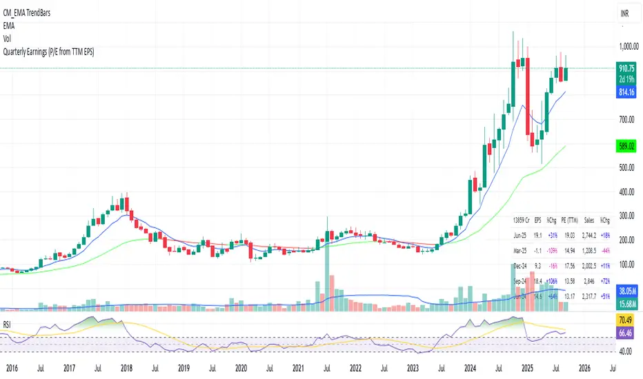
Quarterly EarningsThis Pine script shows quarterly EPS, Sales, and P/E (TTM-based) in a styled table.
PE Rating by The Noiseless TraderPE Rating by The Noiseless Trader
This script analyzes a symbol’s Price-to-Earnings (P/E) ratio, using Diluted EPS (TTM) fundamentals directly from TradingView.
The script calculates the Price-to-Earnings ratio (P/E) using Diluted EPS (TTM) fundamentals. It then identifies:
PE High → the highest valuation point over a 3-year historical range.
PE Low → the lowest valuation point over a 3-year historical range.
PE Median → the midpoint between the two extremes, offering a fair-value benchmark.
PE (Int) → an additional intermediate low to track more recent undervaluation points. This is calculated based on lowest valuation point over a 1-year historical range
These levels are plotted directly on the chart as horizontal references, with markers showing the exact bars/dates when the extremes occurred. Candles corresponding to those days are also highlighted for context.
Bars corresponding to these extremes are highlighted (red = PE High, green = PE Low).
How it helps
Provides a historical valuation framework that complements technical analysis. We look for long opportunity or base formation near the PE Low and be cautious when stocks tends to trade near High PE.
We do not short the stock at High PE infact be cautious with long trades.
Helps identify whether current price action is happening near overvalued or undervalued zones.
Adds a long-term perspective to support swing trading and investing decisions. If a stock is coming from Low PE to Median PE and along with that if we get entry based on Classical strategies like Darvas Box, or HH-HL based on Dow Theory.
Offers a simple visual map of how far the market has moved from “cheap” to “expensive.”
This tool is best suited for long-term investors and swing traders who want to merge fundamentals with technical setups.
This indicator is designed as an educational tool to illustrate how valuation metrics (like earnings multiples) can be viewed alongside price action, helping traders connect fundamental context with technical execution in real market conditions.

NYSE Advancing Issues & Volume RatiosOverview
This comprehensive market breadth indicator tracks two essential NYSE ratios that provide deep insights into market sentiment and internal strength:
NYSE Advancing Issues Ratio
NYSE Advancing Volume Ratio
Dual Ratio Analysis
Issues Ratio: Measures the percentage of NYSE stocks advancing vs. total issues
Volume Ratio: Measures the percentage of NYSE volume flowing into advancing stocks
Both ratios displayed as easy-to-read percentages (0-100%)
Customizable Display Options
Toggle each ratio on/off independently
Choose from multiple moving average types (SMA, EMA, WMA)
Adjustable moving average periods
Custom color schemes for better visualization
Reference Levels
50% Line: Market neutral point (gray dashed)
10% Line: Extremely bearish breadth (red dotted)
90% Line: Extremely bullish breadth (green dotted)
Optional background highlighting for extreme readings
Smart Alerts
Cross above/below 50% (neutral) for both ratios
Extreme readings: Above 90% (strong bullish) and below 10% (strong bearish)
Real-time notifications for key market breadth shifts
📈 How to Interpret
Bullish Signals
Above 50%: More stocks/volume advancing than declining
Above 90%: Extremely strong market breadth (rare occurrence)
Divergence: Price making new highs while breadth weakens (potential warning)
Market Timing
Extreme readings (10%/90%) often coincide with market turning points
Breadth thrusts from extreme levels can signal powerful moves
Use with other technical indicators for enhanced timing

Tick Ratio Simulator - Advanced Market Sentiment IndicatorOverview
The Tick Ratio Simulator is a sophisticated market sentiment indicator that provides real-time insights into buying and selling pressure dynamics. This proprietary indicator transforms complex market microstructure data into actionable trading signals.
Key Features
Real-Time Sentiment Analysis: Captures instantaneous shifts in market momentum
Multi-Timeframe Adaptability: Customizable calculation periods for any trading style
Visual Clarity: Color-coded histogram with dynamic zone highlighting
Integrated Alert System: Pre-configured alerts for key market transitions
Performance Dashboard: Live metrics display for informed decision-making
Trading Applications
✓ Trend Confirmation: Validate existing trends with momentum analysis
✓ Reversal Detection: Identify potential turning points at extreme readings
✓ Entry/Exit Timing: Optimize trade execution with overbought/oversold zones
✓ Risk Management: Clear visual boundaries for position sizing decisions
Signal Interpretation
Extreme Zones (±75): High probability reversal areas
Standard Thresholds (±50): Traditional overbought/oversold levels
Zero Line Crossings: Momentum shift confirmations
Histogram Expansion/Contraction: Strength of directional bias
Customization Options
Adjustable calculation and smoothing periods
Fully customizable color schemes
Toggle histogram and reference lines
Real-time information table positioning
Alert Conditions
Four pre-built alert templates for automated notifications:
Momentum threshold breaches
Directional changes
Extreme zone entries
Custom level crossovers
Best Practices
Works exceptionally well when combined with:
Volume analysis
Support/resistance levels
Price action patterns
Other momentum oscillators
Note: This indicator uses proprietary calculations to simulate institutional-grade tick analysis without requiring actual tick data feeds. Results are optimized for liquid markets with consistent volume profiles.
For optimal results, adjust parameters based on your specific instrument and timeframe. Past performance does not guarantee future results.

Forward P/E CalculatorI could not find a forward P/E indicator that gave me proper results. So here is mine.

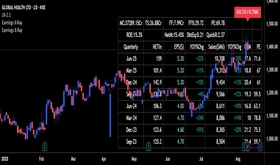
Earnings X-Ray and Fundamentals Data:VSMarketTrendThis indicator calculates essential financial metrics for stocks using TradingView's built-in functions and custom algorithms. The values are derived from fundamental data sources available on TradingView.
Key Output Metrics(YOY Basic Quaterly DATA)
MC (Market Cap): Company’s total market value (Price × Total Shares).
TS (Total Shares Outstanding): All shares (float + restricted) in circulation.
Sales: Annual revenue (TTM or latest fiscal year).
NETIn: Net income
P/E (Price-to-Earnings): Valuation ratio (Market Cap / Net Income or Price / EPS).
EPS (Earnings Per Share): Net income per share (Net Income / TS).
OPM (Operating Margin %): Core profitability (Operating Income / Revenue × 100).
Quick Ratio: Short-term liquidity ((Current Assets – Inventory) / Current Liabilities).
BVPS (Book Value Per Share): Equity per share (Shareholders’ Equity / TS).
PS (Price-to-Sales): Revenue-based valuation (Market Cap / Annual Revenue).
FCF (Free Cash Flow Per Share): Post-CapEx cash ((Operating Cash Flow – CapEx) / TS).
Data Sources & Methods
Uses TradingView’s request.financial() for income/balance sheet data (Revenue, EBITDA, etc.).
Fetches real-time metrics via request.security() (e.g., Shares Outstanding).
Normalizes data across timeframes (quarterly/annual).
Disclaimer
Not financial advice. Verify with official filings before trading.
RATIO TPI SOLETH | JeffreyTimmermansSOLETH Ratio Trend Probability Indicator
Medium-Term Trend Assessment | Dominant Major Detector: The SOLETH Ratio TPI is a medium-term trend-following tool designed to measure the performance relationship between Solana and Ethereum — two of the leading smart contract platforms in the crypto market. By tracking the SOLETH ratio, this indicator determines which of the two is acting as the dominant major in the current market environment.
Rather than focusing on absolute price movements, the SOLETH Ratio TPI isolates relative strength. An upward-trending ratio means Solana is outperforming Ethereum, while a downward trend means Ethereum is taking the lead.
Key Features
Dominant Major Identification:
The indicator’s primary function is to determine leadership between Solana and Ethereum:
SOL Dominant: SOLETH ratio trending up
ETH Dominant: SOLETH ratio trending down
Neutral: No clear leader
8 Trend-Following Inputs:
Integrates 8 carefully selected medium-term trend-following signals into a composite score for clarity and accuracy in dominance detection.
Score-Based Regime Classification:
Score > 0.1 → SOL in relative uptrend → Dominant Major: SOL
Score < -0.1 → ETH in relative uptrend → Dominant Major: ETH
Between -0.1 and 0.1 → Neutral → No clear dominance
Dynamic Visual Interface:
Background colors change according to the dominant asset.
Bottom dashboard displays the status of all inputs, the composite score, and the determined dominance label.
Use Cases:
Smart Contract Sector Rotation: Identify leadership shifts between Solana and Ethereum to guide allocation within the L1 ecosystem.
Sector Sentiment Insight: Dominance changes often precede broader capital flows into or out of each ecosystem.
Multi-Timeframe Confirmation: Combine with broader market LTPI and MTPI tools to reinforce conviction in rotation-based strategies.
Conclusion
The SOLETH Ratio TPI condenses the competition between two of crypto’s top smart contract platforms into one clear, actionable view. By aggregating 8 powerful medium-term trend-following inputs, it delivers a precise assessment of which chain currently leads the market.

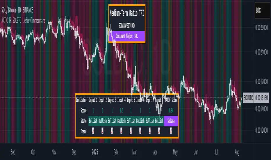
RATIO TPI SOLBTC | JeffreyTimmermansSOLBTC Ratio Trend Probability Indicator
Medium-Term Trend Assessment | Dominant Major Detector: The SOLBTC Ratio TPI is a medium-term trend-following indicator designed to measure the relative strength between Solana and Bitcoin — two of the most influential assets in the crypto market. By analyzing the SOLBTC ratio, this tool identifies which of the two is currently the dominant major in the market cycle.
Unlike standard price-based analysis, this indicator focuses on relative dominance. When Solana outperforms Bitcoin, the ratio trends upward, signaling SOL dominance. When Bitcoin outperforms Solana, the ratio trends downward, signaling BTC dominance.
Key Features
Dominant Major Identification:
The primary goal of this TPI is to determine whether Solana or Bitcoin is leading the market:
SOL Dominant: SOLBTC is trending up
BTC Dominant: SOLBTC is trending down
Neutral: No clear leader in the current cycle
8 Trend-Following Inputs:
Combines 8 carefully selected medium-term trend-following indicators into a single composite score for clear and actionable dominance detection.
Score-Based Regime Classification:
Score > 0.1 → SOL in relative uptrend → Dominant Major: SOL
Score < -0.1 → BTC in relative uptrend → Dominant Major: BTC
Between -0.1 and 0.1 → Neutral → No clear dominance
Dynamic Visuals:
Background colors shift to match the dominant asset
Bottom dashboard displays the state of each input, the composite score, and the resulting dominance label
Use Cases:
Rotation Strategies: Identify when capital is rotating between Solana and Bitcoin to optimize positioning.
Market Leadership Signals: Use dominance changes as a leading indicator for broader altcoin cycles and sentiment shifts.
Multi-Timeframe Confirmation: Pair with LTPI and STPI for higher conviction in directional bias.
Conclusion
The SOLBTC Ratio TPI distills the relationship between Solana and Bitcoin into one simple question: Who is leading right now? By combining 8 powerful trend-following inputs into a clear dominance score, it provides traders and investors with a precise, medium-term view of market leadership.
RATIO TPI ETHBTC | JeffreyTimmermansETHBTC Ratio Trend Probability Indicator
Medium-Term Trend Assessment | Dominant Major Detector: The ETHBTC Ratio TPI is a medium-term trend-following indicator designed to measure the relative strength between Ethereum and Bitcoin — the two most dominant assets in crypto. By analyzing the ETHBTC ratio, this tool provides insights into which of the two is currently leading the market trend.
Unlike absolute price indicators, this tool tracks relative dominance. When Ethereum outperforms Bitcoin, the ratio trends upward, signaling ETH dominance. When Bitcoin outperforms Ethereum, the ratio trends downward, signaling BTC dominance.
Key Features
Dominant Major Identification:
The core purpose of this TPI is to determine which asset — Ethereum or Bitcoin — is the dominant major in the current crypto cycle.
ETH Dominant: ETHBTC is trending up
BTC Dominant: ETHBTC is trending down
Neutral: No clear directional edge
8 Trend-Following Inputs:
The indicator aggregates 8 hand-picked, medium-term trend-following metrics into a single score that simplifies the ETHBTC trend assessment.
Score-Based Regime Classification:
Score > 0.1 → ETH is in relative uptrend → Dominant Major: ETH
Score < -0.1 → BTC is in relative uptrend → Dominant Major: BTC
Between -0.1 and 0.1 → Neutral trend → No clear dominance
Dynamic Visuals:
Background color adapts to the dominant asset
Score, trend state per input, and composite result are shown in a clean dashboard
Use Cases:
Rotation Strategy Insight: Understand whether capital is flowing into Ethereum or Bitcoin to adjust your portfolio positioning accordingly.
Dominance-Based Macro Timing: Use the dominance shift as a leading signal for broader altcoin cycles.
Multi-Timeframe Confirmation: Combine with LTPI (Long-Term) and STPI (Short-Term) to build directional conviction.
Conclusion
The ETHBTC Ratio TPI is a highly focused tool that simplifies the complex relationship between Ethereum and Bitcoin into one clear output: who is currently leading the crypto market. With 8 inputs driving a composite trend score and a dynamic dominance label, this indicator is essential for anyone looking to time ETH vs BTC rotations with precision.

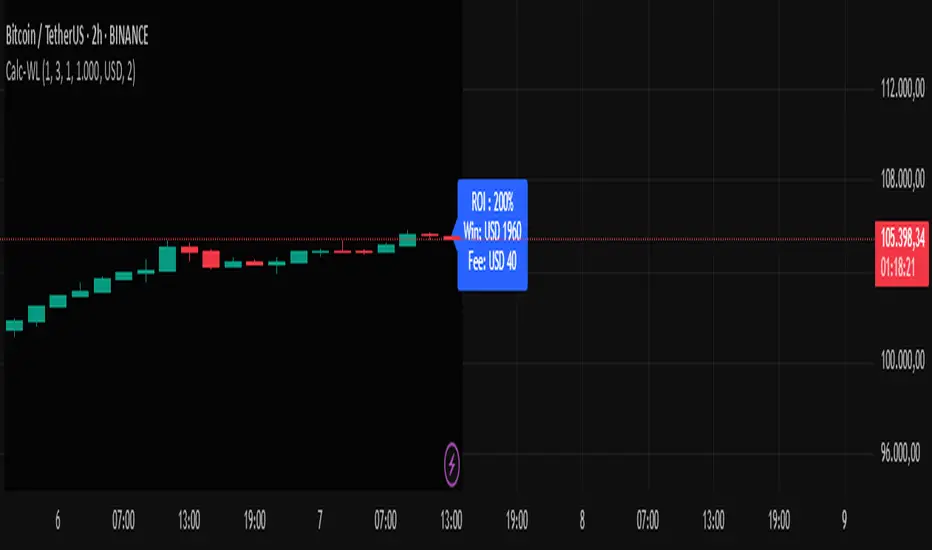
Calc win-LoserHow to Use the Calc win-Loser Indicator
The indicator calculates the profit or loss of the operation, showing how much you gained or lost on the invested amount, without adding the initial capital, displaying only the profit or loss separately.
Use a period (.) to separate decimal numbers, without thousand separators (e.g., 1000 for one thousand, 1000.50 for one thousand and fifty cents).
Price Definition for Calculation
Long Position (buy):
Low Price: entry price (lower)
High Price: exit price (higher)
Example: enter at 1 and exit at 3
Short Position (sell):
High Price: entry price (higher)
Low Price: exit price (lower)
Example: enter at 3 and exit at 1
Main Parameters
Parameter Description Example
Low Price Base price for calculation (Long: entry; Short: exit) 1
High Price Base price for calculation (Long: exit; Short: entry) 3
Leverage Operation multiplier (leverage) 2.0
Universal Amount Total amount invested 1000
Broker Fee (%) Percentage fee charged by broker 0.1
Currency Currency symbol for value display USD
Practical Example
Long: entry at 1, exit at 3, 2x leverage, $1000 investment, 0.1% fee.
Short: entry at 3, exit at 1, 2x leverage, $1000 investment, 0.1% fee.
The indicator will show the expected profit or loss based on the percentage difference adjusted by leverage and subtracting the broker fee.
Notes
Adjust prices according to the type of operation (Long or Short).
Use a period for decimals and do not use thousand separators.
This indicator is a simulation tool and does not execute automatic trades.
Original indicator by Canhoto-Medium — protected to maintain order and respect, prevent copying and plagiarism.
Enhanced Zones with Volume StrengthEnhanced Zones with Volume Strength
Your reliable visual guide to market zones — now with Multi-Timeframe (MTF) power!
What you get:
Clear visual zones on your chart — color-coded boxes that highlight important price areas.
Blue Boxes for neutral zones — easy to spot areas of indecision or balance.
Gray Boxes to show normal volume conditions, giving you context without clutter.
Green Boxes highlighting bullish zones where strength is showing.
Red Boxes marking bearish zones where weakness might be in play.
Multi-Timeframe Support:
Seamlessly visualize these zones from higher timeframes directly on your current chart for a bigger-picture view, helping you make smarter trading decisions.
How to use it:
Adjust the box width (in bars) to fit your trading style and timeframe.
Customize colors and opacity to suit your chart theme.
Toggle neutral blue and gray volume boxes on/off to focus on what matters most to you.
Set the maximum number of boxes to keep your chart clean and performant.
Why you’ll love it:
This indicator cuts through the noise by visually marking zones where volume and price action matter the most — without overwhelming your chart. The MTF feature means you’re always aligned with higher timeframe trends without switching views.
Pro tip:
Use these boxes as dynamic support/resistance areas or to confirm trade setups alongside your favorite indicators.
No complicated formulas here, just crisp, actionable visuals designed for clarity and confidence.

Metatrader CalculatorThe “ Metatrader Calculator ” indicator calculates the position size, risk, and potential gain of a trade, taking into account the account balance, risk percentage, entry price, stop loss price, and risk/reward ratio. It supports the XAUUSD, XAGUSD, and BTCUSD pairs, automatically calculating the position size (in lots) based on these parameters. The calculation is displayed in a table on the chart, showing the lot size, loss in dollars, and potential gain based on the defined risk.
