MATHR3E IMPULSION█ OVERVIEW
MATHR3E IMPULSION is a momentum-based indicator that aims to operate in the direction of the overall price trend,
relying on Fibonacci ratios to identify triggers for extended moves towards exhaustion levels.
█ CONCEPTS
Disclaimer
MATHR3E Impulsion indicator is intended for advanced traders and may fit your profile, whether you are a day trader or a long-term investor.
It was originally developed by a renowned market analyst and documented in numerous books. Among them is the author Jason Perl.
It is recommended to have read the trading techniques mentioned in the books covering this indicator beforehand.
How to use
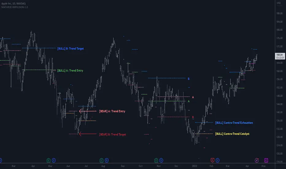
It is designed to operate in the direction of the overall price trend.
Bullish case:
If a market rallies, pulls back, and then resumes its uptrend without having violated the origin of the advance,
the indicator will identify the inflection price level, at which time sufficient momentum or thrust has been generated to trigger the catalyst for an extension to a higher target level.
Bearish case:
If a market declines, rallies, and then resumes its downtrend without having violated the origin of the decline,
the indicator will identify the bear trigger that should provide the catalyst for an extension to a lower target level.
Definitions:
• X: Initial thrust level
• Y: Initial thrust completion level
• Z: Retracement level of at least 0.236
• A: Momentum (Entry) = 0.236 from Z
• B: Exhaustion (Target) = 0.472 from Z
MATHR3E Impulsion will automatically detect the X, Y and Z points and draw the A and B levels.
The A and B levels are calculated based on two ratios that are derivatives of the Fibonacci numbers:
— The primary level (0.236) is the Momentum which serves as a trigger for extended moves in the direction of the trend.
— The secondary level (0.472) is the likely target, known as the exhaustion level.
Counter-trend:
The indicator is also able to detect counter-trend movements. In this case, the A and B levels are also applied since the last advance/decline.
A distinct coloring will let traders distinguish the trending impulsion from the counter-trending one.
█ FEATURES & BENEFITS
Versatile
The indicator is designed to work with other indicators by the same author, including the identification of exhaustion points.
It highlights trends in progress and potential trend reversal.
Entry and profit taking levels are backed by Fibonacci levels.
This indicator can be applied to any market or time frame
Customizable
The sensitivity of the XYZ points can be configured.
Customizable Fibonacci levels for Momentum and targets levels.
Exhaustion
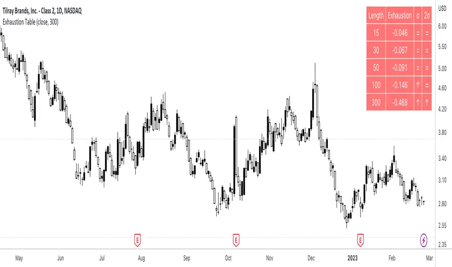
Exhaustion Table [SpiritualHealer117]A simple indicator in a table format, is effective for determining when an individual stock or cryptocurrency is oversold or overbought.
Using the indicator
In the column "2σ" , up arrows indicate that the asset is very overbought , down arrows indicate that an asset is very oversold , and an equals sign indicates that the indicator is neutral.
In the column "σ" , up arrows indicate that the asset is overbought , down arrows indicate that an asset is oversold , and an equals sign indicates that the indicator is neutral.
What indicator is
The indicator shows the exhaustion (percentage gap between the closing price and a moving average) at 5 given lengths, 15, 30, 50, 100, and 300. It compares that to two thresholds for exhaustion: one standard deviation out and one two standard deviations out.
MATHR3E FLOW EXTENSION DASHBOARD█ OVERVIEW
MATHR3E Flow Extension Dashboard is a market timing tool which aims to anticipate trend reversals and highlight potential low risk entries.
█ CONCEPTS
Disclaimer:
MATHR3E Flow Extension Dashboard indicator is intended for advanced traders and may fit your profile, whether you are a day trader or a long-term investor.
It was originally developed by a renowned market analyst and documented in numerous books. Among them is the author Jason Perl.
It is recommended to have read the trading techniques mentioned in the books covering this indicator beforehand.
How to use:
Fibonacci Flow is a very complex tool, the purpose is not to detail it here but rather to introduce it briefly.
For a complete understanding, it is strongly recommended to read the books mentioned in the disclaimer section.
This indicator has two main components:
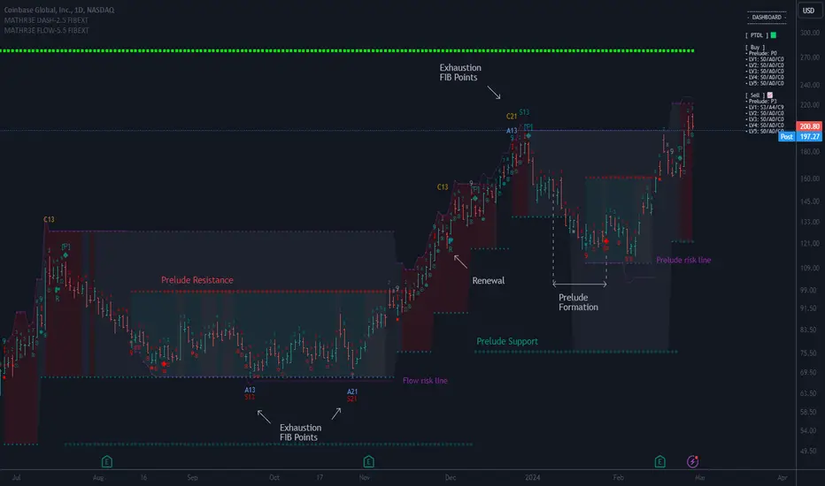
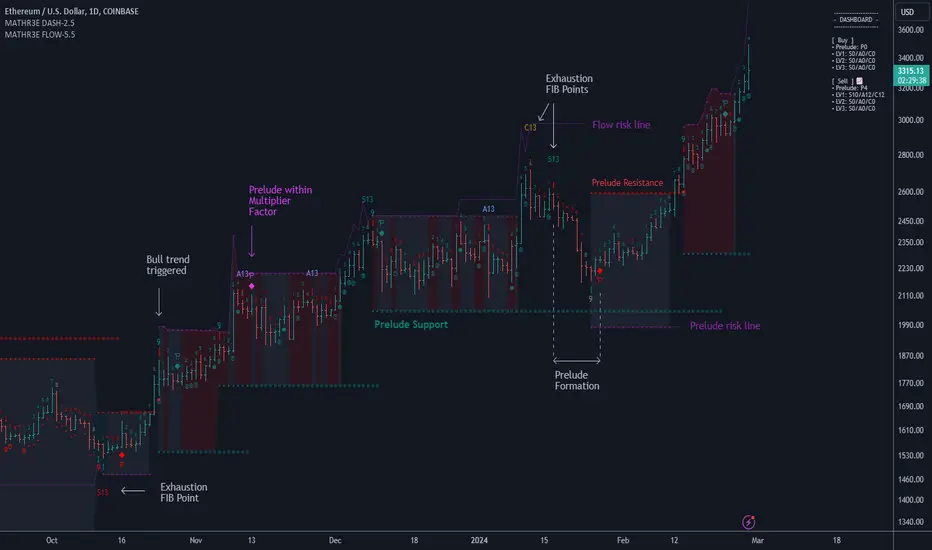
1 — The Prelude, which relies on momentum to define price ranges.
From a Price Reversal there must be nine consecutive closes;
Each one less/greater than the corresponding close four bars earlier.
Preludes are numbered from 1 to 9. A complete Prelude occurs on bar 9.
It can be: Sharpened / Flawed / Ignored / Extended / Over-Extended / Renewed
Cross over parameter can also evaluate the slowdown in a price trend's intensity and qualify the inception of Flow
2 — The Flow, which comes into play once the Prelude is complete.
They are trend based, and look for low-risk opportunities to fade established directional moves.
Flows are counts numbered from 1 to 13. There are 3 of them:
• SEQ: compares the current close with the low/high two bars earlier
• AGG: compares the current low/high with the low/high two bars earlier
• CMB: complex set of comparison with 2 available methods (not detailed here)
To handle the large amount of data to be displayed, they have been distributed over two indicators.
This indicator therefore works in pair with its companion: MATHR3E Flow Extension.
The distribution of the display is as follows:
Current indicator:
• Prelude points
• Markers for sharpened/flawed/valid/invalid completed preludes.
• Markers for Nested preludes (with brackets)
• Markers for Extension preludes (E)
• Markers for Over Extension preludes (O)
• Markers for Renewed preludes (R)
• Prelude Risk lines
• Flow Risk lines
• Prelude Trend Support and resistance
• Dashboard for supervision of ongoing counts
Companion indicator:
• Flow points
• Markers for Flows cancelation (X)
• Markers for Nested Exhaustion points (with brackets)
• Exhaustions points for:
• SEQ: 13 up to 55 (Identify trend fading)
• AGG: 13 up to 55 (For higher trading frequency)
• CMB: 13 up to 34 (Identify prospective turning points following an abrupt price movement)
█ FEATURES & BENEFITS
Fibonacci Sequence
The number 13 is part of the Fibonacci sequence which is nature’s numbering system.
Even if a Prelude Renewal is not triggered, a trend may extend beyond Fibonacci number 13.
MATHR3E Flow Extension can unveil the next exhaustion points based on this same Fibonacci sequence (21, 34, 55) while respecting the logic of the Flow.
Exhaustion points
Potential exhaustion points emerge whenever the individual flows reach Fibonacci numbers.
These points may help traders to identify low-risk buy or sell opportunities.
Risk Lines
Once the trader has selected an entry point, the displayed risk lines should encourage the trader to remain disciplined and apply proper money management.
Position sizing remains the responsibility of the trader.
Available risk lines:
• buy/sell Preludes
• buy/sell Flows
Nested Flows
The indicator can track up to five nested Flows.
Nested exhaustion points will have markups brackets.
Renewing
During the path to reach point number 13, it is very common to trigger other Prelude in the same direction as the previously initiated trend.
MATHR3E Flow Extension will address these potential market renewals with multiples options:
• Prelude range qualifiers
• Renewal Multiplier
• Renewal Method (Before/On/After, Before/On, Only Before, After/On, Only After, Ignore All)
Dashboard:
The dashboard makes it easier to monitor multiple buy and sell signals at the same time:
• Prelude: (P from 1 to 9) / Compares the current close with the corresponding close four bars earlier
• SEQ: (S from 1 to 55) / Compares the current close with the low/high two bars earlier
• AGG: (A from 1 to 55) / Compares the current low/high with the low/high two bars earlier
• CMB: (C from 1 to 34) / Requires four conditions to be satisfied simultaneously
Dashboard also provides the possibility to monitor up to 5 levels of flows
Alerts
The indicator also provides programmable alerts whose format can be adapted to be received on Discord servers
Configure your alerts and get notified on:
• Trend changes
• BUY or SELL P9
• BUY or SELL S13 to S55
• BUY or SELL A13 to A55
• BUY or SELL C13 to C34

MATHR3E FLOW EXTENSION█ OVERVIEW
MATHR3E Flow Extension is a market timing tool which aims to anticipate trend reversals and highlight potential low risk entries.
█ CONCEPTS
Disclaimer:
MATHR3E Flow indicator is intended for advanced traders and may fit your profile, whether you are a day trader or a long-term investor.
It was originally developed by a renowned market analyst and documented in numerous books. Among them is the author Jason Perl.
It is recommended to have read the trading techniques mentioned in the books covering this indicator beforehand.
How to use:
Fibonacci Flow is a very complex tool, the purpose is not to detail it here but rather to introduce it briefly.
For a complete understanding, it is strongly recommended to read the books mentioned in the disclaimer section.
This indicator has two main components:
1 — The Prelude, which relies on momentum to define price ranges.
From a Price Reversal there must be nine consecutive closes;
Each one less/greater than the corresponding close four bars earlier.
Preludes are numbered from 1 to 9. A complete Prelude occurs on bar 9.
It can be: Sharpened / Flawed / Ignored / Extended / Over-Extended / Renewed
Cross over parameter can also evaluate the slowdown in a price trend's intensity and qualify the inception of Flow
2 — The Flow, which comes into play once the Prelude is complete.
They are trend based, and look for low-risk opportunities to fade established directional moves.
Flows are counts numbered from 1 to 13. There are 3 of them:
• SEQ: compares the current close with the low/high two bars earlier
• AGG: compares the current low/high with the low/high two bars earlier
• CMB: complex set of comparison with 2 available methods (not detailed here)
To handle the large amount of data to be displayed, they have been distributed over two indicators.
This indicator therefore works in pair with its companion: MATHR3E Flow Extension Dashboard.
The distribution of the display is as follows:
Current indicator:
• Flow points
• Markers for Flows cancelation (X)
• Markers for Nested Exhaustion points (with brackets)
• Exhaustions points for:
• SEQ: 13 up to 55 (Identify trend fading)
• AGG: 13 up to 55 (For higher trading frequency)
• CMB: 13 up to 34 (Identify prospective turning points following an abrupt price movement)
Companion indicator:
• Prelude points
• Markers for Sharpened/flawed/valid/invalid completed preludes.
• Markers for Nested preludes (with brackets)
• Markers for Extension preludes (E)
• Markers for Over Extension preludes (O)
• Markers for Renewed preludes (R)
• Prelude Risk lines
• Flow Risk lines
• Prelude Trend Support and resistance
• Dashboard for supervision of ongoing counts
█ FEATURES & BENEFITS
Fibonacci Sequence
The number 13 is part of the Fibonacci sequence which is nature’s numbering system.
Even if a Prelude Renewal is not triggered, a trend may extend beyond Fibonacci number 13.
MATHR3E Flow Extension can unveil the next exhaustion points based on this same Fibonacci sequence (21, 34, 55) while respecting the logic of the Flow.
Exhaustion points
Potential exhaustion points emerge whenever the individual flows reach Fibonacci numbers.
These points may help traders to identify low-risk buy or sell opportunities.
Risk Lines
Once the trader has selected an entry point, the displayed risk lines should encourage the trader to remain disciplined and apply proper money management.
Position sizing remains the responsibility of the trader.
Available risk lines:
• buy/sell Preludes
• buy/sell Flows
Nested Flows
The indicator can track up to five nested Flows.
Nested exhaustion points will have markups brackets.
Renewing
During the path to reach point number 13, it is very common to trigger other Prelude in the same direction as the previously initiated trend.
MATHR3E Flow Extension will address these potential market renewals with multiples options:
• Prelude range qualifiers
• Renewal Multiplier
• Renewal Method (Before/On/After, Before/On, Only Before, After/On, Only After, Ignore All)
Alerts
Its Companion indicator also provides programmable alerts whose format can be adapted to be received on Discord servers
Configure your alerts and get notified on:
• Trend changes
• BUY or SELL P9
• BUY or SELL S13 to S55
• BUY or SELL A13 to A55
• BUY or SELL C13 to C34
MATHR3E FLOW DASHBOARD█ OVERVIEW
MATHR3E Flow Dashboard is a market timing tool which aims to anticipate trend reversals and highlight potential low risk entries.
█ CONCEPTS
Disclaimer:
MATHR3E Flow Dashboard indicator is intended for advanced traders and may fit your profile, whether you are a day trader or a long-term investor.
It was originally developed by a renowned market analyst and documented in numerous books. Among them is the author Jason Perl.
It is recommended to have read the trading techniques mentioned in the books covering this indicator beforehand.
How to use:
Fibonacci Flow is a very complex tool, the purpose is not to detail it here but rather to introduce it briefly.
For a complete understanding, it is strongly recommended to read the books mentioned in the disclaimer section.
This indicator has two main components:
1 — The Prelude, which relies on momentum to define price ranges.
From a Price Reversal there must be nine consecutive closes;
each one less/greater than the corresponding close four bars earlier.
Preludes are numbered from 1 to 9. A complete Prelude occurs on bar 9.
It can be: Sharped / Flawed / Ignored / Extended
Cross over parameter can also evaluate the slowdown in a price trend's intensity and qualify the inception of Flow
2 — The Flow, which comes into play once the Prelude is complete.
They are trend based, and look for low-risk opportunities to fade established directional moves.
Flows are counts numbered from 1 to 13. There are 3 of them:
• SEQ: compares the current close with the low/high two bars earlier
• AGG: compares the current low/high with the low/high two bars earlier
• CMB: complex set of comparison with 2 available methods (not detailed here)
To handle the large amount of data to be displayed, they have been distributed over two indicators.
This indicator therefore works in pair with its companion: MATHR3E Flow Extension.
The distribution of the display is as follows:
Current indicator:
• Prelude points
• Markers for Extension preludes (E)
• Prelude Risk lines
• Flow Risk lines
• Prelude Trend Support and resistance
• Dashboard for supervision of ongoing counts
Companion indicator:
• Flow points
• Markers for Flows cancelation (X)
• Exhaustions points for:
• SEQ: up to 13 (Identify trend fading)
• AGG: up to 13 (For higher trading frequency)
• CMB: up to 13 (Identify prospective turning points following an abrupt price movement)
█ FEATURES & BENEFITS
Fibonacci Sequence
The number 13 is part of the Fibonacci sequence which is nature’s numbering system.
Exhaustion points
Potential exhaustion points emerge whenever the individual flows reach Fibonacci number 13.
These points may help traders to identify low-risk buy or sell opportunities.
Risk Lines
Once the trader has selected an entry point, the displayed risk lines should encourage the trader to remain disciplined and apply proper money management.
Position sizing remains the responsibility of the trader.
Available risk lines:
• buy/sell Preludes
• buy/sell Flows
Nested Flows
The indicator can track up to three nested Flows.
Renewing
During the path to reach point number 13, it is very common to trigger other Prelude in the same direction as the previously initiated trend.
MATHR3E Flow will address these potential market renewal with multiples options:
• Prelude range qualifiers
• Renewal Multiplier
Dashboard:
The dashboard makes it easier to monitor multiple buy and sell signals at the same time:
• Prelude: (P from 1 to 9) / Compares the current close with the corresponding close four bars earlier
• SEQ: (S from 1 to 13) / Compares the current close with the low/high two bars earlier
• AGG: (A from 1 to 13) / Compares the current low/high with the low/high two bars earlier
• CMB: (C from 1 to 13) / Requires four conditions to be satisfied simultaneously
Dashboard also provides the possibility to monitor up to 3 levels of flows
Alerts
The indicator also provides programmable alerts whose format can be adapted to be received on Discord servers
Configure your alerts and get notified on:
• Trend changes
• BUY or SELL P9
• BUY or SELL S13
• BUY or SELL A13
• BUY or SELL C13
MATHR3E FLOW█ OVERVIEW
MATHR3E Flow is a market timing tool which aims to anticipate trend reversals and highlight potential low risk entries.
█ CONCEPTS
Disclaimer:
MATHR3E Flow indicator is intended for advanced traders and may fit your profile, whether you are a day trader or a long-term investor.
It was originally developed by a renowned market analyst and documented in numerous books. Among them is the author Jason Perl.
It is recommended to have read the trading techniques mentioned in the books covering this indicator beforehand.
How to use:
Fibonacci Flow is a very complex tool, the purpose is not to detail it here but rather to introduce it briefly.
For a complete understanding, it is strongly recommended to read the books mentioned in the disclaimer section.
This indicator has two main components:
1 — The Prelude, which relies on momentum to define price ranges.
From a Price Reversal there must be nine consecutive closes;
each one less/greater than the corresponding close four bars earlier.
Preludes are numbered from 1 to 9. A complete Prelude occurs on bar 9.
It can be: Sharped / Flawed / Ignored / Extended
Cross over parameter can also evaluate the slowdown in a price trend's intensity and qualify the inception of Flow
2 — The Flow, which comes into play once the Prelude is complete.
They are trend based, and look for low-risk opportunities to fade established directional moves.
Flows are counts numbered from 1 to 13. There are 3 of them:
• SEQ: compares the current close with the low/high two bars earlier
• AGG: compares the current low/high with the low/high two bars earlier
• CMB: complex set of comparison with 2 available methods (not detailed here)
To handle the large amount of data to be displayed, they have been distributed over two indicators.
This indicator therefore works in pair with its companion: MATHR3E Flow Extension Dashboard.
The distribution of the display is as follows:
Current indicator:
• Flow points
• Markers for Flows cancelation (X)
• Exhaustions points for:
• SEQ: up to 13 (Identify trend fading)
• AGG: up to 13 (For higher trading frequency)
• CMB: up to 13 (Identify prospective turning points following an abrupt price movement)
Companion indicator:
• Prelude points
• Markers for Extension preludes (E)
• Prelude Risk lines
• Flow Risk lines
• Prelude Trend Support and resistance
• Dashboard for supervision of ongoing counts
█ FEATURES & BENEFITS
Fibonacci Sequence
The number 13 is part of the Fibonacci sequence which is nature’s numbering system.
Exhaustion points
Potential exhaustion points emerge whenever the individual flows reach Fibonacci number 13.
These points may help traders to identify low-risk buy or sell opportunities.
Risk Lines
Once the trader has selected an entry point, the displayed risk lines should encourage the trader to remain disciplined and apply proper money management.
Position sizing remains the responsibility of the trader.
Available risk lines:
• buy/sell Preludes
• buy/sell Flows
Nested Flows
The indicator can track up to three nested Flows.
Renewing
During the path to reach point number 13, it is very common to trigger other Prelude in the same direction as the previously initiated trend.
MATHR3E Flow will address these potential market renewal with multiples options:
• Prelude range qualifiers
• Renewal Multiplier
Alerts
Its Companion indicator also provides programmable alerts whose format can be adapted to be received on Discord servers
Configure your alerts and get notified on:
• Trend changes
• BUY or SELL P9
• BUY or SELL S13
• BUY or SELL A13
• BUY or SELL C13

[VC] Cumulative Delta PLUS It is a Merged Version of our following two indicators.
V.C Box Chart Histogram
&
V.C Cumulative Delta Histogram.
We merged them at the user's request & convenience. This merged version also helps to save space for other indicators.
Description & Usage
Description & Usage will remain the same as described in individual descriptions of the above-mentioned parent indicators. Only one additional input is added to adjust the scale, named "Scale_Setting''.
Because now it's a merged version of 2 different indicators & both indicators have their different scale levels. To bring both indicators on an equal scale so that they can be visualised better, we have added scale adjustment settings that are easy to understand. Let's elaborate it.
Scale adjustment settings belong to the Cumulative length of the ' 'Cumulative Delta Indicator'' . Keep in mind that the best scale setting is keeping the scale setting values near or equal to cumulative length.
For example:
If you set cumulative length 20, the scale setting value should also be 20 or near 20 (like 17, 18, 19 etc.). (It depends on you, how large cumulative columns you want to see relative to Box chart Histogram)
Note: Any scale setting value can be used, it only affects visuals, not the actual calculations.
Disclaimer Note:
V.C Cumulative Delta Histogram It is purely Volume, Delta, Demand & Supply imbalance and comparative analysis-based tool. Before applying this Indicator to your study, you should clear your concepts about Volume, Delta & Spread, Demand & Supply, and Aggressive & Passive behaviour of buyers/sellers.
Some basic understanding of Sir Richerd Wyckoff's Theory can also be helpful.

LNL Keltner ExhaustionLNL Keltner Exhaustion resolves the constant issue of Bands vs. EMAs
With the keltner exhaustion wedges, you can easily see the keltner channel extremes witout using the actual bands. That way, you will know whether the price is outside of the keltner channels + you can use other indicators (such as EMAs) on chart without the bands so the chart does not look messy & hard to read.
Two Types of Wedges:
1. Green/Red Wedge - Price action is extended outside the regular band. More of a "profit taking" zone rather than "entry taking" (default set to 3.0 ATR factor).
2. Purple Wedge - Price action is extended outside of the extreme band. Chances are price will revert to mean soon (default set to 4.0 ATR factor).
Works great as a target tool with the squeeze setup or as an overall extension gauge.
Hope it helps.

LNL Fractal EnergyMarkets knows only two movements. Expansion and Consolidation. The price is either moving or it is consolidating. Fractal Energy will show you which move is about to happen. The funny thing is.. Fractal Energy will NOT tell you the direction of the potential move nor the time when the move will happen. It only shows whether the energy is accumulating or exhausting and which one of these moves are about to happen.
Fractal Energy Zones:
1. Gray = Neutral Energy, price will spend most of the time between the 0.60 and 0.30 ranges, if the FE is hanging around midline chop can be expected.
2. Pink = Energy Building (low compression), pink can produce solid moves but can turn in to a red or dark red which are way more powerful.
3. Red = Energy Building (yet to be released), once the FE colors red there is a high probability for a bigger than expected move.
4. Dark Red = Energy Building (high compression), dark red is rare and can be seen usually around earnings reports (explosive move can be expected).
5. Yellow = Energy Released = Exhaustion, everything ends at some point, yellow color represents the exhaustion of the move (the car ran out of gas).
6. Orange = Extreme Exhaustion, high probability for a sideways action or a reversal.
Tips & Tricks:
1. Importance of the Midline:
- Midline can be used as a target for the compressions. Once the FE reach the midpoint, the move is usually considered to be over.
2. Huge Gaps on earnings DO NOT COUNT:
- If the price heavily gaps up or gaps down, FE usually drops too steep with the gap thus signals after such moves can be ignored.
3. Fractal Energy Length & Time Frames:
- For the daily & weekly time frame length of 13 works nicely. But for the lower TF length 13 starts to lag behind the price a little. I would suggest using Length 15 for 30min to 4 hour and Length 17 - 20 for below 30min time frames.
4. Exhaustions:
- Exhaustions can be played too. Once the FE drops below 0.30 the price usually stays within the weekly expected move (great for iron condors), or non directional option strategies.. yellow/orange = price either reverse or stays at same levels for a few candles..
5. Combination of direction based studies with the magnitude based studies:
- Use the FE as a confirmation of your analysis from other (direction-based) trend or momentum indicators. Once you analyze your direction you can use Fractal Energy (magnitute-based) indicator to analyse whether there is a chance for a big move or not.
Hope it helps.

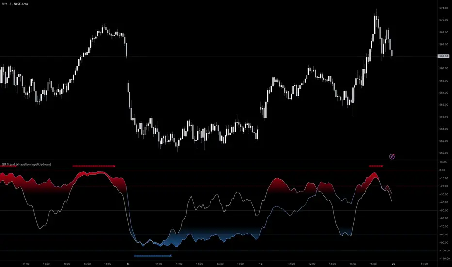
%R Trend Exhaustion [upslidedown]I love Williams %R! This indicator mixes two %R periods... a standard %R with a longer period %R. The longer period of 112 has interesting results for trend following strategies in the crypto market through backtesting.
Alone these are fairly ordinary but together they provide a very interesting trend exhaustion/reversal system while filtering out some noise. I have highlighted key areas of interest with filled boxes. An "area of interest" is when there is confluence between the short and long period %R values along with being overbought or oversold. Once there is a break in the overbought or oversold trend, an arrow will print.
This is one of my odder ideas that appears to have some merit and detects interesting tops or bottoms (or confirms a trend reversal) so I'm publicly publishing for the community to find. If you find this useful please reach out and let me know how you use it as it's fairly unique... and thus different than anything I've ever seen or used.
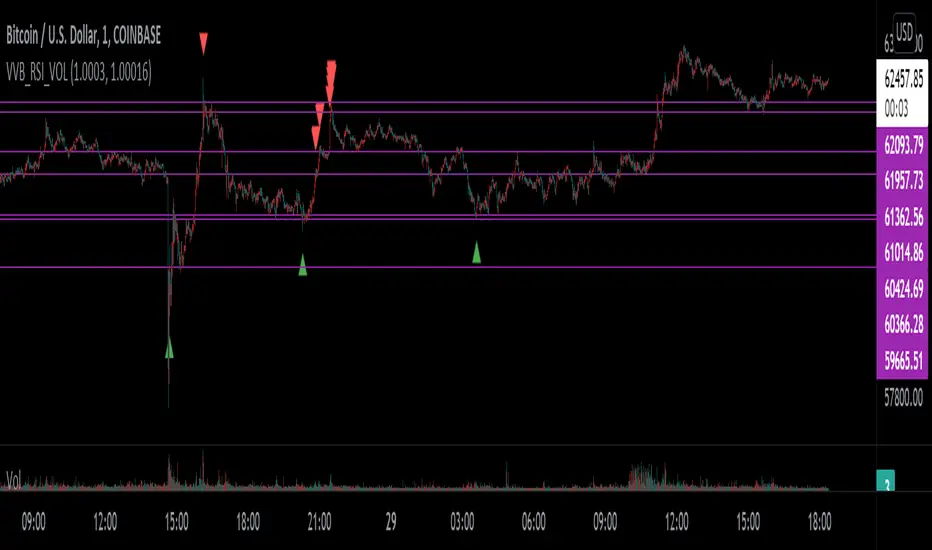
VVB_RSI_VOLFirst time so idk what I'm doing lel
I use vervoot volatility bands, relative strength index, and volume to determine the color of the bar - that's it
I have candle colors inverted - you can change the regular and indicator bar colors in the settings
Meant to help identify risk on and risk off areas
Volume SpikesOVERVIEW
Easily identify volume spikes. This indicator identifies volume spike bars and highlights them to facilitate studying volume spikes alongside price action.
CONCEPTS
Bars with abnormally high volume indicate market interest and are worth a closer look. They could indicate market exhaustion or act as future areas of S/R (as shown by the horizontal rays above).
The question is the level of volume that should prompt our interest.
Here, we use the Upper Band of a long-term Bollinger Bands applied on volume to identify bars with outlier volumes. (The lower panel of the chart shown serves to illustrate this concept, and is not included in this indicator.)
HOW TO USE
Volume spike bars will be highlighted in green by default. You may study how the market price action reacts to these volume spikes without the distraction of a separate plot.
Parameters
Period - Lookback period for the Bollinger Bands applied on volume.
Multiple - Multiple for the same Bollinger Bands.
Feel free to experiment with the parameters, but the default parameters work well for me on daily charts. However, for intraday timeframes, due to the typical skewing of volume to the beginning and end of a session, they do not work as well.

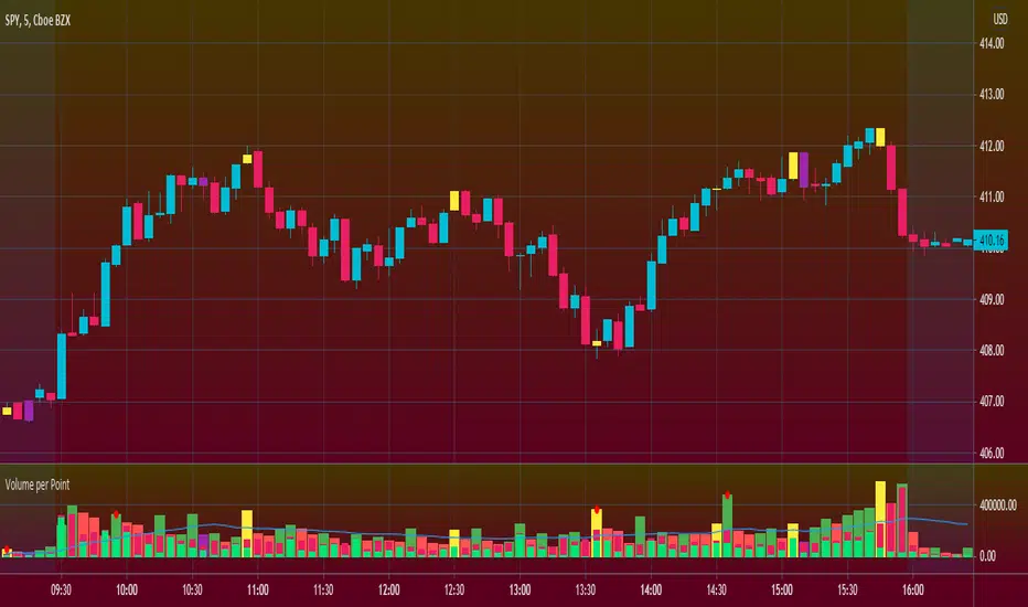
Volume per PointHello everyone <3
I present to you guys my new indicator Volume per Point (VP)
As suggested by the title, this script gives you the volume for every point.
Here's a run down on specific features:
SUBCHART COLUMNS:
The columns can be the following four colors:
Green - There was an increase in VP
Red - There was a decrease in VP
Yellow - There was divergence between volume and candle range
Purple - There are signs of exhaustion compared to the previous candlestick
SUBCHART HISTOGRAM:
The histogram can be the following two colors:
Lime - Buying volume
Red - Selling volume
I left you guys the ability to change the multiplier on the volume in settings just incase it's too small or too big compared to the VP. Decimals are allowed!
CANDLESTICK CHART:
The candlesticks can the following two colors:
Yellow - There was a divergence between volume and candle range
Purple - There are signs of exhaustion compared to the previous candlestick
FILTERS
In the settings, you're able to add the following two filters:
RSI Filters - RSI must be below or above the specified value for the divergence or exhaustion to trigger
Percent Filters - The candlestick range or volume must be higher or lower than the specified value depending whether it's divergence or exhaustion.
This is a very helpful tool if you're interesting in reading volume. It also facilitates finding market maker activity depending on the size of the VP. Sudden abnormal spikes in VP usually do signal something and that's up for you to figure out :)
Thank you for your time to read this
~July <3
[astropark] Cumulative Volume Delta (CVD)Dear Followers,
today another awesome Analysis Tool, that you can use in your trading journey: Cumulative Volume Delta (CVD) , also known as Cumulative Delta Volume (CDV)!
Volume says a lot about price action:
price drops with low volume? or price pumps but no volume increase?
big sellers volume but price does not drop? or big buyers volume but price does not increase?
The Cumulative Volume Delta measures the effectiveness of buyers and sellers' actions, so basically if the volume they generate with their buy and sell market orders is effective on price or not.
When it's not effective, a divergence appears and we, as traders, can profit from it.
Here some examples how you can use the indicator by spotting divergences between price and cumulative volume delta.
EURUSD, 15m
sellers trying hard to make price fall, but volume is lacking on CVD (exhaustion): bullish divergence
EURUSD, 15m
buyers trying hard to make price go up, but volume is lacking on CVD (exhaustion): many bearish divergences
SPX500, 15m
buyers exhaustion: bearish divergence
XAUUSD, 15m
sellers exhaustion: bullish divergences
XAGUSD, 15m
buyers exhaustion: bearish divergence
BTCUSD, 15m
buyers exhaustion: bearish divergence (in red)
buyers absorbed sellers' pressure: hidden bullish divergence (in green)
BTCUSD, 15m
inefficiency by buyers: higher and higher buy volume but it's not effective on price (sellers absorbed): hidden bearish divergence (in blue)
sellers exhaustion: bullish divergences (in green)
buyers exhaustion: bearish divergence (in red)
ETHBTC, 15m
buyers exhaustion: bearish divergence (in red)
inefficiency by sellers: higher and higher sell volume but it's not effective on price (buyers absorbed): hidden bullish divergence (in blue)
TSLA, 15m
inefficiency by sellers, sellers pressure absorbed by buyers: hidden bullish divergence (in blue)
buyers exhaustion: bearish divergence (in red)
sellers exhaustion: bullish divergence (in green)
inefficiency by buyers, sellers pressure absorbed by sellers: hidden bearish divergence (in fuchsia)
This indicator works on every timeframe, market and pair, by the way must be said that it works best on 15m and 5m timeframes, as you can have access to a more detailed volume information.
As I always say, all tools are great if you use them correctly: this is not the "Holy Grail", so always use proper money and risk management strategies.
This is a premium indicator , so send me a private message in order to get access to this script.

ema exhaustion (exa)The exa is an oscillator that combines fisher transform with distance from moving average and it is based on a theory that exhaustion can be derived from how far price is able to extend from a moving average, on average.
The fisher transform converts price into a gaussian normal distribution, also known as a bell curve {1}. A normal distribution is a type of probability distribution for a real-valued random variable {2}. Applying this method to the price of an asset can help to identify probabilities, but it will never identify certainties.
‘exa’ is an abbreviation for ema exhaustion. It can be used to identify when price is probable to revert to the mean but I prefer using it to confirm entries that are signaled following a reversion to the mean (aka buying the dip in bull markets). When price gets oversold into support, in a bull trend, then that can provide a good opportunity to enter long. However that isn’t necessarily the case when the same metrics indicate oversold conditions in a bear trend. In this situation the exa is best suited for identifying profit taking opportunities on shorts.
The default settings are a 9 lookback period and a 50 ema. By default signals will be derived from how far price is from the 50 ema relative to the probable distribution of the last 9 periods. If the exa is above 2, or below -2, then the price is in the 80th percentile of the prior 9 candles. Being outside of 3, or -3, represents the 90th percentile and 4, or -4, represents the 95th percentile.
Those ranges will never indicate a necessity of reverting to the mean, but they will indicate a higher and higher probability. I prefer to use this oscillator in combination with an indicator(s) that identifies the trend. When the oscillator reaches -2 in a bull trend then it can confirm long entry signals, whereas if it reaches +2 in a bull trend then it can be used to confirm signals to take profit.
Crossovers are especially significant because they indicate a shift in the tide. When the exa reaches 2 without crossing over then it is very much in a position to move to 3 or 4+. When it crosses above 2 then it is an indication that price is extended from the mean and exhausted.
This is certainly not a situation that implies price will revert to the mean, it simply provides confirmation.
The default settings are what I have been finding most effective personally, however that is mostly a function of the trend following tools that I use. The same principles should apply with all settings and I would encourage users to experiment with various lookback periods and emas.
{1} www.investopedia.com
{2} en.wikipedia.org
Mean Reversion Channel - (fareid's MRI Variant)Description :
Mean Reversion Channel objective, based on Mean Reversion theory ( everything has a tendency to revert back to its mean), is to help visualizing:
Inner Channel -> Dynamic Support and Resistance
Outer Channel -> Overbought/Oversold Zone which may signal consolidation phase or potential reversal due to unsustainable move
Details on some of the filtering type used for mean calculation can be read in Ehlers Technical Papers: "Swiss Army Knife Indicator" and/or his book "Cybernetics Analysis for Stock and Futures"
Disclaimer:
These study scripts was built only to test/visualize an idea to see its viability and if it can be used to optimize existing strategy.
Any ideas to further improve this indicator are welcome :)

MESA Adaptive Moving Average - MTF and Divergence analysisThe latest iteration of the MESA Adaptive Moving Average - rewritten to make use of Pinescript v4 Arrays.
Explanation of settings and example use cases:
Fast Limit: Lower values will reduce the reactivity of the MA to rapid price changes.
- For instance, if you want to ignore price spikes on a low timeframe, then reduce Fast Limit
Slow Limit: Lower values will reduce the reactivity of the MA to slow price changes.
- For instance, if you want the MA to ignore small retracements during a trend, then reduce Slow Limit
Show MESA for next higher timeframe: Display the MA of the next standard timeframe that TV offers.
- Displays 3min if the chart timeframe is 1min. Displays D if the chart timeframe is 4H. Does not work with custom timeframes.
Show MESA for custom higher timeframe: Display a secondary MESA plot with a custom timeframe, selectable via the Custom Timeframe drop-down. Overrides the previous setting, if enabled. This functionality is experimental since it provides a higher sample rate than would normally be available. Take precautions making entries using only Custom Timeframe MESA.
- For instance, you made a decision on the 4H chart using MESA and are now watching the 15min to time a trade entry. Enable and select "4H" from the drop-down menu
Show Divergence between MESA Timeframes: Since divergence can differ greatly between assets, we form a baseline by continuously tracking the difference between the chart MA and higher timeframe MA. We note the maximum divergence in each direction (bullish and bearish). A white circle is plotted when divergence is close to the historical maximum. When a record-breaking divergence occurs, a yellow circle is plotted. You can tweak these indications by adjusting the Divergence Threshold %
- Multi-timeframe divergence is typically a weak indication of trend exhaustion, especially if Volume is not present.
Show Divergence between Source & MESA: Again, divergence can differ greatly between assets. This time, we form a baseline by continuously tracking the difference between the chart MA and Source (usually Close). We note the maximum divergence in each direction (bullish and bearish). A purple triangle is plotted when divergence is close to the historical maximum. When a record-breaking divergence occurs, a lime-green triangle is plotted. You can tweak these indications by adjusting the Divergence Threshold %
- Price divergence is a strong indicator of over-extension. It works well for timing reversals on intraday timeframes.
Source: The input data to perform MESA calculations on.
I've really enjoyed trading with this indicator, especially when combined with my previous two tools:
Empirical Suite : factors Trend, Price momentum, Volume, and Volatility
Squeeze Zone : provides a visual representation of volatility squeezes and attempts to predict breakout directions
Use this indicator to get a sense of overall trend, from any chart timeframe, as well as indications of over-extensions and exhaustion.

PT MSTx StochasticVersion 1.0 of our MSTx Stochastic indicator helps determine when a trend is strong vs. exhausted. The indicator is a modified version of the original stochastic. We added a second line for further confluence, which acts as support & resistance. The added smoothing toggle of the indicator can help you get a different perspective of the move. We also added a series of Fibonacci levels that act as pivotal areas. We have two highlighted areas that offer volatility. Our Red zone (upper fibs) should prompt you to look for short entries & our Grey zone (mid fibs), which acts as a neutral/range area.
Main line – Faster settings that move through support/resistance quicker.
Signal line- Slower settings that tend to act as support/resistance for our main line.
Strategy:
Shorting- Look for the Main line to cross down into the Signal line & then retest the Signal line. Stronger signal if algo is active (Maroon).
Longing – Look for the Main line to cross up into the Signal line & then retest the Signal line. Stronger signal if algo is active (Green).
This Oscillator was built around our buy sell indicator & it is used on all time frames for swinging & scalping. It is included as part of the library. Just message us for access!

Effort v RewardI made this indicator to make it easier to compare volume and price movement. This is similar in concept to the Market Facilitation Index by Bill Williams, although hopefully this can make that analysis easier to see at a glance (similar to the way some bar overlays/recolors work but with more detail and in its own pane). The primary use for this indicator would be paying attention to the red EMA, which shows the difference between price movement and volume, normalized within the normalization lookback period (adjustable, defaults to 30 bars). When the red ema moves up, it means there is less effort required to move price more, which means the trend (if there is one) is probably stronger or has had resistance removed/shaken out already; if the red ema moves down into the negative, it means there is a lot of effort for very little price movement, meaning a large battle between the bears and the bulls currently (squat). Enjoy, let me know if you want adjustments, and safe and successful trading!

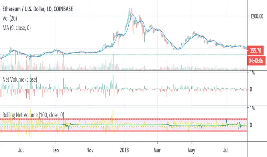
Rolling Net VolumeMay still make changes, the current study should be helpful as is. Looking to highlight potential relative trend exhaustion in net volume. Should be most effective for stable supply assets. We're looking at an 100 day moving average of net volume essentially. The values of the RNV are slightly exaggerated to help with visibility PLEASE bear this in mind. Never the less, you can look at many commodities and notice moderate and extreme trend exhaustion on the positive and negative side using the transparent bands above and below. The less transparent red band perhaps suggests an opportunity to open a position against the current direction. It's not perfect, I may try to improve it. I am definitely open to feedback and appreciate it very much in advance.
Trend Exhaustion IndicatorThe Trend Exhaustion Indicator is a custom indicator of mine that is loosely based on the Trend Exhaustion Index created by Clifford L. Creel Ph.D. (Stocks & Commodities V. 9:1 (9-11))
This indicator will let you know the trend reversal points and when it falls below the signal line then the trend is ending vice versa. Buy when the indicator crosses above the signal line and sell when it falls below the signal line.
Let me know if you would like to see me write any other scripts!

Keltner Channels WidthSimilar to bollinger bands width, but for keltner channels, designed to recognize when a move is exhausted and contraction is to be expected.
Would use it as a filter to stay out of any trades if the indicator peaks (red color).
Exhausted Volume (Expo)Exhausted Volume (Expo)
DESCRIPTION
Exhausted Volume (Expo) indicator visualize exhausted volume. Exhaustion often signals the reversal of a current trend because it illustrates excess levels of supply or demand, indicating a market is either overbought or oversold.
The indicator can also be used to detect volume pressure in either direction which can occur in breakouts or in reversal points. The input variable ‘Volume Length’ can be changed. A longer Volume length means that the indicator detects bolder exhausted volume.
• Volume pressure is seen in reversal points.
• Volume pressure can be seen in breakouts.
The indicator is also equipped with exhausted volume signals that are more sensitive. This is visualized with arrows up and down. The investor has the ability to adjust the sensitivity of these signals.
HOW TO USE
1. Use the indicator to identify exhausted volume
2. Use the indicator to identify volume pressure.
3. Use the indicator to identify reversal points.
4. Use the indicator to identify breakouts.
Combine the indicator with ‘ Climax Volume (Expo) ’
INDICATOR IN ACTION
EURUSD
EURUSD
BTCUSD
BTCUSD
The indicator works with RENKO, HEIKIN ASHI and with KAGI charts as well.
I hope you find this indicator useful, and please comment or contact me if you like the script or have any questions/suggestions for future improvements. Thanks!
I will continue to work on this indicator, so please share your experience and feedback with me so that I can continuously improve it. Thanks to everyone that have contacted me regarding my scripts. Your feedback is valuable for future developments!
ACCESS THE INDICATOR
• Contact me on TradingView or use the links below
-----------------
Disclaimer
Copyright by Zeiierman.
The information contained in my scripts/indicators/ideas does not constitute financial advice or a solicitation to buy or sell any securities of any type. I will not accept liability for any loss or damage, including without limitation any loss of profit, which may arise directly or indirectly from use of or reliance on such information.
All investments involve risk, and the past performance of a security, industry, sector, market, financial product, trading strategy, or individual’s trading does not guarantee future results or returns. Investors are fully responsible for any investment decisions they make. Such decisions should be based solely on an evaluation of their financial circumstances, investment objectives, risk tolerance, and liquidity needs.
My scripts/indicators/ideas are only for educational purposes!
