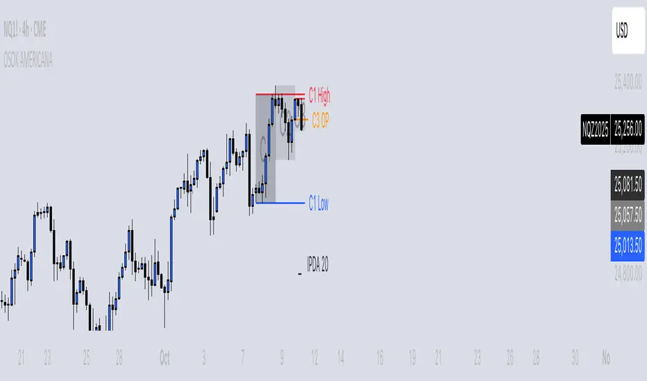
OSOK AMERICANA [TakingProphets]OVERVIEW
OSOK is an ICT-inspired execution framework designed to help traders map the interaction between Higher-Timeframe (HTF) liquidity sweeps, qualifying Order Blocks, and Current-Timeframe (CTF) confirmation signals — all within a single, structured workflow.
By sequencing an HTF CRT → Order Block → CTF CRT model and integrating IPDA 20 equilibrium context, this tool provides traders with a visual framework for aligning intraday execution decisions with higher-timeframe intent. All plotted elements — sweeps, blocks, open prices, and equilibrium levels — update continuously in real time.
-----------------------------------------------------------------------------------------------
Core Concepts (ICT-Based)
-----------------------------------------------------------------------------------------------
Candle Range Transition (CRT) Sweeps
Bullish CRT → The second candle runs below the first candle’s low and closes back inside its range.
Bearish CRT → The second candle runs above the first candle’s high and closes back inside its range.
These patterns are frequently associated with liquidity grabs and potential directional shifts.
HTF → CTF Alignment
-Detects valid HTF CRTs (e.g., Daily CRTs derived from H4 or Weekly CRTs derived from Daily).
-Locates a qualifying Order Block within HTF Candle-2 to identify areas of potential interest.
-Waits for a modified CRT confirmation on the current timeframe before signaling possible directional bias.
IPDA 20 Equilibrium
-Plots the midpoint of the daily highest and lowest prices over the last 20 periods.
-Provides a visual reference for premium and discount pricing zones.
-----------------------------------------------------------------------------------------------
How OSOK Works
-----------------------------------------------------------------------------------------------
Step 1 — HTF CRT Check
On each new HTF candle, the script scans for a clean CRT formation on the higher aggregation (e.g., H4 → D or D → W).
If found, it tags the candles as C1, C2, and C3 and optionally shades their backgrounds for clear visual parsing.
Step 2 — HTF Order Block Identification
Searches within HTF Candle-2 for a qualifying Order Block using a compact pattern filter.
Draws a persistent OB level with clear labeling for context.
Step 3 — CTF Confirmation (Modified CRT)
Monitors your current chart timeframe for a modified CRT in alignment with the HTF setup:
For bullish setups → waits for a bullish modified CRT and close above C1’s high zone.
For bearish setups → expects a bearish modified CRT and close below C1’s low zone.
Step 4 — Real-Time Maintenance
All labels, lines, and background spans update intrabar.
If the setup invalidates — for example, if implied targets are exceeded before entry — the layout resets and waits for the next valid sequence.
-----------------------------------------------------------------------------------------------
KEY FEATURES
-----------------------------------------------------------------------------------------------
HTF CRT Visualization
-Optional “×” markers on Daily/Weekly CRT sweeps.
-Independent background shading for C1, C2, and C3.
Order Block + Open Price Context
-Draws HTF Order Block levels and plots C3 Open Price (DOP) for additional directional reference.
CTF CRT Execution Cue
-Displays a modified CRT on your current timeframe when conditions align with the HTF narrative.
IPDA 20 Line + Label
-Plots a dynamic midpoint level with an optional label for quick premium/discount context.
Optimized Drawing Engine
-Lightweight, efficient use of chart objects ensures smooth performance without visual clutter.
INPUTS
-Higher Timeframe Settings
-Toggle markers for Daily/Weekly CRT sweeps.
-Enable and color C1, C2, and C3 background spans.
-IPDA Display Options
-Control visibility, color, and line style for IPDA 20 equilibrium levels.
-Sweep, OB, and Open Price Styles
-Per-element customization for colors, widths, and labels.
-----------------------------------------------------------------------------------------------
BEST PRACTICES
-----------------------------------------------------------------------------------------------
Start on H4 or Daily to identify valid HTF CRT formations.
Confirm a qualifying OB inside Candle-2.
Drop to your execution timeframe and wait for the modified CTF CRT confirmation before acting.
Use IPDA 20 equilibrium as a reference for premium vs. discount zones.
Combine with your ICT session bias and overall market context for optimal decision-making.
-----------------------------------------------------------------------------------------------
Important Notes
-----------------------------------------------------------------------------------------------
OSOK is not a buy/sell signal provider. It’s a visual framework for understanding ICT-based execution models.
All objects reset automatically when new HTF candles form or setups invalidate.
Works on any symbol and timeframe by default, with HTF mapping set to H4 → D and D → W.
Buscar en scripts para "weekly"
Previous Day & Week High/Low LevelsPrevious Day & Week High/Low Levels is a precision tool designed to help traders easily identify the most relevant price levels that often act as strong support or resistance areas in the market. It automatically plots the previous day’s and week’s highs and lows, as well as the current day’s developing internal high and low. These levels are crucial reference points for intraday, swing, and even position traders who rely on price action and liquidity behavior.
Key Features
Previous Day High/Low:
The indicator automatically draws horizontal lines marking the highest and lowest prices from the previous trading day.
These levels are widely recognized as potential zones where the market may react again — either rejecting or breaking through them.
Previous Week High/Low:
The script also tracks and displays the high and low from the last completed trading week.
Weekly levels tend to represent stronger liquidity pools and broader institutional zones, which makes them especially important when aligning higher timeframe context with lower timeframe entries.
Internal Daily High/Low (Real-Time Tracking):
While the day progresses, the indicator dynamically updates the current day’s internal high and low.
This allows traders to visualize developing market structure, identify intraday ranges, and anticipate potential breakouts or liquidity sweeps.
Multi-Timeframe Consistency:
All levels — daily and weekly — remain visible across any chart timeframe, from 1 minute to 1 day or higher.
This ensures traders can maintain perspective and avoid losing track of key zones when switching views.
Customizable Visuals:
The colors, line thickness, and label visibility can be easily adjusted to match personal charting preferences.
This makes the indicator adaptable to any trading style or layout, whether minimalistic or detailed.
How to Use
Identify Key Reaction Zones:
Observe how price interacts with the previous day and week levels. Rejections, consolidations, or clean breakouts around these lines often signal strong liquidity areas or potential directional moves.
Combine with Market Structure or Liquidity Concepts:
The indicator works perfectly with supply and demand analysis, liquidity sweeps, order block strategies, or simply classic support/resistance techniques.
Scalping and Intraday Trading:
On lower timeframes (1m–15m), the daily levels help identify intraday turning points.
On higher timeframes (1h–4h or daily), the weekly levels provide broader context and directional bias.
Risk Management and Planning:
Using these levels as reference points allows for more precise stop placement, target setting, and overall trade management.
Why This Indicator Helps
Markets often react strongly around previous highs and lows because these zones contain trapped liquidity, pending orders, or institutional decision points.
By having these areas automatically mapped out, traders gain a clear and objective view of where price is likely to respond — without needing to manually draw lines every day or week.
Whether you’re a beginner still learning about price structure, or an advanced trader refining entries within liquidity zones, this tool simplifies the process and keeps your charts clean, consistent, and data-driven.

Bubble ChartBubble Chart- Visual Market Intelligence
⸻
⚡ Quick Start - Here is how you get started in 30 seconds
Default view (Y-axis: None) = market heatmap
X-axis always = performance
Bubble size = importance (your choice of metric)
Hover any bubble for details
Switch timeframes to change the measurement window
Pick any stock ticker to see their friends
Pick one of the 143 etfs listed below and see their top constituents
That's it. Everything else is deeper cuts of data
⸻
Overview
The Bubble Chart is a market-wide visual map designed to instantly reveal how thousands of stocks and ETFs are performing relative to their peers, all in a single glance.
It dynamically builds relationships between ~3,400 stocks and 143 ETFs , each with its own “friends list” of most-connected tickers. It’s a bit unlike all the other indicators, which you’ll see shortly. It’s a very Tops Down, then Sideways view of the market.
The 144 ETFs covered in the Bubble Chart indicator are listed here in this watchlist: www.tradingview.com
Each bubble represents a security.
X-axis → performance (% change)
Y-axis → variable (you choose the insight)
Bubble size → market cap, relative weight, or %volume
Color → relative performance (green up, red down)
Border → sector color
Your current chart’s timeframe determines the measurement window:
Intraday chart → today so far
Daily chart → week-to-date (WTD)
Weekly chart → month-to-date (MTD)
Monthly chart → year-to-date (YTD)
Everything is relative to that timeframe’s performance window — making it as useful for morning scans as for long-term sector rotations. I recommend starting with an intraday chart. The bubbles represent the day so far on this timeframe.
⸻
📦 Version Differences
Bubble Chart Lite (Free):
✓ All features and dimensions
✓ Up to 5 bubbles displayed
✓ Perfect for tracking top movers
Bubble Chart (Invite-Only):
✓ All features and dimensions
✓ Up to 38 bubbles displayed
✓ See actual market breadth and structure
✓ Indicator name: “Bubble Chart”
✓ Available under the indicator “Bubble Chart” (Invite-Only) — details on my profile
⸻
📊 Y-Axis Options
1. “None” - Heatmap Mode
By default, the Y-axis is set to “None”.
In this mode, the chart functions as a market heatmap, with:
Left-to-right representing relative performance (% change)
Bubble color indicating gain/loss
Bubble size reflecting your chosen metric (Market Cap, Weight, or %Volume)
Up-down randomized just for bubble separation
Think of it as a fancy heatmap with extra context — sector coloring, bubble sizing, and tooltips that surface live data.
Perfect for a quick snapshot of the day’s winners and losers across your selected universe.
⸻
1. %Turnover
This measures conviction behind each move.
Turnover = current money flow vs. average money flow over your lookback window.
A large % move with low turnover = a weak move with little backing.
A moderate % move with high turnover = strong participation, higher conviction.
This is my personal favorite morning setup — it instantly reveals where real buying and selling pressure is emerging as the session unfolds.
A horizontal line across your selected ticker acts as a benchmark, so you can compare others’ conviction levels relative to it.
Any %turnover score >100 means more money than average is flowing in and out of this name. In the example above, ELS, AMT, SUI, and PSA were positive on the day and saw more than the average amount of money being transacted on these tickers today. Do the same for the negative (KIM, ESS, HST, etc), and you know where the money is going. Below 100, the move lacked conviction.
⸻
2. %ATR
Measures range expansion or compression relative to average volatility.
A stock can move big in price but stay inside a tight range → no expansion.
A stock can move little but break its typical volatility boundary → range expansion.
Expansion often signals momentum continuation; compression after large moves can precede turnarounds or consolidations.
This view helps you spot early volatility inflection points.
In the example above, in XLRE, you can see there are a lot of companies that are experiencing a range expansion to the downside. These stocks are now short setup stocks, as the power is pretty overwhelming (number of top companies as well as magnitude over the 100 index). However, there are 3 Stocks that are doing something completely different than the rest. AMT, SBAC, and CCI are experiencing range expansion (volatility) to the upside. These may become the new leaders. You would have to inspect each ticker to see what’s going on.
⸻
3. ROC(5) Z-Score
Z-Score quantifies how far a data point deviates from its mean, measured in standard deviations.
Here it’s applied to 5-period Rate of Change (ROC5).
A high positive Z-Score = performance far above its historical average.
A low (negative) Z-Score = deeply oversold vs. history.
Use this view to identify stretched momentum or mean-reversion candidates:
Stocks high on the Y-axis and green = extended upside momentum
Stocks high but red = potential reversal zones
Stocks low and red = extreme washouts that may soon rebound
This makes it a powerful stock-picking lens for traders who look for reversions or contrarian entries.
The following is the XLU and its 5 top holdings. Looked at on the daily timeframe, which means the ROC(5) score is for its weekly ROC (see timeframe discussion above).
What you can see here is most stocks are within their normal acceleration band. However BIIB is very close to -200. This is uncommon.As you can see from the chart of BIIB with it’s ROC(5) graphed below it, this does indicate a short term turn, and is a high probability long setup.
⸻
4. RSI(15) Z-Score
Similar to the ROC version, but based on RSI(15).
It contextualizes RSI against its own historical distribution, not the fixed 0–100 scale.
When RSI’s Z-Score is above +100 → historically overbought.
Below -100 → historically oversold.
A stock with a high RSI Z-Score but negative performance may be starting to roll over.
A stock with a low RSI Z-Score but positive performance could be beginning a rebound.
This lens is especially powerful for early spotting of turning points in swing and position trades.
In this view, we can see a bunch of stocks that are at or below their -200 Z-Score which suggests RSI is going to increase soon. Taking a look at KKR, we see that it is indeed an area where we might want to look for a short term bounce. .
⸻
5. %52-Week High / %52-Week Low
These two let you visualize positioning within the broader yearly range.
%52-Week High:
Shows how close each ticker is to its highs. Stocks near the top may be in breakout mode.
%52-Week Low:
Shows distance from the lows. Watching these can highlight potential recovery trades — many reversals start when beaten-down stocks begin to cluster and climb from their lows.
Are you really going to want to mess around with VZ? Other companies are winning the race
⸻
⚙️ Bubble Size Options
Market Cap-
Larger companies = larger bubbles.
Ideal for weighting visibility by overall size of influence in the market or sector.
ETF/Friend Weight-
Scales bubbles by their relationship weight to the target ETF or stock.
This helps identify which peers or constituents exert the most pull within the current context.
%Volume-
This scales by relative volume to average volume.
Big bubbles here mean unusual activity, perfect for spotting where participation is surging.
⸻
👥 Friends — Relationship Mapping
Every ticker on the chart has its own “friends list.”
These aren’t arbitrary. They’re discovered through a multi-stage algorithm that analyzes co-occurrence of holdings across ETFs and sectors, roughly like social network analysis for stocks. This is what allows a chart of one stock to intelligently surface others that behave like it, whether through shared ETFs, sector overlap, or statistical co-presence.
Why Friends Matter: When you load AAPL, the chart doesn't just show random stocks. It shows AAPL's "friends", the tickers most connected to it through:
Shared ETF holdings
Sector relationships
Statistical co-movement
This means you're seeing AAPL's context, not just AAPL. Example: AAPL up 2% might look strong, but if all its friends are up 3-4%, AAPL is actually lagging. The chart reveals this instantly.
In this friendship look, you can see companies that are in better (and worse) shape for the month (we are looking at it on the “W” timeframe). If I didn’t own ORCL, INTC, or MU (hidden use tooltip), I should start looking at them.
⸻
Common Setups - do these today
Morning Momentum Scan: - Y-axis: %Turnover - Bubble Size: %Volume - Look for: Top-right quadrant (high performance + high conviction)
Reversal Hunting: - Y-axis: RSI(15) Z-Score - Look for: Red bubbles above +100 (overbought rolling over) Green bubbles below -100 (oversold bouncing)
Sector Rotation: - Y-axis: None (heatmap mode) - Bubble Size: Market Cap - Look for: Color clustering by sector (border colors)
⸻
🧩 Data Sources
ETF Constituents:
ETF holdings are derived from information filed with the SEC’s EDGAR database, specifically N-PORT-P filings. These filings are public records submitted by ETF issuers.
Because EDGAR data can vary in structure and naming conventions, additional parsing, fuzzy matching, and ticker reconciliation logic were applied. Some inconsistencies may remain, and minor inaccuracies are possible.
EDGAR filings can also lag slightly behind real-time changes to ETF portfolios; however, for this visualization tool, that level of latency does not materially affect its purpose or insights.
Exchange & Share Count Data:
Information on exchanges and outstanding shares primarily comes from the SEC Company Facts API.
When unavailable, supplemental values are inferred from public SEC filings such as 8-K, 10-Q, and 10-K reports, and the SEC Company Submissions API for general company metadata.
All such data is publicly accessible through the SEC’s online systems.
I will update the SEC information on the ETFs once every 3 months to ensure etf constituent accuracy.
Sector & Industry Classification:
Sector and industry classifications were developed through a custom workflow that combines automated and human-reviewed methods.
An internal AI system analyzed each company’s publicly available website information to summarize business activities and assign one of 144 custom-defined industry categories.
Results were cross-checked by multiple independent classification models, and any uncertain outputs were manually reviewed for accuracy.
To improve interpretive consistency, publicly available information from StockAnalysis.com was also referenced (not republished) to inform final classifications.
Their content was used in accordance with their stated policy allowing limited reference with attribution — no full content or proprietary data was reproduced.
⸻
🚀 How to Use It
Load the Bubble Chart on any stock, ETF, or futures symbol.
Choose your Y-axis insight — start with “None” for the heatmap.
Adjust bubble size to highlight capital weight or activity.
Switch timeframes to shift context (today, this week, month, or year).
Hover bubbles for details: sector, turnover, z-scores, %volume, and more.
⸻
❓ Frequently Asked Questions
Q: Why do I only see 5 bubbles?
A: You're using Bubble Chart Lite. The full version shows up to 39 bubbles simultaneously for complete market breadth..
To get access:
Find the "Bubble Chart" (invite-only) indicator on TradingView
Read the description for access instructions
Or visit my TradingView profile for details
Q: Can I customize which tickers appear?
A: The indicator automatically selects the most relevant tickers based on the current chart's symbol and the friends algorithm. This ensures you're seeing context, not random stocks.
Q: What timeframe should I use?
A: Any timeframe works. The chart adapts: - Intraday = today's performance - Daily = week-to-date - Weekly = month-to-date - Monthly = year-to-date
Q: How often does the friends list update?
A: Friends relationships are recalculated periodically as ETF holdings change (once every 3 months). The relationships are stable enough that daily changes are minimal.
Q: Does this work on crypto/forex?
A: Currently optimized for US equities and ETFs. Other asset classes may show limited friends data.
Q: The chart looks cluttered. Help?
A: Start with Y-axis: None and Bubble Size: Market Cap. You can also choose to pick less number of bubbles which will clear up the chart
⸻
The Bubble Chart is a market topology engine that visualizes participation, conviction, volatility, and sentiment in real time.
Whether you’re scanning morning momentum, identifying exhausted moves, or exploring ETF ecosystems, it gives you a spatial view of where the action really is.

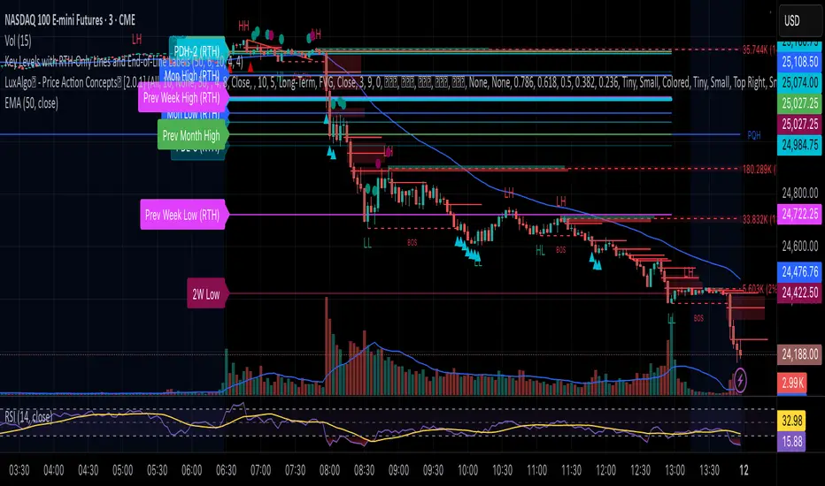
Key Levels with RTH-Only Lines and End-of-Line LabelsThis script plots important market structure levels such as Premarket High/Low, Previous Day High/Low, Monday High/Low, Weekly and Monthly Highs/Lows — but only during Regular Trading Hours (RTH) to keep the chart clean and focused on the active session.
Each level is automatically updated based on session data and is visually extended across the current trading day using line breaks (plot.style_linebr). At the start of each RTH session, the script also places end-of-line labels identifying each level (e.g., PDH, PDL, Mon High, Mon Low, Weekly High/Low, Monthly High/Low), allowing traders to quickly reference key zones without clutter.
This tool is ideal for:
Futures and equity traders who rely on session-based support and resistance levels.
Identifying reaction points where liquidity often builds — such as prior highs/lows or weekly extremes.
Maintaining focus on live market structure while avoiding noise from premarket or overnight price action.
Additional features:
All levels and labels are plotted only during RTH for visual clarity.
Supports custom labeling and alert logic extensions for breakout or retest strategies.
Built with scalability in mind — works across different symbols and timeframes.
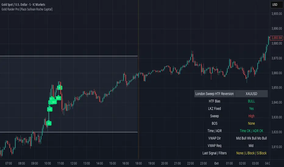
Gold Raider Pro [Plazo Sullivan Roche Capital]Core logic
During the London kill-zone, the script locks in the session high/low (LKZ).
After London ends, it looks for a liquidity sweep (price pokes beyond LKZ high/low) then a BOS (break of the first opposing swing) to confirm reversal.
Trades are only valid with higher-timeframe bias (D1 & H4 above/below EMA-50 in agreement).
Optional filters block weak signals: time gate (NY cutoff), ADR (skip if the day’s move is already stretched), and VWAP alignment (Midnight/Weekly/Monthly).
Output is a unified signal: BUY after low sweep + BOS in bull HTF, SELL after high sweep + BOS in bear HTF; labels + dashboard summarize state and reasons.
Best setup & usage
Chart & broker: XAUUSD on a high-liquidity feed (ICMarkets/FXPro/OANDA). Use 2m–5m for executions; confirm with 15m market structure.
Session: Set timezone to America/New_York. Default London kill-zone 02:30–04:30 NY; stop taking new signals after 11:00 NY (toggle in inputs).
HTF bias: Keep EMA length = 50 on D & H4 (default). Only toggle off bias if you’re deliberately testing counter-trend sweeps (not recommended live).
Structure/BOS: Use Swing Length = 3. Leave “Require BOS after the sweep” = ON for the cleanest signals; turn “Require close back inside LKZ” ON only if you want ultra-conservative entries.
VWAP filters: Keep Midnight VWAP = ON; add Weekly/Monthly only on trend days to avoid over-filtering range sessions.
ADR guardrail: Enable ADR filter once you go live; start with ADR Threshold = 0.9 and Lookback 14. This blocks chasing extended moves.
Execution playbook:
BUY: Wait for low sweep of LKZ → BOS up → dashboard shows BULL bias, Time/ADR OK, VWAP pass. Enter on the next pullback or at close; SL below BOS invalidation (or fixed 0.5–0.8× ADR14 of XAU).
SELL: Mirror logic after a high sweep in BEAR bias; SL above BOS invalidation.
TP: Scale at 1R, leave runner to 2–3R or to Midnight/Weekly VWAP touch; hard exit by NY lunchtime or on bias flip.
Risk: 0.25–0.5% per trade (XAU is spiky). One trade per direction per session; if ADR block triggers post-entry, manage to BE or flatten if structure weakens.
Alerts & dashboard: Turn on runtime alerts once parameters are set. Read the Last Signal / Filters row; only act when it shows your direction and “L:OK / S:OK” for your side.
Validation & tuning: Forward-test 3–4 weeks. If over-filtered, relax VWAP Weekly/Monthly first; if too chatty, enforce close-back-inside and keep NY cutoff tight.
Don’ts: Don’t trade during major news spikes, don’t counter the D1/H4 agreement, and don’t enter before BOS—sweeps without structure confirmation are bait.
BMSB Watchlist Alert - Daily w/ 1% Proximity# Bull Market Support Band - Daily Updates with Proximity Alerts
## Overview
This indicator tracks the Bull Market Support Band (20-week SMA and 21-week EMA) with daily resolution updates and proximity warnings. The weekly moving averages update every day on your chart, giving you more frequent signals than traditional weekly-only scripts.
## What It Does
The script monitors price action relative to the BMSB and generates alerts for:
- Price crossing above or below either the 20W SMA or 21W EMA
- Price coming within 1% of either moving average (early warning system)
This proximity feature is useful for catching potential support/resistance tests before they actually happen, giving you advance notice to prepare for entries or exits.
## Key Features
- Weekly MAs that update daily for more responsive monitoring
- Configurable proximity threshold (default 1%, adjustable from 0.1% to 5%)
- Visual proximity zones shown as dotted lines around each MA
- Color-coded background highlighting (green when above both MAs, red when below both, orange when in proximity zone)
- On-chart labels for crosses and proximity warnings
- Status table showing current position relative to the band
## Setup for Watchlist Alerts
1. Add the indicator to any chart
2. Create alerts using these conditions:
- "BMSB Cross Alert" - fires on actual crosses
- "BMSB Proximity Alert" - fires when entering the 1% zone
3. Set interval to 1 day (recommended) or 4 hour for more frequent checks
4. Use "Once Per Bar Close" for the trigger option
5. Apply the same alert to your entire watchlist
## Settings
You can toggle on/off:
- Cross above alerts
- Cross below alerts
- Proximity alerts
- Proximity percentage adjustment
- Visual elements (labels, MA lines, proximity zones)
## Notes
The BMSB is commonly used in crypto markets to identify bull market pullback support levels. This implementation adds the proximity warning system to help you anticipate potential tests of these key levels rather than waiting for confirmed crosses.
Works on any timeframe but designed for daily monitoring of weekly moving averages.

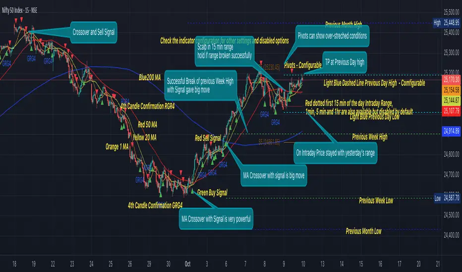
GRG/RGR Signal, MA, Ranges and PivotsThis indicator is a combination of several indicators.
It is a combination of two of my indicators which I solely use for trading
1. EMA 10-20-50-200, Pivots and Previous Day/Week/Month range
2. 3/4-Bar GRG / RGR Pattern (Conditional 4th Candle)
You can use them individually if you already have some of them or just use this one. Belive me when I say, this is all you need, along with market structure knowlege and even if you don’t have that, this indicator has been doing wonders for me. This is all I use. I do not use anything else.
**Note - Do checkout the indicators individually as I have added valuable information in the comment section.
It contains the following,
1. 10 EMA/SMA - configurable
2. 20 EMA/SMA - configurable
3. 50 EMA/SMA - configurable
4. 200 EMA/SMA - configurable
5. Previous Day's Range - configurable
6. Previous Week's Range - configurable
7. Previous Month's Range - configurable
8. Pivots - configurable
9. Buy Sell Signal - configurable
The Moving Averages
It is a very important combination and using it correctly with price action will strengthen your entries and exits.
The ema's or sma's added are the most powerful ones and they do definitely act as support and resistance.
The Daily/Weekly/Monthly Ranges
The Daily/Weekly/Monthly ranges are extremely important for any trader and should be used for targets and reversals.
Pivots
Pivots can provide support and resistance level. R5 and S5 can be used to check for over stretched conditions. You can customise them however you like. It is a full pivot indicator.
It is defaulted to show R5 and S5 only to reduce noise in the chart but it can be customised.
The 3/4 RGR or GRG Signal Generator
Combined with a 3/4 RGR or GRG setup can be all a trader needs.
You don't need complex strategies and SMC concepts to trade. Simple EMAs, ranges and RGR/GRG setup is the most winning combination.
This indicator can be used to identify the Green-Red-Green or Red-Green-Red pattern.
It is a price action indicator where a price action which identifies the defeat of buyers and sellers.
If the buyers comprehensively defeat the sellers then the price moves up and if the sellers defeat the buyers then the price moves down.
In my trading experience this is what defines the price movement.
It is a 3 or 4 candle pattern, beyond that i.e, 5 or more candles could mean a very sideways market and unnecessary signal generation.
How does it work?
Upside/Green signal
1. Say candle 1 is Green, which means buyers stepped in, then candle 2 is Red or a Doji, that means sellers brought the price down. Then if candle 3 is forming to be Green and breaks the closing of the 1st candle and opening of the 2nd candle, then a green arrow will appear and that is the place where you want to take your trade.
2. Here the buyers defeated the sellers.
3. Sometimes candle 3 falls short but candle 4 breaks candle 1's closing and candle 2's opening price. We can enter on candle 4.
4. Important - We need to enter the trade as soon as the price moves above the candle 1 and 2's body and should not wait for the 3rd or 4th candle to close. Ignore wicks.
5. But for a more optimised entry I have added an option to use candle’s highs and lows instead of open and close. This reduces lot of noise and provides us with more precise entry. This setting is turned on by default.
6. I have restricted it to 4 candles and that is all that is needed. More than that is a longer sideways market.
7. I call it the +-+ or GRG pattern or Green-Red-Green or Buyer-Seller-Buyer or Seller defeated or just Buyer pattern.
8. Stop loss can be candle 2's mid for safe traders (that includes me) or candle 2's body low for risky traders.
9. Back testing suggests that body low will be useless and result in more points in loss because for the bigger move this point will not be touched, so why not get out faster.
Downside/Red signal
1. Say candle 1 is Red, which means sellers stepped in, then candle 2 is Green or a Doji, that means buyers took the price up. Then if candle 3 is forming to be Red and breaks the closing of the 1st candle and opening of the 2nd candle then a Red arrow will appear and that is the place where you want to take your trade.
2. Sometimes candle 3 falls short but candle 4 breaks candle 1's closing and candle 2's opening price. We can enter on candle 4.
3. We need to enter the trade as soon as the price moves below the candle 1 and 2's body and should not wait for the 3rd or 4th candle to close.
4. But for a more optimised entry I have added an option to use candle’s highs and lows instead of open and close. This reduces lot of noise and provides us with more precise entry. This setting is turned on by default.
5. I have restricted it to 4 candles and that is all that is needed. More than that is a longer sideways market.
6. I call it the -+- or RGR pattern or Red-Green-Red or Seller-Buyer-Seller or Buyer defeated or just Seller pattern.
7. Stop loss can be candle 2's mid for safe traders ( that includes me) or candle 2's body high for risky traders.
8. Back testing suggests that body high will be useless and result in more points in loss because for the bigger move this point will not be touched, so why not get out faster.
Combining Indicators and Signal
Combining these indicators with GRG/RGR signal can be very powerful and can provide big moves.
1. MA crossover and Signal - This is very powerful and provides a very big move. Trades can be held for longer. If after taking the trade we notice that the MA crossover has happened then trades can be held for higher targets.
2. Pivots and Signal - Pivots and add a support or resistance point. Take profits on these points. R5/S5 are over streched conditions so we can start looking for reversal signals and ignore other signals
3. Intraday Range - first 1, 5, 15 min of the day - Sideways days is when price will stay in these ranges. You can take profits at these ranges or if the range is broken and we get a signal, then it can mean that the direction will be sustained.
4. Previous Day/Week/Month Ranges - These can be used as Take Profit points if the price is moving towards them after getting the signal. If the range is broken and we get a signal then it can be a strong signal. They can also be used as reversal points if a strong signal is generated.
Important Settings
1. Include 4th Candle Confirmation - You can enable or disable the 4th candle signal to avoid the noise, but at times I have noticed that the 4th candle gives a very strong signal or I can say that the strong signal falls on the 4th candle. This is mostly a coincidence.
2. Bars to check (default 10) - You can also configure how many previous bars should the signal be generated for. 10 to 30 is good enough. To backtest increase it to 2000 or 5000 for example.
3. Use Candle High/Low for confirmation instead of Candle Open/Close - More optimized entry and noise reduction. This option is now defaulted to false.
4. Show Green-Red-Green (bull) signals - Show only bull entries. Useful when I have a predefined view i.e, I know market is going to go up today.
5. Show Red-Green-Red (bear) signals - Show only bear entries. Useful when I have a predefined view i.e, I know market is going to go down today.
6. 3rd candle should be a Strong candle before considering 4th candle - This will enforce additional logic in 4 candle setup that the 3rd candle is the candle in our direction of breakout. This means something like GRGG is mandatory, which is still the default behaviour. If disabled, the 3rd candle can be any candle and 4th candle will act as our breakout candle. This behaviour has led to breakouts and breakdowns as times, hence I added this as a separate feature. Vice-versa for a RGGR.
For a 4 candle setup till now we were expecting GRGG or RGRR but we can let the system ignore the 3rd candle completely if needed.
This will result in additional signals.
7. Three intraday ranges added for index and stock traders - 1 min, 5 min and 15 min ranges will be displayed. These are disabled by default except 15 min. These are very important ranges and in sideways days the price will usually move within the 15 min. A breakout of this range and a positive signal can be a very powerful setup.
Safe traders can avoid taking a trade in this range as it can lead to fakeouts.
The line style, width, color and opacity are configurable.
Pointers/Golden Rules
1. If after taking the trade, the next candle moves in your direction and closes strong bullish or bearish, then move SL to break even and after that you can trail it.
2. If a upside trade hits SL and immediately a down side trade signal is generated on the next candle then take it. Vice versa is true.
3. Trades need to be taken on previous 2 candle's body high or low combined and not the wicks.
4. The most losses a trader takes is on a sideways day and because in our strategy the stop loss is so small that even on a sideways day we'll get out with a little profit or worst break even.
5. Hold trades for longer targets and don't panic.
6. If last 3-4 days have been sideways then there is a good probability that today will be trending so we can hold our trade for longer targets. Inverse is true when the market has been trending for 2-3 days then volatility followed by sideways is coming (DOW theory). Target to hold the trade for whole day and not exit till the day closes.
7. In general avoid trading in the middle of the day for index and stocks. Divide the day into 3 parts and avoid the middle.
8. Use Support/Resistance, 10, 20, 50, 200 EMA/SMA, Gaps, Whole/Round numbers(very imp) for identifying targets.
9. Trail your SL.
10. For indexes I would use 5 min and 15 min timeframe and at times 10 mins.
11. For commodities and crypto we can use higher timeframe as well. Look for signals during volatile time durations and avoid trading the whole day. Signal usually gives good targets on those times.
12. If a GRG or RGR pattern appears on a daily timeframe then this is our time to go big.
13. Minimum Risk to Reward should be 1:2 and for longer targets can be 1:4 to 1:10.
14. Trade with small lot size. Money management will happen automatically.
15. With small lot size and correct Risk-Reward we can be very profitable. Don't trade with big lot size.
16. Stay in the market for longer and collect points not money.
17. Very imp - Watch market and learn to generate a market view.
18. Very imp - Only 3 type of candles are needed in trading -
Strong Bullish (Big Green candle), Strong Bearish (Big Red candle),
Hammer (it is Strong Bullish), Inverse Hammer (it is Strong Bearish)
and Doji (indecision or confusion).
If on daily timeframe I see Strong Bullish candle previous day then I am biased to the upside the next day, if I see Strong Bearish candle the previous day then I am biased to the downside the next day, if I see Doji on the previous day then I am cautious the next day, if there are back to back Dojis forming in daily or weekly then I am preparing for big move so time to go big once I get the signal.
19. Most Important Candlestick pattern - Bullish and Bearish Engulfing
20. The only Chart patterns I need -
a) Falling Wedge/Channel Bullish Pattern Uptrend or Bull Flag - Buying - Forming over a couple days for intraday and forming over a couple of weeks for swing
b) Falling Wedge/Channel Bullish Pattern Downtrend or Falling Channel - Buying
c) Rising Wedge Bearish Pattern Uptrend or Rising Channel - Selling
d) Rising Wedge Bearish Pattern Downtrend or Bear flag - Selling
e) Head and Shoulder - Over a longer period not for intraday. In 15 min takes few days and for swing 1hr or 4h or daily can take few days
f) M and W pattern - Reversal Patterns - They form within the above 4 patterns, usually resulting in the break of trend line
21. How Gaps work -
a) Small Gap up in Uptrend - Market can fill the gap and reverse. The perception is that people are buying. If previous day candle was Strong Bullish then market view is up.
b) Big Gap up in Uptrend - Not news driven - Profit booking will come but may not fill the entire gap
c) Big Gap up in Uptrend - News driven, war related, tax, interest rate - Market can keep going up without stopping.
c) Flat opening in Uptrend - Big chance of market going up. If previous day candle was Strong Bullish then view is upwards, if it was Doji then still upwards.
d) Gap down in Uptrend - Market is surprised. After going down initially it can go up
e) Small Gap down in Downtrend - Market can fill the gap and keep moving down. If previous day candle was Strong Bearish then view is still down.
f) Flat opening in Downtrend - View is down, short today.
g) Big Gap down in Downtrend - Profit booking and foolish buying will come but market view is still down.
h) Gap down with News - Volatility, sideways then down.
i) Gap Up in Downtrend - Can move up - Price can move up during 2/3rd of the day and End of the day revert and close in red.
22. Go big on bearish days for option traders. Puts are better bought and Calls are better sold.
23. Cluster of green signals can lead to bigger move on the upside and vice versa for red signals.
24. Most of this is what I learned from successful traders (from the top 2%) only the indicator is mine.
Hotzones EssentialsThe Hotzones essentials kit combines key price action principles into a single kit. These features come together to form a unique approach to price action trading.
The Killzone Blocks are a precision-engineered market-mapping system designed to identify high-liquidity price regions zones where institutional participants and smart money are most likely to interact. These areas often act as reaction points , where liquidity absorption, reversals, or continuation moves are started. By highlighting these zones, traders can potentially anticipate market intent and position themselves accordingly with greater confidence.
Shown above is are Killzone Blocks highlighting their strength and deltas.
Killzone Blocks are dynamically generated from significant structural shifts in the market where key areas where order flow and volume imbalance indicate a change in control between buyers and sellers. Each block represents a localized liquidity pocket, allowing users to visualize potential killzones which are regions where price is statistically more likely to bounce, reject, or consolidate before choosing direction.
The algorithm continuously tracks structural breaks , pivot reactions , and volume clustering to ensure that every block represents a meaningful, data-driven region rather than random candle overlap.
Volume and Delta Analysis
Each Killzone Block carries an advanced volume breakdown that quantifies order-flow dynamics within the zone.
Volume Data: Displays both bullish and bearish volume as a percentage of the total block volume, quantifying buying vs. selling intensity and helping traders gauge whether the zone was dominated by aggressive buyers or sellers.
Gray Text (Order Block Volume Type): Shows metrics specific to the block’s nature.
Bearish Blocks: Display only the bear volume (sell pressure) as a percentage of total OB volume.
Bullish Blocks: Display only the bull volume (buy pressure) as a percentage of total OB volume.
This separation removes noise and helps traders focus on which participant truly dominated the zone.
Each block also features a Delta Indicator which is a color-coded circle offering instant insight into which side of the market was in control:
🔴 Red: Strong negative delta (-100% to -20%) = Sellers dominated.
🟡 Yellow: Neutral delta (-10% to +10%) = Market in balance or absorption.
🔵 Blue: Strong positive delta (+20% to +100%) = Buyers dominated.
The delta represents the difference between buyer and seller volume within that block. A positive delta indicates aggressive buying absorption , while a negative delta suggests sell-side control .
Shown above we see a very small delta with neutral volume. This is a very balanced market zone where we might be less likely to see a reaction.
Customization and Inputs
Users can tailor the Killzone Blocks to suit their analysis style:
* Adjust the displayed block count to view short-term or long-term structures.
* Choose whether zones are drawn from wicks or bodies . Wick-based zones are more reactive to intraday liquidity hunts, while body-based zones reflect institutional candle closings and conviction.
Killzone Levels
Killzone Levels expand on the concept of liquidity mapping by plotting the most influential horizontal levels in the market daily, weekly, and monthly highs and lows . These levels represent major liquidity pools where large clusters of stop orders, breakout triggers, and institutional re-entries often occur.
Users can customize every visual aspect of these levels, including color, style, and line thickness if needed.
These levels are crucial because markets tend to gravitate toward previous highs and lows to collect liquidity before reversing or extending the trend. Daily levels act as intraday targets, weekly levels provide swing and mid-term context, and monthly levels define macro liquidity boundaries where institutional flows are concentrated.
When a Killzone Block aligns with a Killzone Level ; for example, a bullish block forming near a weekly low, it creates strong confluence and raises the probability of a meaningful reaction. Together, these levels transform simple horizontal lines into dynamic zones of opportunity.
Open Range Breakout
The Open Range Breakout feature identifies the first major liquidity window of each trading session, often referred to as the opening range or killzone window . This range is defined by the high and low formed within a user-defined session time (for example, 08:00–08:45 for the London session).
Shown above is a breakout of a range.
Once the window closes, the system locks in the session’s high and low, marking the balance point of early order flow. From this moment, price action is monitored in real time:
- A break above the high generates a bullish breakout signal , confirming buyer control.
- A break below the low generates a bearish breakout signal , confirming seller dominance.
To enhance accuracy, the feature includes a Level 2 Confirmation setting. Rather than triggering on a wick or brief spike, this level confirms a breakout only when a full candle closes outside the open range . This ensures signals reflect genuine intent and continuation pressure instead of short-term liquidity sweeps.
Seen above is confluence between a retest of a zone and a breakout.
Traders use the Open Range Breakout to establish session bias ; whether the market is trending bullish or bearish for that specific session. Combined with Killzone Blocks and Levels, it forms a complete confluence system for identifying direction, gauging strength, and mapping high-probability reaction zones.
Overall this toolkit provides 3 unique tools that come together to form powerful confluence and deeper insights into volume and price action.
Futures Day Trading Key Levels by Dhawal Ranka
Hey everyone, thank you for using this script, let me know in the comments how you feel about it!
What this script does:
This indicator renders one consolidated map of intraday reference levels for futures (e.g., ES, NQ, GC, CL). It is session-aware and draws:
- Previous ETH day High/Low/Close
- Previous RTH High/Low/Close (built from your RTH session)
- Today’s developing RTH High/Low and Mid
- Overnight (ON) session High/Low
- Opening Range (first N minutes of RTH): OR High/Low
- VWAP (day-anchored) with optional ±σ bands
- Floor Pivots (PP/R1/S1/R2/S2) from prior ETH daily bar
- ADR projections (Up/Down) using a configurable lookback and anchor
- Settlement: prior official settlement and today’s projected settle (with manual override)
- Weekly/Monthly context: prior W/M High/Low/Close and current W/M Open
- Minimal right-edge text tags (instead of big boxes) that sit on the price scale line and auto-pack when levels coincide
All lines extend across the chart to make confluence obvious without clutter.
How it works (methods & calculations)
Sessions
The script exposes two user sessions and a time zone:
RTH (e.g., 09:30–16:00 America/New_York)
ON (e.g., 18:00–09:29 America/New_York)
Session membership is computed with time(timeframe, session, tz) != 0.
RTH H/L/C (prev) are aggregated intrabar: on RTH start we seed H/L; while inRTH we update; on RTH end we store the close.
Previous Day (ETH) levels
request.security(syminfo.tickerid, "D", high /low /close ) supplies PDH/PDL/PDC on the continuous ETH daily.
Opening Range
On RTH start we mark orStartTime.
While RTH is active and elapsed time < N minutes, we track the running high/low.
When elapsed ≥ N minutes, we freeze OR High/Low.
VWAP & ±σ bands (intraday)
Day-anchored VWAP uses ta.vwap(hlc3).
Bands: standard deviation of (close − vwap) from day start, accumulated inline:
stdev = sqrt( mean(dev^2) − mean(dev)^2 )
Bands = vwap ± k * stdev (user multiplier).
Floor Pivots (classic)
Using prior ETH daily H/L/C:
PP = (H + L + C) / 3
R1 = 2*PP − L, S1 = 2*PP − H
R2 = PP + (H − L), S2 = PP − (H − L).
ADR projections
Daily range series rng = request.security(..., "D", high - low).
ADR = SMA(rng, L) (default L=14).
Anchor is user-selectable: today’s open or yesterday’s close.
Projections: ADR Up = anchor + ADR/2, ADR Down = anchor − ADR/2.
Settlement
Prev Settle defaults to prior ETH daily close but can be overridden manually for markets where official settlement differs from feed close.
Today Projected Settle uses the current ETH daily close value.
Weekly / Monthly context
Prior W/M H/L/C from "W"/"M" with , plus current W/M Open.
Rendering & label logic (originality)
Lines are persistent: each named level owns one line object that is updated, not re-created—keeps resource use low and avoids “too many plots”.
Right-edge labels are text-only (no box) placed at x = bar_index + offset and yloc.price.
When multiple levels share (almost) the same price, labels are packed side-by-side using a small bucketing algorithm:
Prices are bucketed within ±½ tick.
Each label gets a position index inside its bucket; the final x-offset = baseOffset + index*step + priority.
Priorities nudge important tags (e.g., Settle/RTH levels) closer to the price scale so they remain readable.
Why this is published & what’s original
It’s not a simple mashup: the script’s utility is the session-aware aggregation, the OR timing logic, the intraday σ calculation around VWAP, the line-persistence manager, and the label packing with priorities that keeps the right edge readable even when many levels coincide.
The closed-source protection covers the packing/priority scheme and the persistent object management that make it practical on busy futures charts without hitting Pine limits.
How to use
Set your sessions & time zone
Choose RTH/ON session windows (the defaults match CME equity index futures) and the time zone of your charting workflow.
Toggle components
Enable only the layers you need (e.g., VWAP bands off if you want a cleaner chart).
Opening Range length (minutes) is adjustable.
Settlement
If your broker/feed’s daily close isn’t the official settlement, enter a manual settle value for the prior day.
Read the right edge
Labels sit on the price scale line. When two labels share the same price, they appear side-by-side rather than overlapping.
Timeframes & symbols
Designed for intraday futures on 1–30m. Works on other symbols/timeframes but intent is day trading.
Inputs (summary)
Sessions/TZ: RTH window, ON window, time zone
Today: RTH H/L/Mid, ON H/L, OR (minutes)
VWAP: on/off, ±σ bands, multiplier
Pivots: PP/R1/S1/R2/S2 (ETH)
ADR: lookback, anchor (open vs. prev close)
Settlement: show prev/proj, manual override
Weekly/Monthly: prior H/L/C + current open
Style: line transparency; right-edge tag size, base offset, and step; optional inline labels
Limitations & notes
“Prev Settle” equals the prior daily close unless overridden.
Session definitions matter: if your exchange hours differ, set your own RTH/ON windows.
No alerts are included to minimize plot count and keep performance high (you can add alert conditions on any level in a private copy).
Disclaimer
For educational purposes only; not financial advice. Futures trading involves significant risk.
Versioning
This script will be maintained under a single publication using Update (no minor forks). Major changes will be documented in the Change Log section of the script description.

COT Raw Net Positions📊 What the COT Raw Data Shows — and Why It’s So Valuable
The COT Raw view displays the actual net positions of each trader group (Commercials, Large Speculators, and Retail/Small Traders) as reported weekly by the CFTC.
Instead of normalizing or smoothing the data, it shows the real contract numbers — how many futures contracts each group is long or short.
This raw form of the data offers pure transparency into market positioning.
It allows traders to:
See the true scale of institutional buying or selling pressure.
Understand how different market participants are behaving week to week.
Spot early accumulation or distribution phases long before they become visible on price charts.
Compare multiple assets side by side to gauge relative strength across markets.
While the COT Index simplifies things by showing where current positions sit relative to history, the COT Raw view provides context and depth — helping experienced traders understand why those extremes are forming.
In essence:
📈 COT Raw = the foundation of the data — it shows what’s really happening under the surface.
It’s a must-have for traders who want to study institutional flows, analyze correlations, and confirm macro sentiment shifts directly from the source.
⚠️ Note: As with all COT-based tools, the data updates weekly and is best interpreted on weekly or higher timeframes.
VWAP Deviation Oscillator [BackQuant]VWAP Deviation Oscillator
Introduction
The VWAP Deviation Oscillator turns VWAP context into a clean, tradeable oscillator that works across assets and sessions. It adapts to your workflow with four VWAP regimes plus two rolling modes, and three deviation metrics: Percent, Absolute, and Z-Score. Colored zones, optional standard deviation rails, and flexible plot styles make it fast to read for both trend following and mean reversion.
What it does
This tool measures how far price is from a chosen VWAP and expresses that gap as an oscillator. You can view the deviation as raw price units, percent, or standardized Z-Score. The plot can be a histogram or a line with optional fills and sigma bands, so you can quickly spot polarity shifts, overbought and oversold conditions, and strength of extension.
VWAP modes track a session VWAP that resets (4H, Daily, Weekly) or a rolling VWAP that updates continuously over a fixed number of bars or days.
Deviation modes let you choose the lens: Percent, Absolute, or Z-Score. Each highlights different aspects of stretch and mean pressure.
Visual encoding uses a 10-zone color palette to grade the magnitude of deviation on both sides of zero.
Volatility guards compute mode-specific sigma so thresholds are stable even when volatility compresses.
Why this works
VWAP is a high signal anchor used by institutions to gauge fair participation. Deviations around VWAP cluster in regimes: mild oscillations within a band, decisive pushes that signal imbalance, and standardized extremes that often precede either continuation or snapback. Expressing that distance as a single time series adds clarity: bias is the oscillator’s sign, risk context is its magnitude, and regime is the way it behaves around sigma lines.
How to use it
Trend following
Favor the side of the zero line. Bullish when the oscillator is above zero and making higher swing highs. Bearish when below zero and making lower swing lows. Use +1 sigma and +2 sigma in your mode as strength tiers. Pullbacks that hold above zero in uptrends, or below zero in downtrends, are often continuation entries.
Mean reversion
Fade stretched readings when structure supports it. Look for tests of +2 sigma to +3 sigma that fail to progress and roll back toward zero, or the mirror on the downside. Z-Score mode is best when you want standardized gates across assets. Percent mode is intuitive for intraday scalps where a given percent stretch tends to mean revert.
Session playbook
Use Daily or Weekly VWAP for intraday or swing context. Rolling modes help when the asset lacks clean session boundaries or when you want a continuous anchor that adapts to liquidity shifts.
Key settings
VWAP computation
VWAP Mode = 4 Hours, Daily, Weekly, Rolling (Bars), Rolling (Days). Session modes reset the VWAP when a new session begins. Rolling modes compute VWAP over a fixed trailing window.
Rolling (Lookback: Bars) controls the trailing bar count when using Rolling (Bars).
Rolling (Lookback: Days) converts days to bars at runtime and uses that trailing span.
Use Close instead of HLC3 switches the price reference. HLC3 is smoother. Close makes the anchor track settlement more tightly.
Deviation measurement
Deviation Mode
Percent : 100 * (Price / VWAP - 1). Good for uniform scaling across instruments.
Absolute : Price - VWAP. Good when price units themselves matter.
Z-Score : Standardizes the absolute residual by its own mean and standard deviation over Z/Std Window . Ideal for cross-asset comparability and regime studies.
Z/Std Window sets the mean and standard deviation window for Z-Score mode.
Volatility controls
Percent Mode Volatility Lookback estimates sigma for percent deviations.
Absolute Mode Volatility Lookback estimates sigma for absolute deviations.
Minimum Sigma Guard (pct pts) prevents the percent sigma from collapsing to near zero in extremely quiet markets.
Visualization
Plot Type = Histogram or Line. Histogram emphasizes impulse and polarity changes. Line emphasizes trend waves and divergences.
Positive Color / Negative Color define the palette for line mode. Histogram uses a 10-bucket gradient automatically.
Show Standard Deviations plots symmetric rails at ±1, ±2, ±3 sigma in the current mode’s units.
Fill Line Oscillator and Fill Opacity add a soft bias band around zero for line mode.
Line Width affects both the oscillator and the sigma rails.
Reading the zones
The oscillator’s color and height map deviation to nine graded buckets on each side of zero, with deeper greens above and deeper reds below. In Percent and Absolute modes, those buckets are scaled by their mode-specific sigma. In Z-Score mode the bucket edges are fixed at 0.5, 1.0, 2.0, and 2.8.
0 to +1 sigma weak positive bias, usually rotational.
+1 to +2 sigma constructive impulse. Pullbacks that hold above zero often continue.
+2 to +3 sigma strong expansion. Watch for either trend continuation or exhaustion tells.
Beyond +3 sigma statistical extreme. Requires structure to avoid fading too soon.
Mirror logic applies on the negative side.
Suggested workflows
Trend continuation checklist
Pick a session VWAP that matches your timeframe, for example Daily for intraday or Weekly for position trades.
Wait for the oscillator to hold the correct side of zero and for a sequence of higher swing lows in the oscillator (uptrend) or lower swing highs (downtrend).
Buy pullbacks that stabilize between zero and +1 sigma in an uptrend. Sell rallies that stabilize between zero and -1 sigma in a downtrend.
Use the next sigma band or a prior price swing as your target reference.
Mean reversion checklist
Switch to Z-Score mode for standardized thresholds.
Identify tests of ±2 sigma to ±3 sigma that fail to extend while price meets support or resistance.
Enter on a polarity change through the prior histogram bar or a small hook in line mode.
Fade back to zero or to the opposite inner band, then reassess.
Notes on the three modes
Percent is easy to reason about when you care about proportional stretch. It is well suited to intraday and multi-asset dashboards.
Absolute tracks cash distance from VWAP. This is useful when instruments have tight ticks and you plan risk in price units.
Z-Score standardizes the residual and is best for quant studies, cross-asset comparisons, and threshold research that must be scale invariant.
What the alerts can tell you
Polarity changes at zero can mark the start or end of a leg.
Crosses of ±1 sigma identify overbought or oversold in the current mode’s units.
Zone changes signal an upgrade or downgrade in deviation strength.
Troubleshooting and edge cases
If your instrument has long flat periods, keep Minimum Sigma Guard above zero in Percent mode so the rails do not vanish.
In Rolling modes, very short windows will respond quickly but can whip around. Session modes smooth this by resetting at well known boundaries.
If Z-Score looks erratic, increase Z/Std Window to stabilize the estimate of mean and sigma for the residual.
Final thoughts
VWAP is the anchor. The deviation oscillator is the narrative. By separating bias, magnitude, and regime into a simple stream you can execute faster and review cleaner. Pick the VWAP mode that matches your horizon, choose the deviation lens that matches your risk framework, and let the color graded zones guide your decisions.

Auto Market Bias Dashboard |TG|Overview
The Auto Market Bias Dashboard is a Pine Script v5 indicator developed on the TradingView platform. This tool automatically calculates and visualizes the market bias for the selected asset (crypto, forex, or futures). By analyzing the market structure across different timeframes (Weekly, Daily, 4-Hour, 1-Hour), it identifies bullish, bearish, or neutral trends. Its main purpose is to provide traders with a quick summary to simplify the decision-making process. The indicator is optimized particularly for 1-hour and higher timeframes and issues warnings on lower timeframes.
How It Works?
The indicator uses a scoring system based on 7 fundamental questions for each timeframe. Each question evaluates market dynamics and assigns a score of +1 (bullish), -1 (bearish), or 0 (neutral):
Is the Trend in an Upward Direction? – The closing price is checked against the 20-period SMA.
Has the Previous Candle's High Been Breached? – For breakout analysis, the close is evaluated against the previous candle's high/low.
Was Respect Paid to PDA? (FVG/Sweep) – Market structure alignment is sought through Fair Value Gap (FVG) detection (calculated specifically for each TF).
Is Volume Increasing in the Direction of Price? – Volume is compared to its 20-period SMA and the candle direction (TF-specific).
Does the Correlated Asset Show the Same Bias? – Trend alignment is checked with the selected correlated asset (e.g., ES1!, MNQ1!, MES1!); neutral conditions are supported.
Market Structure – Reversal signals are sought through pivot high/low detection (high: bearish, low: bullish).
Has Volatility Increased? – ATR (14 periods) and its SMA (20 periods) are combined with the candle direction (TF-specific).
The total bias for each timeframe is calculated (/7). The overall bias combines the weekly score with double weighting ((Weekly × 2) + Daily + 4H + 1H = /28). Results:
Positive (>0): Bullish (Green) – Buying opportunity.
Negative (<0): Bearish (Red) – Selling opportunity.
Zero: Neutral (Silver) – Indecisive.
Candle Opens by HAZED🎯 Candle Opens by HAZED - Multi-Timeframe Open Levels Indicator
📊 Overview
This powerful indicator displays multiple timeframe opening prices on your chart, providing crucial reference levels that institutional traders and algorithms frequently monitor. Track up to 7 different timeframe opens simultaneously, from 1-hour to yearly, with advanced visualization features including dynamic coloring, heatmap analysis, and real-time status tracking.
✨ Key Features
📈 Multi-Timeframe Support:
- 1H, 4H, Daily, Weekly, Monthly, Quarterly, and Yearly opens
- Each timeframe can be individually enabled/disabled
- Automatic visibility adjustment based on chart timeframe
🎨 Dynamic Visual System:
- Smart Color Coding: Lines automatically change color based on price position (green above, red below)
- Customizable Styling: Adjust line thickness, transparency, and colors
- Intelligent Line Positioning: Choose between equal-length or staggered lines for better visibility
- Enhanced Labels: Display timeframe only or include price with colored background
🌈 Advanced Heatmap:
- Background coloring shows overall market sentiment across all timeframes
- Gradient or solid color modes
- Instantly see when multiple timeframes align bullish or bearish
📊 Status Table Dashboard:
- Real-time overview of all active opens
- Shows current price position relative to each open
- Simplified view when all timeframes align
- Customizable position and font style
⚙️ Professional Tools:
- Alert system for new open levels
- Extended hours session support
- Price discovery mode for EOD/intraday discrepancies
- Left/right line extensions for enhanced visibility
💡 Trading Applications
Support & Resistance:
Opening prices act as natural support/resistance levels. Price often reacts at these levels, providing entry/exit opportunities.
Trend Confirmation:
When price is above multiple opens (especially higher timeframes), it confirms bullish momentum. The opposite indicates bearish pressure.
Mean Reversion:
Price tends to revert to significant opens, particularly daily and weekly levels. Use these as targets for counter-trend trades.
Breakout Trading:
Monitor when price breaks above/below clustered opens for potential continuation moves.
Risk Management:
Use opens as logical stop-loss levels or position sizing references based on distance from key opens.
🔧 Indicator Settings
Timeframes Section:
- Toggle each timeframe on/off
- Customize individual colors
Visual Style Section:
- Dynamic Colors: Auto-color based on price position
- Line Thickness: 1-4 pixels
- Transparency: 0-80%
- Extension Length: How far lines extend right
- Label Style: Plain or enhanced with price
Heatmap Section:
- Enable/disable background coloring
- Adjust transparency
- Choose gradient or solid zones
Status Table Section:
- Position on chart
- Font selection
Advanced Section:
- Enable alerts for new opens
- Price discovery mode
- Extended hours inclusion
]📈 Best Practices
1. Timeframe Selection:
- For intraday: Focus on 1H, 4H, and Daily
- For swing trading: Daily, Weekly, Monthly
- For position trading: Monthly, Quarterly, Yearly
2. Color Coding:
- Enable dynamic colors for instant sentiment reading
- Use heatmap for overall market bias
3. Confluence Zones:
- Pay special attention when multiple opens cluster
- These zones often produce stronger reactions
4. Alignment Signals:
- When all timeframes show same color = strong trend
- Mixed colors = potential consolidation or reversal zone
🎯 Pro Tips
- Volume Confirmation: Combine with volume indicators to confirm reactions at open levels
- Multiple Instruments: Compare opens across correlated assets for divergences
- News Events: Opens often act as magnets after major news releases
- Options Trading: Weekly and monthly opens align with options expiry levels
- Algorithmic Levels: Many algorithms use these opens for entries/exits
🔄 Updates in Version 8.3
- Added 1H and 4H timeframe support
- Enhanced dynamic color system
- Implemented heatmap visualization
- Added real-time status table
- Optimized performance for smoother operation
- Improved label styling options
- Better yearly timeframe detection
⚡ Performance Optimizations
This indicator uses advanced Pine Script v6 features for optimal performance:
- Efficient object reuse instead of recreation
- Smart calculation loops
- Minimal repainting
- Optimized for real-time updates
📝 Notes
- Works on all markets (stocks, forex, crypto, futures)
- Best on timeframes lower than the opens you're tracking
- Lines automatically hide when their timeframe is lower than chart timeframe
- Past opens are not displayed (indicator shows current opens only)
🙏 Credits & Support
Created by HAZED | Version 8.3
Optimized for TradingView Pine Script v6
For questions, suggestions, or bug reports, please comment below.
If you find this indicator useful, please consider leaving a like and a follow!
Remember: No indicator is perfect. Always use proper risk management and combine multiple confirmation signals in your trading decisions.

3CRGANG - SESSIONSOverview
The "3CRGANG - SESSIONS" indicator is a comprehensive tool for visualizing and monitoring major global trading sessions on TradingView charts. It highlights sessions for key exchanges—New York (NYSE), London (LSE), Frankfurt (FSE), Sydney (ASX), Tokyo (TSE), and Hong Kong (HKSE)—with customizable alerts, background coloring on low timeframes, and an interactive dashboard table. Designed for traders who operate across timezones or need session-based context, it accounts for holidays, half-days, and daylight saving time (DST) adjustments to provide accurate, real-time session status. On charts of 1-minute or lower, it overlays semi-transparent background colors to mark active sessions visually. Across all timeframes, a compact table at the bottom center displays session cells with dynamic coloring, and hovering over each reveals a tooltip with the weekly schedule, time until open/close, and holiday notes.
Built on Pine Script v6, this overlay indicator enhances situational awareness for forex, stocks, futures, and other assets by syncing with exchange-specific calendars. Its invite-only status ensures access to refined features that go beyond standard session tools, making it ideal for multi-market strategies.
How It's Built: Core Concepts and Calculations
The indicator leverages a modular approach to session detection, drawing from time-based logic for precision. Sessions are defined by fixed start/end times in their native timezones (e.g., NYSE: 0930-1600 America/New_York), adjusted dynamically for DST via timezone-aware functions. Key components include:
Session Activation Checks: Using helper functions like f_isSessionActive, it evaluates if the current bar or real-time timestamp falls within session hours, excluding weekends. Time is broken into minutes since midnight for comparisons, with special handling for overnight sessions (though none here cross midnight significantly).
Holiday and Half-Day Integration: Pre-loaded holiday maps for each exchange detect full closures or early closes (e.g., NYSE half-days end at custom times like 1300). If a half-day is identified, session end times are overridden, and pre-close periods recalculated (e.g., 30/5 minutes before adjusted close).
Pre-Open/Pre-Close Detection: Sub-sessions (e.g., 30 minutes before open) use similar logic to flag impending events, triggering only on the first bar of these windows via f_SessionOpen and f_SessionClose for efficiency.
Timestamp Calculations: Functions like f_SessionTimes and f_SessionTimesForTooltip compute open/close timestamps from timenow, adjusting for next trading day if after close or on weekends/holidays. This ensures forward-looking accuracy in tooltips.
Alert System: Configurable per-session, it fires notifications for pre-open (30/5 min), open, pre-close (30/5 min), close, and holidays. Alerts use alert.freq_once_per_bar to avoid spam, gated by market open status.
Visual Dashboard: A 6-column table is drawn with table.new, positioned via input (default bottom-center). Cells update colors based on state: active (session color at 75% opacity), pre-active (yellow), or inactive (gray). Tooltips via f_getSessionTooltip compile weekly schedules using f_formatScheduleEntry, which converts session times to user timezone, formats dates (DD/MM), weekdays (padded for alignment), and notes holidays/early closes. Time remaining uses f_formatTimeRemainingtooltip for human-readable countdowns (e.g., "1h:30m").
Background Coloring: On ≤1m timeframes, bgcolor applies session-specific hues (e.g., green for NYSE) at 90-95% transparency, configurable via light/dark themes.
User Customization: Inputs handle timezone (90+ options with DST), time format (standard/military, though not fully implemented in script), device (adjusts text padding/sizes), and theme (swaps colors for readability).
This setup combines timestamp arithmetic, conditional mapping, and array-based date iteration to create a robust, adaptive system that respects global market nuances without relying on simplistic built-in session strings.
Why It's Useful
Trading sessions drive liquidity, volatility, and price action—e.g., London open often sparks trends in forex, while NYSE influences equities. This indicator demystifies these by providing at-a-glance visuals and alerts, reducing the need for manual timezone conversions or external calendars. Background colors on low TFs help spot session overlaps (e.g., London/NY for high volume), while the table's tooltips offer quick weekly overviews, ideal for planning around holidays like Lunar New Year (HKSE-specific additions). Alerts prevent missing key events, and holiday detection avoids false expectations during closures.
For global traders, it minimizes errors in multi-asset setups; scalpers benefit from pre-open warnings, while swing traders use schedules for longer-term context. Its non-intrusive design (transparent on higher TFs) keeps charts clean, enhancing overall workflow efficiency.
How to Use It
Add to Chart: Access via invite-only on TradingView; apply to any timeframe, best on intraday for backgrounds or any for the dashboard.
Configure Inputs:
Time Settings: Select your timezone (e.g., UTC+3 Jerusalem) for accurate tooltip conversions; choose time format (standard preferred for readability).
Visualization Setup: Pick device (Desktop/Tablet/Mobile) for optimized text sizing/padding; select Light/Dark theme to match your chart.
Sessions Dashboard: Adjust table position if needed (default bottom-center).
Notifications Settings: Toggle alerts per exchange (e.g., enable NYSE for US focus).
Trading Application:
Visual Cues: On ≤1m charts, watch for color changes to enter/exit during active sessions. Hover table cells for schedules—current day highlighted, future/past separated, holidays marked (*).
Alerts: Set up in TradingView's alert manager for "alert() function calls only" to get notifications like "New York Session is about to Open in less than 5 minutes!"
Strategies: Use pre-open for setups (e.g., range breaks), closes for profit-taking. Combine with volume indicators during overlaps.
Best Practices: Test on demo; adjust alerts to avoid overload. For non-realtime, tooltips use current date for projections.
Why It's Unique and Worth Invite-Only Access
Unlike basic session highlighters that use rigid time strings or ignore holidays, this indicator integrates a custom holiday library with half-day adjustments and additional events (e.g., Buddha's Birthday for HKSE), ensuring precision across exchanges. Its tooltip system—generating timezone-converted weekly schedules with day adjustments, countdowns, and holiday notes—provides unmatched planning utility, while adaptive visuals (device/theme-aware) and granular alerts (pre-events included) elevate it beyond public tools. The logic for timestamp forward-projection, weekend skipping, and formatted entries builds on but significantly enhances built-in functions and educational examples.
This originality—protecting the proprietary blend of global calendar handling, alert gating, and interactive dashboards—justifies closed-source status. As invite-only, it delivers premium value through reliable, low-maintenance features that free traders from external apps, warranting access for those seeking an edge in session-based trading. Contact via TradingView for support.
Disclaimer
This indicator is a tool for analyzing market sessions and does not guarantee success. Trading involves risk, and past performance is not indicative of future results. Always use proper risk management.

LA - Opening Price based Previous day Range PivotThis "LA - Opening Price based Previous day Range Pivot" indicator is a custom technical analysis tool designed for Trading View charts. It plots support and resistance levels (often referred to as pivots or ranges) based on the current opening price combined with the previous period's trading range. The "previous period" can be daily, weekly, or monthly, making it a multi-timeframe tool. These levels are projected using Fibonacci-inspired multipliers to create potential breakout or reversal zones.
The core idea is inspired by concepts like the Opening Range Breakout (ORB) strategy or Fibonacci pivots, but it's customized here to use a dynamic range calculation (the maximum of several absolute price differences) rather than a simple high-low range. This makes it more robust for volatile markets. Levels are symmetric above (resistance) and below (support) the opening price, helping traders identify potential entry/exit points, stop-losses, or targets. This will be useful when there is a gap-up/down as in Nifty/Sensex .
Purpose of the Indicator:
To visualize potential support/resistance zones for the current trading session based on the opening price and historical range data. This helps traders anticipate price movements, such as breakouts above resistance or bounces off support
Use Cases:
Intraday Trading: On lower timeframes (e.g., 5-min or 15-min charts), it shows daily levels for short-term trades.
Swing Trading: On higher timeframes (e.g., hourly or daily), it displays weekly/monthly levels for longer holds.
Range Identification: The filled bands highlight "zones" where price might consolidate or reverse.
Conditional Display: Levels only appear on appropriate timeframes (e.g., daily levels on intraday charts <60min), preventing clutter.
Theoretical Basis: It builds on pivot point theory, where the opening price acts as a central pivot. Multipliers (e.g., 0.618 for Fibonacci golden ratio) project levels, assuming price often respects these ratios due to market psychology.
How Calculations Work
Let's dive into the math with examples. Assume a stock with:
Current daily open (cdo) = $100
Previous daily high (pdh) = $105, low (pdl) = $95, close (pdc) = $102, close 2 days ago (pdc2) = $98
Step 1: Dynamic Range Calculation (var_d2):
This is the max of:
|pdh - pdc2| = |105 - 98| = 7
|pdl - pdc2| = |95 - 98| = 3
|pdh - pdl| = |105 - 95| = 10 (previous day range)
|pdh - cdo| = |105 - 100| = 5
|pdl - cdo| = |95 - 100| = 5
|pdc - cdo| = |102 - 100| = 2
|pdc2 - cdo| = |98 - 100| = 2
Max = 10 (so range = 10). This ensures the range accounts for gaps and extended moves, not just high-low.
Step 2: Level Projections:
Resistance (above open): Open + (Range * Multiplier)
dre6 = 100 + (10 * 1.5) = 115
dre5 = 100 + (10 * 1.27) ≈ 112.7
... down to dre0 = 100 + (10 * 0.1) = 101
dre50 = 100 + (10 * 0.5) = 105 (midpoint)
Support (below open): Open - (Range * Multiplier)
dsu0 = 100 - (10 * 0.1) = 99
... up to dsu6 = 100 - (10 * 1.5) = 85
Without Indicator
With Indicator
Pros and Cons
Pros:
Multi-Timeframe Flexibility: Seamlessly integrates daily, weekly, and monthly levels, useful for aligning short-term trades with longer trends (e.g., intraday breakout confirmed by weekly support).
Dynamic Range Calculation: Unlike standard pivots (just (H+L+C)/3), it uses max of multiple diffs, capturing gaps/volatility better—great for stocks with overnight moves.
Customizable via Inputs: Users can toggle levels, adjust multipliers, or change timeframes without editing code. Inline inputs keep the UI clean.
Visual Aids: Filled bands make zones obvious; conditional colors highlight "tight" vs. "wide" ranges (e.g., for volatility assessment).
Fibonacci Integration: Levels based on proven ratios, appealing to technical traders. Symmetric supports/resistances simplify strategy building (e.g., buy at support, sell at resistance).
No Repainting: Uses historical data with lookahead, so levels are fixed once calculated—reliable for back-testing.
Cons:
Chart Clutter: With all toggles on, 50+ plots/fills can overwhelm the chart, especially on mobile or small screens. Requires manual disabling.
Complexity for Beginners: Many inputs and calculations; without understanding fib ratios or range logic, it might confuse new users.
Performance Overhead: On low timeframes (e.g., 1-min), fetching higher TF data multiple times could lag, especially with many symbols or back-tests.
Assumes Volatility Persistence: Relies on previous range projecting future moves; in low-vol markets (e.g., sideways trends), levels may be irrelevant or too wide/narrow.
No Alerts or Signals: Purely visual; no built-in buy/sell alerts or crossover conditions—users must add separately.
Hardcoded Styles/Colors: Limited customization without code edits (e.g., can't change line styles via inputs).
Also, not optimized for non-stock assets (e.g., forex with 24/7 trading).
In summary, this is a versatile pivot tool for range-based trading based on Opening price, excelling in volatile markets but requiring some setup. If you're using it, start with defaults on a daily chart and toggle off unnecessary levels.

Combined Indicator - W (Optimized)/ @description This weekly-focused indicator combines multiple technical analysis tools optimized for weekly timeframes:
// - Weighted Moving Averages: WMA 10 (short-term), WMA 30 (medium-term), and WMA 52 (annual cycle)
// - Bollinger Bands: With configurable basis (SMA, EMA, WMA, etc.) and customizable standard deviation, default 30 periods
// - CAGR Calculation: Shows compound annual growth rate and total growth for the visible period
// WMA indicators provide responsive trend analysis suitable for weekly charts. The 52-period WMA represents annual cycles.
// Bollinger Bands indicate volatility and potential reversal zones. CAGR provides long-term performance perspective.
// Optimized for better performance with efficient calculations and reduced memory usage.
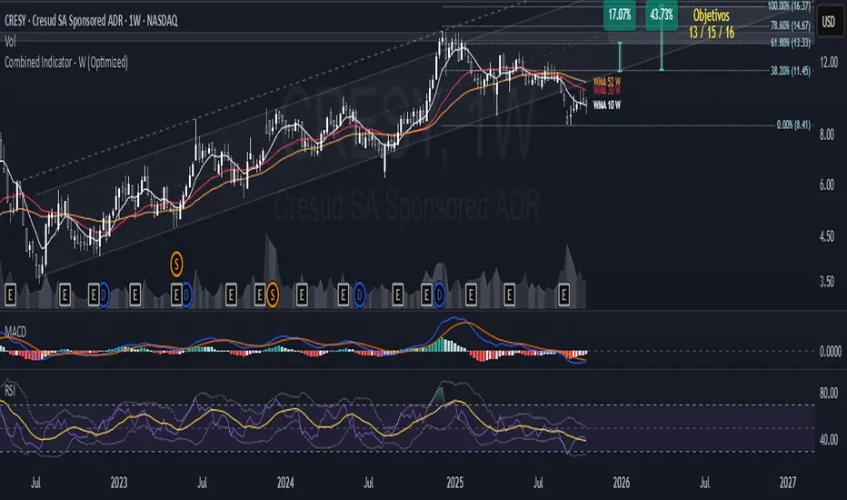
Session Volume Profile HVN210
Session Volume Profile HVN - Comprehensive Indicator Description
Overview
The Session Volume Profile HVN is an advanced volume analysis indicator that provides traders with a visual representation of volume distribution across price levels within defined trading sessions. This powerful tool combines traditional volume profile analysis with High Volume Node (HVN) detection and Volume Point of Control (VPOC) tracking to help identify key support and resistance areas based on trading activity.
Key Features
1. Dynamic Volume Profile Visualization
Creates a comprehensive volume profile for each trading session (daily, weekly, or custom timeframes)
Displays volume distribution as a horizontal histogram, showing where the most trading activity occurred
Automatically scales to fit the price range of each session
Customizable number of price levels (rows) for granular or broad analysis
Profile extension capability to project volume areas into subsequent sessions
2. Volume Point of Control (VPOC)
Automatically identifies and marks the price level with the highest volume in each session
Displays VPOC as a prominent horizontal line that can extend into future sessions
Tracks multiple historical VPOCs with customizable extension limits
Optional date labels for easy identification of when each VPOC was formed
Particularly useful for identifying potential support/resistance levels based on peak trading activity
3. High Volume Node (HVN) Detection
Sophisticated algorithm that identifies significant volume clusters within the profile
Validates HVNs based on customizable strength criteria
Two display options:
Levels: Shows HVNs as horizontal lines (solid for VPOC, dotted for other nodes)
Areas: Displays HVNs as shaded boxes covering the full price range of the node
Color-coded based on price position relative to previous close:
Bullish color for HVNs below the previous close (potential support)
Bearish color for HVNs above the previous close (potential resistance)
4. Multi-Timeframe Analysis
Profile Timeframe: Defines the session boundaries (e.g., daily, weekly, monthly)
Resolution Timeframe: Uses lower timeframe data for more accurate volume distribution
Automatically adjusts to ensure compatibility with chart timeframe
Enables precise volume analysis even on higher timeframe charts
Practical Applications
Support and Resistance Identification
VPOCs and HVNs often act as significant support/resistance levels
Multiple confluent HVNs can indicate strong price zones
Historical VPOC levels provide context for potential price reactions
Trading Strategy Development
Entry/exit points near HVN boundaries
Stop loss placement beyond significant volume nodes
Trend continuation or reversal signals when price breaks through HVN areas
Market Structure Analysis
Identify accumulation/distribution zones
Recognize price acceptance or rejection at specific levels
Understand market participant behavior through volume concentration
Customization Options
Visual Settings
Adjustable colors for profile, VPOC lines, and HVN areas
Line width controls for better visibility
Label size options from tiny to huge
Profile transparency for chart clarity
Technical Parameters
Number of price levels (rows) for profile resolution
HVN detection strength for sensitivity adjustment
VPOC extension count for historical reference
Profile extension percentage for future projection
Display Preferences
Toggle VPOC visibility
Enable/disable HVN display
Choose between line or area representation for HVNs
Control date label display based on timeframe
Best Practices
Timeframe Selection: Choose profile timeframes that align with your trading style (day traders might use hourly profiles, swing traders daily or weekly)
HVN Strength Calibration: Adjust the HVN strength parameter based on market volatility and desired sensitivity
Multiple Timeframe Confirmation: Use different profile timeframes to identify confluence zones
Combination with Other Indicators: Enhance analysis by combining with trend indicators, momentum oscillators, or price action patterns
Performance Considerations
The indicator is optimized for smooth performance while maintaining accuracy through:
Efficient data processing algorithms
Smart memory management for historical data
Automatic cleanup of old visual elements
Scalable architecture supporting up to 500 visual elements
Ideal For
Day Traders: Identifying intraday support/resistance levels
Swing Traders: Finding multi-day accumulation zones
Position Traders: Analyzing longer-term volume structures
Market Analysts: Understanding market participant behavior
Algorithmic Traders: Incorporating volume-based levels into automated strategies

Dizzy HOLO🚀 Dizzy HOLO is an all-in-one professional trading suite designed for serious traders.
It combines Pivot Points, Opening Range Breakout (ORB), HOLO (High of Low / Low of High), Weekly Levels, SMA Thresholds, and Real-Time Alerts into a single lightweight indicator.
🔑 Key Features:
✅ Pivot Points (Fibonacci & Camarilla) – Automatic support & resistance with labels.
✅ Opening Range Breakout (ORB) – Custom session ORB with historical data and breakout alerts.
✅ HOLO Strategy – Daily High/Low, Highest H1 Open, Lowest H1 Close with dynamic buy/sell zones.
✅ Weekly Levels – Previous Week High/Low/Open/Close with extended dotted projections.
✅ SMA Threshold Zones – Dynamic SMA with gray zone filter and trend-based candle coloring.
✅ Multi-Timeframe Analysis – Auto-switching pivots & real-time confirmation.
✅ Smart Alerts – Pivot breakouts, ORB levels, HOLO crosses, and Weekly breaks.
🎯 Why Use Dizzy HOLO?
This indicator is built for breakout, reversal, and trend traders. It provides clear market structure, liquidity zones, and actionable alerts so you never miss important setups.
🛠️ Best Suited For:
Intraday scalpers
Swing traders
Breakout traders
HOLO strategy followers
Multi-timeframe traders

MTF MomentumUniqueness:
MTF Momentum is designed to provide true multiple-timeframe information at once on a single screen with as little clutter as possible. What makes MTF Momentum unique is the way it condenses the perspectives of our other internal models into a single bullish or bearish slope near the current candle, then automatically draws the same bullish or bearish momentum slopes of the next higher timeframes. The structure is engineered to highlight shifts in momentum as they happen on the current candle (angled lines), marking potential reversal points as they build (red and green diamonds), and provides a numerical Q-Score that draws a horizontal marker for elevated Q-Score exhaustion. The design avoids telling you when to buy or sell. Instead, it structures the raw inputs in a way that makes interpretation easier. That makes it useful whether you’re trading actively or simply learning to recognize how momentum flows across layers.
Usefulness:
This indicator is designed to work across multiple timeframes. Instead of juggling the same indicator on 3 different screens, you can see a unified picture that captures both the local momentum and higher timeframes that provide time-dimensional context. When short-term and higher-timeframe angles point in the same direction, MTF Momentum makes that visible in a straightforward way and may help highlight when momentum is consistent across multiple timeframes. When short-term layers push against a stronger higher timeframe, it signals that momentum may be shifting or exhausting. This indicator provides an efficient workflow and helps reduce clutter.
How It Works:
At its core, MTF Momentum is a blend of momentum readings from multiple sources — RSI slopes, EMA stacks, Gaussian smoothing, Fisher-style transforms, and MACD widening analysis built from the same shared core mathematical engines as our other indicators. The uniqueness of this indicator is not tied to any single formula as each component is well-known, but it is in the way they are layered, smoothed, and consolidated that entirely new readings are created.
The process begins with multiple RSI calculations, offset and averaged to reduce jitter. These are smoothed through EMA stacks of varying lengths, then run through Gaussian-style filters that emphasize directional change while filtering noise. The slope differences across these layers form the foundation of the momentum calculation. This momentum reading is then checked against MACD widening conditions. MACD gap expansion is treated as a momentum confirmation — widening gaps with price in agreement add weight, while narrowing gaps or misaligned candles reduce confidence. Additional derivative logic, including Fisher-style transforms, is applied to normalize the outputs and make them more stable across different assets.
Multi-timeframe integration comes from using request.security to pull higher timeframe versions of the same structures that are on the base chart. For example, you can see a one-minute chart overlaid with five-minute and fifteen-minute context. The blending is seamless — higher timeframe momentum is displayed alongside lower timeframe signals that help the user see where current timeframe momentum is in relation to higher timeframes.
How to Use the MTF Momentum Indicator:
Applying the MTF Momentum indicator is straightforward, but interpretation depends on your process.
To use, load the indicator on your preferred base timeframe. Use this general guideline to setup your indicators:
Base timeframe -> 1st HTF -> 2nd HTF
1min -> 5min -> 15min
5min -> 15min -> 1hr
15min -> 1hr -> 4hr
1hr -> 4hr -> 1day
4hr -> 1day -> Weekly
1day -> Weekly -> Monthly
Weekly -> Monthly -> Yearly
When used at base timeframes at 1 hour or lower, higher timeframe lines ARE drawn automatically.
When using a base timeframe above 1 hour (e.g., 4h, Daily), higher-timeframe slopes are NOT drawn automatically. To view them, switch to the higher-timeframe chart itself (for example, Daily or Weekly) and draw an arrow along the slope using TradingView’s drawing tools. Once placed, the arrow will remain visible when you return to your lower base timeframe chart, giving you the higher-timeframe context alongside your current view. This step is optional, purely for visual reference, and does not affect the indicator’s calculations.
These are your higher timeframe momentum angles that can help provide context to the automatically drawn angle on your current timeframe. You can even practice drawing these lines on the lower timeframes such as using a 5min base and 15min and 1hr HTF charts. You can compare your manually drawn angles with the automatic HTF lines by enabling them in the INPUTS tab of the MTF Momentum settings menu.
Q-SCORE:
The Q-Score label presents two values ranging from 0 to 100. These values are a numerical translation of the same momentum conditions our other indicators display visually. Higher values indicate stronger readings of exhaustion within the current trend model, while lower values indicate less. You can think of this as similar to a distribution curve, where some states occur less frequently at the extreme ends of the range and more frequently near the middle. Q-Score values are provided as contextual information only and do not predict reversals or guarantee outcomes.
Blue Dotted & Solid Horizontal line:
The aqua blue horizontal line is a visual representation of the Q-Score values. When one or both numerical values is below 85 the line stays dotted -- it is only when both numerical values exceed 85 that the line changes from dotted to solid.
Green & Red Diamonds:
Diamonds mark areas where the underlying model detects counter-trend behavior. They may flicker on the current candle during intrabar calculations but are locked in at candle close and never get altered or repainted.
Red diamonds highlight points where the model detects counter-trend pressure during a bullish phase. Green diamonds highlight counter-trend pressure during a bearish phase. These markers reflect where momentum conditions have shifted relative to the prevailing trend. They appear where short-term dynamics differ from the broader trend. Traders can interpret these areas in their own context; the diamonds themselves do not predict reversals or guarantee outcomes.
Example ways to use the MTF Momentum indicator:
Look for agreement -- when both your base timeframe and higher timeframe momentums are pointing in the same direction, it reflects stronger alignment. This may help identify areas of trend continuation.
Watch for divergence -- if your short-term momentum pushes opposite to the higher timeframe, it flags a potential transition.
Disclaimer:
This tool does not generate buy or sell signals. It is a framework for visualizing momentum across layers, allowing you to incorporate that information into your own decision-making. How you apply it depends entirely on your goals, timeframe, and risk tolerance. This indicator is provided for educational and informational purposes only. It does not constitute financial advice, trading advice, or investment recommendations. Trading involves risk, and you may lose some or all of your capital. Past performance is not a guarantee of future results. You are solely responsible for any decisions you make — always trade to the best of your own abilities and within your own risk tolerance.
Release Notes:
v1.0 (Initial Release)
SOL Dashboard v6 — Investor / Swing / Scalp (VWAP, ATR, RS (SCP)
**SOL Dashboard v6 — Investor / Swing / Scalp (VWAP, ATR, RSI, BTC\Ð influence, noise-filters)**
**In short:** a universal indicator for SOLUSDT (Spot/Futures), combining three analysis horizons — Investor (D1), Swing (H1/H4), and Scalp (5m/3m/1m) — in a single script. It provides clean signals (arrows), a summary table of layer states, alerts, as well as a set of noise filters (VWAP/RSI/volume/EMA “gap”/candle body requirement/cooldown). Optional BTC/ETH trend influence filters are available. Suitable for both spot and futures.
---
### What the indicator does
**Investor (HTF, default D1):** market background. EMA(50/200) → defines long-term phase (BULL/BEAR/NEUTRAL).
**Swing (MTF, default H1):** medium-term direction. EMA(20/50) + weekly VWAP (option).
**Scalp (LTF, default 5m):** quick entries. EMA(9/21) → SCALP BUY/SELL arrows strictly at the crossover candle, plus filters.
---
### Visual elements
* EMA lines for each layer (toggled on/off).
* VWAP lines: daily (scalp filter) and weekly (swing filter).
* SCALP BUY / SCALP SELL arrows (optional).
* Table in the top-right corner: Investor/Swing/Scalp modes and hints (including BTC/ETH states if influence is enabled).
* (Optional) Debug label — shows which filter is blocking the signal (RSI/VWAP/GAP/BODY/VOL/AGREE/CD).
---
### Signals (arrow logic)
**Base trigger:** crossover(EMA Fast, EMA Slow) on bar close (default EMA9/21 for LTF).
Arrows appear only if confirmations are met:
1. EMA slope matches signal (both rising for BUY / both falling for SELL).
2. Candle closed on the “correct” side of both EMAs (above/below).
3. Noise filters (toggleable/configurable):
* VWAP (daily): BUY only above VWAP; SELL only below.
* RSI(14): BUY if RSI>50; SELL if RSI<50.
* EMA-Gap (%): minimum difference between Fast/Slow EMAs (avoids micro-crossovers in chop).
* Body ratio: minimum body-to-range ratio (filters out dojis/wicks).
* Volume filter: volume ≥ median over N bars (default 20).
* Cooldown: minimum bars between same-direction signals.
4. Trend agreement (optional): requires alignment with Swing and BTC/ETH Swing modes.
**Result:** an arrow appears at the crossover only if all active filters are satisfied.
---
### Alerts
* **SCALP BUY (filtered):** “ETH/SOL scalp BUY (cross-confirmed)”
* **SCALP SELL (filtered):** “ETH/SOL scalp SELL (cross-confirmed)”
* (Optional) EXIT signals (if included in your build): exit on opposite side of EMA25 or VWAP.
---
### BTC/ETH influence (optional)
* Toggleable trend filters:
* Script checks BTCUSDT and/or ETHUSDT Swing states (EMA20/50 on H1/H4).
* BUY only if BTC/ETH are in BULL and SOL(H1) is BULL.
* SELL only if all corresponding Swing modes are BEAR.
This increases accuracy in trending markets (can be disabled in chop if you want more entries).
---
### Recommended presets
**1) Conservative (cleaner, less noise):**
* LTF = 5m (or 3m); EMA 9/21
* VWAP daily: ON, RSI: ON
* minEmaGapPct: 0.12–0.14%
* minBodyRatio: 0.60–0.70
* cooldownBars: 7–10
* BTC/ETH agreement: ON
* confirmBars: 1 (or 0 in trends)
**2) Base (balanced):**
* LTF = 5m; EMA 9/21
* VWAP: ON, RSI: ON
* minEmaGapPct: 0.08–0.12%
* minBodyRatio: 0.55–0.65
* cooldownBars: 5–7
* BTC/ETH agreement: ON in trend / OFF in chop
* confirmBars: 0 (or 1 in chop)
**3) Aggressive (more entries):**
* LTF = 3m or 1m; EMA 7/14 (or 7/25 if enabled)
* VWAP: ON, RSI: ON
* minEmaGapPct: 0.06–0.08%
* minBodyRatio: 0.50
* cooldownBars: 3–5
* BTC/ETH agreement: OFF in chop
* confirmBars: 0 (or 1 if too many false signals)
---
### How to read the summary table
* **Investor (D1):** EMA50 vs EMA200 → BULL/BEAR/NEUTRAL.
* **Swing (H1/H4):** EMA20 vs EMA50 (+ W-VWAP) → trade direction.
* **Scalp (LTF):** EMA Fast vs EMA Slow → short-term phase.
* **BTC / ETH (Swing):** their states (if influence enabled).
👉 Alignment of Investor + Swing + Scalp in one direction = maximum trend strength.
👉 Disagreement = reduce position size / wait for confirmation.
---
### Practical application
* **Entries:** SCALP arrows in Swing direction (and optionally BTC/ETH) + above/below VWAP.
* **Stops:** recommended ATR(14, LTF) × 1.6–2.0 (or beyond EMA21/EMA25).
* **Targets:** at least 1.8–2.2 R, take 30–50% at +1R, leave remainder as trailing (EMA9/EMA25/VWAP).
* **Trend filter:** trade longs mainly when price > daily VWAP and Swing = BULL (and vice versa).
---
### Settings (key parameters)
* Independent TFs for Investor / Swing / Scalp.
* EMA Fast/Slow set separately for each layer.
* VWAP (Daily/Weekly) as toggleable filters.
* RSI filter (BUY >50 / SELL <50).
* Noise filters: EMA-Gap, Body ratio, Volume ≥ median, Cooldown.
* Trend agreement: BTC/ETH Swing + SOL Swing.
* Debug mode: shows which filter is blocking a signal.
---
### FAQ
**Why no arrows when “crossover is visible”?**
Because arrows are plotted on bar close only if all active filters (VWAP/RSI/GAP/BODY/VOL/AGREE/CD) are satisfied. Enable Debug to see which filter blocks the signal.
**When to enable BTC/ETH influence?**
In trending markets → ON (accuracy ↑). In chop, if you want more entries → OFF.
**Works on Spot/Futures?**
Yes. But remember: futures fees are charged on position notional, not margin — factor this into risk management.
---
### Disclaimer
This is a research tool. Not financial advice. Trading crypto assets and derivatives carries high risk (especially with leverage). Always use stop-losses and manage risk per trade.
---
\#SOL #SOLUSDT #Scalping #Swing #Investor #VWAP #EMA #RSI #ATR #Crypto #Futures #NoiseFilters #BTCInfluence #ETHInfluence #TrendFilter #TradingView

SMR - Simple Market Recap📊 Simple Market Recap (SMR)
🎯 A comprehensive market overview tool displaying price changes, percentage movements, and status indicators for multiple financial instruments across customizable timeframes with intelligent data synchronization.
━━━━━━━━━━━━━━
📋 OVERVIEW
The Simple Market Recap indicator provides a professional market analysis dashboard that displays key performance metrics for major financial instruments. This educational tool features intelligent asset selection, automatic dark mode detection, comprehensive period analysis with bilingual support, and advanced data synchronization ensuring accurate price data regardless of the current chart symbol.
Perfect for:
Market overview analysis and educational study
Multi-asset performance comparison and research
Weekly, daily, and monthly market recap visualization
Educational purposes and market trend analysis
━━━━━━━━━━━━━━
🚀 KEY FEATURES & ENHANCEMENTS
🌙 Intelligent Dark Mode Detection
Automatic chart background color analysis and adaptation
Dynamic color scheme adjustment for optimal visibility
Enhanced contrast ratios for both light and dark themes
Professional appearance across all chart backgrounds
📊 Comprehensive Asset Coverage
Major Forex Pairs: EURUSD, GBPUSD, AUDUSD, NZDUSD, USDCHF, USDJPY, USDCAD
Indices & Dollar: DXY (US Dollar Index), SPX (S&P 500)
Commodities: XAUUSD (Gold), USOIL (Crude Oil)
Bonds: US10Y (10-Year Treasury)
Cryptocurrencies: BTCUSDT, ETHUSDT
Selective asset display with individual on/off controls
Fixed asset order: DXY, EURUSD, GBPUSD, AUDUSD, NZDUSD, USDCHF, USDCAD, USDJPY, XAUUSD, USOIL, SPX, US10Y, ETHUSDT, BTCUSDT
⏰ Flexible Timeframe Analysis
Multiple Periods: Daily (1D), Weekly (1W), Monthly (1M)
Time Selection: Current Period or Previous Period analysis
Dynamic Titles: Automatic report naming with dates and periods
Historical Comparison: Compare current vs previous period performance
📈 Enhanced Data Visualization
Professional table with adaptive row count based on selected assets
Color-coded price movements: Enhanced green for positive, bright red for negative
Status emojis: ↗️ Up, ↘️ Down, ↔️ Sideways, ❓ No data
Smart price formatting based on asset type and price level
Improved contrast colors for better visibility in all lighting conditions
🔄 Advanced Data Synchronization
Symbol-Independent Accuracy: Correct data display regardless of current chart symbol
Real-Time Security Requests: Direct data fetching from specific instrument sources
Cross-Asset Reliability: Accurate price data for all monitored assets simultaneously
Data Integrity: No cross-contamination between different financial instruments
━━━━━━━━━━━━━━
🎨 PROFESSIONAL TABLE LAYOUT
Adaptive Design Features:
Automatic dark mode detection and color adaptation
Enhanced contrast ratios for better readability
Professional color scheme with clear data separation
Responsive design for all screen sizes and themes
Comprehensive Data Display:
Dynamic Title Row: Period-specific report titles with dates
Asset Column: Selected financial instruments
Open/Close Prices: Period opening and closing values
Change Percentage: Color-coded performance indicators
Pips Movement: Precise pip calculations for each asset
Status Indicators: Visual emoji representations of trend direction
Visual Design Features:
Merged title cells for clean header presentation
Asset-specific price formatting for optimal readability
Color-coded positive/negative movements
Professional table borders and spacing
━━━━━━━━━━━━━━
⚙️ ADVANCED CUSTOMIZATION
Timeframe Controls:
Report Period selection: Daily, Weekly, or Monthly analysis
Time Selection toggle: Current vs Previous period comparison
Dynamic row count based on active asset selection
Automatic title generation with period-specific formatting
Asset Selection:
Individual toggle controls for each supported asset
Major forex pairs with complete coverage
Cryptocurrency and precious metals options
Index and commodity instrument support
Display Options:
9 table positioning options across the entire chart
5 text size levels from Tiny to Huge for optimal visibility
Language selection between English and Vietnamese
Automatic theme adaptation for all chart backgrounds
━━━━━━━━━━━━━━
⚠️ EDUCATIONAL & ANALYTICAL PURPOSE
This indicator is designed exclusively for educational market analysis and research purposes .
📚 Educational Applications:
Understanding multi-asset market performance correlation
Studying period-based price movements and trends
Analyzing market volatility across different timeframes
Learning to read and interpret market recap data
📊 Analysis Capabilities:
Market overview visualization for educational study
Multi-timeframe performance comparison research
Historical period analysis and trend identification
Cross-asset correlation studies and market research
🚨 Important Disclaimer: This tool provides educational market data visualization only and does NOT generate trading signals or investment advice. All data is for learning and analysis purposes. Users must conduct independent research and consult financial professionals before making any investment decisions.
━━━━━━━━━━━━━━
🛠️ SETUP & CONFIGURATION
Quick Start Guide:
Add the indicator to your chart from the indicators library
Select your preferred language (English or Vietnamese)
Choose your desired reporting timeframe (Daily, Weekly, or Monthly)
Select Current Period or Previous Period for analysis
Toggle on/off specific assets you want to monitor
Adjust table position and text size for optimal viewing
Advanced Configuration:
Customize asset selection based on your analysis needs
Configure timeframe settings for different market studies
Set up language preferences for your region
Fine-tune display options for your screen setup
Optimize table positioning for your chart layout
Theme Optimization:
Indicator automatically detects your chart theme
Colors adapt automatically for optimal contrast and readability
No manual adjustments required for theme changes
Professional appearance maintained across all backgrounds
━━━━━━━━━━━━━━
🔧 TECHNICAL SPECIFICATIONS
Performance & Reliability:
Pine Script v6 with optimized data retrieval
Real-time updates with minimal CPU and memory usage
No repainting or lookahead bias in calculations
Stable performance across all timeframes and instruments
Universal Compatibility:
Works with all TradingView chart types and instruments
Compatible with mobile and desktop platforms
Supports all timeframes with period-specific analysis
Cross-platform functionality with consistent behavior
Data Precision:
High-precision floating-point calculations
Asset-specific formatting and pip calculations
Real-time price data from multiple exchanges
Accurate percentage and movement calculations
Advanced Features:
Automatic chart background detection and color adaptation
Dynamic table sizing based on active asset selection
Intelligent price formatting for different asset classes
Professional status indicators with emoji visualization
━━━━━━━━━━━━━━
📋 VERSION HISTORY
v1.7 - Enhanced Data Synchronization & Color Improvements
Fixed critical data synchronization issue - accurate data regardless of current chart symbol
Enhanced data retrieval system with symbol-specific security requests
Improved color scheme: brighter red for negative values, enhanced contrast
Fixed asset order: DXY, EURUSD, GBPUSD, AUDUSD, NZDUSD, USDCHF, USDCAD, USDJPY, XAUUSD, USOIL, SPX, US10Y, ETHUSDT, BTCUSDT
Optimized price formatting with proper decimal display and leading zeros
Enhanced calendar-based time calculations for accurate period reporting
Improved pip calculations for different asset classes
Professional color coding with adaptive contrast for all themes
Previous Versions:
v1.6 - Data accuracy improvements and bug fixes
v1.5 - Enhanced market analysis with flexible timeframes
v1.4 - Professional table layout and bilingual support
Earlier versions - Core market data display functionality development
━━━━━━━━━━━━━━
Author: tohaitrieu
Version: 1.7
Category: Market Analysis / Educational Overview
Language Support: English, Vietnamese
License: Educational Use Only
This indicator is provided exclusively for educational and analytical purposes to help users understand market overview concepts and multi-asset analysis. It features automatic theme adaptation, flexible timeframe analysis, enhanced data synchronization, and comprehensive market data visualization for the most accurate and informative educational experience. It does not provide trading signals or investment advice. Always conduct thorough research and consider professional guidance before making financial decisions.

Monday's Range Superpowerkyu🔔 Settings
You can customize the colors and toggle ON/OFF in the indicator settings.
Works on daily, hourly, and minute charts.
Easily visualize Monday’s high, low, and mid-line range.
📌 1. Support & Resistance with Monday’s Range
Monday High: Acts as the first resistance of the week.
◽ Example: If price breaks above Monday’s high after Tuesday, it signals potential bullish continuation → long setup.
Monday Low: Acts as the first support of the week.
◽ Example: If price breaks below Monday’s low, it signals bearish continuation → short setup.
📌 2. Mid-Line Trend Confirmation
Monday Mid-Line = average price of Monday.
Price above mid-line → bullish bias.
Price below mid-line → bearish bias.
Use mid-line breaks as entry confirmation for long/short positions.
📌 3. Breakout Strategy
Break of Monday’s High = bullish breakout → long entry.
Break of Monday’s Low = bearish breakout → short entry.
Place stop-loss inside Monday’s range for a conservative approach.
📌 4. False Breakout Strategy
If price breaks Monday’s high/low but then falls back inside Monday’s range, it is a False Breakout.
Strategy: Trade in the opposite direction.
◽ False Breakout at High → short.
◽ False Breakout at Low → long.
Stop-loss at the wick (extreme point) of the failed breakout.
📌 5. Range-Based Scalping
Use Monday’s high and low as a trading range.
Sell near Monday’s High, buy near Monday’s Low, repeat until breakout occurs.
📌 6. Weekly Volatility Forecast
Narrow Monday range → higher chance of strong trend later in the week.
Wide Monday range → lower volatility expected during the week.
📌 7. Pattern & Trend Analysis within Monday Range
Look for candlestick patterns around Monday’s High/Low/Mid-Line.
◽ Example: Double Top near Monday’s High = short setup.
◽ Repeated bounce at Mid-Line = strong long opportunity.
✅ Summary
The Monday’s Range (Superpowerkyu) Indicator helps traders:
Identify weekly support & resistance
Confirm trend direction with Mid-Line
Trade breakouts & false breakouts
Apply range scalping strategies
Forecast weekly volatility
⚡ Especially, the False Breakout strategy is powerful as it captures failed moves and sudden sentiment reversals.