BitGin 3 Scalping Method AlertCombined 3 indicators
WaveTrend with Crosses
Ehlers Stochastic CG Oscillator
Slow Stochastic
Buscar en scripts para "wave"

Dominant Cycle Tuned RsiIntroduction
Adaptive technical indicators are importants in a non stationary market, the ability to adapt to a situation can boost the efficiency of your strategy. A lot of methods have been proposed to make technical indicators "smarters" , from the use of variable smoothing constant for exponential smoothing to artificial intelligence.
The dominant cycle tuned rsi depend on the dominant cycle period of the market, such method allow the rsi to return accurate peaks and valleys levels. This indicator is an estimation of the cycle finder tuned rsi proposed by Lars von Thienen published in Decoding the Hidden Market Rhythm/Fine-tuning technical indicators using the dominant market vibration/2010 using the cycle measurement method described by John F.Ehlers in Cybernetic Analysis for Stocks and Futures .
The following section is for information purpose only, it can be technical so you can skip directly to the The Indicator section.
Frequency Estimation and Maximum Entropy Spectral Analysis
“Looks like rain,” said Tom precipitously.
Tom would have been a great weather forecaster, but market patterns are more complex than weather ones. The ability to measure dominant cycles in a complex signal is hard, also a method able to estimate it really fast add even more challenge to the task. First lets talk about the term dominant cycle , signals can be decomposed in a sum of various sine waves of different frequencies and amplitudes, the dominant cycle is considered to be the frequency of the sine wave with the highest amplitude. In general the highest frequencies are those who form the trend (often called fundamentals) , so detrending is used to eliminate those frequencies in order to keep only mid/mid - highs ones.
A lot of methods have been introduced but not that many target market price, Lars von Thienen proposed a method relying on the following processing chain :
Lars von Thienen Method = Input -> Filtering and Detrending -> Discrete Fourier Transform of the result -> Selection using Bartels statistical test -> Output
Thienen said that his method is better than the one proposed by Elhers. The method from Elhers called MESA was originally developed to interpret seismographic information. This method in short involve the estimation of the phase using low amount of information which divided by 360 return the frequency. At first sight there are no relations with the Maximum entropy spectral estimation proposed by Burg J.P. (1967). Maximum Entropy Spectral Analysis. Proceedings of 37th Meeting, Society of Exploration Geophysics, Oklahoma City.
You may also notice that these methods are plotted in the time domain where more classic method such as : power spectrum, spectrogram or FFT are not. The method from Elhers is the one used to tune our rsi.
The Indicator
Our indicator use the dominant cycle frequency to calculate the period of the rsi thus producing an adaptive rsi . When our adaptive rsi cross under 70, price might start a downtrend, else when our adaptive rsi crossover 30, price might start an uptrend. The alpha parameter is a parameter set to be always lower than 1 and greater than 0. Lower values of alpha minimize the number of detected peaks/valleys while higher ones increase the number of those. 0.07 for alpha seems like a great parameter but it can sometimes need to be changed.
The adaptive indicator can also detect small top/bottoms of small periods
Of course the indicator is subject to failures
At the end it is totally dependent of the dominant cycle estimation, which is still a rough method subject to uncertainty.
Conclusion
Tuning your indicator is a great way to make it adapt to the market, but its also a complex way to do so and i'm not that convinced about the complexity/result ratio. The version using chart background will be published separately.
Feel free to tune your indicators with the estimator from elhers and see if it provide a great enhancement :)
Thanks for reading !
References
for the calculation of the dominant cycle estimator originally from www.davenewberg.com
Decoding the Hidden Market Rhythm (2010) Lars von Thienen
Ehlers , J. F. 2004 . Cybernetic Analysis for Stocks and Futures: Cutting-Edge DSP Technology to Improve Your Trading . Wiley

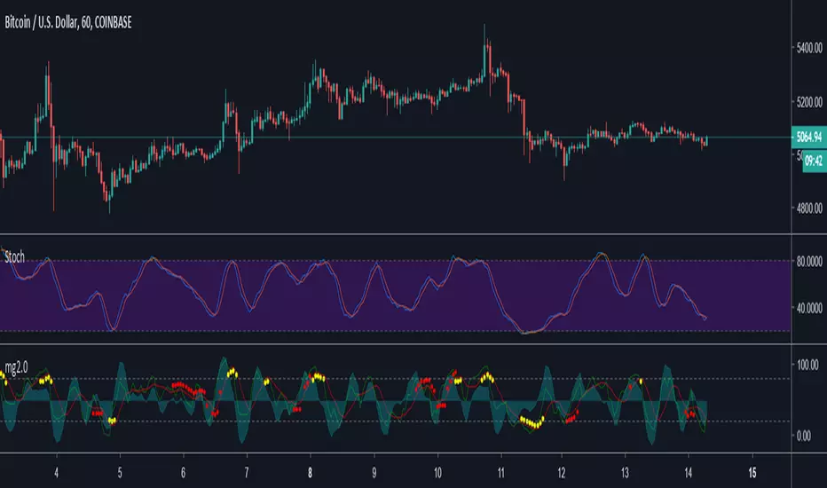
Minimal Godmode 2.0Second iteration of Minimal Godmode with in-line TTM Squeeze linked to godmode channel length, TTSI from godmode 4.0.0, and new LRSI + CBCI calculations for godmode engine.
Note: Like the original godmode, this indicator is designed specifically for use in trading BTC/XBT pairs.
Surface Roughness EstimatorIntroduction
Roughness of a signal is often non desired since smooth signals are easier to analyse, its logical to say that anything interacting with rough price is subject to decrease in accuracy/efficiency and can induce non desired effects such as whipsaws. Being able to measure it can give useful information and potentially avoid errors in an analysis.
It is said that roughness appear when a signal have high-frequencies (short wavelengths) components with considerable amplitudes, so its not wrong to say that "estimating roughness" can be derived into "estimating complexity".
Measuring Roughness
There are a lot of way to estimate roughness in a signal, the most well know method being the estimation of fractal dimensions. Here i will use a first order autocorrelation function.
Auto-correlation is defined by the linear relationship between a signal and a delayed version of itself, for exemple if the price goes on the same direction than the price i bars back then the auto-correlation will increase, else decrease. So what this have to do with roughness ? Well when the auto-correlation decrease it means that the dominant frequency is high, and therefore that the signal is rough.
Interpretation Of The Indicator
When the indicator is high it means that price is rough, when its low it indicate that price is smooth. Originally its the inverse way but i found that it was more convenient to do it this way. We can interpret low values of the indicator as a trending market but its not totally true, for example high values dont always indicate that the market is ranging.
Here the comparison with the indicator applied to price (orange) and a moving average (purple)
The average measurement applied to a moving average is way lower than the one using the price, this is because a moving average is smoother than price.
Its also interesting to see that some trend strength estimator like efficiency ratio can treat huge volatility signals as trend as shown below.
Here the efficiency ratio treat this volatile movement as a trending market, our indicator instead indicate that this movement is rough, such indication can avoid situation where price is followed by another huge volatile movement in the opposite direction.
Its important to make the distinction between volatility and trend strength, the trend is defined by low frequencies components of a signal, therefore measuring trend strength can be resumed as measuring the amplitude of such frequencies, but roughness estimation can do a great job as well.
Conclusion
I have showed how to estimate roughness in price and compared how our indicator behaved in comparison with a classic trend strength measurement tool. Filters or any other indicator can be way more efficient if they know how to filter according to a situation, more commonly smoothing more when price is rough and smoothing less when price is smooth. Its good to have a wider view of how market is behaving and not sticking with the binary view of "Trending" and "Ranging" .
I hope you find a use to this script :)
Best Regards

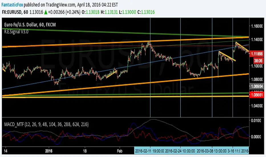
BE-EMA(12,26) (Blue Empire Exponential Moving Average)
Simple EMA where you get a CROSS mark between EMA 12 and EMA 26.
Each time a cross happens, a spot gets created.
If it's cyan, it goes up.
If it's magenta, it goes down.
I'm studying Trading at Blue Empire Academy, if you want to know more send me a PM.
Wave Analysis study the wave's behavior and tries to predict by using trendlines, elliot waves, fibonacci retracements, and EMAs basically.
In this Indicator, It's a confirmation when EMA 12 goes over to confirm the price may go up. and Vice versa.
Hope you like, please share if you think it's useful and comment if you think this can be better.
Thank you again for reading
>> This is just an indicator, it doesn't predict the future. Use it at your own risk. <<
##########
All the credits to @tracks, a genius who helped me polish the code. :] thank you.

SMMA Analyses - Buy / Sell signals and close position signals This script combines the usage of the SMMA indicator in order to provide signals for opening and closing trades, either buy or sell signals.
It uses two SMMA , a fast and a slow one, both configurable by the users.
The trigger of Buy and Sell Signals are calculated through the SMMA crosses:
Buy Signals : The fast SMMA crosses over the slow SMMA . They are highlighting by a green area and a "B" label.
Sell Signals : The fast SMMA crosses under the slow SMMA . They are highlighting by a red area and a "S" label
The trigger of Close Buy and Close Sell Signals are calculated through the close price crosses with the fast SMMA:
Close Buy Signals : The fast SMMA crosses under the close price and at the same time the trend is bullish , so the fast SMMA is greater than the slow SMMA . They are highlighted by a lighter green area
Close Sell Signals : The fast SMMA crosses over the close price and at the same time the trend is bearish , so the fast SMMA is lower than the slow SMMA . They are highlighted by a lighter red area
Few important points about the indicator and the produced signals :
This is not intended to be a strategy, but an indicator for analyzing the SMMA conditions. It gives you the triggers depending on the real time analysis of the SMMA and prices, but not being a proper strategy, pay attention about "fake signals" and add always a visual analysis to the provided signals
Following this indicator, the trade positions should be opened only when a cross happens. Either in this case, analyse the chart in order to see if the signals are a "weak" ones, due to "waves" around the SMMA . In these cases, you might wait for the next confirmation signals after the waves, when the trend will be better defined
The close trade signals are provided in order to help to understand when you should close the buy or sell trades. Even in this case, always add a visual analysis to the signals, and pay attention to the support/resistance areas. Sometimes, you can have the close signals in correspondence to support/resistance areas: in these cases wait for the definition of the trend and eventually for the next close trade signals if they will be better defined

Fractal HelperA spinoff from a previous script I published, this configurable indicator also selects highs and lows and then plots a trend line that bounces between them. In addition, it also iterates this up to two more times in a quasi-fractal manner, on larger time scales, and plots them on the same graph.
Of course this will not spit out Elliott waves, but with adjusting, it could aid in discerning one wave from another.
I may experiment with the security function again to get a better, longer L3 plot, although charts are limited in duration anyway.

CMYK XIAM OPEN◊ Introduction
This is project XIAM, a work in progress.
Recently i came across the repainting problem.
Since then i haven't seen any bot-code that makes > 5% profit in two weeks with 0.25% fees/trade.
People who make good bots either bluff or don't share the code.
they let you rent it.
I aim to understand, learn it, write it myself. And share my findings with whoever shares with me.
◊ Origin
Based on RMI (RSI with momentum) and SMA, and values derived from those.
◊ Usage
Currently an investigative script.
◊ Theoretical Approaches
Philosophy α :: Cleansignal
:: Cleaning up the signal, from irregularities that cause unpredictable results.
Merging available tickers of a pair into one.
Merging available tickers of different coins into one in the correct proportion. (eg. Crypto market cap)
Removing Jitter, and smoothing signal without delay.
Philosophy β :: Rythmic
:: Syncing into the rythm's, to never miss the que, and trade on every theoretical low/high
Searching Amplitude, Period, Phase Shift, Frequency's of the carrier waves.
Marking Acrivity/inactivity of the carrier waves.
Partial Fractal repetition asses-able with above data?
Philosophy γ :: consequential
:: Seeking for Indicatory events and causal relations
Probability / reward.
Confirmation and culmination.
...
◊ Community
Wanna share your findings ? or need help resolving a problem ?
CMYK :: discord.gg
AUTOTVIEW :: discordapp.com

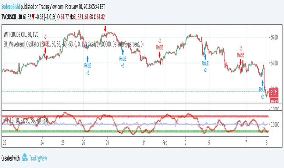
SB_Wavetrend_OscillatorA take on LazyBear's Wavetrend_Oscillator
The idea is bit modified.
Original Idea:
When the oscillator is above the overbought band (red lines) and crosses down the signal (dotted line), it is usually a good SELL signal. Similarly, when the oscillator crosses above the signal when below the Oversold band (green lines), it is a good BUY signal.
Modified Idea:
Carrying the original idea, if the oscillator crosses the overbought band (red lines) and crosses down the signal (dotted line) twice without crossing the Oversold band (green lines) and crosses above the signal (dotted line), a buy or sell signal will take place when the oscillator crosses the dotted line and the value of oscillator is >0(if sell order is to be placed) and <0(if buy order is to be placed).
For the original idea you can refer to:
Let me know if any refinements could improve the oscillator.

Noro's SILA v1.6LIn 1.6:
1) WaveTrend Oscilator (LazyBear's code)
2) Locomotive-pattern
3) A new distance for SILA lines
Noro's SILA v1.6L - the original and new system of finding of a trend.
SILA is not one trend indicator, but 8 different trend indicators in one. Therefore high precision.
For:
- any pair
- any timeframe >= H1

Fractal Quad Components8 Fractal Resonance Component indicators on a chart eats up LOTS of vertical space, so we're providing this Fractal Quad Components script to group 4 components a bit more compactly (eliminating the margin whitespace between indicator rows).
To view 8 components you'll need to add a second instance of this script to your chart and set its Base Timescale Multiplier to 16. Then grab the dividers to stretch both instances to a good viewing height.
One disadvantage of this grouping method is that to read off the x2, x4, and x8 lead and lag line values, you'll need to mentally add 200, 400 or 600 respectively.
We also replaced the "Extreme" > +-100% black crosses (+) with more subtle purple circle outlines. These extreme crosses are often (but not always) too early to be a major reversal so it's best not to overemphasize them.
Significant crosses (> +-75%) are still highlighted with black circle outlines, and are the most likely to be major reversals for buy/sell.
Note how the 30-minute oscillator (2nd row) showed the cleanest (black-outlined) reversals on the S&P for the last week of 2016, with just a bit more profit-eating lag than the 15-minute oscillator above.

MACD MultiTimeFrame 1h4h1D [Fantastic Fox]Please insert the indicator into 1h time-frame, otherwise you need to change the lengths' inputs.
When there are tops for two of the MACDs and they are near and close* to each other, there is a big opportunity of a "Major Top" for the security, and vice versa for "Major Bottom".
This indicator can be used for tracing multi time-frame divergence. Also, it could help traders to identify the waves of Elliott Wave, and as a signal for confirmation of an impulse after a correction or retracement.
* They should be on top of each others head, not crossing each other. not necessarily touching, but not so far from each other.
Ehlers Smoothed Stochastic & RSI with Roofing FiltersRoofing filters, first discussed by Mr.John Ehlers, act as a passband, filtering out unwanted noise from market data and accentuating turning points.
I have included 2 indicators with filters enabled. Both support double smoothing via options page. All the parameters are configurable.
Info on Roofing Filter and Ehlers Super Smoother:
----------------------------------------------------
The Ehlers' Roofing Filter is an expansion on Ehlers Super Smoother Filter, both being smoothing techniques based on analog filters. This filter aims at reducing noise in price data.
In Super Smoother Filter, regardless of the time frame used, all waves having cycles of less than 10 bars are considered noise (customizable via options page). The Roofing Filter uses this principle, however, it also creates a so-called "roof" by eliminating wave components having cycles greater than 48 bars which are perceived as "spectral dilation". Thus, the filter only passes those spectral components whose periods are between 10 and 48 bars. This technique noticeably reduces indicator lag and also helps assess turning points more accurately.
More info:
- Spectral dilation paper: www.mesasoftware.com
- John Ehlers presentation: www.youtube.com
------------------------------------------------------
If you want to use RSI %B and Bandwidth, follow this guide to "Make mine" this chart and get access to the source:
drive.google.com
For the complete list of my indicators, check this post:
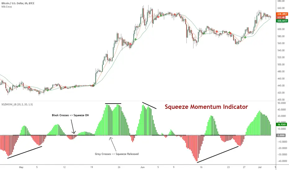
Squeeze Momentum Indicator [LazyBear]
Fixed a typo in the code where BB multiplier was stuck at 1.5. Thanks @ucsgears for bringing it to my notice.
Updated source: pastebin.com
Use the updated source instead of the what TV shows below.
This is a derivative of John Carter's "TTM Squeeze" volatility indicator, as discussed in his book "Mastering the Trade" (chapter 11).
Black crosses on the midline show that the market just entered a squeeze (Bollinger Bands are with in Keltner Channel). This signifies low volatility, market preparing itself for an explosive move (up or down). Gray crosses signify "Squeeze release".
Mr.Carter suggests waiting till the first gray after a black cross, and taking a position in the direction of the momentum (for ex., if momentum value is above zero, go long). Exit the position when the momentum changes (increase or decrease --- signified by a color change). My (limited) experience with this shows, an additional indicator like ADX / WaveTrend, is needed to not miss good entry points. Also, Mr.Carter uses simple momentum indicator, while I have used a different method (linreg based) to plot the histogram.
More info:
- Book: Mastering The Trade by John F Carter
List of all my indicators:
Market Structure Break + RSI ExitSignal Architect™ — Developer Note
This indicator includes a limited visual preview of a proprietary power signal I have personally developed and refined across futures, algorithmic systems, options, and equity trading.
Every tool I release is built with one principle in mind:
clarity of direction without over-promising or under-delivering.
That is why all Signal Architect™ tools emphasize:
Market structure first
High-probability directional context
Clear, visual risk framing
No predictive claims, no curve-fit illusions
What you are seeing here is only a small glimpse of a much broader internal framework I actively use in live environments.
🧠 Background & Scope
Over the years, I have personally developed 800+ programs spanning:
Equities
Futures
Options
Dividend & income systems
Portfolio construction and allocation logic
This includes 40+ Nasdaq-100 trading bots, several of which operate under extremely strict rule-sets and controlled deployment conditions.
Nothing shared publicly represents my full system—only educational and analytical previews designed to demonstrate how structure and probability can be aligned visually.
🤝 Support & Collaboration
If you find value in what I share:
Please subscribe, boost, and share my scripts, Ideas, and MINDS posts
You are always welcome to message me directly with questions or if you need something built or adapted
Constructive feedback and collaboration are encouraged
For traders looking to go deeper, I offer optional memberships that include:
Access to additional signals
Early previews
Occasional free tools and upgrades to support your trading journey
🔗 Membership & Signals:
trianchor.gumroad.com
⚠️ Final Note
Everything published publicly is for educational and analytical purposes only.
Markets carry risk. Discipline and risk management always come first.
— Signal Architect™
You can Find my personally developed GBT below
chatgpt.com
chatgpt.com
chatgpt.com
********************************************************************************************************************WHAT THIS INDICATOR DOES
This indicator is a structure-first breakout engine designed around how price actually transitions between balance and expansion.
It does not predict reversals.
It waits for confirmed market structure breaks, then:
Anchors risk using recent wave extremes
Projects deterministic TP/SL zones
Tracks outcomes visually and statistically
Optionally exits early when momentum exhausts (RSI fade)
This makes it ideal for:
Directional traders
Swing continuation setups
Expansion phases after compression
🧠 CORE SIGNAL ARCHITECT LOGIC
1️⃣ Market Structure Identification
The system uses pivot highs and pivot lows to define true structural levels:
Pivot High break → Long bias
Pivot Low break → Short bias
This avoids:
Random candle breakouts
Intrabar noise
False momentum spikes
Only confirmed structural levels are traded.
2️⃣ Entry Trigger (Structure Break)
A trade is triggered only when price closes through structure:
Direction Requirement
Long Close breaks above last confirmed pivot high
Short Close breaks below last confirmed pivot low
📌 Important:
No signal fires if you are already in a trade — one position at a time, clean sequencing.
3️⃣ Stop-Loss Logic (Wave-Anchored Risk)
Stops are not arbitrary.
They are anchored to:
Recent wave low (for longs)
Recent wave high (for shorts)
This ensures:
Stops sit beyond real market structure
Risk reflects actual auction failure, not candle noise
4️⃣ Take-Profit Logic (Risk × Reward)
Take-profit is mechanically derived:
TP = Risk × Risk:Reward Ratio
Examples:
RR = 1.0 → TP = same distance as SL
RR = 1.5 → TP = 1.5× SL distance
RR = 2.0 → TP = expansion-focused swings
This keeps results comparable, repeatable, and testable.
5️⃣ Optional RSI Exit (Momentum Fade)
RSI is not used for entries.
It is used only as an optional early-exit filter:
Trade RSI Condition
Long RSI crosses down from Overbought
Short RSI crosses up from Oversold
This is designed for:
Reducing give-back during exhaustion
Tight markets where expansion stalls
Volatility contraction environments
🔕 You can disable this entirely for pure structure trading.
📦 VISUAL OUTPUTS
🔲 Risk Boxes (Core Feature)
Every trade plots:
Green box = profit zone
Red box = loss zone
Boxes:
Extend forward bar-by-bar
Stop updating once trade resolves
Allow instant visual expectancy review
🔺 Signal Arrows
Green ▲ = Structure Break Long
Red ▼ = Structure Break Short
No repainting.
No intrabar guessing.
🧮 Performance Stats Table
Tracks:
Total trades
Wins
Losses
Win rate %
📌 This is contextual feedback, not a promise of future results.
🎯 RECOMMENDED TIMEFRAMES (VERY IMPORTANT)
This indicator performs best when structure matters.
⭐ PRIMARY TIMEFRAMES (Recommended)
Timeframe Use Case
15-Minute Intraday structure breaks, clean expansions
30-Minute Session-level continuation
1-Hour Swing structure, reduced noise
2-Hour Institutional rhythm, fewer false breaks
4-Hour Macro structure legs
✔ These timeframes allow pivots to form properly
✔ Stops remain structurally meaningful
✔ RR math stays realistic
⚠️ SECONDARY / CONDITIONAL
Timeframe Notes
5-Minute Use only during trend days
Daily Works well, but slower signal frequency
🚫 NOT RECOMMENDED
Timeframe Why
1–3 Minute Too much pivot distortion
Tick / Seconds Breaks structure logic entirely
This is not a scalping indicator.
🟩 BACKGROUND BIAS SHADING
Green tint → Active long bias
Red tint → Active short bias
No tint → Neutral / flat
This helps:
Avoid over-trading
Stay aligned with active structure
Recognize when the system is waiting
🧠 HOW TO USE THIS CORRECTLY
Best Practices
✔ Trade only in expansion environments
✔ Let pivots form before expecting signals
✔ Respect the stop — it is structurally valid
✔ Journal results per timeframe
Avoid
✘ Forcing trades in chop
✘ Using this as a reversal indicator
✘ Lowering timeframe to “get more signals”
⚠️ IMPORTANT DISCLAIMER
This indicator is for educational and analytical purposes only.
It does not:
Predict markets
Guarantee profits
Replace risk management
Trading involves substantial risk and can result in loss of capital.
Past performance does not guarantee future results.

Market Structure Buy and Sells This indicator is based on these two indicators:
- Next Candle Predictor with Auto Hedging by HackWarrior
- Market Structure by odnac
How It Works
The Entry (Breakout): The script tracks the most recent Swing Highs and Lows. When price closes above a Swing High, it triggers a Buy Signal. When it closes below a Swing Low, it triggers a Sell Signal.
The Stop Loss (Signal #1): Unlike standard indicators that use a fixed pip amount, this uses "Signal #1"—a volatility-based calculation that finds the recent wave bottom (for buys) or wave top (for sells) to set a logical, market-based stop loss.
The Take Profit: Once the risk is defined by Signal #1, the indicator automatically projects a target based on your desired Risk:Reward Ratio (default is 1:1).
Key Features
Visual Trade Boxes: Instantly see your Profit (Green) and Loss (Red) zones on the chart the moment a signal triggers.
RSI "C" Exit (Optional): A toggleable safety switch that allows you to exit trades early if the RSI becomes overbought or oversold, protecting your gains before a reversal.
Live Backtest Table: A real-time dashboard in the corner of your chart that tracks Total Trades, Wins, Losses, and Win Rate so you can see how the strategy performs on any timeframe.
Integrated Alerts: Full support for alerts on both Buy and Sell signals.

TWR of Bill WilliamsThis indicator was taken from the book “Trading Chaos Pt 1” by Bill Williams.
TWR contains 3 Moving Averages
Ripple - MA with 5 bars length
Wave - MA with 13 bars length
Tide - MA with 34 bars length
According to Bill Williams, you should take only a long position if the Ripple(5 bars length) is higher than Wave(13) and Tide(34).
Also, you should take only a short position, if the Ripple (the fastest MA) is lower than Wave MA and Tide MA(slowest MA).
This indicator is also used if you want to fill in the Profitunity Trading Partner table.

HOHO Oscillator Squeeze With AGAIG TurnsHOHO OSCILLATOR SQUEEZE WITH AGAIG TURN DETECTION
═════════════════════════════════════════════════════════════
OVERVIEW
This powerful indicator combines three proven trading concepts into one visually stunning, highly accurate momentum and trend analysis tool:
• HOHO (Hump Oscillator) - Multi-timeframe momentum oscillator
• Squeeze Indicator - Bollinger Bands/Keltner Channel volatility compression detector
• AGAIG (As Good As It Gets) Turn Detection - Intelligent price reversal identification
The result is a comprehensive trading system that identifies high-probability entry and exit points with exceptional visual clarity.
═════════════════════════════════════════════════════════════
KEY FEATURES
HOHO OSCILLATOR
The foundation of this indicator is the Hump Oscillator, which creates distinctive wave patterns ("humps") above and below the zero line. These colorful columns provide instant visual feedback on momentum direction and strength:
• Fast oscillator (thin columns) - Responsive to immediate price action
• Slow oscillator (wide columns) - Confirms underlying trend momentum
• Color-coded bars shift from bright (strong momentum) to dark (weakening momentum)
• Fully customizable MA types (EMA/SMA) and lengths
SQUEEZE DETECTION
Integrated Bollinger Band and Keltner Channel analysis identifies volatility compression:
• Yellow zero-line dots signal active squeeze conditions
• Optional yellow background highlights compression zones
• Anticipates explosive breakout moves
• Adjustable BB and KC parameters for different markets and timeframes
AGAIG TURN DETECTION
Intelligent price reversal identification based on the "As Good As It Gets" methodology:
• Automatically identifies significant market turning points
• Adjustable sensitivity via "Turn Detection Length" (lower = more signals, higher = fewer signals)
• Strength filter ensures only quality setups are marked (1-10 scale)
• Eliminates noise and false signals common in traditional pivot indicators
VISUAL SIGNALS
• BUY arrows (green triangles) mark bullish reversal opportunities
• SELL arrows (red triangles) mark bearish reversal opportunities
• Text labels positioned for optimal readability
• All arrows appear at actual turning points with configurable lookback offset
FLEXIBLE CUSTOMIZATION
• Choose between EMA or SMA for all moving average calculations
• Adjustable oscillator lengths for different trading styles
• Configurable turn detection sensitivity
• Optional bar coloring based on Fast or Slow momentum
• Clean, professional visual design
═════════════════════════════════════════════════════════════
HOW TO USE
ENTRY SIGNALS
Look for BUY/SELL arrows combined with:
1. Squeeze conditions (yellow markers) for highest-probability setups
2. Oscillator color confirmation (green for longs, red for shorts)
3. Turn strength that meets your minimum requirements
TREND CONFIRMATION
• Strong green humps = bullish momentum building
• Strong red humps = bearish momentum building
• Oscillator crossing zero = momentum shift
• Color transitions = momentum strengthening or weakening
VOLATILITY ANALYSIS
• Yellow zero-line dots = consolidation/squeeze active
• Expansion after squeeze = high-probability breakout opportunity
• Combine with turn arrows for precise entry timing
PARAMETER TUNING
For scalping/day trading (5m-15m charts):
• Turn Detection Length: 3-5
• Turn Strength: 2-4
For swing trading (1H-4H charts):
• Turn Detection Length: 5-8
• Turn Strength: 3-5
For position trading (Daily charts):
• Turn Detection Length: 8-15
• Turn Strength: 5-7
═════════════════════════════════════════════════════════════
CREDITS & ATTRIBUTION
This indicator builds upon the excellent work of:
• HOHO (Hump Oscillator) - Original concept from ThinkorSwim community
• Squeeze Indicator - Based on TTM Squeeze by John Carter
• AGAIG (As Good As It Gets) - Turn detection methodology by NPR21
Converted and enhanced for TradingView with permission from the trading community.
═════════════════════════════════════════════════════════════
BEST PRACTICES
✓ Use on liquid markets (major indices, forex pairs, crypto)
✓ Combine with support/resistance levels for confluence
✓ Wait for oscillator color confirmation before entry
✓ Higher turn strength settings = fewer but higher-quality signals
✓ Squeeze breakouts offer exceptional risk/reward opportunities
✓ Practice proper risk management and position sizing
✗ Don't trade every arrow - wait for confluence
✗ Don't ignore the oscillator colors - they show momentum health
✗ Don't use overly sensitive settings in choppy markets
✗ Don't trade counter to the oscillator trend without strong confirmation
═════════════════════════════════════════════════════════════
WHAT MAKES THIS INDICATOR UNIQUE
Unlike standalone momentum oscillators or simple pivot indicators, this tool synthesizes three proven methodologies into a single, coherent visual system. The combination of momentum analysis (HOHO), volatility detection (Squeeze), and intelligent turn identification (AGAIG) provides traders with a comprehensive view of market conditions and high-probability trading opportunities.
The indicator's visual design uses color psychology and positioning to make complex market analysis instantly understandable at a glance - critical for fast-moving markets and quick decision-making.
═════════════════════════════════════════════════════════════
SUITABLE FOR
• Day traders on 5m-30m timeframes
• Swing traders on 1H-Daily timeframes
• Scalpers seeking momentum confirmation
• Options traders identifying reversal points
• Futures traders (especially /ES, /NQ, /YM)
• Forex traders on major pairs
• Cryptocurrency traders

Ultimate Gold & FX K-NN Master V95A sophisticated market analysis tool powered by K-NN.
Users have full control over MACD, STC, and SMC configurations. With integrated Elliott Wave analysis, this tool offers high-level functionality for professional trading.

Trend Speed Analyzer with Entries (Zeiierman)📈 Trend Speed Analyzer with Entry Signals (Zeiierman – Modified)
🔹 Overview
This indicator is a trend-following momentum system built around an adaptive (dynamic) moving average and a proprietary trend speed / wave strength engine.
It is designed to identify high-quality continuation entries after price confirms direction, not to predict tops or bottoms.
Best suited for:
Index futures (ES, NQ)
ETFs (SPY, QQQ)
Strongly trending stocks
Intraday or swing trading
🔹 Core Concepts
1️⃣ Dynamic Trend Line (Adaptive EMA)
Instead of using a fixed EMA length, this script dynamically adjusts:
EMA length based on normalized price movement
EMA responsiveness using an accelerator factor
Result:
Fast reaction during strong trends
Smooth behavior during choppy markets
Fewer false flips compared to traditional EMAs
This trend line acts as the primary regime filter.
2️⃣ Trend Speed & Wave Analysis
The indicator tracks trend speed, which represents cumulative directional pressure over time.
It also records:
Bullish wave sizes
Bearish wave sizes
Average vs maximum wave strength
Bull/Bear dominance
These statistics are displayed in an optional table to help assess:
Market bias
Momentum asymmetry
Whether the current move is weak, average, or exceptional
🔹 Entry Signal Logic (One Signal per Trend Shift)
Signals are not spammy.
Only one entry signal is allowed per crossover.
Long Entry Conditions
A long signal is generated when:
Price crosses above the dynamic trend line
A bullish candle forms
The candle body is at least X% of ATR (filters weak/doji candles)
The entire candle body is above the trend line
(Optional) Trend speed is positive
Short Entry Conditions
A short signal is generated when:
Price crosses below the dynamic trend line
A bearish candle forms
The candle body is at least X% of ATR
The entire candle body is below the trend line
(Optional) Trend speed is negative
📌 Once a signal fires, no additional signals will appear until a new crossover occurs.
🔹 What this indicator is NOT
❌ Not a mean-reversion system
❌ Not a prediction tool
❌ Not meant for sideways markets
This tool assumes structure → confirmation → continuation.
🔹 How to Trade It (Suggested Use)
Use higher timeframes (5m–30m) for cleaner signals
Trade in the direction of higher-timeframe bias
Combine with:
VWAP
Key levels (PDH / PDL / PMH / PML)
Market session context
🔹 Customization
Adjust Maximum Length for smoother vs faster trends
Adjust Accelerator Multiplier for sensitivity
Enable/disable speed filter for stricter momentum confirmation
ATR candle filter removes weak signals automatically
⚠️ Disclaimer
This indicator provides technical signals only and does not include trade management, stops, or targets.
Always apply proper risk management.

Cosmic Volume Analyzer [JOAT]
Cosmic Volume Analyzer - Astrophysics Edition
Overview
Cosmic Volume Analyzer is an open-source oscillator indicator that applies astrophysics-inspired concepts to volume analysis. It classifies volume into buy/sell categories, calculates volume flow, detects accumulation/distribution phases, identifies climax volume events, and uses gravitational and stellar mass analogies to visualize volume dynamics.
What This Indicator Does
The indicator calculates and displays:
Volume Classification - Categorizes each bar as CLIMAX_BUY, CLIMAX_SELL, HIGH_BUY, HIGH_SELL, NORMAL_BUY, or NORMAL_SELL
Volume Flow - Percentage showing buy vs sell pressure over a lookback period
Buy/Sell Volume - Separated volume based on candle direction
Accumulation/Distribution - Phase detection using Money Flow Multiplier
Volume Oscillator - Fast vs slow volume EMA comparison
Gravitational Pull - Volume-weighted price attraction metric
Stellar Mass Index - Volume ratio combined with price momentum
Black Hole Detection - Identifies extremely low volume periods (liquidity voids)
Supernova Events - Detects extreme volume with extreme price movement
Orbital Cycles - Sine-wave based cyclical visualization
How It Works
Volume classification uses volume ratio and candle direction:
classifyVolume(series float vol, series float close, series float open) =>
float avgVol = ta.sma(vol, 20)
float volRatio = avgVol > 0 ? vol / avgVol : 1.0
if volRatio > 1.5
if close > open
classification := "CLIMAX_BUY"
else
classification := "CLIMAX_SELL"
else if volRatio > 1.2
// HIGH_BUY or HIGH_SELL
else
// NORMAL_BUY or NORMAL_SELL
Volume flow separates buy and sell volume over a period:
calculateVolumeFlow(series float vol, series float close, simple int period) =>
float currentBuyVol = close > open ? vol : 0.0
float currentSellVol = close < open ? vol : 0.0
// Accumulate in buffers
float flow = (buyVolume - sellVolume) / totalVol * 100
Accumulation/Distribution uses the Money Flow Multiplier:
float mfm = ((close - low) - (high - close)) / (high - low)
float mfv = mfm * vol
float adLine = ta.cum(mfv)
if adLine > adEMA and ta.rising(adLine, 3)
phase := "ACCUMULATION"
else if adLine < adEMA and ta.falling(adLine, 3)
phase := "DISTRIBUTION"
Gravitational pull uses volume-weighted price distance:
gravitationalPull(series float vol, series float price, simple int period) =>
float massCenter = ta.vwma(price, period)
float distance = math.abs(price - massCenter)
float mass = vol / ta.sma(vol, period)
float gravity = distance > 0 ? mass / (distance * distance) : 0.0
Signal Generation
Signals are generated based on volume conditions:
Buy Climax: Volume exceeds 2 standard deviations above average on bullish candle
Sell Climax: Volume exceeds 2 standard deviations above average on bearish candle
Strong Buy Flow: Volume flow exceeds positive threshold (default 45%)
Strong Sell Flow: Volume flow exceeds negative threshold (default -45%)
Supernova: Volume 3x average AND price change 3x average
Black Hole: Volume 2 standard deviations below average
Dashboard Panel (Top-Right)
Volume Class - Current volume classification
Volume Flow - Buy/sell flow percentage
Buy Volume - Accumulated buy volume
Sell Volume - Accumulated sell volume
A/D Phase - ACCUMULATION/DISTRIBUTION/NEUTRAL
Volume Strength - Normalized volume strength
Gravity Pull - Current gravitational metric
Stellar Mass - Current stellar mass index
Cosmic Field - Combined cosmic field strength
Black Hole - Detection status and void strength
Signal - Current actionable status
Visual Elements
Volume Ratio Columns - Colored bars showing normalized volume
Volume Flow Line - Main oscillator showing flow direction
Flow EMA - Smoothed flow for trend reference
Volume Oscillator - Area plot showing fast/slow comparison
Gravity Field - Area plot showing gravitational pull
Orbital Cycle - Circle plots showing cyclical pattern
Stellar Mass Line - Line showing mass index
Climax Markers - Fire emoji for buy climax, snowflake for sell climax
Supernova Markers - Diamond shapes for extreme events
Black Hole Markers - X-cross for liquidity voids
A/D Phase Background - Subtle background color based on phase
Input Parameters
Volume Period (default: 20) - Period for volume calculations
Distribution Levels (default: 5) - Granularity of distribution analysis
Flow Threshold (default: 1.5) - Multiplier for flow significance
Accumulation Period (default: 14) - Period for A/D calculation
Gravitational Analysis (default: true) - Enable gravity metrics
Black Hole Detection (default: true) - Enable void detection
Stellar Mass Calculation (default: true) - Enable mass index
Orbital Cycles (default: true) - Enable cyclical visualization
Supernova Detection (default: true) - Enable extreme event detection
Suggested Use Cases
Identify accumulation phases for potential long entries
Watch for distribution phases as potential exit signals
Use climax volume as potential exhaustion indicators
Monitor volume flow for directional bias
Avoid trading during black hole (low liquidity) periods
Watch for supernova events as potential trend acceleration
Timeframe Recommendations
Best on 15m to Daily charts. Volume analysis requires sufficient trading activity for meaningful readings.
Limitations
Volume data quality varies by exchange and instrument
Buy/sell separation is based on candle direction, not actual order flow
Astrophysics concepts are analogies, not literal physics
A/D phase detection may lag during rapid transitions
Open-Source and Disclaimer
This script is published as open-source under the Mozilla Public License 2.0 for educational purposes. It does not constitute financial advice. Past performance does not guarantee future results. Always use proper risk management.
- Made with passion by officialjackofalltrades
