Candle Volume Profile Marker# 📊 Candle Volume Profile Marker (CVPM)
**Transform your chart analysis with precision volume profile levels on every candle!**
The Candle Volume Profile Marker displays key volume profile levels (POC, VAH, VAL) for individual candles, giving you granular insights into price acceptance and rejection zones at the micro level.
## 🎯 **Key Features**
### **Core Levels**
- **POC (Point of Control)** - The price level with highest volume concentration
- **VAH (Value Area High)** - Upper boundary of the value area
- **VAL (Value Area Low)** - Lower boundary of the value area
- **Customizable Value Area** - Adjust percentage from 50% to 90%
### **Flexible Display Options**
- **Current Candle Only** or **Historical Lookback** (1-50 candles)
- **Multiple Visual Styles** - Lines, dots, crosses, triangles, squares, diamonds
- **Smart Line Extensions** - Right only, both sides, or left only
- **4 Line Length Modes** - Normal, Short, Ultra Short, Micro (for ultra-clean charts)
- **Full Color Customization** - Colors, opacity, line width
- **Adjustable Marker Sizes** - Tiny to Large
### **Advanced Calculation Methods**
Choose your POC calculation:
- **Weighted** - Smart estimation based on volume distribution (default)
- **Close** - Uses closing price
- **Middle** - High-Low midpoint
- **VWAP** - Volume weighted average price
### **Professional Tools**
- **Real-time Info Table** - Current levels display
- **Smart Alerts** - POC crosses and Value Area breakouts
- **Highlight Current Candle** - Extended dotted lines for current levels
- **Developing Levels** - Real-time updates for active candle
## 🚀 **Why Use CVPM?**
### **Precision Trading**
- Identify exact support/resistance on each candle
- Spot volume acceptance/rejection zones
- Plan entries and exits with micro-level precision
### **Clean & Customizable**
- Lines extend only right (eliminates confusion)
- Ultra-short line options for minimal chart clutter
- Professional appearance with full customization
### **Multiple Timeframes**
- Works on any timeframe from 1-minute to monthly
- Historical analysis with adjustable lookback
- Real-time developing levels
## 📈 **Perfect For**
- **Day Traders** - Micro-level entry/exit points
- **Swing Traders** - Key levels for position management
- **Volume Analysis** - Understanding price acceptance zones
- **Support/Resistance Trading** - Precise level identification
- **Breakout Trading** - Value area breakout alerts
## ⚙️ **Easy Setup**
1. Add indicator to your chart
2. Choose your preferred visual style (lines/dots)
3. Select line extension (right-only recommended)
4. Adjust line length (try "Ultra Short" for clean charts)
5. Customize colors and enable alerts
## 🎨 **Customization Groups**
- **Display Options** - What to show and how many candles
- **Calculation** - POC method and value area percentage
- **POC Visual** - Style, color, width, length for Point of Control
- **Value Area Visual** - Style, color, width, length for VAH/VAL
- **Line Settings** - Extension direction and length modes
- **Size** - Marker sizes and opacity
## 🔔 **Built-in Alerts**
- Price crosses above/below POC
- Value Area breakouts (up/down)
- Fully customizable alert messages
## 💡 **Pro Tips**
- Use "Right Only" extension to avoid confusion about which candle owns the levels
- Try "Ultra Short" or "Micro" line modes for cleaner charts
- Enable "Highlight Current Candle" for extended reference lines
- Combine with volume indicators for enhanced analysis
- Use different colors for easy POC/VAH/VAL identification
---
**Transform your volume analysis today with the most flexible and customizable candle-level volume profile indicator available!**
*Perfect for traders who demand precision and clean, professional charts.*
Buscar en scripts para "volume indicator"
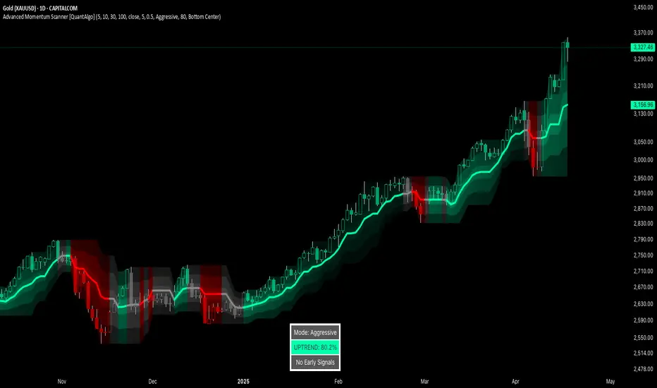
Advanced Momentum Scanner [QuantAlgo]The Advanced Momentum Scanner is a sophisticated technical indicator designed to identify market momentum and trend direction using multiple exponential moving averages (EMAs), momentum metrics, and adaptive visualization techniques. It is particularly valuable for those looking to identify trading and investing opportunities based on trend changes and momentum shifts across any market and timeframe.
🟢 Technical Foundation
The Advanced Momentum Scanner utilizes a multi-layered approach with four different EMA periods to identify market momentum and trend direction:
Ultra-Fast EMA for quick trend changes detection (default: 5)
Fast EMA for short-term trend analysis (default: 10)
Mid EMA for intermediate confirmation (default: 30)
Slow EMA for long-term trend identification (default: 100)
For momentum detection, the indicator implements a Rate of Change (RoC) calculation to measure price momentum over a specified period. It further enhances analysis by incorporating RSI readings for overbought/oversold conditions, volatility measurements through ATR, and optional volume confirmation. When these elements align, the indicator generates trading signals based on the selected sensitivity mode (Conservative, Balanced, or Aggressive).
🟢 Key Features & Signals
1. Multi-Period Trend Identification
The indicator combines multiple EMAs of different lengths to provide comprehensive trend analysis within the same timeframe, displaying the information through color-coded visual elements on the chart.
When an uptrend is detected, chart elements are colored with the bullish theme color (default: green/teal).
Similarly, when a downtrend is detected, chart elements are colored with the bearish theme color (default: red).
During neutral or indecisive periods, chart elements are colored with a neutral gray color, providing clear visual distinction between trending and non-trending market conditions.
This visualization provides immediate insights into underlying trend direction without requiring separate indicators, helping traders and investors quickly identify the market's current state.
2. Trend Strength Information Panel
The trend panel operates in three different sensitivity modes (Conservative, Aggressive, and Balanced), each affecting how the indicator processes and displays market information.
The Conservative mode prioritizes trend sustainability over frequency, showing only strong trend movements with high probability.
The Aggressive mode detects early trend changes, providing more frequent signals but potentially more false positives.
The Balanced mode offers a middle ground with moderate signal frequency and reliability.
Regardless of the selected mode, the panel displays:
Current trend direction (UPTREND, DOWNTREND, or NEUTRAL)
Trend strength percentage (0-100%)
Early detection signals when applicable
The active sensitivity mode
This comprehensive approach helps traders and investors:
→ Assess the strength of current market trends
→ Identify early potential trend changes before full confirmation
→ Make more informed trading and investing decisions based on trend context
3. Customizable Visualization Settings
This indicator offers extensive visual customization options to suit different trading styles and preferences:
Display options:
→ Fully customizable uptrend, downtrend, and neutral colors
→ Color-coded price bars showing trend direction
→ Dynamic gradient bands visualizing potential trend channels
→ Optional background coloring based on trend intensity
→ Adjustable transparency levels for all visual elements
These visualization settings can be fine-tuned through the indicator's interface, allowing traders and investors to create a personalized chart environment that emphasizes the most relevant information for their strategy.
The indicator also features a comprehensive alert system with notifications for:
New trend formations (uptrend, downtrend, neutral)
Early trend change signals
Momentum threshold crossovers
Other significant market conditions
Alerts can be customized and delivered through TradingView's notification system, making it easy to stay informed of important market developments even when you are away from the charts.
🟢 Practical Usage Tips
→ Trend Analysis and Interpretation: The indicator visualizes trend direction and strength directly on the chart through color-coding and the information panel, allowing traders and investors to immediately identify the current market context. This information helps in assessing the potential for continuation or reversal.
→ Signal Generation Strategies: The indicator generates potential trading signals based on trend direction, momentum confirmation, and selected sensitivity mode. Users can choose between Conservative (fewer but more reliable signals), Balanced (moderate approach), or Aggressive (more frequent but potentially less reliable signals).
→ Multi-Period Trend Assessment: Through its layered EMA approach, the indicator enables users to understand trend conditions across different lookback periods within the same timeframe. This helps in identifying the dominant trend and potential turning points.
🟢 Pro Tips
Adjust EMA periods based on your timeframe:
→ Lower values for shorter timeframes and more frequent signals
→ Higher values for higher timeframes and more reliable signals
Fine-tune sensitivity mode based on your trading style:
→ "Conservative" for position trading/long-term investing and fewer false signals
→ "Balanced" for swing trading/medium-term investing with moderate signal frequency
→ "Aggressive" for scalping/day trading and catching early trend changes
Look for confluence between components:
→ Strong trend strength percentage and direction in the information panel
→ Overall market context aligning with the expected direction
Use for multiple trading approaches:
→ Trend following during strong momentum periods
→ Counter-trend trading at band extremes during overextension
→ Early trend change detection with sensitivity adjustments
→ Stop loss placement using dynamic bands
Combine with:
→ Volume indicators for additional confirmation
→ Support/resistance analysis for strategic entry/exit points
→ Multiple timeframe analysis for broader market context
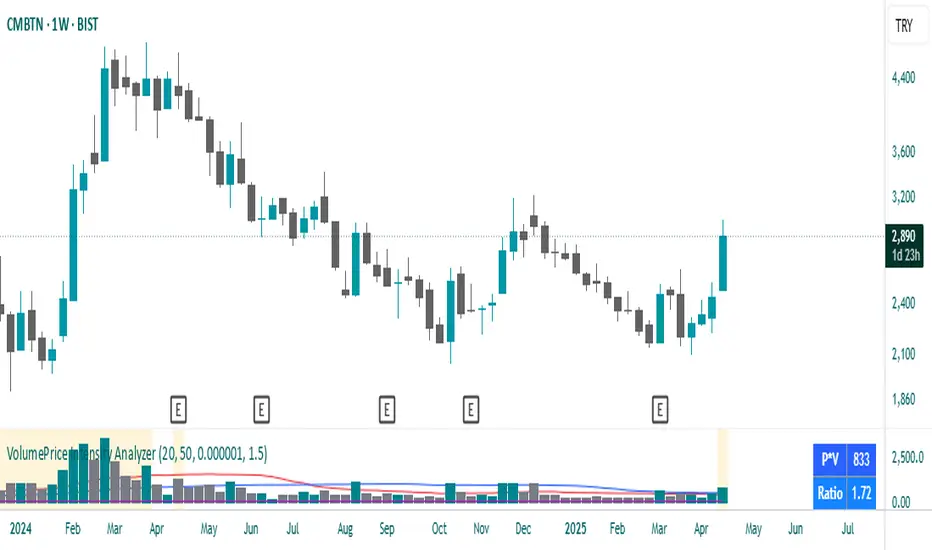
VolumePrice Intensity AnalyzerVolumePrice Intensity Analyzer
The VolumePrice Intensity Analyzer is a Pine Script v6 indicator designed to measure market activity intensity through the trading value (Price * Volume, scaled to millions). It helps traders identify significant volume-price interactions, track trends, and gauge momentum by combining volume analysis with trend-following tools.
Features:
Volume-Based Analysis: Calculates Price * Volume in millions to highlight market activity levels.
Trend Identification: Plots 20-day and 50-day SMAs of the trading value to smooth fluctuations and reveal sustained trends.
Relative Strength: Displays the ratio of daily Price * Volume to the long-term SMA in a separate pane, helping traders assess activity intensity relative to historical averages.
Real-Time Metrics: A table shows the current Price * Volume and its ratio to the long SMA, updated continuously with bold text formatting (v6 feature).
Alerts: Triggers notifications for high trading values (when Price * Volume exceeds 1.5x the long SMA) and SMA crossovers (short SMA crossing above long SMA).
Visual Cues: Uses dynamic bar colors (teal for bullish, gray for bearish) and background highlights to mark significant market activity.
Customizable Inputs: Adjust SMA periods, scaling factor, and alert threshold via the settings panel, with tooltips for clarity (v6 feature).
Originality:
Unlike basic volume indicators, this tool combines Price * Volume with trend analysis (SMAs), relative strength (ratio plot), and actionable alerts. The real-time table and visual highlights provide a unique, at-a-glance view of market intensity, making it a valuable addition for volume and trend-focused traders.
Calculations:
Trading Value (P*V): (Close * Volume) * Scale Factor (default scale factor of 1e-6 converts to millions).
SMAs: 20-day and 50-day Simple Moving Averages of the trading value to identify short- and long-term trends.
Ratio: Daily Price * Volume divided by the 50-day SMA, plotted in a separate pane to show relative activity strength.
Bar Colors: Teal (RGB: 0, 132, 141) for bullish bars (close > open or close > previous close), gray for bearish or neutral bars.
Background Highlight: Light yellow (hex: #ffcb3b, 81% transparency) when Price * Volume exceeds the long SMA by the alert threshold.
Plotted Elements:
Short SMA P*V (M): Red line, 20-day SMA of Price*Volume in millions.
Long SMA P*V (M): Blue line, 50-day SMA of Price*Volume in millions.
Today P*V (M): Columns, daily Price*Volume in millions (teal/gray based on price action).
Daily V*P/Longer Term Average: Purple line in a separate pane, ratio of daily Price * Volume to the 50-day SMA.
Usage:
Spot High Activity: Look for Price * Volume columns exceeding the SMAs or spikes in the ratio plot to identify significant market moves.
Confirm Trends: Use SMA crossovers (e.g., short SMA crossing above long SMA) as bullish trend signals, or vice versa for bearish trends.
Monitor Intensity: The table provides real-time Price * Volume and ratio values, while background highlights signal high activity periods.
Versatility: Suitable for stocks, forex, crypto, or any market with volume data, across various timeframes.
How to Use:
Add the indicator to your chart.
Adjust inputs (SMA periods, scale factor, alert threshold) via the settings panel to match your trading style.
Watch for alerts, check the table for real-time metrics, and observe the ratio plot for relative strength signals.
Use the background highlights and bar colors to quickly spot significant market activity and price action.
This indicator leverages Pine Script v6 features like lazy evaluation for performance and advanced text formatting for better visuals, making it a powerful tool for traders focusing on volume, trends, and momentum.
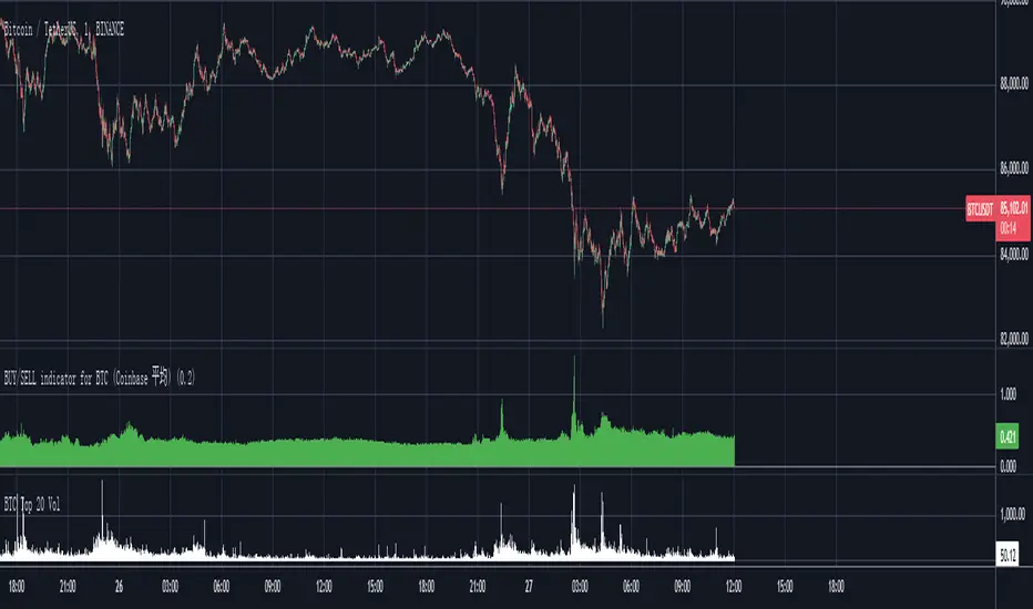
Bitcoin Total VolumeThis Pine Script indicator, titled "Bitcoin Top 16 Volume," is designed to provide traders with an aggregate view of Bitcoin (BTC) spot trading volume across leading cryptocurrency exchanges. Unlike traditional volume indicators that focus on a single exchange, this tool compiles data from a selection of the top exchanges as ranked by CoinMarketCap, offering a broader perspective on overall market activity.
The indicator works by fetching real-time volume data for specific BTC trading pairs on various exchanges. It currently incorporates data from prominent platforms such as Binance (BTCUSDT), Coinbase (BTCUSD), OKX (BTCUSDT), Bybit (BTCUSDT), Kraken (BTCUSD), Bitfinex (BTCUSD), Bitstamp (BTCUSD), Gemini (BTCUSD), Upbit (BTCKRW), Bithumb (BTCKRW), KuCoin (BTCUSDT), Gate.io (BTCUSDT), MEXC (BTCUSDT), Crypto.com (BTCUSD), Poloniex (BTCUSDT), and BitMart (BTCUSDT). It's important to note that while the indicator aims to represent the "Top 16" exchanges, the actual number included may vary due to data availability within TradingView and the dynamic nature of exchange rankings.
The script then calculates the total volume by summing up the volume data retrieved from each of these exchanges. This aggregated volume is visually represented as a histogram directly on your TradingView chart, displayed in white by default. By observing the height of the histogram bars, traders can quickly assess the total trading volume for Bitcoin spot markets over different time periods, corresponding to the chart's timeframe.
This indicator is valuable for traders seeking to understand the overall market depth and liquidity of Bitcoin. Increased total volume can often signal heightened market interest and potential trend strength or reversals. Conversely, low volume might suggest consolidation or reduced market participation. Traders can use this indicator to confirm trends, identify potential breakouts, and gauge the general level of activity in the Bitcoin spot market across major exchanges. Keep in mind that the list of exchanges included may need periodic updates to accurately reflect the top exchanges as rankings on CoinMarketCap evolve.
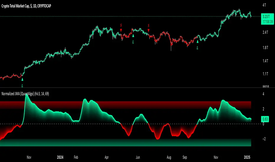
Normalized Jurik Moving Average [QuantAlgo]Upgrade your investing and trading strategy with the Normalized Jurik Moving Average (JMA) , a sophisticated oscillator that combines adaptive smoothing with statistical normalization to deliver high-quality signals! Whether you're a swing trader looking for momentum shifts or a medium- to long-term investor focusing on trend validation, this indicator's statistical approach offers valuable analytical advantages that can enhance your trading and investing decisions!
🟢 Core Architecture
The foundation of this indicator lies in its unique dual-layer calculation system. The first layer implements the Jurik Moving Average, known for its superior noise reduction and responsiveness, while the second layer applies statistical normalization (Z-Score) to create standardized readings. This sophisticated approach helps identify significant price movements while filtering out market noise across various timeframes and instruments.
🟢 Technical Foundation
Three key components power this indicator are:
Jurik Moving Average (JMA): An advanced moving average calculation that provides superior smoothing with minimal lag
Statistical Normalization: Z-Score based scaling that creates consistent, comparable readings across different market conditions
Dynamic Zone Detection: Automatically identifies overbought and oversold conditions based on statistical deviations
🟢 Key Features & Signals
The Normalized JMA delivers market insights through:
Color-adaptive oscillator line that reflects momentum strength and direction
Statistically significant overbought/oversold zones for trade validation
Smart gradient fills between signal line and zero level for enhanced visualization
Clear long (L) and short (S) markers for validated momentum shifts
Intelligent bar coloring that highlights the current market state
Customizable alert system for both bullish and bearish setups
🟢 Practical Usage Tips
Here's how to maximize your use of the Normalized JMA:
1/ Setup:
Add the indicator to your favorites, then apply it to your chart ⭐️
Begin with the default smoothing period for balanced analysis
Use the default normalization period for optimal signal generation
Start with standard visualization settings
Customize colors to match your chart preferences
Enable both bar coloring and signal markers for complete visual feedback
2/ Reading Signals:
Watch for L/S markers - they indicate validated momentum shifts
Monitor oscillator line color changes for direction confirmation
Use the built-in alert system to stay informed of potential trend changes
🟢 Pro Tips
Adjust Smoothing Period based on your trading style:
→ Lower values (8-12) for more responsive signals
→ Higher values (20-30) for more stable trend identification
Fine-tune Normalization Period based on market conditions:
→ Shorter periods (20-25) for more dynamic markets
→ Longer periods (40-50) for more stable markets
Optimize your analysis by:
→ Using +2/-2 zones for primary trade signals
→ Using +3/-3 zones for extreme market conditions
→ Combining with volume analysis for trade confirmation
→ Using multiple timeframe analysis for strategic context
Combine with:
→ Volume indicators for trade validation
→ Price action for entry timing
→ Support/resistance levels for profit targets
→ Trend-following indicators for directional bias
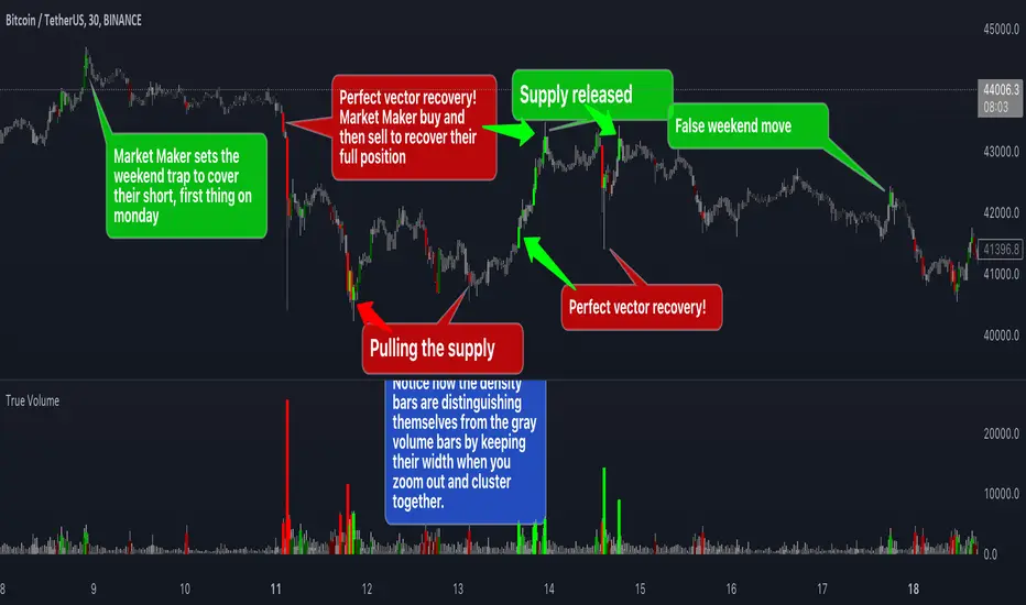
True VolumeThis indicator is designed to provide in-depth analysis of volume data from multiple sources and distinguish highly liquid candles by measuring the density of the volume. By focusing on the density and concentration of volume, rather than just the volume itself, it offers a more nuanced view of the market. This can be particularly beneficial in markets like cryptocurrencies, where understanding the role of market makers versus retail traders is crucial for strategic trading.
This is how it works:
Multiple Asset Integration:
Unlike standard volume indicators, True Volume allows the inclusion of up to four different assets (or the same asset from various exchanges) into its volume calculations. This feature provides a broader and more accurate total volume representation, essential in markets like cryptocurrencies where volume is dispersed across multiple exchanges.
Adjustable Time Anchors:
It offers various time anchor options, allowing traders to analyze volume data over different time periods or a specific amount of lookback candles. This flexibility helps in understanding volume trends over both short and long-term time frames.
Volume Density Analysis:
The core of this indicator is the innovative concept of Volume Density. It's calculated using a sigmoid function that normalizes the volume-to-price movement ratio in a unique way without needing a max cap or having the density column spike off the chart. This method helps in distinguishing between normal volume fluctuations and those that are unusually dense for the given price movement. This distinction is key in identifying potential market maker activities.
The Visuals:
The Volume Density is displayed in a unique way without compromising the original volume bars or cap the density. Infinite density can essentially be represented without having an infinitely large bar or caping out the density data. There's also two different color themes, optional bar color, and an option to flip the density bars up-side down for a different representation. Each of the original volume sources can be displayed separately as well. All colors as customizable as well for your own preference.
Price Volume Trend (PVT):
Included in this indicator is also the Price Volume Trend, which cumulatively measures the density delta, offering insights into the longer-term momentum of the market.
How do I trade it?
This indicator aims to give you insight into 'the other side of the trade', the Market Makers. When you buy, they provide liquidity by selling to you. That drives the Volume Density up.
Consider whether the market maker is currently long or short and might need to cover their position by wicking price back, or "adjust inventory". Especially towards the end of a market session.
Consider dense candles during market gaps or weekends to be market manipulation moves.
The density also goes up when stop losses are hit. If price makes a higher high or lower low, high density could indicate a liquidation event.
MarketSmith VolumesThe 'MarketSmith Volumes' is to be used with the 'MarketSmith Indicator' and 'EPS & Sales' in order to mimic fully MarketSmith Graphs with the maximum number of indicators allowed by a free Tradingview Plan: 3
This indicator is no more than a simple volume indicator where all parameters are already adjusted to resemble MarketSmith graphical volumes.
Also you will find integrated:
High Volumes Bars Peak :
They allow us to see peak volumes at a glance.
10-Week Average Volume :
When viewing a weekly chart, this line represents a 10-week moving average volume level. It allows you to see if the current Volume Bar of the week is above or under the average volume traded in the past 10 Weeks.
50-Day Average Volume :
When viewing a daily chart, this line represents a 50-day moving average volume level. Whether or not volume is above or below the average for a certain period could have a significant impact on your stock chart analysis.

Intraday Intensity ModesIntraday Intensity Index was created by David Bostian and its use was later featured by John Bollinger in his book "Bollinger on Bollinger Bands" . It is categorically a volume indicator and considered to be a useful tool for analyzing supply and demand dynamics in the market. By measuring the level of buying and selling pressure within a given trading session it attempts to provide insights into the strength of market participants' interest and their aggressiveness in executing trades throughout the day. It can be used in conjunction with Bollinger Bands® or other envelope type indicators as a complimentary indicator to aid in trying to identify potential turning points or trends.
Intraday intensity is calculated based upon the relationship between the price change and the volume of shares traded during each daily interval. It aims to capture the level of buying or selling activity relative to the overall volume. A high intraday intensity value suggests a higher level of buying or selling pressure, indicating a more active and potentially volatile market. Conversely, a low intraday intensity value indicates less pronounced trading activity and a potentially quieter market. Overall, intraday intensity provides a concise description of the intensity of trading activity during a particular trading session, giving traders an additional perspective on market dynamics. Note that because the calculation uses volume this indicator will only work on symbols where volume is available.
While there are pre-existing versions within community scripts, none were found to have applied the calculations necessary for the various modes that are presented within this version, which are believed to be operating in the manner originally intended when first described by Bostian and again later by Bollinger. When operating in default modes on daily or lower chart timeframes the logic used within this script tracks the intraday high, low, close and volume for the day with each progressing intraday bar.
The BB indicator was included on the top main chart to help illustrate example usage as described below. The Intraday Intensity Modes indicator is pictured operating in three different modes beneath the main chart:
• The top pane beneath the main chart shows the indicator operating as a normalized 21 day II% oscillator. A potential use while in this mode would be to look for positive values as potential confirmation of strength when price tags the upper or lower Bollinger bands, and to look for negative values as potential confirmation of weakness when price tags the upper or lower Bollinger bands.
• The middle pane shows the indicator operating as an "open ended" cumulative sum of II. A potential use while in this mode would be to look for convergence or divergence of trend when price is making new highs or lows, or while price is walking the upper or lower Bollinger bands.
• The bottom pane shows the indicator operating in standard III mode, which provides independent values per session.
Indicator Settings: Inputs tab:
Osc Length : Set to 1 disables oscillation, values greater than 1 enables oscillation for II% (Intraday Intensity percent) mode.
Tootip : Hover mouse over (i) to show recommended example Settings for various modes.
Cumulative : When enabled values are cumulatively summed for the entire chart and indicator operates in II mode.
Normalized : When enabled a rolling window of Osc Length values are summed and normalized to the rolling window's volume.
Intrabar : When enabled price range and volume are evaluated for intensity per bar instead of per day which is a departure from the original
concept. Whenever this setting is enabled the indicator should be regarded as operating in an experimental mode.
Colors For Up Down : Sets the plot colors used, may be overridden in Settings:Style tab.
Styles / Width : Sets the plot style and width used, may be overridden in Settings:Style tab.
This indicator is designed to work with any chart timeframe, with the understanding that when used on timeframes higher than daily the indicator becomes "IntraPeriod" intensity, for example on weekly bars it would be "IntraWeek" intensity. On Daily or lower timeframes the indicator operates as "IntraDay" intensity and is being updated on each bar as each day progresses. If the experimental setting Intrabar is enabled then the indicator operates as "IntraBar" intensity and is no longer constrained to daily or higher evaluations, for example with Intrabar enabled on a 4H timeframe the indicator would operate as "Intra4H" intensity.
NOTICE: This is an example script and not meant to be used as an actual strategy. By using this script or any portion thereof, you acknowledge that you have read and understood that this is for research purposes only and I am not responsible for any financial losses you may incur by using this script!

Average Traded MoneyAs its name indicates, this indicator shows us the average amount of money traded in a specific asset.
It is calculated by multiplying the volume by the price (calculated on hl2) on each trading day and from there calculate a moving average of 25 periods.
The indicator only shows this 25 period moving average .
What is it for?
Well, it helps us to find out if there are variations in the amount of money traded and therefore identify areas of accumulation and distribution and thus be able to anticipate changes in trend and enter together with the large funds and thus obtain benefits.
It is something very simple to calculate but strangely no one had published it in TradingView yet. I think it is very useful and shows us information that is hidden in the volatility of a simple volume indicator. The simple volume indicator only shows us the number of shares traded but not the money that has been traded, that's why my indicator can be helpful. By averaging this data, we smooth the highs and lows of money traded and we get a cleaner graphic that gives us a better interpretation of what is happening with the negotiation of the asset.

The On Balance Volume & Accumulation Distribution RibbonMedic trades using "Smart Money Concepts", and Medic's system revolves around the one taught by MentFX (i.e. Structure, Supply/ Demand Zone , and Confirmation). While this system per se doesn't require the use of a volume indicator, Medic has come to respect the OBV and Accumulation / Distribution .
The OBV Ribbon is available in many a shape and form, but Medic wanted something more responsive, and the OBVAD is just that.
This ribbon works across all time frames, and allows users to visualize what is happening behind the scenes of The Trigger indicator.
The Ribbon applies 11 DEMA of different periods to the cumulative sum of SpaceTrader's OBV/AD formula: volume*(close-open)/( high-low )*hlc3.
The Ribbon is able to identify the general trend, and changes into a blu ein an uptrend, and purple in a downtrend, and also potential reversals by means of divergences.

[potatoshop] Volume Profile lower timeframeThis script is a volume profile that displays the volume of transactions in price blocks over a recent period of time.
For a more detailed representation, OHCLV values on the time frame lower than the time zone on the chart were called and expressed.
Low time frames are adjustable.
You can adjust the number of blocks and the most recent time period that you want to view.
Although it cannot be compared to the volume indicators provided for paid users of Trading-View, it has functioned by displaying transactions that are difficult to find on open source.
Displays the amount traded in each block and the percentage of the total over a given period.
POC represents the middle value of the block with the highest transaction volume as a line.
TPOC represents the block that stayed the longest regardless of the volume of transaction.
The reversal line appears when you determine the trading advantage of the rising and falling closing on a block basis and then have a different value from the neighboring blocks.
(I didn't mean it much, but I just put it in for fun.)
It represents the total volume of transactions traded in each block, and there are also check boxes in the settings window that represent the volume of transactions that closed higher and closed lower.
You can specify the color of each block.
The highest and lowest values for the set period and the total sum of each block are displayed at the bottom of the box.
Because it was made using a lot of arrays, the total transaction volume was marked separately to check the value.
When expressing the price block according to the trading volume percentage, it was a pity that the minimum pixel was 1 bar, so it could not be expressed delicately.
Although set to bar_time in Box properties xloc, 1 bar was actually the minimum unit of the X-axis value.
The logic used to place the transaction volume for each block is as follows.
1. Divide the difference between the high and low values of 1 LTF bar by the transaction volume .
2. Find the percentage of this LTF bar within each block.
3. Multiply the ratio by the transaction volume again.
4. Store the value in each block cell.
Below are the codes of the people I referred to this time.
1. ‘Time & volume point of control (TPOC & VPOC)’ by quantifytools
2. ‘Volume Profile ’ by LuxAlgo
3. ‘Volume Profile and Volume Indicator by DGT’ by dgtrd
The script is for informational and educational purposes only.
이 스크립트는 최근 일정 기간동안의 거래량을 가격 블록단위로 표시해 주는 볼륨 프로화일입니다.
좀 더 자세한 표현을 위해 차트상의 시간대보다 낮은 시간 프레임상의 OHCLV 값들을 호출하여 표현하였습니다.
낮은 시간 프레임은 조절 가능합니다..
보고 싶은 최근 일정 기간과 블럭 갯수를 조절할 수 있습니다.
트뷰 유료 사용자들을 위해 제공하는 지표와는 비교할 수는 없지만, 오픈 소스상에서는 찾기 힘든 거래량을 표시해 기능을 넣었습니다.
각 블럭에서 거래되었던 양 과 주어진 기간 동안의 총량 대비 퍼센트를 표시해 줍니다.
POC는 거래량이 가장 많았던 블럭의 중간값을 라인으로 표현해 줍니다.
TPOC는 거래량에 상관없이 가장 오랜 시간 머물렸던 블럭을 표현해 줍니다.
반전선은 블럭 단위로 상승 마감과 하락 마감의 거래량 우세를 결정한 뒤, 이웃 블럭들하고 다른 값을 가질 때 나타납니다.
(어떤 뜻을 갖고 만든 건 아니고 그냥 재미로 넣어 보았습니다.)
각 블럭에서 거래되었던 총거래량을 표현해 주며, 또한 설정창에서 상승 마감한 거래량과 하락 마감한 거래량을 표현하는 체크 박스가 있습니다.
각 블럭의 색깔을 지정하실 수 있습니다.
설정된 기간 동안의 최고값과 최저값, 각 블럭을 합친 총량을 박스 하단에 표시해 두었습니다.
어레이를 많이 사용하여 만들었기 때문에 값의 확인을 위해 전체 거래량을 따로 표시하였습니다.
가격 블럭을 거래량 퍼센트에 따라 표현할 때, 최소 픽셀이 1bar 이어서 섬세하게 표현 할 수 없어 안타까웠습니다.
박스 속성을 xloc.bar_time 로 설정하였지만 실제로는 1 bar가 X축 값의 최소 단위였습니다.
각 블록 별로 거래량을 배치 할 때 쓰인 로직은 다음과 같습니다.
1. 1 LTF bar의 하이 와 로우 값의 차이를 거래량으로 나누어 줍니다.
2. 각 블록 안에서 이 LTF bar가 차지 하는 비율을 구합니다.
3. 그 비율에 다시 거래량을 곱해 줍니다.
4. 그 값을 각 블록 셀에 저장해 줍니다.
밑에 제가 이번에 참고한 분들의 코드들입니다.
1. ‘Time & volume point of control (TPOC & VPOC)’ by quantifytools
2. ‘Volume Profile ’ by LuxAlgo
3. ‘Volume Profile and Volume Indicator by DGT’ by dgtrd

Tick StrategyTick Strategy:
Questions many pine coders/traders have is, How to enter/exit trade as soon as trade condition is met i.e. do not wait till candle completion to enter/exit the trade. This strategy will help you to understand one of the way to achieve it.
This is an educational strategy to demonstrate, how one can trade based on tick data. This being a strategy based on tick data, it can be tested only on real time candles. This strategy will not take any trades on historical candles and cannot be used for back testing. All the strategy trades taken on real time candles will disappear (repainting) once chart is refreshed and new trades will be entered on real time candles.
The strategy will do nothing during off market hours and will not take any trades.
The strategy has been designed based on rules/inputs below:
1. Count the ticks from start of a candle till end of candle
2. Bifurcate ticks as up-ticks and down-ticks. If tick price is above previous tick price the tick is considered as up-tick and vice versa
3. Count the successive up-ticks and successive down-ticks
Strategy rules:
1. Track candle type (green or red) continuously on each tick (green candle is when latest tick price > previous tick price)
2. Take a long trade if work in progress (WIP) candle is green candle and we get successive up-ticks equal to user input ticks for trade
3. Take a short trade if work in progress (WIP) candle is red candle and we get successive down-ticks equal to user input ticks for trade
4. Exit the trade when we get successive ticks equal to user input ticks in opposite direction
5. Optionally for trade entry, user can decide whether to calculate successive up-ticks/down-ticks from beginning of candle or successive up-ticks/down-ticks anytime during the candle formation
6. Optionally for trade exit/square off, user can decide whether to apply exit rules on the entry candle or only from subsequent candle
Strategy setting:
1. '' – This is just to describe when trades are entered. This parameter is not used for any calculation
2. 'No of successive ticks to enter the trade' – User input to decide, number of successive ticks for trade entry
3. 'Count successive ticks for trade only from start of candle' – check this to count successive ticks only from beginning of a candle
4. 'Exit if succussive ticks in opposite direction' - User input to decide, number of successive ticks in opposite direction for exiting the trade
5. 'Apply exit criteria on entry candle' – check to allow exit of trade on the entry candle, if un-checked, trade will not be exited on the entry candle i.e. opposite direction ticks will be counted from subsequent candle
Information below will be displayed continuously on the chart:
1. Candle no – Candles are counted from start of the trading session. This is current candle being formed on the chart
2. Candle now – This shows either ‘Green’ or ‘Red’ based on type of candle being formed
3. Tick count – This is current tick number being processed. Tick number starts from 1 for each new candle
4. Up-tick count – Number of up-ticks during formation of current candle
5. Down-tick count – Number of down-ticks during formation of current candle
6. Successive up-ticks – Current successive up-tick count
7. Successive down-ticks – Current successive down-tick count
8. Up-tick volume – Volume associated with up-ticks
9. Down-tick volume – Volume associated with down-ticks
10. Up-tick volume % - This is % of volume associated with up-ticks
11. Total volume – Candle volume till now. (Some times you might observe small difference between total volume and the volume shown by volume indicator. The difference could be because of refresh rate of your screen)
12. Candle completion % - This shows current candles completion %. This is candle progress from start of candle till close of candle

Volume Profile, Pivot Anchored by DGTVolume Profile (also known as Price by Volume ) is an charting study that displays trading activity over a specified time period at specific price levels. It is plotted as a horizontal histogram on the finacial isntrumnet's chart that highlights the trader's interest at specific price levels. Specified time period with Pivots Anchored Volume Profile is determined by the Pivot Levels, where the Pivot Points High Low indicator is used and presented with this Custom indicator
Finally, Volume Weighted Colored Bars indicator is presneted with the study
Different perspective of Volume Profile applications;
Anchored to Session, Week, Month etc : Anchored-Volume-Profile
Custom Range, Interactive : Volume-Profile-Custom-Range
Fixed Range with Volume Indicator : Volume-Profile-Fixed-Range
Combined with Support and Resistance Indicator : Price-Action-Support-Resistance and Volume-Profile
Combined with Supply and Demand Zones, Interactive : Supply-Demand-and-Equilibrium-Zones
Disclaimer : Trading success is all about following your trading strategy and the indicators should fit within your trading strategy, and not to be traded upon solely
The script is for informational and educational purposes only. Use of the script does not constitutes professional and/or financial advice. You alone the sole responsibility of evaluating the script output and risks associated with the use of the script. In exchange for using the script, you agree not to hold dgtrd TradingView user liable for any possible claim for damages arising from any decision you make based on use of the script

MY:Aggregated Volume BTC:DERIVATIVES█ MY Aggregated Volume BTC DERIVATIVES
This indicator shows a panel to display the Bitcoin Trading Volume of different exchanges. A lot of traders follow the default volume indicator provided by tradingview. This default indicator shows the volume for the current ticker (example BTCUSD:BITSTAMP), but each exchange has its own volume.
In a matter of visibility and accessibility, I've decided to aggregate the volume of almost all the Bitcoin exchanges (tickers) in tradingview.
This indicator helps identifying decreasing volume, where the volume comes from (spot or derivatives). A decreasing DERIVATIVES volume isn't a good sign as it shows a decrease in the buying pressure.
The panel has 1 main configuration : Display mode, showing Aggregated (all exchanges in one bar) or Difference (Stacked bar)
The other configuration Legend Item Gap and Legend X Gap is for when the difference mode is selected. It affects the position of the legend. Some might have smaller screens, bigger screens, viewport zoomed in etc.
Due to the number of exchanges, and pinescript limitations, I had to split the volume in 2 indicators, the SPOT volume, and the DERIVATIVES volume. The script in this page is specific to the DERIVATIVES volume. For the SPOT, please refer to my other available script.
Exchange list :
// OKEX:BTCUSDPERP
// OKEX:BTCUSDTPERP
// FTX:BTCPERP
// BTSE:BTCPFC
// KRAKEN:XBTUSDPERP
// BITMEX:XBTUSD
// HUOBI:BTCPERP
// DERIBIT:BTCPERP
// BINANCE:BTCPERP
// BINANCE:BTCUSDTPERP
// PHEMEX:BTCUSD
// BITGET:BTCUSDPERP
// BITGET:BTCUSDTPERP
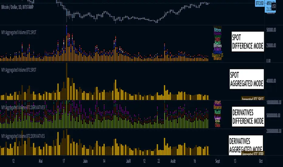
MY:Aggregated Volume BTC:SPOT█ MY Aggregated Volume BTC SPOT
This indicator shows a panel to display the Bitcoin Trading Volume of different exchanges. A lot of traders follow the default volume indicator provided by tradingview. This default indicator shows the volume for the current ticker (example BTCUSD:BITSTAMP), but each exchange has its own volume.
In a matter of visibility and accessibility, I've decided to aggregate the volume of almost all the Bitcoin exchanges (tickers) in tradingview. Some have been commented out (Kucoin, FTX) due to high volume data which was hiding the other ones.
This indicator helps identifying decreasing volume, where the volume comes from (spot or derivatives). A decreasing SPOT volume isn't a good sign as it shows a decrease in the buying pressure.
The panel has 1 main configuration : Display mode, showing Aggregated (all exchanges in one bar) or Difference (Stacked bar)
The other configuration Legend Item Gap and Legend X Gap is for when the difference mode is selected. It affects the position of the legend. Some might have smaller screens, bigger screens, viewport zoomed in etc.
Due to the number of exchanges, and pinescript limitations, I had to split the volume in 2 indicators, the SPOT volume, and the DERIVATIVES volume. The script in this page is specific to the SPOT volume. For the DERIVATIVES, please refer to my other available script.
Exchange list :
// BINANCE:BTCUSD
// BINANCE:BTCUSDT
// BINANCE:BTCEUR
// COINBASE:BTCUSD
// COINBASE:BTCUSDT
// COINBASE:BTCEUR
// KRAKEN:XBTUSD
// KRAKEN:XBTUSDT
// KRAKEN:XBTEUR
// BITFINEX:BTCUSD
// BITFINEX:BTCEUR
// HUOBI:BTCUSDT
// HUOBI:BTCUSDC
// OKEX:BTCUSDT
// FTX:BTCUSD DISABLED FOR NOW, TO MUCH VOLUME
// FTX:BTCUSDT DISABLED FOR NOW, TO MUCH VOLUME
// KUCOIN:BTCUSDT DISABLED FOR NOW, TO MUCH VOLUME
// KUCOIN:BTCUSDC DISABLED FOR NOW, TO MUCH VOLUME
// GEMINI:BTCUSD
// GEMINI:BTCEUR
// PHEMEX:BTCUSDT
// BITTREX:BTCUSD
// BITTREX:BTCUSDT
// BITTREX:BTCEUR

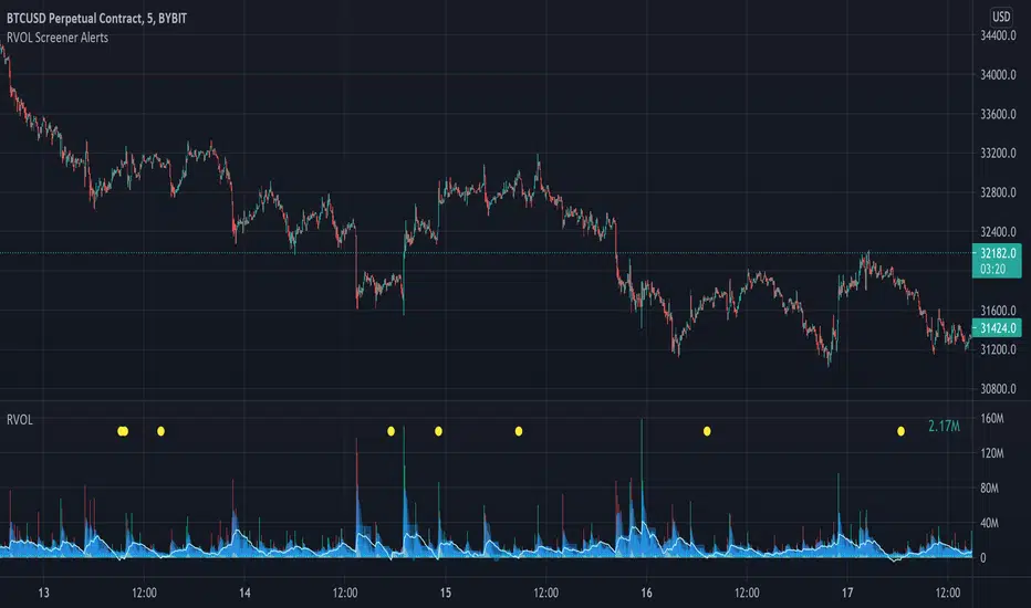
Relative Volume Screener AlertsThis script will screen 12 different stocks and current chart (13 in total) for entry points from my relative volume indicator.
1. Enter in any ticker ID's from charts you wish to scan in the settings.
2. Go to desired timeframe.
3. Click add alert button at top toolbar.
4. Select RVOL Screener Alerts indicator, input alert notification settings and/or change alert name and click create.
The script will then scan the stocks and alert you of any entry points from the timeframe you set the alerts.
A new alert needs to be created for each timeframe you wish to screen.
You can find my relative volume indicator here:
Estimated Up Down VolumeThis indicator plot estimated Up volume and Down volume.
Adjust colors to the default volume indicator.
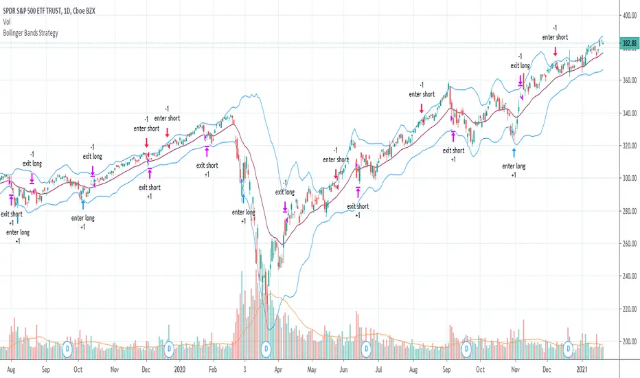
Bollinger Bands Strategy with Intraday Intensity IndexFor Educational Purposes. Results can differ on different markets and can fail at any time. Profit is not guaranteed.
This only works in a few markets and in certain situations. Changing the settings can give better or worse results for other markets.
This is a mean reversion strategy based on Bollinger Bands and the Intraday Intensity Index (a volume indicator). John Bollinger mentions that the Intraday Intensity Index can be used with Bollinger Bands and is one of the top indicators he recommends in his book. It seems he prefers it over the other volume indicators that he compares to for some reason. III looks a lot like Chaikin Money Flow but without the denominator in that calculation. On the default settings of the BBs, the III helps give off better entry signals. John Bollinger however is vague on how to use the BBs and it's hard to say if one should enter when it is below/above the bands or when the price crosses them. I find that with many indicators and strategies it's best to wait for a confirmation of some sort, in this case by waiting for some crossover of a band. Like most mean reversion strategies, the exit is very loose if using BBs alone. Usually the plan to exit is when the price finally reverts back to the mean or in this case the middle band. This can potentially lead to huge drawdowns and/or losses. Mean reversion strategies can have high win/loss ratios but can still end up unprofitable because of the huge losses that can occur. These drawdowns/losses that mean reversion strategies suffer from can potentially eat away at a large chunk of all that was previously made or perhaps up to all of it in the worst cases, can occur weeks or perhaps up to months after being profitable trading such a strategy, and will take a while and several trades to make it all back or keep a profitable track record. It is important to have a stop loss, trailing stop, or some sort of stop plan with these types of strategies. For this one, in addition to exiting the trade when price reverts to the middle band, I included a time-based stop plan that exits with a gain or with a loss to avoid potentially large losses, and to exit after only a few periods after taking the trade if in profit instead of waiting for the price to revert back to the mean.
Dynamic Money Flow with color switch [aamonkey]"Dynamic Money Flow is a volume indicator based on Marc Chaikin's Money Flow with a few improvements.
It can be used to confirm break-outs and trends." (RezzaHmt)
This is the script from RezzaHmt called "Dynamic Money Flow".
All I did is the color change of the line because I find it easier to read that way.
Here you can find the original script explaining the theory behind this indicator:
R100 Wave v2 (*v*)This is a Wave (or Zig Zag) indicator I made to use in conjunction with the Wave Volume indicator I use.
It uses the Jurik moving average to determine turning points, and will plot the tops and bottoms of the wave based on the most recent high- so you can also use to quickly find pivot highs and lows. If you are using with the R100 Wave Volume indicator, first adjust the wave to fit better (if required) using the Jurik length and/or power, and then use the same settings on the Wave Volume indicator. Default settings work pretty well for most stocks, but adjusting the length between 8 and 14 should be enough for a good fit, or adjust the power between 1 and 3, or get fussy and tweak it with both.
The Jurik MA has been modified to include a VWAP component, so will only work where you have volume. The last "leg" of the wave will move about until the next pivot high or low is found and then will remain fixed.
I hope you find some value with it. Only conditions of use are that if you improve it, let me know and if you publish something that uses it, don't hide the code! Enjoy!
Code pinched and modified from Zero Lag ZigZag by Duyck - thankyou
Jurik Moving Average (for turning points) by Everget - thankyou
and Weis Wave by Modhelius - thankyou

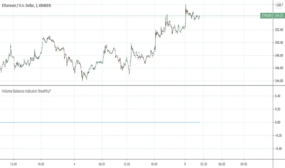
Volume Balance Indicator Stealthy7Find out if Bulls (buys) or Bears (sells) are moving the price. This gives a clear view of activity, even if you are using a higher time period. The lookback is in minutes, I believe. This is a superior volume indicator. Bars are recolored to show the underlying activity per the look back (minutes).
Normalized VolumeA simple study of normalized volume. Normalizing the volume can sometimes make it easier to see when it is above average. Normalizing volume in this way portrays the total volume as a percentage above or below the moving average chosen. By this method, its output number is the percentage above 100% or below 100% (ie. a value of 110 really means the day's volume is 10% greater than the moving average.)
I have also included a monochrome option, that I prefer on my charts as well as a rising/falling (1 period) indication on the moving average, which I have defaulted to 9 periods (fully customizable).
For me, displaying the moving average rising/falling makes sense as oftentimes when the volume flow changes direction, it heralds an end or pause in the move.
The default settings are for normalization off, and monochromatic display. Check their respective boxes for your preferred view.
I sincerely hopes this helps any fans of volume indicators.
And as always, trade responsibly, I am not responsible for gains/losses incurred and make no claim to authorship of this idea.
Good Trading folks, enjoy.
Shiroki

Propagation Volumes and TrendsWith this, i calculate RSI of the HL2 of the volume and use like an oscillator, this will use to measure the strength of the trend and the "Volume Flow" to follow the trend.
I use like foundation the LazyBear "Volume Flow Indicator" "honor a quien honor merece"
Background:
I think the volume as the price could be represented by candles or other graphic to use indicators and strengthen their analysis, due to lack of registration of this it is first necessary to calculate a volume graph, if the candle traditionally negative price brand then the total volume is taken as negative for the period. An example of this is in the On Balance Volume indicator, the problem is that there is no way to analyze the volume using other methods. An approximate volume of the spread could be the use of the price spread to make a synthetic behavior
As traditionally is observed if Open> Close then the candle and the volume will be negative and vice versa; the next step, is estimate the amounts of the candle necessary to calculate the ratio to use for the volume and thus idealize their spread within the candle:
VLOW = Volume x Low
vHigh = x High Volume
VOpen = vClose
vClose = Volume x Close
This graph can show a stable synthetic form of fluctuations in the volume trend affected by price.
ideas, comments and suggestions (or corrections).They are always welcome