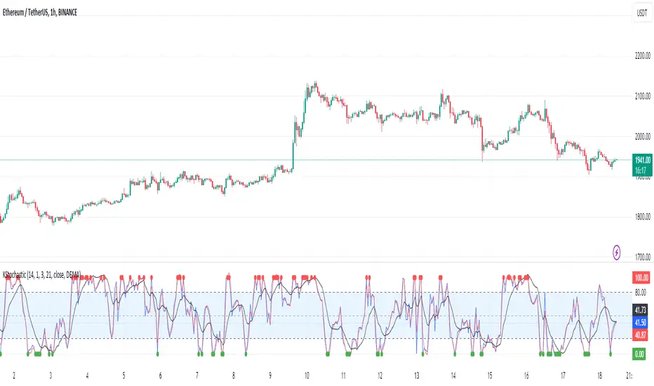
[KVA]K Stochastic IndicatorOriginal Stochastic Oscillator Formula:
%K=(C−Lowest Low)/(Highest High−Lowest Low)×100
Lowest Low refers to the lowest low of the past n periods.
Highest High refers to the highest high of the past n periods.
K Stochastic Indicator Formula:
%K=(Source−Lowest Source)/(Highest Source−Lowest Source)×100
Lowest Source refers to the lowest value of the chosen source over the past length periods.
Highest Source refers to the highest value of the chosen source over the past length periods.
Key Difference :
The original formula calculates %K using the absolute highest high and lowest low of the price over the past n periods.
The K Stochastic formula calculates %K using the highest and lowest values of a chosen source (which could be the close, open, high, or low) over the specified length periods.
So, if _src is set to something other than the high for the Highest Source or something other than the low for the Lowest Source, the K Stochastic will yield different results compared to the original formula which strictly uses the highest high and the lowest low of the price.
Impact on Traders :
Flexibility in Price Source :
By allowing the source (_src) to be customizable, traders can apply the Stochastic calculation to different price points (e.g., open, high, low, close, or even an average of these). This could provide a different perspective on market momentum and potentially offer signals that are more aligned with a trader's specific strategy.
Sensitivity to Price Action :
Changing the source from high/low to potentially less extreme values (like close or open) could result in a less volatile oscillator, smoothing out some of the extreme peaks and troughs and possibly offering a more filtered view of market conditions.
Customization of Periods :
The ability to adjust the length period offers traders the opportunity to fine-tune the sensitivity of the indicator to match their trading horizon. Shorter periods may provide earlier signals, while longer periods could filter out market noise.
Possibility of Applying the Indicator on Other Indicators :
Layered Technical Analysis :
The K Stochastic can be applied to other indicators, not just price. For example, it could be applied to a moving average to analyze its momentum or to indicators like RSI or MACD, offering a meta-analysis that studies the oscillator's behavior of other technical tools.
Creation of Composite Indicator s:
By applying the K Stochastic logic to other indicators, traders could create composite indicators that blend the characteristics of multiple indicators, potentially leading to unique signals that could offer an edge in certain market conditions.
Enhanced Signal Interpretation :
When applied to other indicators, the K Stochastic can help in identifying overbought or oversold conditions within those indicators, offering a different dimension to the interpretation of their output.
Overall Implications :
The KStochastic Indicator's modifications could lead to a more tailored application, giving traders the ability to adapt the tool to their specific trading style and analysis preferences.
By being applicable to other indicators, it broadens the scope of stochastic analysis beyond price action, potentially offering innovative ways to interpret data and make trading decisions.
The changes might also influence the trading signals, either by smoothing the oscillator's output to reduce noise or by altering the sensitivity to generate more or fewer signal
Including the additional %F line, which is unique to the K Stochastic Indicator, further expands the potential impacts and applications for traders:
Impact on Traders with the %F Line:
Triple Smoothing :
The %F line introduces a third level of smoothing, which could help in identifying longer-term trends and filtering out short-term fluctuations. This could be particularly useful for traders looking to avoid whipsaws and focus on more sustained movements.
Potential for Enhanced Confirmation :
The %F line might be used as a confirmation signal. For instance, if all three lines (%K, %D, and %F) are in agreement, a trader might consider this as a stronger signal to buy or sell, as opposed to when only the traditional two lines (%K and %D) are used.
Risk Management:
The additional line could be utilized for more sophisticated risk management strategies, where a trader might decide to scale in or out of positions based on the convergence or divergence of these lines.
Possibility of Applying the Indicator on Other Indicators with the %F Line:
Depth of Analysis :
When applied to other indicators, the %F line can provide an even deeper layer of analysis, perhaps identifying macro trends within the indicator it is applied to, which could go unnoticed with just the traditional two-line approach.
Refined Signal Strength Assessment :
The strength of signals from other indicators could be assessed by the position and direction of the %F line, providing an additional filter to evaluate the robustness of buy or sell signals.
Overall Implications with the %F Line :
The inclusion of the %F line in the K Stochastic Indicator enhances its utility as a tool for trend analysis and signal confirmation. It allows traders to potentially identify and act on more reliable trading opportunities.
This feature can enrich the trader's toolkit by providing a nuanced view of momentum and trend strength, which can be particularly valuable in volatile or choppy markets.
For those applying the K Stochastic to other indicators, the %F line could be integral in creating a multi-tiered analysis strategy, potentially leading to more sophisticated interpretations and decisions.
The presence of the %F line adds a dimension of depth to the analysis possible with the K Stochastic Indicator, making it a versatile tool that could be tailored to a variety of trading styles and objectives. However, as with any indicator, the additional complexity requires careful study and back-testing to ensure its signals are understood and actionable within the context of a comprehensive trading plan.
Buscar en scripts para "indicator"
Consolidation indicator█ Overview
The "Consolidation Indicator" is a custom indicator for TradingView designed to identify consolidation periods in the price chart. Consolidation typically occurs when the price of an asset moves within a narrow range, and this indicator helps traders recognize such conditions. It can be a useful tool for traders looking to identify potential breakouts or periods of reduced volatility.
█ Indicator Settings
1 — Timeframe: This setting allows you to select the timeframe for which you want to analyze consolidation. You can choose from various timeframes available in TradingView.
2 — Price Smoothing Length: This parameter controls the smoothing of price data. You can adjust the value, with a minimum of 1, to control the level of smoothing applied to the price data.
3 — Average Range Length (range_len): This setting defines the length of the average range used in the calculation of the indicator. By default, it is set to 14.
4 — Threshold for Narrow Range (NR_threshold): The indicator will consider a price range as narrow if it falls below this threshold as a percentage of the average range. It is set to 80% by default.
5 — Consecutive Narrow Ranges for Consolidation: This parameter allows you to specify how many consecutive narrow price ranges are required to confirm a consolidation period. The default value is 3.
6 — Candle Color: You can choose the color for the consolidation candles. The default is a bright green color.
█ Indicator Output
The indicator visually displays consolidation and breakout periods on the price chart using colored candles and breakout icons.
• Candles: During a consolidation period, the indicator colorizes the candles in a specified color (default is green) with a transparency that decreases as the number of consecutive narrow ranges increases. This allows you to easily spot consolidation periods on the chart.
• Breakout Icons: The indicator also places a breakout icon (💥) below the price chart to indicate potential breakout opportunities. When a breakout condition is met, the icon appears with an orange color.
█ Alerts
The indicator provides two alert conditions:
1 — Consolidation Begins: This alert triggers when a consolidation period starts. It indicates that the price is moving within a narrow range compared to the average range.
2 — Breakout: This alert triggers when a potential breakout from the consolidation is detected.
█ How to Use
1 — Apply the "Consolidation Indicator" to your TradingView chart by adding it as a custom indicator.
2 — Customize the indicator settings based on your trading preferences, such as timeframe, smoothing length, and threshold for a narrow range.
3 — Monitor the chart for colored candles. The indicator will color candles to highlight consolidation periods.
4 — Look for the breakout icon (💥) below the chart, which indicates potential breakout opportunities.
5 — Set up alerts to be notified when a consolidation begins or a breakout is detected, helping you stay on top of potential trading opportunities.
Keep in mind that this indicator is a tool to assist in identifying consolidation periods, and it should be used in conjunction with other analysis methods for comprehensive trading decisions.

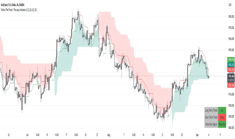
Follow The Trend - The Lazy Indicator**Understanding the 'Follow The Trend - The Lazy Indicator'**
This indicator is designed to help traders visualize the trend direction over both short-term and long-term periods. Let's dive deeper into understanding how it's designed and how it can be beneficial.
**1. How It's Designed:**
* **User Inputs:**
The first few lines ask the user for specific inputs related to the Average True Range (ATR) length and values for both short-term and long-term trends. ATR is a volatility indicator and, in this context, is used as part of the SuperTrend calculation.
* **SuperTrend Calculations:**
This indicator uses the SuperTrend, a popular trend-following indicator. Here, two SuperTrends are being calculated – one for short-term trends and another for long-term trends. The direction of the SuperTrend is also determined, signaling whether the trend is upwards or downwards.
* **Visual Representations:**
* The short-term SuperTrend is represented using green lines (for uptrend) and red lines (for downtrend).
* The indicator also provides a "cloud" between a Simple Moving Average (SMA) of the closing price (over the past 10 periods) and the long-term SuperTrend. This cloud changes color based on the direction of the long-term trend, providing another visual cue about market direction.
* **Signal Evaluation:**
This part of the code interprets the combination of short-term and long-term trends and assigns trading signals like "Strong Buy," "Weak Buy," "Strong Sell," "Weak Sell," and so on. This can act as a guide for traders, suggesting potential trading actions based on the prevailing trends.
* **Signal Coloration:**
The indicator also assigns colors to each signal. For instance, "Strong Buy" is green, "Strong Sell" is red, and there are transparency adjustments for weak signals to differentiate them from strong ones.
* **Tabular Presentation:**
At the end of the script, there’s a table displayed on the chart, summarizing the direction of both the long-term and short-term trends, as well as the overall trading signal. It provides a quick snapshot for traders to understand the current market scenario.
**2. How It May Be Helpful:**
* **Simplicity:**
The "Follow The Trend" indicator, despite its underlying complexity, is presented in a very user-friendly way. By just looking at the color cues and the table, traders can quickly understand the market's trend and potential direction.
* **Dual Trend Analysis:**
By analyzing both short-term and long-term trends, traders get a comprehensive view. This helps in understanding if the market is just having a short-term retracement (temporary reverse in direction) or if there's a genuine change in the long-term trend.
* **Adaptability:**
Traders can adjust the ATR values and lengths to customize the sensitivity of the indicator. This means it can be adapted to different assets or varying market conditions.
* **Actionable Signals:**
The signals like "Strong Buy" or "Weak Sell" are direct suggestions that can help in decision-making. Especially for beginners or those who might be overwhelmed by complex charts, such signals can be very beneficial.
* **Visual Appeal:**
The combination of trend lines, cloud coloring, and tabulated information provides a visually pleasing and easy-to-understand representation of market data. This can help reduce analysis fatigue and make chart reading more enjoyable.
In conclusion, the "Follow The Trend - The Lazy Indicator" is designed to make trend-following more accessible and actionable. By providing clear visual cues and combining short-term and long-term trend analysis, it offers traders a tool that's both comprehensive and user-friendly. Whether you're a beginner looking for clear signals or an experienced trader wanting an overview of the market trend, this indicator might be a useful addition to your toolkit.
Baseline Indicator [SS]Hello,
This is the Baseline Indicator. I modelled it after one of my favourite Tradingview chart types, the baseline type (shown in image below):
I really love this chart, but I wanted a way for it to:
a) Be static and not move with the chart; and
b) Auto calculate the baseline average for a specified period of time.
So I created this indicator which does essentially that.
What it does:
The indicator will calculate the average between the high and low of a user defined timeframe. The timeframe is customizable, but it defaults to daily. It will then plot the average (or baseline) of the high and low over that specified timeframe. The default plot is a candle plot. It will change the colours of the candles to green (for above the baseline) and red (for below the baseline). The chart below shows an example of the indicator with candles on SPY. The Baseline timeframe is set to 1 hour:
You can choose whether you want to plot the current baseline average or the previous.
The advantage to plotting the previous is that this provide a static reference point and can be helpful on the 30 and 60 minute timeframe. Here is an example:
In this example on SPY, the indicator is plotting the previous average. You can see SPY is using this as support and creating a "staircase" pattern. This is indicative of a trend.
The example above is using the previous day average on the daily timeframe during a sideways day. You can see that the price action accumulates and is consistently drawn to this point.
Inversely, you can manually select your own baseline price if you want a static, self-calculated baseline reference point.
Options and Settings:
Below is an outline of the menu as well as a brief explanation of the options and settings:
To view your chart as a baseline chart, make sure you select the "Line" input and then hide the candles on your chart using your chart settings (see image below):
The purple arrow shows how to hide the candles. You select the "Eye" Icon which should then become greyed out and you will be left with the baseline chart from the indicator.
Why use baseline average?
The average between the high and low of a designated timeframe is a very helpful value. In choppy markets, this acts as a key point of frequent return. In trendy markets, this acts as a reference point of trend direction and strength. I encourage you to play around with the indicator and review some historical charts using it, and you will see some patterns emerge!
Final thoughts:
I have also done a quick tutorial video on the indicator for your reference, you can check that out below:
Thanks for checking out the indicator and I hope you like it!

Order Block & Fractal Zones (OBFZ) Indicator.The "Order Block & Fractal Zones (OBFZ) Indicator." indicator is a technical analysis tool designed to identify and display key price levels on a chart. It utilizes the concept of Order Blocks and the Fractal Value Zone (FVG) to highlight potential support and resistance areas in the market.
The indicator marks bearish and bullish Order Blocks, which are significant price structures characterized by consecutive higher highs and higher lows for a bearish block, or consecutive lower lows and lower highs for a bullish block. These blocks suggest potential areas of market reversal.
Additionally, the indicator calculates and displays retracement and extension levels within each Order Block. These levels are derived from the previous highest and lowest values within a specified number of candles. The retracement levels include 38.2%, 50%, and 61.8%, while the extension levels include 138.2%, 150%, and 161.8%.
Furthermore, the Fractal Value Zone (FVG) is determined to identify the highest high and lowest low within the selected number of candles. The FVG helps identify areas of significant price action and potential breakout zones.
Overall, the "Order Block & Fractal Zones (OBFZ) Indicator." indicator assists traders in identifying potential support and resistance levels, as well as areas of market reversal or breakout. It can be used to make informed trading decisions based on key price levels within the observed price action.
Time Series Model IndicatorHello,
I am releasing this time series modelling indicator.
Brief overview of the indicator's functionality:
The Time Series Model indicator is a technical analysis tool that calculates and visualizes a linear regression line based on historical price data. It assesses the trend direction and provides an outer band around the regression line to indicate potential support and resistance levels. The indicator also detects outliers in the price data and calculates correlations between the time variable and the closing price. It offers various customization options such as input length, user-defined hours in advance, display settings for tables and fills, and the ability to show variable correlations. Overall, this indicator aims to help traders identify trends, potential reversals, and price extremes in a given time series.
Specific Functions:
Slope Calculations: The indicator calculates the slope and intercept of the regression line using the specified length of assessment (user defined). It also computes the residuals, standard error of the regression, and the upper and lower bounds of the standard error region. Additionally, it calculates multiple standard deviation bands around the regression line. The slope will change to green if the stock is in an uptrend and to red if the stock is in a downtrend.
Outliers: This feature detects extreme positive and negative outliers based on the z-score calculated from the price data. It highlights the outliers with a red background color to red if this option is selected.
Correlation to Time Assessments: This feature performs trend assessments based on the correlation between time and price data. It identifies uptrends, downtrends, falling trends, rising trends, etc.
Outerband Plots: This feature plots the regression line, standard error bands, and multiple standard deviation bands around the regression line. It also fills the areas between these lines.
Trend Assessment: This feature further assesses the trend based on the strength of the correlation. It identifies strong up or down trends, moderate trends, weak trends, no trend, etc.
Linear Regression Time Data: This section retrieves price data (close, high, low, open) for the specified timeframe and stores them in arrays for a linear regression analysis.
Define LinReg Variables: This section calculates linear regression lines and their upper and lower control limits for the close, low and high prices. It also calculates the correlation between close price and time.
Manual assessments: This feature allows for the manual assessment of time series data. The user can input a look forward for hours in the future and get the predicted price range based on the current time relationship. See image below:
Calculating model "fit": The indicator will display the amount of time the stock closes within and outside its respective bands to ascertain the degree of "fit" (see image below):
Explanations:
The outer cloud: The outer, tealish green cloud represents the regression line + 1.5 standard deviations from the regression line.
The inner cloud: The inner, white coloured cloud represents the immediate time series range calculated through regression of the open, high and low price of the ticker.
Correlations:
The ability of the indicator to calculate correlations on both the smaller and larger timeframes are its strongest feature. You can see the formation of trends by tracking the correlation over the length of the time series model's assessment. You can also track the degree of change. The image below shows the correlation table:
In this image, we can see that the stock is in a moderate downtrend manifested by a correlation of -0.73 (purple arrow).
This downtrend is weakening as manifested by a positive change of 0.05 on the shorter timeframe.
If we scroll down on the table and see the Close, High and Low, we can see that the larger trend over time is a downtrend and that this downtrend is actually strengthening. We know this by the negative change (negative change = significant inverse relationship to time is increasing. i.e. as time increases, the stock price decreases proportionately).
So what does negative correlation to time mean?
If a stock's price exhibits a negative correlation to time, it implies that there is a systematic relationship between the passage of time and the stock's price movement in the opposite direction. This finding could have several potential implications for traders and investors. Firstly, it suggests that the stock's price tends to decrease as time progresses, indicating a downward trend or bearish sentiment. This information might be useful for traders looking to capitalize on short-selling or hedging strategies. Secondly, it could indicate a potential opportunity to predict future price movements based on the timing of negative correlations. By understanding the relationship between time and price, investors may be able to make more informed decisions about when to buy or sell the stock. Lastly, a negative correlation to time may also suggest the influence of external factors or market conditions that systematically impact the stock's performance over time. Therefore, monitoring this correlation can provide insights into broader market dynamics and help investors better understand the stock's behavior.
What about a positive correlation to time?
If a stock's price demonstrates a positive correlation to time, it means that there is a consistent relationship between the passage of time and the stock's price movement in the same direction. This positive correlation to time can have significant implications for traders and investors. Firstly, it indicates a potential upward trend or bullish sentiment, suggesting that the stock's price tends to increase as time progresses. This information can be valuable for investors seeking long-term growth opportunities or looking to capitalize on upward price movements. Secondly, a positive correlation to time may provide insights into the stock's historical performance patterns and help identify potential buying or selling opportunities based on the timing of positive correlations. Additionally, understanding this correlation can aid in assessing the stock's overall trajectory and identifying potential market trends. It's important to note that positive correlation to time does not guarantee future performance, but it can offer valuable information to inform investment decisions.
Because this indicator is pretty big, I have done an overview and tutorial video which I will link below:
As always, please leave your comments and suggestions below.
I thank you for taking the time to read and check out this indicator.
Safe trades everyone and enjoy your weekend!

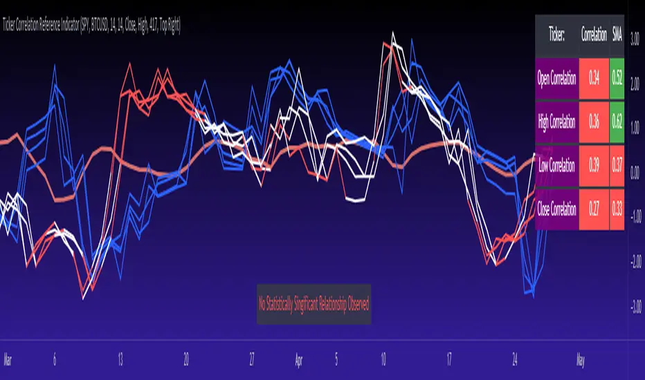
Ticker Correlation Reference IndicatorHello,
I am super excited to be releasing this Ticker Correlation assessment indicator. This is a big one so let us get right into it!
Inspiration:
The inspiration for this indicator came from a similar indicator by Balipour called the Correlation with P-Value and Confidence Interval. It’s a great indicator, you should check it out!
I used it quite a lot when looking for correlations; however, there were some limitations to this indicator’s functionality that I wanted. So I decided to make my own indicator that had the functionality I wanted. I have been using this for some time but decided to actual spruce it up a bit and make it user friendly so that I could share it publically. So let me get into what this indicator does and, most importantly, the expanded functionality of this indicator.
What it does:
This indicator determines the correlation between 2 separate tickers. The user selects the two tickers they wish to compare and it performs a correlation assessment over a defaulted 14 period length and displays the results. However, the indicator takes this much further. The complete functionality of this indicator includes the following:
1. Assesses the correlation of all 4 ticker variables (Open, High, Low and Close) over a user defined period of time (defaulted to 14);
2. Converts both tickers to a Z-Score in order to standardize the data and provide a side by side comparison;
3. Displays areas of high and low correlation between all 4 variables;
4. Looks back over the consistency of the relationship (is correlation consistent among the two tickers or infrequent?);
5. Displays the variance in the correlation (there may be a statistically significant relationship, but if there is a high variance, it means the relationship is unstable);
6. Permits manual conversion between prices; and
7. Determines the degree of statistical significance (be it stable, unstable or non-existent).
I will discuss each of these functions below.
Function 1: Assesses the correlation of all 4 variables.
The only other indicator that does this only determines the correlation of the close price. However, correlation between all 4 variables varies. The correlation between open prices, high prices, low prices and close prices varies in statistically significant ways. As such, this indicator plots the correlation of all 4 ticker variables and displays each correlation.
Assessing this matters because sometimes a stock may not have the same magnitude in highs and lows as another stock (one stock may be more bullish, i.e. attain higher highs in comparison to another stock). Close price is helpful but does not pain the full picture. As such, the indicator displays the correlation relationship between all 4 variables (image below):
Function 2: Converts both tickers to Z-Score
Z-Score is a way of standardizing data. It simply measures how far a stock is trading in relation to its mean. As such, it is a way to express both tickers on a level playing field. Z-Score was also chosen because the Z-Score Values (0 – 4) also provide an appropriate scale to plot correlation lines (which range from 0 to 1).
The primary ticker (Ticker 1) is plotted in blue, the secondary comparison ticker (Ticker 2) is plotted in a colour changing format (which will be discussed below). See the image below:
Function 3: Displays areas of high and low correlation
While Ticker 1 is plotted in a static blue, Ticker 2 (the comparison ticker) is plotted in a dynamic, colour changing format. It will display areas of high correlation (i.e. areas with a P value greater than or equal to 0.9 or less than and equal to -0.9) in green, areas of moderate correlation in white. Areas of low correlation (between 0.4 and 0 or -0.4 and 0) are in red. (see image below):
Function 4: Checks consistency of relationship
While at the time of assessing a stock there very well maybe a high correlation, whether that correlation is consistent or not is the question. The indicator employs the use of the SMA function to plot the average correlation over a defined period of time. If the correlation is consistently high, the SMA should be within an area of statistical significance (over 0.5 or under -0.5). If the relationship is inconsistent, the SMA will read a lower value than the actual correlation.
You can see an example of this when you compare ETH to Tezos in the image below:
You can see that the correlation between ETH and Tezo’s on the high level seems to be inconsistent. While the current correlation is significant, the SMA is showing that the average correlation between the highs is actually less than 0.5.
The indicator also tells the user narratively the degree of consistency in the statistical relationship. This will be discussed later.
Function 5: Displays the variance
When it comes to correlation, variance is important. Variance simply means the distance between the highest and lowest value. The indicator assess the variance. A high degree of variance (i.e. a number surpassing 0.5 or greater) generally means the consistency and stability of the relationship is in issue. If there is a high variance, it means that the two tickers, while seemingly significantly correlated, tend to deviate from each other quite extensively.
The indicator will tell the user the variance in the narrative bar at the bottom of the chart (see image below):
Function 6: Permits manual conversion of price
One thing that I frequently want and like to do is convert prices between tickers. If I am looking at SPX and I want to calculate a price on SPY, I want to be able to do that quickly. This indicator permits you to do that by employing a regression based formula to convert Ticker 1 to Ticker 2.
The user can actually input which variable they would like to convert, whether they want to convert Ticker 1 Close to Ticker 2 Close, or Ticker 1 High to Ticker 2 High, or low or open.
To do this, open the settings and click “Permit Manual Conversion”. This will then take the current Ticker 1 Close price and convert it to Ticker 2 based on the regression calculations.
If you want to know what a specific price on Ticker 1 is on Ticker 2, simply click the “Allow Manual Price Input” variable and type in the price of Ticker 1 you want to know on Ticker 2. It will perform the calculation for you and will also list the standard error of the calculation.
Below is an example of calculating a SPY price using SPX data:
Above, the indicator was asked to convert an SPX price of 4,100 to a SPY price. The result was 408.83 with a standard error of 4.31, meaning we can expect 4,100 to fall within 408.83 +/- 4.31 on SPY.
Function 7: Determines the degree of statistical significance
The indicator will provide the user with a narrative output of the degree of statistical significance. The indicator looks beyond simply what the correlation is at the time of the assessment. It uses the SMA and the highest and lowest function to make an assessment of the stability of the statistical relationship and then indicates this to the user. Below is an example of IWM compared to SPY:
You will see, the indicator indicates that, while there is a statistically significant positive relationship, the relationship is somewhat unstable and inconsistent. Not only does it tell you this, but it indicates the degree of inconsistencies by listing the variance and the range of the inconsistencies.
And below is SPY to DIA:
SPY to BTCUSD:
And finally SPY to USDCAD Currency:
Other functions:
The indicator will also plot the raw or smoothed correlation result for the Open, High, Low or Close price. The default is to close price and smoothed. Smoothed just means it is displaying the SMA over the raw correlation score. Unsmoothing it will show you the raw correlation score.
The user also has the ability to toggle on and off the correlation table and the narrative table so that they can just review the chart (the side by side comparison of the 2 tickers).
Customizability
All of the functions are customizable for the most part. The user can determine the length of lookback, etc. The default parameters for all are 14. The only thing not customizable is the assessment used for determining the stability of a statistical relationship (set at 100 candle lookback) and the regression analysis used to convert price (10 candle lookback).
User Notes and important application tips:
#1: If using the manual calculation function to convert price, it is recommended to use this on the hourly or daily chart.
#2: Leaving pre-market data on can cause some errors. It is recommended to use the indicator with regular market hours enabled and extended market hours disabled.
#3: No ticker is off limits. You can compare anything against anything! Have fun with it and experiment!
Non-Indicator Specific Discussions:
Why does correlation between stocks mater?
This can matter for a number of reasons. For investors, it is good to diversify your portfolio and have a good array of stocks that operate somewhat independently of each other. This will allow you to see how your investments compare to each other and the degree of the relationship.
Another function may be getting exposure to more expensive tickers. I am guilty of trading IWM to gain exposure to SPY at a reduced cost basis :-).
What is a statistically significant correlation?
The rule of thumb is anything 0.5 or greater is considered statistically significant. The ideal setup is 0.9 or more as the effect is almost identical. That said, a lot of factors play into statistical significance. For example, the consistency and variance are 2 important factors most do not consider when ascertaining significance. Perhaps IWM and SPY are significantly correlated today, but is that a reliable relationship and can that be counted on as a rule?
These are things that should be considered when trading one ticker against another and these are things that I have attempted to address with this indicator!
Final notes:
I know I usually do tutorial videos. I have not done one here, but I will. Check back later for this.
I hope you enjoy the indicator and please feel free to share your thoughts and suggestions!
Safe trades all!
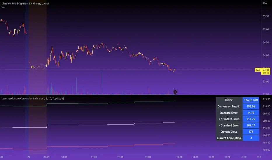
Leveraged Share Conversion IndicatorHello everyone,
Releasing my leveraged share conversion indicator.
I noticed that the option traders have all the fun and resources but the share traders don't really have many resources in terms of adjusting or profits on leveraged and inverse shares. So, I decided to change that this this indicator!
What it does:
In a nut shell, the calculator converts one share to the price of another through the use of a regression based analysis.
There are multiple pre-stored libraries available in the indicator, including IWM, SPY, BTC and QQQ.
However, if the ticker you want to convert is not in one of the pre-defined libraries, you can select "Use Alternative Ticker" and indicate the stock you wish to convert.
Using Libraries:
If the conversion you want is available in one of the libraries, simply select the conversion you would like. For example, if you want to convert SPY to SPXU, select that conversion. The indicator will then launch up the conversion results which it will display in a dashboard to the right and will also display the plotted conversion on a chart (see imagine below:
In the dashboard, the indicator will show you:
a) The conversion result: This is the most likely price based on the analysis
b) The standard error: This is the degree of error within the conversion. This is the basis of the upper and lower bands. In statistics, we can add and subtract the standard error from the likely result to get the "Upper" and "Lower" Confidence levels of assessment. This is just a fancy way of saying the range in which our predicted result will fall. So, for example, in the image above it shows you the price of SPXU is assessed to be around 16$ based on SPY's price. The standard error range is 15-17. This means that, the majority of the time, based on this SPY close price, SPXU should fall between 15-17$ with the most likely result being the 16$ range.
Why is there error?
Because leveraged shares have an inherent decay in them. The degree of decay can be captured utilizing the standard error. So at any given time, the small changes in price fluctuations caused by the fact that the share is leveraged can be assessed and displayed using standard error measurements.
c) The current correlation: This is important! Because if the stocks are not strongly correlated, it tells you there is a problem. In general, a perfect correlation is 1 or -1 (perfectly negative correlation or inverse correlation) and a bad correlation is anything under 0.5 or -0.5. So, for an INVERSE leveraged share, you would expect the correlation to read a negative value. Ideally -1. Because the inverse share is doing the opposite of the underlying (if the underlying goes up, the inverse goes down and vice versa). For a non-inverse leveraged share, the correlation should read a positive value. As the underlying goes up, so too does the leveraged.
Manual Conversion using Library:
If you are using a pre-defined library but want to convert a manual close price, simply select "Enable manual conversion" at the bottom of the settings and then type in the manual close price. If you are converting SPY to SPXU, type in the manual close price of SPY to get the result in SPXU and vice versa.
Using an Alternative Ticker:
If the ticker you want is not available in a pre-defined library (i.e. UDOW, BOIL, APPU, TSLL, etc.), simply select "Use Alternative Ticker" in the settings menu. When you select this, make sure your chart is set to the dominant chart. The "Dominant chart" is the chart of the underlying. So, if you want TSLA to TSLL, be sure you have the TSLA chart open and then set your Alternative Ticker to TSLL or TSLQ.
The process of using an Alternative Ticker remains the same. If you wish to enter a manual close price, simply select "Enable Manual Conversion".
Special Considerations:
The indicator uses 1 hour candles. Thus, please leave your dominant chart set on the 1 hour time frame to avoid confusing the indicator.
The lookback period of the manual conversion is 10, 1 hour candles. As such, the results should not be used to make longer term predictions (i.e. anything over 6 months is pushing the capabilities of a manual conversion but fair game for the pre-defined library conversions which use more longer-term data).
You can technically use the indicator to make assessments between 2 separate equities. For example, the relationship between QQQ and ARKK, SPY and DIA, IWM and SPY, etc. If there is a good enough correlation, you can use it to make predictions of the opposing ticker. For example, if DIA goes to 340, what would SPY likely do? And vice versa.
As always, I have prepared a tutorial and getting started video for your reference:
As always, let me know your questions and requests/recommendations for the indicator below. This indicator is my final reference indicator in my 3 part reference indicator release. I will be going back over the feedback to make improvements based on the suggestions I have received. So please feel free to leave any suggestions here and I will take them into consideration for improvement!
Thank you for checking this out and as always, safe trades!
RSI Overbought/Oversold + Divergence IndicatorDESCRIPTION:
This script combines the Relative Strength Index ( RSI ), Moving Average and Divergence indicator to make a better decision when to enter or exit a trade.
- The Moving Average line (MA) has been made hidden by default but enhanced with an RSIMA cloud.
- When the RSI is above the selected MA it turns into green and when the RSI is below the select MA it turns into red.
- When the RSI is moving into the Overbought or Oversold area, some highlighted areas will appear.
- When some divergences or hidden divergences are detected an extra indication will be highlighted.
- When the divergence appear in the Overbought or Oversold area the more weight it give to make a decision.
- The same color pallet has been used as the default candlestick colors so it looks familiar.
HOW TO USE:
The prerequisite is that we have some knowledge about the Elliot Wave Theory, the Fibonacci Retracement and the Fibonacci Extension tools.
Wave 1
(1) When we receive some buy signals we wait until we receive some extra indications.
(2) On the RSI Overbought/Oversold + Divergence Indicator we can see a Bullish Divergence and our RSI is changing from red to green ( RSI is higher then the MA).
(3) If we are getting here into the trade then we need to use a stop loss. We put our stop loss 1 a 2 pips just below the lowest wick. We also invest maximum 50% of the total amount we want to invest.
Wave 2
(4) Now we wait until we see a clear reversal and here we starting to use the Fibonacci Retracement tool. We draw a line from the lowest point of wave(1) till the highest point of wave (1). When we are retraced till the 0.618 fib also called the golden ratio we check again the RSI Overbought/Oversold + Divergence Indicator. When we see a reversal we do our second buy. We set again a stop loss just below the lowest wick (this is the yellow line on the chart). We also move the stop loss we have set in step (3) to this level.
Wave 3
(5) To identify how far the uptrend can go we need to use the Fibonacci Extension tool. We draw a line from the lowest point of wave(1) till the highest point of wave (1) and draw it back to the lowest point of wave (2). Wave (3) is most of the time the longest wave and can go till it has reached the 1.618 or 2.618 fib. On the 1.618 we can take some profit. If we don't want to sell we move our stop loss to the 1 fib line (yellow line on the chart).
(6) We wait until we see a clear reversal on the Overbought/Oversold + Divergence Indicator and sell 33% to 50% of our investment.
Wave 4
(7) Now we wait again until we see a clear reversal and here we starting to use the Fibonacci Retracement tool. We draw a line from the lowest point of wave(2) till the highest point of wave (3). When we are retraced till the 0.618 fib also called the golden ratio we check again the RSI Overbought/Oversold + Divergence Indicator. When we see a reversal we buy again. We set again a stop loss just below the lowest wick (this is the yellow line on the chart).
(8) If we bought at the first reversal ours stop los was triggered (9) and we got out of the trade.
(9) If we did not bought at step (7) because our candle did not hit the 0.618 fib or we got stopped out of the trade we buy again at the reversal.
Wave 5
(10) To identify how far the uptrend can go we need to use the Fibonacci Extension tool. We draw a line from the lowest point of wave(2) till the highest point of wave (3) and draw it back to the lowest point of wave (4). Most of the time wave 5 goes up till it has reached the 1 fib. And that is the point where we got out of the trade with all of our investment. In this trade we got out of the trade a bit earlier. We received the sell signals and got a reversal on the Overbought/Oversold + Divergence Indicator.
We are hoping you learned something so you can make better decisions when to get into or out of a trade.
If you have any question just drop it into the comments below.
FEATURES:
• You can show/hide the RSI .
• You can show/hide the MA.
• You can show/hide the lRSIMA cloud.
• You can show/hide the Stoch RSI cloud.
• You can show/hide and adjust the Overbought and Oversold zones.
• You can show/hide and adjust the Overbought Extended and Oversold Extended zones.
• You can show/hide the Overbought and Oversold highlighted zones.
• Etc...
HOW TO GET ACCESS TO THE SCRIPT:
• Favorite the script and add it to your chart.
REMARKS:
• This advice is NOT financial advice.
• We do not provide personal investment advice and we are not a qualified licensed investment advisor.
• All information found here, including any ideas, opinions, views, predictions, forecasts, commentaries, suggestions, or stock picks, expressed or implied herein, are for informational, entertainment or educational purposes only and should not be construed as personal investment advice.
• We will not and cannot be held liable for any actions you take as a result of anything you read here.
• We only provide this information to help you make a better decision.
• While the information provided is believed to be accurate, it may include errors or inaccuracies.
Good Luck and have fun,
The CryptoSignalScanner Team
RSI BGCOLOR indicatorHi
This is a standard RSI indicator.
It changes the background color to green if the RSI reading is greater than the RSI bullish value and it changes to red if the RSI is below the RSI bearish value.
It will turn black for values between RSI bullish value and RSI bearish value.
You can tweak it to your liking, for example if you'd like to detect long only trades that are above 30 then you set RSI bearish value to 0 and RSI bullish value to 30 and it will only get long signals.
P.S More confirmation indicators will be necessary
Green to Red Gradient for Dynamic / Color Changing IndicatorsI have evenly divided every color between green and red.
This gradient is useful for pine coders who are creating color changing, dynamic, or gradient indicators.

[blackcat] L1 volume Oscillator IndicatorLevel: 1
Background
Omega Research proposed volume oscillator indicator in June 2000.
Function
This is actually a volume-price indicator. With columns greater than zero line, which indicates a up trend. Otherwise, it is a down trend. Green columns indicate up trend pump; yellow columns indicate up trend retracements; red columns indicate down trend dump; blue columns indicate down trend re-bounce.
Key Signal
VolOsc --> volume osillator indicator.
Remarks
This is a Level 1 free and open source indicator.
Feedbacks are appreciated.
Voss Strategy (Filter + Trend Indicator) [Bitduke]Created strategy based on Voss Predictive Filter, implemented by TradingView user e2e4mfck.
Voss Predictive Filter
This is a relatively new filter from John F. Ehlers’ article, “A Peek Into The Future .” Ehlers describes the calculation of a new filter that could help signal cyclical turning points in markets.
But filter has a negative group delay and while an indicator based on it cannot actually see into the future, it may provide the trader with signals in advance of other indicators.
In mentioned article he tested filter on SPY and at one point in time "it went into a trend mode in January 2019, and the cycle signal failed miserably, signaling a short position during the runup. <...> The only way to minimize the impact of this condition is to employ an additional trend detector."
Thus I've added another Ehlers' based trend based indicator Instantaneous Trendline (thanks to LazyBear for implementation) to minimize the impact of the trend mode and got a good results on XBTUSD pair 4h.
Backtest :
> Range: 2016 - 2020
> XBTUSD
> 4h
> ~20% drawdown
> Sharpe (0.361, not too impressive)
I think it can be improved with Risk Management system and experimenting with various trend following indicators.

TD/VixFix/VolatilityStop/Momentum/WeisWave IndicatorsA nice collection of Buy/Sell indicators.
Send me some love if you find this useful:
btc: 1GcWRvkrLwmv2sD8nHYvJ7ZWf4qB1tQ1r9
eth: 0x3061513011c071d9ced8a375e51004aba26410e8
etc: 0xc7ad9ad4d6b0008a1be897666e7f643e7259a509
ltc: LY5pxGhRvNvGJcrb4pnTyH2A2hN1DPjLqt
xvg: DKcou5NyfvVzqLjjDo1eFTNaZuThdZaVUJ
zrx: 0x3061513011c071d9ced8a375e51004aba26410e8
Many thanks to:
glaz, ChrisMoody, admin, LazyBear

RSI Currency Strength IndicatorRSI based currency strength indicator. Other indicators only give 7 currencies, leaving NZD. This one is an updated version which gives all 8 major currencies.

Money Flow Index IndicatorImplementation of the money flow indicator. Its identical to the default MFi listed in TradingView indicators
Created it for practice, maybe someone can find it useful.

Hammer, Hanging man, Shooting star, Inverted hammer IndicatorsThis script creates Hammer, Hanging man, Shooting star, Inverted hammer chart indicators.
RED + CROSS = Sell
GREEN + DOT = Buy

Ichimoku Screener [Pineify]Advanced Multi-Timeframe Ichimoku Screener - Complete Market Analysis Tool
This sophisticated Ichimoku Screener represents a comprehensive approach to multi-timeframe market analysis, combining four distinct Ichimoku-based indicators into a unified screening system. Unlike traditional single-symbol indicators, this screener provides simultaneous analysis across multiple assets and timeframes, enabling traders to identify optimal trading opportunities with enhanced precision and efficiency.
Key Features
Multi-asset screening capability for up to 10 symbols simultaneously
Four customizable timeframes per symbol for comprehensive analysis
Four integrated Ichimoku-based indicators working in harmony
Real-time visual feedback with color-coded signals
Customizable Ichimoku parameters for personalized analysis
Clean, organized table display for easy interpretation
Automated signal strength assessment and timing
How It Works
The screener employs the traditional Ichimoku Kinko Hyo methodology, utilizing five core components: Conversion Line (Tenkan-sen), Base Line (Kijun-sen), Leading Span A (Senkou Span A), Leading Span B (Senkou Span B), and displacement calculations. Each component is mathematically calculated using specific period lengths:
Conversion Line = (Highest High + Lowest Low) / 2 over conversion period
Base Line = (Highest High + Lowest Low) / 2 over base period
Leading Span A = (Conversion Line + Base Line) / 2
Leading Span B = (Highest High + Lowest Low) / 2 over lagging span period
The screener processes these calculations across multiple securities simultaneously using TradingView's security() function, enabling real-time cross-asset analysis. The system tracks state changes using barssince() functions to provide precise timing information for each signal type.
Trading Ideas and Insights
This screener excels in identifying momentum convergence patterns where multiple Ichimoku components align across different timeframes. The most powerful signals occur when:
Cloud color aligns with price position relative to the cloud
Conversion Line crosses above/below Base Line in the same direction as cloud bias
Multiple timeframes show consistent directional bias
Entry signals appear with minimal bars since formation (indicating fresh momentum)
For trend following strategies , focus on symbols where the cloud maintains consistent color across higher timeframes while showing recent entry signals on lower timeframes. For reversal opportunities , identify assets where cloud color changes coincide with price re-entering the cloud after extended periods above or below.
The screener particularly excels in cryptocurrency and forex markets where momentum shifts can be dramatic and sustained. By monitoring multiple timeframes simultaneously, traders can identify when short-term signals align with longer-term trends, significantly improving trade success probability.
How Multiple Indicators Work Together
The four integrated indicators create a comprehensive analytical framework through synergistic interaction:
Ichimoku Cloud (IchiCld) establishes the primary trend bias by comparing Leading Span A with Leading Span B. When Span A > Span B, the cloud displays bullish characteristics; when Span A < Span B, bearish characteristics emerge. The indicator tracks duration since the last cloud color change, providing momentum persistence insight.
Ichimoku Lagging Cloud (IchiLagCld) determines price position relative to the displaced cloud formation. This indicator identifies whether current price action occurs above, below, or within the cloud structure, revealing support/resistance dynamics and trend confirmation signals.
Conversion vs Base (IchiC>Base) monitors the relationship between short-term (Conversion Line) and medium-term (Base Line) momentum. Crossovers in this relationship often precede significant price movements and provide early trend change warnings.
Ichimoku Entry (IchiEnt) synthesizes all components into actionable signals by requiring alignment between cloud bias, price position, and conversion/base relationship. This multi-factor confirmation approach significantly reduces false signals while maintaining sensitivity to genuine momentum shifts.
The mathematical foundation ensures that each indicator contributes unique information while maintaining logical consistency. The system's strength lies in requiring multiple confirmations before generating entry signals, following Ichimoku's original philosophy of comprehensive market analysis.
Unique Aspects
This implementation distinguishes itself through several innovative features:
Advanced State Tracking : Unlike standard Ichimoku indicators that show current values, this screener tracks duration since state changes , providing crucial timing information for signal freshness and momentum strength assessment.
Multi-Asset Efficiency : The screener eliminates the need to manually check multiple charts by presenting comparative analysis across assets and timeframes in a single view, dramatically improving analytical efficiency.
Customizable Visual Feedback : The color-coding system adapts to different signal types and strengths, with recent signals receiving enhanced visual prominence to draw attention to fresh opportunities.
Professional Table Architecture : The organized display accommodates up to 40 symbol-timeframe combinations (10 symbols × 4 timeframes), with intelligent pagination for optimal screen utilization.
Signal Correlation Analysis : By displaying multiple timeframes for each symbol, traders can quickly identify timeframe confluence and divergence patterns that would otherwise require extensive manual analysis.
How to Use
Symbol Configuration : Enter up to 10 symbols in the Symbol input group. Use full exchange:ticker format for optimal compatibility (e.g., "BINANCE:BTCUSDT").
Timeframe Selection : Configure four timeframes in ascending order for logical analysis progression. Recommended combinations include 1m/5m/15m/1h for intraday analysis or 1h/4h/1D/1W for swing trading.
Ichimoku Parameters : Adjust the four core parameters based on your trading style:
Conversion Line Length (default: 9) - Controls short-term momentum sensitivity
Base Line Length (default: 26) - Determines medium-term trend identification
Leading Span B Length (default: 52) - Sets long-term trend calculation period
Displacement (default: 26) - Controls forward projection of cloud structure
Signal Interpretation :
Green backgrounds indicate bullish conditions
Red backgrounds indicate bearish conditions
Numerical values show bars since last state change
"L:" prefix indicates long entry signals
"S:" prefix indicates short entry signals
"N/A" indicates neutral/transitional states
Trading Workflow : Scan for symbols showing consistent signals across multiple timeframes, prioritize fresh signals (low bar counts), and use individual charts for precise entry timing and risk management.
Customization
The screener accommodates various trading approaches through parameter adjustment:
Scalping Configuration : Use shorter periods (Conversion: 5, Base: 13, Span B: 26) with 1m/3m/5m/15m timeframes for high-frequency opportunities.
Swing Trading Setup : Employ standard parameters with 4h/1D/3D/1W timeframes for position trading across days or weeks.
Cryptocurrency Optimization : Given crypto's 24/7 nature, consider using 4h/8h/1D/3D combinations for optimal signal timing.
Symbol selection can focus on correlated assets (e.g., major cryptocurrencies) for sector analysis or diverse assets for portfolio opportunity identification. The flexible timeframe configuration allows adaptation to any market's characteristic volatility and trading patterns.
Conclusion
This Advanced Multi-Timeframe Ichimoku Screener transforms traditional single-chart analysis into a comprehensive market monitoring system. By integrating multiple Ichimoku components across various timeframes and assets, it provides traders with unprecedented analytical efficiency and signal reliability.
The mathematical rigor of traditional Ichimoku analysis combines with modern Pine Script capabilities to deliver a professional-grade screening tool. Whether used for identifying trend continuation opportunities, spotting potential reversals, or conducting broad market analysis, this screener offers the analytical depth and practical functionality required for serious trading applications.
The system's emphasis on signal confluence across multiple timeframes and indicators significantly improves trade selection quality while reducing analysis time. For traders seeking to leverage Ichimoku's proven methodology across multiple markets simultaneously, this screener represents an essential analytical upgrade to traditional single-symbol approaches.
Kelly Optimal Leverage IndicatorThe Kelly Optimal Leverage Indicator mathematically applies Kelly Criterion to determine optimal position sizing based on market conditions.
This indicator helps traders answer the critical question: "How much capital should I allocate to this trade?"
Note that "optimal position sizing" does not equal the position sizing that you should have. The Optima position sizing given by the indicator is based on historical data and cannot predict a crash, in which case, high leverage could be devastating.
Originally developed for gambling scenarios with known probabilities, the Kelly formula has been adapted here for financial markets to dynamically calculate the optimal leverage ratio that maximizes long-term capital growth while managing risk.
Key Features
Kelly Position Sizing: Uses historical returns and volatility to calculate mathematically optimal position sizes
Multiple Risk Profiles: Displays Full Kelly (aggressive), 3/4 Kelly (moderate), 1/2 Kelly (conservative), and 1/4 Kelly (very conservative) leverage levels
Volatility Adjustment: Automatically recommends appropriate Kelly fraction based on current market volatility
Return Smoothing: Option to use log returns and smoothed calculations for more stable signals
Comprehensive Table: Displays key metrics including annualized return, volatility, and recommended exposure levels
How to Use
Interpret the Lines: Each colored line represents a different Kelly fraction (risk tolerance level). When above zero, positive exposure is suggested; when below zero, reduce exposure. Note that this is based on historical returns. I personally like to increase my exposure during market downturns, but this is hard to illustrate in the indicator.
Monitor the Table: The information panel provides precise leverage recommendations and exposure guidance based on current market conditions.
Follow Recommended Position: Use the "Recommended Position" guidance in the table to determine appropriate exposure level.
Select Your Risk Profile: Conservative traders should follow the Half Kelly or Quarter Kelly lines, while more aggressive traders might consider the Three-Quarter or Full Kelly lines.
Adjust with Volatility: During high volatility periods, consider using more conservative Kelly fractions as recommended by the indicator.
Mathematical Foundation
The indicator calculates the optimal leverage (f*) using the formula:
f* = μ/σ²
Where:
μ is the annualized expected return
σ² is the annualized variance of returns
This approach balances potential gains against risk of ruin, offering a scientific framework for position sizing that maximizes long-term growth rate.
Notes
The Full Kelly is theoretically optimal for maximizing long-term growth but can experience significant drawdowns. You should almost never use full kelly.
Most practitioners use fractional Kelly strategies (1/2 or 1/4 Kelly) to reduce volatility while capturing most of the growth benefits
This indicator works best on daily timeframes but can be applied to any timeframe
Negative Kelly values suggest reducing or eliminating market exposure
The indicator should be used as part of a complete trading system, not in isolation
Enjoy the indicator! :)
P.S. If you are really geeky about the Kelly Criterion, I recommend the book The Kelly Capital Growth Investment Criterion by Edward O. Thorp and others.

Trend Indicator with ArrowsTrend Indicator with arrows is a NoBrainer indicator to see the trend clearly.
UpTrend is defined as a candle closing above previous high. I
DownTrend is defined as a candle closing below previous low
A consolidation is defined as a candle closing inside previous candle high low.
UpTrend - Indicated with a green arrow below the candle with the current indicator.
DownTrend - ndicated with a red arrow above the candle with the current indicator.
So How to use this Indicator?
Identify zones of consolidation where the indicator doesn't show any arrows. Upon shift from consolidation to UpTrend or DownTrend take a entry. This is one way.
Second and most useful way is wait for Support or resistant hit.
If it's a support. Upon support hit wait for Consolidation, DownTrend and then UpTrend/(Consolidation again with uptrend) for long entry.
If its a resistance. Upon resistance hit wait for Consolidation, Uptrend and then DownTrend/(Consolidation again with DownTrend) for short Entry.

Multi-Moving Average Buy/Sell IndicatorThis Multi-Moving Average Buy/Sell Indicator is a powerful and customizable tool designed to help traders identify potential buy and sell signals based on the interaction between price and multiple moving averages. Whether you're a day trader, swing trader, or long-term investor, this indicator provides clear visual cues and alerts to help you make informed trading decisions.
Key Features
1. Multiple Moving Averages
The indicator calculates four key moving averages:
9-period MA
20-period MA
50-period MA
180-period MA
You can choose the type of moving average:
SMA (Simple Moving Average)
EMA (Exponential Moving Average)
WMA (Weighted Moving Average)
2. Custom Timeframe
Select a custom timeframe from a user-friendly dropdown menu:
1 Minute
5 Minutes
15 Minutes
30 Minutes
1 Hour
4 Hours
Daily
Weekly
The indicator dynamically adjusts to the selected timeframe, making it suitable for all trading styles.
3. Buy/Sell Signals
Buy Signal: Triggered when the price crosses above any of the moving averages.
Sell Signal: Triggered when the price crosses below any of the moving averages.
Signals are displayed as labels on the chart:
Green "BUY" Label: Below the bar when a buy signal is triggered.
Red "SELL" Label: Above the bar when a sell signal is triggered.
4. Visualization
Toggle the visibility of all moving averages using the showAllMAs input.
Moving averages are plotted with distinct colors for easy identification:
9 MA: Blue
20 MA: Orange
50 MA: Purple
180 MA: Teal
5. Alerts
The indicator generates alerts for buy and sell signals, which can be used for notifications or automated trading.
How to Use
Add the Indicator:
Open TradingView and go to the Pine Script Editor.
Copy and paste the script into the editor.
Click Add to Chart.
Configure Inputs:
maType: Choose the type of moving average (SMA, EMA, WMA).
timeframe: Select a custom timeframe (e.g., "1 Minute", "Daily").
showSignals: Toggle to show or hide buy/sell signals.
showAllMAs: Toggle to show or hide all moving averages.
Interpret the Signals:
Look for green "BUY" labels below the bars for potential buy opportunities.
Look for red "SELL" labels above the bars for potential sell opportunities.
Set Alerts:
Use the built-in alert system to get notified when buy or sell signals are triggered.
Example Use Cases
Day Trading
Use a 1-minute or 5-minute timeframe with an EMA for quick signals.
Example Inputs:
maType = "EMA"
timeframe = "5 Minutes"
showAllMAs = true
Swing Trading
Use a daily timeframe with an SMA for longer-term signals.
Example Inputs:
maType = "SMA"
timeframe = "Daily"
showAllMAs = false
Why Use This Indicator?
Versatility: Suitable for all trading styles and timeframes.
Customization: Choose your preferred moving average type and timeframe.
Clear Signals: Easy-to-read buy/sell labels and moving averages.
Alerts: Never miss a trading opportunity with built-in alerts.
Limitations
False Signals:
The indicator may generate false signals in choppy or sideways markets. Always combine it with other tools (e.g., RSI, volume analysis) for better accuracy.
Timeframe Dependency:
The effectiveness of the signals depends on the selected timeframe. Shorter timeframes may produce more signals but with higher noise.
No Backtesting:
The script does not include backtesting functionality. Test the strategy manually on historical data.
Customization Options
Add More Moving Averages: Modify the script to include additional moving averages (e.g., 200 MA).
Change Signal Logic: Adjust the conditions for buy/sell signals (e.g., require confirmation from multiple moving averages).
Add Alerts for Specific MAs: Create separate alerts for signals based on specific moving averages (e.g., only 9 MA or 50 MA).
Squeeze Momentum Indicator [CHE] Squeeze Momentum Indicator
The Squeeze Momentum Indicator is an improved and simplified version of the classic Squeeze Momentum Indicator by LazyBear. It focuses on precise detection of squeeze phases without relying on Keltner Channels (KC) or complex momentum calculations. Instead, it emphasizes the dynamic analysis of Bollinger Band widths and their distance changes to provide clear and intuitive signals.
What is the Squeeze Momentum Indicator ?
This indicator helps you identify periods of low volatility (squeeze phases) when the market is often poised for significant moves. With its clear visualization and innovative methods, it enables traders to spot breakout opportunities early and trade strategically.
Differences from the Original LazyBear Indicator
1. Use of Bollinger Bands (BB):
- LazyBear Indicator combines Bollinger Bands with Keltner Channels. A squeeze is detected when the Bollinger Bands fall inside the Keltner Channels.
- CHE Indicator relies solely on Bollinger Bands and an additional analysis of their width (distance between the upper and lower bands). This makes the calculation more straightforward and reduces dependency on multiple indicator families.
2. Squeeze Detection:
- LazyBear: A squeeze is defined based on the relationship between Bollinger Bands and Keltner Channels. It has three states: “Squeeze On,” “Squeeze Off,” and “No Squeeze.”
- CHE: A squeeze is detected when the width of the Bollinger Bands falls below the lower "Distance Bollinger Bands." It only has two states: Squeeze Active and No Squeeze.
3. Momentum Calculation:
- LazyBear: Uses linear regression (LinReg) to calculate momentum and displays it as color-coded histograms.
- CHE: Does not include momentum calculations. The focus is entirely on volatility visualization and squeeze detection.
4. Visualization:
- LazyBear: Displays momentum histograms and horizontal lines to signal different states.
- CHE: Visualizes the width of the Bollinger Bands and their Distance Bollinger Bands as lines on the chart. The chart background turns green when a squeeze is detected, simplifying interpretation.
What Is Plotted?
1. Bollinger Band Width:
- A line representing the distance between the upper and lower Bollinger Bands, measuring market volatility.
2. Distance Bollinger Bands:
- Two additional lines (upper and lower Distance Bollinger Bands) based on the Bollinger Band width, defining thresholds for squeeze conditions.
3. Session-Specific Box:
- A dynamic box is drawn on the chart during a squeeze phase. The box marks the high and low of the market for the squeeze duration. It visually frames the range, helping traders monitor breakouts beyond these levels.
4. Max/Min Markers:
- The indicator dynamically updates and marks the maximum and minimum price levels during a squeeze. These levels can serve as breakout thresholds or critical reference points for price action.
5. Background Color:
- The chart background turns green when a squeeze is active (Bollinger Band width falls below the lower Distance Bollinger Bands). This highlights potential breakout conditions.
How to Use the CHE Indicator
1. Add the Indicator:
- Add the indicator to your chart and customize settings such as Bollinger Band length (`sqz_length`) and multiplier (`sqz_multiplier`) to fit your strategy.
2. Identify Squeeze Conditions:
- Watch for the green background, which signals a squeeze—indicating a period of low volatility where significant market moves often follow.
3. Monitor the Box and Max/Min Levels:
- During a squeeze, the box outlines the trading range, and the maximum and minimum levels are updated in real time. Use these as breakout triggers or support/resistance zones.
4. Session-Specific Analysis:
- The indicator can highlight squeezes during specific trading sessions (e.g., market open), allowing you to focus on key time frames.
5. Additional Confirmation:
- Combine the CHE Indicator with price action analysis or momentum tools to determine the direction of potential breakouts.
Why Use the Squeeze Momentum Indicator ?
- Simplicity: Clear visualization and reduced complexity by eliminating Keltner Channels and momentum calculations.
- Flexibility: Suitable for all markets—stocks, forex, crypto, and more.
- Enhanced Visualization: The box and max/min markers provide real-time visual cues for range-bound trading and breakout strategies.
- Efficiency: Focuses on what matters most—identifying volatility and squeeze phases.
With the Squeeze Momentum Indicator , you can take your trading strategy to the next level. Thanks to its clear design, dynamic range visualization, and innovative methods, you’ll recognize breakout opportunities earlier and trade with greater precision. Try it out and experience its user-friendliness and effectiveness for yourself!