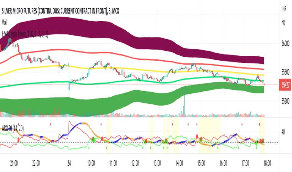
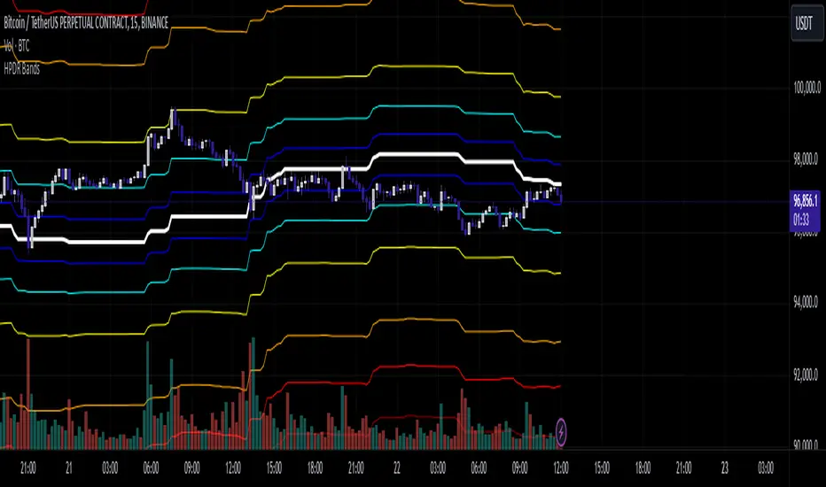
HPDR Bands IndicatorThe HPDR Bands indicator is a customizable tool designed to help traders visualize dynamic price action zones. By combining historical price ranges with adaptive bands, this script provides clear insights into potential support, resistance, and midline levels. The indicator is well-suited for all trading styles, including trend-following and range-bound strategies.
Features:
Dynamic Price Bands: Calculates price zones based on historical highs and lows, blending long-term and short-term price data for responsive adaptation to current market conditions.
Probability Enhancements: Includes a probability plot derived from the relative position of the closing price within the range, adjusted for volatility to highlight potential price movement scenarios.
Fibonacci-Like Levels: Highlights key levels (100%, 95%, 88%, 78%, 61%, 50%, and 38%) for intuitive visualization of price zones, aiding in identifying high-probability trading opportunities.
Midline Visualization: Displays a midline that serves as a reference for price mean reversion or breakout analysis.
How to Use:
Trending Markets: Use the adaptive upper and lower bands to gauge potential breakout or retracement zones.
Range-Bound Markets: Identify support and resistance levels within the defined price range.
Volatility Analysis: Observe the probability plot and its sensitivity to volatility for informed decision-making.
Important Notes:
This script is not intended as investment advice. It is a tool to assist with market analysis and should be used alongside proper risk management and other trading tools.
The script is provided as-is and without warranty. Users are encouraged to backtest and validate its suitability for their specific trading needs.
Happy Trading!
If you find this script helpful, consider sharing your feedback or suggestions for improvement. Collaboration strengthens the TradingView community, and your input is always appreciated!
Buscar en scripts para "bands"
Multi-Period % Change Bands (Extreme Dots)Multiple Period Percentage Change Extreme Dots
This indicator visualizes percentage changes across three different timeframes (8, 13, and 21 days), highlighting extreme movements that break out of a user-defined band. It's designed to identify which timeframe is showing the most significant percentage change when prices make notable moves.
Features:
- Tracks percentage changes for 8-day, 13-day, and 21-day periods
- Customizable upper and lower bands to define significant moves
- Shows dots only for the most extreme moves (highest above band or lowest below band)
- Color-coded for easy identification:
- Blue: 8-day changes
- Green: 13-day changes
- Red: 21-day changes
- Includes current values display for all timeframes
Usage Tips:
- Shorter timeframes (8-day) are more sensitive to price changes and should use narrower bands (e.g., ±3%)
- Medium timeframes (13-day) work well with moderate bands (e.g., ±5%)
- Longer timeframes (21-day) can use wider bands (e.g., ±8%)
- Dots appear only when a timeframe shows the most extreme move above/below bands
- Use the gray zone between bands to identify normal price action ranges
The indicator helps identify which lookback period is showing the strongest momentum in either direction, while filtering out normal market noise within the bands.
Note: This is particularly useful for:
- Identifying trend strength across different timeframes
- Spotting which duration is showing the most extreme moves
- Filtering out minor fluctuations through the band system
- Comparing relative strength of moves across different periods

ka66: Bar Range BandsThis tool takes a bar's range, and reflects it above the high and below the low of that bar, drawing upper and lower bands around the bar. Repeated for each bar. There's an option to then multiply that range by some multiple. Use a value greater than 1 to get wider bands, and less than one to get narrower bands.
This tool stems out of my frustration from the use of dynamic bands (like Keltner Channels, or Bollinger Bands), in particular for estimating take profit points.
Dynamic bands work great for entries and stop loss, but their dynamism is less useful for a future event like taking profit, in my experience. We can use a smaller multiple, but then we can often lose out on a bigger chunk of gains unnecessarily.
The inspiration for this came from a friend explaining an ICT/SMC concept around estimating the magnitude of a trend, by calculating the Asian Session Range, and reflecting it above or below on to the New York and London sessions. He described this as standard deviation of the Asian Range, where the range can thus be multiplied by some multiple for a wider or narrower deviation.
This, in turn, also reminded me of the Measured Move concept in Technical Analysis. We then consider that the market is fractal in nature, and this is why patterns persist in most timeframes. Traders exist across the spectrum of timeframes. Thus, a single bar on a timeframe, is made up of multiple bars on a lower timeframe . In other words, when we reflect a bar's range above or below itself, in the event that in a lower timeframe, that bar fit a pattern whose take profit target could be estimated via a Measured Move , then the band's value becomes a more valid estimate of a take profit point .
Yet another way to think about it, by way of the fractal nature above, is that it is essentially a simplified dynamic support and resistance mechanism , even simpler than say the various Pivot calculations (e.g. Classical, Camarilla, etc.).
This tool in general, can also be used by those who manually backtest setups (and certainly can be used in an automated setting too!). It is a research tool in that regard, applicable to various setups.
One of the pitfalls of manual backtesting is that it requires more discipline to really determine an exit point, because it's easy to say "oh, I'll know more or less where to exit when I go live, I just want to see that the entry tends to work". From experience, this is a bad idea, because our mind subconsciously knows that we haven't got a trained reflex on where to exit. The setup may be decent, but without an exit point, we will never have truly embraced and internalised trading it. Again, I speak from experience!
Thus, to use this to research take profit/exit points:
Have a setup in mind, with all the entry rules.
Plot your setup's indicators, mark your signals.
Use this indicator to get an idea of where to exit after taking an entry based on your signal.
Credits:
@ICT_ID for providing the idea of using ranges to estimate how far a trend move might go, in particular he used the Asian Range projected on to the London and New York market sessions.
All the technicians who came up with the idea of the Measured Move.
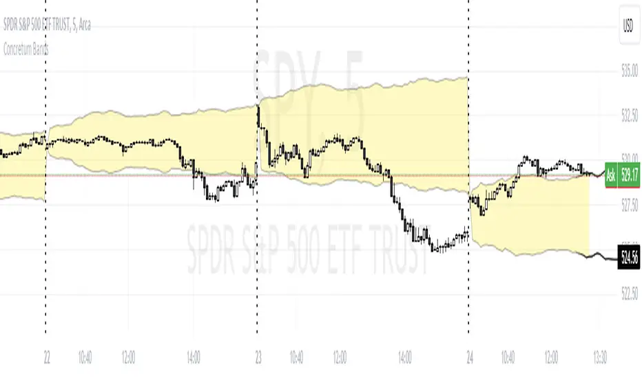
Concretum BandsDefinition
The Concretum Bands indicator recreates the Upper and Lower Bound of the Noise Area described in the paper "Beat the Market: An Effective Intraday Momentum Strategy for S&P500 ETF (SPY)" published by Concretum founder Zarattini, along with Barbon and Aziz, in May 2024.
Below we provide all the information required to understand how the indicator is calculated, the rationale behind it and how people can use it.
Idea Behind
The indicator aims to outline an intraday price region where the stock is expected to move without indicating any demand/supply imbalance. When the price crosses the boundaries of the Noise Area, it suggests a significant imbalance that may trigger an intraday trend.
How the Indicator is Calculated
The bands at time HH:MM are computed by taking the open price of day t and then adding/subtracting the average absolute move over the last n days from market open to minute HH:MM . The bands are also adjusted to account for overnight gaps. A volatility multiplier can be used to increase/decrease the width of the bands, similar to other well-known technical bands. The bands described in the paper were computed using a lookback period (length) of 14 days and a Volatility Multiplier of 1. Users can easily adjust these settings.
How to use the indicator
A trader may use this indicator to identify intraday moves that exceed the average move over the most recent period. A break outside the bands could be used as a signal of significant demand/supply imbalance.
Intraday Volatility Bands [Honestcowboy]The Intraday Volatility Bands aims to provide a better alternative to ATR in the calculation of targets or reversal points.
How are they different from ATR based bands?
While ATR and other measures of volatility base their calculations on the previous bars on the chart (for example bars 1954 to 1968). The volatility used in these bands measure expected volatility during that time of the day.
Why would you take this approach?
Markets behave different during certain times of the day, also called sessions.
Here are a couple examples.
Asian Session (generally low volatility)
London Session (bigger volatility starts)
New York Session (overlap of New York with London creates huge volatility)
Generally when using bands or channel type indicators intraday they do not account for the upcoming sessions. On London open price will quickly spike through a bollinger band and it will take some time for the bands to adjust to new volatility.
This script will show expected volatility targets at the start of each new bar and will not adjust during the bar. It already knows what price is expected to do at this time of day.
Script also plots arrows when price breaches either the top or bottom of the bands. You can also set alerts for when this occurs. These are non repainting as the script knows the level at start of the bar and does not change.
🔷 CALCULATION
Think of this script like an ATR but instead it uses past days data instead of previous bars data. Charts below should visualise this more clearly:
The scripts measure of volatility is based on a simple high-low.
The script also counts the number of bars that exist in a day on your current timeframe chart. After knowing that number it creates the matrix used in it's calculations and data storage.
See how it works perfectly on a lower timeframe chart below:
Getting this right was the hardest part, check the coding if you are interested in this type of stuff. I commented every step in the coding process.
🔷 SETTINGS
Every setting of the script has a tooltip but I provided a breakdown here:
Some more examples of different charts:

Vollinger BandsI'm happy to present to you... VOLLINGER BANDS. Loosely based on bollinger bands, this indicator uses the new Up/Down Volume indicator from tradingview, which I have add moving averages, and a width calculation between them to determine squeeze. Essentially I have created a volume squeeze bollinger band derivative, hence the term "Vollinger Band".
The bands are NOT a deviation of any middle line or moving average, but rather their own moving averages of the volume delta, respectively.
Blue background = Volume Squeeze (vollinger bands width is less than the squeeze strength line), meaning consolidation, and a big move may happen soon.
Top line = A moving average of the Up Volume delta
Bottom line = A moving average of the Down Volume delta
Vol MA = the moving average length of both the top/bottom line
> If you zoom in, you can see a white line, which is the squeeze represented as a single line, calculated using bollinger bands width. The squeeze strength is a moving average of the squeeze line, which then determines if the width is below that moving average, then the squeeze will occur (white line below purple)
The bands are colored based on the sum of the Up/Down volume over the specified number of bars (preset at 5). If the volume is more buying than selling over that amount of bars, then the line is colored green, and vice versa.

[blackcat] L1 Vitali Apirine Exponential Deviation BandsLevel 1
Background
Vitali Apirine’s articles in the July issues on 2019,“Exponential Deviation Bands”
Function
In “Exponential Deviation Bands” in this issue, author Vitali Apirine introduces a price band indicator based on exponential deviation rather than the more traditional standard deviation, such as is used in the well-known Bollinger Bands. As compared to standard deviation bands, the author’s exponential deviation bands apply more weight to recent data and generate fewer breakouts. Apirine describes using the bands as a tool to assist in identifying trends.
Remarks
Feedbacks are appreciated.

Bollinger Bands with RSI Signals* Bollinger Bands (BB) are a widely popular technical analysis instrument created by John Bollinger in the early 1980’s. Bollinger Bands consist of a band of three lines which are plotted in relation to security prices. The line in the middle is usually a Simple Moving Average (SMA) set to a period of 20 days (The type of trend line and period can be changed by the trader; however a 20 day moving average is by far the most popular). The SMA then serves as a base for the Upper and Lower Bands. The Upper and Lower Bands are used as a way to measure volatility by observing the relationship between the Bands and price. Typically the Upper and Lower Bands are set to two standard deviations away from the SMA (The Middle Line); however the number of standard deviations can also be adjusted by the trader.
* The Relative Strength Index (RSI) is a well versed momentum based oscillator which is used to measure the speed (velocity) as well as the change (magnitude) of directional price movements. Essentially RSI, when graphed, provides a visual mean to monitor both the current, as well as historical, strength and weakness of a particular market. The strength or weakness is based on closing prices over the duration of a specified trading period creating a reliable metric of price and momentum changes. Given the popularity of cash settled instruments (stock indexes) and leveraged financial products (the entire field of derivatives); RSI has proven to be a viable indicator of price movements.
* sma used = 21.
* Multiple BBands used one with SD 2 , other with SD 3.
* RSI alerts are based on close outside bands and Position of RSI 14 period close.
cheers,
Happy trading

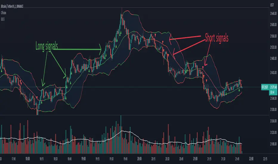
BBSS - Bollinger Bands Scalping SignalsModified Bollinger Bands Indicator
Added:
- color change divergence (green) and narrowing (red) of the upper and lower bands
- color change of the moving average - upward trend (green) and downward trend (red)
- the appearance of a potential signal for long and short positions when the candle closes behind the upper or lower bands.
How to use the indicator:
Long conditions:
- the price breaks through the upper band
- Bollinger bands are expanding and should be green
- the mid-line is green
- the trigger candle should be green
Short conditions:
- the price breaks through the lower band
- Bollinger bands are expanding and should be red
- the mid-line is red
- the trigger candle should be red
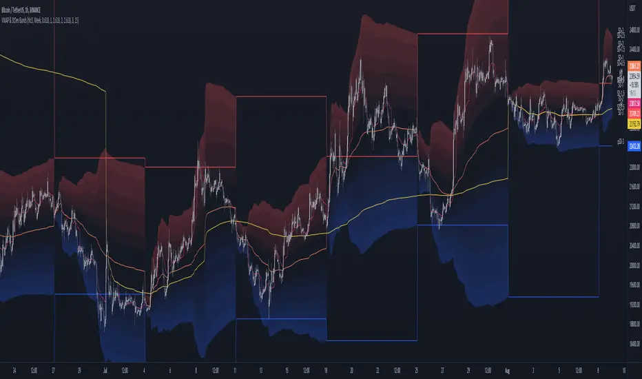
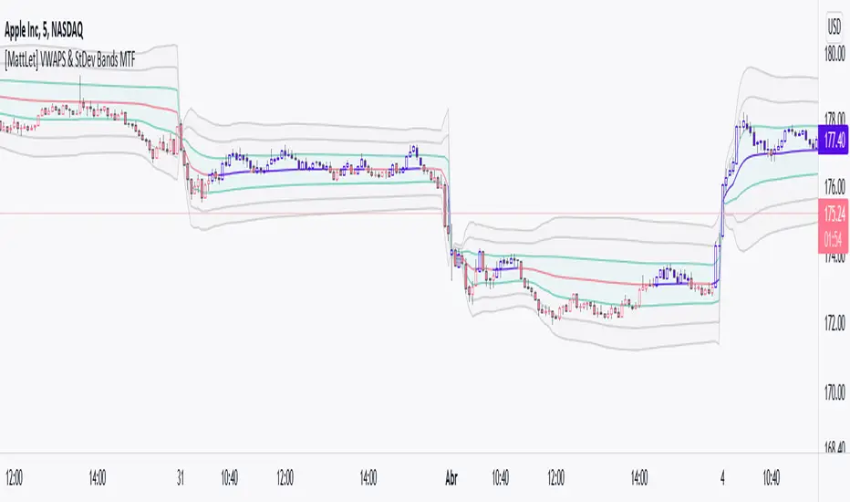
MTF VWAP & StDev BandsMulti Timeframe Volume Weighted Average Price with Standard Deviation Bands
I used the script "Koalafied VWAP D/W/M/Q/Y" by Koalafied_3 and made some changes, such as adding more standard deviation bands.
The script can display the daily, weekly, monthly, quarterly and yearly VWAP.
Standard deviation bands values can be changed (default values are 0.618, 1, 1.618, 2, 2.618, 3).
Also the previous standard deviation bands can be displayed.
EMA Channel – Multi-Timeframe Adaptive Bands📘 Short Description (for TradingView listing)
A powerful, adaptive EMA channel indicator with independent timeframes for each band (Lower / Median / Upper), dynamic colors, and a smart configurable resistance line that can follow price, EMA, or ATR-based volatility.
Perfect for multi-timeframe confluence analysis, support/resistance mapping, and identifying early trend reversals.
🔹 Overview
The EMA Channel – Multi-Timeframe Adaptive Bands creates a dynamic price corridor that adapts to volatility and structure across multiple timeframes.
Each of the three bands (Lower, Median, and Upper) is independently configurable with its own:
Timeframe
EMA length
Source (close, hl2, ohlc4)
Line width, color logic, and visibility
The indicator also features automatic color shifts depending on price position, providing instant trend context.
🔹 Core Features
✅ Lower/Base EMA (Support)
Anchored EMA that defines the lower boundary of the trend channel.
Turns blue when price is above (bullish control) and red when price breaks below.
✅ Median Line (Neutral / Balance Zone)
Can either be its own EMA or automatically calculated as the midpoint between lower and upper bands.
Yellow below price, red above – clear mid-zone visualization.
✅ Upper Band (Dynamic Resistance)
Built above the selected anchor (Lower EMA, Median, Own EMA, or Price).
Configurable by ATR, Percentage offset, or ATR + Percentage combo.
Additional fine-tuning options:
Minimum gap (ATR or % based)
Absolute offset (price units)
EMA smoothing for a cleaner visual curve
Turns green when above price (active resistance) and red if price breaks through.
✅ Multi-Timeframe Engine
Each band is computed in its own timeframe (5D, 1D, 4H, etc.), making the tool highly adaptable for cross-TF confluence setups.
The "Hold HTF value between bars" option ensures smooth visualization when switching chart timeframes.
✅ Optional Channel Fill
Soft gray background fill between Lower and Upper bands for quick recognition of the dominant structure.
🔹 Typical Use Cases
Identify multi-timeframe trend channels and reversals.
Use the Upper band as adaptive resistance and the Lower EMA as dynamic support.
Combine with volume and RSI/MACD for confirmation of breakouts or retests.
Works for crypto, forex, indices, and stocks.
🔹 Technical Notes
Uses request.security() with barmerge.gaps_off and optional lookahead_on to preserve higher-timeframe integrity.
Compatible with all symbols and chart timeframes.
Designed for traders who rely on visual confluence and precision trend detection rather than single EMA signals.
🧠 Credits & Author Note
Developed by Bogdan TOMOIAGA – built for precision trend tracking, multi-timeframe analysis, and dynamic color feedback.
Inspired by institutional-grade volatility envelopes and enhanced with Pine v5 adaptive plotting.
⚠️ Disclaimer
This script is provided for informational and educational purposes only.
It does not constitute financial advice, trading advice, or investment guidance of any kind.
Past performance does not guarantee future results.
Trading involves risk — including the possible loss of capital.
Always do your own research and consult a licensed financial advisor before making any trading decisions.
The author and publisher of this script assume no responsibility or liability for any losses or damages resulting from its use.

Zarattini Intra-day Threshold Bands (ZITB)This indicator implements the intraday threshold band methodology described in the research paper by Carlo Zarattini et al.
Overview:
Plots intraday threshold bands based on daily open/close levels.
Supports visualization of BaseUp/BaseDown levels and Threshold Upper/Lower bands.
Optional shading between threshold bands for easier interpretation.
Usage Notes / Limitations:
Originally studied on SPY (US equities), this implementation is adapted for NSE intraday market timing, specifically the NIFTY50 index.
Internally, 2-minute candles are used if the chart timeframe is less than 2 minutes.
Values may be inaccurate if the chart timeframe is more than 1 day.
Lookback days are auto-capped to avoid exceeding TradingView’s 5000-bar limit.
The indicator automatically aligns intraday bars across multiple days to compute average deltas.
For better returns, it is recommended to use this indicator in conjunction with VWAP and a volatility-based position sizing mechanism.
Can be used as a reference for Open Range Breakout (ORB) strategies.
Customizations:
Toggle plotting of base levels and thresholds.
Toggle shading between thresholds.
Line colors and styles can be adjusted in the Style tab.
Intended for educational and research purposes only.
This indicator implements the approach described in the research paper by Zarattini et al.
Note: This implementation is designed for the NSE NIFTY50 index. While Zarattini’s original study was conducted on SPY, this version adapts the methodology for the Indian market.
Methodology Explanation
This indicator is primarily designed for Open Range Breakout (ORB) strategies.
Base Levels
BaseUp = Maximum of today’s open and previous day’s close
BaseDown = Minimum of today’s open and previous day’s close
Delta Calculation
For the past 14 trading days (lookbackDays), the delta for each intraday candle is calculated as the ab
solute difference from the close of the first candle of that day.
Average Delta
For a given intraday time/candle today, deltaAvg is computed as the average of the deltas at the same time across the previous 14 days.
Threshold Bands
ThresholdUp = BaseUp + deltaAvg
ThresholdDown = BaseDown − deltaAvg
Signals
Spot price moving above ThresholdUp → Long signal
Spot price moving below ThresholdDown → Short signal
Tip: For better returns, combine this indicator with VWAP and a volatility-based position sizing mechanism.
PulseRPO Zero-Lag BandsPulseRPO is a momentum and volatility timing suite built on a zero-lag Relative Price Oscillator. It pairs an RPO (fast vs slow MA spread, in %) with adaptive volatility envelopes that tighten or widen as conditions change, so you can spot true momentum bursts, exhaustion and “quiet-before-the-move” squeezes—without the usual MA lag.
What it shows
Zero-Lag RPO: Choose EMA, SMA, WMA, RMA, HMA or ZLEMA for the base, then apply ZLEMA/DEMA/TEMA/HMA zero-lag smoothing to cut delay.
Adaptive Bands: StdDev, ATR, Range or Hybrid volatility; bands auto-tighten in high vol and widen in quiet regimes.
Dynamic OB/OS: Levels scale with current regime so extremes mean something even as volatility shifts.
Signal & Histogram: Classic signal cross plus histogram for quick read of acceleration vs deceleration.
Squeeze Paint: Subtle background highlight when band width compresses below its average.
Divergences & Triggers: Optional bullish/bearish divergence tags, plus band-cross and signal-cross alerts out of the box.
How to use it (general guide)
Momentum entries: Look for RPO crossing up its signal from below or snapping out of a squeeze; extra weight if it also re-enters from below the lower band.
Trend continuation: RPO riding outside the upper (or lower) band with rising histogram = power move; trail risk on pullbacks to the signal line.
Exhaustion / fades: Taps beyond dynamic OB/OS or band re-entries can mark mean-revert windows—confirm with price/volume.
Risk filter: During squeeze, size down and prepare for expansion; after expansion, respect extremes.
Tweak the MA type, band method and zero-lag strength to match your timeframe. PulseRPO is designed to be a self-contained read: regime → setup → trigger → alert.

VWAP with Prev. Session BandsVWAP with Prev. Session Bands is an advanced indicator based on TradingView’s original VWAP. It adds configurable standard deviation or percentage-based bands, both for the current and previous session. You can anchor the VWAP to various timeframes or events (like Sessions, Weeks, Months, Earnings, etc.) and selectively show up to three bands.
The unique feature of this script is the ability to display the VWAP and bands from the previous session, helping traders visualize mean reversion levels or historical volatility ranges.
Built on top of the official TradingView VWAP implementation, this version provides enhanced flexibility and visual clarity for intraday and swing traders alike.

STH-MVRV Bollinger BandsSTH-MVRV Bollinger Bands
🛠️ Detailes
This proprietary indicator seamlessly integrates on-chain data with advanced volatility metrics to construct adaptive Bollinger Bands that overlay directly on the price chart. Here’s a breakdown of its technical components:
Data Integration:
On-chain & Index Data: Utilizes BTC_MVRV (on-chain metric) and INDEX:BTCUSD (market index) to compute the STH-MVRV ratio.
Smoothing: Data series are smoothed with a configurable SMA (Simple Moving Average) over a user-defined period to reduce noise.
Ratio Computation:
Forms: Calculates three ratio variants:
STH-MVRV (MVRV)
STH-MVRV (Price)
STH-MVRV (AVG)
Dynamic Selection: The user can select the desired ratio from a dropdown menu.
Bollinger Bands Construction:
Basis & Deviation:
The basis is derived using the SMA of the selected ratio (or price, if substituted).
The standard deviation is scaled by a multiplier to form the upper and lower bands.
🟢 Green: When the selected ratio is ≥ 1 (bullish condition).
🔴 Red: When the selected ratio is < 1 (bearish condition).
Usage Recommendations:
Parameter Tuning: Adjust the moving average period, band length, and standard deviation multiplier to tailor the indicator to specific market conditions.
Multi-Timeframe Analysis: Combine with other technical indicators for a comprehensive risk management and trade execution strategy.

Ethereum Logarithmic Regression Bands (Fine-Tuned)This indicator, "Ethereum Logarithmic Regression Bands (Fine-Tuned)," is my attempt to create a tool for estimating long-term trends in Ethereum (ETH/USD) price action using logarithmic regression bands. Please note that I am not an expert in financial modeling or coding—I developed this as a personal project to serve as a rough estimation rather than a precise or professional trading tool. The data was fitted to non-bubble periods of Ethereum's history to provide a general trendline, but it’s far from perfect.
I’m sharing this because I couldn’t find a similar indicator available, and I thought it might be useful for others who are also exploring ETH’s long-term behavior. The bands start from Ethereum’s launch price and are adjustable via input parameters, but they are based on my best effort to align with historical data. With some decent coding experience, I’m sure someone could refine this further—perhaps by optimizing the coefficients or incorporating more advanced fitting techniques. Feel free to tweak the code, suggest improvements, or use it as a starting point for your own projects!
How to Use:
** THIS CHART IS SPECIFICALLY CODED FOR ETH/USD (KRAKEN) ON THE WEEKLY TIMEFRAME IN LOG VIEW**
The main band (blue) represents the logarithmic regression line.
The upper (red) and lower (green) bands provide a range around the main trend, adjustable with multipliers.
Adjust the "Launch Price," "Base Coefficient," "Growth Coefficient," and other inputs to experiment with different fits.
Disclaimer:
This is not financial advice. Use at your own risk, and always conduct your own research before making trading decisions.

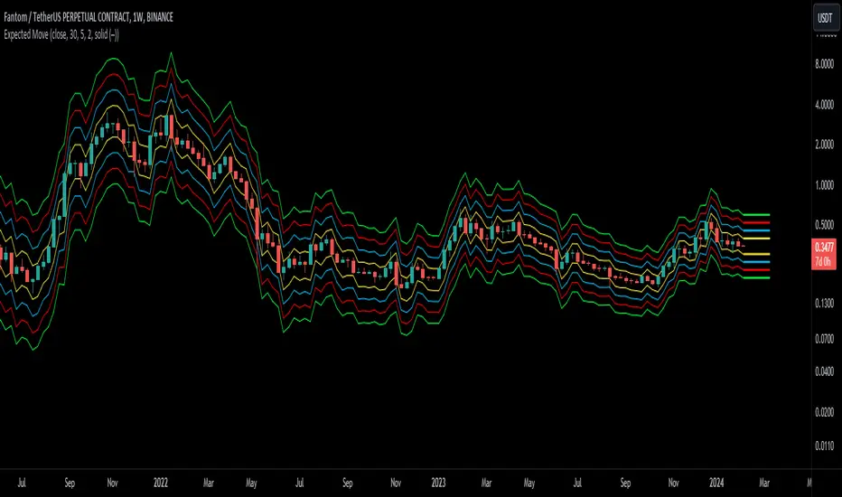
Expected Move BandsExpected Moves
The Expected Move of a security shows the amount that a stock is expected to rise or fall from its current market price based on its level of volatility or implied volatility. The expected move of a stock is usually measured with standard deviations.
An Expected Move Range of 1 SD shows that price will be near the 1 SD range 68% of the time given enough samples.
Expected Move Bands
This indicator gets the Expected Move for 1-4 Standard Deviation Ranges using Historical Volatility. Then it displays it on price as bands.
The Expected Move indicator also allows you to see MTF Expected Moves if you want to.
This indicator calculates the expected price movements by analyzing the historical volatility of an asset. Volatility is the measure of fluctuation.
This script uses log returns for the historical volatility calculation which can be modelled as a normal distribution most of the time meaning it is symmetrical and stationary unlike other scripts that use bands to find "reversals". They are fundamentally incorrect.
What these ranges tell you is basically the odds of the price movement being between these levels.
If you take enough samples, 95.5% of the them will be near the 2nd Standard Deviation. And so on. (The 3rd Standard deviation is 99.7%)
For higher timeframes you might need a smaller sample size.
Features
MTF Option
Parameter customization
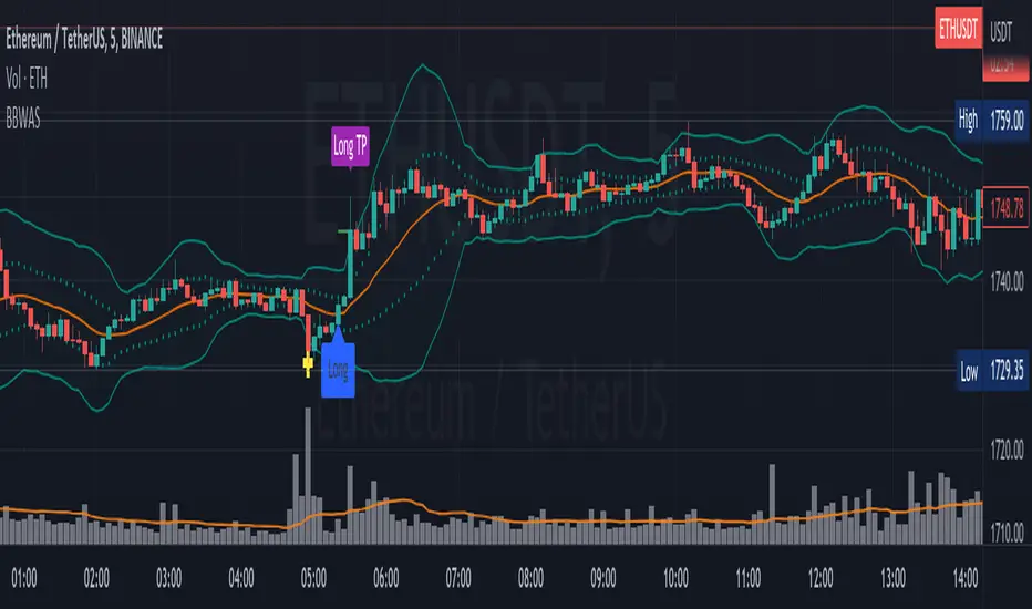
Bollinger Bands Weighted Alert System (BBWAS)The idea of this indicator is very similar to my previous published script called BBAS (Bollinger Bands Alert System).
Just with little additions. In this case, we're using a Weighted Moving Average (ta.wma) instead of Simple Moving Average to calculate the basis line.
A breakout in trading refers to a situation where the price of a security or asset moves beyond a defined level of support or resistance, which is typically indicated by technical analysis tools like Bollinger Bands. Bollinger Bands consist of three lines: the upper band, the lower band, and the middle band (or basis). The upper and lower bands are set at a specified number of standard deviations away from the middle band, and they help to define the range within which the price of an asset is expected to fluctuate.
When the price of the asset moves beyond the upper or lower band, it is said to have "broken out" of the range. If the price closes below the lower band, it is considered a bearish breakout, and if it closes above the upper band, it is considered a bullish breakout.
Once a breakout occurs, traders may look for a confirmation signal before entering a trade. In this case, crossing the middle line (or basis) after a breakout may signal a potential trend reversal and a good opportunity to enter a long or short trade, depending on the direction of the breakout.
Dear traders, while we strive to provide you with the best trading tools and resources, we want to remind you to exercise caution and diligence in your investing decisions.
It is important to always do your own research and analysis before making any trades. Remember, the responsibility for your investments ultimately lies with you.
Happy trading!
DEMA Supertrend Bands [Misu]█ Indicator based on DEMA (Double Exponential Moving Average) & Supertrend to show Bands .
DEMA attempts to remove the inherent lag associated with Moving Averages by placing more weight on recent values.
Supertrend aims to detect price trends, it's also used to set protective stops.
█ Usages:
Combining Dema to calculate Supertrend results in nice lower and upper bands.
This can be used to identify potential supports and resistances and set protective stops.
█ Parameters:
Length DEMA: Double Ema lenght used to calculate DEMA. Dema is used by Supertrend indicator.
Length Atr: Atr lenght used to calculate Atr. Atr is used by Supertrend indicator.
Band Mult: Used to calculate Supertrend Bands width.
█ Other Applications:
The mid band can be used to filter bad signals in the manner of a more classical Moving Average.
[MattLet] VWAPS + Standard Deviation Bands MTFVWAP is the volume-weighted average price for a futures contract plotted as a line on the price chart. The calculation is the sum of traded volume, multiplied by the price, divided by the sum of the traded volume.
This study has a number of uses. It provides the current volume-weighted average price for the trading day or the trading session.
I have added Standard Deviation Bands to the VWAP indicator. This indicator has three upper and three lower bands. The Standard Deviation Factor of these bands can be set in the parameters.
Features:
1 - VWAPS Multi Timeframe
2 - Standard Deviations Bands Multi Timeframe
3 - Colored candles/bars on "Daily Vwap" crossing up and down.
4 - Every elements styles edition.
Bollinger Bands color candlesThis Pine Script indicator applies Bollinger Bands to the price chart and visually highlights candles based on their proximity to the upper and lower bands. The script plots colored candles as follows:
Bullish Close Above Upper Band: Candles are colored green when the closing price is above the upper Bollinger Band, indicating strong bullish momentum.
Bearish Close Below Lower Band: Candles are colored red when the closing price is below the lower Bollinger Band, signaling strong bearish momentum.
Neutral Candles: Candles that close within the bands remain their default color.
This visual aid helps traders quickly identify potential breakout or breakdown points based on Bollinger Band dynamics.
Percentile Rank of Bollinger BandsThis simple indicator provides you three useful information with Bollinger Bands:
How wide the current width (standard deviation) of the Bollinger Band is.
Compared to the widths in the past, is the current width relatively small or big? Value is expressed in percentile format.
What the "relative position of current price" to the current Bollinger Band is.
This indicator can be useful to identify whether the Bollinger Band has substantially "expanded" or "squeezed."
First, divide the current standard deviation by the current price, we get the current width. The current width is displayed by the columns at the bottom. When the current width becomes wider, the column becomes taller, and the color is dark green. On the contrary, if the width becomes narrower, the column becomes shorter and the color is light green.
Next, compare the current width with the previous N widths, we get the percentile rank for the current width. The percentile rank is shown by the thicker line graph. When the percentile rank grows, it is green; whereas when the rank declines, the color is red.
Lastly, calculate (close - lower)/(upper - lower) and we get an idea of the relative height of the current price, compared to the upper and lower band. This is displayed by the thinner line graph. When the relative position becomes higher, the color is in aqua. It is in blue when the relative position becomes lower. Note that since closing prices can go above the upper band or go below the lower band, the values may be greater than 100 or less than 0.

EMA Bollinger Bands with customized std dev and moving averageTo use EMA with band you need to set input parameter named as "TypeOfMa" to 1.
If you set TypeOfMa = 1 then it will use EMA average for Bollinger bands.
If you set TypeOfMa = 0 then it will use MA average for Bollinger bands.