Buscar en scripts para "Volatility"


Fx Sessions For CryptoFx Sessions for crypto traders. High Volatility occurs at weekends, and NY-Assia overlap in week days.

ATR_MYThe ATR_MY script is designed to calculate the average daily volatility of a previously specified number of days, as well as finding the average SL and TP in equipping the calculated data.
3D Integrated Price Mass (3xResLin 405-600) [acatwithwithcharts]This is a 3x resolution version of my 3D Integrated Price Mass indicator, which already more or less at the exact limit of how far you can push Pinescript before it throws up errors.
In 3D Integrated Price Mass, I took Mark Whistler's WAVE-PM indicator and first integrated the result by taking a running total of the period number then re-averaged it in order to make it range-bound. This means that a 14-period WAVE-PM is normal, but as the period number increases it increasingly becomes the average of periods below it. In theory, this should create a measurement for the "impulse" of the "force" of a volatility expansion. I plotted 32 period lengths from 14 to 600 at height equal to their length, reading out colors based on their value. I chose those lengths to create a relatively continuous indicator on log scale.
What I really wanted to do though was to (1) have the option to view this indicator in either linear or log and (2) not lose as much data resolution across nearly 600 periods. Within the limitations of Pinescript, the best solution I could find was to make multiple indicators hard-coding the different period lengths to create linear and log ranges such that I could make a composite heatmap with several different indicators on the same pane.
This is the 3rd of 3 indicators for linear scale 3x resolution Integrated Price Mass.
Fair warning: this more than my other published indicators can take awhile to load and sometimes times out, requiring changing TFs, symbols, or reapplying the indicator to refresh it.
I am posting these as invite-only and have a short list of collaborators in mind who will get access if they want it. It is not being made available to the general public as of this posting; I’m vaguely working towards eventually offering being able to offer some sort of paid indicator offering in the future.
Rather than shut the door entirely, I will say that if someone approaches me by PM with a really interesting idea on how they’d like to test this or my other indicators, I’m willing to consider giving access. I’m not giving this away just to anyone who asks and will, for my own time and sanity, probably just ignore requests by people who don't come to me already knowing what this indicator does and how they might want to use it.
I will also say that I am interested in ideas for other applications for heatmap indicators. If you think you have an interesting idea/proposal/collaboration to propose, feel free to PM me.

3D Integrated Price Mass (3xResLin 205-400) [acatwithwithcharts]This is a 3x resolution version of my 3D Integrated Price Mass indicator, which already more or less at the exact limit of how far you can push Pinescript before it throws up errors.
In 3D Integrated Price Mass, I took Mark Whistler's WAVE-PM indicator and first integrated the result by taking a running total of the period number then re-averaged it in order to make it range-bound. This means that a 14-period WAVE-PM is normal, but as the period number increases it increasingly becomes the average of periods below it. In theory, this should create a measurement for the "impulse" of the "force" of a volatility expansion. I plotted 32 period lengths from 14 to 600 at height equal to their length, reading out colors based on their value. I chose those lengths to create a relatively continuous indicator on log scale.
What I really wanted to do though was to (1) have the option to view this indicator in either linear or log and (2) not lose as much data resolution across nearly 600 periods. Within the limitations of Pinescript, the best solution I could find was to make multiple indicators hard-coding the different period lengths to create linear and log ranges such that I could make a composite heatmap with several different indicators on the same pane.
This is the 2nd of 3 indicators for linear scale 3x resolution Integrated Price Mass.
Fair warning: this more than my other published indicators can take awhile to load and sometimes times out, requiring changing TFs, symbols, or reapplying the indicator to refresh it.
I am posting these as invite-only and have a short list of collaborators in mind who will get access if they want it. It is not being made available to the general public as of this posting; I’m vaguely working towards eventually offering being able to offer some sort of paid indicator offering in the future.
Rather than shut the door entirely, I will say that if someone approaches me by PM with a really interesting idea on how they’d like to test this or my other indicators, I’m willing to consider giving access. I’m not giving this away just to anyone who asks and will, for my own time and sanity, probably just ignore requests by people who don't come to me already knowing what this indicator does and how they might want to use it.
I will also say that I am interested in ideas for other applications for heatmap indicators. If you think you have an interesting idea/proposal/collaboration to propose, feel free to PM me.

3D Integrated Price Mass (3xResLin 14-200) [acatwithwithcharts]This is a 3x resolution version of my 3D Integrated Price Mass indicator, which already more or less at the exact limit of how far you can push Pinescript before it throws up errors.
In 3D Integrated Price Mass, I took Mark Whistler's WAVE-PM indicator and first integrated the result by taking a running total of the period number then re-averaged it in order to make it range-bound. This means that a 14-period WAVE-PM is normal, but as the period number increases it increasingly becomes the average of periods below it. In theory, this should create a measurement for the "impulse" of the "force" of a volatility expansion. I plotted 32 period lengths from 14 to 600 at height equal to their length, reading out colors based on their value. I chose those lengths to create a relatively continuous indicator on log scale.
What I really wanted to do though was to (1) have the option to view this indicator in either linear or log and (2) not lose as much data resolution across nearly 600 periods. Within the limitations of Pinescript, the best solution I could find was to make multiple indicators hard-coding the different period lengths to create linear and log ranges such that I could make a composite heatmap with several different indicators on the same pane.
This is the 1st of 3 indicators for linear scale 3x resolution Integrated Price Mass.
Fair warning: this more than my other published indicators can take awhile to load and sometimes times out, requiring changing TFs, symbols, or reapplying the indicator to refresh it.
I am posting these as invite-only and have a short list of collaborators in mind who will get access if they want it. It is not being made available to the general public as of this posting; I’m vaguely working towards eventually offering being able to offer some sort of paid indicator offering in the future.
Rather than shut the door entirely, I will say that if someone approaches me by PM with a really interesting idea on how they’d like to test this or my other indicators, I’m willing to consider giving access. I’m not giving this away just to anyone who asks and will, for my own time and sanity, probably just ignore requests by people who don't come to me already knowing what this indicator does and how they might want to use it.
I will also say that I am interested in ideas for other applications for heatmap indicators. If you think you have an interesting idea/proposal/collaboration to propose, feel free to PM me.

3D Integrated Price Mass (3xResLog 210-600) [acatwithwithcharts]This is a 3x resolution version of my 3D Integrated Price Mass indicator, which already more or less at the exact limit of how far you can push Pinescript before it throws up errors.
In 3D Integrated Price Mass, I took Mark Whistler's WAVE-PM indicator and first integrated the result by taking a running total of the period number then re-averaged it in order to make it range-bound. This means that a 14-period WAVE-PM is normal, but as the period number increases it increasingly becomes the average of periods below it. In theory, this should create a measurement for the "impulse" of the "force" of a volatility expansion. I plotted 32 period lengths from 14 to 600 at height equal to their length, reading out colors based on their value. I chose those lengths to create a relatively continuous indicator on log scale.
What I really wanted to do though was to (1) have the option to view this indicator in either linear or log and (2) not lose as much data resolution across nearly 600 periods. Within the limitations of Pinescript, the best solution I could find was to make multiple indicators hard-coding the different period lengths to create linear and log ranges such that I could make a composite heatmap with several different indicators on the same pane.
This is the 3rd of 3 indicators for log scale 3x resolution Integrated Price Mass.
Fair warning: this more than my other published indicators can take awhile to load and sometimes times out, requiring changing TFs, symbols, or reapplying the indicator to refresh it.
I am posting these as invite-only and have a short list of collaborators in mind who will get access if they want it. It is not being made available to the general public as of this posting; I’m vaguely working towards eventually offering being able to offer some sort of paid indicator offering in the future.
Rather than shut the door entirely, I will say that if someone approaches me by PM with a really interesting idea on how they’d like to test this or my other indicators, I’m willing to consider giving access. I’m not giving this away just to anyone who asks and will, for my own time and sanity, probably just ignore requests by people who don't come to me already knowing what this indicator does and how they might want to use it.
I will also say that I am interested in ideas for other applications for heatmap indicators. If you think you have an interesting idea/proposal/collaboration to propose, feel free to PM me.

3D Integrated Price Mass (3xRes Log 46-200) [acatwithwithcharts]This is a 3x resolution version of my 3D Integrated Price Mass indicator, which already more or less at the exact limit of how far you can push Pinescript before it throws up errors.
In 3D Integrated Price Mass, I took Mark Whistler's WAVE-PM indicator and first integrated the result by taking a running total of the period number then re-averaged it in order to make it range-bound. This means that a 14-period WAVE-PM is normal, but as the period number increases it increasingly becomes the average of periods below it. In theory, this should create a measurement for the "impulse" of the "force" of a volatility expansion. I plotted 32 period lengths from 14 to 600 at height equal to their length, reading out colors based on their value. I chose those lengths to create a relatively continuous indicator on log scale.
What I really wanted to do though was to (1) have the option to view this indicator in either linear or log and (2) not lose as much data resolution across nearly 600 periods. Within the limitations of Pinescript, the best solution I could find was to make multiple indicators hard-coding the different period lengths to create linear and log ranges such that I could make a composite heatmap with several different indicators on the same pane.
This is the 2nd of 3 indicators for log scale 3x resolution Integrated Price Mass.
Fair warning: this more than my other published indicators can take awhile to load and sometimes times out, requiring changing TFs, symbols, or reapplying the indicator to refresh it.
I am posting these as invite-only and have a short list of collaborators in mind who will get access if they want it. It is not being made available to the general public as of this posting; I’m vaguely working towards eventually offering being able to offer some sort of paid indicator offering in the future.
Rather than shut the door entirely, I will say that if someone approaches me by PM with a really interesting idea on how they’d like to test this or my other indicators, I’m willing to consider giving access. I’m not giving this away just to anyone who asks and will, for my own time and sanity, probably just ignore requests by people who don't come to me already knowing what this indicator does and how they might want to use it.
I will also say that I am interested in ideas for other applications for heatmap indicators. If you think you have an interesting idea/proposal/collaboration to propose, feel free to PM me.

3D Integrated Price Mass (3x Res Log 14-45) [acatwithwithcharts]This is a 3x resolution version of my 3D Integrated Price Mass indicator, which already more or less at the exact limit of how far you can push Pinescript before it throws up errors.
In 3D Integrated Price Mass, I took Mark Whistler's WAVE-PM indicator and first integrated the result by taking a running total of the period number then re-averaged it in order to make it range-bound. This means that a 14-period WAVE-PM is normal, but as the period number increases it increasingly becomes the average of periods below it. In theory, this should create a measurement for the "impulse" of the "force" of a volatility expansion. I plotted 32 period lengths from 14 to 600 at height equal to their length, reading out colors based on their value. I chose those lengths to create a relatively continuous indicator on log scale.
What I really wanted to do though was to (1) have the option to view this indicator in either linear or log and (2) not lose as much data resolution across nearly 600 periods. Within the limitations of Pinescript, the best solution I could find was to make multiple indicators hard-coding the different period lengths to create linear and log ranges such that I could make a composite heatmap with several different indicators on the same pane.
This is the 1st of 3 indicators for log scale 3x resolution Integrated Price Mass.
Fair warning: this more than my other published indicators can take awhile to load and sometimes times out, requiring changing TFs, symbols, or reapplying the indicator to refresh it.
I am posting these as invite-only and have a short list of collaborators in mind who will get access if they want it. It is not being made available to the general public as of this posting; I’m vaguely working towards eventually offering being able to offer some sort of paid indicator offering in the future.
Rather than shut the door entirely, I will say that if someone approaches me by PM with a really interesting idea on how they’d like to test this or my other indicators, I’m willing to consider giving access. I’m not giving this away just to anyone who asks and will, for my own time and sanity, probably just ignore requests by people who don't come to me already knowing what this indicator does and how they might want to use it.
I will also say that I am interested in ideas for other applications for heatmap indicators. If you think you have an interesting idea/proposal/collaboration to propose, feel free to PM me.

3D WAVE-PM (3x Res Log 210-600) [acatwithwithcharts]This is an (il)logical extreme adaptation of my (il)logical extreme adaption of Mark Whistler's WAVE-PM script, originally published in his book Volatility Illuminated as a MetaTrader script.
In 3D WAVE-PM, I plotted 32 period lengths from 14 to 600 at height equal to their length, reading out colors based on their value. I chose those lengths to create a relatively continuous indicator on log scale.
What I really wanted to do though was to (1) have the option to view this indicator in either linear or log and (2) not lose as much data resolution across nearly 600 periods. Within the limitations of Pinescript, the best solution I could find was to make multiple indicators hard-coding the different period lengths to create linear and log ranges such that I could make a composite heatmap with several different indicators on the same pane.
This is the 3rd of 3 indicators for log scale 3x resolution WAVE-PM.
I am posting these as invite-only and have a short list of collaborators in mind who will get access if they want it. It is not being made available to the general public as of this posting; I’m vaguely working towards eventually offering being able to offer some sort of paid indicator offering in the future.
Rather than shut the door entirely, I will say that if someone approaches me by PM with a really interesting idea on how they’d like to test this or my other indicators, I’m willing to consider giving access. I’m not giving this away just to anyone who asks and will, for my own time and sanity, probably just ignore requests by people who don't come to me already knowing what this indicator does and how they might want to use it.
I will also say that I am interested in ideas for other applications for heatmap indicators. If you think you have an interesting idea/proposal/collaboration to propose, feel free to PM me.

3D WAVE-PM (3x Res Log 46-200) [acatwithwithcharts]This is an (il)logical extreme adaptation of my (il)logical extreme adaption of Mark Whistler's WAVE-PM script, originally published in his book Volatility Illuminated as a MetaTrader script.
In 3D WAVE-PM, I plotted 32 period lengths from 14 to 600 at height equal to their length, reading out colors based on their value. I chose those lengths to create a relatively continuous indicator on log scale.
What I really wanted to do though was to (1) have the option to view this indicator in either linear or log and (2) not lose as much data resolution across nearly 600 periods. Within the limitations of Pinescript, the best solution I could find was to make multiple indicators hard-coding the different period lengths to create linear and log ranges such that I could make a composite heatmap with several different indicators on the same pane.
This is the 2nd of 3 indicators for log scale 3x resolution WAVE-PM.
I am posting these as invite-only and have a short list of collaborators in mind who will get access if they want it. It is not being made available to the general public as of this posting; I’m vaguely working towards eventually offering being able to offer some sort of paid indicator offering in the future.
Rather than shut the door entirely, I will say that if someone approaches me by PM with a really interesting idea on how they’d like to test this or my other indicators, I’m willing to consider giving access. I’m not giving this away just to anyone who asks and will, for my own time and sanity, probably just ignore requests by people who don't come to me already knowing what this indicator does and how they might want to use it.
I will also say that I am interested in ideas for other applications for heatmap indicators. If you think you have an interesting idea/proposal/collaboration to propose, feel free to PM me.

3D WAVE-PM (3x Res Log 14-45) [acatwithwithcharts]This is an (il)logical extreme adaptation of my (il)logical extreme adaption of Mark Whistler's WAVE-PM script, originally published in his book Volatility Illuminated as a MetaTrader script.
In 3D WAVE-PM, I plotted 32 period lengths from 14 to 600 at height equal to their length, reading out colors based on their value. I chose those lengths to create a relatively continuous indicator on log scale.
What I really wanted to do though was to (1) have the option to view this indicator in either linear or log and (2) not lose as much data resolution across nearly 600 periods. Within the limitations of Pinescript, the best solution I could find was to make multiple indicators hard-coding the different period lengths to create linear and log ranges such that I could make a composite heatmap with several different indicators on the same pane.
This is the 1st of 3 indicators for log scale 3x resolution WAVE-PM.
I am posting these as invite-only and have a short list of collaborators in mind who will get access if they want it. It is not being made available to the general public as of this posting; I’m vaguely working towards eventually offering being able to offer some sort of paid indicator offering in the future.
Rather than shut the door entirely, I will say that if someone approaches me by PM with a really interesting idea on how they’d like to test this or my other indicators, I’m willing to consider giving access. I’m not giving this away just to anyone who asks and will, for my own time and sanity, probably just ignore requests by people who don't come to me already knowing what this indicator does and how they might want to use it.
I will also say that I am interested in ideas for other applications for heatmap indicators. If you think you have an interesting idea/proposal/collaboration to propose, feel free to PM me.

3D WAVE-PM (3x Res Linear 405-600) [acatwithwithcharts]This is an (il)logical extreme adaptation of my (il)logical extreme adaption of Mark Whistler's WAVE-PM script, originally published in his book Volatility Illuminated as a MetaTrader script.
In 3D WAVE-PM, I plotted 32 period lengths from 14 to 600 at height equal to their length, reading out colors based on their value. I chose those lengths to create a relatively continuous indicator on log scale.
What I really wanted to do though was to (1) have the option to view this indicator in either linear or log and (2) not lose as much data resolution across nearly 600 periods. Within the limitations of Pinescript, the best solution I could find was to make multiple indicators hard-coding the different period lengths to create linear and log ranges such that I could make a composite heatmap with several different indicators on the same pane.
This is the 3rd of 3 indicators for linear scale 3x resolution WAVE-PM.
I am posting these as invite-only and have a short list of collaborators in mind who will get access if they want it. It is not being made available to the general public as of this posting; I’m vaguely working towards eventually offering being able to offer some sort of paid indicator offering in the future.
Rather than shut the door entirely, I will say that if someone approaches me by PM with a really interesting idea on how they’d like to test this or my other indicators, I’m willing to consider giving access. I’m not giving this away just to anyone who asks and will, for my own time and sanity, probably just ignore requests by people who don't come to me already knowing what this indicator does and how they might want to use it.
I will also say that I am interested in ideas for other applications for heatmap indicators. If you think you have an interesting idea/proposal/collaboration to propose, feel free to PM me.

3D WAVE-PM (3x Res Linear 205-400) [acatwithwithcharts]This is an (il)logical extreme adaptation of my (il)logical extreme adaption of Mark Whistler's WAVE-PM script, originally published in his book Volatility Illuminated as a MetaTrader script.
In 3D WAVE-PM, I plotted 32 period lengths from 14 to 600 at height equal to their length, reading out colors based on their value. I chose those lengths to create a relatively continuous indicator on log scale.
What I really wanted to do though was to (1) have the option to view this indicator in either linear or log and (2) not lose as much data resolution across nearly 600 periods. Within the limitations of Pinescript, the best solution I could find was to make multiple indicators hard-coding the different period lengths to create linear and log ranges such that I could make a composite heatmap with several different indicators on the same pane.
This is the 2nd of 3 indicators for linear scale 3x resolution WAVE-PM.
I am posting these as invite-only and have a short list of collaborators in mind who will get access if they want it. It is not being made available to the general public as of this posting; I’m vaguely working towards eventually offering being able to offer some sort of paid indicator offering in the future.
Rather than shut the door entirely, I will say that if someone approaches me by PM with a really interesting idea on how they’d like to test this or my other indicators, I’m willing to consider giving access. I’m not giving this away just to anyone who asks and will, for my own time and sanity, probably just ignore requests by people who don't come to me already knowing what this indicator does and how they might want to use it.
I will also say that I am interested in ideas for other applications for heatmap indicators. If you think you have an interesting idea/proposal/collaboration to propose, feel free to PM me.

3D WAVE-PM (3x Res Linear 14-200) [acatwithwithcharts]This is an (il)logical extreme adaptation of my (il)logical extreme adaption of Mark Whistler's WAVE-PM script, originally published in his book Volatility Illuminated as a MetaTrader script.
In 3D WAVE-PM, I plotted 32 period lengths from 14 to 600 at height equal to their length, reading out colors based on their value. I chose those lengths to create a relatively continuous indicator on log scale.
What I really wanted to do though was to (1) have the option to view this indicator in either linear or log and (2) not lose as much data resolution across nearly 600 periods. Within the limitations of Pinescript, the best solution I could find was to make multiple indicators hard-coding the different period lengths to create linear and log ranges such that I could make a composite heatmap with several different indicators on the same pane.
This is the 1st of 3 indicators for linear scale 3x resolution WAVE-PM.
I am posting these as invite-only and have a short list of collaborators in mind who will get access if they want it. It is not being made available to the general public as of this posting; I’m vaguely working towards eventually offering being able to offer some sort of paid indicator offering in the future.
Rather than shut the door entirely, I will say that if someone approaches me by PM with a really interesting idea on how they’d like to test this or my other indicators, I’m willing to consider giving access. I’m not giving this away just to anyone who asks and will, for my own time and sanity, probably just ignore requests by people who don't come to me already knowing what this indicator does and how they might want to use it.
I will also say that I am interested in ideas for other applications for heatmap indicators. If you think you have an interesting idea/proposal/collaboration to propose, feel free to PM me.


3D Integrated Price Mass [acatwithwithcharts]This is the 3D version of my Integrated Price Mass indicator, based on taking the integral of and then re-normalizing my adaptation of Mark Whistler's WAVE-PM MT4 script.
This experimental indicator exists at the literal outer limit of what Pinescript actually allows you to do before throwing up errors.
I took Mark Whistler's WAVE-PM indicator and first integrated the result by taking a running total of the period number then re-averaged it in order to make it range-bound. This means that a 14-period WAVE-PM is normal, but as the period number increases it increasingly becomes the average of periods below it. In theory, this should create a measurement for the "impulse" of the "force" of a volatility expansion.
The 3D versions illustrate well that it works like WAVE-PM, but it smooths out choppy conflicting period numbers to give a better overall picture. It gains a lot of data from calculating more period lengths and promptly loses a bunch from its averaging effect. This is a trade-off, and thus 3D Integrated Price Mass is likely best used side-by-side with 3D WAVE-PM - also, this setup will melt your browser window (this is unfortunate, but I have not yet figured out how to avoid it.)
As with 3D WAVE-PM, it's designed to be used on log scale and it may not show up on the example chart until you change the scaling.


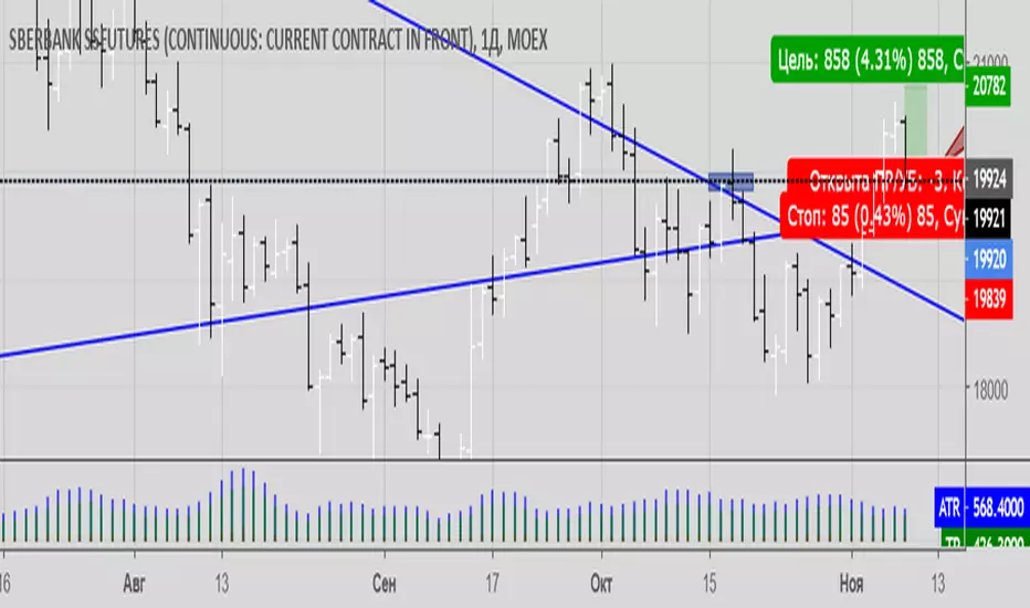
Galen Woods Reward-To-RiskThis indicator projects minimum targets for attaining positive expectancy given the probability of winning. You can use it to quickly judge if your intended target level offers positive expectancy.
It assumes that you are placing a stop-loss at the opposite end of the entry price bar. If you are using other stop placement methods, do not use this indicator.
Enter the Probability of Winning based on your experience, track record, and current assessment of the setup. (Default is 40%.)
The Buffer input allows you to add a number of ticks to your risk amount to account for slippage and commissions.
The Volatility function allows you to hide targets for entry bars with higher than average bar range. A wide range bar represents the need to risk more for that setup. Hence, this function hides the targets for relatively high-risk setups.
This indicator forms part of Galen Wood's Day Trading With Price Action Course.

TTPro Bottom Alerts V4TTPro Bottom Alerts V4 is a volatility indicator. When the bars are higher we can anticipate a bearish sentiment in the market, and when the bars are lower, the sentiment is regarded as bullish. The longest orange bars indicate market bottoms.

