Volatility Value BandsThis indicator is a modern adaptation of Mark Helweg's original Value Charts concept, focused on visually displaying volatility zones and "extreme value" areas directly on the price chart. It does not replicate the original work but draws inspiration from the logic of normalizing price by volatility to highlight statistically stretched regions.
1. Introduction
This study displays three lines directly on the chart:
- a central reference line (base),
- an upper overvaluation band,
- and a lower undervaluation band.
The bands are calculated from the relationship between price, moving average, and volatility (via true range/ATR), following Mark Helweg's Value Charts concept but with a custom implementation and adjustable parameters for different assets and timeframes. This allows objectively visualizing when price is in a statistically extended region relative to its recent behavior.
2. Key Features
- Volatility-normalized base
The indicator converts price deviation into "value units" using a combination of moving average and smoothed volatility (true range/ATR), making levels comparable across different assets and time horizons.
- Auto-adjusting limits (optional)
An automatic mode can calculate upper and lower limits from recent value unit extremes, using a configurable sampling window and percentile, allowing bands to adapt to the current volatility regime without manual recalibration.
- Direct plot on price chart
The three lines (central, upper, and lower) are drawn directly on the main asset chart (`overlay`), making it easy to read context: it's clear when price "touches" or breaks the volatility bands without switching to a separate pane.
- Flexible parameters
Users can control:
- base moving average period (length)
- volatility factor (manual or automatic)
- independent windows for volatility and limits calculation
- limits mode (auto or manual) and percentile used
This allows adapting behavior to different markets (stocks, indices, forex, crypto).
3. How to Use
- Basic interpretation
- When price approaches or exceeds the upper band, it indicates a statistically overvalued zone where the asset is stretched upward relative to recent volatility.
- When price approaches or exceeds the lower band, it indicates a statistically undervalued zone.
- The central line serves as a reference for recent "average value," derived from the base moving average.
- Recommended initial setup
- Choose the Value Chart period (e.g., 144 bars) for the base.
- Enable automatic limits mode for coherent bands matching the asset's volatility.
- Adjust the limits window and percentile for tighter bands (more signals) or wider bands (fewer but more extreme).
- Best practices
- Use bands as context filters, not standalone buy/sell signals. Combine with trend, market structure, or other confirmation indicators.
- Avoid decisions solely because price touched a band; in strong trends, price can "walk the edge" for extended periods.
- Always follow TradingView community rules when publishing: clearly state in the description that the study is "inspired by Mark Helweg's Value Charts concept," without claiming official status, reproducing proprietary code, or violating copyrights.
Buscar en scripts para "Volatility"

Volatility Percentage IndicatorThis simple indicator plot 11 lines in the chart at prices that correspond to -5%, -4%, -3%, -2%, -1%, 0%, 1%, 2%, 3%, 4%, 5%, referred to realtime price.
So the lines will move with the price.
The indicator is intended to give an at-a-glance information on price volatility by comparing the amplitude of the last candles with the percentages above.

Volatility Ratio Adaptive RSX [Loxx]Volatility Ratio Adaptive RSX this indicator adds volatility ratio adapting and speed value to RSX in order to make it more responsive to market condition changes at the times of high volatility, and to make it smoother in the times of low volatility
What is RSX?
RSI is a very popular technical indicator, because it takes into consideration market speed, direction and trend uniformity. However, the its widely criticized drawback is its noisy (jittery) appearance. The Jurik RSX retains all the useful features of RSI, but with one important exception: the noise is gone with no added lag.
Included:
-Toggle on/off bar coloring
Volatility Stop trading with risk managementQuick coding of a trading system based on the Volatility Stop (VStop) indicator. In addition to that I added the possibility to calculate the position size based on the amount that you want to risk. Beware, this is the amount you want to risk per trade. The total draw-down might be higher, as you can have multiple loosing trades.
[TH] Volatility BreakoutVolatility Breakout Strategy for TradingHook.
This strategy is not for backtesting but for forward-testing starting when added to chart.
It can make and send a formatted message string for buy and sell order using alert.
Volatility Trend Score [BackQuant]Volatility Trend Score
Overview
Volatility Trend Score is a trend-strength and regime-evaluation indicator built to measure directional persistence, not just direction. Most trend tools answer “up or down” using slope, crossovers, or a single condition. This indicator answers a more useful question for real trading: “How consistently is trend structure holding up once volatility is accounted for?”
It does this by building a volatility-scaled trailing structure (ATR-based) and then scoring how that structure evolves over a configurable lookback range. The output is a continuous score that rises when trend is persistent and decays when price action becomes noisy, mean-reverting, or unstable.
What it is measuring (the real goal)
This indicator is not trying to predict reversals. It is trying to quantify whether the market is behaving like a trend market or a chop market. It focuses on:
Persistence: does structure keep pushing in one direction bar after bar?
Stability: are pullbacks being absorbed without breaking the trailing structure?
Regime: is the market trending strongly enough to justify directional bias?
If you already have entries from other systems, this becomes a high-quality trend filter and trade management layer.
Core idea
At its foundation, the indicator combines two parts:
A volatility-adjusted trailing level derived from ATR and a user-defined factor.
A rolling persistence score that compares the current trail to prior trail values over a configurable loop window.
The trailing structure adapts to volatility and enforces one-sided movement, while the scoring logic converts that behavior into a numeric measure of trend quality.
Inputs and what they actually control
Average True Range Period (calc_p)
Defines the ATR window used to estimate volatility. A higher value smooths the volatility estimate and makes the trailing structure less reactive.
Factor (atr_factor)
Scales the ATR band size. Higher values widen the trailing band, filtering more noise, reducing flip frequency, and generally producing slower but more stable regimes.
For Loop Start/End (start/end)
Defines the comparison window used to build the score. It effectively sets how many historical trail values the current trail is compared against.
Shorter ranges produce a faster, more responsive score.
Longer ranges produce a slower, more “confidence-based” score that only climbs when trend persistence is sustained.
Long/Short Thresholds (thresL/thresS)
Convert a continuous score into regime thresholds.
Long threshold is a “trend quality requirement” for bullish bias.
Short threshold is used as a deterioration / breakdown trigger via crossunder logic.
Volatility-adjusted trailing structure
The trailing line is built from ATR bands around price:
up = close + ATR * factor
dn = close - ATR * factor
Then a trailing value is maintained with one-sided ratcheting behavior:
If dn rises above the previous trail, the trail steps up (ratchets upward).
If up drops below the previous trail, the trail steps down (ratchets downward).
This “ratchet” behavior is important. It prevents the trail from oscillating with small countertrend moves, forcing the trail to represent meaningful structure rather than micro-noise. On-chart, this trail often behaves like dynamic support/resistance in trends.
Why the trail is a better base than raw price
Price itself is noisy, and volatility changes the meaning of “big move” vs “small move.” By anchoring structure to ATR:
A move is interpreted relative to current volatility, not in absolute points.
High-volatility chop is less likely to be misread as a trend.
Trend structure is normalized across assets and timeframes more reliably.
This is why the score remains usable even when switching from low-vol assets to high-vol crypto pairs.
Trend scoring logic
The score is built by repeatedly comparing the current trailing value to trailing values from prior bars across a loop window:
If current trail > trail , add +1
If current trail < trail , add -1
This is a persistence test, not a momentum calculation. In a strong trend, the trail should generally keep stepping in the trend direction, so current values will be greater than many past values (bullish) or lower than many past values (bearish). In chop, the trail fails to progress meaningfully, so the score compresses, oscillates, or bleeds out.
How to interpret the score
Think of the score as a “trend conviction meter”:
High positive values: bullish persistence, structure is advancing consistently.
Low positive values: bullish bias may exist, but trend quality is weak or unstable.
Near zero: indecision, range behavior, or frequent structure challenges.
Negative values: bearish dominance or sustained deterioration in structure.
The speed of score change matters too:
Fast expansion suggests a fresh regime gaining traction.
Slow grind suggests mature trend continuation.
Rapid compression often signals consolidation, exhaustion, or a transition phase.
Signals and regime transitions
This script uses two different styles of conditions (important detail):
Long condition: score > long threshold (state-based, persistent while true).
Short condition: crossunder(score, short threshold) (event-based trigger).
That means:
Long bias can remain active as long as score stays above the long threshold.
Short regime flips are triggered at the moment the score breaks down through the short threshold.
On the chart, long/short shapes are only plotted when the regime flips (first bar of the change), not on every bar, using:
Long shape when signal becomes 1 and previous signal was -1
Short shape when signal becomes -1 and previous signal was 1
This keeps signals clean and avoids spam, making it usable for alerts and regime tagging.
Visual presentation
The indicator is designed to work both as a panel oscillator and as an on-chart overlay:
Score plot (oscillator): color reflects active regime state.
Optional trail on price: volatility-scaled structure line on chart.
Optional threshold reference lines: clear regime boundaries.
Optional candle coloring: makes regime obvious without reading the panel.
Optional background shading: useful for quick scanning and backtesting visually.
You can use only the score, only the trail, or both together depending on your workflow.
Practical use cases
1) Trend filter for systems
Use the score as a regime gate:
Allow long entries only when score is above the long threshold.
Avoid longs when score compresses toward zero or loses the threshold.
Treat the short threshold break as “trend is no longer healthy.”
This often improves system expectancy by reducing exposure during low-conviction conditions.
2) Trend quality grading
Instead of treating all uptrends as equal:
Higher score = higher persistence, better continuation odds.
Score plateau = trend losing pressure, continuation becomes less reliable.
Score decay while price rises = trend is getting weaker under the hood.
This is useful for position sizing or deciding whether to add to winners.
3) Trade management and exits
Two complementary tools exist here:
Trail line can act as a dynamic stop reference or structure invalidation level.
Score behavior can be used to scale out when persistence fades (before a full flip).
Many traders use the trail for “hard structure” and the score for “soft deterioration.”
4) Breakout confirmation vs fakeouts
A breakout that immediately fails to build score is often low quality.
Healthy breakouts usually come with score expansion as structure advances.
Fakeouts often revert quickly, score fails to climb, and regime stays unstable.
Tuning guidelines
These are general behaviors you can expect when adjusting settings:
Higher ATR period and factor: slower regimes, fewer flips, cleaner structure.
Lower ATR period and factor: faster reaction, more sensitivity, more noise risk.
Longer loop range: score becomes more “confidence-based,” slower to change.
Shorter loop range: score becomes more “tactical,” faster but more jittery.
A good way to tune is to pick the trail behavior first (ATR period and factor), then tune the score window (loop) to match how quickly you want “trend conviction” to build.
Market behavior focus
Volatility Trend Score is most valuable in markets where volatility shifts frequently and fake trends are common, especially crypto. It is designed to:
Stay out of low-quality chop where most indicators whipsaw.
Quantify when volatility is being expressed directionally (constructive trend).
Provide a clean regime framework for filtering, alignment, and management.
Summary
Volatility Trend Score converts volatility-adjusted structure into a quantified measure of trend persistence. By combining an ATR-based trailing mechanism with a rolling comparison score, it provides a more reliable read on trend quality than single-condition indicators. It is best used as a regime filter, a trend strength gauge, and a trade management layer, helping you stay aligned with strong directional phases while avoiding low-conviction envir

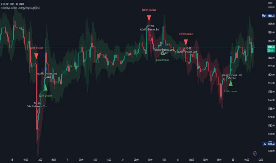
Volatility Breakout Strategy [Angel Algo]As traders, we're always looking for opportunities to profit from sudden price breakouts, and the Volatility Breakout Strategy aims to do just that.
This script is the perfect starting point for traders who want to experiment with capturing price movements resulting from increased volatility. The script plots the Average True Range (ATR) on the chart, which is a measure of the asset's volatility over a specified period. By setting the "Length" parameter, you can customize the period over which the volatility is measured.
Using the ATR, the strategy calculates upper and lower breakout levels and plots them on the chart. The signals for long and short positions are generated when the price crosses above the upper breakout level or below the lower breakout level, respectively. They are confirmed by checking the current bar state.
The strategy also fills the space between the upper and lower breakout levels with a color that indicates the latest signal direction. This feature helps traders quickly identify the prevailing trend.
The strategy uses the generated signals to enter trades. When a long or short signal is confirmed, and there is no open position in the direction of the signal, the strategy enters a long or short trade, respectively.
Choice of parameters.
Choosing the right value for the Length input parameter is crucial for tailoring the Volatility Breakout Strategy to suit your trading preferences. In general, a higher Length value implies a focus on capturing longer price moves. For instance, in this script, we have set the Length value to 20, resulting in trades that span approximately 100 candles. These trades encompass price trends consisting of multiple swings.
However, if your goal is to trade individual swings rather than longer trends, it's advisable to experiment with smaller values for the Length parameter. By reducing the Length, you can target shorter-term price movements and potentially increase the frequency of trades.
It's important to note that while a higher Length value tends to lead to longer trades, there is no strict correlation between the Length parameter and the average length of trades. This can vary across different markets. Therefore, it's essential to conduct thorough experimentation with various Length values and closely observe the length of trades they generate. Comparing these trade lengths with the average trend or swing length in the specific market can provide valuable insights.
Ideally, you should aim to select a Length value that aligns with the average trend or swing length observed in the market you are trading. This way, you can optimize the strategy to capture price movements that closely match the prevailing market conditions.
Remember, finding the optimal Length value is a process of trial and error, combined with careful observation of trade lengths and their correlation with market trends. So, don't be afraid to experiment and refine the Length parameter to maximize the effectiveness of the Volatility Breakout Strategy in your chosen market.
Disclaimer: This trading strategy is provided for educational and informational purposes only.Trading involves risk, and past performance is not indicative of future results.
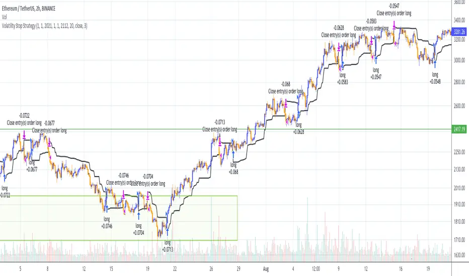
Volatility Stop Strategy (by Coinrule)Traders often use the volatility stop to protect trades dynamically, adjusting the stop price gradually based on the asset's volatility.
Just like the volatility stop is a great way to capture trend reversals on the downside, the opposite applies as well. Therefore, another useful application of the volatility stop is to add it to a trading system to signal potential trend reversals to catch a good buy opportunity.
ENTRY
- When the price crosses above the Volatility Stop
EXIT
- When the price crosses below the Volatility Stop
For this strategy, the Volatility stop's multiplier is set to 3 to allow more flexibility to the trade. The strategy is designed for medium-term trades.
Based on the backtest result from a sample of crypto trading pairs, the most profitable time frame is the 2-hr.
The strategy works well with both crypto-to-crypto and crypto-to-fiat pairs. To make results more realistic, a trading fee of 0.1% is added to the script. The fee is aligned to the base fee applied on Binance.
Volatility SkewThis indicator measure the historical skew of actual volatility for an individual security. It measure the volatility of up moves versus down moves over the period and gives a ratio. When the indicator is greater than one, it indicators that volatility is greater to the upside, when it is below 1 it indicates that volatility is skewed to the downside.
This is not comparable to the SKEW index, since that measures the implied volatility across option strikes, rather than using historical volatility.
Volatility RegimeThis is a useful volatility indicator to be used on a Daily time Frame
and paired with the Market Regime indicator.
Gray means that the markets have low volatility (calm) and might be consolidating before resuming or reversing the trend.
Teal means that volatility is somewhere around the average.
And Yellow means it has spiked up and we are in a high volatility regime.
When you pair it with the Market Regime filter for Bull/Bear markets you will
find that the best bull markets start from low volatility and mature on high volatility.
More often than not, the top comes when The Market Regime is very strong (Super Bull)
and volatility is high.
Similarly, the bottom arrives when the Market Regime is very bearish (Super Bear)
and volatility is high.

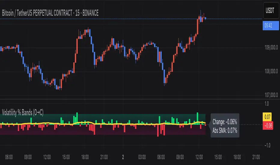
Volatility % Bands (O→C)Volatility % Bands (O→C) is an indicator designed to visualize the percentage change from Open to Close of each candle, providing a clear view of short-term momentum and volatility.
**Histogram**: Displays bar-by-bar % change (Close vs Open). Green bars indicate positive changes, while red bars indicate negative ones, making momentum shifts easy to identify.
**Moving Average Line**: Plots the Simple Moving Average (SMA) of the absolute % change, helping traders track the average volatility over a chosen period.
**Background Bands**: Based on the user-defined Level Step, ±1 to ±5 zones are highlighted as shaded bands, allowing quick recognition of whether volatility is low, moderate, or extreme.
**Label**: Shows the latest candle’s % change and the current SMA value as a floating label on the right, making it convenient for real-time monitoring.
This tool can be useful for volatility breakout strategies, day trading, and short-term momentum analysis.
Volatility Index of Range Verification█ OVERVIEW
This is a volatility indicator created by extending concepts from Tushar Chande's Range Action Verification Index (RAVI).
█ CONCEPTS
This indicator constructs range of the RAVI indicator. It uses this range to build a histogram that represents how fast the range is changing, or a measure of volatility. A line is then constructed, either from a moving average or standard deviation depending on the settings that can serve as an action trigger.
█ INPUTS
• Fast MA Period: the period of the quickest moving average that is used to build the RAVI indicator line
• Slow MA Period: the period of the slowest moving average that is used to build the RAVI indicator line
• MA Type: the type of moving average to use, either Simple or Exponential
• Price Source: the type of price source to use; close, high, low, hlc3, etc.
• Lookback Period: how far back to construct the minimum and maximum of the range
• Standard Range: the standard range of the indicator. a smaller range will exaggerate differences in the columns, and vice-versa
• Volatility Period: the period used for the trigger line moving average
• Std. Deviation Mode?: Whether the trigger line will plot using a moving average or a multiple of Standard Deviation.
• Deviation Multiplier: How many deviations to use if the trigger line is in Std. Deviation Mode
Volatility Squeeze Pro [JOAT]
Volatility Squeeze Pro — Advanced Volatility Compression Analysis System
This indicator addresses a specific analytical challenge in volatility analysis: how to identify periods when different volatility measurements show compression relationships that may indicate potential energy buildup in the market. It combines two distinct volatility calculation methods—standard deviation-based bands and ATR-based channels—with a momentum oscillator to provide comprehensive volatility state analysis.
Why This Combination Provides Unique Analytical Value
Traditional volatility indicators typically focus on single measurements, but markets exhibit different types of volatility that require different analytical approaches:
1. **Closing Price Volatility** (Standard Deviation): Measures how much closing prices deviate from their average
2. **Trading Range Volatility** (ATR): Measures the actual high-to-low trading ranges
3. **Directional Momentum**: Measures where price sits within its recent range
The problem with using these individually:
- Standard deviation alone doesn't account for intraday volatility
- ATR alone doesn't consider closing price clustering
- Momentum alone doesn't provide volatility context
- No single measurement captures the complete volatility picture
This indicator's originality lies in creating a comprehensive volatility analysis system that:
**Identifies Volatility Compression**: When closing price volatility contracts inside trading range volatility, it suggests potential energy buildup
**Provides Momentum Context**: Shows directional bias during compression periods
**Offers Multi-Dimensional Analysis**: Combines three different analytical approaches into one coherent system
**Delivers Real-Time Assessment**: Continuously monitors the relationship between different volatility types
Technical Innovation and Originality
While individual components (Bollinger Bands, Keltner Channels, Linear Regression) are standard, the innovation lies in:
1. **Volatility Relationship Detection**: The mathematical comparison between standard deviation bands and ATR channels creates a unique compression identification system
2. **Integrated Momentum Analysis**: Linear regression-based momentum calculation provides directional context specifically during volatility compression periods
3. **Multi-State Visualization**: The indicator provides clear visual encoding of different volatility states (compressed vs. normal) with momentum direction
4. **Adaptive Threshold System**: The squeeze detection automatically adapts to different instruments and timeframes without manual calibration
How the Components Work Together Analytically
The three components create a comprehensive volatility analysis framework:
**Standard Deviation Component**: Measures closing price dispersion around the mean
float bbBasis = ta.sma(close, bbLength)
float bbDev = bbMult * ta.stdev(close, bbLength)
float bbUpper = bbBasis + bbDev
float bbLower = bbBasis - bbDev
**ATR Channel Component**: Measures actual trading range volatility
float kcBasis = ta.ema(close, kcLength)
float kcRange = ta.atr(atrLength)
float kcUpper = kcBasis + kcRange * kcMult
float kcLower = kcBasis - kcRange * kcMult
**Squeeze Detection Logic**: Identifies when closing price volatility compresses within trading range volatility
bool squeezeOn = bbLower > kcLower and bbUpper < kcUpper
// This condition indicates closing prices are clustering more tightly
// than the typical trading range would suggest
**Momentum Context Component**: Provides directional bias during compression
float highestHigh = ta.highest(high, momLength)
float lowestLow = ta.lowest(low, momLength)
float momentum = ta.linreg(close - math.avg(highestHigh, lowestLow), momLength, 0)
float momSmooth = ta.sma(momentum, smoothLength)
The analytical relationship creates a system where:
- Squeeze detection identifies WHEN volatility compression occurs
- Momentum analysis shows WHERE price is positioned during compression
- Combined analysis provides both timing and directional context
How the Volatility Comparison Works
The indicator compares two volatility measurements:
Standard Deviation Bands
These measure how much closing prices deviate from their average. When prices cluster tightly around the average, the bands contract.
// Standard deviation bands calculation
float bbBasis = ta.sma(close, bbLength)
float bbDev = bbMult * ta.stdev(close, bbLength)
float bbUpper = bbBasis + bbDev
float bbLower = bbBasis - bbDev
ATR-Based Channels
These measure volatility using Average True Range—the typical distance between high and low prices. They respond to the actual trading range rather than closing price dispersion.
// ATR-based channels calculation
float kcBasis = ta.ema(close, kcLength)
float kcRange = ta.atr(atrLength)
float kcUpper = kcBasis + kcRange * kcMult
float kcLower = kcBasis - kcRange * kcMult
The Squeeze Condition
A "squeeze" is detected when the standard deviation bands are completely contained within the ATR channels:
// Squeeze detection
bool squeezeOn = bbLower > kcLower and bbUpper < kcUpper
This condition indicates that closing price volatility has compressed relative to the overall trading range.
The Momentum Component
The momentum oscillator measures where price sits relative to its recent high-low range, using linear regression for smoothing:
// Momentum calculation
float highestHigh = ta.highest(high, momLength)
float lowestLow = ta.lowest(low, momLength)
float momentum = ta.linreg(close - math.avg(highestHigh, lowestLow), momLength, 0)
float momSmooth = ta.sma(momentum, smoothLength)
Positive values indicate price is above the midpoint of its recent range; negative values indicate below.
Why Display Both Together
The squeeze detection shows WHEN volatility is compressed. The momentum reading shows the current directional bias of price within that compression. Together, they provide two pieces of information:
1. Is volatility currently compressed? (squeeze status)
2. Where is price leaning within the current range? (momentum)
These are observations about current conditions, not predictions about future movement.
Visual Elements
Momentum Histogram — Bars showing momentum value
- Green shades: Positive momentum (price above range midpoint)
- Red shades: Negative momentum (price below range midpoint)
- Brighter colors: Momentum increasing
- Faded colors: Momentum decreasing
Squeeze Dots — Circles on the zero line
- Red: Squeeze condition active
- Green: No squeeze condition
Release Markers — Triangle markers when squeeze condition ends
Dashboard — Current readings and status
Color Scheme
Squeeze Active — #FF5252 (red)
No Squeeze — #4CAF50 (green)
Momentum Positive — #00E676 / #81C784 (green shades)
Momentum Negative — #FF5252 / #E57373 (red shades)
Inputs
Standard Deviation Bands:
Length (default: 20)
Multiplier (default: 2.0)
ATR Channels:
Length (default: 20)
Multiplier (default: 1.5)
ATR Period (default: 10)
Momentum:
Length (default: 12)
Smoothing (default: 3)
How to Read the Display
Red dots indicate the squeeze condition is present
Green dots indicate normal volatility relationship
Histogram direction shows current momentum bias
Histogram color brightness shows whether momentum is increasing or decreasing
Alerts
Squeeze condition started
Squeeze condition ended
Squeeze ended with positive momentum
Squeeze ended with negative momentum
Extended squeeze (8+ bars)
Important Limitations and Realistic Expectations
Volatility compression detection is a mathematical relationship between calculations—it does not predict future price movements
Many compression periods do not result in significant price expansion or directional moves
Momentum direction during compression does not reliably indicate future breakout direction
This indicator analyzes current and historical volatility conditions only—it cannot predict future volatility
False signals are common—not every squeeze leads to tradeable price movement
Different parameter settings will produce different compression detection sensitivity
Market conditions, news events, and fundamental factors often override technical volatility patterns
No volatility indicator can predict the timing, direction, or magnitude of future price movements
This tool should be used as one component of comprehensive market analysis
Appropriate Use Cases
This indicator is designed for:
- Volatility state analysis and monitoring
- Educational study of volatility relationships
- Multi-dimensional volatility assessment
- Supplementary analysis alongside other technical tools
- Understanding market compression/expansion cycles
This indicator is NOT designed for:
- Standalone trading signal generation
- Guaranteed breakout prediction
- Automated trading system triggers
- Market timing precision
- Replacement of fundamental analysis
Understanding Volatility Analysis Limitations
Volatility analysis, while useful for understanding market conditions, has inherent limitations:
- Past volatility patterns do not guarantee future patterns
- Compression periods can extend much longer than expected
- Expansion periods may be brief and insufficient for trading
- External factors (news, fundamentals) often override technical patterns
- Different markets and timeframes exhibit different volatility characteristics
— Made with passion by officialjackofalltrades

Volatility Targeting: Single Asset [BackQuant]Volatility Targeting: Single Asset
An educational example that demonstrates how volatility targeting can scale exposure up or down on one symbol, then applies a simple EMA cross for long or short direction and a higher timeframe style regime filter to gate risk. It builds a synthetic equity curve and compares it to buy and hold and a benchmark.
Important disclaimer
This script is a concept and education example only . It is not a complete trading system and it is not meant for live execution. It does not model many real world constraints, and its equity curve is only a simplified simulation. If you want to trade any idea like this, you need a proper strategy() implementation, realistic execution assumptions, and robust backtesting with out of sample validation.
Single asset vs the full portfolio concept
This indicator is the single asset, long short version of the broader volatility targeted momentum portfolio concept. The original multi asset concept and full portfolio implementation is here:
That portfolio script is about allocating across multiple assets with a portfolio view. This script is intentionally simpler and focuses on one symbol so you can clearly see how volatility targeting behaves, how the scaling interacts with trend direction, and what an equity curve comparison looks like.
What this indicator is trying to demonstrate
Volatility targeting is a risk scaling framework. The core idea is simple:
If realized volatility is low relative to a target, you can scale position size up so the strategy behaves like it has a stable risk budget.
If realized volatility is high relative to a target, you scale down to avoid getting blown around by the market.
Instead of always being 1x long or 1x short, exposure becomes dynamic. This is often used in risk parity style systems, trend following overlays, and volatility controlled products.
This script combines that risk scaling with a simple trend direction model:
Fast and slow EMA cross determines whether the strategy is long or short.
A second, longer EMA cross acts as a regime filter that decides whether the system is ACTIVE or effectively in CASH.
An equity curve is built from the scaled returns so you can visualize how the framework behaves across regimes.
How the logic works step by step
1) Returns and simple momentum
The script uses log returns for the base return stream:
ret = log(price / price )
It also computes a simple momentum value:
mom = price / price - 1
In this version, momentum is mainly informational since the directional signal is the EMA cross. The lookback input is shared with volatility estimation to keep the concept compact.
2) Realized volatility estimation
Realized volatility is estimated as the standard deviation of returns over the lookback window, then annualized:
vol = stdev(ret, lookback) * sqrt(tradingdays)
The Trading Days/Year input controls annualization:
252 is typical for traditional markets.
365 is typical for crypto since it trades daily.
3) Volatility targeting multiplier
Once realized vol is estimated, the script computes a scaling factor that tries to push realized volatility toward the target:
volMult = targetVol / vol
This is then clamped into a reasonable range:
Minimum 0.1 so exposure never goes to zero just because vol spikes.
Maximum 5.0 so exposure is not allowed to lever infinitely during ultra low volatility periods.
This clamp is one of the most important “sanity rails” in any volatility targeted system. Without it, very low volatility regimes can create unrealistic leverage.
4) Scaled return stream
The per bar return used for the equity curve is the raw return multiplied by the volatility multiplier:
sr = ret * volMult
Think of this as the return you would have earned if you scaled exposure to match the volatility budget.
5) Long short direction via EMA cross
Direction is determined by a fast and slow EMA cross on price:
If fast EMA is above slow EMA, direction is long.
If fast EMA is below slow EMA, direction is short.
This produces dir as either +1 or -1. The scaled return stream is then signed by direction:
avgRet = dir * sr
So the strategy return is volatility targeted and directionally flipped depending on trend.
6) Regime filter: ACTIVE vs CASH
A second EMA pair acts as a top level regime filter:
If fast regime EMA is above slow regime EMA, the system is ACTIVE.
If fast regime EMA is below slow regime EMA, the system is considered CASH, meaning it does not compound equity.
This is designed to reduce participation in long bear phases or low quality environments, depending on how you set the regime lengths. By default it is a classic 50 and 200 EMA cross structure.
Important detail, the script applies regime_filter when compounding equity, meaning it uses the prior bar regime state to avoid ambiguous same bar updates.
7) Equity curve construction
The script builds a synthetic equity curve starting from Initial Capital after Start Date . Each bar:
If regime was ACTIVE on the previous bar, equity compounds by (1 + netRet).
If regime was CASH, equity stays flat.
Fees are modeled very simply as a per bar penalty on returns:
netRet = avgRet - (fee_rate * avgRet)
This is not realistic execution modeling, it is just a simple turnover penalty knob to show how friction can reduce compounded performance. Real backtesting should model trade based costs, spreads, funding, and slippage.
Benchmark and buy and hold comparison
The script pulls a benchmark symbol via request.security and builds a buy and hold equity curve starting from the same date and initial capital. The buy and hold curve is based on benchmark price appreciation, not the strategy’s asset price, so you can compare:
Strategy equity on the chart symbol.
Buy and hold equity for the selected benchmark instrument.
By default the benchmark is TVC:SPX, but you can set it to anything, for crypto you might set it to BTC, or a sector index, or a dominance proxy depending on your study.
What it plots
If enabled, the indicator plots:
Strategy Equity as a line, colored by recent direction of equity change, using Positive Equity Color and Negative Equity Color .
Buy and Hold Equity for the chosen benchmark as a line.
Optional labels that tag each curve on the right side of the chart.
This makes it easy to visually see when volatility targeting and regime gating change the shape of the equity curve relative to a simple passive hold.
Metrics table explained
If Show Metrics Table is enabled, a table is built and populated with common performance statistics based on the simulated daily returns of the strategy equity curve after the start date. These include:
Net Profit (%) total return relative to initial capital.
Max DD (%) maximum drawdown computed from equity peaks, stored over time.
Win Rate percent of positive return bars.
Annual Mean Returns (% p/y) mean daily return annualized.
Annual Stdev Returns (% p/y) volatility of daily returns annualized.
Variance of annualized returns.
Sortino Ratio annualized return divided by downside deviation, using negative return stdev.
Sharpe Ratio risk adjusted return using the risk free rate input.
Omega Ratio positive return sum divided by negative return sum.
Gain to Pain total return sum divided by absolute loss sum.
CAGR (% p/y) compounded annual growth rate based on time since start date.
Portfolio Alpha (% p/y) alpha versus benchmark using beta and the benchmark mean.
Portfolio Beta covariance of strategy returns with benchmark returns divided by benchmark variance.
Skewness of Returns actually the script computes a conditional value based on the lower 5 percent tail of returns, so it behaves more like a simple CVaR style tail loss estimate than classic skewness.
Important note, these are calculated from the synthetic equity stream in an indicator context. They are useful for concept exploration, but they are not a substitute for professional backtesting where trade timing, fills, funding, and leverage constraints are accurately represented.
How to interpret the system conceptually
Vol targeting effect
When volatility rises, volMult falls, so the strategy de risks and the equity curve typically becomes smoother. When volatility compresses, volMult rises, so the system takes more exposure and tries to maintain a stable risk budget.
This is why volatility targeting is often used as a “risk equalizer”, it can reduce the “biggest drawdowns happen only because vol expanded” problem, at the cost of potentially under participating in explosive upside if volatility rises during a trend.
Long short directional effect
Because direction is an EMA cross:
In strong trends, the direction stays stable and the scaled return stream compounds in that trend direction.
In choppy ranges, the EMA cross can flip and create whipsaws, which is where fees and regime filtering matter most.
Regime filter effect
The 50 and 200 style filter tries to:
Keep the system active in sustained up regimes.
Reduce exposure during long down regimes or extended weakness.
It will always be late at turning points, by design. It is a slow filter meant to reduce deep participation, not to catch bottoms.
Common applications
This script is mainly for understanding and research, but conceptually, volatility targeting overlays are used for:
Risk budgeting normalize risk so your exposure is not accidentally huge in high vol regimes.
System comparison see how a simple trend model behaves with and without vol scaling.
Parameter exploration test how target volatility, lookback length, and regime lengths change the shape of equity and drawdowns.
Framework building as a reference blueprint before implementing a proper strategy() version with trade based execution logic.
Tuning guidance
Lookback lower values react faster to vol shifts but can create unstable scaling, higher values smooth scaling but react slower to regime changes.
Target volatility higher targets increase exposure and drawdown potential, lower targets reduce exposure and usually lower drawdowns, but can under perform in strong trends.
Signal EMAs tighter EMAs increase trade frequency, wider EMAs reduce churn but react slower.
Regime EMAs slower regime filters reduce false toggles but will miss early trend transitions.
Fees if you crank this up you will see how sensitive higher turnover parameter sets are to friction.
Final note
This is a compact educational demonstration of a volatility targeted, long short single asset framework with a regime gate and a synthetic equity curve. If you want a production ready implementation, the correct next step is to convert this concept into a strategy() script, add realistic execution and cost modeling, test across multiple timeframes and market regimes, and validate out of sample before making any decision based on the results.

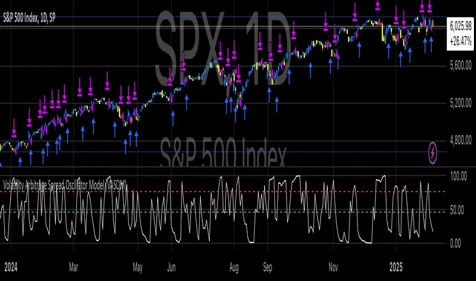
Volatility Arbitrage Spread Oscillator Model (VASOM)The Volatility Arbitrage Spread Oscillator Model (VASOM) is a systematic approach to capitalizing on price inefficiencies in the VIX futures term structure. By analyzing the differential between front-month and second-month VIX futures contracts, we employ a momentum-based oscillator (Relative Strength Index, RSI) to signal potential market reversion opportunities. Our research builds upon existing financial literature on volatility risk premia and contango/backwardation dynamics in the volatility markets (Zhang & Zhu, 2006; Alexander & Korovilas, 2012).
Volatility derivatives have become essential tools for managing risk and engaging in speculative trades (Whaley, 2009). The Chicago Board Options Exchange (CBOE) Volatility Index (VIX) measures the market’s expectation of 30-day forward-looking volatility derived from S&P 500 option prices (CBOE, 2018). Term structures in VIX futures often exhibit contango or backwardation, depending on macroeconomic and market conditions (Alexander & Korovilas, 2012).
This strategy seeks to exploit the spread between the front-month and second-month VIX futures as a proxy for term structure dynamics. The spread’s momentum, quantified by the RSI, serves as a signal for entry and exit points, aligning with empirical findings on mean reversion in volatility markets (Zhang & Zhu, 2006).
• Entry Signal: When RSI_t falls below the user-defined threshold (e.g., 30), indicating a potential undervaluation in the spread.
• Exit Signal: When RSI_t exceeds a threshold (e.g., 70), suggesting mean reversion has occurred.
Empirical Justification
The strategy aligns with findings that suggest predictable patterns in volatility futures spreads (Alexander & Korovilas, 2012). Furthermore, the use of RSI leverages insights from momentum-based trading models, which have demonstrated efficacy in various asset classes, including commodities and derivatives (Jegadeesh & Titman, 1993).
References
• Alexander, C., & Korovilas, D. (2012). The Hazards of Volatility Investing. Journal of Alternative Investments, 15(2), 92-104.
• CBOE. (2018). The VIX White Paper. Chicago Board Options Exchange.
• Jegadeesh, N., & Titman, S. (1993). Returns to Buying Winners and Selling Losers: Implications for Stock Market Efficiency. The Journal of Finance, 48(1), 65-91.
• Zhang, C., & Zhu, Y. (2006). Exploiting Predictability in Volatility Futures Spreads. Financial Analysts Journal, 62(6), 62-72.
• Whaley, R. E. (2009). Understanding the VIX. The Journal of Portfolio Management, 35(3), 98-105.
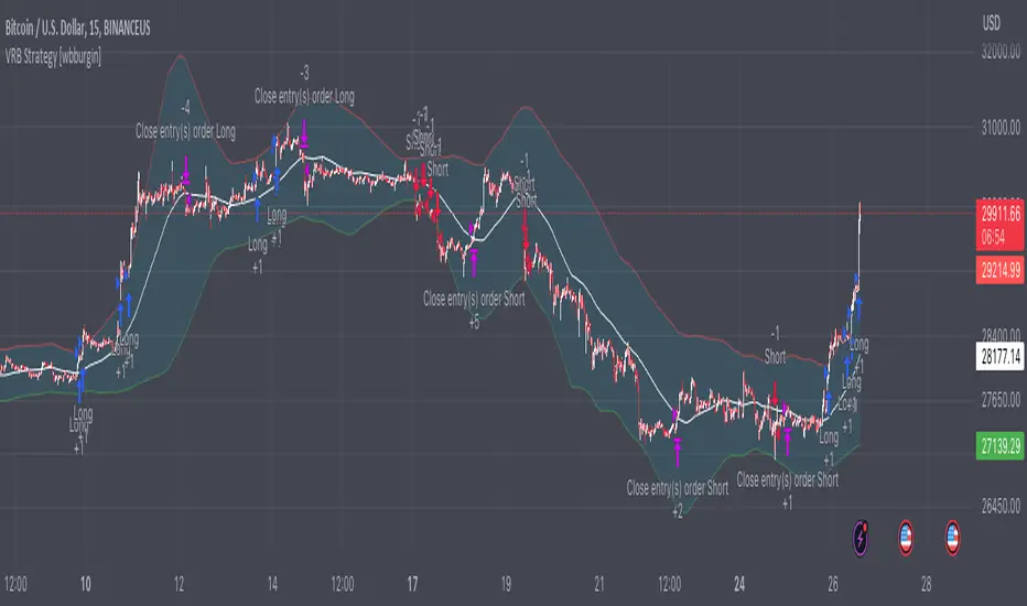
Volatility Range Breakout Strategy [wbburgin]The "Volatility Range Breakout Strategy" uses deviations of high-low volatility to determine bullish and bearish breakouts.
HOW IT WORKS
The volatility function uses the high-low range of a lookback period, divided by the average of that range, to determine the likelihood that price will break in a specific direction.
High and low ranges are determined by the relative volatility compared to the current closing price. The high range, for example, is the (volatility * close) added to the close, the low range is this value subtracted by the close.
A volatility-weighted moving average is taken of these high and low ranges to form high and low bands.
Finally, breakouts are identified once the price closes above or below these bands. An upwards breakout (bullish) occurs when the price breaks above the upper band, while a downwards breakout (bearish) occurs when the price breaks below the lower band. Positions can be closed either by when the price falls out of its current band ("Range Crossover" in settings under 'Exit Type') or when the price falls below or above the volatility MA (default because this allows us to catch trends for longer).
INPUTS/SETTINGS
The AVERAGE LENGTH is the period for the volatility MA and the weighted volatility bands.
The VOLATILITY LENGTH is how far the lookback should be for highs/lows for the volatility calculation.
Enjoy! Let me know if you have any questions.
Volatility Percentile🎲 Volatility is an important measure to be included in trading plan and strategy. Strategies have varied outcome based on volatility of the instruments in hand.
For example,
🚩 Trend following strategies work better on low volatility instruments and reversal patterns work better in high volatility instruments. It is also important for us to understand the median volatility of an instrument before applying particular strategy strategy on them.
🚩 Different instrument will have different volatility range. For instance crypto currencies have higher volatility whereas major currency pairs have lower volatility with respect to their price. It is also important for us to understand if the current volatility of the instrument is relatively higher or lower based on the historical values.
This indicator is created to study and understand more about volatility of the instruments.
⬜ Process
▶ Volatility metric used here is ATR as percentage of price. Other things such as bollinger bandwidth etc can also be used with few changes.
▶ We use array based counters to count ATR values in different range. For example, if we are measuring ATR range based on precision 2, we will use array containing 10000 values all initially set to 0 which act as 10000 buckets to hold counters of different range. But, based on the ATR percentage range, they will be incremented. Let's say, if atr percent is 2, then 200th element of the array is increased by 1.
▶ When we do this for every bar, we have array of counters which has the division on how many bars had what range of atr percent.
▶ Using this array, we can calculate how many bars had atr percent more than current value, how many had less than current value, and how many bars in history has same atr percent as current value.
▶ With these information, we can calculate the percentile of atr percentage value. We can also plot a detailed table mentioning what percentile each range map to.
⬜ Settings
▶ ATR Parameters - this include Moving average type and Length for atr calculation.
▶ Rounding type refers to rounding ATR percentage value before we put into certain bucket. For example, if ATR percentage 2.7, round or ceil will make it 3, whereas floor will make it 2 which may fall into different buckets based on the precision selected.
▶ Precision refers to how much detailed the range should be. If precision set to 0, then we get array of 100 to collect the range where each value will represent a range of 1%. Similarly precision of 1 will lead to array of 1000 with each item representing range of 0.1. Default value used is 2 which is also the max precision possible in this script. This means, we use array of 10000 to track the range and percentile of the ATR.
▶ Display Settings - Inverse when applied track percentile with respect to lowest value of ATR instead of high. By default this is set to false. Other two options allow users to enable stats table. When detailed stats are enabled, ATR Percentile as plot is hidden.
▶ Table Settings - Allows users to select set size and coloring options.
▶ Indicator Time Window - Allow users to select particular timeframe instead of all available bars to run the study. By default windows are disabled. Users can chose start and end time individually.
Indicator display components can be described as below:

K's Volatility BandsVolatility bands come in all shapes and forms contrary to what is believed. Bollinger bands remain the principal indicator in the volatility bands family. K's Volatility bands is an attempt at optimizing the original bands. Below is the method of calculation:
* We must first start by calculating a rolling measure based on the average between the highest high and the lowest low in the last specified lookback window. This will give us a type of moving average that tracks the market price. The specificity here is that when the market does not make higher highs nor lower lows, the line will be flat. A flat line can also be thought of as a magnet of the price as the ranging property could hint to a further sideways movement.
* The K’s volatility bands assume the worst with volatility and thus will take the maximum volatility for a given lookback period. Unlike the Bollinger bands which will take the latest volatility calculation every single step of time, K’s volatility bands will suppose that we must be protected by the maximum of volatility for that period which will give us from time to time stable support and resistance levels.
Therefore, the difference between the Bollinger bands and K's volatility bands are as follows:
* Bollinger Bands' formula calculates a simple moving average on the closing prices while K's volatility bands' formula calculates the average of the highest highs and the lowest lows.
* Bollinger Bands' formula calculates a simple standard deviation on the closing prices while K's volatility bands' formula calculates the highest standard deviation for the lookback period.
Applying the bands is similar to applying any other volatility bands. We can list the typical strategies below:
* The range play strategy : This is the usual reversal strategy where we buy whenever the price hits the lower band and sell short whenever it hits the upper band.
* The band re-entry strategy : This strategy awaits the confirmation that the price has recognized the band and has shaped a reaction around it and has reintegrated the whole envelope. It may be slightly lagging in nature but it may filter out bad trades.
* Following the trend strategy : This is a controversial strategy that is the opposite of the first one. It assumes that whenever the upper band is surpassed, a buy signal is generated and whenever the lower band is broken, a sell signal is generated.
* Combination with other indicators : The bands can be combined with other technical indicators such as the RSI in order to have more confirmation. This is however no guarantee that the signals will improve in quality.
* Specific strategy on K’s volatility bands : This one is similar to the first range play strategy but it adds the extra filter where the trade has a higher conviction if the median line is flat. The reason for this is that a flat line means that no higher highs nor lower lows have been made and therefore, we may be in a sideways market which is a fertile ground for mean-reversion strategies.
Volatility-Volume Index (VVI)Volatility-Volume Index (VVI) – Indicator Description
The Volatility-Volume Index (VVI) is a custom trading indicator designed to identify market consolidation and anticipate breakouts by combining volatility (ATR) and trading volume into a single metric.
How It Works
Measures Volatility : Uses a 14-period Average True Range (ATR) to gauge price movement intensity.
Tracks Volume : Monitors trading activity to identify accumulation or distribution phases.
Normalization : ATR and volume are normalized using their respective 20-period Simple Moving Averages (SMA) for a balanced comparison.
Interpretation
VVI < 1: Low volatility and volume → Consolidation phase (range-bound market).
VVI > 1: Increased volatility and/or volume → Potential breakout or trend continuation.
How to Use VVI
Detect Consolidation:
Look for extended periods where VVI remains below 1.
Confirm with sideways price movement in a narrow range.
Anticipate Breakouts:
A spike above 1 signals a possible trend shift or breakout.
Why Use VVI?
Unlike traditional volatility indicators (ATR, Bollinger Bands) or volume-based tools (VWAP), VVI combines both elements to provide a clearer picture of consolidation zones and breakout potential.
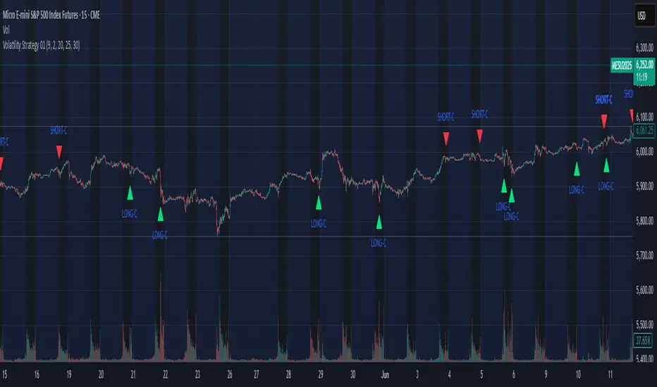
Volatility Strategy 01a quantitative volatility strategy (especially effective in trend direction on the 15min chart on the s&p-index)
the strategy is a rule-based setup, which dynamically adapts to the implied volatility structure (vx1!–vx2!)
context-dependent mean reversion strategy based on multiple timeframes in the vix index
a signal is provided under following conditions:
1. the vvix/vix spread has deviated significantly beyond one standard deviation
2. the vix is positioned above or below 3 moving averages on 3 minor timeframes
3. the trade direction is derived from the projected volatility regime, measured via vx1! and vx2! (cboe)
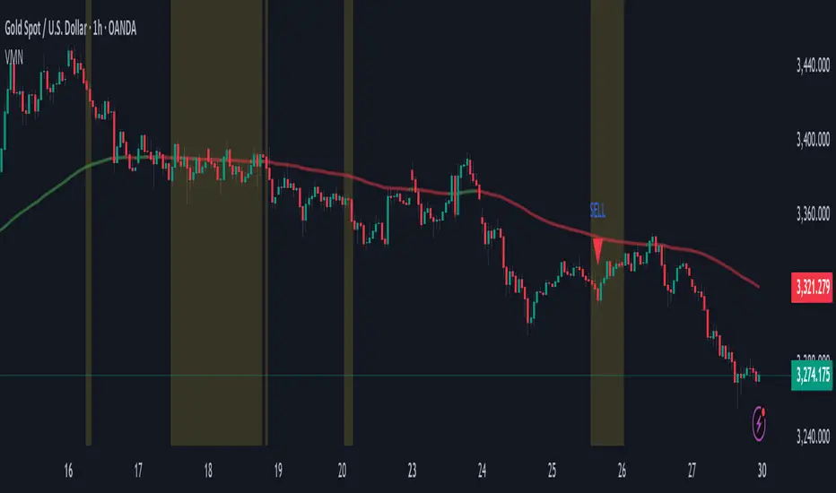
Volatility & Momentum Nexus (VMN)Volatility & Momentum Nexus (VMN)
This indicator was designed to solve a common trader's problem: chart clutter from dozens of indicators that often contradict each other. The Volatility & Momentum Nexus ( VMN ) is not just another indicator; it's a complete analysis system that synthesizes four essential market pillars into a single, clean, and intuitive visual signal.
The goal of VMN is to identify high-probability moments where a period of accumulation (low volatility) is about to erupt into an explosive move, confirmed by trend, momentum, and volume.
VMN analyzes the real-time confluence of four critical elements:
The Trend (The Main Filter): A 100-period Exponential Moving Average (EMA) sets the overall context. The indicator will only look for buy signals above this line (in an uptrend) and sell signals below it (in a downtrend). The line's color changes for quick visualization.
Volatility (Energy Accumulation): Using Bollinger Bands Width (BBW), the indicator identifies "Squeeze" periods—when the price contracts and builds up energy. These zones are marked with a yellow background on the chart, signaling that a major move is imminent.
Momentum (The Trigger): An RSI (Relative Strength Index) acts as the trigger. A signal is only validated if momentum confirms the direction of the breakout (e.g., RSI > 55 for a buy), ensuring we enter the market with force.
Volume (The Final Confirmation): No breakout move is credible without volume. VMN checks if the volume at the time of the signal is significantly higher than its recent average, adding a vital layer of confirmation.
Green Arrow (Buy Signal): Appears ONLY when ALL the following conditions are met simultaneously:
Price is above the 100 EMA (Bullish Trend).
The chart is exiting a Squeeze zone (yellow background on the previous bar).
Price breaks above the upper Bollinger Band.
RSI is above the buy threshold (default 55).
Volume is above average.
Red Arrow (Sell Signal): Appears ONLY when all the opposite conditions are met.
Do not treat signals as blind commands to trade. They are high-probability confirmations.
Look for signals near key Support/Resistance levels for an even higher success rate.
Always set a Stop Loss (e.g., below the low of the signal candle or below the lower Bollinger Band for a buy).
All parameters (EMA, RSI, Bollinger Bands lengths, thresholds, etc.) can be customized from the settings menu to adapt the indicator to any financial asset or timeframe.
Disclaimer: This indicator is a tool for educational and analytical purposes. It does not constitute and should not be interpreted as financial advice. Trading involves significant risk. Always perform your own analysis and backtesting before risking real capital.
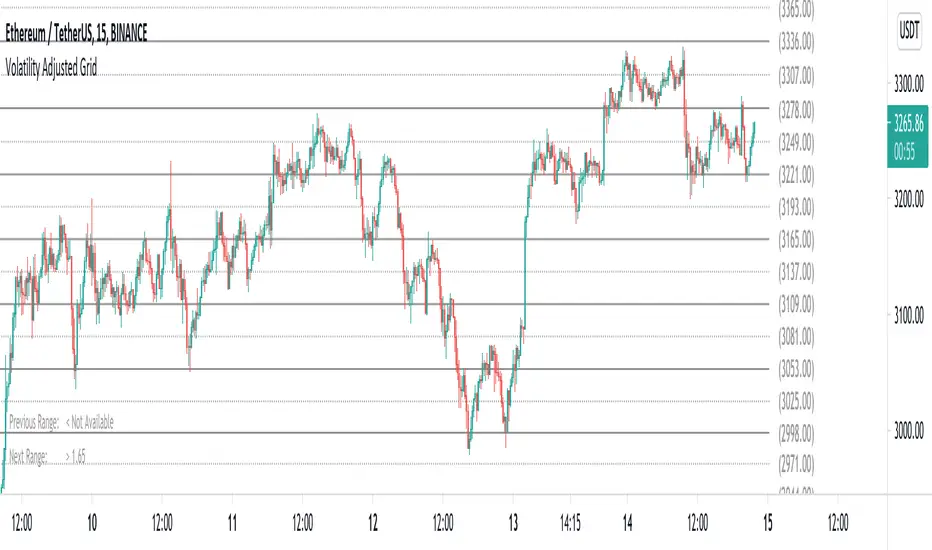
Volatility Adjusted Grid [Gann]█ OVERVIEW
Gann Square of 9 is one of the many brilliant concepts from W.D.Gann himself where it revolves around the idea that price is moving in a certain geometrical pattern. Numbers on the Square of 9 spiral tables, especially those lie in every 45degree in the chart act as key vibration levels where prices have tendency to react to (more on the table below).
There are few square of 9 related scripts here in Tradingview and while there's nothing wrong with them, it doesn't address 1 particular issue that i have: The numbers can be too rigid even when scaled based on current price because the levels are fixed, which makes them not tradable on certain timeframes depending on where the price currently sitting.
Heres 5min and 1hour Bitcoin chart to illustrate what i mean: Grey line on the left is based on Volatility Adjusted levels, while red/blue on the right are the standard Gann levels.
You can see that on 1hour chart, it provides a good levels (both Volatility Adjusted and the standard one happened to share the same multiplier in this case),
1Hour Chart:
On 5 min chart tells a different story as the range between blue/red levels can be deemed as to big for a short term trade, while the grey line is adjusted to suit that particular timeframe (You can still adjust to make it bigger/smaller from the settings, more on this below)
5Min Chart:
█ Little bit on Gann Square of 9 table
This is the square of nine table, the numbers highlighted in Red are known as Cardinal Cross and considered to be a major Support/Resistance while those in Blue color are known as Ordinal Cross considered as minor (but still important) Support/Resistance levels
Similarly, this script use these numbers (and certain multipliers) to print out the levels, with Cardinal numbers represented by solid lines and Ordinal numbers by dotted lines.
█ How it Works and Limitations
The Volatility Adjusted grid will go through several iterations of different multipliers to find the Gann number range that is at least bigger than times ATR. Because it's using ATR to determine the range, occasionally you'll notice that the line become smaller as ATR contracting (and vice versa). To overcome this, you can change the size range multiplier from the settings to retrieve the previous range size.
Use the size guide at the bottom left to find the multiplier that suits your need:
1st Row -> Previous Range -- Change Range Size to number lower than this to get a smaller range
2nd Row -> Next Range -- Change Range Size to number higher than this to get a larger range
Example:
Before:
After:
As you'll soon realise, the key here is to find the range that fits the historical structure and suits your own strategy. Enjoy :)
█ Disclaimer
Past performance is not an indicator of future results.
My opinions and research are my own and do not constitute financial advice in any way whatsoever.
Nothing published by me constitutes an investment recommendation, nor should any data or Content published by me be relied upon for any investment/trading activities.
I strongly recommends that you perform your own independent research and/or speak with a qualified investment professional before making any financial decisions.
Any ideas to further improve this indicator are welcome :)
Volatility IndexThis indicator is based on Historical Volatility (HV) built-in indicator with minor tweaks to match the Bitcoin Volatility Index (from Bybt).
Also, you can select a symbol to compare its volatility with the volatility of the currently selected symbol.
