BitMEX BTC Volatility IndexThis indicator displays the BitMEX BTC Volatility Index ( BVOL24H ) as an indicator and it can be compared to the VIX of the cryptocurrencies.
more information about how BVOL24H is calculated can be found here: www.bitmex.com
Symbol can be changed in the parameters
Buscar en scripts para "Volatility"

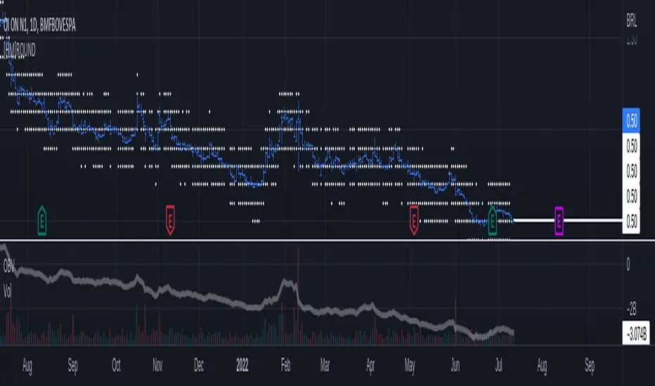
Previous Earnings Volatility v1 by RMThis study checks previous Stock trends (volatility) before Earnings announcements. This indicator is used to gauge the stock personality before earnings. Some are consistently better than others.
The range to be analysed before earnings is modified in "Candles before EA to plot Trend" , and the total period under study (how many Earnings periods) is set by "Date From" and "Date To" parameters.
The indicator shows closing values for the periods analysed and presents a tables with the summary, how many are up and down.
Used part of this code as published by @PineCoders and Public Library, This script is based on previous work from several people like Sushil Kothawade and other open source coders:
in.tradingview.com
Disclaimer: This is not a Financial advisory tool. For education purposes only. * Use at your own risk *

Chonky Hourly Volatility StatsShows a table of the average volatility per hour of day.
Can inform about the more/less opportune times to trade a particular asset.
Gaps are not accounted for; ranges only consist of high - low.
Use on the hourly time frame only.

Percentage Volume VolatilityI was looking for a script similar to ATR that would show percentage point volatility relative to current price. It's way easier to compare 2 different tickers, with similar entry conditions, and judge witch one has bigger gains predisposition than calculating everything with just ATR value.
Unfortunately I haven't found any, so there is one I've composed out of ATR and VWAP. First choice is self explanatory, the VWAP on the other choice in my opinion shows more faithful average price than SMAs or EMAs. Feel free to adjust the script if You feel like it.
Cheers - Mizer.

Volatility Dispersion EnvelopesThe Volatility Dispersion Envelope Indicator (VDE) is a custom forward-looking indicator developed by Macro Ops. This indicator is best used to identify when price action is reaching statistical points of reversal within the next five to seven days.
An operator can conceptualize the VDE as a vacuum, out to absorb all of the speculators (dispersive outlooks). When the bounds of the VDE are at their maximum divergence, this points to a likely trend reversal, as there is a maximum amount of speculators caught offsides. A reversal off the first lower-bound band is common, while a reversal off of a second or third lower-bound band is rare. A reversal is confirmed when the slope of the VDE bands change direction, or support has been established when price fails to break below a VDE band multiple times.

Realized Volatility (annualized for any time frame)Plots standard deviation of returns (realized volatility), and annualizes it for the selected timeframe. Suitable for forex/cryptocurrencies which trade 24/7.

[ProfitTrailer:Feeder] Up Down VolatilityUpside & DownSide Volatility is commonly used in the ProfitTrailer:Feeder community scene, so I decided to create a script for it.
Please 'follow & like' if you like this script! Thanks

[HM] HORIZONTAL GRID ROUNDED (VOLATILITY BASED)The purpose of this indicator is to draw a horizontal grid having in mind:
- rounded price levels instead tradingview standard grid, zoom-based;
- calculated by volatility, using daily ATR;
- independent of timeframe in use, locked to DAILY calculations.
Further improvements are intended.
Wish this could be useful. Any questions, feel free to comment.
Historical exponential volatilityIndicator of Historical volatility according to the exponential model with an additional moving average for CME , NYMEX futures
Window - the number of periods for calculating HV
WindowAdg - the number of periods for calculating the moving average for HV
Индикатор исторической волатильности по экспоненциальной модели с дополнительной скользящей средней. Оптимизирован под фьючерсы CME , NYMEX
Window - количество периодов расчета HV
WindowAdg - количество периодов расчета скользящей средней для HV

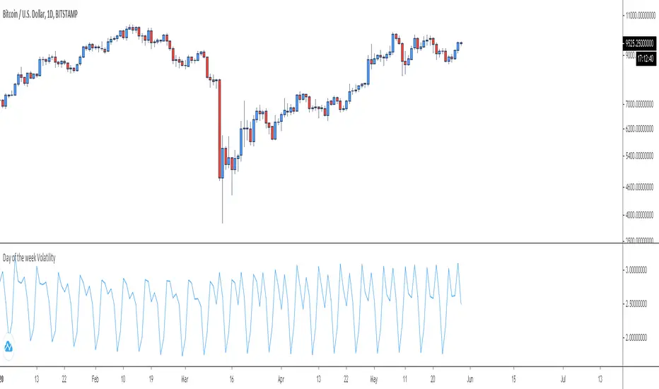
Day of the week VolatilityPlots a particular day's volatility for the past x weeks' data. Default is set at 100 weeks, but it can be modified
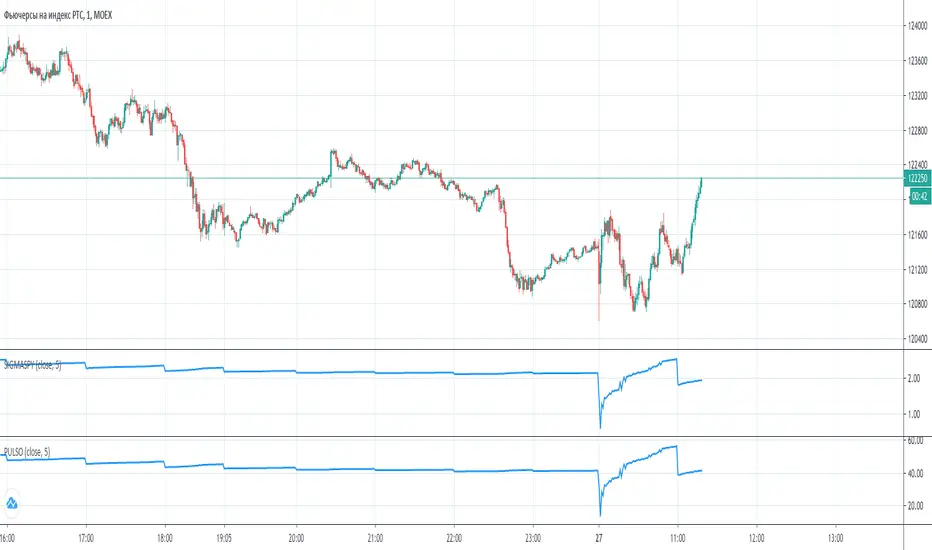
PulsoMetr: ongoing volatility estimatorPulsoMetr is ongoing volatility estimator for MOEX Futures. May be a little less exact since it does not consider nights and weekdays. It can not be used to measure on the day of option expiry, please, be careful. In days till expiry we put number of full days till expiry, try it with and without the current started day included in this number
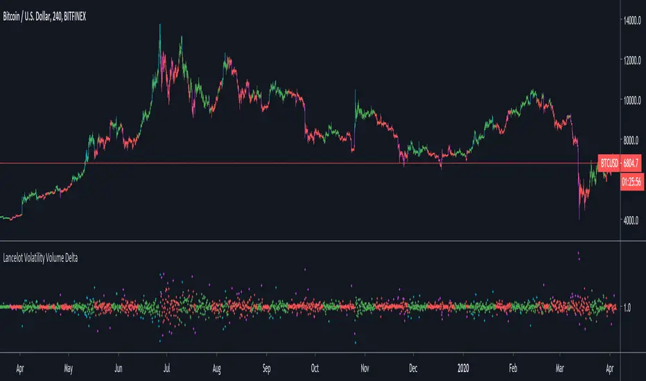
Lancelot Volatility Volume DeltaThis indicator calculate the delta of the volatility adjusted on-balance volume.
This could be use as a filter or trigger in a system.
Bollinger Band - Keltner Squeeze - Failed Volatility BreakoutThis simple script provides Bollinger Band and Keltner Channel indicators, and will highlight areas where the Bollinger Bands enter into the Keltner Channel.
This script is based on the Failed Volatility Breakout (FVBO) System used by professional trader ChrisD_Macro. The default plot styles for the indicators in this script are based on Chris's setup, but visual styles as well as BB and Kelt settings (length, standard deviation, etc...) can all be easily customized with the user interface in the indicator settings.
You can also choose whether you want the condition to be triggered by just one Bollinger Band entering the Keltner Channel, or if it has to be both bands entering the channel.
This script is very useful when manually back testing the FVBO strategy, as it clearly highlights the BB-Kelt squeezes instead of having to constantly scroll in and out looking for them.
It can also be useful live as it has the ability to trigger TradingView alerts using the condition "BB-Kelt Squeeze".
Hope it's helpful
- JDC
Side Notes:
With Forex / Currencies this indicator I usually use this indicator on the 1 Day time frame.
Keep in mind that the script includes the Bollinger Bands and Keltner Channels, so if you already have your own version of these indicators on your chart, it will get really messy. (Just hide the other indicators while you get to know this one).

Hophop Volatility StudyStudy version of
Please make sure to select Once Per Bar Close for the alerts

Price Volatility Index[Version No.1]The 'Price Volatility index' indicator shows the amplitude of the price. It's called PVI.
If the PVI index rises, it means that the inertia of the price is sufficiently supplied.
The key point here is that the rise in the PVI index doesn't mean the price is going up, and the decline in the PVI index is not going to go down.
Shows the strength of the amplitude of the price regardless of directionality.
If the PVI indicator rises, it means that the amplitude of the price is strong, and if the PVI indicator decreases, the amplitude of the price will be weakened, indicating a directionless market.
"This indicator had reused indicator which name is 'CEMA'.
Reused indicator URL: www.tradingview.com
reused indicator 'CEMA' CODE
study(title="Color EMA", shorttitle="CEMA", overlay=true)
en = input (10, minval=1, Title="Length")
src = input(close, Title="Source")
out = ema ( src , le)
(out, color=out>out?green:out


Historical Volatility STDThis aims to help provide an equity to volatility ratio for trading bitcoin options.


Volatility Index Oscillator LargeCap [aamonkey]There are two versions of this indicator (Large and Small Cap).
Both work exactly the same the only difference are the default coins selected.
What does this indicator do?
- can be used on any timeframe
- plots the percentage change of the candles of the selected timeframe of 9 LargeCap coins (Default: ETH, EOS, TRX, IOTA, XLM, ADA, ATOM, Tezos, BTC)
- +1 line for the chart you are currently on (Default: red line)
Why use this indicator:
- compare selected coins to the LargeCap coins in terms of volatility
- see correlations in price movements
- see which coin outperforms the others
- find coins that are behind
Settings:
- pairs, exchanges, and colors changeable
- always write the pairs and exchanges in caps!

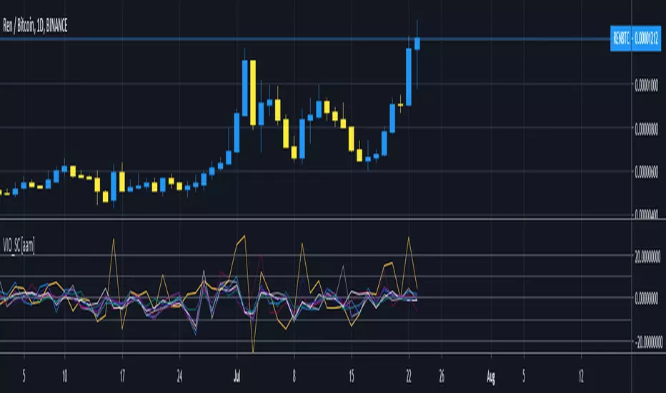
Volatility Index Oscillator SmallCap [aamonkey]There are two versions of this indicator (Large and Small Cap).
Both work exactly the same the only difference are the default coins selected (and this version compares only 9 coins in total instead of 10).
What does this indicator do?
- can be used on any timeframe
- plots the percentage change of the candles of the selected timeframe of 8 SmallCap coins (Default: REN, LOOM, MANA, ENJ , KNC, ZRX, BNT, REP)
- +1 line for the chart you are currently on (Default: red line)
Why use this indicator:
- compare selected coins to the SmallCap coins in terms of volatility
- see correlations in price movements
- see which coin outperforms the others
- find coins that are behind
Settings:
- pairs, exchanges, and colors changeable
- always write the pairs and exchanges in caps!
Futures - Measure and compare volatility in USDThis is a dirty fix.
Dollar value (syminfo.pointvalue) is wrong in Tradingview for the below listed futures, where the price is in quarters of cents.
For example ZC (Corn) says syminfo.pointvalue = 5000 (syminfo.mintick = 0.13), which gives you (with ATR = 6) volatility of $30,000 (6 * 5000) instead of the correct $300.
For all other futures I used the default syminfo.pointvalue.
Feel free to correct me, if I am wrong regarding the syminfo.pointvalue error.
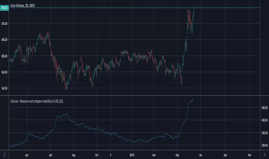
Futures - Measure and compare volatility in USDDollar value (syminfo.pointvalue) is wrong in Tradingview for the below listed futures, where the price is in quarters of cents. So this is a dirty fix.
For example ZC (Corn) says syminfo.pointvalue = 5000 (syminfo.mintick = 0.13), which gives you (ATR = 6) volatility 30,000 USD instead of the correct 300 USD.
For all other futures is used the default syminfo.pointvalue.

Volatility IndicatorThis is a market volatility indicator made up of 4 indicators
Stochastic, Money Flow, RSI and Williams Percentage.
This script is good for following a trend
