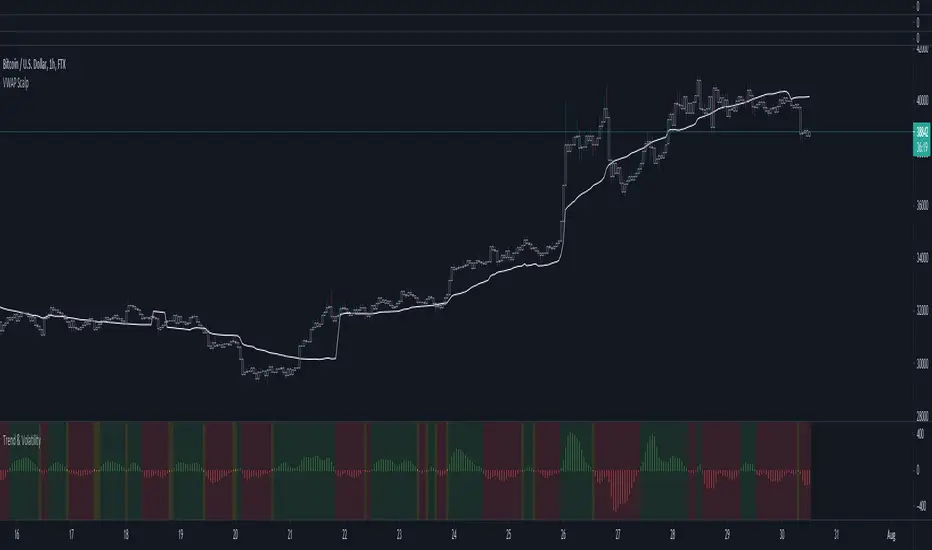
Market Trend using First Derivative of MAs + Volatility Based on Smooth First Derivative Indicator by tbiktag
Volatility also from another public TV script, forgot which one though, sorry if this is yours and I haven't credited your work, let me know if it is and I'll reference it properly.
About this indicator:
Estimates whether market is trending up, down or sideways by adding the slope (first derivatives) of a fast & slow MA. Uptrend = Green, Downtrend = Red, Sideways = Yellow
Uses a minimum slope percentile to determine threshold for uptrend, downtrend & sideways. Definitely adjust this when changing timeframes, for BTCUSD at 1 hour timeframe a value of 25 is decent
Also has a measure of Volatility if you're into that
Explanation of inputs:
Bandwidth - for derivative function
Fastma - period for fast Moving Average
Slowma - period for slow Moving Average
Derivmalength - smooths out the signal, reducing single contrasting bars, but delays the signal. Use 1 if don't want to use
V length - ema of volatility if you want to smooth it
Min Slope Percentile - slope should exceed this percentile to be classified as uptrend (green) or downtrend (red) anything in this bottom percentile will be considered sideways
Mine Slope Lookback Period - # of bars back to calculate Slope Percentile
Buscar en scripts para "Volatility"
Cyclical volatility index v1This indicator is used to measure the volatility of the cycle in question.
It is very useful for clearly reading impulsive phases or corrective phases
Calculate average volatility and current volatility
The labels improve the visualization.
It is fully customizable in shapes and colors
C and the ability to disable labels
For any bugs contact the creators

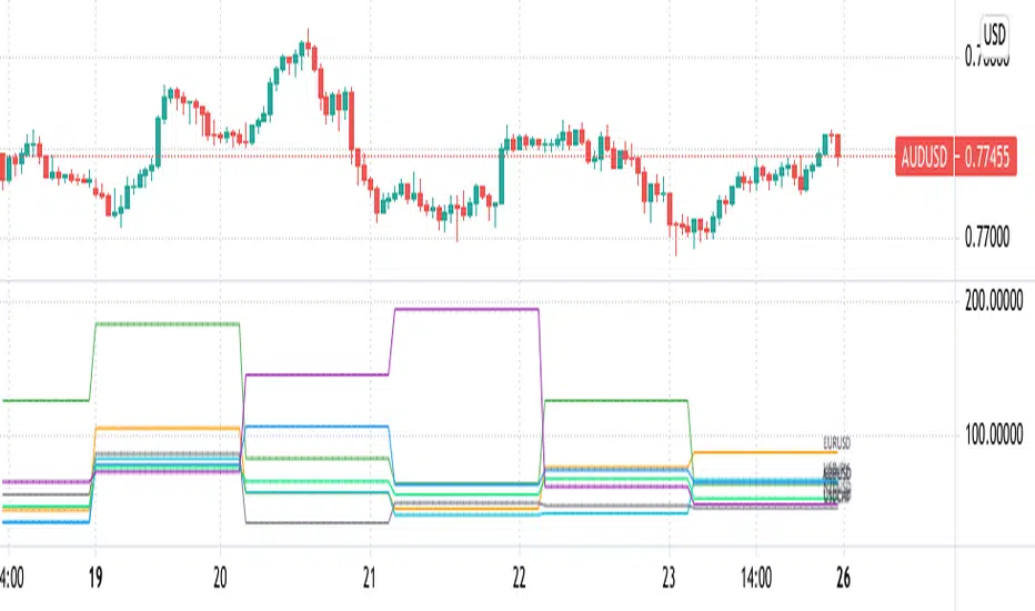
Pips Volatility ComparisonJapanese below / 日本語説明は下記
This indicator shows daily volatility in pips for multiple currency pairs so as to compare and identify most volatile pairs of the day.
Some traders would prefer to change pairs to trade depending on volatility while some traders would refrain from trading if overall market volatility is less or their favorite pairs are less volatile compared to previous days. That’s when this indicator would help.
Currency pairs can be selected from 25 pairs from US dollar cross, Yen cross, Euro cross, GBP cross and AUD cross. You can select what to display depending on your needs.
Pips volatility is calculated using high and low of the day and being updated as high/low updated.
Example :
The following chart shows EURUSD moved around 80 pips on Apr23, 2021 and is the most volatile pairs of the day among major US dollar crosses.
----------------------
複数通貨ペアのボラティリティをPipsで比較することのできるインジケーターです。
トレーダーの中にはボラティリティによって日毎にトレードする通貨ペアを変えたり、マーケット全体のボラティリティが低下していればトレードを控えたりする方もいると思います。また、お気に入りの通貨ペアのボラティリティが過去数日と比べて低い場合はトレードしないという判断もありうるでしょう。そういった判断に役立つかもしれません。
通貨ペアはドルストレート、クロス円、ユーロクロス、ポンドクロス、豪ドルクロスの25通貨ペアから必要なものを複数選択することが可能です。
Pipsは当日の高値・安値を使って計算し、日中の変動に合わせて随時更新されます。
例:
以下のチャートではEURUSDが2021年4月23日に約80pipsの変動があったことを示しています。
これは他の主要ドルストレートペアと比べ最も大きい値動きであることがわかります。
Annualised Price Volatility %Annualised Price Volatility in percent, also called Instrument Risk, as outlined by Rob Carver in his excellent books, 'Systematic Trading' and 'Leveraged Trading'.
This is written for those who have read one of his books and want to use this tool on TradingView.
Trend strength, oscillators, and volume indicators are all the rage. Finding a great setup is, of course, key. You've decided to go long. Great!
But how much is your capital at risk?
How does that compare with your level of risk tolerance?
When trading, it's key to understand just how risky a certain instrument is. An uptrend is an uptrend, but is it at an annualised volatility of 2% per year or 500% per year? If it's the former, I know I can put a good chunk of capital into trading it. But if its the latter, I don't want to put so much money at risk. Volatility is rarely in a straight line. It's usually up and down.
I won't give the whole game away. To find out more about how to use this concept of risk, I'd highly recommend the books 'Leveraged Trading' and 'Systematic Trading' by Rob Carver.
Do you have any thoughts, ideas, or questions? Let me know in the comments or send me a message! I'd be glad to help you out.

Profit Accumulator Relative VolatilityRelative Volatility Indicator
This is a support indicator to the Main Indicator which has also been published.
This indicator uses volatility to determine if the market is quiet, or trading sideways or if there is money in the market and the opportunity for a long or short signal. There is an adjustable bottom line (in this case 0.15) and anything near or below that would indicate that no trades should be taking place. Similarly, if the trend line is declining, this is another indication that any trades should not be taken.
The trend line as an adjustable maximum setting of 0.5 and an increasing trend line is indicative of volatility in the market and a long or short position should be considered. This indicator should be used with the other suite of indicators to provide confluence of the trade.
Whilst an actual alert function is not set for the indicator, the TradingView alert function can be used to trigger a message when the line crosses above 0.15.
I've been using this successfully on the one hour FX charts, but seems to work equally as well on higher or lower time frames (not less than 15min).
The other indicators which are part of the suite are shown on the website which is highlighted in my signature at the bottom of the page. Purchase of the main indicator gives access to the full suite of eight indicators. I use the other indicators to confirm the direction of the trade and to determine if I want to trade or not. I use it along with the 2min, 15min and 4hr timeframes to identify the best entry window and how long I'm likely to be in the trade.
Support can be provided via private message or in the comments below.
The links are provided below for access to the indicator.
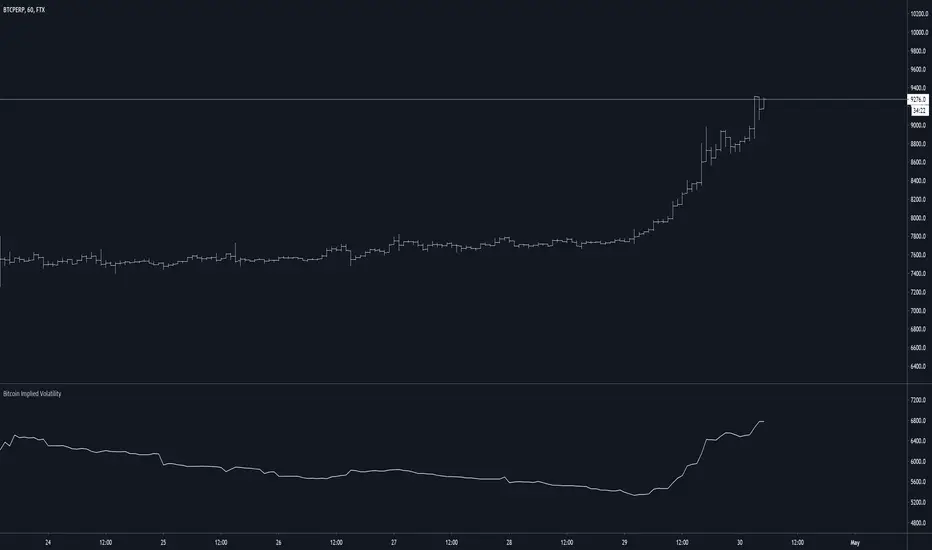
Bitcoin Implied VolatilityThis simple script collects data from FTX:BVOLUSD to plot BTC’s implied volatility as a standalone indicator instead of a chart.
Implied volatility is used to gauge future volatility and often used in options trading.
Best Volatility Calculator (Multi Instruments)Hello traders
A bit of context
Definition: Volatility is defined as the close of current candle - close of the previous N candle
This is an alternative version of my Best Volatility Calculator
The other version is displayed on a panel below. This one overlays on the chart using the "overlay=true" setting
This indicator shows the average volatility, of last N Periods, for the selected time frames and for 2 selected instruments.
You can select up to 2 timeframes with this version
Presented as Currency, Pip, percentage labels in a panel below.
Will calculate in real-time only for the current instrument on the chart.
The indicator is coded to not be repainting
Example
In the indicator screenshot, I used a lookback period of 1.
That compares the current candle close versus the previous one for the daily and weekly timeframe
Showing how the results look like using FOREX instruments (where using the PIPS labels make more sense than with cryptocurrency assets)
Best regards
Dave

Volume VolatilityThis script uses the idea behind Bollinger Bands and Market Facilitation Index.
This is not a trend direction indicator. Use this for confirmation only.
Green Bars : High Volume and High Volatility
Yellow Bars : Low Volume and Low Volatility
Blue Bars : Low Volume but High Volatility
Pink Bars : High Volume but Low Volatility

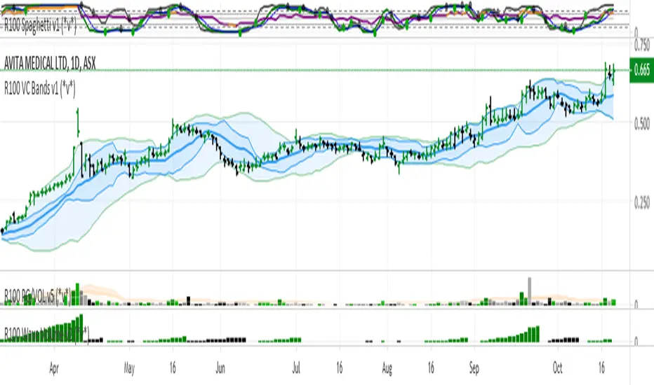
R100 Volatility Combo Bands v1 (*v*)The Volatility Combo Bands are made from 4 separate volatility bands- two Bollinger Bands (10 and 20 period) and two Price Headley Acceleration Bands (10 and 20 period). The Volatility Combo Bands plot the innermost upper and lower points from these bands and then plots a mid-line. By default, only the standard 20 period Bollinger Bands and Combo Bands with mid-line are displayed, but can be configured however you want.
Try it out- see squeezes earlier, ride the bands earlier in trending markets, trade pullbacks to the Combo Bands and mid-line, trade the range of the band or use them to help identify potential support and resistance levels. Hopefully they can add another dimension to identifying volatility contraction patterns or whatever you currently use these things for!
I hope you get some value out of it. Only conditions of use are that if you improve it, let me know and if you publish something that uses it, don't hide the code! Enjoy!
Code for the Price Headley Acceleration Bands pinched and modified from LazyBear - thankyou.
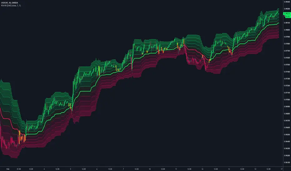
Relative Strength Volatility Variable Bands [DW]This is an experimental adaptive trend following study inspired by Giorgos Siligardos's Reverse Engineering RSI and Tushar S. Chande's Variable Moving Average.
In this study, reverse engineered RSI levels are calculated and used to generate a volatility index for VMA calculation.
First, price levels are calculated for when RSI will equal 70 and 30. The difference between the levels is taken and normalized to create the volatility index.
Next, an initial VMA is calculated using the created volatility index. The moving average is an exponential calculation that adjusts the sampling length as volatility changes.
Then, upper and lower VMAs are calculated by taking a VMA of prices above and below the initial VMA. The midline is produced by taking the median of the upper and lower VMAs.
Lastly, the band levels are calculated by multiplying the distance from the midline to the upper and lower VMAs by 1, 2, 3, 4, and 5.
Bar colors are included. They're based on the midline trend and price action relative to the upper and lower VMAs.
BitMEX Volatility Guppy [NeoButane]Guppy Multiple Moving Averages based on volatility moving averages.
Coloring rules from ChrisMoody's Guppy.
Guppy: www.investopedia.com
Volatility index moving average: etfhq.com
BitMEX volatility indexes: www.bitmex.com

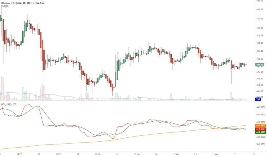
Indicator: Volatility Quality Index [VQI]Volatility Quality Index (VQI), by Thomas Stridsman, points out the difference between bad and good volatility in order to identify better trade opportunities in the market.
This plots 3 lines:
- Red line is the VQI (actually, sum of VQI).
- Green line is the 9-period SMA of sum_of_VQI.
- Orange line is the 200-period SMA of sum_of_VQI.
Stridsman suggested to buy when VQI has increased in the previous 10 bars (use the SMAs) and sell when it has decreased in the previous 10 bars. IMO, use this with your other indicators as a confirmation signal.
More info: www.3pips.com
To use this indicator in your charts, click on "Share" button (top right on the chart). Click on "Make it mine" button on the dialog that pops up. Now, you will have a copy of this chart with the indicator's source code in it. Click on "{}" to open the source code of VQI_LB and save it to your custom scripts section.
McMillan Volatility Bands (MVB) – with Entry Logic// McMillan Volatility Bands (MVB) with signal + entry logic
// Author: ChatGPT for OneRyanAlexander
// Notes:
// - Bands are computed using percentage volatility (log returns), per the Black‑Scholes framing.
// - Inner band (default 3σ) and outer band (default 4σ) are configurable.
// - A setup occurs when price closes outside the outer band, then closes back within the inner band.
// The bar that re‑enters is the "signal bar." We then require price to trade beyond the signal bar's
// extreme by a user‑defined cushion (default 0.34 * signal bar range) to confirm entry.
// - Includes alertconditions for both setups and confirmed entries.

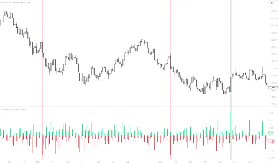
Volatility & Big Market MovesThis indicator shows the volatility per candle, and highlights candles where volatility exceeds a defined threshold.
Data shown:
Furthest %-distance from the previous candle's closing price to the top (positive histogram).
Furthest %-distance from the previous candle's closing price to the bottom (negative histogram).
Candlestick Strength and Volatility ReadoutDisplays a readout on the top right corner of the screen displaying a two basic calculations (volatility and strength; i.e. candlestick size and how close to the highs or lows it closed) for more convenient candlestick (price action) analysis.
Due to restrictions with Pine Script (or my knowledge thereof) only the current and previous candlestick data is shown, rather than the one currently hovered over.
The data is derived via two simple calculations; volatility being division between the range of the candlestick's high and low by the ATR; 'strength' (what I like to call it) being the range of the body by the range of the open to high or low, depending on the facing direction (positive or negative candlestick). These are expressed as percentages and will turn green depending on the set threshold.
Using this, one can effectively automate calculations you'd have to do by hand otherwise. I personally use these as entry filters in my trading, so it helps to not have to measure, remeasure, and divide before each potential entry.
Settings are implemented to change certain variables to your liking.

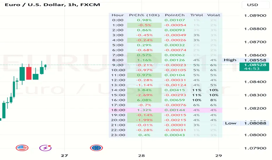
Volatility and Volume by Hour EXT(Extended republication, use this instead of the old one)
The goal of this indicator is to show a “characteristic” of the instrument, regarding the price change and trading volume. You can see how the instrument “behaved” throughout the day in the lookback period. I've found this useful for timing in day trading.
The indicator creates a table on the chart to display various statistics for each hour of the day.
Important: ONLY SHOWS THE TABLE IF THE CHART’S TIMEFRAME IS 1H!
Explanation of the columns:
1. Volatility Percentage (Volat): This column shows the volatility of the price as a percentage. For example, a value of "15%" means the price movement was 15% of the total daily price movement within the hour.
2. Hourly Point Change (PointCh): This column shows the change in price points for each hour in the lookback period. For example, a value of "5" means the price has increased by 5 points in the hour, while "-3" means it has decreased by 3 points.
3. Hourly Point Change Percentage (PrCh% (LeverageX)): This column shows the percentage change in price points for each hour, adjusted with leverage multiplier. Displayed green (+) or red (-) accordingly. For example, a value of "10%" with a leverage of 2X means the price has effectively changed by 5% due to the leverage.
4. Trading Volume Percentage (TrVol): This column shows the percentage of the daily total volume that was traded in a specific hour. For example, a value of "10%" would mean that 10% of the day's total trading volume occurred in that hour.
5. Added New! - Relevancy Check: The indicator checks the last 24 candle. If the direction of the price movement was the same in the last 24 hour as the statistical direction in that hour, the background of the relevant hour in the second column goes green.
For example: if today at 9 o'clock the price went lower, so as at 9 o'clock in the loopback period, the instrument "behaves" according to statistics . So the statistics is probably more relevant for today. The more green background row the more relevancy.
Settings:
1. Lookback period: The lookback period is the number of previous bars from which data is taken to perform calculations. In this script, it's used in a loop that iterates over a certain number of past bars to calculate the statistics. TIP: Select a period the contains a trend in one direction, because an upward and a downward trend compensate the price movement in opposite directions.
2. Timezone: This is a string input that represents the user's timezone. The default value is "UTC+2". Adjust it to your timezone in order to view the hours properly.
3. Leverage: The default value is 10(!). This input is used to adjust the hourly point change percentage. For FOREX traders (for example) the statistics can show the leveraged percentage of price change. Set that according the leverage you trade the instrument with.
Use at your own risk, provided “as is” basis!
Hope you find it useful! Cheers!
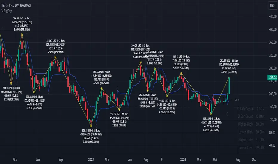
Volatility ZigZagIt calculates and plots zigzag lines based on volatility and price movements. It has various inputs for customization, allowing you to adjust parameters like source data, length, deviation, line styling, and labeling options.
The indicator identifies pivot points in the price movement, drawing lines between these pivots based on the deviation from certain price levels or volatility measures.
The script labels various data points at the ZigZag pivot points on the chart. These labels provide information about different aspects of the price movement and volume around these pivot points. Here's a breakdown of what gets labeled:
Price Change: Indicates the absolute and average percentage change between the two pivot points. It displays the absolute or relative change in price as a percentage. Additionally, the average absolute price increase or the average rate of increase can also be labeled.
Volume: Shows the total volume and average volume between the two pivot points.
Number of Bars: Indicates the number of bars between the current and the last pivot point.
Reversal Price: Displays the price of the reversal point (the previous pivot).
Zero-line Volatility Quality Index (VQI) [Loxx]Originally volatility quality was invented by Thomas Stridsman, and he uses it in combination of two averages.
This version:
This doesn't use averages for trend estimation, but instead uses the slope of the Volatility quality. In order to lessen the number of signals (which can be enormous if the VQ is not filtered), some versions similar to this are using pips filters. This version is using % ATR (Average True Range) instead. The reason for that is that :
Using fixed pips value as a filter will work on one symbol and will not work on another
Changing time frames will render the filter worthless since the ranges of higher time frames are much greater than those at lower time frames, and, when you set your filter on one time frame and then try it on another, it is almost certain that it will have to be adjusted again
Additionally, this version is made to oscillate around zero line (which makes the potential levels, which are even in the original Stridsman's version doubtful, unnecessary)
Usage:
You can use the color change as signals when using this indicator
Volatility indicator based on ATR Hello,
I'm sharing to you a volatility indicator I've done in the last few weeks based on ATR. There is multiple functionalities on this indicator, the first one is an overlay displaying when an asset is in an "overvolatily zone"
(displayed with red cross) and when we are in an "undervolatily zone" (displayed with green cross). You can change the sensibility of the signals in the parameters if you wish to have more or less greedy signals
(it will only modify the overvolatility signals). By the way those signals are not working for week-ends because volatility works differently on week-ends and it's not a good idea to count week-ends in the calculations, so do not worry if you see no signals on weekends.
Second part of the indicator is something I called "Atr bands" it's an equivalent to the famous Bollinger-Bands but based on ATR. I haven't backtested them yet but they seems really interesting in low ut
(15 mins seems to be the best ut for those) and they seems pretty bad in high ut so they can maybe be useful for low ut scalping.
Last thing, there is a parameter allowing you to display bands on the week-ends so you can easily see where the indicator won't give signals.
I would be really happy if I could have some feedsback if you try the indicator :)
Have a wonderful day

VWAP Implied Volatility BandsThis script takes the built in VWAP function and creates bands using various Volatility Indexes from the CBOE. The script plots the bands at desired multiples, as well as the closing value of the prior day's first set of bands. Users can choose from the following:
VIX(ES), VXN(NQ), RVX(RTY), OVX(CL), GVX(GC), SIV(ZS), CIV(ZC), TYVIX(ZN), EUVIX(EURUSD), BPVIX(GBPUSD)
Upon selecting the desired volatility index, users must change the multiplier to fit the underlying product since the indexes are all calculated differently.
The goal with this script was to use market generated information (IV) to highlight potential trade locations.
Critical Levels Mixing Price Action, Volatility and VolumeIntroduction
This indicator has the purpose of setting levels, automatically, basing its creation on three aspects of the market:
- price action
- volume
- volatility
Price Action Algorithm
I divided the candle into 3 parts:
- body => abs (close-open)
- lower tail => red candle (close-low) green candle (open-low)
- upper tail => red candle (high-open) green candle (high-close)
- total => high-low
to give the signal the following conditions must be respected
- the body must be smaller than a certain percentage ("MAX CORE SIZE%) and larger than a certain percentage (" MIN CORE SIZE%);
- furthermore, the shorter tail cannot be higher than a certain percentage ("MAXIMUM LENGTH FOR SHORTE TAIL%");
Volume Algorithm
The volume value must be greater than the volume EMA multiplied by a certain value ("Multiplier")
Volatility Algorithm
the True Range of the candle must be greater than the "ATR percentage" of the ATR
Trigger
If all these three conditions are met then and only then will the level be drawn that will include the prices of the longest tail of the candle (high/open or open/low or high/close or close/low).
How to use
Like any level, the situation in which the price is reached does not imply a market reaction, for this reason, the use together with moving averages or oscillators from which to extrapolate the divergences can be a valid tool.
Using this indicator alone you can enter the market by placing a pending order above the high or low of the candle touching the level.
Example:
a bearish candle touches a low level, we place a pending buy order above the high of the candle
a bullish candle touches a level located high, we place a pending sell order below the low of the candle
Risk adjusted returns data (volatility optimised)RAR - risk adjusted returns. This methodology could be helpful in portfolio creation and position size risk management. We can set our own preference of risk tolerance via the X variable which is the exponent of volatility in our calculations. This gives an unlimited set of example portfolios on a given time-frame that can be sorted from return oriented to volatility reduction oriented as X increases. RARs are to be compared against eachother.

Bricklayer's Volatility MeterBricklayer's Volatility Meter will calculate Bollinger Bands Width up to 20 different lengths between lowest and highest input.
• If it is increasing, the brick will be green.
• If it is decreasing, the brick will be red.
The idea is that if volatility is decreasing across an increasing number of periods, the market will be ready for different strategies than when it is increasing.
Good luck trading!
