MonthlyReturnsVsMarketLibrary "MonthlyReturnsVsMarket" is a repackaging of the script here
Credits to @QuantNomad for orginal script
Now you can avoid to pollute your own strategy's code with the monthly returns table code and just import the library and call displayMonthlyPnL(int precision) function
To be used in strategy scripts.
Buscar en scripts para "N+credit最新动态"

Reshape Table Matrix█ OVERVIEW
Simple method to reshape matrix to table.
Credits to Tradingview for new matrix update.

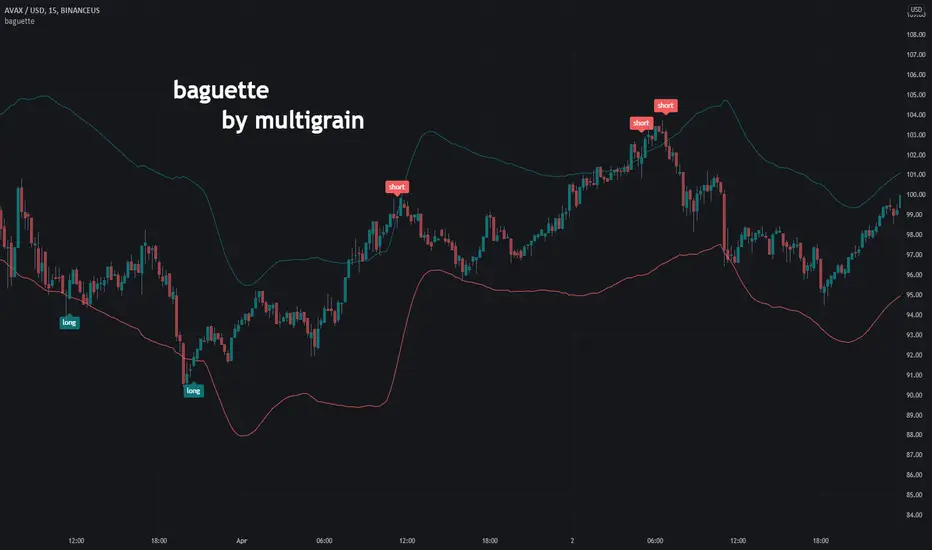
baguette by multigrainRationale
The rationale behind this indicator is that: when the price of an asset reaches an extreme, regardless of the trend, there is a (maybe not equal but) opposite reaction.
Settings
The default settings will not be the best for whatever timeframe you choose. I personally believe a longer than 'normal' JMA Length is best.
JMA Source: The source in which the Jurik Moving Average calculations are based off of.
JMA Length: Controls the length of the Jurik Moving Average.
JMA Phase: A lag controller of sorts. Increasing the phase increases overshoots but reduces lag, decreasing the phase decreases overshoots but increases lag.
ATR Length: The length in which an average true range value will be calculated with.
ATR Multiplier: This multiplier controls the 'width' of our envelope or our extreme bands.
Credits
@gorx1 for the improved and more accurate (?) Jurik Moving Average calculations.
@redktrader for the ATR envelope calculations.
Cosmic Pi Troll CycleBased on the Cosmic Pi cycle for BTC, but this indicator also includes the cycles for ETH and LINK.
All credits to cosmic_indicators for the initial idea.

Accurate BUY & SELL 5 mins TF by RRAlways trade using 5 mins Time frame of chart.
For Buy entry always buy 1 point above the candle closing price & SL would be previous candle low or 30 points.
For Sell Entry Always Sell 1 point below the candle opening price & SL would be previous candle high or 30 points.
Do not take trades using 3 mins Time frame, as there is lot of noise. It works best with 5 mins Time frame.
I have adjusted/set according my trading pattern, if needed use the settings options to set accordingly .
Removed range highlighter to keep the chart simple.
Original Version credits to ZacVaughn
Actual Version i just set alerts and change the parameters for Crude OIL 5min Chart.
NO REPAINT.
Wait For Barclose

ATRStopLossFinderLibrary "ATRStopLossFinder"
Average True Range Stop Loss Finder
credits to www.tradingview.com for the initial version
stopLossFinder(length, smoothing, multiplier, refHigh, refLow, refClose) Returns the stop losses for an entry on this candle, depending on the ATR
Parameters:
length : simple int optional to select the lookback amount of candles
smoothing : string optional to select the averaging method, options=
multiplier : simple float optional if you want to tweak the speed the trend changes.
refHigh : series float optional if you want to use another timeframe or symbol, pass it's 'high' series here
refLow : series float optional if you want to use another timeframe or symbol, pass it's 'low' series here
refClose : series float optional if you want to use another timeframe or symbol, pass it's 'close' series here
Returns: series float stopLossLong, series float stopLossShort, series float atr

T3 Super GuppyA Tillson T3 moving average implemented variation of the CM Super Guppy indicator by @FritzMurphy
The T3 moving average was developed by Tom Tilson which combines multiple EMAs into a single moving average. it is smoother and more responsive compared to traditional moving averages. The disadvantage is that it can overshoot price.
█ Description
T3 Super Guppy consists of 20 T3 moving averages:
• 7 fast T3 MAs
• 13 slow T3 MAs
Visuals:
• Compact view available for chart minimalists
• In compact view only 10 of the fastest T3 moving averages will be displayed
• Compact view will not affect how the colour scales with trend movement
• Ribbon transparency will automatically scale based on the display mode chosen
Colour Gradient
• The more T3 MAs that cross above or below their slower counterparts will result in how deep the chosen upTrend(Blue) or downTrend(Red) colour is displayed
• Helps to spot weakening trends or reversal signals when indicator colour starts converging into the opposite colour
• Single colour mode is available if you find the colour gradient distracting
█ Credits
@ChrisMoody original guppy idea:
@FritzMurphy super guppy format:
█ Examples
compact view:
full view:

RedK Momentum Bars (RedK Mo_Bars)Momentum Bars (Mo_Bars) offers a different way to visualize (relative) momentum - and uses some simple TA concepts to provide a different perspective into how we read momentum changes and incorporate that in our trading.
The idea here (and the script itself) is really super simple, and is (very loosely) inspired by Elder's Impulse System (EIS) - then evolved to leverage some other concepts, and to become less cluttering and "easier to read".
The construction of the Mo_Bars
---------------------------------------------
The base concept utilizes 3 moving average lines :
the first line is a relatively fast MA with a short length - acts as the main price tracking line
the second line is slightly slower than the main line - 2 to 3 bars longer length - and will by default use the open value as source - this works better to identify when the closing price starts to move faster than the open (as in, bars more frequently close higher than they open) - this line acts as the signal line - there's an added setting for an additional delay that utilizes regular WMA smoothing - the delay acts to magnify the relative displacement between the 2 MAs
for both these MA's, i choose to use the RSS MA (Lazy Line) - other MA types can be used, but the reason i used that MA type specifically is that it moves "gracefully" - and 2 Lazy Lines moving together minimizes whipsaws from small price swings - i tested with other MA types and found that the RSS has an advantage there.
the third line is a much slower MA (length 5 to 6 x the fast line) - and acts as a filter or a baseline. When we're above that line, we should favor long positions - we're in bull territory. When we're below that line we favor short positions, and we're in bear territory. Adjust this line as it suits your trading style and time frame.
(I choose to use WMA as the MA type for the filter line .. and there's a good reason for that - which i'll skip for now - but in future versions, we can add other selectable MA types. )
Using Mo_Bars
----------------------------
at a very broad level, we can use Mo_Bars similar to how we use a MACD - both are centered and unrestricted oscillators - note the difference that Mo_Bars is based on 3 MA's rather than 2.
the Mo_Bar bar length reflects the distance between the main MA and the signal MA - plotted relative to the baseline (filter line) - that means that the length of the bar represents the relative momentum between the 2 MA's - The Mo_Bars are then colored in a way that reflects increase or decrease in the value of that momentum (the visual here may have been inspired by another indicator recently published by one of our esteemed wizards - it worked perfectly - so due credits here :)
-- in simple terms, if the main MA is below the signal MA, the bar is red - and when the main MA is above the signal MA, the bar is green - a white bar usually shows up when there's a detected change of relative momentum direction (note that this is not the same as the trend direction - and that's what helps show and exploit convergence and divergence - similar to a MACD)
* in the chart above, i noted few examples of how visualizing relative momentum in this way exposes areas of chop (Mo_Bars above zero but are in red or moving down, or when Mo_Bars are below zero and green or moving up) - convergence / divergence with price - and how this can act to expose the possibility of potential changes in price action or trend.
* there's so much more to play around with this setup - and maybe if there's enough interest there can be future dedicated posts on how utilize or even to evolve it further - there's a lot of potential here, to add more filters (maybe volume based), alerts, signals...etc - so let's see the interest :)
Here's the detailed (top chart) setup that Mo_Bars is based on -- The settings for the MA's on the price charts have been matched / sync'ed with the Mo_Bars settings on the lower panel to demonstrate how the script works and how it translate the MA action on the price chart to what we see below.
As always, please play around with the indicator to get used to how it works - use it in tandem with other indicators to get proper confirmations and adjust settings to suit your own trading style, time frame, and instruments
Feedback and thoughts are always welcome --- good luck!

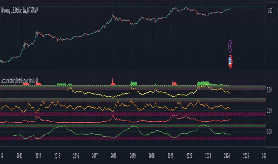
Accumulation/Distribution Bands & Signals (BTC, 1D, BITSTAMP) This is an accumulation/distribution indicator for BTC/USD (D) based on variations of 1400D and 120D moving averages and logarithmic regression. Yellow plot signals Long Term Accumulation, which is based on 1400D (200W) ALMA, orange plot signals Mid Term Accumulation and is based on 120D ALMA, and finally the red plot signals Long Term Distribution that's based on log regression. It should be noted that for red plot to work BTC 1D BITSTAMP graph must be used, because the function of the logarithmic regression was modified according to the x axis of the BITSTAMP data.
Signal bands have different coefficients; long term accumulation (yellow) and and the log regression (red) plots have the highest coefficients and mid term accumulation (orange) has the lowest coefficients. Coefficients are 6x, 3x and 1.5x for the red (sell) and yellow (buy) plots and 1x, 2x and 3x for the orange (buy) plot. Selling coefficient for the yellow and the orange plots are respectively 2x and 1x. Buy and sell signals are summed up accordingly and plotted at the top of the highest band.
Acknowledgement: Credits for the logarithmic regression function are due @memotyka9009 and Benjamin Cowen
SuperTrended Moving AveragesA different approach to SuperTrend:
adding 100 periods Exponential Moving Average in calculation of SuperTrend and also 0.5 ATR Multiplier to have a clear view of the ongoing trend and also provides significant Supports and Resistances.
Default Moving Average type set as EMA (Exponential Moving Average) but users can choose from 11 different Moving Average types as:
SMA : Simple Moving Average
EMA : Exponential Moving Average
WMA : Weighted Moving Average
DEMA : Double Exponential Moving Average
TMA : Triangular Moving Average
VAR : Variable Index Dynamic Moving Average a.k.a. VIDYA
WWMA : Welles Wilder's Moving Average
ZLEMA : Zero Lag Exponential Moving Average
TSF : True Strength Force
HULL : Hull Moving Average
TILL : Tillson T3 Moving Average
Credits going to @CryptoErge for sharing his development to public.
SonicR PVA VolumesI decided to practice and rewrite some interesting scripts from mt4 to pinescript for myself, all credits are in the source code.
An interesting indicator, I decided to post it like all other alternatives have closed source code, I hope it will be useful for someone!
With this indicator, you can filter small volumes, thereby making less noise so that you notice a possible trend reversal.
For example, rising/extreme factor set to - 1.263, some volume was filtered, now it's more easy to understand, isn't ?

Multi-Timeframe Squeeze Pro/DIM/Momentum/MAIMPORTANT NOTE:
-> The table will not display any timeframes lower than the current one
-> This indicator combine multiple popular indicators and give ability to use them on Multiple timeframes (MFT)
-> Indicators used for the MFT are: Squeeze / Momentum / 10X DIM and Stacked MA (or EMA)
-> Give at glance a good way to see the trend all different timeframes
-> If you are using in combination with squeeze pro please use the one from @Beardy_Fred since it matches the colours and condition used
Credits :
-> J. Welles Wilder creating the Directional Movement System (DMS) (1978); and
-> John Carter applying the DMS to create the popular Simpler Trading 10X Bars indicator.
-> @Beardy_Fred creating a first version including MOM and SQZ
-> Makit0's evolution of Lazybear's script to factor in the TTM Squeeze Pro upgrades - Squeeze PRO Arrows
I have adapted the version from @Beardy_Fred to provide a more complete and customisable indicator while including also the Stacked EMA/MA for further validation
Explanation:
You can learn more about each indicators following those links:
Squeeze Pro:
10X:
Momentum Histogram:
The stacked EMA/MA highlights when the MA/EMA are in order:
Red when they are stacked from the highest to the lowest
Green when they are stacked from the lowest to the highest
Yellow when they are stacked without a clear order
Customisation:
You can customise:
Timeframes
Settings for each indicators (10X/MA/Momentum/Squeeze)
Colors
Visibility
Trade Signals:
If you are going Long, Since this is a combination ideally on the timeframe you are trading you should have all green + green on the above timeframes (those colors are the default ones but can be changed)
-> Green on 10X indicator meaning you are in an uptrend
-> EMA or MA (depending on the configuration of the indicator) Green meaning EMA or MA
-> Squeeze should be Orange or Red ideally (indicating an high or medium Squeeze)
-> Momentum should be Cyan indicating an increase in momentum (while Dark Blue could indicate a reversal)
Standalone indicators:
- Squeeze Pro
- 10X Bar
- Stacked MA
- Momentum

Modified QQE-ZigZag [Non Repaint During Candle Building]V V V V V V V Please Read V V V V V V V
I ask Peter and he is fine, that im published this script
Tell me if you have some ideas or criticism about that sricpt
>>>>>>>>>> This is a modified Version of Peter_O's Momentum Based ZigZag <<<<<<<<<<<
This is only a test, and i want to share it with the community
It works like other ZigZags
Because Peters_O's original Version is only non repaint on closed historical Data ,
during a Candle building process it can still repaint (signal appears / 21 seconds later signal disapears / 42 seconds later signal appears again in the same candle / etc.),
but that isnt important for backtesting, its only important for realtime PivotPoints during a candle.
My goal for this zigzag was to make it absolute non repaint neither during a candle building process (current candle),
so once the signal is shown there is no chance that it disapers and shown a few seconds later again on that same candle, it can only show up one time per candle an thats it,
and that makes it absolute non repaint in all time frames.
Credits to:
==> Thanks to @glaz , for bringing the QQE to Tradingview <3
==> Thanks to @Peter_O , for sharing his idea to use the QQE as base for a Zigzag
and for sharing his MTF RSI with the Community <3
Changes:
- I changed the MTF RSI a little bit, you can choose between two version
- I changed the QQE a little bit, its now using the MTF RSI , and its using High and Low values as Source to make it absolute non repaint during a candle is building
- I added a little Divergence Calculation beween price and the MTF RSI that is used for the ZigZag
Colors :
- Green for HH / HL Continuation
- Red for LL / LH Continuation
- Yellow for Positive Divergence
- Purple for Negative Divergence
Important:
It is not possible to backtest this script correctly with historical Data, its only possible in Realtime,
because the QQE is using crossunders with RSILowSource and the QQE Line to find the Tops and,
because the QQE is using crossovers with RSIHighSource and the QQE Line to find the Bottoms,
and that means it is not possible to find the correct Time/Moment when that crossovers / crossunders happens in historical Data
=============> So please be sure you understand the Calculation and Backtest it in Realtime when you want to use it,
because i didn't published this script for real trading
=============> Im not a financial advisor and youre using this script at your own risk
=============> Please do your own research
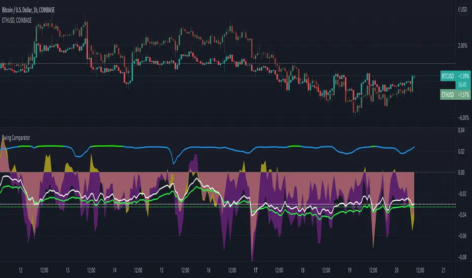
Swing ComparatorHere I bring you an array of methods to compare the swings and consistency between assets.
This indicator is excellent for swing traders and scalpers looking to maximize their profits by examining which of two closely related pairs provides greater price fluctuation during given period.
This indicator works against two assets, which are to be configured in settings.
This indicator has 5 particular plots for you to examine, each which can be considered for you to contemplate which pair for you to next perform a trade on.
First off, let's start with the blue.
The blue is simply a pearson correlation coefficient, thankfully now included in tradingview. This provides a value of 1 as values show to be close correlation, 0 showing no correlation, and -1 showing negative correlation - meaning an increase in one pair correlates to a decrease in another pair. This will turn green when greater than 0.975, showing a very strong relationship between the two pairs, and red when below -0.975. This is the only plot to be interpreted on a scale from -1 to +1.
Next, we have the purple and yellow background plots, followed by the white and green moving averages. Though similar, these are all slightly different.
For each of these 4 plots, a value greater than 0 indicates greater price swings for your Symbol #1, while a value less than 0 indicates greater price swings for Symbol #2.
These calculations are performed on a per bar basis, meaning you're likely going to be examining bars longer than what you'll normally be trading on. Use confluence, as well as your own judgement for this.
For example, if symbol #1 provides a bar with an open value 1% greater or less than close, providing a 1% swing on a given bar, but symbol #2 provides 2%, the indicator will fall down toward the negative, as Symbol #2 had the greater swing.
First, yellow focuses on only open/close bar values, and thus the body of the candlestick.
Purple, on the other hand, focuses on the wicks of the candle - thus, the high/low values. I've opted to make these two different values as a wick focuses on the embodiment within the time period, and body focuses on the open/close instant.
Next, the green is an extended EMA of the purple - High/Low ratio. This is important to examine trend overtime, and reduce unneeded noise.
Lastly, the white is simply difference in the standard deviation of the particular bars, between the two symbols you have selected. The tends to usually tie up with the green pretty well.
Considering this is going to by nature be very noisy datasets, I have included in settings the option to extend an EMA for everything. They have their default settings, but if you'd like to examine the trend without an EMA, feel free to set it to 1 to eliminate its effects.
I have additionally added the ability to introduce clipping, as well as scale the correlation coefficient to remain visible when examining very short term time scales. In the future, I hope to properly normalize all plots to remain within a -1 to +1 basis. Please be patient as I have multiple projects ongoing.
Suggestions and constructive criticism are very well encouraged.
Anyone is welcome to utilize this in their code, as well, i just ask you provide credit.
As you reduce to time frames less than a day, you will likely have to reduce the coefficient min/max closer to 0.025, or just hide it entirely.
TODO:
Make it look better. Sorry, folks.
Introduce latency between pairs.
Examine significance of a coefficient of determination
Remove static weights and introduce z-score and linear normalization.
Consider adding room for a 3rd pair. This could get ugly, however.
Cyclic RSI High Low With Noise Filter█ OVERVIEW
This indicator displays Cyclic Relative Strength Index based on Decoding the Hidden Market Rhythm, Part 1 written by Lars von Thienen.
To determine true or false for Overbought / Oversold are unnecessary, therefore these should be either strong or weak.
Noise for weak Overbought / Oversold can be filtered, especially for smaller timeframe.
█ FEATURES
Display calculated Cyclic Relative Strength Index.
Zigzag high low based on Cyclic Relative Strength Index.
Able to filter noise for high low.
█ LEGENDS
◍ Weak Overbought / Oversold
OB ▼ = Strong Overbought
OS ▲ = Strong Oversold
█ USAGE / TIPS
Recommend to be used for Harmonic Patterns such as XABCD and ABCD.
Condition 1 (XABCD) : When ▼ and ▲ exist side by side, usually this outline XA, while the next two ◍ can be BC.
Condition 2 (ABCD) : When ▼ and ▲ exist side by side, usually this outline AB, while the next one ◍ can be BC, strong ABCD.
Condition 3 (ABCD) : When ▼ or ▲ exist at Point A, the next two ◍ can be Point B and Point C, medium ABCD.
Condition 4 (ABCD) : When ◍ exist at Point a, the next two ◍ can be Point b and Point c, weak ABCD usually used as lower case as abcd.
█ CREDITS
LoneSomeTheBlue
WhenToTrade

[TTI] ATR channelsHISTORY AND CREDITS
Used by John Carter in his indicator’s toolbox. The ATR channels or the Keltner Channels represent the railroads or the natural movement of stocks.
WHAT IT DOES
Movements between the the The first multiplier lines (white) represent standard movement for the timeframe you are trading. Movements between the second multiplier (green/red lines) represent a 2stdv move of the stock in a single direction. Once a stock starts reaching the 3rd multiplier lines there’s an exponential chance that it will revert to the mean (cyan line)
Additionally, we have added the Institutional lines. These are thought in a Small Account Mastery class 2019 by John Carter, as the levels heavily watched by institutions. The default settings represent what John is teaching but they can be further customised.
HOW TO USE IT
ATRs channels or Keltner Channels can be great source for target or stop losses and can be used as a indicator for confluence with other technical tools like the Fibonacci lines.

Williams %R & RSI with Multiple PeriodsDESCRIPTION
1. Calculates %R and RSI with multiple period lengths.
1 period length value is defined by User.
8 period length values follow User's selection of classic number sequences, e.g. Fibonacci, Leonardo, Lucas, Narayana, etc.
2. User selects which indicator and periods to display or hide.
DEFAULTS
%R default custom period: 10.
RSI default custom period: 14.
%R & RSI default number sequence periods: Lucas numbers 11, 18, 29, 47, 76, 123, 199, 322.
CALCULATIONS
%R = (period high - most recent period's close price)/(period high - period low)
RSI = 100 - 1 / (100 + RS), where RS = SMMA(up, period) / SMMA(down, period)
PURPOSE
1. Identify price trends.
CREDITS
1. Williams %R technical analysis momentum oscillator by Larry Williams.
2. Wilder's Relative Strength Index technical analysis momentum oscillator by J. Welles Wilder.
3. "Solarized" color scheme by Ethan Schoonover.
Pythagorean Means of Moving AveragesDESCRIPTION
Pythagorean Means of Moving Averages
1. Calculates a set of moving averages for high, low, close, open and typical prices, each at multiple periods.
Period values follow the Fibonacci sequence.
The "short" set includes moving average having the following periods: 5, 8, 13, 21, 34, 55, 89, 144, 233, 377.
The "mid" set includes moving average having the following periods: 5, 8, 13, 21, 34, 55, 89, 144, 233, 377, 610, 987, 1597.
The "long" set includes moving average having the following periods: 5, 8, 13, 21, 34, 55, 89, 144, 233, 377, 610, 987, 1597, 2584, 4181.
2. User selects the type of moving average: SMA, EMA, HMA, RMA, WMA, VWMA.
3. Calculates the mean of each set of moving averages.
4. User selects the type of mean to be calculated: 1) arithmetic, 2) geometric, 3) harmonic, 4) quadratic, 5) cubic. Multiple mean calculations may be displayed simultaneously, allowing for comparison.
5. Plots the mean for high, low, close, open, and typical prices.
6. User selects which plots to display: 1) high and low prices, 2) close prices, 3) open prices, and/or 4) typical prices.
7. Calculates and plots a vertical deviation from an origin mean--the mean from which the deviation is measured.
8. Deviation = origin mean x a x b^(x/y)/c.
9. User selects the deviation origin mean: 1) high and low prices plot, 2) close prices plot, or 3) typical prices plot.
10. User defines deviation variables a, b, c, x and y.
Examples of deviation:
a) Percent of the mean = 1.414213562 = 2^(1/2) = Pythagoras's constant (default).
b) Percent of the mean = 0.7071067812 = = = sin 45˚ = cos 45˚.
11. Displaces the plots horizontally +/- by a user defined number of periods.
PURPOSE
1. Identify price trends and potential levels of support and resistance.
CREDITS
1. "Fibonacci Moving Average" by Sofien Kaabar: two plots, each an arithmetic mean of EMAs of 1) high prices and 2) low prices, with periods 5, 8, 13, 21, 34, 55, 89, 144, 233, 377, 610, 987, 1597, 2584, 4181.
2. "Solarized" color scheme by Ethan Schoonover.

Correlation StrategyThis is a basic strategy that shows how to trigger short/long/close signals on chart's symbol based on calculations made on another symbol which we consider correlated to it.
With default parameters, ETH/USDT as base symbol, the strategy shows good results in backtest for several symbols : DENT/USDT, BTT/USDT, FTT/USDT, DOT/USDT etc.
This is not surprising giving the importance of ETH in the crypto market so it makes sense many crypto currencies will follow ETH big movements.
Note : the strategy with default parameters is supposed to be applied on 4h timeframe. On other timeframes, try another support length.
How the strategy works :
A wma is calculated on the base symbol, with 200 length by default.
When wma is rising, we go long. When wma is falling we go short.
Take profit for Long/Short and Stop Loss for Long/Short are calculated percentages so 0.05 = 5% etc.
Also, Take profit / Stop loss are calculated on the base symbol not the chart's symbol.
The script uses the Monthly Returns table slightly modified to include buy & hold returns. Credits to @QuantNomad

Fib RSI++ by [JohnnySnow]Fib RSI++ by is an RSI Inspired by my absolutely favorite RSI on tradingview: RSI & EMA with Reverse Calculator Panel by balipour.
Built for quicker and easily identify prices at current RSI /possibly reversals/ RSI direction and RSI landings.
From balipour, I reuse /adapt to pinescriptV5 3 lines of code ( ) - the balipour implementation for reversing RSI formula in order to calculate price estimation based on the Given RSI level. Credits to the author.
Inspired by it, I also combine RSI with a MA but tuned to reads better the support/resistance levels (my humble opinion).
For quicker price target identification 2 features were added:
- Gridlines based on Fib levels, standard overbought/oversold levels and other levels I personally use. All of the grid lines can be configured according to user preferences.
- 2 information tables:
--First with a collection of 'close' numbers and Fib RSI levels price estimations at given RSI
--The second table allows the user to add up to 3 custom RSI levels to further target the price estimation.
Author UI Preferences to be used with this indicator: dark theme, hidden vertical and horizontal chart gridlines.

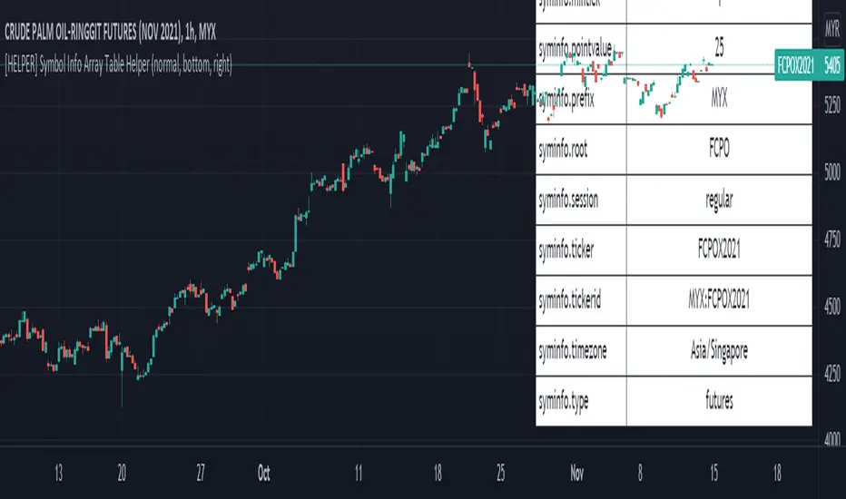
[HELPER] Symbol Info Array Table HelperThis indicator is to show symbol info in table using built-in syminfo name space, coded in latest Pine Script version 5.
Credits to PineCoders and Everget
Features :
- Display table by changing table position, font size and color.
- Show / Hide necessary symbol info.
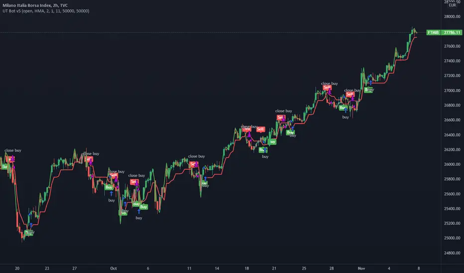
UT Bot v5This is an update by request, on someone elses strategy! well more of an edit, but also update from pine v4 to pine v5.
//CREDITS to HPotter for the orginal code. The guy trying to sell this as his own is a scammer lol.
//Edited and converted to @version=5 by SeaSide420 for Paperina
The UT Bot v5 is Movinging average (the MA) vs ATR (the ATR is in the form intended for use as trailing stop loss (ATR_TSL))
Entry logic:
buy = the MA > ATR_TSL and Price > ATR_TSL
sell = the MA < ATR_TSL and Price < ATR_TSL
The Moving average type can be changed in the settings:
options = "SMA", "EMA", "WMA", "HMA"]
the edits i made were:
convert to v5
Add TP and SL
Add Buy only or Sell only option
Add MA type option
Add price source option
Draw MA and ATR_TSL on-chart
logLibrary "log"
A Library to log and display messages in a table, with different colours.
The log consists of 3 columns:
Bar Index / Message / Log
Credits
QuantNomad - for his idea on logging messages as Error/Warnings and displaying the color based on the type of the message
setHeader(_t, _location, _header1, _header2, _header3, _halign, _valign, _size) Sets the header for the table to be used for displaying the logs.
Parameters:
_t : table, table to be used for printing
_location : string, Location of the table.
_header1 : string, the name to put into the Index Queue Header. Default is 'Bar #'
_header2 : string, the name to put into the Message Queue Header. Default is 'Message'
_header3 : string, the name to put into the Log Queue Header. Default is 'Log'
_halign : string, the horizontal alignment of header. Options - Left/Right/Center
_valign : string, the vertical alignment of header. Options - Top/Bottom/Center
_size : string, the size of text of header. Options - Tiny/Small/Normal/Large/Huge/Auto
Returns: Void
initHeader(_location, _rows, _header1, _header2, _header3, _halign, _valign, _size, _frameBorder, _cellBorder) Creates the table for logging.
3 columns will be displayed.
Bar Index Q / Message Q / Log Q
Parameters:
_location : string, Location of the table.
_rows : int, table size, excluding the header. Default value is 40.
_header1 : string, the name to put into the Index Queue Header. Default is 'Bar #'
_header2 : string, the name to put into the Message Queue Header. Default is 'Message'
_header3 : string, the name to put into the Log Queue Header. Default is 'Log'
_halign : string, the horizontal alignment of header. Options - Left/Right/Center
_valign : string, the vertical alignment of header. Options - Top/Bottom/Center
_size : string, the size of text of header. Options - Tiny/Small/Normal/Large/Huge/Auto
_frameBorder : int, table Frame BorderWidth. Default value is 1.
_cellBorder : int, table Cell Borders Width, Default value is 2.
Returns: table
init(_rows) Initiate array variables for logging.
Parameters:
_rows : int, table size, excluding the header. Default value is 40.
Returns: tuple, arrays - > error code Q, bar_index Q, Message Q, Log Q
log(_ec, _idx, _1, _2, _m1, _m2, _code, _prefix, _suffix) logs a message to logging queue.
Parameters:
_ec : int , Error/Codes (1-7) for colouring.
Default Colour Code is 1 - Gray, 2 - Orange, 3 - Red, 4 - Blue, 5 - Green, 6 - Cream, 7 - Offwhite
_idx : int , bar index Q. The index of current bar is logged automatically
you can add before and after this index value, whatever you choose to, via the _prefix and _suffix variables.
_1 : string , Message Q.
_2 : string , Log Q
_m1 : string, message needed to be logged to Message Q
_m2 : string, detailed log needed to be logged to Log Q
_code : int, Error/Code to be assigned. Default code is 1.
_prefix : string, prefix to Bar State Q message
_suffix : string, suffix to Bar State Q message
Order of logging would be Bar Index Q / Message Q / Log Q
Returns: void
resize(_ec, _idx, _1, _2, _rows) Resizes the all messaging queues.
a resize will delete the existing table, so a new header/table has to be initiated after the resize.
This is because pine doesnt allow changing the table dimensions once they have been recreated.
If size is decreased then removes the oldest messages
Parameters:
_ec : int , Error/Codes (1-7) for colouring.
_idx : int , bar index Q.
_1 : string , Message Q.
_2 : string , Log Q
_rows : int, the new size needed for the queue. Default value is 40.
Returns: void
print(_t, _ec, _idx, _1, _2, halign, halign, _size) Prints Bar Index Q / Message Q / Log Q
Parameters:
_t : table, table to be used for printing
_ec : int , Error/Codes (1-7) for colouring.
Default Colour Code is 1 - Gray, 2 - Orange, 3 - Red, 4 - Blue, 5 - Green, 6 - Cream, 7 - Offwhite
_idx : int , for bar index Q.
_1 : string , Message Q.
_2 : string , Log Q
halign : string, the horizontal alignment of all message column. Options - Left/Right/Center
halign : string, the vertical alignment of all message column. Options - Top/Bottom/Center
_size : string, the size of text across the table, excepr the headers. Options - Tiny/Small/Normal/Large/Huge/Auto
Returns: void
printx(_t, _idx, _1, _2, _ec, _fg, _bg, _halign, _valign, _size) Prints Bar Index Q / Message Q / Log Q, but with custom options to format the table and colours
Parameters:
_t : table, table to be used for printing
_idx : int , for bar index Q.
_1 : string , Message Q.
_2 : string , Log Q
_ec : int , Error/Codes (1-7) for colouring.
_fg : color , Color array specifying colours for foreground. Maximum length is seven. Need not provide all seven, but atleast one. If not enough provided then last colour in the array is used for missing codes
_bg : color , Same as fg.
_halign : string, the horizontal alignment of all message column. Options - Left/Right/Center
_valign : string, the vertical alignment of all message column. Options - Top/Bottom/Center
_size : string, the size of text across the table, excepr the headers. Options - Tiny/Small/Normal/Large/Huge/Auto
Returns: void
flush(_t, _idx, _1, _2, _ec) Clears queues of existing messages, filling with blanks and 0
Parameters:
_t : table, table to be flushed
_idx : int , for bar index Q.
_1 : string , Message Q.
_2 : string , Log Q
_ec : int , Error/Codes (1-7) for colouring.
Returns: void.
erase(_idx, _1, _2, _ec) Deletes message queue and the table used for displaying the queue
Parameters:
_idx : int , for bar index Q.
_1 : string , Message Q.
_2 : string , Log Q
_ec : int , Error/Codes (1-7) for colouring.
Returns: void
