SuperTrader Trend Analysis and Trade Study DashboardSuperTrader Trend Analysis and Trade Study Dashboard
Overview
This script offers a multi-faceted look at market behavior. It combines signals from different momentum indicators, daily cross checks, and a specialized dashboard to reveal trend strength, potential divergences, and how far price has traveled from its recent averages.
Three Musketeers Method
This script uses a special set of three indicators (the “Three Musketeers”) to determine bullish or bearish pressure on the current chart.
Trend Condition – Compares fast vs. slow EMAs (50 and 200) and checks which side of the line price is favoring.
Mean Reversion Condition – Watches RSI crossing typical oversold or overbought thresholds (e.g., crossing above 30 or below 70).
Bollinger Condition – Checks whether price pushes above/below the Bollinger Bands (based on a 20 SMA + standard deviations).
When at least two out of these three conditions align in a bullish way, the script issues a Buy Signal . Conversely, if at least two align in a bearish way, a Sell Signal is triggered. This “Three Musketeers” synergy ensures multiple confirmations before calling a potential market turn.
Mag 8 Daily Performance
The script tracks eight highly influential stocks (AAPL, AMZN, GOOG, NFLX, NVDA, TSLA, META, MSFT) to see which are green (higher) or red (lower) compared to yesterday’s close. It then prints a quick tally – helpful in gauging overall market mood via these major players.
Golden / Death Cross Signals
On a daily time frame, the script notes when the 50-day SMA crosses above or below the 200-day SMA. A “Golden Cross” often signals rising momentum, while a “Death Cross” can hint at oncoming weakness.
RSI & Divergence Checks
RSI helps identify hidden turning points. Whenever a bullish or bearish divergence is spotted, the script updates you via a concise readout.
Hardcoded Settings
EMA lengths for trend checks, Bollinger parameters, etc., are locked in, letting you focus on adjusting only the pivotal study inputs (e.g., RSI length, VIDYA momentum).
VIDYA Trend Line & Fill
Built on an adaptive Variable Index Dynamic Average, it plots a line that quickly reacts to changing momentum. Users can set a “Trend Band Distance” to mark ATR-based thresholds around that line, identifying possible breakouts or breakdowns.
YoYo Distance
This concept measures how far price strays from SMA(10). If it’s too far, the script colors your display to indicate potential snapbacks.
Gap Up/Down Probability
By weighing volume, MACD signals, and whether price sits above/below its midrange, the script estimates probabilities of a gap up or down on the next daily candle.
Table Output & Trend Label
Turning on Show Table Widget reveals a quick dashboard on the chart detailing RSI, CCI, divergences, bull/bear scores, and more. A label on the last bar further summarizes overall trend, gap distance, and the Mag 8 snapshot – perfect for a fast read of current market posture.
Use this script to unify multiple signals in one place, see how far price has ventured from typical patterns, and get daily cross signals plus real-time bullish/bearish calls – all at a glance.
Buscar en scripts para "META股票怎么样"
Cumulative Weighted Change (Session) with 14 MAThis indicator provides the session weighted cumulative change of the Magnificent 7(AAPL META GOOG AMZN MSFT NVDA TSLA), it is weighted according to their market capitalization and size in relation to size of the market. The bar to bar current change is plotted by the fast line that begins its calculations at the start of each daily session, the smoother(slower) line is the 14 period Volume Weighted Moving Average of the cumulative change.
I use this in conjunction with a timeframe continuity indicator in order to weed out invalid signals, I have one that I have recently published. I use this to trade futures and index stock options, since the 7 tickers that this indicator is built off of are the biggest force that moves markets this ends up acting as an alpha indicator if you can find a consistent and reliable way to weed out false signals.
Happy Trading!
-Drgzzz

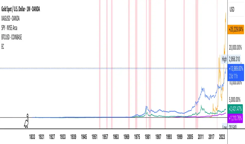
Economic Crises by @zeusbottradingEconomic Crises Indicator by @zeusbottrading
Description and Use Case
Overview
The Economic Crises Highlight Indicator is designed to visually mark major economic crises on a TradingView chart by shading these periods in red. It provides a historical context for financial analysis by indicating when major recessions occurred, helping traders and analysts assess the performance of assets before, during, and after these crises.
What This Indicator Shows
This indicator highlights the following major economic crises (from 1953 to 2020), which significantly impacted global markets:
• 1953 Korean War Recession
• 1957 Monetary Tightening Recession
• 1960 Investment Decline Recession
• 1969 Employment Crisis
• 1973 Oil Crisis
• 1980 Inflation Crisis
• 1981 Fed Monetary Policy Recession
• 1990 Oil Crisis and Gulf War Recession
• 2001 Dot-Com Bubble Crash
• 2008 Global Financial Crisis (Great Recession)
• 2020 COVID-19 Recession
Each of these periods is shaded in red with 80% transparency, allowing you to clearly see the impact of economic downturns on various financial assets.
How This Indicator is Useful
This indicator is particularly valuable for:
✅ Comparative Performance Analysis – It allows traders and investors to compare how different assets (e.g., Gold, Silver, S&P 500, Bitcoin) performed before, during, and after major economic crises.
✅ Identifying Market Trends – Helps recognize recurring patterns in asset price movements during times of financial distress.
✅ Risk Management & Strategy Development – Understanding how markets reacted in the past can assist in making better-informed investment decisions for future downturns.
✅ Gold, Silver & Bitcoin as Safe Havens – Comparing precious metals and cryptocurrencies against traditional stocks (e.g., SPY) to analyze their performance as hedges during economic turmoil.
How to Use It in Your Analysis
By overlaying this indicator on your Gold, Silver, SPY, and Bitcoin chart (for example), you can quickly spot historical market reactions and use that insight to predict possible behaviors in future downturns.
⸻
How to Apply This in TradingView?
1. Click on Use on chart under the image.
2. Overlay it with Gold ( OANDA:XAUUSD ), Silver ( OANDA:XAGUSD ), SPY ( AMEX:SPY ), and Bitcoin ( COINBASE:BTCUSD ) for comparative analysis.
⸻
Conclusion
This indicator serves as a powerful historical reference for traders analyzing asset performance during economic downturns. By studying past crises, you can develop a data-driven investment strategy and improve your market insights. 🚀📈
Let me know if you need any modifications or enhancements!
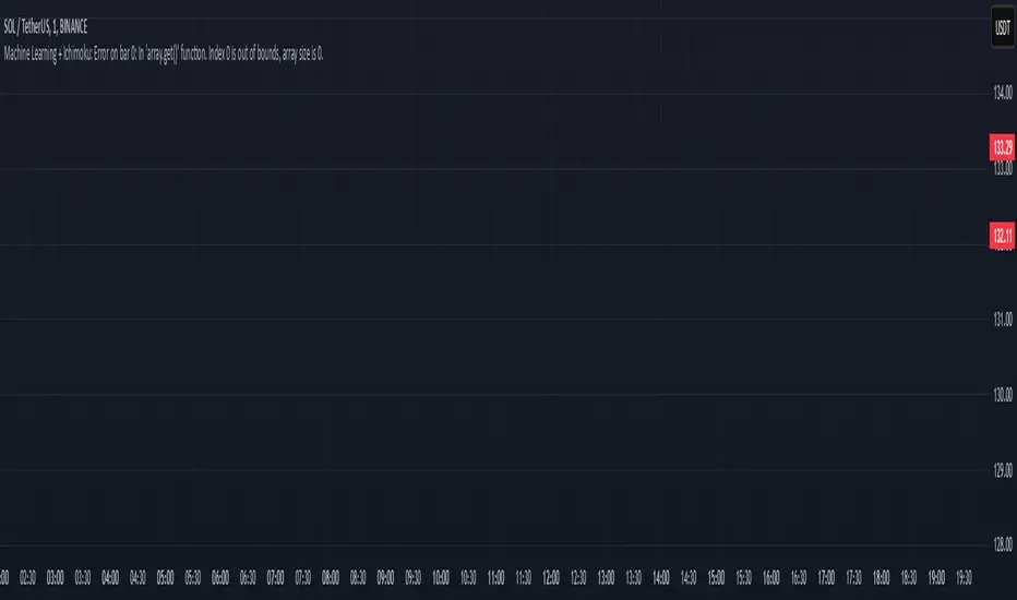
Machine Learning + IchimokuIchimoku Cloud + Machine Learning Levels is an advanced indicator that merges a classic trend tool with machine-learned supply & demand zones. Combining the two can help traders identify trends and key price zones with greater confidence when both signals align!
How it Works
The Ichimoku Cloud component identifies the trend direction and momentum at a glance – it shows support/resistance areas via its cloud (Kumo) and signals potential trend changes when the Tenkan-sen and Kijun-sen lines cross. Meanwhile, the Machine Learning module analyzes historical price data to project potential support and resistance levels (displayed as horizontal lines) that the algorithm deems significant. By combining these, the script offers a two-layer confirmation: Ichimoku outlines the broader trend and equilibrium, while the ML levels pinpoint specific price levels where the price may react. For example, if price is above the Ichimoku Cloud (uptrend) and also near an ML-predicted support, the confluence of these signals strengthens the case for a bounce.
How to Use
Apply the indicator to a chart like any other TradingView script. It works on multiple asset classes (see supported list below). Once added:
Ichimoku Lines
Tenkan-sen (Blue): Short-term average reflecting recent highs/lows.
Kijun-sen (Red): Medium-term baseline for support/resistance.
Senkou Span A (Green) & Senkou Span B (Orange) form the “Cloud” (Kumo). Price above the Cloud often signals a bullish environment; price below it can signal a bearish environment.
Chikou Span (Purple): Plots current closing price shifted back, helping gauge momentum vs. past price.
ML-Predicted Support/Resistance Lines (Green/Red Horizontal Lines)
Green Horizontal Lines – Potential support zones.
Red Horizontal Lines – Potential resistance zones.
These dynamically adjust based on the specific asset and are updated as new historical data becomes available.
Password (for Advanced Features)
In the indicator’s Settings, there is an input field labeled “Password.” The password corresponds to the ticker(s) listed below.
Stocks
TSLA, NVDA, AAPL, AMZN, PLTR, AMD, META, MSFT, MSTR, GOOG, GME, COIN, NFLX, BABA, UBER, HOOD, NKE
Cryptocurrencies
ETH, BTC, SOL, BNB, XRP, ADA, DOT, DOGE, LTC, JUP, LINK, INJ, FET, SAND, HBAR, TRX, SHIB, UNI
(If you attach the indicator to any unlisted ticker, you will only see the Ichimoku Cloud.)
Why It’s Unique
This script is a fresh take on market analysis – it’s original in fusing Ichimoku’s visual trend mapping with machine learning. The Ichimoku framework provides time-proven trend insight, and the ML levels add forward-looking context specific to each asset. By uniting them, the indicator aims to filter out false signals and highlight high-probability zones. No repainting occurs: Ichimoku values are based on closed data, and ML levels are computed from historical patterns (they do not retroactively change).
Ichimoku Cloud + Machine Learning Levels offers an informative blend of old and new analysis techniques. It clearly shows where price is relative to trend (via Ichimoku) and where it might react in the future (via ML levels). Use it to gain a richer view of the market’s behavior. I hope this indicator provides valuable insights for your trading decisions. Happy trading!
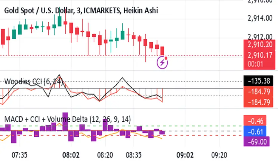
Shavarie's MCV IndicatorShavarie's MCV Indicator (MACD + CCI + Volume Delta) is a custom-built trend-following and volume-based indicator that helps traders confirm market direction with high accuracy. It combines the MACD (Moving Average Convergence Divergence), CCI (Commodity Channel Index), and Volume Delta, ensuring that all three indicators align before making a trading decision. The goal is to filter out false signals and provide high-probability trade setups.
History & Development
Shavarie's MCV Indicator was developed by Shavarie Gordon, an experienced swing trader, to improve trend confirmation on Gold (XAUUSD) and other markets. After testing various indicators, Shavarie discovered that MACD, CCI, and Volume Delta together provide the best combination of trend strength, momentum, and real-time volume flow. This indicator was designed to eliminate lagging signals, improve win rates, and enhance market timing for both swing and scalping strategies.
How It Works & Calculations
MACD (Moving Average Convergence Divergence)
Measures momentum and trend strength using the difference between a 12-period EMA and a 26-period EMA.
The MACD line and Signal line crossover confirms buy/sell signals.
A rising MACD histogram confirms bullish strength, while a falling histogram confirms bearish strength.
CCI (Commodity Channel Index)
Measures how far the price is from its statistical average.
Above +100 → Overbought (strong trend continuation or reversal).
Below -100 → Oversold (strong trend continuation or reversal).
When CCI aligns with MACD, it confirms momentum strength.
Volume Delta
Measures the difference between buying and selling volume in real time.
A positive delta means more aggressive buying (bullish).
A negative delta means more aggressive selling (bearish).
Helps confirm MACD and CCI trends by showing real volume strength.
Key Takeaways & Features
✅ No false signals: All three indicators must align before entering a trade.
✅ Trend confirmation: Ensures momentum and volume agree before trading.
✅ Works on multiple timeframes: Designed for swing trading on the daily and scalping on 45 min + 5 min.
✅ Great for Gold & Metals: Optimized for XAUUSD, XAUJPY, XAU/AUD, and possibly Palladium (XPDUSD).
✅ Custom-built by a professional trader: Developed by Shavarie Gordon after extensive testing.
Summary
Shavarie’s MCV Indicator is a powerful and reliable trading tool that combines momentum, trend, and volume analysis. By ensuring that MACD, CCI, and Volume Delta align, it eliminates false signals and increases trade accuracy. Whether used for swing trading or scalping, this indicator helps traders enter high-probability trades with confidence.
Put/Call RatioPut/Call Ratio Indicator
This indicator visualizes the Put/Call Ratio for various market symbols, helping traders assess market sentiment and potential reversals. It offers a dropdown menu to select from a range of Put/Call Ratios, including broad equities (CBOE), major indices (SPX, QQQ, IWM, VIX), and individual stocks (TSLA, GOOG, META, AMZN, MSFT, INTC).
The indicator plots the Put/Call Ratio with adjustable moving averages and standard deviation bands to highlight overbought or oversold conditions. A short-term moving average (default: 10 periods) is displayed with trend-based coloring, while longer-term moving averages (defaults: 30 and 200 periods) are calculated but hidden by default. Bands at 1, 1.5, and 2 standard deviations provide context for extreme readings.
Key Overbought/Oversold Signals:
Short-Term Extremes: The 10-day moving average moves beyond 1 standard deviation from the 200-day moving average, signaling potential overbought (above) or oversold (below) conditions. This will be highlighted by red or green background color.
Ratio Extremes: The Put/Call Ratio line itself crosses outside 2 standard deviations from the 200-day moving average, indicating stronger overbought or oversold zones.
Conditional coloring of the ratio line reflects its position relative to the bands, and background shading highlights when the short-term moving average crosses key levels.
Key Features:
Selectable Put/Call Ratio symbols.
Trend-colored moving averages.
Standard deviation bands for volatility analysis.
Dynamic line and background coloring for quick insights.
Usage:
Use this indicator to gauge market sentiment—high ratios may suggest bearish sentiment or oversold conditions, while low ratios may indicate bullish sentiment or overbought conditions. Combine with price action or other tools for confirmation.

Earnings Expansion ProjectionThis indicator has no counterpart in the platform and is a professional-grade earnings visualization tool that plots EPS expansion directly on your charts, inspired by institutional-level technical analysis platforms.
The indicator creates a distinctive earnings expansion projection curve that can be a leading indicator of price direction moves.
Key features:
Clean, institutional-style, EPS-expansion projection line overlaid on price action
Visual earnings surprise indicators with beat/miss multipliers
Dashboard for rapid fundamental assessment including the stocks win rate on beatings / missing earnings historically and other fundamental information not readily available on Tradingview
What is it doing?
It collects all earnings results available and will interpolate the numbers so that we see earnings expansion as a curve.
The video below describes usage
Note: Valid on the weekly time-frame only.

BTC vs Mag7 Combined IndexThis Mag7 Combined Index script is a custom TradingView indicator that calculates and visualizes the collective performance of the Magnificent 7 (Mag7) stocks—Apple, Microsoft, Alphabet, Amazon, NVIDIA, Tesla, and Meta (red line) compared to Bitcoin (blue line). It normalizes the daily closing prices of each stock to their initial value on the chart, scales them into percentages, and then computes their simple average to form a combined index. The result is plotted as a single red line, offering a clear view of the aggregated performance of these influential stocks over time compared to Bitcoin.
This indicator is ideal for analyzing the overall market impact of Bitcoin compared to the Mag7 stocks.

Multi-ticker Daily Pivot AlertDescription:
The Big Tech Daily Pivot Alert is a powerful TradingView indicator designed to monitor daily pivot points for major tech and market-leading tickers. It provides real-time alerts when prices approach their daily pivot levels, helping traders identify potential trading opportunities during the U.S. market hours.
Key Features:
Multi-Ticker Monitoring: Tracks the daily pivot points for top tech and market tickers, including NVDA, TSLA, AMZN, NFLX, SPY, QQQ, GOOGL, MSFT, META, and AAPL.
Daily Pivot Calculations: Uses yesterday's high, low, and close prices to calculate the pivot point for each ticker.
Real-Time Alerts: Sends instant alerts when the open, high, low, or current price is near the pivot point (within 0.25% tolerance).
Time-Sensitive Alerts: Operates exclusively during U.S. market hours (6:00 AM to 1:00 PM PST) on weekdays (Monday to Friday).
Customizable Alert Format: Alerts are sent as JSON payloads for seamless integration with platforms like Discord or other webhook-supported systems.
How It Works:
The indicator calculates the daily pivot point for each ticker using the formula:
Pivot Point = (High + Low + Close) / 3
It continuously monitors the open, high, low, and current prices of each ticker on a 1-minute timeframe.
If any value approaches the pivot point within a configurable threshold (default: 0.25%), it triggers an alert with detailed information for all tickers meeting the criteria.
Who Should Use It:
Day Traders: Spot potential price reversal or breakout levels based on pivot point testing.
Swing Traders: Identify key levels of support and resistance to inform trading decisions.
Tech and Market Enthusiasts: Stay updated on critical price levels for major tech and market tickers.
Instructions:
Add the indicator to your chart.
Configure your webhook endpoint to receive alerts (e.g., Discord or Slack).
Monitor alerts for actionable opportunities when prices test pivot points.

Volatility IndicatorThe volatility indicator presented here is based on multiple volatility indices that reflect the market’s expectation of future price fluctuations across different asset classes, including equities, commodities, and currencies. These indices serve as valuable tools for traders and analysts seeking to anticipate potential market movements, as volatility is a key factor influencing asset prices and market dynamics (Bollerslev, 1986).
Volatility, defined as the magnitude of price changes, is often regarded as a measure of market uncertainty or risk. Financial markets exhibit periods of heightened volatility that may precede significant price movements, whether upward or downward (Christoffersen, 1998). The indicator presented in this script tracks several key volatility indices, including the VIX (S&P 500), GVZ (Gold), OVX (Crude Oil), and others, to help identify periods of increased uncertainty that could signal potential market turning points.
Volatility Indices and Their Relevance
Volatility indices like the VIX are considered “fear gauges” as they reflect the market’s expectation of future volatility derived from the pricing of options. A rising VIX typically signals increasing investor uncertainty and fear, which often precedes market corrections or significant price movements. In contrast, a falling VIX may suggest complacency or confidence in continued market stability (Whaley, 2000).
The other volatility indices incorporated in the indicator script, such as the GVZ (Gold Volatility Index) and OVX (Oil Volatility Index), capture the market’s perception of volatility in specific asset classes. For instance, GVZ reflects market expectations for volatility in the gold market, which can be influenced by factors such as geopolitical instability, inflation expectations, and changes in investor sentiment toward safe-haven assets. Similarly, OVX tracks the implied volatility of crude oil options, which is a crucial factor for predicting price movements in energy markets, often driven by geopolitical events, OPEC decisions, and supply-demand imbalances (Pindyck, 2004).
Using the Indicator to Identify Market Movements
The volatility indicator alerts traders when specific volatility indices exceed a defined threshold, which may signal a change in market sentiment or an upcoming price movement. These thresholds, set by the user, are typically based on historical levels of volatility that have preceded significant market changes. When a volatility index exceeds this threshold, it suggests that market participants expect greater uncertainty, which often correlates with increased price volatility and the possibility of a trend reversal.
For example, if the VIX exceeds a pre-determined level (e.g., 30), it could indicate that investors are anticipating heightened volatility in the equity markets, potentially signaling a downturn or correction in the broader market. On the other hand, if the OVX rises significantly, it could point to an upcoming sharp movement in crude oil prices, driven by changing market expectations about supply, demand, or geopolitical risks (Geman, 2005).
Practical Application
To effectively use this volatility indicator in market analysis, traders should monitor the alert signals generated when any of the volatility indices surpass their thresholds. This can be used to identify periods of market uncertainty or potential market turning points across different sectors, including equities, commodities, and currencies. The indicator can help traders prepare for increased price movements, adjust their risk management strategies, or even take advantage of anticipated price swings through options trading or volatility-based strategies (Black & Scholes, 1973).
Traders may also use this indicator in conjunction with other technical analysis tools to validate the potential for significant market movements. For example, if the VIX exceeds its threshold and the market is simultaneously approaching a critical technical support or resistance level, the trader might consider entering a position that capitalizes on the anticipated price breakout or reversal.
Conclusion
This volatility indicator is a robust tool for identifying market conditions that are conducive to significant price movements. By tracking the behavior of key volatility indices, traders can gain insights into the market’s expectations of future price fluctuations, enabling them to make more informed decisions regarding market entries and exits. Understanding and monitoring volatility can be particularly valuable during times of heightened uncertainty, as changes in volatility often precede substantial shifts in market direction (French et al., 1987).
References
• Bollerslev, T. (1986). Generalized Autoregressive Conditional Heteroskedasticity. Journal of Econometrics, 31(3), 307-327.
• Christoffersen, P. F. (1998). Evaluating Interval Forecasts. International Economic Review, 39(4), 841-862.
• Whaley, R. E. (2000). Derivatives on Market Volatility. Journal of Derivatives, 7(4), 71-82.
• Pindyck, R. S. (2004). Volatility and the Pricing of Commodity Derivatives. Journal of Futures Markets, 24(11), 973-987.
• Geman, H. (2005). Commodities and Commodity Derivatives: Modeling and Pricing for Agriculturals, Metals and Energy. John Wiley & Sons.
• Black, F., & Scholes, M. (1973). The Pricing of Options and Corporate Liabilities. Journal of Political Economy, 81(3), 637-654.
• French, K. R., Schwert, G. W., & Stambaugh, R. F. (1987). Expected Stock Returns and Volatility. Journal of Financial Economics, 19(1), 3-29.

4AM-5AM BRT HighlighterThe 4AM-5AM BRT Highlighter is a simple yet effective tool designed to visually mark your preferred trading time on the chart. It highlights the period between 4:00 AM and 5:00 AM Brazilian Time (BRT/UTC-3) by default, helping you stay focused and aware of your prime trading window.
Key Features:
Clear Visual Highlight: Colors the background of your chart during the chosen timeframe, making it easy to see when your trading session starts and ends.
Customizable Colors: Easily adjust the highlight color and transparency to suit your visual preferences.
Accurate Time Conversion: Automatically accounts for Brazilian Time (BRT), ensuring the highlight appears correctly no matter your chart’s default timezone.
Whether you're trading currencies, metals, indexes, or cryptocurrencies, this indicator helps you maintain focus during your dedicated trading hour by clearly marking your active period on the chart.

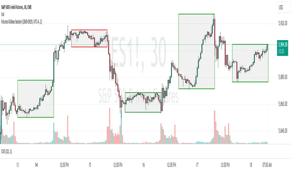
Futures Globex Session(s)This indicator draws a box around the Globex Session for the various Futures markets. The box height defines the highs and lows of that session, and the width defines the timeframe of that session. The boxes are outlined green if price rose during that period, and red if price fell during that period. The default Globex Session is set for the Equity Index Futures and is set in the UTC-4 time zone (Eastern Time). In the settings you can adjust the session time and time zone of your Globex Session to reflect the trading times of that market. Below are the session times for various Futures markets set in time zone UTC-4.
Equity Indexes: 18:00 - 9:30
(ES, NQ, YM, RTY)
Treasuries: 18:00 - 8:20
(ZN, ZB)
Metals: 18:00 - 8:20
(GC)
Energies: 18:00 - 9:00
(CL, NG)
Agricultures: 20:00 - 9:30
(ZS, ZW)
RSI TreeRSI Tree is a simple way to compare the strength of several different instruments against each other.
The default is to compare MSFT, NVDA, TSLA, GOOG, META, AMZN, AAPL and NASDAQ. You could do the same for currency pairs and any other instruments available in Trading View. However, it makes the most sense to compare seven instruments to an eighth underlying instrument. As you can see in the default values, we included the NASDAQ as the eighth instrument since the other seven are part of the NASDAQ composite index. If you were to trade major currency pairs, then your eighth instrument would most likely be the U.S. Dollar (DXY).
The chart setup is important as well. You need to split your chart horizontally into 4 plots. Each plot would be at a different timing interval. The example shows 4 hr, 1 hr, 15 min and 5 min (left to right) charts. Now not only can we compare the instruments against each other, but we can do it across time to get an idea of the motion of each instrument.
Note, the instrument used on the chart is somewhat important. If the chart is set to a currency pair, but you have the RSI Tree setup for equities (as in the default) then you will get some odd behavior due to the times when these are open. Equities are 0930 to 1600 EST, whereas something like a currency would be open 24 hours a day.
Layout for default settings: www.tradingview.com
Bugs?
Kindly report any issues and I'll try to fix them promptly.
Thank you!

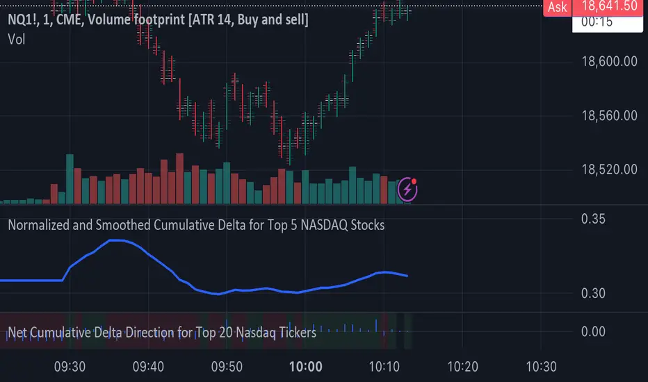
Normalized and Smoothed Cumulative Delta for Top 5 NASDAQ StocksThis script is designed to create a TradingView indicator called **"Normalized and Smoothed Cumulative Delta for Top 5 NASDAQ Stocks."** The purpose of this indicator is to track and visualize the cumulative price delta (the change in price from one period to the next) for the top five NASDAQ stocks: Apple Inc. (AAPL), Microsoft Corporation (MSFT), Alphabet Inc. (GOOGL), Amazon.com Inc. (AMZN), and Meta Platforms Inc. (FB).
### Key Features of the Script:
1. **Ticker Selection**:
- The script focuses on the top five NASDAQ stocks by automatically setting their tickers.
2. **Price Data Retrieval**:
- It fetches the closing prices for each of these stocks using the `request.security` function for the current timeframe.
3. **Delta Calculation**:
- The script calculates the delta for each stock, which is simply the difference between the current closing price and the previous closing price.
4. **Cumulative Delta Calculation**:
- It calculates the cumulative delta for each stock by adding the current delta to the previous cumulative delta. This helps track the total change in price over time.
5. **Summing and Smoothing**:
- The cumulative deltas for all five stocks are summed together.
- The script then applies an Exponential Moving Average (EMA) with a period of 5 to smooth the summed cumulative delta, making the indicator less sensitive to short-term fluctuations.
6. **Normalization**:
- To ensure the cumulative delta is easy to interpret, the script normalizes it to a range of 0 to 1. This is done by tracking the minimum and maximum values of the smoothed cumulative delta and scaling the data accordingly.
7. **Visualization**:
- The normalized cumulative delta is plotted as a smooth line, allowing users to see the overall trend of the cumulative price changes for the top five NASDAQ stocks.
- A horizontal line is added at 0.5, serving as a midline reference, which can help traders quickly assess whether the normalized cumulative delta is above or below its midpoint.
### Usage:
This indicator is particularly useful for traders and investors who want to monitor the aggregated price movements of the top NASDAQ stocks, providing a high-level view of market sentiment and trends. By smoothing and normalizing the data, it offers a clear and concise visualization that can be used to identify potential market turning points or confirm ongoing trends.
FX Index Curve Oscillator (FICO)We can approximate the TVC:DXY with simple multiplication, rather than using geometric weighted averages; the values will be different, but the charts will look almost the same. Because we can make a "good enough" version of DXY, we can also extend this concept to the other major currencies:
AUD - Yellow
CAD - Red
CHF - Orange
EUR - Purple
GBP - Green
JPY - White
NZD - Lime green
USD - Blue
This indicator works by constructing an "index" for each currency, performing a lookback to figure out the rate of change, and then smoothing the values. These values are fed through an oscillator to normalize them between -1.00 and +1.00, before finally being smoothed again. Interestingly, using HMA to smooth them the second time will cause the values to leak past 1.00, which we can also use as a signal.
If you want to change the values, I find that the biggest difference comes from the lookback and oscillator settings; the MA/smoothing is probably good enough. The default settings are for doing forex trades on the daily chart. Other timeframes are possible, but I could not find any settings that work. It might also be possible to use a similar approach on other assets (crypto, metals, indexes, etc) but I have not tried yet.
In my own testing, what I found to be a good approach is to look for a currency to be above +1 and another to be below -1, and then look for color changes; ideally this will happen on the same bar/candle.
You can also consider two line crosses, breaking above or below 1, etc as other entry signals. I find that price will either move immediately, or take a candle or two to retrace and then start moving.
Happy trading!
Unfortunately, the indicator pane can get quite crowded; if you're testing for a single currency pair, you may want to disable some of the plotted lines:

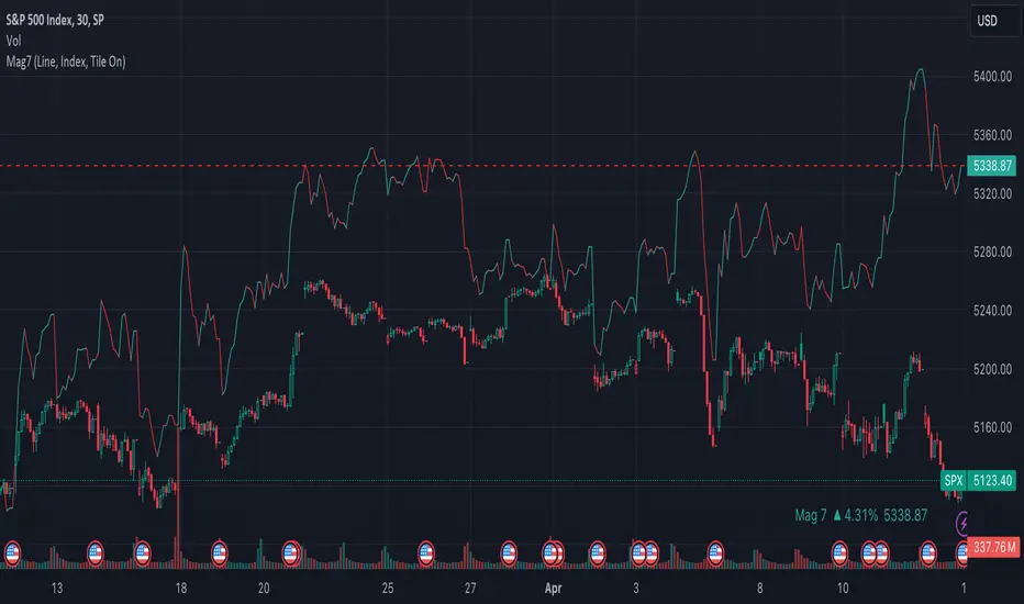
Mag7 IndexThis is an indicator index based on cumulative market value of the Magnificent 7 (AAPL, MSFT, NVDA, TSLA, META, AMZN, GOOG). Such an indicator for the famous Mag 7, against which your main security can be benchmarked, was missing from the TradingView user library.
The index bar values are calculated by taking the weighted average of the 7 stocks, relative to their market cap. Explicitly, we are multiplying each bar period's total outstanding stock amount by the OHLC of that period for each stock and dividing that value by the combined sum of outstanding stock for the 7 corporations. OHLC is taken for the extended trading session.
The index dynamically adjusts with respect to the chosen main security and the bars/line visible in the chart window; that is, the first close value is normalized to the main security's first close value. It provides recalculation of the performance in that chart window as you scroll (this isn't apparent in the demo chart above this description).
It can be useful for checking market breadth, or benchmarking price performance of the individual stock components that comprise the Magnificent 7. I prefer comparing the indicator to the Nasdaq Composite Index (IXIC) or S&P500 (SPX), but of course you can make comparisons to any security or commodity.
Settings Input Options:
1) Bar vs. Line - view as OHLC colored bars or line chart. Line chart color based on close above or below the previous period close as green or red line respectively.
2) % vs Regular - the final value for the window period as % return for that window or index value
3) Turn on/off - bottom right tile displaying window-period performance
Inspired by the simpler NQ 7 Index script by @RaenonX but with normalization to main security at start of window and additional settings input options.
Please provide feedback for additional features, e.g., if a regular/extended session option is useful.
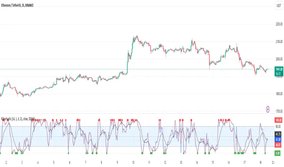
[KVA]K Stochastic IndicatorOriginal Stochastic Oscillator Formula:
%K=(C−Lowest Low)/(Highest High−Lowest Low)×100
Lowest Low refers to the lowest low of the past n periods.
Highest High refers to the highest high of the past n periods.
K Stochastic Indicator Formula:
%K=(Source−Lowest Source)/(Highest Source−Lowest Source)×100
Lowest Source refers to the lowest value of the chosen source over the past length periods.
Highest Source refers to the highest value of the chosen source over the past length periods.
Key Difference :
The original formula calculates %K using the absolute highest high and lowest low of the price over the past n periods.
The K Stochastic formula calculates %K using the highest and lowest values of a chosen source (which could be the close, open, high, or low) over the specified length periods.
So, if _src is set to something other than the high for the Highest Source or something other than the low for the Lowest Source, the K Stochastic will yield different results compared to the original formula which strictly uses the highest high and the lowest low of the price.
Impact on Traders :
Flexibility in Price Source :
By allowing the source (_src) to be customizable, traders can apply the Stochastic calculation to different price points (e.g., open, high, low, close, or even an average of these). This could provide a different perspective on market momentum and potentially offer signals that are more aligned with a trader's specific strategy.
Sensitivity to Price Action :
Changing the source from high/low to potentially less extreme values (like close or open) could result in a less volatile oscillator, smoothing out some of the extreme peaks and troughs and possibly offering a more filtered view of market conditions.
Customization of Periods :
The ability to adjust the length period offers traders the opportunity to fine-tune the sensitivity of the indicator to match their trading horizon. Shorter periods may provide earlier signals, while longer periods could filter out market noise.
Possibility of Applying the Indicator on Other Indicators :
Layered Technical Analysis :
The K Stochastic can be applied to other indicators, not just price. For example, it could be applied to a moving average to analyze its momentum or to indicators like RSI or MACD, offering a meta-analysis that studies the oscillator's behavior of other technical tools.
Creation of Composite Indicator s:
By applying the K Stochastic logic to other indicators, traders could create composite indicators that blend the characteristics of multiple indicators, potentially leading to unique signals that could offer an edge in certain market conditions.
Enhanced Signal Interpretation :
When applied to other indicators, the K Stochastic can help in identifying overbought or oversold conditions within those indicators, offering a different dimension to the interpretation of their output.
Overall Implications :
The KStochastic Indicator's modifications could lead to a more tailored application, giving traders the ability to adapt the tool to their specific trading style and analysis preferences.
By being applicable to other indicators, it broadens the scope of stochastic analysis beyond price action, potentially offering innovative ways to interpret data and make trading decisions.
The changes might also influence the trading signals, either by smoothing the oscillator's output to reduce noise or by altering the sensitivity to generate more or fewer signal
Including the additional %F line, which is unique to the K Stochastic Indicator, further expands the potential impacts and applications for traders:
Impact on Traders with the %F Line:
Triple Smoothing :
The %F line introduces a third level of smoothing, which could help in identifying longer-term trends and filtering out short-term fluctuations. This could be particularly useful for traders looking to avoid whipsaws and focus on more sustained movements.
Potential for Enhanced Confirmation :
The %F line might be used as a confirmation signal. For instance, if all three lines (%K, %D, and %F) are in agreement, a trader might consider this as a stronger signal to buy or sell, as opposed to when only the traditional two lines (%K and %D) are used.
Risk Management:
The additional line could be utilized for more sophisticated risk management strategies, where a trader might decide to scale in or out of positions based on the convergence or divergence of these lines.
Possibility of Applying the Indicator on Other Indicators with the %F Line:
Depth of Analysis :
When applied to other indicators, the %F line can provide an even deeper layer of analysis, perhaps identifying macro trends within the indicator it is applied to, which could go unnoticed with just the traditional two-line approach.
Refined Signal Strength Assessment :
The strength of signals from other indicators could be assessed by the position and direction of the %F line, providing an additional filter to evaluate the robustness of buy or sell signals.
Overall Implications with the %F Line :
The inclusion of the %F line in the K Stochastic Indicator enhances its utility as a tool for trend analysis and signal confirmation. It allows traders to potentially identify and act on more reliable trading opportunities.
This feature can enrich the trader's toolkit by providing a nuanced view of momentum and trend strength, which can be particularly valuable in volatile or choppy markets.
For those applying the K Stochastic to other indicators, the %F line could be integral in creating a multi-tiered analysis strategy, potentially leading to more sophisticated interpretations and decisions.
The presence of the %F line adds a dimension of depth to the analysis possible with the K Stochastic Indicator, making it a versatile tool that could be tailored to a variety of trading styles and objectives. However, as with any indicator, the additional complexity requires careful study and back-testing to ensure its signals are understood and actionable within the context of a comprehensive trading plan.
NQ 7 IndexThis is a simple index-like script that adds up the market value of the magnificent 7 (AAPL, MSFT, NVDA, TSLA, META, AMZN, GOOG) and divided by a constant.
The way this works is similar to SPX and NDX, except that it doesn't have any special weighting mechanism.
DrNon_NASDAQ10Title: NASDAQ 10 Index with TOP 10 Securities
Introduction:
TradingView offers traders and investors a powerful platform for technical analysis and trading. One of its notable features is the ability to create custom indices based on the values of multiple individual securities. In this blog post, we will explore how to build a custom index with 10 securities in TradingView using Pine Script, the platform's proprietary programming language.
Description:
Custom indices allow market participants to track the performance of a specific group of securities, providing valuable insights into the collective performance of the chosen assets. By leveraging Pine Script, traders can easily develop and deploy custom indicators and strategies to build their own indices.
The script provided focuses on creating a custom index with 10 securities. The selected securities include popular stocks such as AAPL (Apple Inc.), MSFT (Microsoft Corporation), GOOG (Alphabet Inc.), AMZN (Amazon.com Inc.), NVDA (NVIDIA Corporation), TSLA (Tesla Inc.), META (Facebook, Inc.), AVGO (Broadcom Inc.), PEP (PepsiCo, Inc.), and COST (Costco Wholesale Corporation).
Using the security() function in Pine Script, we retrieve the closing prices of each individual security to ensure accurate data for the index calculation.
The index value is then calculated by summing the closing prices of the 10 securities. This simple arithmetic operation captures the overall performance of the custom index.
To visualize the index, we use the plot() function to display the index value on the chart. Traders can observe the custom index alongside other technical indicators or price action, aiding in decision-making and market analysis.
By building a custom index with 10 securities in TradingView, traders gain a consolidated view of the performance of these chosen assets. This allows for easier tracking of sector trends, evaluation of specific strategies, and the ability to compare the performance of individual portfolios against the broader market.
Conclusion:
TradingView's Pine Script provides traders and investors with a flexible solution to build custom indices. By defining the 10 individual securities, calculating the index value, and plotting it on the chart, traders can monitor the collective performance of these chosen assets. Custom indices offer insights into sector performance, enable the evaluation of specific strategies, and provide a benchmark for comparing portfolio performance. By harnessing the power of custom indices in TradingView, traders can enhance their decision-making process and gain a competitive edge in the market.
Engulfing Pattern BUY and SELL SystemThis indicator is based on multiple parameters such as the Open, High, Low, and Close of candles. We add confluences such as SMMA crossovers, engulfing candles, and the number of pips that it has moved from it.
The main parameter is the DFS (Distance from SMMA). This will adjust the number of signals you'll get. This parameter is calculated based on the Open price of the signal bar and the 50 SMMA price. If the difference between these two values is greater than the input value, it will not be considered a signal.
The buy/sell signal consists of the following conditions:
1. Engulfing Candle based on conditions
2. SMMA crossover (21 and 50 periods)
3. For BUYS, the RSI value is greater than 49. For SELLS, the RSI value is less than 51.
4. Open price of the signal bar is less/greater than the 50 SMMA for SELLS/BUYS respectively.
5. DFS value is less than or equal to the input value
We recommend backtesting this on FX Pairs, and metals such as Gold. It is not well suited for Crypto or Indices.
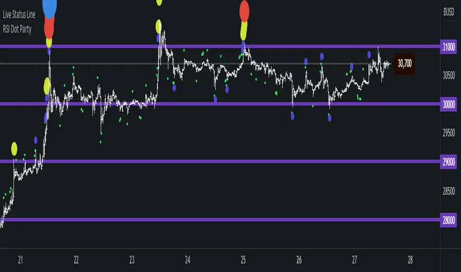
RSI Dot Party - All Lengths From 1 To 120The RSI Dot Party indicator displays all RSI lengths from 1 to 120 as different colored dots on the chart.
🔶 Purpose
Show the reversal point of price action to time entries and exits.
🔶 USAGE
When a dot displays it is a indication of the reversal of the price/trend. The larger the dot the more likely it is to reverse.
The Default settings generates dots for extreme cases where the RSI is over = 90 or under = 10 for every RSI length in the range of 1-120.
Example if the RSI of length 1 or 2 or 3 or 4 or ... or 15 or 16 or 17 or ... or 80 or 81 or 82 or ... if any of does RSI crosses a boundary a dot is shown.
A boundary is the over/under the RSI oscillates in.
Customize the settings until the dots match up with the high and lows of past price action.
🔶 SETTINGS
🔹 Source
Source 1: Is the First Source RSI is calculated from
Source 2: Is the Second Source RSI is calculated from
🔹 Meta Settings
Hours back to draw: To speed up the script calculate it only draws a set number of hours back, default is 300 hours back in time to draw then it cuts off.
Show Dots: Show or disable dots
Show Bar Color: Color the bars for each RSI incident
Filter Cross: Filters and only shows dots when the RSI crosses above or bellow a boundary. If not all candles above or bellow the boundaries will display a dot.
Dots Location Absolute: Instead of showing the dots above or bellow the candle, the dots will show up on the top and bottom of the window.
🔹 7 RSI Groups
There are a total of 7 RSI colors.
Range Very Tiny: Default Color Green
Range Tiny: Default Color Purple
Range Small: Default Color Yellow
Range Normal: Default Color Red
Range Large: Default Color Blue
Range Huge: Default Color Dark Purple
Range Very Huge: Default Color White
🔹 RSI Group Settings
Hi/Low Color: Change the Color of that group.
Start/End: The Start and End range of this RSI color. Example if start = 5 and end = 10 the RSI of 5,6,7,8,9,10 will be displayed on the chart for that color, if any of does RSI goes above or bellow the boundary a dot is displayed on that candle.
Delay: The RSI needs to be above or bellow a boundary for x number of candles before displaying a dot. For example if delay = 2 and the RSI is over = 70 for 2 candles then it will display a dot.
Under/Over: Boundaries that indicate when to draw a dot, if over = 70 and RSI crosses above 70 a dot is displayed.
🔹 Show
Section that allows you to disable RSI grounds you dont want to see, this also removes them from the alert signal generated.
Show Low: Show or disable Low RSI dots
Show High: Show or disable High RSI dots
🔶 ALERTS
Alert for all New RSIs Dots Created in real time
The alert generated depends on what groups are showing or not, if the green group is disabled for example the alert will not be generated.
🔶 Warning
When a dot shows up it can continue moving. For example if a purple dot shows itself above a 15 minute candle, if that candle/price continue to extend up the dot will move up with it.
Dots can also disappear occasionally if the RSI moves in and out of a boundary within that candles life span.
🔶 Community
I hope you guys find this useful, if you have any questions or feature requests leave me a comment! Take care :D
XAUXXXThis simple script is meant to get around the limitations some data providers have, in terms of the length of historical data they choose to provide traders. Inspired by OANDA's XAUCAD pair only having data as far back as 2005, whereas XAUUSD has data back to to the 19th century.
By taking the OHLC data from XAUUSD and multiplying it by the price of USD in a desired currency you are able to see further back in time, the limitation now being the length of FX data available instead of the price of Precious metal / currency pair. As shown in the chart you can now see the price of Gold in CAD as far back as the late 1960s, a nearly half century of data uncovered for all to see!

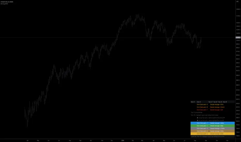
libhs.log.DEMO◼ Overview
This is a demonstration of dual logging library I have ported from my personal use for public use. Please start bar replay from Bar#4, and progress automatically slowly or manually.You would need to go through 450+ bars to see the full capability.
Logger=A dual logging library for developers. Tradingview lacks logging capability. This library provided logging while developing your scripts and is to be used by developers when developing and debugging their scripts.
Using this library would potentially slow down you scripts. Hence, use this for debugging only. Once your code is as you would like it to be, remove the logging code.
◼︎ Usage (Console):
Console = A sleek single cell logging with a limit of 4096 characters. When you dont need a large logging capability.
//@version=5
indicator("demo.Console", overlay=true)
plot(na)
import GETpacman/log/2 as logger
var console = logger.log.new()
console.init() // init() should be called as first line after variable declaration
console.FrameColor:=color.green
console.log('\n')
console.log('\n')
console.log('Hello World')
console.log('\n')
console.log('\n')
console.ShowStatusBar:=true
console.StatusBarAtBottom:=true
console.FrameColor:=color.blue //settings can be changed anytime before show method is called. Even twice. The last call will set the final value
console.ShowHeader:=false //this wont throw error but is not used for console
console.show(position=position.bottom_right) //this should be the last line of your code, after all methods and settings have been dealt with.
◼︎ Usage (Logx):
Logx = Multiple columns logging with a limit of 4096 characters each message. When you need to log large number of messages.
//@version=5
indicator("demo.Logx", overlay=true)
plot(na)
import GETpacman/log/2 as logger
var logx = logger.log.new()
logx.init() // init() should be called as first line after variable declaration
logx.FrameColor:=color.green
logx.log('\n')
logx.log('\n')
logx.log('Hello World')
logx.log('\n')
logx.log('\n')
logx.ShowStatusBar:=true
logx.StatusBarAtBottom:=true
logx.ShowQ3:=false
logx.ShowQ4:=false
logx.ShowQ5:=false
logx.ShowQ6:=false
logx.FrameColor:=color.olive //settings can be changed anytime before show method is called. Even twice. The last call will set the final value
logx.show(position=position.top_right) //this should be the last line of your code, after all methods and settings have been dealt with.
◼︎ Fields (with default settings)
▶︎ IsConsole = True Log will act as Console if true, otherwise it will act as Logx
▶︎ ShowHeader = True (Log only) Will show a header at top or bottom of logx.
▶︎ HeaderAtTop = True (Log only) Will show the header at the top, or bottom if false, if ShowHeader is true.
▶︎ ShowStatusBar = True Will show a status bar at the bottom
▶︎ StatusBarAtBottom = True Will show the status bar at the bottom, or top if false, if ShowHeader is true.
▶︎ ShowMetaStatus = True Will show the meta info within status bar (Current Bar, characters left in console, Paging On Every Bar, Console dumped data etc)
▶︎ ShowBarIndex = True Logx will show column for Bar Index when the message was logged. Console will add Bar index at the front of logged messages
▶︎ ShowDateTime = True Logx will show column for Date/Time passed with the logged message logged. Console will add Date/Time at the front of logged messages
▶︎ ShowLogLevels = True Logx will show column for Log levels corresponding to error codes. Console will log levels in the status bar
▶︎ ReplaceWithErrorCodes = True (Log only) Logx will show error codes instead of log levels, if ShowLogLevels is switched on
▶︎ RestrictLevelsToKey7 = True Log levels will be restricted to Ley 7 codes - TRACE, DEBUG, INFO, WARNING, ERROR, CRITICAL, FATAL
▶︎ ShowQ1 = True (Log only) Show the column for Q1
▶︎ ShowQ2 = True (Log only) Show the column for Q2
▶︎ ShowQ3 = True (Log only) Show the column for Q3
▶︎ ShowQ4 = True (Log only) Show the column for Q4
▶︎ ShowQ5 = True (Log only) Show the column for Q5
▶︎ ShowQ6 = True (Log only) Show the column for Q6
▶︎ ColorText = True Log/Console will color text as per error codes
▶︎ HighlightText = True Log/Console will highlight text (like denoting) as per error codes
▶︎ AutoMerge = True (Log only) Merge the queues towards the right if there is no data in those queues.
▶︎ PageOnEveryBar = True Clear data from previous bars on each new bar, in conjuction with PageHistory setting.
▶︎ MoveLogUp = True Move log in up direction. Setting to false will push logs down.
▶︎ MarkNewBar = True On each change of bar, add a marker to show the bar has changed
▶︎ PrefixLogLevel = True (Console only) Prefix all messages with the log level corresponding to error code.
▶︎ MinWidth = 40 Set the minimum width needed to be seen. Prevents logx/console shrinking below these number of characters.
▶︎ TabSizeQ1 = 0 If set to more than one, the messages on Q1 or Console messages will indent by this size based on error code (Max 4 used)
▶︎ TabSizeQ2 = 0 If set to more than one, the messages on Q2 will indent by this size based on error code (Max 4 used)
▶︎ TabSizeQ3 = 0 If set to more than one, the messages on Q2 will indent by this size based on error code (Max 4 used)
▶︎ TabSizeQ4 = 0 If set to more than one, the messages on Q2 will indent by this size based on error code (Max 4 used)
▶︎ TabSizeQ5 = 0 If set to more than one, the messages on Q2 will indent by this size based on error code (Max 4 used)
▶︎ TabSizeQ6 = 0 If set to more than one, the messages on Q2 will indent by this size based on error code (Max 4 used)
▶︎ PageHistory = 0 Used with PageOnEveryBar. Determines how many historial pages to keep.
▶︎ HeaderQbarIndex = 'Bar#' (Logx only) The header to show for Bar Index
▶︎ HeaderQdateTime = 'Date' (Logx only) The header to show for Date/Time
▶︎ HeaderQerrorCode = 'eCode' (Logx only) The header to show for Error Codes
▶︎ HeaderQlogLevel = 'State' (Logx only) The header to show for Log Level
▶︎ HeaderQ1 = 'h.Q1' (Logx only) The header to show for Q1
▶︎ HeaderQ2 = 'h.Q2' (Logx only) The header to show for Q2
▶︎ HeaderQ3 = 'h.Q3' (Logx only) The header to show for Q3
▶︎ HeaderQ4 = 'h.Q4' (Logx only) The header to show for Q4
▶︎ HeaderQ5 = 'h.Q5' (Logx only) The header to show for Q5
▶︎ HeaderQ6 = 'h.Q6' (Logx only) The header to show for Q6
▶︎ Status = '' Set the status to this text.
▶︎ HeaderColor Set the color for the header
▶︎ HeaderColorBG Set the background color for the header
▶︎ StatusColor Set the color for the status bar
▶︎ StatusColorBG Set the background color for the status bar
▶︎ TextColor Set the color for the text used without error code or code 0.
▶︎ TextColorBG Set the background color for the text used without error code or code 0.
▶︎ FrameColor Set the color for the frame around Logx/Console
▶︎ FrameSize = 1 Set the size of the frame around Logx/Console
▶︎ CellBorderSize = 0 Set the size of the border around cells.
▶︎ CellBorderColor Set the color for the border around cells within Logx/Console
▶︎ SeparatorColor = gray Set the color of separate in between Console/Logx Attachment
◼︎ Methods (summary)
● init ▶︎ Initialise the log
● log ▶︎ Log the messages. Use method show to display the messages
● page ▶︎ Clear messages from previous bar while logging messages on this bar.
● show ▶︎ Shows a table displaying the logged messages
● clear ▶︎ Clears the log of all messages
● resize ▶︎ Resizes the log. If size is for reduction then oldest messages are lost first.
● turnPage ▶︎ When called, all messages marked with previous page, or from start are cleared
● dateTimeFormat ▶︎ Sets the date time format to be used when displaying date/time info.
● resetTextColor ▶︎ Reset Text Color to library default
● resetTextBGcolor ▶︎ Reset Text BG Color to library default
● resetHeaderColor ▶︎ Reset Header Color to library default
● resetHeaderBGcolor ▶︎ Reset Header BG Color to library default
● resetStatusColor ▶︎ Reset Status Color to library default
● resetStatusBGcolor ▶︎ Reset Status BG Color to library default
● setColors ▶︎ Sets the colors to be used for corresponding error codes
● setColorsBG ▶︎ Sets the background colors to be used for corresponding error codes. If not match of error code, then text color used.
● setColorsHC ▶︎ Sets the highlight colors to be used for corresponding error codes.If not match of error code, then text bg color used.
● resetColors ▶︎ Reset the colors to library default (Total 36, not including error code 0)
● resetColorsBG ▶︎ Reset the background colors to library default
● resetColorsHC ▶︎ Reset the highlight colors to library default
● setLevelNames ▶︎ Set the log level names to be used for corresponding error codes. If not match of error code, then empty string used.
● resetLevelNames ▶︎ Reset the log level names to library default. (Total 36) 1=TRACE, 2=DEBUG, 3=INFO, 4=WARNING, 5=ERROR, 6=CRITICAL, 7=FATAL
● attach ▶︎ Attaches a console to an existing Logx, allowing to have dual logging system independent of each other
● detach ▶︎ Detaches an already attached console from Logx