Riptide - Loki (Market Cipher B / WaveTrend)Hey guys,
Just a free version of LazyBears WaveTrend indicator - modified to be a bit more reactive with MFI added for open use. This is a slightly stripped down version but the original is open and wanted to keep it that way.
Behind the wave I've added an RSI and Stochastic for those on free plans to allow you saving some indicator space and find confluence on two pretty common indicators.
If you are interested in some of the other indicators you can.
Buscar en scripts para "LazyBear"

Genesis Volume Floworiginal work was by lazybear...ive modified it with alerts and tweaked the deadzone for crypto...thanks to Libertus for helping with alerts...


RSI Oscillator [bionis]This is an adaptation of the OBV using the RSI. Credit for the idea goes to LazyBear.

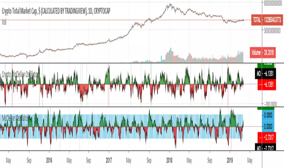
Crypto McClellan OscillatorMcClellan Oscillator for cryptocurrency, taking into account only the top 40 cryptos.
Original code was by LazyBear.
ETH HawkEye Aggregated Volume IndicatorThis is combined Aggregated ETH Exchange Volume by Neobutane with HawkEye volume clone indicator by LazyBear.
Indicator includes aggregated raw ETH volume from 7 user selectable fiat and tether exchanges on USD, USDT, BTC, EUR, GBP, JPY pairs + Exponential MA + hawkeye bar coloring where: green is bullish volume , red - bearish and white - volume neutral to the market:
Bitfinex
Coinbase
Bitstamp
Kraken
Binance
Poloniex
Bittrex
*There is a TV bug that doesn't display a whole volume history if some pair was added later than date intended to be analysed by operator eg, if you want to watch older data you should exclude all secondary pairs that were added later and switch off "newer" exchanges like Binance.

#112 TTM SqueezeTTM Squeeze with Circles Cross Signals.
Credit for the original formula goes to Lazybear.

Bull Bear Divergence IndicatorThe script is written for Constance Brown-like anayis with divergence signals between price and indicator (i.e. stock close / RSI divergence)
Note: Though the example here with NVDA shows good reversal predictions, best results generally are optained with un-normalized indicators and oscilators like CB#s comosite index.
(For Trading view written by LazyBear.) I use two different lines: an indi high line for baerish, and an indi low line for bullish divergences.
The script only shows divergences to pivot pairs next to each other, not between actual pivot and those "a few pivots ago"
For individual work, chose your indicator and replace rsi in line 10 with it, anything else is auto. Sript bottom: optional comparison lines addable.

HEAVI - HawkEye Aggregated Volume IndicatorThis is combined Aggregated BTC Exchange Volume by Neobutane with HawkEye volume clone indicator by LazyBear.
Indicator includes aggregated raw BTC volume from 9 user selectable fiat and tether exchanges + Exponential MA + hawkeye bar coloring where: green is bullish volume, red - bearish and white - volume neutral to the market:
Bitfinex
Coinbase
Bitstamp
Kraken
Binance
Poloniex
Bittrex
bitFlyer
Bithumb

RSI's EMA by @cryptoTrader_RSI Indicator with EMA of RSI. Great Confirming Signals. Modified version of CM_ and lazyBear. *RSI is red
WaveTrend Oscillator - EnhancedByPuppy This is a modification and slight finetuning of the Wavetrend Oscilator created by LazyBear.
Only for Personal use.
TtM - The Phenomenal Five‘TtM - The Phenomenal Five’ Indicator
NOTE: I am NOT a professional trader. I DO NOT provide investment advice. This content and the data provided in the indicator is based on my live and simulated, personal observations and is ONLY intended for educational purposes. YOU are responsible for ALL your trading decisions and ALL subsequent tax ramifications. Past performance DOES NOT guarantee future results.
‘The Phenomenal Five’ refers to a specific group of five underlying indicators. That is how the indicator got its name. It is a slimmed down version of a prior indicator called ‘The Score Card’. The majority of those previous features got transferred to a new indicator called ‘The Calculator’. That new indicator represents the core of how I presently trade. Although nothing is perfect, ‘The Calculator’ was designed for short term scalps. In my case, those scalps usually range above the 2% mark.
With that being said, there were still features of ‘The Score Card’ that were extremely helpful visual aids. The display of those features, although still very important, could not be coded into a normal, lower indicator. That is why I separated out those five necessities into this indicator.
Here is a list of the features contained within ‘The Phenomenal Five’:
1. Automated Fibonacci Lines: Even though the display is simple, this feature took quite a bit to accomplish. Behind the scenes, it is tracking downward moves. It calculates from the MOST RECENT Pivot High (100%) as its beginning point and continues down to the MOST RECENT lowest low (0%) as its ending point. It then automatically projects Fibonacci Retracement Lines upward based on that downward move. The display of those lines will statically continue until a new lowest low is established OR a new Pivot High is reached. In either of those cases, the display will automatically readjust accordingly. The default values of the 5 adjustable, colored lines are as follows:
Level #1 Orange Line: 23.6%
Level #2 Lime Green Line: 38.2%
Level #3 Blue Line: 50.0%
Level #4 Purple Line: 61.8%
Level #5 Red Line: 78.6%
2. Highlighted Consolidation Zones: Consolidation may not be the right technical trading term here. However, I use it to help explain areas where price is within a range of indecision and is consolidating across a few bars. The yellow highlighted areas, especially the ones with a smaller quantity of bars and a tighter range, help train my eye to spot similar zones which may not meet the exact criteria of the indicator itself. I use the areas I spot AND the areas the indicator highlights as potential profit targets. In other words, instead of forcing my exit decision or a specific percentage as the outcome of a trade, I let the market tell me where to exit. My assumption is that once a trade starts heading in my direction that it would at least gravitate to the middle of the last area of indecision which is quite possibly a yellow Highlighted Consolidation Zone or at least a location I RECOGNIZED as similar to the highlighted areas.
3. Profit Projection Line: This is a line that rides at a specific percentage above current price. In my case, that percentage is 2%. (That number can be adjusted on the ‘Inputs’ window of the indicator.) I use this line combined with the yellow highlighted areas AND locations I define as important visual aids. If, for example, I want to only look at trades that potentially offer 2% or more profit, I can quickly glance at a chart and see if a setup is worth digging into deeper. In other words, if the Profit Projection Line is already above my profit target (yellow highlighted area OR one I recognize), then I move onto the next setup. On the other hand, if the line is below the zone(s), I get a little more interested in working through my trade decision process.
4. Pivot Highs and Lows: A Pivot High, as structured in this indicator, has 10 bars to the left AND 10 bars to the right of the High Bar that ALL closed lower than the close of the High Bar. A Pivot Low, as structured in this indicator, has 10 bars to the left AND 10 bars to the right of the Low Bar that ALL closed higher than the close of the Low Bar. There is NO guarantee that price is going to adjust itself at the High Bar, but based on the data, that adjustment is a logical assumption. However, the main problem is that once a Pivot High or Low has completed, price is already 10 bars past the High Bar. The point is that Pivots, both High and Low, provide real good indications of possible market sentiment, but they are a definitely a ‘lagging’ portion of the indicator.
Note: For visual reference, the indicator is coded to display on the High/Low Bar, even though the full Pivot did not complete until 10 bars later.
With that being said, I also have ‘The Phenomenal Five’ coded to display what might be considered 1/2 of a Pivot High or Low. In this case, the indicator DOES NOT take into account any bars to the right. Instead, I have what I call possible 8’s, 9’s and 10’s. This version of the Pivots, both High and Low, are displayed in purple boxes on the chart. An *8* High will only appear when the prior 8 bars closed lower than that interim High Bar. A *9* Low will only appear when the prior 9 bars closed higher than that interim Low Bar and so on.
Here is the reasoning behind these pseudo Pivots. Let’s assume I locate a bounce in the market and wanted to enter a trade. If an *8* High displayed, I may think twice about that entry. There are obviously NO guarantees, but perhaps the upward move I was looking to catch has already moved to far to sustain the profit percentage I desired. On the other hand, let’s assume I was looking for an early indication of a possible bounce. There are obviously NO guarantees, but if an *8* Low, then *9* Low and *10* Low displayed on the most recent 3 bars, I might be more confident in an earlier entry to catch a larger portion of the potential bounce.
5. Zig Zag Line: Price action on a chart can be quite annoying. It moves up, down, sideways or in whatever direction it wants whenever it wants to. I use the Zig Zag Line as a visual aid to help smooth out that chaos. It helps drown out some of the choppiness when I am in the heat of the battle trying to make a trading decision.
Be aware, that the Zig Zag Line is far from perfect. It is somewhat more of a hack than pure coding. It combines various readings across a different timeframe to even have a chance at being somewhat visually correct. The question then becomes, why did I code it into ‘The Phenomenal Five’? The answer is simple. None of my decisions depend on the line. Basically, it just tells me where I am at on the chart. So, in my case, I don’t mind a little imperfection in this visual aid. Additionally, the free version of TradingView allows for only 3 indicators on a chart. By combining a less than perfect version here, I freed up one of those slots. However, if I had an available slot on my charts for an additional indicator, I would use the TradingView, built-in Zig Zag tool. My personal settings for that tool are Deviation 0.00001, Depth 10 and I have the ‘Extend To Last Bar’ box checked. To disable my Zig Zag Line, I simply UNcheck the ‘Zig Zag Display’ box on the style page of the indicator.
Note: Just about everything (including, lines, levels, percentages and colors) within ‘The Phenomenal Five’ is adjustable. It’s as simple as clicking on the ‘gear’ icon to the right of the name of the indicator. From there, the ‘Input’ page controls the settings and the ‘Style’ page controls the colors. I can make my updates, hit ‘SAVE’ and in essence I have a new indicator that calculates based off the new edits. That makes things REAL EASY to change for further testing purposes.
That’s it. Let me know what you think. You can ‘Follow’ and/or ‘Message’ me within the TradingView platform at: www.tradingview.com
Full Speed ahead. Go get ‘em!!!
The Trading Guy
Acknowledgments: I would like to personally thank the following TV members for their inspiration and, in certain cases, their code snippet usage approval: RicardoSantos and LazyBear. By virtue of building on their publically available code snippets, the finish line came sooner rather than later. Also, a special thanks to gyromatical for assistance and brain storming.

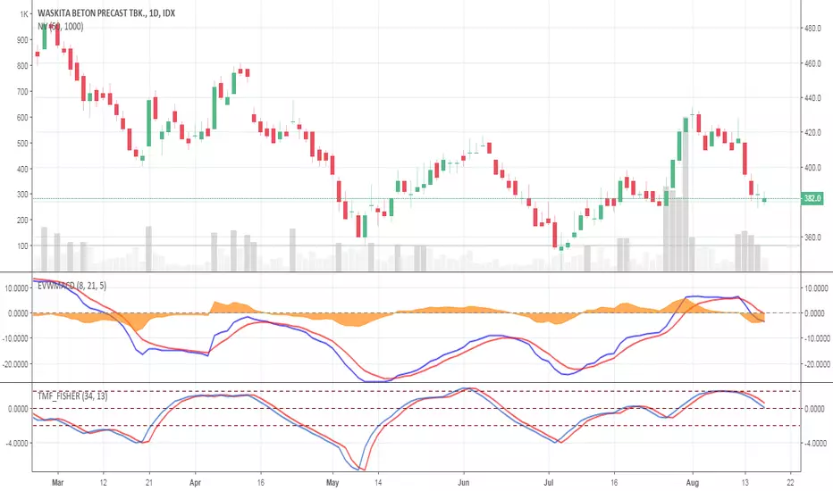
Elastic Volume Weighted MACD ( EVWMACD )The Elastic Volume Weighted MACD is a variation of standard MACD.
The Difference is that this script apply the formula of standard MACD with the Elastic Volume Weighted Moving Average.
I took the formula of EVWMA from public library coded by LazyBear.
I use EVWMACD as a trend confirmation indicator.
Just tune all lengths and parameters according to your instruments
ClearVision_1.0First and foremost, huge credit must be given to Flibbr for creating the Rational Flibbr Indicator, which presents itself as the foundation for this indicator.
This indicator adds to the Rational Flibbr Indicator with the inclusion of Wave Trend, via LazyBear.
In this, we allow for Bullish/Bearish signals (transparent columns on the Daily Left).
Important thing pointed out on the daily is the ability to predict market tops. Each "Red Cross of Death" led to the infamous 10, 20, 30, and even 40% corrections BTC -6.60% -4.47% has exhibited for quite some time.
Important thing pointed out on the 4HR is the ability to assess market bottoms, especially when standard indicators can remain oversold for quite some time (and the same could be said for top conditions and being overbought). Here, I bring focus to the green oversold highlight crosses between Willy's%R and its EMA , as well as the Wave Trend "Green Holy Cross". In conjunction, these two indicators on the 4HR have historically been extremely accurate for signaling market bottoms after significant corrections.
This indicator also works extremely well on the short time frames. However, with short time frames it is important to have both signals in order to take action, meaning market tops should only be considered if there is a red cross of death + cross down from overbought conditions on the Willys%R and EMA . In contrast, for intra-day dips, one should look for a green holy cross + oversold conditions on the Willys%R and EMA crossover.

ClearVision_1.0First and foremost, huge credit must be given to Flibbr for creating the Rational Flibbr Indicator, which presents itself as the foundation for this indicator.
This indicator adds to the Rational Flibbr Indicator with the inclusion of Wave Trend, via LazyBear.
In this, we allow for Bullish/Bearish signals (transparent columns on the Daily Left).
Important thing pointed out on the daily is the ability to predict market tops. Each "Red Cross of Death" led to the infamous 10, 20, 30, and even 40% corrections BTC -4.47% has exhibited for quite some time.
Important thing pointed out on the 4HR is the ability to assess market bottoms, especially when standard indicators can remain oversold for quite some time (and the same could be said for top conditions and being overbought). Here, I bring focus to the green oversold highlight crosses between Willy's%R and its EMA , as well as the Wave Trend "Green Holy Cross". In conjunction, these two indicators on the 4HR have historically been extremely accurate for signaling market bottoms after significant corrections.
This indicator also works extremely well on the short time frames. However, with short time frames it is important to have both signals in order to take action, meaning market tops should only be considered if there is a red cross of death + cross down from overbought conditions on the Willys%R and EMA . In contrast, for intra-day dips, one should look for a green holy cross + oversold conditions on the Willys%R and EMA crossover.

[naoligo] 12x MA DT (5, 15, 30 & 60)This indicator is based on "Generic 8x MA Plotter", by @LazyBear.
It is also based on my own indicator "10x MA (H, D, W, M)", which is good for Swing Trading and/or Position.
This one is focused in daytrade and it will plot three Moving Averages based on current time interval (under 5 minutes) and nine based on chosen periods by 5, 15, 30 and 60 minutes. You will be able to see where is, for example, a 50 period's SMA of 15 minutes when using a 2 minutes time interval chart. I find it very useful to analyze, in a snap, possible price ranges and enter/exit points. All reference values are from setups known and used by daytraders.
you can choose between EMA or SMA (default: SMA) for each time interval, that are distributed in:
3x MA current time interval;
3x MA 5 minutes;
2x MA 15 minutes;
2x MA 30 minutes;
2x MA 60 minutes.
I've tried to keep the code as simple as possible, so you can increase the number of MA or modify the type for each time interval.
Cons: Use it wisely, because if you choose to plot all the 12 Moving Averages, it will may consume a lot of your navigator resources.
Enjoy!


[naoligo] 10x MA (H, D, W, M)This one is based on "Generic 8x MA Plotter" indicator, by @LazyBear.
It will plot three Moving Averages based on current time interval and seven based on chosen periods by hour, day, week and month. You will be able to see where is, for example, a 50 days SMA when using a 5 minutes time interval chart. I find it very useful to analyze, in a snap, possible price ranges and enter/exit points. All reference values are from setups known and used by traders.
Cons: Use it wisely, because if you choose to plot all the 10 Moving Averages, he will consume a lot of the computer resources.
Enjoy!!
Edit: I forgot to mention that you can choose between EMA or SMA for each time interval, that are distributed in:
2x MA Hour;
2x MA Day;
2x MA Week;
1x MA Month.
I've tried to keep the code as simple as possible, so you can increase that number or modify the Moving Average that each time interval will use.
Peace!

OBV [OR]OBV and ema line.
i changed color using ...something :) secret
many thing from LazyBear. thanks!
if you see red dot, sell time!

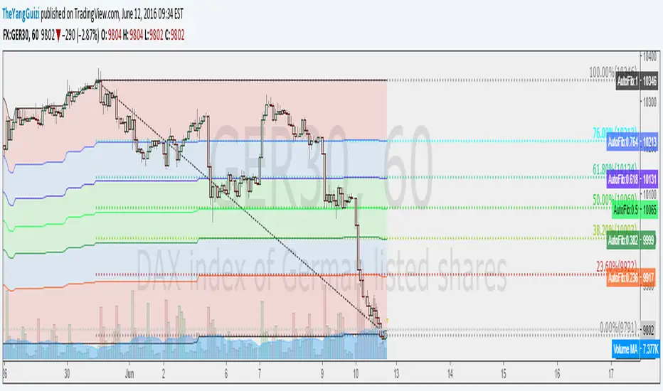
Auto FibTook the code from LazyBears rsi-fib and made it so you could apply it to a chart. It plots fib levels between the high and low of a timeframe of your choosing. Seems to line up well with custom drawn fib levels.
Not sure if it's any better than just drawing the lines yourself, but whatever.
ZeroLag ema + adx = trueCombined LazyBears ZeroLag EMA and CapnOscars moving average ADX. Here's the result.
I figured it could be used as a trend trendtrading system,
ADX red + ema cross downards = short.
ADX green + ema cross up = long.
ADX black + ema cross = no trade
Or something along those line. A way filter out whipsaws.
This is just something I threw together in 5 min, so din't go all in tho. Haven't had time to test.
2 ADX
3 Z-EMAs
Colors/settings can be customized.

All-in-One Momentum Composite The Four Components (and Why They're Chosen)
RSI (Relative Strength Index) – Classic overbought/oversold oscillator (14-period default). Measures speed and change of price movements.
Stochastic (%D line) – Smoothened momentum indicator that compares closing price to the price range over a period. Excellent at spotting reversals in ranging markets.
WaveTrend – Very popular in crypto and forex communities (originally by LazyBear). It’s essentially a momentum oscillator based on overbought/oversold channels, similar to a faster, smoother RSI/Stochastic hybrid. Known for early divergence signals and clean crossovers.
MACD Histogram – Captures momentum changes and trend strength via the difference between fast and slow EMAs. The histogram shows acceleration/deceleration.

Black Arrow Wave Trend
Summary:
Goal was to add FIB Levels to the "WaveTrend with Crosses ". This tool is trying to identify if FIB levels in the "WaveTrend" oscillator has any relation to price action in candles.
Details:
1) Made FIB levels adjustable in the input sections under settings. Adjust to your needs.
2) Blue ribbon represents bullish waves and red ribbons represents bearish waves.
3) Purple line is at .5 "Fair Value", Two Gold lines represent "Golden Pocket", Red line represents the .786
How to use:
1) Observe either bullish or bearish waves enter FIB levels that are color coded.
2) Observe as momentum slows if following waves mark lower FIB levels.
3) Zero line is at the bottom color = grey.
4) As momentum ribbons momentum slows, this may indicate a reversal in momentum.
Probability levels:
1) Lowest: Purple line is "Fair Value" at 50% pullback. Reversal in momentum chance is weak.
2) Medium: Gold Double lines are the "Golden Pocket". Reversal in momentum chance is medium.
3) Highest: Red Line as a higher Probability for a Reversal in momentum.
Please let me know if there are any changes or items I should add.
This would be best used if combined with a support and resistance indicator.
