Smart Money Range + Displacement🧠 How This Indicator Works
This indicator is based on Smart Money Concepts, which follow how institutions actually move the market:
Build liquidity → Take liquidity → Show intent → Move price
It does not predict the market.
It reacts only after confirmation.
1️⃣ Trend Filter (EMA) – Market Direction
What it does:
The Exponential Moving Average (EMA) shows the dominant market direction.
How it’s used:
Price above EMA → bullish bias → only BUY signals
Price below EMA → bearish bias → only SELL signals
Why it matters:
Institutions usually push price in the direction of the higher-timeframe trend.
This filter removes low-probability counter-trend trades.
2️⃣ Smart Money Range – Liquidity Zone
What it does:
The indicator calculates the highest high and lowest low over a fixed number of candles to create a trading range.
Why this range matters:
Equal highs and equal lows form inside ranges
Retail stop-loss orders accumulate at range boundaries
These areas become liquidity pools
Institutions need liquidity to enter large positions — this shows where it is.
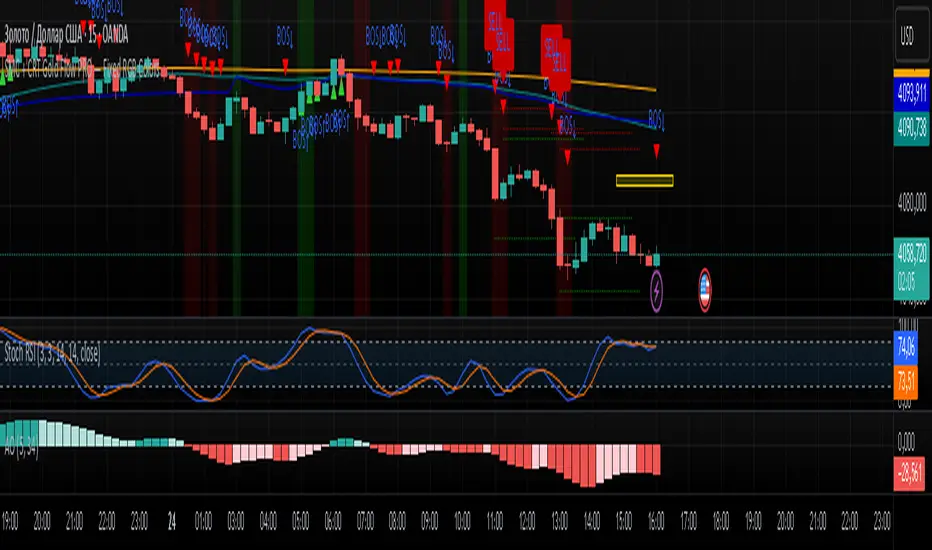
3️⃣ Liquidity Sweep – Stop Hunt Detection
What it does:
The indicator detects when price breaks above or below the range but fails to close outside it.
What this means:
Stops above highs or below lows are triggered
Retail traders are trapped
Smart money absorbs liquidity
This is manipulation, not a real breakout.
4️⃣ Displacement Candle – Institutional Entry
What it does:
The indicator checks for a candle with a body significantly larger than recent candles.
Why displacement is important:
Large candle bodies show strong order flow
Confirms that institutions have entered the market
Filters out weak or fake moves
No displacement = no trade.
5️⃣ Trade Confirmation Logic – Final Signal
BUY Signal Conditions
Liquidity taken below the range
Strong displacement candle
Price above EMA
SELL Signal Conditions
Liquidity taken above the range
Strong displacement candle
Price below EMA
Meaning:
Only trade after liquidity is taken and real momentum appears in trend direction.
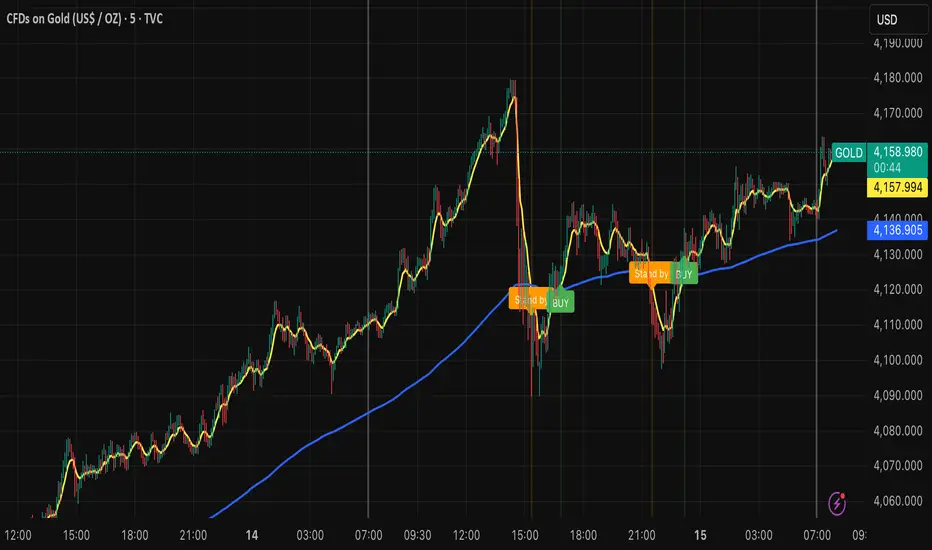
6️⃣ Signal Plotting – Clear Execution
What you see on the chart:
BUY label below the candle
SELL label above the candle
Signals appear only after candle close, ensuring no repainting.
🔁 Market Behavior This Indicator Reads
Market moves sideways (range formation)
Liquidity builds
Stops are taken (false breakout)
Displacement confirms intent
Price expands in one direction
This is how institutional trading works.
⚠️ Best Usage Guidelines
Best timeframes: 15m, 30m, 1H
Avoid major news releases
Wait for candle close
Use structure-based stop loss, not fixed pips
🎯 Why This Indicator Is Effective
Logic-based, not lag-based
No repainting
Works on Gold, BTC, Forex, Indices
Filters noise and emotional trading
Indicador Pine Script®