Risk-Adjusted Performance Rankings | NickJoanRisk-Adjusted Performance Rankings | NickJoan
Core Idea
Risk-Adjusted Performance Rankings is a multi-asset comparison dashboard designed to rank up to 15 symbols by how efficiently they convert recent price movement into risk-adjusted return. Instead of looking only at raw price performance, the indicator evaluates three classic performance measures: Sharpe, Sortino and Omega over a user-defined lookback window and organizes the results into a table.
The script can be used in two ways:
• As a metrics table, where all three risk-adjusted values are shown side by side for each asset.
• As a ranking tool, where the symbols are sorted by Sharpe, Sortino, Omega, or a composite Z-Score score.
Calculation Logic
The indicator works by taking the percentage return of each symbol over the selected period and then building three separate statistics from that same return stream.
1. Return calculation
For each symbol, the script first calculates the one-bar rate of change. This creates a rolling return series that acts as the base input for all three risk-adjusted metrics.
2. Sharpe ratio
The Sharpe calculation measures average return relative to total return volatility.
• The script calculates the mean of returns over the selected lookback.
• It calculates the standard deviation of those returns.
• It divides mean return by standard deviation.
• It then multiplies by the square root of the lookback length to create a rolling-style scaled value.
In practical terms, a higher Sharpe reading means the asset has produced more return for each unit of total volatility.
3. Sortino ratio
The Sortino ratio is similar to Sharpe, but it only penalizes downside volatility.
• The script collects only negative returns from the lookback window.
• It computes the standard deviation of those downside returns.
• It divides mean return by that downside deviation.
• It then scales the result by the square root of the lookback.
This means Sortino rewards assets that may have volatile upside moves but relatively controlled downside behavior.
4. Omega ratio
The Omega calculation compares total gains to total losses over the selected window.
• All positive returns are summed as gains.
• All negative returns are converted to positive values and summed as losses.
• Omega is computed as the ratio of total gains to total losses.
A value above 1 suggests gains outweigh losses, while a value below 1 suggests the opposite.
Ranking Logic
The indicator supports several ranking modes, and each one uses the same asset list but applies a different sort key.
Metrics Table
In Metrics Table mode, the script shows:
• The ticker name.
• Sharpe.
• Sortino.
• Omega.
This mode is the most direct view if you want to inspect each asset’s raw values without sorting.
Sharpe / Sortino / Omega ranking
When one of these modes is selected:
• The table sorts the assets by that chosen metric.
• The highest values appear at the top.
• The table becomes a direct performance leaderboard.
Z-Score ranking
The Z-Score mode is a composite ranking system.
• The script first computes the mean and standard deviation of each metric across all 15 assets.
• It then converts each asset’s Sharpe, Sortino, and Omega into z-scores.
• Those three standardized values are averaged into one composite score.
• Assets are sorted by that final score.
This allows apples-to-apples comparison even when the raw metrics live on different numeric scales.
What the Colors Mean
The script uses color thresholds to make the table easier to read at a glance.
Sharpe colors
Sharpe cells are colored according to the input range defined by:
• Sharpe Min
• Sharpe Max
Values below the minimum are treated as weak.
Values between the lower zone and upper zone are shown as progressively stronger.
Values above the upper threshold are treated as strong.
Sortino colors
Sortino uses the same idea, but with its own range:
• Sortino Min
• Sortino Max
This allows the heatmap to reflect downside-adjusted performance independently from Sharpe.
Omega colors
Omega is especially important because it is naturally centered around 1.0.
• Values below the lower threshold are weak.
• Values between the band limits gradually improve.
• Values above the upper threshold are strong.
Z-Score colors
The Z-Score mode uses a standardized color logic:
• Strongly negative values are weak.
• Slightly negative values are mid-negative.
• Slightly positive values are mid-positive.
• Strongly positive values are strong.
This helps show whether an asset is above or below the group average on a normalized basis.
Table Output
Metrics Table output
In this mode, the table displays:
• Column 1: ticker.
• Column 2: Sharpe.
• Column 3: Sortino.
• Column 4: Omega.
Single-metric ranking output
In Sharpe, Sortino, and Omega modes, the table displays:
• Rank number.
• Ticker.
• Chosen metric.
This keeps the interface minimal while still showing the full ranked order.
Z-Score output
In this mode, the table displays:
• Rank number.
• Ticker.
• Sharpe Z.
• Sortino Z.
• Omega Z.
• Average score.
This view is useful when you want a compact, relative ranking rather than raw values.
Inputs
The indicator has four main input groups.
Calculation
• Period: defines the lookback window used for all metric calculations.
Table
• Display Mode: chooses between Metrics Table, Sharpe, Sortino, Omega, and Z-Score.
• Table Position: controls where the table is placed on the chart.
Color Scale
• Sharpe Min / Max: controls the heatmap thresholds for Sharpe.
• Sortino Min / Max: controls the heatmap thresholds for Sortino.
• Omega Min / Max: controls the heatmap thresholds for Omega.
Colors
• Strong: the strongest positive color.
• Mid +: the intermediate positive color.
• Mid -: the intermediate negative color.
• Weak: the weakest negative color.
Tickers
The script includes 15 symbol inputs, allowing you to compare a basket of assets at once. This makes it suitable for crypto rotation, watchlist comparison, or broad performance ranking across a selected universe.
How to Use It
This indicator is best used as a relative strength and quality filter, not as a standalone entry signal.
Trend selection
Use the ranking table to see which assets are showing the best risk-adjusted behavior over the chosen period.
Rotation analysis
If you track a basket of coins or market leaders, the indicator can help identify which names are improving in risk-adjusted terms and which ones are losing momentum.
Risk control
A raw gain is not always useful if it comes with excessive volatility or poor downside behavior. This script helps highlight assets with better return efficiency, not just bigger movement.
Multi-factor comparison
Because Sharpe, Sortino, and Omega emphasize different aspects of return quality, the script gives a more balanced view than a single metric alone.
Practical Interpretation
Here is a simple way to read the results:
• High Sharpe: efficient return relative to total volatility.
• High Sortino: strong return with less downside volatility.
• High Omega: gains outweigh losses over the lookback window.
• High Z-Score average: strong performance relative to the rest of the selected universe.
If an asset scores well across all three, it usually represents a stronger and more stable candidate than one that only looks good on one metric.
Best Use Cases
Typical uses include:
• Crypto basket comparison.
• Top-asset ranking.
• Risk-adjusted momentum filtering.
• Rotation watchlists.
• Regime-aware asset selection.
It is especially useful when you want to compare many symbols quickly without manually calculating which ones are actually performing best on a quality-adjusted basis.
Notes
The metric table is only as good as the selected lookback period and asset set.
• Shorter periods react faster but can be noisier.
• Longer periods smooth the results but may lag recent shifts.
• The Z-Score mode is relative to the selected group, so its meaning depends on the symbols you include. Indicador

Indicador

Stocks vs Sector Leaderboard**Stocks vs Sector Leaderboard** compares the performance of up to 10 selected stocks against a sector index or other benchmark.
The indicator is designed to quickly show which stocks are **outperforming or underperforming their sector** over a configurable lookback period.
The default configuration compares a selection of ASX Energy stocks against the **S&P/ASX 200 Energy Index (XEJ)**, but both the stocks and benchmark are fully configurable.
**How it works**
For each selected stock, the indicator:
* Calculates performance over the selected number of bars.
* Calculates the benchmark's performance over the same period.
* Calculates relative performance as **Stock Performance − Sector Performance**.
* Estimates market capitalization using the latest available shares outstanding and current share price.
* Ranks the selected stocks by estimated market capitalization.
* Displays the results in a configurable leaderboard directly on the chart.
A positive **vs Sector** value means the stock has outperformed the benchmark over the selected period. A negative value means it has underperformed.
The lookback uses the **current chart timeframe**. For example, a lookback of 60 means 60 daily bars on a daily chart, 60 hourly bars on a 1-hour chart, or 60 weekly bars on a weekly chart.
**Configuration**
The indicator allows you to configure the benchmark, up to 10 stock symbols, performance lookback, table position, font size, normal text color, outperforming color, and underperforming color.
Although the default configuration uses ASX Energy stocks and XEJ, the indicator can be used with other sectors, indices, exchanges, or groups of stocks by changing the symbols in the settings.
**TradingView request limit**
The indicator intentionally supports a maximum of **10 stocks** because it needs to retrieve external price and financial data for each symbol using Pine Script `request.*()` functions.
TradingView imposes limits on the number of unique `request.*()` calls a script may make. On plans with a **40 unique-request limit**, increasing the number of stocks can cause the script to exceed that limit and fail to execute.
Because request limits and access to financial data can depend on the user's TradingView plan, **this indicator may not work, or may have limited functionality, on TradingView's free plan**.
**Note**
Market capitalization is an estimate based on share price and the latest shares-outstanding data available through TradingView. It should be used for ranking and comparison rather than as an authoritative real-time market-cap figure.
This indicator is intended as an analysis tool and does not provide trading or investment advice.
Indicador

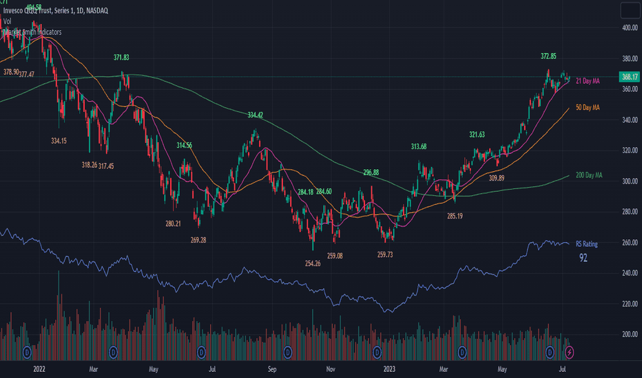
RS Rating (Relative Strength) - Clean Table UIThis indicator calculates the Relative Strength (RS) Rating of a stock compared to the S&P 500 (SPY) and displays it as a clean, simple numerical value in a customizable table on your chart.
Unlike many complex swing data indicators that clutter your screen with moving averages, background colors, and multiple data points, this script is specifically designed for minimalist traders, day traders, and scalpers who only need to see the core RS Rating score at a single glance.
How It Works:
Core Calculation: It uses the standard weighted formula for 1-year performance (40% for the most recent quarter, and 20% for each of the previous three quarters) compared against the S&P 500 benchmark.
Percentile Ranking (1-99): Using market environment seed data, the raw score is converted into a true 1 to 99 percentile ranking. For example, an RS Rating of 85 means the stock is currently outperforming 85% of the overall market.
Color-Coded Signals: The numerical value automatically changes color based on the stock's momentum:
Green (>= 80): Strong market leader.
Red (<= 40): Weak laggard.
Custom/White: Neutral performance.
Features:
Zero Chart Clutter: No lines or shapes plotted over your candles. Just a single, elegant table.
Fully Customizable: You can easily change the table's position (Top/Bottom, Left/Right) and text size (Normal, Large, Huge) directly from the indicator settings to fit your exact workspace layout.
(Credits to the original open-source community and Fred6724 for the percentile mapping seed function utilized to power this clean UI version). Indicador

Relative Strength (RS) - Mansfield StyleRelative Strength (RS) measures how a symbol performs against a chosen
benchmark. Instead of plotting the raw price ratio — whose scale differs
from one symbol to another and makes comparison difficult — this script
normalizes the ratio (symbol close / benchmark close) against its own
simple moving average over a configurable lookback "Period". The result
is a zero-centered line that reads the same way on any symbol:
- RS above 0 and rising → the asset is outperforming the benchmark
- RS below 0 and falling → the asset is underperforming
- Zero-line crossings → shifts in relative leadership
Only the direction and the position relative to zero matter, not the
absolute value.
█ HOW IT WORKS
1. The script requests the benchmark's close on the selected timeframe.
2. It computes the raw ratio: symbol close / benchmark close.
3. The ratio is divided by its SMA over the "Period" lookback, minus 1 —
expressing how far the current relative strength stands above or
below its recent average.
4. An optional moving average of RS can be displayed as a signal line.
█ INPUTS
- Comparative Symbol: the benchmark (an index such as SPX, a sector
index, or any peer symbol — e.g. compare gold against silver).
- Period (default 50): normalization lookback. Shorter = more reactive,
longer = smoother and slower.
- Show Moving Average / Moving Average Period: optional smoothing line.
- Timeframe: leave empty to use the chart's timeframe, or select a
higher timeframe for multi-timeframe analysis.
█ HOW TO USE
Apply the indicator to any symbol. When RS holds above zero, the asset
is leading its benchmark — favor it for relative-strength strategies
(buy strength). When RS holds below zero, the asset is lagging — avoid
it or rotate out. Zero-line crossovers flag early changes in relative
leadership, and two built-in alerts fire on these crossings.
RS is a relative tool, not a timing tool: an asset can outperform a
falling benchmark while still declining in absolute terms. Combine it
with your own trend or entry criteria.
█ CREDITS
The normalization method follows the Mansfield Relative Strength
concept popularized by Stan Weinstein in "Secrets for Profiting in
Bull and Bear Markets".
█ NOTE ON HIGHER TIMEFRAMES
When a higher timeframe is selected in the Timeframe input, the value
of the current forming bar updates until that bar closes. Historical
values do not repaint. Indicador

Trident Screener - Stocks, Themes, Sectors [Galin]Trident Screener
What it does
One screener, three universes. Run it in the Pine Screener on individual stocks, on thematic and industry ETFs, and on the sector SPDRs — same columns, same saved filters, three watchlists. It combines a Minervini-style trend template, an IBD-style weighted relative strength score, a three-condition leadership flag with same-day rotation detection, and setup-ripeness columns: contraction, volume dry-up, extension. Every plot becomes a filterable, sortable column — the answer arrives as a ranked table, not a chart to eyeball.
The columns
Trend
MM — 0 to 8, one point per rule when true: 1) close above the 150 and 200 SMA · 2) 150 SMA above 200 SMA · 3) 200 SMA rising vs 22 bars ago · 4) 50 SMA above the 150 and 200 · 5) close above the 50 SMA · 6) at least 25% above the 260-bar low · 7) within 25% of the 260-bar high · 8) weighted price-momentum composite above 70. Rule 8 uses a price composite, not an IBD-style rating — that job belongs to RS Score below.
Relative strength
RS Score — IBD-style weighted relative strength vs the benchmark, in percentage points: 40% × 3M + 20% × 6M + 20% × 9M + 20% × 12M. Zero means the symbol moves with the benchmark; leaders typically read +20 to +80. It is a margin, not a 0–99 percentile — sorting the column gives you the ranking over your own watchlist, which is the honest version of a ranking anyway.
RS 1W % / RS 1M % / RS 3M % — relative performance vs the benchmark per window, computed as the change of the symbol/benchmark ratio.
Leadership & rotation
A+ — 1/0. Above the 200-day SMA AND beats the benchmark over 1 month AND over 3 months. Each condition catches what the other two miss: a "strong month" inside a downtrend is a bounce, not a leader.
A+ streak — consecutive days with the A+ flag. 1 = promoted today: your rotation alert. Sort descending to rank the most established leaders. Tip: check RS 1W on fresh promotions — a green week means an organic promotion; a deep red week means the calendar just rolled a crash out of the 1-month window.
Improving — above the 200 SMA and beating the benchmark on 1M but not yet on 3M: the waiting room for tomorrow's leaders.
Early accumulation
RS NH — the RS line (symbol ÷ benchmark) is at a 252-bar high.
RS NH lead — RS NH while price is still more than 2% below its own 260-bar high. Relative strength breaking out before price is a classic accumulation tell: someone is buying the base hard enough to outrun the index without a breakout.
Setup ripeness
xFrom50 — extension from the 50 SMA measured in daily ATRs: the "too extended to chase" gauge.
% vs 20SMA — the pullback radar: an extended leader near its 20 SMA is offering an entry instead of demanding a chase.
% from 20D High / % from 60D High — proximity to the recent high and to the base high.
Tight5 (xATR) — the 5-day range measured in ATRs. Small = contraction.
Vol 5D/50D — volume dry-up ratio; below ~0.8 = quiet base.
Suggested setups (set once — filters stick to the indicator)
Stocks: MM = 8 · xFrom50 0 to 4 · % from 60D High −8 to 0 · Tight5 < 3 · Vol 5D/50D < 0.8 → sort RS Score descending. Result: tight, dry leaders sitting just under their highs. Loosen the last three by ~30% for an "almost ready" second pass.
Themes / sectors: A+ = 1 → sort RS Score descending. The row count is a daily breadth curve — log it. A+ streak = 1 → fresh promotions. Improving = 1 → the waiting room.
Weekly: RS NH lead = 1 → the names where the money arrived before the breakout.
Settings
Benchmark — default SPY. Compare sectors vs SPY, growth themes vs QQQ, breadth vs RSP, or a stock vs its own sector ETF.
Notes
Run the screener on the 1D timeframe — required, because A+ streak and RS NH count chart bars, so one bar must equal one day. Plots are hidden on the chart by design; this is a screener tool. All windows are trading days (5/21/63/126/189/252). Symbols younger than ~12 months show empty RS Score cells until the history exists. MM criteria adapted from the Minervini Trend Template by yogy.frestarahmawan (MPL 2.0). Volume confirms what the screener nominates — for entry confirmation, pair it with my Relative Volume At Time indicator. Indicador

RS/Correlation Panel**RS/Correlation Panel**
A single-table dashboard that benchmarks the current chart's symbol against any reference ticker you choose (SPY, QQQ, BTC, or any other symbol) across multiple timeframes — correlation, today's relative performance, short-term relative strength, and a longer IBD-style relative strength rating — plus historical daily move statistics for the symbol itself.
**Inputs**
- **Benchmark Ticker** — the symbol to compare against. Defaults to SPY, but accepts any ticker (QQQ, individual stocks, or crypto via its exchange prefix, e.g. COINBASE:BTCUSD).
- **Correlation Lookback (bars)** — number of bars used for the rolling correlation calculation. Default 20.
- **Daily Stats Lookback (days)** — number of trading days used to calculate average rise/fall and green/red day percentages. Default 60.
- **Short-Term RS/RW Lookback (bars)** — the window used for the medium-term relative strength/weakness reading, sitting between the 1-day and quarterly reads. Default 10.
- **Table Position** — corner of the chart where the table is displayed.
**Table Rows**
- **Correlation** — rolling correlation coefficient between the symbol and the benchmark over the chosen lookback, tagged Strong / Moderate / Weak based on absolute value.
- **Symbol's Today's Move / Benchmark's Today's Move** — each instrument's current-session percent change, calculated from that day's open to the live/last close.
- **RS/RW Today** — the difference between the symbol's and benchmark's daily percent change. Positive means the symbol is outperforming the benchmark today; negative means it's underperforming.
- **N-Bar RS/RW** — the same outperformance/underperformance concept, but measured as the difference in rate-of-change over the user-defined short-term lookback (default 10 bars). This fills the gap between a single day's move and a full quarterly trend.
- **IBD-Style RS** — a quarterly-weighted relative strength calculation modeled on the classic IBD Relative Strength methodology: the symbol's and benchmark's trailing performance are each computed across four rolling quarters (weighted 40/20/20/20, most recent quarter weighted heaviest), then compared as a percentage difference. This is a slower-moving, trend-level strength read — it won't react much to a single day's move, by design.
- **Avg % Rise / Fall** — average percentage gain on up days and average percentage loss on down days, calculated over the Daily Stats Lookback period.
- **Green Days % / Red Days %** — percentage of days in the lookback period that closed up versus down.
**Notes**
- All relative-strength and correlation metrics reference the same user-selected benchmark, so switching the input updates every row consistently.
- The IBD-Style RS calculation is a reproduction of the standard quarterly-weighted RS methodology and is intended to complement — not replace — short-term price action analysis.
- This is a decision-support tool, not a standalone trading signal. Always confirm readings against price structure, volume, and catalysts before acting. Indicador

Ultimate RSIHere is a breakdown of its core features and how they work together:
1. Volatility-Adaptive RSI Length
How it works: Instead of using a static length (like the traditional 14-period RSI), the script calculates the market's standard deviation (volatility).
The Benefit: When the market is highly volatile, the RSI length dynamically shortens, making the indicator more responsive so you can catch quick reversals. When volatility drops (consolidation), the length expands, smoothing the RSI line to filter out "chop" and false signals.
2. Dynamic Overbought / Oversold Zones (Bollinger Bands)
How it works: Standard RSIs use static horizontal lines at 70 and 30. This script applies Bollinger Bands directly to the RSI values themselves.
The Benefit: A reading of 70 isn't always overbought in a strong trend. By wrapping the RSI in a standard deviation channel, you get a dynamic zone. If the RSI breaks above its upper dynamic band, you know momentum is genuinely extreme relative to recent conditions, rather than a fixed arbitrary number.
3. Automated Divergence Detection
How it works: The script constantly scans for discrepancies between price action and RSI momentum.
The Benefit: It automatically plots visual markers on the RSI pane when it detects:
Regular Divergences (Reversals): E.g., Price makes a Lower Low, but RSI makes a Higher Low (Bullish Divergence).
Hidden Divergences (Trend Continuations): E.g., Price makes a Higher Low, but RSI drops to a Lower Low (Hidden Bullish).
4. RSI Moving Average (Signal Line)
How it works: An additional moving average (you can choose between SMA, EMA, RMA, WMA, or HMA) is plotted alongside the RSI.
The Benefit: This acts as a trigger line. An RSI crossing above its EMA can be used as an early entry signal, or as confirmation that momentum has definitively shifted.
5. Multi-Timeframe (MTF) Support
How it works: You can configure the indicator to calculate RSI based on a higher timeframe (e.g., pulling 4-Hour RSI data while you are looking at a 15-minute chart).
The Benefit: This ensures your lower timeframe entries are always aligned with the macro momentum, preventing you from trading against the larger trend.
6. Visual Confluence & Alerts
The RSI line itself is color-coded. For example, it turns bright green when momentum is both above 50 and rising, and dark red when below 50 and falling.
It includes a full suite of alert conditions (divergences and MA crossovers) so you can automate your trading or get pinged when a setup occurs.
In summary, it's designed to replace 3 or 4 different indicators on your chart by giving you adaptive momentum, dynamic exhaustion zones, trend direction, and divergence signals all natively in one branded, professional package. Indicador

DAX Universe Relative Strength [JS]DAX Universe Relative Strength
This indicator compares the current stock with an equal-weighted German stock market benchmark consisting of DAX, MDAX, SDAX and TecDAX.
Instead of comparing a stock only with one single index, the script creates a broader DAX Universe benchmark by calculating the average performance of the four major German equity indices over a selected lookback period.
The goal is to identify whether a stock is showing relative strength or relative weakness versus the broader German stock universe.
How it works:
1. The script measures the performance of the current stock over the selected comparison period.
2. It measures the performance of DAX, MDAX, SDAX and TecDAX over the same period.
3. It calculates the equal-weighted average performance of these four indices.
4. It compares the stock’s performance with this benchmark.
5. The result is plotted as a relative strength line.
Interpretation:
- RS above 0:
The stock is outperforming the DAX Universe benchmark.
- RS below 0:
The stock is underperforming the DAX Universe benchmark.
- RS above its moving average:
Relative strength is improving.
- RS below its moving average:
Relative strength is weakening.
- Strong RS signal:
The stock is above the benchmark, above its RS moving average, and the RS moving average is rising.
This indicator is designed as a filter, not as a standalone buy or sell signal.
For pullback and swing trading, I use it to identify stocks that are stronger than the broader German market. A strong RS reading does not mean that a stock should be bought immediately. It only means that the stock deserves attention and may be worth adding to a watchlist.
A complete trade setup should also include:
- constructive trend structure
- price above important moving averages
- controlled pullback
- declining selling pressure
- clear pivot or trigger
- defined stop-loss
- attractive risk/reward ratio
The indicator includes:
- relative strength line
- moving average of the RS line
- zero line
- histogram
- background highlighting
- interpretation label
- alert conditions for RS changes
Suggested use cases:
- screening German stocks
- comparing DAX, MDAX, SDAX and TecDAX stocks
- identifying potential market leaders
- filtering pullback candidates
- avoiding stocks with persistent relative weakness
Important:
This script is for educational and analytical purposes only. It does not provide investment advice, buy signals or sell signals. Always combine relative strength analysis with your own chart analysis, risk management and trading plan. Indicador

Indicador

EMA Ride Scanner V2.a (Toggle) - AshishShort Description
A dual-mode EMA9/21/50 trend-ride scanner with volume classification and a relative-strength "Grinder Mode" for stocks that trend without ever coiling tight enough to trigger a squeeze. Use alongside its companion, SQZ_SCAN, for momentum timing.
What it does
EMA Ride Scanner V2.a finds stocks in a clean, established uptrend and flags healthy pullback zones to buy — instead of chasing breakouts after the move has happened. Built on ideas from Qullamaggie's Episodic Pivot framework, Stockbee's price-neglect filter, and VCPSwing's 10/20-MA ride philosophy.
It checks: EMA9>21>50 stack alignment, minimum ride duration, distance from 52-week low, and volatility contraction. Volume bars are color-coded as EP surges, distribution, or healthy dips.
Two modes (single toggle)
Standard Mode (toggle OFF) — for stocks that coil and release. Flags a 0-5% pullback to EMA9, ideally on light volume. Pair with SQZ_SCAN for the breakout-timing signal.
Grinder Mode (toggle ON) — for stocks that never coil. Some strong trends have such low, steady volatility that they never compress enough to trigger a squeeze — by the time SQZ_SCAN fires, they've already run too far from EMA9 to count as a dip. Grinder Mode drops the squeeze requirement and instead checks: low ATR, long ride above EMA21, and meaningful outperformance vs a benchmark index (momentum begets momentum). If price is also near EMA9/21, it flags a Grinder Setup.
Note: cloud-bounce count is shown for visual reference only, not used as a filter — low-ATR stocks often show very few bounces simply because they ride EMA9 continuously rather than dipping and recovering.
Companion: SQZ_SCAN
SQZ_SCAN shows when volatility compression releases into a confirmed move — WATCH (squeeze building), EARLY FIRE (just released), or BUY (released + volume confirmed). NOTE: As with most indicators, this is a lagging indicator on a daily timeframe, and accuracy reduces significantly on lower timeframes.
Workflow:
Screen with EMA Ride Scanner (Standard Mode) for clean pullback candidates.
Check SQZ_SCAN on each — prioritize WATCH/EARLY FIRE/BUY.
Separately, screen Grinder Mode for low-volatility names — don't require SQZ confirmation here, it structurally won't fire for this archetype.
Sanity-check on hourly before entry — only to rule out an active breakdown, not as a hard gate. Both indicators are daily-timeframe tools; hourly readings are noisy and shouldn't override a valid daily setup.
What this isn't
A screening tool, not a full trading system — no buy/sell signals, no risk management built in. Combine with your own entry timing, sizing, and stops. Indicador

Pair Currency Strength📊 What is Pair Currency Strength?
This indicator is a professional-grade relative strength oscillator designed to identify true market divergences and trend reversals in Forex pairs.
Unlike traditional currency strength meters that isolate only the two components of your current chart—causing massive USD volatility to distort the lines—this script calculates a global 8-currency matrix in the background.
To keep your workspace 100% clean and focused on your trading execution, it visually renders only the two lines corresponding to your active chart's pair. Inspired by advanced macro analysis dashboards like MarketMilk (Babypips), this indicator strips away the overwhelming USD background noise and dynamically auto-adjusts the Y-axis scale so micro-divergences become instantly scannable.
🧮 How the Math Works (Why it’s a game-changer)
To completely eliminate USD-dominance bias, the script runs a global basket normalization algorithm on every single bar:
Simultaneous Multi-Asset Fetching: No matter which pair you are actively viewing, the script requests backend data for the 7 major currencies against the USD (EURUSD, GBPUSD, AUDUSD, NZDUSD, USDCAD, USDCHF, USDJPY).
Raw Return Calculation: It measures the percentage return of each currency based on your selected lookback window (22-bar rolling window by default, representing 30 calendar days of trading). The raw return of the USD itself is strictly benchmarked at 0.0.
Global Average Normalization: The script calculates the arithmetic mean of the entire currency market:
Global Average = (Sum of all 8 currency returns) / 8
Extracting True Strength: It subtracts this Global Average from each individual currency's raw return:
True Strength = Raw Return - Global Average
By removing the overall market's average drift, the USD stops being a flat line at zero and fluctuates dynamically. More importantly, the indicator's Y-axis contracts dramatically (auto-zooming in). This amplifies the micro-divergences between your chart's two currencies, forcing them into an elegant "mirror effect" around the zero line.
5. Exclusive Display Filtering: It detects the base and quote currencies of your active chart and instantly hides the other 6 currencies, leaving you with a laser-focused, distraction-free panel.
🛠️ Key Features & Inputs
Data Source Selector: Easily toggle between Spot Forex (utilizing dynamic broker feeds) and CME Futures (Pro) (utilizing institutional, high-liquidity continuous futures contracts like 6E1!, 6B1!, 6J1!, etc.).
Flexible Anchor Modes:
Rolling Period: A continuous lookback window of N bars (Set to 22 or 30 to track the classic "last 30 days" look).
Weekly Anchor: Every line resets strictly to 0.0 at Monday's market open, allowing you to track intra-week capital flows.
EMA Smoothing Filter: An optional moving average layer to shave off erratic price noise and algorithmic spikes, converting raw data into highly readable, organic curves without introducing critical execution lag.
📈 How to Trade with this Tool (Visual Strategy)
Trend Confirmation (The Mirror Effect): A healthy, strong trend is confirmed when the Base and Quote lines expand symmetrically in completely opposite directions away from the zero equilibrium line.
Line Crossover (Early Reversal Trigger): When the Base currency line crosses over the Quote currency line at overextended historical extremes, it serves as a high-probability warning of an impending structural shift on the main price chart.
Divergence Exhaustion: When the vertical distance between the two lines becomes unsustainably wide, the market "rubber band" is stretched to its limit. This is your cue to look for price action reversal triggers, as a retracement or consolidation is highly imminent.
Indicador

Active Pair Currency Strength¡Uff, sí! Se hizo un "licuado" total de texto al pegar. Eso pasa porque el editor de TradingView a veces ignora los saltos de línea simples si vienen muy juntos y no soporta ecuaciones complejas en LaTeX (así que los símbolos como \frac y \text se ven rarísimos en la pantalla).
Aquí tienes la versión completamente limpia, estructurada con títulos claros, viñetas y matemáticas en texto plano legible para que cuando lo pegues se vea impecable, ordenado y muy profesional.
Asegúrate de dejar un espacio en blanco (un doble Enter) entre cada párrafo al pegarlo si ves que el editor de TradingView intenta juntarlos de nuevo.
📝 Copia y pega el siguiente bloque de texto en inglés:
📊 What is "Active Pair Currency Strength"?
This indicator is a professional-grade relative strength oscillator designed to identify true market divergences and trend reversals in Forex pairs.
Unlike traditional currency strength meters that isolate only the two components of your current chart—causing massive USD volatility to distort the lines—this script calculates a global 8-currency matrix in the background.
To keep your workspace 100% clean and focused on your trading execution, it visually renders only the two lines corresponding to your active chart's pair. Inspired by advanced macro analysis dashboards like MarketMilk (Babypips), this indicator strips away the overwhelming USD background noise and dynamically auto-adjusts the Y-axis scale so micro-divergences become instantly scannable.
🧮 How the Math Works (Why it’s a game-changer)
To completely eliminate USD-dominance bias, the script runs a global basket normalization algorithm on every single bar:
Simultaneous Multi-Asset Fetching: No matter which pair you are actively viewing, the script requests backend data for the 7 major currencies against the USD (EURUSD, GBPUSD, AUDUSD, NZDUSD, USDCAD, USDCHF, USDJPY).
Raw Return Calculation: It measures the percentage return of each currency based on your selected lookback window (22-bar rolling window by default, representing 30 calendar days of trading). The raw return of the USD itself is strictly benchmarked at 0.0.
Global Average Normalization: The script calculates the arithmetic mean of the entire currency market:
Global Average = (Sum of all 8 currency returns) / 8
Extracting True Strength: It subtracts this Global Average from each individual currency's raw return:
True Strength = Raw Return - Global Average
By removing the overall market's average drift, the USD stops being a flat line at zero and fluctuates dynamically. More importantly, the indicator's Y-axis contracts dramatically (auto-zooming in). This amplifies the micro-divergences between your chart's two currencies, forcing them into an elegant "mirror effect" around the zero line.
5. Exclusive Display Filtering: It detects the base and quote currencies of your active chart and instantly hides the other 6 currencies, leaving you with a laser-focused, distraction-free panel.
🛠️ Key Features & Inputs
Data Source Selector: Easily toggle between Spot Forex (utilizing dynamic broker feeds) and CME Futures (Pro) (utilizing institutional, high-liquidity continuous futures contracts like 6E1!, 6B1!, 6J1!, etc.).
Flexible Anchor Modes:
Rolling Period: A continuous lookback window of N bars (Set to 22 or 30 to track the classic "last 30 days" look).
Weekly Anchor: Every line resets strictly to 0.0 at Monday's market open, allowing you to track intra-week capital flows.
EMA Smoothing Filter: An optional moving average layer to shave off erratic price noise and algorithmic spikes, converting raw data into highly readable, organic curves without introducing critical execution lag.
📈 How to Trade with this Tool (Visual Strategy)
Trend Confirmation (The Mirror Effect): A healthy, strong trend is confirmed when the Base and Quote lines expand symmetrically in completely opposite directions away from the zero equilibrium line.
Line Crossover (Early Reversal Trigger): When the Base currency line crosses over the Quote currency line at overextended historical extremes, it serves as a high-probability warning of an impending structural shift on the main price chart.
Divergence Exhaustion: When the vertical distance between the two lines becomes unsustainably wide, the market "rubber band" is stretched to its limit. This is your cue to look for price action reversal triggers, as a retracement or consolidation is highly imminent. Indicador

Relative Strength MatrixOverview
This script is based on work of @jfsrev 's indicator "Swing Data - ADR% / RVol / PVol / Float % / Avg $ Vol", which I modified heavily and left only the Relative Strength related calculations and added to these.
The Relative Strength Matrix is a contextual dashboard designed to help traders instantly identify whether a stock—and its corresponding industry or sector—is displaying true leadership or relative weakness. By tracking rolling price performance across multiple timeframes relative to the S&P 500 (SPX), the script visualizes market alpha directly on your chart via a clean, dynamic, and non-intrusive matrix panel.
Features and customization
Script has following main features and customization options:
Modifiable RS score calculation: you can dynamically adjust the mathematical percentage weights for the 2-Week (10d), 1-Month (21d), 3-Month (63d), and 6-Month (126d) momentum lookback periods straight from the UI settings.
Multi-Period Trend Tracking: Calculates and presents the real-time absolute percentage performance of the tracked industry ETF over different time periods. Results can be shown or hidden for each calculation separately.
Individual tickers can be mapped to target ETFs: You can form your own groups with individual tickers and specify benchmark ETF for them (e.g. Tickers: CRWD, S, PANW => Target industry: CIBR)
Industry specific mapping to target ETF: You can use TradingViews provided Industry-information and map the industry to specific ETF (e.g., TW Industry: Semiconductors => Target ETF: SMH)
Complete UI visuals customization: You can customize table position, sizes, background transparencies, border widths, and text colors.
Order for RS calculation
Relative Strength is checked and mapped in the following order:
Tier 1: Custom Groups (Fully User-Defined) - The script checks if the current ticker belongs to any of your 20 fully customizable thematic watchlists (e.g., Cybersecurity, Semis, Crypto Infrastructure). If found, it instantly binds the stock to your manually assigned thematic ETF.
Tier 2: Core Industries (User-Defined Mappings) – If not found in a custom group, the script screens the stock's native TradingView Industry against 30 available custom mapping slots to find your preferred benchmark tracking ETF.
Tier 3: Sector Fallback (Hardcoded) – If no custom group or industry mapping exists, the engine relies on a robust, hardcoded fallback architecture that maps the stock’s native TradingView Sector to its corresponding Select Sector SPDR ETF (e.g., Electronic Technology is mapped to XLK, Finance is mapped to XLF, Energy is mapped to XLE etc).
Tier 4: Global Catch-All – If a stock does not belong to any defined industry or sector, it defaults to SPY to guarantee a clean baseline calculation without script errors.
Indicador

Indicador

Indicador

TT - SPDR Sector RS vs BenchmarkSPDR Sector Relative Strength vs Benchmark
A top-down dashboard that ranks the 11 S&P 500 SPDR sector ETFs by how strongly each is outperforming or underperforming a benchmark (SPY by default) across multiple timeframes — plus a momentum read on which sectors are gaining or losing ground. Built for traders who want to find the strongest sectors first, then hunt individual stock setups inside them.
WHAT IS RELATIVE STRENGTH?
Relative strength (RS) here means a sector's return minus the benchmark's return over the same window. If XLK returns +8% over a month while SPY returns +5%, XLK's RS is +3% — it beat the market by three points. A positive number means the sector is leading; negative means it's lagging. This is more useful than raw return for sector rotation, because it tells you where money is flowing relative to the broad index, not just whether things went up.
HOW TO READ THE TABLE
- 1D / 1W / 1M / 3M / 6M / 1Y — relative strength over each trailing window. Green = beating the benchmark, red = lagging. Each column can be toggled on or off, and the cell colour deepens with the size of the move so you can read the whole grid at a glance.
- Score — the average relative strength across every enabled timeframe, giving you a single ranking number. A sector that's green across all horizons is a more durable leader than one that's only popped on a single window.
- Mom (Momentum) — whether relative strength is improving or deteriorating, by comparing a recent window against an older one. Positive (green) means strength is building; negative (red) means it's fading. This is often where rotation shows up before it's obvious in the raw RS columns.
MOMENTUM MODES
Momentum offers three calculations (Settings > Momentum Mode):
- Level diff — the raw difference between the recent and older RS. Simplest, but biased: a longer window naturally accumulates a bigger number, so it can mislead.
- Pace (per-bar) — rescales the older window to the recent window's length before comparing, removing that size bias.
- Pace (non-overlap) — compares the most recent stretch against the separate, earlier stretch before it. This is a true acceleration measure and the best early signal of a sector quietly turning up or rolling over. It's the default.
Tip: a sector showing a shrinking negative in the raw columns isn't necessarily recovering — shorter windows always show smaller cumulative numbers. The pace modes correct for this and reveal whether the sector is actually decelerating or still getting worse, faster.
KEY SETTINGS
- Benchmark — what each sector is measured against. Swap SPY for QQQ, IWM, or any symbol.
- Measurement Timeframe — the bar size lookbacks are counted in. Daily is recommended, where 5 bars ≈ 1 week, 21 ≈ 1 month, 63 ≈ 3 months, 126 ≈ 6 months, 252 ≈ 1 year.
- RS Columns Show — Cumulative (total RS per window) or Per-Month Rate (RS divided by the months in each window) for an apples-to-apples monthly pace across columns.
- Gradient Scale — Auto (each column scaled to its own strongest sector) or Manual (a fixed percentage maps to the deepest colour, so every column shares one scale).
- Plus full control of table position, size, font, colours and which columns are shown.
A SUGGESTED WORKFLOW
1. Sort by Score (or Momentum) descending.
2. Favour sectors that are both strong (high Score) AND strengthening (positive Momentum) — that combination tends to flag leadership early rather than late.
3. Drill into the top one or two sectors and look for individual stock candidates there. Skip the laggards.
4. For shorter holds, lean on the 1W / 1M columns and momentum; for swing positions, weight the 3M / 6M horizons.
NOTES
- When a column is set to a higher timeframe than your chart, its value updates until that higher-timeframe bar closes. This is expected behaviour, not repainting of confirmed bars.
- In Per-Month Rate mode the 1D and 1W columns get extrapolated to a full month and will look large and noisy — untick them and lean on the 1M–1Y columns in that mode.
- Sector weights are deliberately not used; index weighting tells you what moves SPY, not where the best opportunities are.
This script is an analysis and educational tool, not financial advice. Relative strength is backward-looking and can reverse quickly. Always do your own research and manage risk. Indicador

WT3D SpreadWT3D measures momentum on one asset. WT3D Spread measures relative momentum between two — and that's a different signal entirely. Set any second symbol as your reference; the oscillator runs on the spread between the chart and that reference. NVDA/SPY shows when NVDA is outpacing the market. GDX/GLD shows when miners are leading gold. Altcoin/BTC shows when an alt is decoupling. Same WT3D engine, different question.
Watchlist workflow: leg 1 follows the chart, leg 2 stays pinned. Arrow through your list and watch each name update against your fixed reference in succession.
Built on jdehorty's open-source WaveTrend 3D — full credit chain in the description (jdehorty, LazyBear, PineCoders, veryfid). Additions on top: two-symbol spread layer, anchor-lead tracking from the left visible bar, and an optional currency-debasement view using FRED T10YIFR with calendar-time inflation decay (so the math is right on any chart timeframe, not just daily).
Open-source under MPL 2.0. Feedback welcome.
█ TECHNICAL OVERVIEW
WT3D Spread takes a two-symbol spread — either subtract or ratio — and feeds it into the WaveTrend 3D (WT3D) oscillator engine. WT3D operates on tanh-bounded, quadratic-mean-normalised derivatives, which means the absolute scale of the input is irrelevant; only the rate-of-change shape matters. That property makes spreads a natural fit, because pair-trade dynamics, relative outperformance, and cross-asset divergence are all rate-of-change questions on relative price.
This script is not a re-skin of WT3D. The oscillator core is jdehorty's open-source WaveTrend 3D — credited and linked in full at the bottom — but the surrounding machinery is new and addresses problems the original wasn't built to solve.
█ WHAT THIS SCRIPT ADDS ON TOP OF WT3D
1. Two-symbol spread layer
A second symbol is selectable as an input. The script computes either close1 − close2 (Subtract) or close1 / close2 (Ratio) on the chart's timeframe and routes the resulting series through WT3D's normalisation pipeline as the source. Leg 1 is always the chart symbol and is read directly from `close` rather than through `request.security()` — one fewer security call and no exchange-prefix ambiguity.
Leg 2 is the reference you're measuring against. Common patterns: a broad-market benchmark (SPY, QQQ) for relative-strength against the market; a sector index ETF (XLK for tech, XLE for energy, XLF for financials, GDX for miners, etc.) for sector-relative strength; a single peer ticker for direct pair comparison; or a macro proxy (DXY, GLD, BTC) for currency or hard-asset framing. Because leg 1 follows the chart automatically, you can pin leg 2 to a fixed reference and arrow through a watchlist to rip through comparisons in sequence — each chart change reruns the spread, the oscillator, and the info table against the new chart ticker.
Subtract is the right choice when both legs trade at similar absolute prices (FX crosses, sector ETFs in the same band). Ratio is the right choice when prices differ by an order of magnitude (a $30 stock vs a $500 index ETF, or an altcoin vs BTC), and is also the more honest framing for "outperformance" — d(A/B)/dt carries a B term that doesn't cancel under quadratic-mean normalisation, so the signal genuinely responds to relative dynamics rather than to whichever leg happens to have the larger absolute moves.
2. Currency Mode — calendar-time inflation drag
Optional. When enabled, the info table shows the spread's real (inflation-adjusted) value alongside the nominal value, plus a running purchasing-power drag percentage. Inflation can be pulled live from FRED's T10YIFR series (the bond market's 5-year-5-year forward inflation expectation, used in preference to backward-looking CPI because the indicator is forward-anchored) or set manually for non-USD currencies or scenario testing.
The decay is calendar-time-based, not bar-based: pp_value at any bar equals (1 − inflation)^(years_since_anchor), with years_since_anchor computed from wall-clock timestamps. This matters because the conventional approach of compounding a daily decay factor per bar over-applies the drag on intraday timeframes (six 4H bars × one daily decay each per session) and under-applies it across weekends (no chart bars form while inflation continues). The calendar-time formulation works identically on 1H, daily, or weekly charts and correctly accounts for weekend and holiday gaps.
This adjustment is display-only and does not affect oscillator signals.
3. Anchor Lead tracking
Optional. Locks an anchor bar at the left visible edge on first render and tracks each leg's percentage return from that anchor onward. The info table shows which leg is leading "since anchor," by how many percentage points, and the underlying returns of both legs for context. Useful for separating long-baseline winners from short-term noise — the rolling lead/trend rows above answer "who's winning right now," and the anchor row answers "who's actually won over the period you've been watching."
4. Lead and trend analysis
Always on. Two rows in the info table summarise the current state of the spread: "Leading" identifies which leg is currently outperforming, measured against a 20-bar SMA of the spread and gated by a volatility-aware tie threshold so noise doesn't flip the label. "Trend" answers whether that lead is expanding, holding, or contracting versus five bars ago. Helps interpret the oscillator at a glance.
5. Info table
Theme-aware (auto-detects from the chart background, or force Dark/Light). Shows the two legs colour-tinted to match the bullish/bearish oscillator palette, the live spread value, the lead and trend rows, the optional anchor row, and the optional Currency Mode block.
█ READING THE OSCILLATOR
A bearish reading in this script is not a value judgment. It means Leg 2 is currently outperforming Leg 1 — exactly the same information as "Leg 1 is currently underperforming Leg 2," but the colour convention narrates one of those two readings and silences the other. Whether a red oscillator is good news for you depends entirely on which leg you own, are considering rotating into, or are using as a benchmark.
The green/red colour scheme is inherited from absolute-asset analysis, where in jdehorty's original WT3D red = bad makes perfect sense because there is only one asset and one perspective. On a relative-strength indicator the same colours code "which side is currently winning the spread," not "good versus bad." This is the central conceptual difference between WT3D Spread and the original.
Two pieces of the UI exist to keep this explicit. The "Above 0 ▲" and "Below 0 ▼" rows at the top of the info table show, in live tickers, exactly which symbol the convention maps to for your current pair — so the framing stays visible on every glance and you never have to memorise which colour means what. The "Leading" row further down names the actual winner in plain language regardless of the colour shown. If you want to soften the framing visually, the Use Mirror toggle in Signal Settings renders the chart symmetrically, making both perspectives equally weighted.
█ WHEN TO USE WHICH SPREAD MODE
The default is Ratio because it works universally. Stock divided by SPY, altcoin divided by BTC, a sector ETF divided by a broad-market ETF — all are dimensionless, bounded, and read as relative-strength in the conventional way. The oscillator responds to genuine relative dynamics regardless of how differently the two legs are priced.
Use Subtract instead when both legs trade at similar absolute levels and you specifically want the spread in raw price units. EUR/USD vs GBP/USD, two large-caps in the same band, two sector ETFs around the same price — Subtract gives you a clean dollar (or basis-point) reading. With unequally-priced legs, Subtract is misleading: a 2% move on the cheaper leg is dwarfed by a 0.5% move on the more expensive leg, so the oscillator ends up tracking the dominant leg's volatility rather than the actual relative dynamic.
█ WHAT THIS ISN'T
This is a momentum and divergence tool for spreads, not a statistical-arbitrage toolkit. If your workflow requires cointegration testing, residual half-life estimation, rolling hedge-ratio computation, or stationarity diagnostics, this isn't that. Use it for timing relative-strength shifts and spotting divergences within the WT3D framework, applied to a custom spread you've chosen.
Currency Mode is a display feature for showing real-value erosion against an inflation series. It does not feed back into the oscillator, and it makes the most sense when at least one leg of the spread carries fiat-currency exposure (a USD-denominated commodity, a currency index, a real-asset-vs-fiat pair). On a pure equity-vs-equity spread the Real Value row is technically computable but conceptually thin.
Anchor Lead locks to the left visible bar on first render. If you scroll the chart and want to re-anchor, reload the indicator.
█ CREDITS
Built on jdehorty's open-source WaveTrend 3D (WT3D):
WT3D in turn credits and inherits from:
• LazyBear — original WaveTrend port to Pine (2014)
• PineCoders — colour-gradient framework (the getColorGradientFromSource / getColorGradientFromSteps helpers used throughout)
• veryfid — mirrored-signal cycle analysis and multi-lookback timeframe proxies (the Use Mirror toggle and the Fast/Normal/Slow oscillator structure)
The KernelFunctions library used for the optional kernel overlays is also jdehorty's, imported by reference.
Released under the Mozilla Public License 2.0 — the TradingView default for open-source Pine publications.
█ DISCLAIMER
For analytical and educational use. Past behaviour of any spread, oscillator, or signal carries no guarantee about future behaviour. Do your own due diligence.
Indicador

Indicador

mbergeschI built this indicator to make my market read cleaner, faster, and more objective.
It brings together the main elements I use when analyzing momentum stocks:
• moving averages to understand trend and pace;
• benchmark comparison to see how the stock is performing against the market;
• relative strength to identify true leadership;
• tables with key information to support faster decision-making.
The goal is not to predict the future or automate the process. The goal is to reduce noise and make it easier to see when a stock is actually standing out.
For me, a good setup is not just price breaking out. It needs context: trend, relative strength, market comparison, structure, volume, and narrative.
This indicator was built around that idea: turning the chart into a cleaner and more practical decision-making dashboard for momentum trading.
Not financial advice. Just a tool for process, discipline, and better market reading.
Indicador

Relative Strength Pullback Map [AGPro Series]Relative Strength Pullback Map
🧠 Core Idea
Is the pullback happening while the asset remains a relative leader against its benchmark?
📌 Overview / What it does
Relative Strength Pullback Map is a benchmark-relative price-action tool built to study whether an asset is pulling back from strength or breaking down into weakness.
The script compares the active symbol against a selected benchmark, builds a relative-strength baseline, evaluates leader status, measures pullback depth, maps a pullback pocket, marks the recovery rail, and summarizes the full context inside a compact AG Pro panel.
It does not predict future price, automate trades, or claim that every leader pullback must recover. It is a structured decision-support map for reading relative strength, benchmark leadership, pullback health, recovery readiness, and relative breakdown risk.
🎯 Purpose & Design Philosophy
Pullbacks are not all equal.
Some pullbacks happen while the asset continues to outperform its benchmark.
Other pullbacks happen because relative strength is already breaking down.
This script was built to separate those two conditions. The design goal is to help traders identify whether a pullback belongs to a still-strong relative leader or a weakening laggard.
⚡ Why This Script Is Different
Most pullback tools focus only on price.
Most relative-strength tools focus only on the ratio line.
This script does NOT treat pullback quality and relative strength as separate ideas.
Instead, it combines benchmark-relative leadership, price pullback depth, trend shelf behavior, recovery rail reclaim, and relative breakdown risk into one visual map.
The focus is not only whether price pulled back.
The focus is whether the asset remained a leader while pulling back.
⚙️ Methodology
1. Benchmark Comparison
The script compares the active symbol against a selected benchmark using a relative-strength ratio.
2. Relative Strength Baseline
The ratio is smoothed into a baseline so leadership can be evaluated against its own recent behavior.
3. Leader Status Scoring
Leader status combines relative-strength distance, relative-strength slope, and price trend structure.
4. Pullback Depth Measurement
The script measures how far price has pulled back from the recent high using ATR-normalized depth and percentage depth.
5. Pullback Pocket Mapping
The pullback pocket is mapped between the fast recovery rail and the deeper trend shelf.
6. Recovery Evaluation
The script checks whether price is reclaiming the recovery rail while relative strength remains constructive.
7. Visual Output
The chart displays the pullback pocket, recovery rail, relative-strength rail, leader/laggard labels, right-side context tags, alerts, and a compact AG Pro panel.
🗺️ How to Read the Chart
Relative Pullback Pocket = the area where a leader pullback can remain structurally constructive.
Recovery Rail = the fast trend rail used to evaluate whether price is starting to recover from the pullback.
RS LEADER tag = the active symbol is outperforming the selected benchmark with constructive relative strength.
PULLBACK tag = the current pullback depth measured in ATR.
LEADER PULLBACK = the asset remains a relative leader while pulling into a meaningful pullback area.
RS HOLD = relative strength remains constructive during the pullback.
RECOVERY READY = price reclaimed the recovery rail while relative strength remained constructive.
RS BREAK = relative strength weakened or price broke the deeper pullback shelf.
Panel = summarizes relative state, quality score, leader status, pullback depth, recovery trigger, benchmark, and next context.
🚦 Signals & States
• LEADER PULLBACK → the asset remains a relative leader while pulling back.
• RS HOLD → relative strength is still holding during the pullback.
• RECOVERY READY → price reclaimed the recovery rail with constructive relative strength.
• RS BREAK → relative strength weakened or the pullback shelf broke.
• LAGGARD RISK → price is pulling back while the asset is no longer a clear relative leader.
🔔 Alerts Logic
Alerts can trigger when a leader pullback appears, relative strength holds, recovery becomes ready, or relative breakdown appears.
These alerts are attention markers only.
They are not trade instructions, entry signals, exit signals, or guaranteed outcomes.
🧩 Confluence Logic
The context becomes stronger when the active symbol remains above its relative-strength baseline, relative-strength slope is constructive, pullback depth is meaningful but not too deep, and price starts reclaiming the recovery rail.
The context becomes weaker when relative strength drops below its baseline, the slope turns down, or price breaks below the deeper trend shelf.
📊 When to Use
• During trend pullbacks
• When comparing an asset against a benchmark
• In crypto rotation analysis
• In stock or ETF relative-strength review
• When looking for leader pullbacks rather than weak pullbacks
• When filtering pullbacks by benchmark-relative performance
⚠️ When NOT to Use
• On symbols with poor benchmark fit
• During extremely noisy sideways markets
• In low-liquidity markets with unreliable candles
• When benchmark data is missing or unsuitable
• As a standalone buy or sell system
🎛️ Key Inputs
• Benchmark Symbol → defines the market used for relative comparison.
• Relative Strength Baseline → controls the smoothing length of the RS ratio.
• RS Slope Lookback → controls how relative-strength direction is evaluated.
• Minimum Leader Score → controls how strict leader classification should be.
• Fast Trend Length → controls the recovery rail.
• Slow Trend Length → controls the deeper pullback shelf.
• Pullback Lookback → controls the recent high used to measure pullback depth.
• Maximum Healthy Pullback ATR → controls when a pullback becomes too deep.
• Label and Panel Font Size → controls chart readability.
🖥️ Interface & Visual Design
The visual design is built around one question:
Is this still a leader pullback?
The pullback pocket shows the structural area, the recovery rail marks the reclaim reference, the relative-strength rail keeps benchmark context visible, the labels mark state changes, and the AG Pro panel summarizes the current decision context.
🧪 Practical Usage Workflow
1. Select an appropriate benchmark.
2. Read the panel first.
3. Check whether the asset is a relative leader.
4. Review pullback depth.
5. Look at the pullback pocket.
6. Watch whether price reclaims the recovery rail.
7. Confirm the broader market structure independently.
🔍 Interpretation Guidelines
A leader pullback means the asset is pulling back while still holding relative strength.
An RS hold means relative leadership has not broken yet.
Recovery ready means price has started reclaiming the recovery rail while relative strength remains constructive.
An RS break means the pullback may no longer be a clean leader pullback.
None of these states guarantee what happens next.
🚫 What This Script Is NOT
This script is not a prediction engine.
It is not a financial advice tool.
It is not an automated trading system.
It does not guarantee recovery after a leader pullback.
It does not guarantee that relative leaders will continue outperforming.
It does not replace risk management or independent analysis.
⚠️ Limitations & Transparency
Relative strength depends heavily on benchmark selection.
Different benchmarks may produce different interpretations.
Different timeframes may show different relative-strength states.
Fast markets can move through the pullback pocket quickly.
Sideways markets may create unclear relative-strength readings.
🧠 Market Context Notes
Relative strength is most useful when combined with structure, trend, volatility, and market regime.
A pullback in a relative leader can be constructive if leadership remains intact.
A pullback with relative breakdown is a weaker context and should be interpreted with caution.
Benchmark choice matters: crypto pairs may use BTCUSDT, stock charts may use SPY, sector ETFs, or another relevant benchmark.
🧾 Use Case Examples
When ETH pulls back while still outperforming BTC, the script can identify whether the pullback remains constructive or starts losing relative strength.
When a stock pulls back against SPY but relative strength holds above baseline, the script can highlight a leader pullback context.
When price breaks the pullback shelf while RS weakens, the script can flag relative breakdown risk.
🧱 System Philosophy
Relative Strength Pullback Map is part of the AGPro Series approach:
Build visual tools that explain market context clearly, avoid hype, avoid prediction claims, and support structured decision-making.
The goal is not to tell users what to do.
The goal is to help users see whether a pullback belongs to a strong leader or a weakening asset.
🔐 Non-Promise Statement
No script can remove uncertainty from trading.
This tool does not promise accuracy, certainty, profitability, or future performance.
📉 Risk Disclosure
Trading involves risk.
Market conditions can change quickly.
Users are responsible for their own decisions, position sizing, risk management, benchmark selection, and interpretation.
This script is for educational and analytical purposes only and does not provide financial advice.
📚 Educational Note
Use this script as a structured way to study relative strength, benchmark leadership, pullback depth, and recovery context.
The most valuable output is not a single label.
The value is the full map: relative state, leader status, pullback pocket, recovery rail, and next context.
Indicador

Supply-Demand Imbalance Prevalence (SDI-P)Supply-Demand Imbalance Prevalence (SDI-P)
Overview
Most indicators focus on candle closes or volume in isolation. SDI-P (Supply-Demand Imbalance Prevalence) looks deeper into intra-bar price dynamics by analyzing buying and selling pressure. It quantifies which side is more successful at pushing the price away from the extremes, then calculates how consistently that dominance occurs over a historical window.
The Core Logic
For every bar, the indicator calculates the Supply Pressure (S) —the distance from the High to the Close—and the Demand Pressure (B) —the distance from the Close to the Low. The indicator, then calculates the difference D between the two:
D = B - S
D > 0$: Buying pressure exceeded selling pressure.
D < 0$: Selling pressure exceeded buying pressure.
Based on the above differences, the indicator calculates the percentage of bars where buying pressure prevailed over the selling pressure over a lookback window of a user-specified size. A number of different weighting schemes can be applied during this computation as described below.
Key Features
Dual Weighting Modes: Choose Uniform for a raw win-rate or SDI Weighted (default) to give more "voting power" to bars with higher supply-demand imbalances.
Volume Weighting (Toggleable): Factor in capital commitment. A "win" on high volume is treated as more significant than a win on thin liquidity.
Quantile Normalization (The Purple Line): This shows you how the current buyer/seller prevalence compares to the last Q bars. A reading above 80 means the current intensity is in the top 20% of historical readings. This line is displayed only when there are at least Q bars of history available.
How to Read the Lines
Prevalence (Gray Line): The raw, bar-by-bar (weighted) percentage. High volatility.
SMA of Prevalence (Teal/Orange Line): The smoothed trend of the "win rate." This is your primary directional bias.
Smoothed Quantile (Purple Line): The "rarity" of the current movement. Use this to identify exhaustion points (extremes) or breakout confirmation.
Multi-Timeframe Strategy: Micro Signals vs. Macro Context
To get the most out of SDI-P, it should be viewed as a fractal tool. The "prevalence" of demand on a Weekly chart means something very different than on a daily chart.
1. Finer Timescales (Daily / Intraday): The Early Warning System
Use lower timeframes to spot **incipient trend shifts** before they are obvious in the price structure.
Furthermore, consider the behavior of SDI-P in conjunction with price trajectory for detecting. This is often effective for detecting divergences before price trajectory shifts. For example: If price is continuing trending higher, but SDI-P is declining and making lower highs, it is a strong indicator of buyers' exhaustion and a warning of an upcoming price decline.
2. Coarser Timescales (Weekly / Monthly): The Strategic Anchor
Higher timeframes provide the structural context and serve to confirm durability of longer-term trends.
Confirming Durable Changes: For example, a "durable" trend change is confirmed when the Weekly SDI-P crosses the 50-median and holds. This filters out the "noise" of daily volatility and identifies shifts in institutional commitment.
Indicador

Indicador