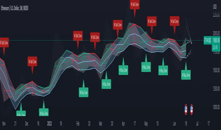
Volume Profile Regression Channel [LuxAlgo]The Volume Profile Regression Channel calculates a volume profile from an anchored linear regression channel. Users can choose the starting and ending points for the indicator calculation interval.
Like a regular volume profile, a "line" of control (LOC), value area, and a developing LOC are displayed.
🔶 SETTINGS
Sections: The number of sections the linear regression channel is divided into for the calculation of the volume profile.
Width %: Determines the length of the profile within the channel relative to the channel length.
Value Area %: Highlights the sections starting from the POC whose accumulated volume is equal to the user-defined percentage of the total profile sections volume.
🔶 USAGES
Regular volume profiles are often constructed from a horizontal price area, this can allow highlighting price areas where most trading activity takes place.
However, when price is strongly trending a classical volume profile can sometimes be more uniform. This is where using an angled volume profile can be useful.
The line of control allows highlighting the section of the channel with the most accumulated volume, this line can be used as a potential future support/resistance. This is where an angled volume profile might be the most useful.
The developing LOC highlights the LOC location at a specific time within the profile (from left to right) and can sometimes provide an estimate of the underlying trend in the price.
🔶 DETAILS
To be computed the script requires a left and right chart time coordinates. When adding the script to their charts users can determine the left and right time coordinates by clicking on the chart.
The linear regression channel width is determined so that the channel precisely encompasses the whole price.
🔶 LIMITATIONS
Using a very large calculation interval can return timeouts. Users can reduce the calculation interval to fix that issue from occurring.
The amount of drawing objects that can be used is limited, as such using a high calculation interval can display an incomplete profile.
🔶 ACKNOWLEDGEMENTS
If you are interested in these types of scripts, @HeWhoMustNotBeNamed published a similar script where users can use a custom line angle. See his 'Angled Volume Profile' script from March 2023.
Regression

MultiMovesCombines 3 different moving averages together with the linear regression. The moving averages are the HMA, EMA, and SMA. The script makes use of two different lengths to allow the end user to utilize common crossovers in order to determine entry into a trade. The edge of each "cloud" is where each of the moving averages actually are. The bar color is the average of the shorter length combined moving averages.
-The Hull Moving Average (HMA), developed by Alan Hull, is an extremely fast and smooth moving average. In fact, the HMA almost eliminates lag altogether and manages to improve smoothing at the same time. A longer period HMA may be used to identify trend.
-The exponential moving average (EMA) is a technical chart indicator that tracks the price of an investment (like a stock or commodity) over time. The EMA is a type of weighted moving average (WMA) that gives more weighting or importance to recent price data.
-A simple moving average (SMA) is an arithmetic moving average calculated by adding recent prices and then dividing that figure by the number of time periods in the calculation average.
-The Linear Regression Indicator plots the ending value of a Linear Regression Line for a specified number of bars; showing, statistically, where the price is expected to be. Instead of plotting an average of past price action, it is plotting where a Linear Regression Line would expect the price to be, making the Linear Regression Indicator more responsive than a moving average.
The lighter colors = default 50 MA
The darker colors = default 200 MA

Advanced Trend Channel Detection (Log Scale)The Advanced Trend Channel Detection (Log Scale) indicator is designed to identify the strongest trend channels using logarithmic scaling. It does this by calculating the highest Pearson's R value among all length inputs and then determining which length input to use for the selected slope, average, and intercept. The script then draws the upper and lower deviation lines on the chart based on the selected slope, average, and intercept, and optionally displays the Pearson's R value.
To use this indicator, you will need to switch to logarithmic scale. There are several advantages to using logarithmic scale over regular scale. Firstly, logarithmic scale provides a better visualization of data that spans multiple orders of magnitude by compressing large ranges of values into a smaller space. Secondly, logarithmic scale can help to minimize the impact of outliers, making it easier to identify patterns and trends in the data. Finally, logarithmic scale is often utilized in scientific contexts as it can reveal relationships between variables that may not be visible on a linear scale.
If the trend channel does not appear on the chart, it may be necessary to scroll back to view historical data. The indicator uses past price data to calculate the trend channel, so if there is not enough historical data visible on the chart, the indicator may not be able to identify the trend channel. In this case, the user should adjust the chart's timeframe or zoom out to view more historical data. Additionally, the indicator may need to be recalibrated if there is a significant shift in market conditions or if the selected length input is no longer appropriate.

Deming Linear Regression [wbburgin]Deming regression is a type of linear regression used to model the relationship between two variables when there is variability in both variables. Deming regression provides a solution by simultaneously accounting for the variability in both the independent and dependent variables, resulting in a more accurate estimation of the underlying relationship. In the hard-science fields, where measurements are critically important to judging the conclusions drawn from data, Deming regression can be used to account for measurement error.
Tradingview's default linear regression indicator (the ta.linreg() function) uses least squares linear regression, which is similar but different than Deming regression. In least squares regression, the regression function minimizes the sum of the squared vertical distances between the data points and the fitted line. This method assumes that the errors or variability are only present in the y-values (dependent variable), and that the x-values (independent variable) are measured without error.
In time series data used in trading, Deming regression can be more accurate than least squares regression because the ratio of the variances of the x and y variables is large. X is the bar index, which is an incrementally-increasing function that has little variance, while Y is the price data, which has extremely high variance when compared to the bar index. In such situations, least squares regression can be heavily influenced by outliers or extreme points in the data, whereas Deming regression is more resistant to such influence.
Additionally, if your x-axis uses variable widths - such as renko blocks or other types of non-linear widths - Deming regression might be more effective than least-squares linear regression because it accounts for the variability in your x-values as well. Additionally, if you are creating a machine-learning model that uses linear regression to filter or extrapolate data, this regression method may be more accurate than least squares.
In contrast to least squares regression, Deming regression takes into account the variability or errors in both the x- and y-values. It minimizes the sum of the squared perpendicular distances between the data points and the fitted line, accounting for both the x- and y-variability. This makes Deming regression more robust in both variables than least squares regression.

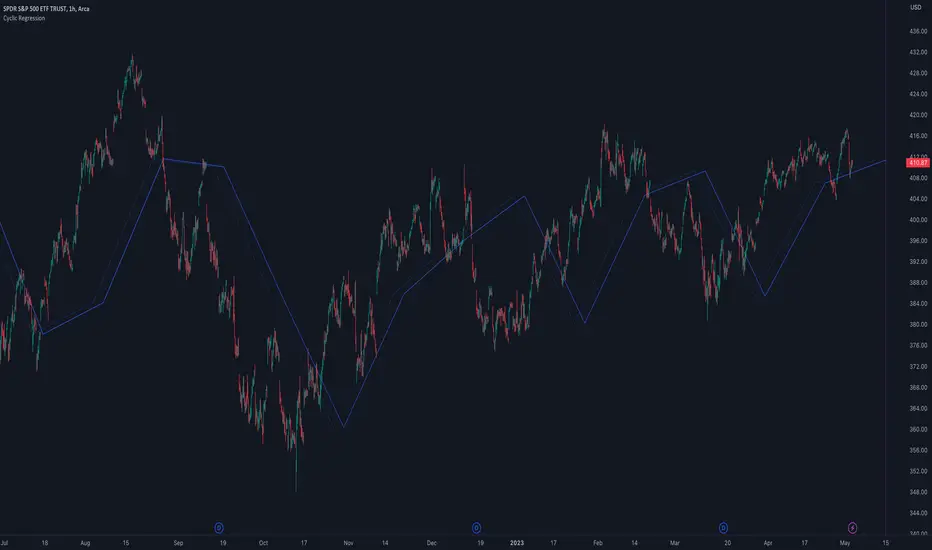
Cyclic RegressionCyclic Regression is a new concept that uses Digital Signal Processing (DSP) to determine the regression of past and future cycles. This is a unique method of regression which has the ability to forecast into the future.
There are several ways to use this tool.
Firstly, it follows similar rules to moving averages and can be used to filter entries. Long entries should be considered when price action is above the line or the line direction is upwards. The opposite is applied for shorts, a downward direction or price action is below.
The regression line is also a strong SR (Support and Resistance) or trend line so traders can expect big moves when this line is broken or a pullback is made after the break.
Each new direction of regression signifies a new cycle so traders can plan for a possible big move when reaching the end of the line.
The Settings are not your typical length or lookback options:
The main modifier is the "Response" input, with this the frequency response for the signal processing can be adjusted. By default it is set at 5000 but this can be boosted to something like 10000 to tune it to bigger cycles.
The other modifiers include sensitivity which will fine tune the response, this can be use with in conjunction with threshold option which adjusts the threshold of the useable response.
There is also the ability to add an external sources to the signal using the source input box. This allows traders to include other sources of data such as volume or RSI.
TrueLevel BandsWhat are TrueLevel Bands ?
TrueLevel Bands is a powerful trading indicator that employs linear regression and standard deviation to create dynamic, envelope-style bands around the price action of a financial instrument. These bands are designed to help traders identify potential support and resistance levels, trend direction, and volatility.
The TrueLevel Bands indicator consists of multiple envelope bands, each constructed using different timeframes or lengths, and a multiple (mult) factor. The multiple factor determines the width of the bands by adjusting the number of standard deviations from the linear regression line.
Key Features of TrueLevel Bands
1. Multi-Timeframe Analysis: Unlike traditional moving average-based indicators, TrueLevel Bands allow traders to incorporate multiple timeframes into their analysis. This helps traders capture both short-term and long-term market dynamics, offering a more comprehensive understanding of price behavior.
2. Customization: The TrueLevel Bands indicator offers a high level of customization, allowing traders to adjust the lengths and multiple factors to suit their trading style and preferences. This flexibility enables traders to fine-tune the indicator to work optimally with various instruments and market conditions.
3. Adaptive Volatility: By incorporating standard deviation, TrueLevel Bands can automatically adjust to changing market volatility. This feature enables the bands to expand during periods of high volatility and contract during periods of low volatility, providing traders with a more accurate representation of market dynamics.
4. Dynamic Support and Resistance Levels: TrueLevel Bands can help traders identify dynamic support and resistance levels, as the bands adjust in real-time according to price action. This can be particularly useful for traders looking to enter or exit positions based on support and resistance levels.
Why TrueLevel Bands are Different from Classic Moving Averages
TrueLevel Bands differ from conventional moving averages in several ways:
1. Linear Regression: While moving averages are based on simple arithmetic means, TrueLevel Bands use linear regression to determine the centerline. This offers a more accurate representation of the trend and helps traders better assess potential entry and exit points.
2. Envelope Style Bands: Unlike moving averages, which are single lines, TrueLevel Bands form envelope-style bands around the price action. This provides traders with a visual representation of potential support and resistance levels, trend direction, and volatility.
3. Multi-Timeframe Analysis: Classic moving averages typically focus on a single timeframe. In contrast, TrueLevel Bands incorporate multiple timeframes, enabling traders to capture a broader understanding of market dynamics.
4. Adaptive Volatility: Traditional moving averages do not account for changing market volatility, whereas TrueLevel Bands automatically adjust to volatility shifts through the use of standard deviation.
The TrueLevel Bands indicator is a powerful, versatile tool that offers traders a unique approach to technical analysis. With its ability to adapt to changing market conditions, provide multi-timeframe analysis, and dynamic support and resistance levels, TrueLevel Bands can serve as an invaluable asset to both novice and experienced traders looking to gain an edge in the markets.

Regression Envelope MTFThe Regression Envelope MTF indicator is a technical analysis tool that uses linear regression to identify potential price reversal points in the market. The indicator plots a linear regression line based on the selected price source over a specified length, and adds and subtracts a multiple of the standard deviation to create upper and lower bands around the line.
One advantage of using linear regression over the traditional envelope indicator is that it takes into account the slope of the trend, rather than assuming that the trend is linear. This means that the bands will adapt to the slope of the trend, which can provide more accurate signals in trending markets.
Another advantage of using linear regression over a simple moving average (SMA) is that it is less sensitive to outliers. SMAs can be heavily influenced by extreme values in the data, which can result in false signals. Linear regression, on the other hand, is more robust to outliers, which can lead to more reliable signals.
Overall, the Regression Envelope MTF indicator can be a useful tool for traders and investors looking to identify potential price reversal points and generate trading signals. However, it should be used in conjunction with other technical analysis tools and with proper risk management strategies in place.

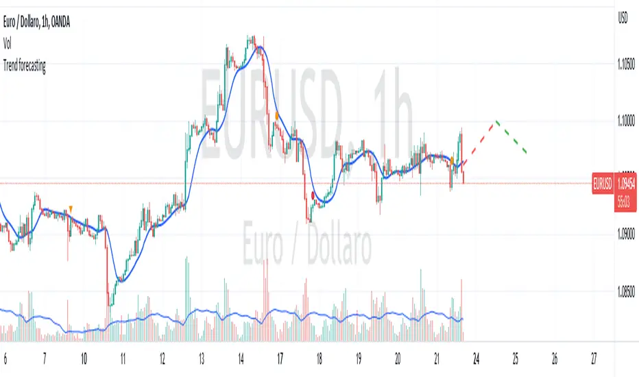
Trend forecasting by c00l75----------- ITALIANO -----------
Questo codice è uno script di previsione del trend creato solo a scopo didattico. Utilizza una media mobile esponenziale (EMA) e una media mobile di Hull (HMA) per calcolare il trend attuale e prevedere il trend futuro. Il codice utilizza anche una regressione lineare per calcolare il trend attuale e un fattore di smorzamento per regolare l’effetto della regressione lineare sulla previsione del trend. Infine il codice disegna due linee tratteggiate per mostrare la previsione del trend per i periodi futuri specificati dall’utente. Se ti piace l'idea mettimi un boost e lascia un commento!
----------- ENGLISH -----------
This code is a trend forecasting script created for educational purposes only. It uses an exponential moving average (EMA) and a Hull moving average (HMA) to calculate the current trend and forecast the future trend. The code also uses a linear regression to calculate the current trend and a damping factor to adjust the effect of the linear regression on the trend prediction. Finally, the code draws two dashed lines to show the trend prediction for future periods specified by the user. If you like the idea please put a boost and leave a comment!
Regression Channel Alternative MTF V2█ OVERVIEW
This indicator is a predecessor to Regression Channel Alternative MTF , which is coded based on latest update of type, object and method.
█ IMPORTANT NOTES
This indicator is NOT true Multi Timeframe (MTF) but considered as Alternative MTF which calculate 100 bars for Primary MTF, can be refer from provided line helper.
The timeframe scenarios are defined based on Position, Swing and Intraday Trader.
Suppported Timeframe : W, D, 60, 15, 5 and 1.
Channel drawn based on regression calculation.
Angle channel is NOT supported.
█ INSPIRATIONS
These timeframe scenarios are defined based on Harmonic Trading : Volume Three written by Scott M Carney.
By applying channel on each timeframe, MW or ABCD patterns can be easily identified manually.
This can also be applied on other chart patterns.
█ CREDITS
Scott M Carney, Harmonic Trading : Volume Three (Reaction vs. Reversal)
█ TIMEFRAME EXPLAINED
Higher / Distal : The (next) longer or larger comparative timeframe after primary pattern has been identified.
Primary / Clear : Timeframe that possess the clearest pattern structure.
Lower / Proximate : The (next) shorter timeframe after primary pattern has been identified.
Lowest : Check primary timeframe as main reference.
█ FEATURES
Color is determined by trend or timeframe.
Some color is depends on chart contrast color.
Color is determined by trend or timeframe.
█ EXAMPLE OF USAGE / EXPLAINATION

Autoregressive Covariance Oscillator by TenozenWell to be honest I don't know what to name this indicator lol. But anyway, here is my another original work! Gonna give some background of why I create this indicator, it's all pretty much a coincidence when I'm learning about time series analysis.
_ _ _ _ _ _ _ _ _ _ _ _ _ _ _ _ _ _ _ _ _ _ _ _ _ _ _ _ _ _ _ _ _ _ _ _ _
Well, the formula of Auto-covariance is:
E{(X(t)-(t) * (X(t-s)-(t-s))}= Y_s
But I don't multiply both values but rather subtract them:
E{(X(t)-(t) - (X(t-s)-(t-s))}= Y_s?
_ _ _ _ _ _ _ _ _ _ _ _ _ _ _ _ _ _ _ _ _ _ _ _ _ _ _ _ _ _ _ _ _ _ _ _ _
For arm_vald, the equation is as follows:
arm_vald = val_mu + mu_plus_lsm + et
val_mu --> mean of time series
mu_plus_lsm --> val_mu + LSM
et --> error term
As you can see, val_mu^2. I did this so the oscillator is much smoother.
_ _ _ _ _ _ _ _ _ _ _ _ _ _ _ _ _ _ _ _ _ _ _ _ _ _ _ _ _ _ _ _ _ _ _ _ _
After I get the value, I normalize them:
aco = Y_s? / arm_vald
So by this calculation, I get something like an oscillator!
(more details in the code)
_ _ _ _ _ _ _ _ _ _ _ _ _ _ _ _ _ _ _ _ _ _ _ _ _ _ _ _ _ _ _ _ _ _ _ _ _
So how to use this indicator? It's so easy! If the value is above 0, we gonna expect a bullish response, if the value is below 0, we gonna expect a bearish response; that simple. Be aware that you should wait for the price to be closed before executing a trade.
Well, try it out! So far this is the most powerful indicator that I've created, hope it's useful. Ciao.
(more updates for the indicator if needed)

Capital Line PackThe Capital Line Pack ( CLP ) indicator is a technical analysis tool that is designed to help traders and investors identify potential buying and selling opportunities in financial markets by using, inter alia, kernel regression methodoliges. It is a standalone indicator that can be placed on top of price chart displaying the Base MA, Capital Line and standard deviation bands.
The Capital Line is calculated based on volatility, measured by a z-scores* of a selected price source and a moving average (Base MA). The Base MA serves as the foundation for the Capital Line calculation and plays a critical role in determining its behavior and responsiveness to price movements. By selecting different types of moving averages as the Base MA, traders can adjust the sensitivity of the Capital Line to changes in market conditions, which can impact the signals generated by the indicator. The Base MA can be set at the user's choice including: SMA, EMA, Volume Weighted Moving Average (VWMA), Kernel Regression MA, HEMA, DEMA, T3.
For example, if a trader selects a EMA as the Base MA, the Capital Line will respond more quickly to changes in price compared to a more smoothed moving average, like a Volume Weighted Moving Average (VWMA) or Kernel Regression MA. This means that the Capital Line will be more sensitive to short-term price fluctuations with a EMA as the Base MA, while a VWMA or Kernel Regression MA will be less reactive to short-term price movements and more focused on longer-term trends.
Therefore, the choice of Base MA can have a significant impact on the behavior of the Capital Line, and traders need to select the most appropriate Base MA that suits their trading strategy and risk management preferences.
*The z-scores are calculated by comparing the current price to the average price over a certain period of time, and then dividing the difference by the standard deviation of the prices over that same period of time.
The Bands are calculated by adding and subtracting a standard deviation from the Base MA.
Bands help identify the volatility of the market, and when the bands are narrow, it suggests that the market is in a range-bound or flat period.
Indicator incorporates trade signals (labels and alerts). The method by which signals are generated can be selected by the user from several options:
Cap line color switch: Turning blue when it rises and red when it starts to fall.
Cap Line crosses the Base MA: This can be useful when the Base MA is weighted, for example, by volume, and the Cap Line Bandwidth and Relative weighting are set to small values.
Price crosses the Base MA: This is a popular and widely-used method that can provide reliable signals during trending market conditions. However, it may generate false signals during range-bound or flat market conditions.
Crossing of secondary MAs which can be selected in the indicator settings: This method provides traders with more flexibility and control over the signals generated by the indicator, but it may also be more complex and require more advanced technical analysis skills.
One of the standout features of our indicator is the ability to choose from several different style themes:
Pro
Modern
and Stealth
The "Pro" and "Modern" themes offer a clean and visually appealing display, while the "Stealth" theme is perfect for traders who want to focus on the price action or other indicators. The "Stealth" theme shades all the elements of the indicator while still keeping them in the field of visibility, allowing traders to concentrate on the most important aspects of their charts.
In addition to its trade signals, alerts, labels, and customizable themes, the indicator also offers several trend highlighting options to help traders visually backtest their trades. These options include candle coloring, background coloring, and highlighting with a histogram.
The candle coloring feature allows traders to customize the color of the candlesticks on their chart based on the direction of the trend. For example, bullish candles could be colored in teal, while bearish candles could be colored purple etc. This can make it easier for traders to identify trend movements and backtest their strategy.
The background coloring feature works similarly to the candle coloring feature, but it applies a color to the background of the chart rather than the candlesticks. This can be a useful way to highlight trends on the chart without obscuring the price action.
The histogram highlighting feature displays a histogram on the chart to show the difference between the upper and lower bands. This can be a useful way to visualize the strength of the trend and backtest trades based on the histogram readings.
NB! Remember, it is important to have a solid trading plan in place and to properly manage risk when trading.
Some traders may, depending upon customized settings, use the Capital Line as a capital risk management feature in trading. Our Capital Line indicator can be a useful tool, but it should not be the only factor considered when making trade decisions.
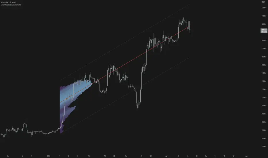
Linear Regression Volume ProfileLinear Regression Volume Profile plots the volume profile fixated on the linear regression of the lookback period rather than statically across y = 0. This helps identify potential support and resistance inside of the price channel.
Settings
Linear Regression
Linear Regression Source: the price source in which to sample when calculating the linear regression
Length: the number of bars to sample when calculating the linear regression
Deviation: the number of standard deviations away from the linear regression line to draw the upper and lower bounds
Linear Regression
Rows: the number of rows to divide the linear regression channel into when calculating the volume profile
Show Point of Control: toggle whether or not to plot the level with highest amount of volume
Usage
Similar to the traditional Linear Regression and Volume Profile this indicator is mainly to determine levels of support and resistance. One may interpret a level with high volume (i.e. point of control) to be a potential reversal point.
Details
This indicator first calculates the linear regression of the specified lookback period and, subsequently, the upper and lower bound of the linear regression channel. It then divides this channel by the specified number of rows and sums the volume that occurs in each row. The volume profile is scaled to the min and max volume.
Linear Regress on Price And VolumeLinear regression is a statistical method used to model the relationship between a dependent variable and one or more independent variables. It assumes a linear relationship between the dependent variable and the independent variable(s) and attempts to fit a straight line that best describes the relationship.
In the context of predicting the price of a stock based on the volume, we can use linear regression to build a model that relates the price of the stock (dependent variable) to the volume (independent variable). The idea is to use lookback period to predict future prices based on the volume.
To build this indicator, we start by collecting data on the price of the stock and the volume over a selected of time or by default 21 days. We then plot the data on a scatter plot with the volume on the x-axis and the price on the y-axis. If there is a clear pattern in the data, we can fit a straight line to the data using a method called least squares regression. The line represents the best linear approximation of the relationship between the price and the volume.
Once we have the line, we can use it to make predictions. For example, if we observe a certain volume, we can use the line to estimate the corresponding price.
It's worth noting that linear regression assumes a linear relationship between the variables. In reality, the relationship between the price and the volume may be more complex, and other factors may also influence the price of the stock. Therefore, while linear regression can be a useful tool, it should be used in conjunction with other methods and should be interpreted with caution.
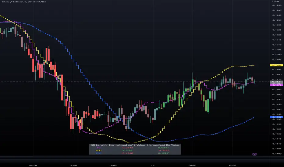
Triple Quadratic Regression - Supplementary UnderlayThis indicator is supplementary to our Triple Quadratic Regression overlaid indicator (which includes three step lines - a fast (fuchsia), a medium (yellow), and a slow (blue) quadratic regression line to help the user obtain a clearer picture of current trends).
Quadratic regression is better suited to determining (and predicting) trend than linear regression ; y = ax^2 + bx + c is better to use than a simple y = ax + b. Calculating the regression involves five summation equations that utilize the bar index (x1), the price source (defaulted to ohlc4), the desired lengths, and the square of x1. Determining the coefficient values requires an additional step that factors in the simple moving average of the source, bar index, and the squared bar index.
Instead of overlaying the three quadratic regression lines themselves, this underlaid indicator is used to show the normalized (-1 to +1) values of ax^2 and bx. The color of the lines and histogram match the associated lines on our overlaid indicator. Here, the solid fuchsia line is the fast QR's normalized ax^2 value, the solid yellow line is the mid QR's normalized ax^2 value, and the solid blue line is the slow QR's normalized ax^2 value. The histograms reflect the normalized bx values. In addition to these, the momentum of the ax^2 values was calculated and represented as a dotted line of the same colors.
Bar color is influenced by the values of ax^2 and bx of the fast and medium length regressions. If ax^2 and bx for both the fast and medium lengths are above 0, the bar color is green. If they are both under 0, the bar color is red. Otherwise, bars are colored gray.
When combined with our overlaid Triple Quadratic Regression indicator and the Triple Quadratic Regression Macro Score strategy (part of the LeafAlgo Premium Macro Strategies) to gather all of the information possible, your chart should look like this:

Triple Quadratic Regression (w/ Normalized Value Table)This indicator draws three step lines - a fast (fuchsia), a medium (yellow), and a slow (blue) quadratic regression line to help the user obtain a clearer picture of current trends. Quadratic regression is better suited to determining (and predicting) trend than linear regression; y = ax^2 + bx + c is better to use than a simple y = ax + b. Calculating the regression involves five summation equations that utilize the bar index (x1), the price source (defaulted to ohlc4), the desired lengths, and the square of x1. Determining the coefficient values requires an additional step that factors in the simple moving average of the source, bar index, and the squared bar index.
In addition to the plotted lines, a change in bar color and a table were added. The bar color is influenced by the values of ax^2 and bx of the fast and medium length regressions. If ax^2 and bx for both the fast and medium lengths are above 0, the bar color is green. If they are both under 0, the bar color is red. Otherwise, bars are colored gray. In the table, located at the bottom of the chart (but can be moved), the ax^2 and bx values for each regression length are shown. The option to view normalized (scale of -1 to +1) values or the standard values is included in the indicator settings menu. By default, the normalized values are shown.
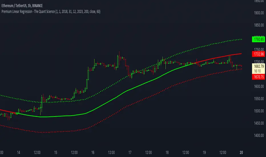
Premium Linear Regression - The Quant ScienceThis script calculates the average deviation of the source data from the linear regression. When used with the indicator, it can plot the data line and display various pieces of information, including the maximum average dispersion around the linear regression.
The code includes various user configurations, allowing for the specification of the start and end dates of the period for which to calculate linear regression, the length of the period to use for the calculation, and the data source to use.
The indicator is designed for multi-timeframe use and to facilitate analysis for traders who use regression models in their analysis. It displays a green linear regression line when the price is above the line and a red line when the price is below. The indicator also highlights areas of dispersion around the regression using circles, with bullish areas shown in green and bearish areas shown in red.
VHF Adaptive Linear Regression KAMAIntroduction
Heyo, in this indicator I decided to add VHF adaptivness, linear regression and smoothing to a KAMA in order to squeeze all out of it.
KAMA:
Developed by Perry Kaufman, Kaufman's Adaptive Moving Average (KAMA) is a moving average designed to account for market noise or volatility. KAMA will closely follow prices when the price swings are relatively small and the noise is low. KAMA will adjust when the price swings widen and follow prices from a greater distance. This trend-following indicator can be used to identify the overall trend, time turning points and filter price movements.
VHF:
Vertical Horizontal Filter (VHF) was created by Adam White to identify trending and ranging markets. VHF measures the level of trend activity, similar to ADX DI. Vertical Horizontal Filter does not, itself, generate trading signals, but determines whether signals are taken from trend or momentum indicators. Using this trend information, one is then able to derive an average cycle length.
Linear Regression Curve:
A line that best fits the prices specified over a user-defined time period.
This is very good to eliminate bad crosses of KAMA and the pric.
Usage
You can use this indicator on every timeframe I think. I mostly tested it on 1 min, 5 min and 15 min.
Signals
Enter Long -> crossover(close, kama) and crossover(kama, kama )
Enter Short -> crossunder(close, kama) and crossunder(kama, kama )
Thanks for checking this out!
--
Credits to
▪️@cheatcountry – Hann Window Smoohing
▪️@loxx – VHF and T3
▪️@LucF – Gradient
Dynamic Linear Regression Oscillator | AdulariDescription:
This dynamic linear regression oscillator visualizes the general price trend of specific ranges in the chart based on the linear regression calculation, it automatically determines these ranges with pivot detection. The central line of the indicator is the baseline of the linear regression itself. This is a good tool to use to determine when a price is unusually far away from its baseline. The lines above or below it are overbought and oversold zones. These zones are based on the high or low of the range, in combination with the set multipliers.
The overbought and oversold lines indicate support and resistance; when the prices stay outside these levels for a significant period of time, a reversal can be expected soon. When the oscillator's value crosses above the signal or smoothed line the trend may become bullish. When it crosses below, the trend may become bearish.
This indicator is quite special, as it first determines price ranges using pivot detection. It then uses the middle of the range to determine how far the current price is from the baseline. This value is then rescaled compared to a set amount of bars back, putting it into relevant proportions with the current price action.
How do I use it?
Never use this indicator as standalone trading signal, it should be used as confluence.
When the value crosses above the signal this indicates the current bearish trend is getting weak and may reverse upwards.
When the value crosses below the signal this indicates the current bullish trend is getting weak and may reverse downwards.
When the value is above the middle line this shows the bullish trend is strong.
When the value is below the middle line this shows the bearish trend is strong.
When the value crosses above the upper line this indicates the trend may reverse downwards.
When the value crosses below the lower line this indicates the trend may reverse upwards.
Features:
Oscillator value indicating how far the price has currently deviated from the middle of the range. Proportioned to data from a set amount of bars ago.
Signal value to indicate whether or not the price is abnormally far from the middle of the range.
Horizontal lines such as oversold, overbought and middle lines, indicating possible reversal zones.
Automatic range detection using pivots.
Built-in rescaling functionality to ensure values are proportionate with the latest data.
How does it work? (simplified)
1 — Calculate the middle of the range.
2 — Define whether the current price is above the middle of the range or below.
3 — If above the middle of the range, calculate the difference of the current high and the middle line. If below, calculate the difference of the current low and the middle line.
4 — Smooth the value using a set moving average type.
5 — Rescale the value to proportionate it with the latest data.

Nadaraya-Watson: Envelope (Non-Repainting)Due to popular request, this is an envelope implementation of my non-repainting Nadaraya-Watson indicator using the Rational Quadratic Kernel. For more information on this implementation, please refer to the original indicator located here:
What is an Envelope?
In technical analysis, an "envelope" typically refers to a pair of upper and lower bounds that surrounds price action to help characterize extreme overbought and oversold conditions. Envelopes are often derived from a simple moving average (SMA) and are placed at a predefined distance above and below the SMA from which they were generated. However, envelopes do not necessarily need to be derived from a moving average; they can be derived from any estimator, including a kernel estimator such as Nadaraya-Watson.
How to use this indicator?
Overall, this indicator offers a high degree of flexibility, and the location of the envelope's bands can be adjusted by (1) tweaking the parameters for the Rational Quadratic Kernel and (2) adjusting the lookback window for the custom ATR calculation. In a trending market, it is often helpful to use the Nadaraya-Watson estimate line as a floating SR and/or reversal zone. In a ranging market, it is often more convenient to use the two Upper Bands and two Lower Bands as reversal zones.
How are the Upper and Lower bounds calculated?
In this indicator, the Rational Quadratic (RQ) Kernel estimates the price value at each bar in a user-defined lookback window. From this estimation, the upper and lower bounds of the envelope are calculated based on a custom ATR calculated from the kernel estimations for the high, low, and close series, respectively. These calculations are then scaled against a user-defined multiplier, which can be used to further customize the Upper and Lower bounds for a given chart.
How to use Kernel Estimations like this for other indicators?
Kernel Functions are highly underrated, and when calibrated correctly, they have the potential to provide more value than any mundane moving average. For those interested in using non-repainting Kernel Estimations for technical analysis, I have written a Kernel Functions library that makes it easy to access various well-known kernel functions quickly. The Rational Quadratic Kernel is used in this implementation, but one can conveniently swap out other kernels from the library by modifying only a single line of code. For more details and usage examples, please refer to the Kernel Functions library located here:

Regression Fit Bollinger Bands [Spiritualhealer117]This indicator is best suited for mean reversion trading, shorting at the upper band and buying at the lower band, but it can be used in all the same ways as a standard bollinger band.
It differs from a normal bollinger band because it is centered around the linear regression line, as opposed to the moving average line, and uses the linear regression of the standard deviation as opposed to the standard deviation.
This script was an experiment with the new vertical gradient fill feature.

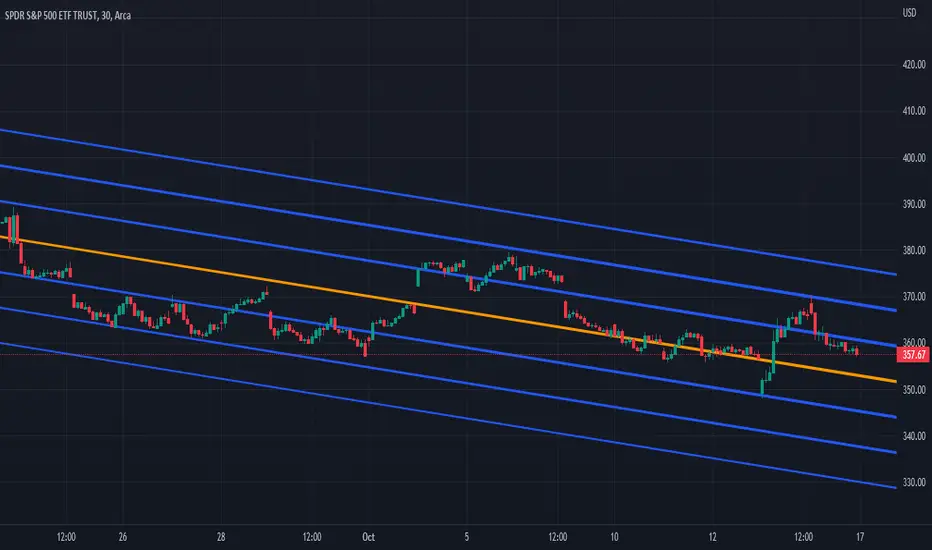
Three Linear Regression ChannelsPlot three linear regression channels using alexgrover 's Computing The Linear Regression Using The WMA And SMA indicator for the linear regression calculations.
Settings
Length : Number of inputs to be used
Source : Source input of the indicator
Midline Colour : The colour of the midline
Channel One, Two, and Three Multiplicative Factor : Multiplication factor for the RMSE, determine the distance between the upper and lower level
Channel One, Two, and Three Colour : The channel's lines colour
Usage
For usage details, please refer to alexgrover 's Computing The Linear Regression Using The WMA And SMA indicator.
Multi-Optimized Linear Regression ChannelA take on alexgrover 's Optimized Linear Regression Channel script which allows users to apply multiple linear regression channel with unique multiplicative factors.
Multiplicative Factors
Adjust the amount of channels and multiplicative factors of existing or additional channels using the "Mults" input.
An input of "1" creates a single linear regression channel with the multiplicative factor of one.
An input of "4" creates a single linear regression channel with the multiplicative factor of four.
An input of "1,4" creates two linear regression channels with multiplicative factors of one and four.
An input of "1,2,3" creates three linear regression channels with multiplicative factors of one, two, and three.
DB Change Forecast ProDB Change Forecast Pro
What does the indicator do?
The DB Change Forecast Pro is a unique indicator that uses price change on HLC3 to detect buy and sell periods along with plotting a linear regression price channel with oversold and undersold zones. It also has a linear regression change forecast mode to optionally project market direction.
Change is calculated by taking a two-bar change of HLC3 and dividing that by the price or, optionally, a fixed divisor.
A fast-moving change cloud is then calculated and displayed as the "regular version" plot (shown in light gray). When the cloud bottom is above low, a buy zone is detected. When the cloud top is below the high, a sell zone is detected.
The linear regression price channel is calculated similarly but using a much slower change rate. The linear regression price channel shows reasonable high, low and HLC3 ranges. At the bar's opening, the channel will be more compact and come fairly accurate about 1/4 into the bar timeframe.
The change forecasted price is projected on the right side of the current bar to indicate the current timeframe direction. Please note this forecasting feature is shown in orange when it's early in the timeframe and gray when the timeframe is more likely to produce an accurate direction forecast for the upcoming bar.
You can use these projected dashed lines to see possible market movements for the Current bar and possible market direction for the next bar. Kindly note these projects change; they should be used to understand possible extreme highs/lows for the current bar or market direction.
The indicator includes an optional change forecast projection feature hidden by default. It will project the market forecast channel with an offset of 1. The forecast is defaulted to an offset of 1 to show market direction. However, you can modify to zero the offset to show the current bar forecast and forecast history.
How should this indicator be used?
First, very important,
1. Settings > Set Symbol to Desired
2. Settings > Set High Timeframe to "Chart"
3. Settings > Ensure "Use price as divisor" is checked.
It's recommended to use this indicator in higher timeframes. Buy and sell signals are displayed in real-time. However, waiting until 1/4 to 1/2 into the current bar is recommended before taking action, and change can happen.
The buy/sell signals (zones) provide recommendations on playing a long vs. a short. When in a buy sone, only play longs. When in a sell zone, only play shorts.
Then use the linear regression price channel oversold and undersold zones to optionally open and close positions within the buy/sell zones.
For example, consider opening a long in a buy zone when the linear regression price channel shows undersold. Then consider closing the long when the price moves into the linear regression oversold or higher. Then repeat as long as it's in the buy zone. Then vice versa for sell zones and shorting.
At basic design, buy in the buy zone, sell or short in the sell zone. If you are up for higher trading frequencies, use the linear regression price channel as described in the example above.
Please note, as, with all indicators, you may need to adjust to fit the indicator to your symbol and desired timeframe.
This is only an example of use. Please use this indicator as your own risk and after doing your due diligence.
Does the indicator include any alerts?
Yes,
"DB CFHLC3: Signal BUY" - Is triggered when a buy signal is fired.
"DB CFHLC3: Signal SELL" - Is triggered when a sell signal is fired.
"DB CFHLC3: Zone BUY" - Is triggered when a buy zone is detected.
"DB CFHLC3: Zeon SELL" - Is triggered when a sell zone is detected.
"DB CFHLC3: Oversold SELL" - Is triggered when the price exceeds the oversold level.
"DB CFHLC3: Undersold BUY" - Is triggered when the price goes below the undersold level.
Any other tips?
Once you have configured the indicator for your symbol and chart timeframe. Meaning the plots are displayed over the price. Check out larger timeframes such as W, 2W, 3W, 4W, M, and 4M. It works wonderfully for showing market lows and highs for long-term investing too!
Another, tip is to combine it with your favorite indicator, such as TTM Squeeze or MACD for confirmation purposes. You may be surprised how fast the indicator shows market direction changes on higher timeframes.
You can just as easily use a high timeframe such as D, 2D, or 3D for day trading due to how the linear price channel works.
Why am I not selling this indicator?
I would like to bless the TradingView community, and I enjoy publishing custom indicators.
If you enjoy this indicator, please consider leaving a thumbs up or a comment for others to know about your experience or recommendations.
Enjoy!