Arkham ORB Indicator 3.815-Minute ORB Breakout Indicator with Volume Confirmation & Dynamic Risk Management
This closed-source indicator identifies high-probability breakout opportunities during the New York session open (8:30-9:30 AM ET) using a systematic Opening Range Breakout methodology combined with volume validation and adaptive volatility-based risk management.
Core Methodology - How It Works
Opening Range Framework
The indicator establishes the Opening Range by tracking the high and low of the first 15 minutes of the trading session (8:30-8:45 AM ET). This range represents the initial price discovery zone where early participants establish equilibrium. Breakouts above the high or below the low signal potential directional moves as liquidity enters the market during the full NY session.
Volume-Based Breakout Validation
To distinguish genuine breakouts from false moves, the indicator employs a rolling volume analysis system. It calculates a 12-period median of volume and applies a 1.2x threshold multiplier. Only price movements accompanied by volume exceeding this threshold are flagged as valid breakout signals. This approach filters out low-conviction breakouts that often occur in choppy, low-participation conditions and significantly reduces false signals at ORB levels.
Adaptive Volatility-Based Stop Loss Calculation
Unlike fixed-point stop losses, this indicator uses a dynamic calculation based on a 10-day lookback of historical ORB ranges. The stop loss is derived by analyzing recent Opening Range sizes and applying a 0.5x multiplier to the average. This creates three key advantages:
Compression adaptation: When recent ORBs shrink (low volatility), stops automatically tighten to reduce risk exposure
Expansion adaptation: When recent ORBs expand (high volatility), stops widen to prevent premature exits on legitimate moves
Hybrid intelligence: The system detects outlier volatility days by comparing current ORB size to the 10-day average. When divergence exceeds 50%, it recognizes abnormal conditions and adjusts stop placement accordingly rather than blindly using historical averages
Multi-Entry Risk Framework
The indicator recognizes that different traders enter at different points relative to the ORB level. It provides simultaneous risk calculations for three entry strategies:
Direct ORB Entry (0-point offset): Immediate breakout entries at the ORB high/low
Pullback Entry 1 (default 5.5 points): Conservative entries waiting for initial retracements
Pullback Entry 2 (default 11.0 points): Deeper retest entries for very conservative approaches
Each entry type displays independently calculated metrics (stop loss distance, contract sizing, take profit levels) that account for the actual entry point's distance from the ORB level. This ensures accurate position sizing and risk/reward ratios regardless of which entry method you use.
Smart Volatility Detection & Alerts
The indicator continuously compares the current day's ORB size against the 10-day historical average. When divergence exceeds a configurable threshold (default 50%), it alerts you to abnormal market conditions:
Compression warnings: When today's ORB is 50%+ smaller than average (potential low-volatility trap)
Expansion warnings: When today's ORB is 50%+ larger than average (potential news event or unusual volatility)
This allows you to adjust expectations and position sizing based on whether current conditions match your backtested historical environment.
Risk Management Safeguards
Min/Max Stop Loss Caps
To prevent extreme stop placements in unusual conditions:
Minimum stop: 35 points (prevents overly tight stops that get hit by noise)
Maximum stop: 75 points (caps risk exposure during extreme volatility events)
Both caps are fully adjustable and can be toggled on/off
Contract Rounding & Risk Display
The indicator automatically rounds to whole contracts and displays real-time risk metrics including:
Suggested stop loss level (adjusted for entry offset + volatility)
Number of contracts (sized to your account risk parameters)
Suggested take profit level (maintains your configured risk/reward ratio)
Dollar risk and potential profit for each entry type
What Makes This Original
This indicator combines several methodological elements that work together as a cohesive risk management system:
Volume confirmation prevents trading every ORB breakout indiscriminately
Adaptive volatility stops ensure your risk scales with current market conditions, not fixed assumptions
Multi-entry framework provides accurate calculations for various entry styles without requiring separate indicators
Outlier detection warns when today's conditions deviate significantly from your backtested norms
Integrated position sizing removes the mental math from determining contracts and risk/reward
Rather than simply plotting ORB levels or using fixed stops, this system adapts to changing volatility while validating breakouts with participation metrics.
How to Use It
Apply to a 5-minute chart of futures instruments (optimized for MNQ/NQ)
Set your account risk parameters in settings (account size, risk per trade %)
Monitor the ORB formation period (8:30-8:45 AM ET) - levels will be drawn
Watch for breakout signals during 8:45-9:30 AM ET with volume confirmation
Choose your entry style from the three displayed options based on your risk tolerance
Use the suggested stops and targets from the real-time risk table
Pay attention to volatility warnings - adjust position sizing if conditions are abnormal
Fully Customizable Settings
All parameters used in the indicator's calculations are user-adjustable, allowing you to adapt the system to your trading style and risk tolerance:
ORB Configuration
ORB formation period start/end times
Entry offset distances (Entry 1 and Entry 2 point values)
Display toggles for each entry type
Volume Analysis
Volume lookback period (default: 12)
Volume multiplier threshold (default: 1.2x)
Toggle volume filtering on/off
Stop Loss Calculation
Historical lookback period (default: 10 days)
Stop loss multiplier (default: 0.5x)
Calculation method: Historical Average, Current Day ORB, or Hybrid
Minimum stop cap (default: 35 points)
Maximum stop cap (default: 75 points)
Toggle min/max caps on/off
Volatility Alerts
Divergence threshold for outlier detection (default: 50%)
Alert display toggles
Risk Management
Account size
Risk percentage per trade
Risk/reward ratio for take profit calculations
Display Options
Table positions and sizes (compact mode)
Color schemes
Show/hide individual components
This flexibility allows you to backtest different parameter combinations and optimize the indicator for current market conditions or your specific trading approach. You are in full control of the calculations - the indicator simply automates the math based on your inputs.
Ideal For
Futures traders (MNQ/NQ) seeking a systematic, rule-based approach to NY session open breakouts with pre-calculated risk parameters that automatically adapt to changing market volatility. Particularly useful for traders who want to eliminate emotional decision-making around stop placement and position sizing.
Important Disclaimers
No Financial Advice
This indicator is provided for educational and informational purposes only. It does not constitute financial advice, investment advice, trading advice, or any other sort of advice. You should not treat any of the indicator's content, outputs, or signals as such. The author is not a licensed financial advisor.
Risk Warning
Trading futures and derivatives involves substantial risk of loss and is not suitable for all investors. Past performance of any trading system or methodology is not necessarily indicative of future results. You should carefully consider whether trading is appropriate for you in light of your experience, objectives, financial resources, and other relevant circumstances.
No Performance Guarantees
While this indicator is designed to identify high-probability setups based on historical analysis, there is no guarantee of profitable results. Market conditions change, and what worked in backtesting may not work in live trading. Due to the leveraged nature of futures trading, losses can significantly exceed your initial investment.
Use at Your Own Risk
All trading decisions made based on this indicator are your sole responsibility. The author assumes no responsibility for your trading results, losses, or any damages resulting from the use of this indicator. Always use proper risk management and never risk more than you can afford to lose.
Backtesting vs. Live Trading
Results generated from backtesting may not reflect actual trading performance due to factors including but not limited to: slippage, commissions, market liquidity, emotional decision-making, and differences between historical and real-time data.
Not a Guarantee of Accuracy
While efforts have been made to ensure the indicator functions as described, no software is perfect. You are responsible for verifying the indicator's calculations and outputs before making any trading decisions.
EMAS

Damo's Custom EMA Bands 1.0I was making these manually for a long time. They just give me more peace of mind when I'm using EMAs. They feel more like a net catching price. These are easy to make. All they are is 3 EMAs with the Source at High, Low and (H+L)/2 for the midpoint.
I find on a 3-Day chart on BTC the 100 EMA is great for telling what trend we're are in.
i.postimg.cc
TTM (Trade The Matrix) Squeeze EMA Cloud
Another way to simply visualize the TTM squeeze but this time with a simpe 2 EMA cloud representation. Fully customizable - change EMA, color, & squeeze to your liking
The **"TTM Squeeze EMA Cloud"** is a **custom TradingView Pine Script (v6)** indicator that **combines the classic TTM Squeeze volatility logic** with a **colored EMA cloud** to visually represent **market state**:
- **Consolidation (Squeeze ON)**
- **Bullish Breakout (Squeeze OFF + Uptrend)**
- **Bearish Breakout (Squeeze OFF + Downtrend)**
It overlays directly on the price chart (`overlay=true`) and uses **color-coded cloud shading** between two EMAs to make the current regime **immediately visible**.
---
## CORE COMPONENTS
| Component | Purpose |
|--------|--------|
| **TTM Squeeze** | Detects low-volatility consolidation (Squeeze ON) vs. volatility expansion (Squeeze OFF) |
| **EMA Cloud** | Fast EMA (8) vs. Slow EMA (21) → determines trend direction |
| **Cloud Fill** | Colors the area between EMAs based on **Squeeze + Trend** |
| **Visual Cues** | Tiny yellow dots below bars when Squeeze is ON |
---
## USER INPUTS (Customizable)
| Input | Default | Description |
|------|--------|-----------|
| `length` | 20 | Period for Bollinger Bands & SMA basis |
| `mult` | 2.0 | Bollinger Band multiplier |
| `lengthKC` | 20 | Period for ATR in Keltner Channels |
| `multKC` | 1.5 | Keltner Channel multiplier |
| `fastLength` | 8 | Fast EMA length |
| `slowLength` | 21 | Slow EMA length |
> These are standard settings — tweak for sensitivity.
---
## CALCULATIONS (Step-by-Step)
### 1. **Bollinger Bands (BB)**
```pinescript
ma = ta.sma(close, length)
stdDev = ta.stdev(close, length)
upperBB = ma + stdDev * mult
lowerBB = ma - stdDev * mult
```
- Measures **statistical volatility**
### 2. **Keltner Channels (KC) – ATR-based**
```pinescript
atrValue = ta.atr(lengthKC)
upperKC = ma + atrValue * multKC
lowerKC = ma - atrValue * multKC
```
- Measures **true range volatility** (more adaptive than stdev)
### 3. **TTM Squeeze Condition**
```pinescript
squeezeOn = (lowerBB > lowerKC) and (upperBB < upperKC)
```
- **True** when **BB is completely inside KC** → **Low volatility = Consolidation**
- **False** → **Volatility expanding = Breakout phase**
---
### 4. **EMA Cloud (Trend Filter)**
```pinescript
fastEma = ta.ema(close, fastLength) // 8-period
slowEma = ta.ema(close, slowLength) // 21-period
```
- Fast EMA reacts quickly, Slow EMA is smoother
- **Trend = fastEma > slowEma → Bullish**, otherwise Bearish
---
### 5. **Cloud Coloring Logic**
| Condition | Cloud Color | Meaning |
|--------|------------|--------|
| `squeezeOn == true` | **Bright Green-Yellow** (`#00ff59`) | **Squeeze ON** → Consolidation |
| `squeezeOn == false` AND `fastEma > slowEma` | **Cyan** (`#00fff7`) | **Squeeze OFF + Bullish** |
| `squeezeOn == false` AND `fastEma < slowEma` | **Red** (`#ff0000`) | **Squeeze OFF + Bearish** |
> The **cloud fills the space between fast and slow EMA** with the appropriate color.
---
## PLOTS & VISUALS
| Element | Description |
|-------|-----------|
| `fill(p1, p2, color=cloudColor)` | **Main EMA Cloud** – colored by regime |
| `plot(fastEma)` | Thin **blue line** (Fast EMA) |
| `plot(slowEma)` | Thin **orange line** (Slow EMA) |
| `plotshape(squeezeOn)` | **Tiny yellow circles below bar** when Squeeze is ON |
> Clean, minimal overlay — no histogram or candles
---
## HOW TO READ THE INDICATOR
| Visual | Market State | Interpretation |
|-------|-------------|----------------|
| **Yellow-Green Cloud** + **Yellow Dots** | **Squeeze ON** | Price is consolidating. **Prepare for breakout** |
| **Cyan Cloud** | **Squeeze OFF + Uptrend** | **Bullish momentum building** → Potential long entry |
| **Red Cloud** | **Squeeze OFF + Downtrend** | **Bearish momentum building** → Potential short entry |
| **Cloud narrowing** | EMAs converging | Trend weakening or reversal possible |
| **Cloud widening** | EMAs diverging | Trend strengthening |
---
## TRADING STRATEGY (Example)
### **Long Setup**
1. Wait for **Yellow-Green Cloud + Yellow Dots** → Squeeze ON
2. Watch for **cloud to turn Cyan**
3. Enter **long** when:
- Price breaks above recent high
- Volume increases (optional)
4. **Stop Loss**: Below slow EMA or recent swing low
5. **Take Profit**: Next resistance or trailing stop
### **Short Setup**
1. Wait for **Yellow-Green Cloud**
2. Enter **short** when cloud turns **Red**
3. Confirm with price breaking lower
> **Best used as a regime filter** — combine with price action, support/resistance, or volume.
---
## KEY ADVANTAGES
| Feature | Benefit |
|-------|--------|
| **One-glance regime detection** | No need to interpret multiple indicators |
| **Cloud = Trend + Volatility** | Combines momentum and consolidation |
| **Clean visuals** | Doesn’t clutter the chart |
| **Adaptive to volatility** | KC uses ATR → better in trending markets |
| **Early breakout signal** | Squeeze OFF often precedes big moves |
---
## LIMITATIONS
| Issue | Note |
|------|------|
| **Lagging EMAs** | 8/21 are reactive, not predictive |
| **No momentum strength** | Unlike histogram versions, no intensity measure |
| **False breakouts** | Squeeze OFF doesn’t guarantee follow-through |
| **Repainting?** | No — all calculations are bar-close based |
| **No alerts built-in** | You’d need to add `alertcondition()` manually |
---
## BEST USE CASES
| Market | Timeframe | Pair With |
|-------|----------|----------|
| Stocks, Crypto, Forex | 1H, 4H, Daily | Volume, RSI, Support/Resistance |
| Swing Trading | Yes | Breakout strategies |
| Scalping | No | Too slow |
---
## COMPARISON TO OTHER TTM VERSIONS
| Feature | This Version | Typical TTM Squeeze |
|-------|-------------|-------------------|
| Visual Output | EMA Cloud | Histogram + Dots |
| Trend Filter | EMA Crossover | Momentum Oscillator |
| Colors | 3-state cloud | 4–5 candle colors |
| Clutter | Low | Medium–High |
| Focus | Regime + Trend | Momentum + Squeeze |
> This version is **cleaner and more trend-focused**.
---
## SUMMARY: What This Indicator Does
> **"TTM Squeeze EMA Cloud"** is a **visual market regime detector** that:
> 1. **Identifies low-volatility consolidation** (Squeeze ON → Yellow-Green cloud)
> 2. **Signals volatility expansion** (Squeeze OFF)
> 3. **Colors the EMA cloud** to show **bullish or bearish breakout direction**
> 4. **Overlays clean trend lines** (8 & 21 EMA) for context
---
**Perfect for traders who want a simple, colorful way to:**
- Spot **consolidations before breakouts**
- Confirm **trend direction** during volatility expansion
- Avoid trading **choppy, low-momentum ranges**
---
**Pro Tip**: Add this to your chart and **watch for cloud color changes** — they often precede **high-probability breakout trades**.

TNT TRADER EMA FANEMA fan of 8 20 50 200, very simple and straight forward with color change options.
300/200 EMA Spread HeatmapHighlights the difference between 300 and 200 EMA to indicated potential over extensions in breakout structures.

Adaptive Trend Trigger // VX-ATTAdaptive Trend Trigger // VX-ATT is a trend-following bias indicator that combines a baseline EMA with adaptive ATR bands and a momentum override layer.
Core idea:
The EMA defines the baseline trend.
ATR bands above/below the EMA mark zones where volatility is high enough to justify a directional push.
A break above the upper band switches the bias to Long.
A break below the lower band switches the bias to Short.
Strong candle bodies (measured vs. an average body size) can temporarily override the current bias when they close far above/below the EMA (momentum override).
What the indicator does:
Colors the background based on the active bias (Long/Short).
Plots EMA + ATR bands.
Marks strong momentum candles with arrows.
Provides alerts when the bias flips from Long → Short or Short → Long.
Typical use cases:
Trend filter for discretionary entries
Bias layer for strategies or additional indicators
Only trade in the direction of the active bias (e.g., favor Long setups in Long bias, avoid counter-trend scalps)
This is a simplified, free component extracted from my VX toolset (VX-ATT), designed as a clean, plug-and-play trend/bias layer you can combine with your own setups.

Adaptive Momentum Pressure (AMP)🔹 Adaptive Momentum Pressure (AMP)
A hybrid momentum oscillator that adapts to volatility and trend dynamics.
AMP measures the rate of change of price pressure and automatically adjusts its sensitivity based on market volatility.
It reacts faster in trending markets and smooths out noise during consolidation — helping traders identify genuine momentum shifts early while avoiding whipsaws.
🧠 Core Concept
AMP fuses three elements into one adaptive momentum model:
Normalized Momentum (ROC) – captures directional acceleration of price.
Adaptive Smoothing – the smoothing length dynamically contracts when volatility rises and expands when it falls.
Directional Bias – derived from the short-term EMA slope to weight momentum toward the prevailing trend.
Combined, these form a pressure value oscillating between –100 and +100, revealing when momentum expands or fades.
⚙️ How It Works
Calculates a normalized rate of change (ROC) relative to recent volatility.
Adjusts its effective length using the ATR — more volatile periods shorten the lookback for quicker reaction.
Applies a custom EMA that adapts in real time.
Modulates momentum by a normalized EMA slope (“trend bias”).
Produces a smoothed AMP line with a Signal line and crossover markers.
🔍 How to Read It
Green AMP line rising above Signal → Building bullish momentum.
Red AMP line falling below Signal → Fading or bearish momentum.
White Signal line = smoothed confirmation of trend energy.
Green dots = early bullish crossovers.
Red dots = early bearish crossovers.
Typical interpretations:
AMP crossing above 0 from below → early bullish impulse.
AMP peaking near +50–100 and curling down → potential momentum exhaustion.
Crosses below 0 with red pressure → bearish confirmation.
⚡ Advantages
✅ Adaptive across all markets and timeframes
✅ Built-in trend bias filters false signals
✅ Reacts earlier than RSI/MACD while reducing noise
✅ No manual retuning required
🧩 Suggested Use
Combine with structure or volume tools to confirm breakouts.
Works well as a momentum confirmation filter for entries/exits.
Optimal display: separate oscillator pane (not overlay).
Use it responsibly — AMP is an analytical tool, not financial advice.

EMA 20/50/100/200 Trader IkkaEMA 20/50/100/200 📊 + Crossover Alerts 🔔 Trader Ikka
This indicator plots four key Exponential Moving Averages (EMA 20, 50, 100, and 200) to help identify trends.
It also detects and marks bullish 🟢 and bearish 🔴 crossovers between the EMA 20 and EMA 50, signaling potential trend reversals or continuations.
✨ Features:
📊 Plots EMA 20, 50, 100, and 200 with color-coded lines
🟢🔴 Highlights bullish and bearish crossovers between EMA 20 & EMA 50
🔔 Built-in alert conditions for automated notifications
⚡ Useful for identifying momentum shifts and entry/exit zones
Sumit Infusion of DARVAS with EMASumit Infusion indicator is made to make trading easier and simpler

Analog Flow [KedArc Quant]Overview
AnalogFlow is an advanced analogue based market projection engine that reconstructs future price tendencies by matching current price behavior to historical analogues in the same instrument. Instead of using traditional indicators such as moving averages, RSI, or regression, AnalogFlow applies pattern vector similarity analysis - a data driven technique that identifies historically similar sequences and aggregates their subsequent movements into a smooth, forward looking curve.
Think of it as a market memory system:
If the current pattern looks like one we have seen before, how did price move afterward?
Why AnalogFlow Is Unique
1. Pattern centric - it does not rely on any standard indicator formula; it directly analyzes price movement vectors.
2. Adaptive - it learns from the same instrument's past behavior, making it self calibrating to volatility and regime shifts.
3. Non repainting - the projection is generated on the latest completed bar and remains fixed until new data is available.
4. Noise resistant - the EMA Blend engine smooths the projected trajectory, reducing random variance between analogues.
Inputs and Configuration
Pattern Bars
Number of bars in the reference pattern window: 40
Projection Bars
Number of bars forward to project: 30
Search Depth
Number of bars back to look for matching analogues: 600
Distance Metric
Comparison method: Euclidean, Manhattan, or Cosine (default Euclidean)
Matches
Number of top analogues to blend (1-5): Top 3
Build Mode
Projection type: Cumulative, MeanStep, or EMA Blend (default EMA Blend)
EMA Blend Length
Smoothness of the projected path: 15
Normalize Pattern
Enable Z score normalization for shape matching: true
Dissimilarity Mode
If true, finds inverse analogues for mean reversion analysis: false
Line Color and Width
Style settings for projection curve: Blue, width 2
How It Works with Past Data
1. The system builds a memory bank of patterns from the last N bars based on the scanDepth value.
2. It compares the latest Pattern Bars segment to each historical segment.
3. It selects the Top K most similar or dissimilar analogues.
4. For each analogue, it retrieves what happened after that pattern historically.
5. It averages or smooths those forward moves into a single composite forecast curve.
6. The forecast (blue line) is drawn ahead of the current candle using line.new with no repainting.
Output Explained
Blue Path
The weighted mean future trajectory based on historical analogues.
Smoother when EMA Blend mode is enabled.
Flat Section
Indicates low directional consensus or equilibrium across analogues.
Upward or Downward Slope
Represents historical tendency toward continuation or reversal following similar conditions.
Recommended Timeframes
Scalping / Short Term
1m - 5m : Short winLen (20-30), small ahead (10-15)
Swing Trading
15m - 1h : Balanced settings (winLen 40-60, ahead 20-30)
Positional / Multi Day
4h - 1D : Large windows (winLen 80-120, ahead 30-50)
Instrument Compatibility
Works seamlessly on:
Stocks and ETFs
Indices
Cryptocurrency
Commodities (Gold, Crude, etc.)
Futures and F&O (both intraday and positional)
Forex
No symbol specific calibration needed. It self adapts to volatility.
How Traders Can Use It
Forecast Context
Identify likely short term price path or drift direction.
Reversal Detection
Flip seekOpp to true for mean reversion pattern analysis.
Scenario Comparison
Observe whether the current regime tends to continue or stall.
Momentum Confirmation
Combine with trend tools such as EMA or MACD for directional bias.
Backtesting Support
Compare projected path versus realized price to evaluate reliability.
FAQ
Q1. Does AnalogFlow repaint?
No. It calculates only once per completed bar and projects forward. The future path remains static until a new bar closes.
Q2. Is it a neural network or AI model?
Not in the machine learning sense. It is a deterministic analogue matching engine using statistical distance metrics.
Q3. Why does the projection sometimes flatten?
That means similar historical setups had no clear consensus in direction (neutral expectation).
Q4. Can I use it for live trading signals?
AnalogFlow is not a signal generator. It provides probabilistic context for upcoming movement.
Q5. Does higher scanDepth improve accuracy?
Up to a point. More depth gives more analogues, but too much can dilute recency. Try 400 to 800.
Glossary
Analogue
A past pattern similar to the current price behavior.
Distance Metric
Mathematical formula for pattern similarity.
Step Vector
Difference between consecutive closing prices.
EMA Blend
Exponential smoothing of the projected path.
Cumulative Mode
Adds sequential historical deltas directly.
Z Score Normalization
Rescaling to mean 0 and variance 1 for shape comparison.
Summary
AnalogFlow converts the market's historical echoes into a structured, statistically weighted forward projection. It gives traders a contextual roadmap, not a signal, showing how similar past setups evolved and allowing better informed entries, exits, and scenario planning across all asset classes.
Disclaimer
This script is provided for educational purposes only.
Past performance does not guarantee future results.
Trading involves risk, and users should exercise caution and proper risk management when applying this strategy.

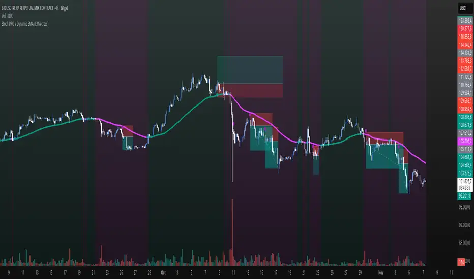
Stoch PRO + Dynamic EMA (EMA cross)Stoch PRO + Dynamic EMA Documentation
Overview:
- Pine Script v6 overlay indicator combining a trend-colored EMA with a Stochastic oscillator to highlight midline momentum shifts.
- Designed for TradingView charts (Indicators → Import) as a visual aid for timing entries within trend-following setups.
- Crafted and optimized around BTCUSDT on the 4h timeframe; adapt inputs before applying to other markets or intervals.
Inputs:
- EMA Length (default 50): smoothing window for the dynamic EMA; lower values respond faster but whipsaw more.
- Stochastic K Length (20): lookback for the raw %K calculation.
- Stochastic K Smoothing (3): SMA applied to %K to reduce noise.
- Stochastic D Smoothing (3): SMA over %K to produce the companion %D line.
Visual Elements:
- EMA plotted on price with linewidth 3; teal when close > EMA, fuchsia otherwise.
- Background tinted teal/fuchsia at high transparency (≈92) to reinforce the current trend bias without obscuring price bars.
Oscillator Logic:
- %K = ta.stoch(high, low, close, kLength); smoothed with ta.sma(kRaw, kSmooth).
- %D = ta.sma(k, dSmooth).
- Focus is on the midline (50) rather than traditional 20/80 extremes to emphasize rapid momentum flips.
Signals:
- Buy: %K crossing above 50 while close > EMA (teal state). Plots tiny teal circle below the bar.
- Sell: %K crossing below 50 while close < EMA (fuchsia state). Plots tiny purple circle above the bar.
Trading Workflow Tips:
- Use EMA/background color for directional bias, then confirm with %K 50-cross to refine entries.
- Consider higher-timeframe trend filters or price-action confirmation to avoid range chop.
- Stops often sit just beyond the EMA; adjust thresholds (e.g., 55/45) if too many false positives occur.
- Always plan risk/reward upfront—define TP/SL levels that fit your strategy and backtest them thoroughly before trading live.
Alerts & Extensions:
- Wrap crossUp/crossDown in alertcondition() if TradingView alerts are needed.
- For automation/backtesting, convert logic to a strategy() script or add position management rules.
STWP Unified EMA Band (HLC Fusion – Crossover Enhanced Edition)🧠 STWP Unified EMA Band (HLC Fusion – Crossover Enhanced Edition)
Author: simpletradewithpatience (STWP)
Markets: Equities, Indices & Futures
Best Timeframes: 5-min to 1-hour (Daily TF optional for broader trend observation)
Built With: Pine Script v5
A structured, educational EMA fusion framework designed to help traders visually study trend transitions, slope behavior, and volume-based momentum shifts.
📌 Overview
The STWP Unified EMA Band merges High–Low–Close fusion logic with crossover detection and volume context to offer a clear visual understanding of trend behavior.
It is designed for traders who want to observe trend transitions, analyze momentum health, and study how volume supports or contradicts directional bias.
Internally, it uses an optimized EMA 9–21 fusion structure to identify directional shifts with precision and stability — a balance developed through the STWP methodology for consistent, unbiased trend evaluation.
This enhanced edition introduces a Crossover Engine for smoother transitions, adaptive band coloring, and a real-time educational dashboard that provides instant feedback on trend and volume strength.
📸 Chart Previews (Educational Examples)
1️⃣ Bullish Momentum Phase
🔗
📈 A bullish crossover where the fast EMA overtakes the slow EMA.
Observe the slope steepening and the dashboard confirming trend expansion.
2️⃣ Bearish Momentum Phase
🔗
📉 Displays a bearish crossover with slope weakening and band compression.
The dashboard highlights a transition to bearish bias with corresponding volume context.
⚠️ Snapshots are for educational reference only — not trading signals or recommendations.
📌 Key Features
✅ Dual EMA Band using High–Low–Close fusion logic
✅ Dynamic bullish/bearish band coloring
✅ Mid-band slope indicator with momentum feedback
✅ Volume strength classification (Strong / Moderate / Weak)
✅ Contextual crossover labels with real-time commentary
✅ Auto-removable exit labels for clean visualization
✅ Built-in educational STWP Dashboard (trend, slope, and volume insights)
✅ User-customizable color palette and toggles
✅ Compatible across intraday and swing setups
📊 STWP Dashboard Summary
A compact real-time data panel offering:
📈 Trend Status: Bullish / Bearish / Neutral
📊 Volume Condition: Strong / Moderate / Low
📉 Slope Direction: Rising / Falling / Flat
🕓 Last Signal Info: Timestamp, price, and strength context
The dashboard helps users learn how volume, slope, and structure interact dynamically during different market phases.
💡 Educational Use Cases
This tool is ideal for traders who want to:
Study momentum evolution through moving averages
Understand EMA slope and compression behavior
Observe how volume validates or contradicts trend strength
Build structured, observation-based learning habits
Develop discipline in recognizing trend exhaustion zones
It is meant as a visual study framework, not as a trading signal generator.
⚙️ Customization Options
Toggle crossover triangles and labels
Optional exit markers (auto-hide after signal)
Show or hide trend background shading
Customizable color settings for each phase
Enable or disable dashboard view
📆 Best Practice for Use
1️⃣ Apply to liquid assets or major indices for reliable band behavior.
2️⃣ Use primarily on 5-min to 1-hour charts to study intraday transitions clearly.
3️⃣ Optionally view on the Daily TF to understand higher-structure slope alignment and long-term trend health.
4️⃣ Observe how slope, band color, and volume interact during trend acceleration and contraction.
5️⃣ Treat dashboard readings as educational context, not trading triggers.
6️⃣ Combine with price structure, volume profile, or demand–supply zones for deeper observation.
⚠️ Important Notes
✅ Designed purely for learning and educational exploration
✅ No trading automation or signal generation included
✅ Does not provide entries, exits, or investment advice
✅ Built to promote structured observation and discipline in analysis
❌ Avoid using on higher timeframes for rapid setups — bands adjust slower there
📐 Glossary
EMA – Exponential Moving Average
HLC – High, Low, Close
Slope – Directional gradient of the mid-band
Volume Ratio – Current volume ÷ 20-bar average
Crossover – Fast EMA crossing Slow EMA
STWP – Simple Trade With Patience
💬 Philosophy Behind the Tool
Developed under the STWP methodology — Simple Trade With Patience — this indicator encourages traders to focus on learning the rhythm of the market, not chasing trades.
Every color, label, and slope change is designed to help users see what price action is communicating rather than predict outcomes.
⚠️ Disclaimer
This indicator is created solely for educational and informational purposes.
It does not constitute financial advice, a trading signal, or an investment recommendation.
Trading involves significant risk and may not be suitable for all participants.
Always consult a SEBI-registered financial advisor or licensed professional before making trading or investment decisions.
The author is not liable for financial loss resulting from the use or interpretation of this script.
By using this tool, you acknowledge and accept these terms.
🤝 Final Note
Built with precision and patience by simpletradewithpatience (STWP) — for traders who value structured learning and objective analysis.
Observe deeply. Learn continuously. Trade with discipline.
📈 Trade Less. Learn More. Let Patience Work for You.
🔒 Script Protection Note
This script is published under Protected visibility to maintain data integrity and prevent unauthorized modification.
The logic remains fully usable for all users while keeping the internal code structure secure — ensuring a safe, stable, and educational experience for everyone.

APXTradez - Swing RSI🔹 APXTradez Swing RSI — Summary & Usage Guide
Purpose
- The APXTradez Swing RSI measures momentum strength and exhaustion in a stock’s price movement.
- It tells you when price is overextended, balanced, or reversing, helping you time entries, exits, and confirmation on swing trades.
This version is tuned for clean visual momentum tracking during 2-to-5-day swings or multi-week trends.
Core Components
-RSI (14-period)
- Uses a standard 14-bar calculation on the closing price (or whichever source you choose).
- Ranges between 0 and 100, showing how strong the recent price push has been.
- Smooth enough for swing trading; reactive enough to catch early turns.
- Color-Coded RSI Line
White = Neutral zone (healthy price action).
Lime = Oversold (< 30) → buying opportunity or short-covering zone.
Red = Overbought (> 70) → profit-taking or potential pullback zone.
Color shifts automatically as RSI crosses key thresholds, so you see sentiment flips instantly.
Horizontal Levels
70 = Overbought (red dashed line)
30 = Oversold (lime dashed line)
50 = Midline (gray dotted line, optional toggle)
These levels frame the RSI’s “zones of strength.”
How to Use It
1️⃣ Identify Momentum Regime
-Above 50 → Bullish Bias
Momentum favors buyers. Use this to confirm call or long positions.
- Below 50 → Bearish Bias
Momentum favors sellers. Confirms put or short setups.
- The 50 midline is your “momentum compass.”
Crosses above or below often precede trend reversals.
2️⃣ Spot Extremes (30 / 70 Zones)
RSI > 70 = Overbought
Price is stretched; risk of pullback or short-term cooling.
→ Good area to trim longs or watch for reversal candles.
RSI < 30 = Oversold
Price is washed out; potential bounce forming.
→ Good area to look for bullish reversal + volume confirmation.
3️⃣ Combine with APX TTM Squeeze and Overlay
- When RSI > 50 and rising + TTM histogram bright teal + Squeeze fires black dot up → high-probability long swing.
- When RSI < 50 and falling + TTM histogram bright yellow + Squeeze fires down → high-probability short swing.
- When RSI flat around 50 → trendless; wait for compression + momentum confirmation.
4️⃣ Divergences (Advanced Use)
- Bullish Divergence: Price makes a lower low, RSI makes a higher low → momentum turning up before price.
- Bearish Divergence: Price makes a higher high, RSI makes a lower high → momentum weakening.
- These signals are strongest when combined with a Squeeze firing or EMA crossover from your Swing Overlay.
Best Timeframes
Daily / 4-Hour: Ideal for swing entries and momentum tracking.
1-Hour: For fine-tuning entries inside larger setups.
- The APXTradez Swing RSI gives you a clean, visual read on who controls momentum and when that strength is fading or reversing.
- It’s not meant to predict exact tops or bottoms — it’s a confirmation and rhythm tool:
Use the 50-line for trend bias.
Use 30/70 for exhaustion.
Use color shifts for quick sentiment reads.
Combine with your APX Squeeze and Overlay for the complete swing-timing system.

APXTradez - Swing Overlay🔹 APX Swing Overlay – Summary & Usage Guide
Purpose
The APX Swing Overlay is built for options swing traders who focus on 1–5 day directional moves.
It visually identifies trend strength, compression zones, and momentum buildup using a combination of EMAs, Bollinger Bands, and Keltner Channels — making it ideal for spotting breakouts early.
Core Components
8 EMA (Exponential Moving Average)
- Tracks short-term price action and momentum.
- Price above = bullish continuation; price below = short-term weakness.
- Acts as the first dynamic support/resistance level.
21 EMA
- Captures the mid-term trend (confirmation layer).
- When the 8 EMA crosses above the 21 EMA → bullish shift.
- When the 8 EMA crosses below the 21 EMA → bearish or consolidation signal.
Bollinger Bands (BB)
- Measures volatility around price.
- When the bands tighten, volatility is compressing → expect expansion soon.
- When the bands expand, volatility is releasing → breakout or breakdown in play.
Keltner Channels (KC)
- Uses ATR to show “normal” price movement range.
- When Bollinger Bands move inside the Keltner Channels, it signals a squeeze — price is coiling up for a potential breakout.
- Compression Highlights
- The overlay visually marks when BB are inside KC (low volatility squeeze).
- These zones are shaded or highlighted so you can easily see when a stock is building pressure.
- Once price exits that zone with momentum, it often begins a new swing leg.
How to Use It
Add to Chart : Apply the APX Swing Overlay on your daily or 4-hour timeframe.
Look for Compression:
- Watch for areas where the bands tighten and the compression highlight appears.
- This means volatility is low — expect an expansion soon.
- Wait for Expansion + EMA Confirmation:
- A breakout above both the 8 & 21 EMA, with bands expanding, signals a potential long swing.
- A breakdown below both EMAs with expanding bands signals potential short swing.
Ride the Trend:
- Stay in the trade as long as price respects the 8 EMA.
- Take profit when momentum slows or the 8 crosses back below the 21 EMA.
Best Timeframes
Daily Chart → Ideal for swing setups (2–5 day hold).
4H Chart → Good for early entry timing and breakout confirmation.
Quick Visual Interpretation
Signal Meaning
8 > 21 and expanding BB Bullish trend continuation
8 < 21 and expanding BB Bearish continuation
BB inside KC Volatility squeeze forming
Highlighted compression zone Potential pre-breakout setup
Price closing above 8/21 Confirmation to enter

Fixed High Timeframe Moving AveragesFixed High Timeframe Moving Averages (W/D/4H)
Summary
This indicator plots essential, high-timeframe (HTF) Moving Averages onto your chart, **no matter which timeframe you are currently viewing**.
It is designed for traders who need multi-timeframe context at a glance. Stop switching charts to see where the 200-Week or 50-Day MA is—now you can see all critical HTF levels directly on your 5-minute (or any other) chart.
---
Who it’s for
Traders who rely on moving averages but like to work on lower chart timeframes while keeping higher timeframe context in sight. If you scalp on 1–15m yet want Weekly/Daily/4H MAs always visible, this is for you.
---
What it shows
Pinned (“fixed”) moving averages from higher timeframes—Weekly (20/100/200) , Daily (50/100/200/365) and 4H (200) —rendered on any chart timeframe. Your favorite HTF MAs stay on screen no matter what TF you’re currently analyzing.
---
Features
* **MA types:** SMA, EMA, VWMA, Hull.
* **Fully configurable:** toggle each line, set periods, colors, and thickness.
* **Two alert modes (see below):** intrabar vs confirmed HTF close.
* **Works on any symbol & chart TF** using `request.security` to fetch HTF data.
---
Alerts & Modes
This indicator solves the biggest problem with MTF alerts: false signals. You can choose one of two modes:
1. **Intrabar mode** — compares current chart price to the HTF MA. Triggers as soon as price crosses the HTF line; great for early signals but may update until the HTF bar closes.
2. **Confirmed mode** — checks HTF close vs HTF MA. Signals only on the higher-TF bar close; fewer false starts, no intrabar repainting on that TF.
Per-line *Cross Above / Cross Below* conditions are provided for all enabled MAs (e.g., “20W — Cross Above”, “365D — Cross Below”, etc.).
**How to use alerts:** add the script → “Create Alert” → pick any condition from the script’s list.
---
Why this helps
* Keeps Weekly/Daily structure visible while you execute on LTF.
* Classic anchors (e.g., 200D, 20W/100W/200W) are popular for trend bias, dynamic support/resistance, and pullback context.
* Lets you standardize MA references across all your lower-TF playbooks.
---
Notes on confirmation & repainting
* Intrabar signals can change until the higher-TF bar closes (that’s expected with multi-TF data).
* Confirmed mode waits for the HTF close—cleaner, but later. Choose what fits your workflow.
---
Quick setup
1. Pick `MA Type` (SMA/EMA/VWMA/Hull).
2. Enable the HTF lines you want (Weekly 20/100/200; Daily 50/100/200/365; 4H 200).
3. Choose `Alert Mode` (Intrabar vs Confirmed).
4. Style colors/widths to taste and set alerts on the lines you care about.
---
Good practice
* Combine HTF MAs with price action (swings, structure, liquidity grabs) rather than using them in isolation.
* Always validate signals in your execution TF and use a risk plan tailored to volatility.
* Protect your capital: position sizing, stops, and disciplined risk management matter more than any single line on the chart.
---
Disclaimer
For educational/informational purposes only; not financial advice. Trading involves risk—manage it responsibly.

THAIT Moving Averages Tight within # ATR EMA SMA convergence
THAIT(tight) indicator is a powerful tool for identifying moving average convergence in price action. This indicator plots four user-defined moving averages (EMA or SMA). It highlights moments when the MAs converge within a user specified number of ATRs, adjusted by the 14-period ATR, signaling potential trend shifts or consolidation.
A convergence is flagged when MA1 is the maximum, the spread between MAs is tight, and the price is above MA1, excluding cases where the longest MA (MA4) is the highest. The indicator alerts and visually marks convergence zones with a shaded green background, making it ideal for traders seeking precise entry or exit points.

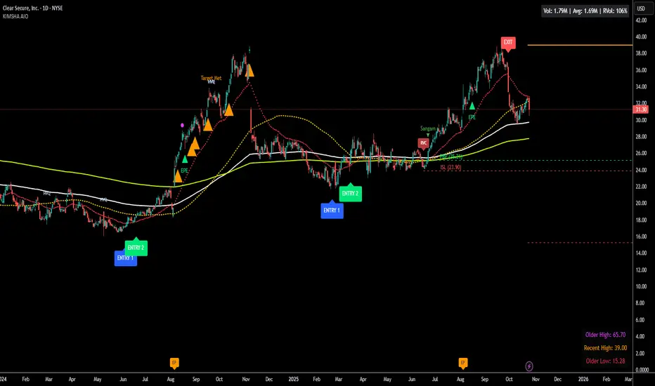
KIMSHA AIODescription
The KIMSHA AIO is a comprehensive overlay indicator designed for swing and position traders. It merges three distinct and powerful trading strategies into a single, cohesive tool to identify high-probability setups in stocks that are in confirmed uptrends.
What the Indicator Does:
Combines Three Strategies: Integrates a multi-scanner breakout system, a mean-reversion model, and a multi-year breakout tool into one indicator.
Main Modules
Signals Module:
1. Features six unique scanner signals (CS1-CS6) to identify a variety of bullish consolidation patterns.
2. Includes a full trade management framework with RVC (Red Volume Candle), PBP (Post Breakout Pivot Entry), and ISL (Initial Stop Loss) levels.
3. Identifies powerful Episodic Pivot (EP) and EP Entry (EPE) signals for stocks showing exceptional strength.
Reversal Module:
1. A mean-reversion strategy that primarily uses Bollinger Bands to find oversold conditions.
2. Provides a three-stage signal process: RA (Reversal Setup), Entry 1, and Entry 2 to time entries from a potential bottom.
Multi-Year Breakout (MYBO) Module:
1. Automatically identifies and plots historical, multi-year resistance and support levels.
2. Generates a clear signal when the price breaks out above these significant long-term levels.
Advanced Alerts: Features a highly customizable alert system that can be timed to trigger either on the bar's close or at a specific time of day, allowing for end-of-day style notifications.
How to Best Use It:
This indicator is most powerful when used with a systematic, rules-based approach. The core principle is to use long-term moving averages to define the trend and then use the indicator's signals to time entries within that trend.
The Foundation (Trend Filter): The most important rule is to only consider long setups on stocks where the 150-day SMA is above the 200-day EMA, and the 150-day SMA is sloping upwards. This keeps you aligned with the primary uptrend.
Strategy 1: The Momentum Breakout (PBP Entry)
1. Confirm the stock meets the primary trend filter rules.
2. Wait for an AIO setup signal (Super, Pls Buy, etc.) to draw a PBP line.
3. Enter when the price crosses above the PBP line or wait for a pull back after the price has crossed the PBP line.
Strategy 2: The Mean Reversion (RA Entry)
1. Confirm the stock meets the primary trend filter rules.
2. Wait for an "RA" (Reversal Setup) signal to appear on the chart.
3. Enter on the "ENTRY 1" (Risky Entry) or "ENTRY 2" signal (Safer Entry) or wait for a pull back after "ENTRY 1" or "ENTRY 2" signal.
Strategy 3: Multi-Year Breakout (MYBO) :
1. A breakout triangle (orange or fuchsia) appears below the candle, signaling a close above the "Recent High" (Orange) or "Older High" (Fuchsia).
2. Recent High refers to the highest price the stock has reached in last 12 months. Breaking above the "Recent High" is a sign of strong current demand.
3. Older High refers to the highest price the stock reached in a more distant, historical period - the period between 5 years ago and 1 year ago. Breaking above the "Older High" is a sign of VERY strong demand as it has broken a historic high.
4. Wait for a breakout triangle to appear on the chart.
5. Enter on the high of the candle marked with a breakout triangle or wait for a pull back after that signal.
Customize Your View: Use the "Inputs" tab to enable/disable the modules you want to focus on and configure the alerts you want to receive. Use the "Style" tab to hide any visual elements you don't need to keep your chart clean.
Word of Caution: Some signals based on higher timeframes (Monthly, Weekly, 3-Hour) may appear mid-period and could change before the higher timeframe bar closes, due to the settings used for accurate chart alignment.
EMA HeatmapEMA Heatmap — Indicator Description
The EMA Order Heatmap is a visual trend-structure tool designed to show whether the market is currently trending bullish, trending bearish, or moving through a neutral consolidation phase. It evaluates the alignment of multiple exponential moving averages (EMAs) at three different structural layers: short-term daily, medium-term daily, and weekly macro trend. This creates a quick and intuitive picture of how well price movement is organized across timeframes.
Each layer of the heatmap is scored from bearish to bullish based on how the EMAs are stacked relative to each other. When EMAs are in a fully bullish configuration, the row displays a bright green or lime color. Fully bearish alignment is shown in red. Yellow tones appear when the EMAs are mixed or compressing, indicating uncertainty, trend exhaustion, or a change in market character. The three rows combined offer a concise view of whether strength or weakness is isolated to one timeframe or broad across the market.
This indicator is best used as a trend filter before making trading decisions. Traders may find more consistent setups when the majority of the heatmap supports the direction of their trade. Green-dominant conditions suggest a trending bullish environment where long trades can be favored. Red-dominant conditions indicate bearish momentum and stronger potential for short opportunities. When yellow becomes more prominent, the market may be transitioning, ranging, or gearing up for a breakout, making timing more challenging and risk higher.
• Helps quickly identify directional bias
• Highlights when trends strengthen, weaken, or turn
• Provides insight into whether momentum is supported by higher timeframes
• Encourages traders to avoid fighting market structure
It is important to recognize the limitations. EMAs are lagging indicators, so the heatmap may confirm a trend after the initial move is underway, especially during fast reversals. In sideways or low-volume environments, the structure can shift frequently, reducing clarity. This tool does not generate entry or exit signals on its own and should be paired with price action, momentum studies, or support and resistance analysis for precise trade execution.
The EMA Order Heatmap offers a clean and reliable way to stay aligned with the broader market environment and avoid lower-quality trades in indecisive conditions. It supports more disciplined decision-making by helping traders focus on setups that match the prevailing structural trend.

MACD with Smart Entry Signals & Trend Filter
This advanced MACD indicator combines traditional MACD analysis with intelligent entry signal detection and an optional EMA trend filter. It identifies high-probability entry points by analyzing histogram patterns, consolidation phases, and trend continuation setups.
### Key Features
**🎯 Smart Entry Detection**
- **Consolidation Breakouts**: Identifies exits from consolidation zones (weak bars) with strong momentum
- **Trend Reversals**: Detects potential trend changes after extended weak phases
- **Correction/Continuation Patterns**: Recognizes brief corrections within strong trends that offer continuation opportunities
**📊 Enhanced MACD Visualization**
- Color-coded histogram showing four distinct states:
- Strong Bullish (dark green): Rising histogram above zero
- Weak Bullish (light green): Falling histogram above zero
- Weak Bearish (light red): Rising histogram below zero
- Strong Bearish (dark red): Falling histogram below zero
**🔍 Multi-Layer Filtering System**
- **Candle Size Filter**: Eliminates signals during high volatility/large candle ranges
- **EMA Trend Filter**: Optional filter ensuring entries align with the dominant trend direction
- Visual markers for rejected signals (orange X for candle size, blue E for EMA trend)
**⚙️ Customizable Parameters**
- Adjustable MACD periods (default: 34/144/9)
- Configurable consolidation bar requirements
- Flexible correction pattern detection
- EMA trend filter with adjustable sensitivity
- Multiple alert types for all signal conditions
### How to Use
1. **Enable/disable filters** based on your trading style and market conditions
2. **Green triangles (L)**: Long entry signals when all conditions are met
3. **Red triangles (S)**: Short entry signals when all conditions are met
4. **Rejected signal markers**: Help you understand why certain setups were filtered out
5. **Background coloring**: Provides visual confirmation of signal zones and correction patterns
### Alert System
Comprehensive alerts for:
- Long and short entry signals
- Specific pattern types (consolidation, reversal, continuation)
- Rejected signals (helps refine strategy)
- Traditional MACD histogram crossovers
### Best Practices
- Use the EMA trend filter in trending markets to avoid counter-trend trades
- Adjust candle size filter based on your instrument's typical volatility
- Consider combining with support/resistance levels for confirmation
- Test different consolidation bar settings for your timeframe
### Parameters Summary
- Fast/Slow Length: MACD calculation periods
- Signal Smoothing: Signal line period
- Consolidation Bars: Minimum weak bars before breakout
- Max Candle Range: Filter for oversized candles
- EMA Period & Sensitivity: Trend filter configuration
---
*This indicator is designed for traders who want a systematic approach to identifying MACD-based entry opportunities with built-in risk management through filtering.*
Opening Range + Daily LevelsA comprehensive multi-timeframe indicator designed for intraday traders who need critical support/resistance levels and EMAs all in one clean display.
Features:
📊 EMAs
9 EMA (default: white)
21 EMA (default: orange)
📅 Previous Day Levels
Yesterday's High, Low, Open, and Close
Lines extend progressively through the current session
Clean visual separation between trading days
📈 Previous Week Levels
Last Week's High, Low, Open, and Close
Dotted lines that extend through the current week
Perfect for identifying major support/resistance zones
🌙 Pre-Market Session (12:00 AM - 7:30 AM)
Pre-Market High and Low
Tracks overnight price action
Extends through the trading day
⏰ 15-Minute Opening Range (7:30 AM - 7:45 AM)
Opening Range High and Low with shaded box
Fibonacci retracement levels (0.382, 0.5, 0.618)
Golden ratio levels (0.382 & 0.618) in gold, midpoint (0.5) in dotted gray
Customization:
Adjustable timezone settings
Fully customizable colors for all levels
Adjustable line widths
Toggle Fibonacci levels on/off
Perfect For:
Day traders who need key levels at a glance
Price action traders using previous session data
Opening range breakout strategies
Multi-timeframe analysis
All levels update automatically and extend progressively as the day progresses, with labels staying visible at the current bar edge.

Tradisfy | TSFY | ORB Pro**TSFY | ORB Pro**
Introduction
TSFY | ORB Pro combines the classic Opening Range Breakout (ORB) logic with professional market structure tools such as EMAs, the Daily Open, ADR, and Pivot Points.
The goal: A clean and logically structured intraday visualization of volatility, trend, and key price zones — without visual clutter.
Timezone: Europe/Berlin
---
Core Features
Multi-Session ORB: Separate Opening Ranges for London, Gold, and New York sessions with ORH, ORL, and Mid levels, optionally extendable to the end of the trading day.
EMAs (Intraday & Daily): Adaptive trend filters from 4 to 800 periods plus Daily 13/50/200 EMAs for higher-timeframe structure context.
Classic Pivots: Automatic calculation of daily PP, R, S, and Mid levels with fully customizable colors, styles, and extensions.
Daily Open: Marks the daily opening price as a bias reference point.
ADR (Average Daily Range): Calculates the average true range of the last X days, optionally anchored to the Daily Open with an optional 50% midpoint.
---
Interpretation
Break above ORH → bullish momentum; break below ORL → bearish weakness.
Combine ORB zones with EMAs, Pivots, or ADR for higher confluence.
Daily Open provides intraday bias, ADR defines realistic target zones.
Reactions around R/S levels or OR Mid often indicate short-term turning points.
---
Usage
Use the ORB zone as the basis for breakout, retest, or mean-reversion setups.
Plan realistic take-profit zones using ADR and Pivot levels.
Daily EMAs define the overall market bias.
All components can be toggled on or off individually.
---
Notes
Optimized for intraday ORB trading.
No alerts integrated (yet).
All colors, line widths, and transparency levels are fully customizable.
Non-repainting — lines are extended forward, not redrawn.
Performance-friendly despite multiple visual components (max. 500 lines/labels).
---
TSFY | ORB Pro is a complete framework for modern intraday traders who want to combine session logic, trend filters, and market structure into one clean and efficient tool.

ORBs, EMAs, SMAs, AVWAPThis is an update to a previously published script. In short the difference is the added capability to adjust the length of EMAs. Also added 3 customizable SMAs. Enjoy! Let me know what you think of the script please. This is only second one I have ever done. Through practice and people like @LuxAlgo and other Pinescripters this isn't possible. Tedious hrs with ChatGPT to correct nuances, who doesnt seem to learn from (insert pronoun) mistakes
This all-in-one indicator combines key institutional tools into a unified framework for intraday and swing trading. Designed for traders who use multi-session analysis and dynamic levels, it automatically maps out global session breakouts, moving averages, and volume-weighted anchors with high clarity.
Features include:
🕓 Tokyo, London, and New York ORBs (Opening Range Breakouts) — 30-minute configurable range boxes that persist until the next New York open.
📈 Anchored VWAP with Standard Deviation Bands — dynamically anchorable to session, week, or month for institutional-grade price tracking.
📊 Exponential Moving Averages (9, 20, 113, 200) — for short-, mid-, and long-term momentum structure.
📉 Simple Moving Averages (20, 50, 100) — fully customizable lengths, colors, and visibility toggles for trend confirmation.
🏁 Prior High/Low Levels (PDH/PDL, PWH/PWL, PMH/PML) — automatically plotted from previous day, week, and month, with labels placed at each session’s midpoint.
🎛️ Session-Aligned Time Logic — all time calculations use New York session anchors with DST awareness.
💡 Clean Visualization Options — every component can be toggled on/off, recolored, or customized for your workflow.
Best used for:
ORB break-and-retest setups
VWAP and EMA rejections
Confluence-based trading around key session levels
Multi-session momentum tracking