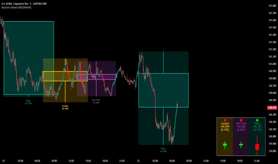
Multi Asset Similarity MatrixProvides a unique and visually stunning way to analyze the similarity between various stock market indices. This script uses a range of mathematical measures to calculate the correlation between different assets, such as indices, forex, crypto, etc..
 Key Features: 
 
  Similarity Measures: The script offers a range of similarity measures to choose from, including SSD (Sum of Squared Differences), Euclidean Distance, Manhattan Distance, Minkowski Distance, Chebyshev Distance, Correlation Coefficient, Cosine Similarity, Camberra Index, Mean Absolute Error (MAE), Mean Squared Error (MSE), Lorentzian Function, Intersection, and Penrose Shape.
  Asset Selection: Users can select the assets they want to analyze by entering a comma-separated list of tickers in the "Asset List" input field.
  Color Gradient: The script uses a color gradient to represent the similarity values between each pair of indices, with red indicating low similarity and blue indicating high similarity.
 
 How it Works: 
 
  The script calculates the source method (Returns or Volume Modified Returns) for each index using the sec function.
  It then creates a matrix to hold the current values of each index over a specified window size (default is 10).
  For each pair of indices, it applies the selected similarity measure using the select function and stores the result in a separate matrix.
  The script calculates the maximum and minimum values of the similarity matrix to normalize the color gradient.
  Finally, it creates a table with the index names as rows and columns, displaying the similarity values for each pair of indices using the calculated colors.
 
 Visual Insights: 
 
  The indicator provides an intuitive way to visualize the relationships between different assets.   By analyzing the color-coded tables, traders can gain insights into:
  Which assets are highly correlated (blue) or uncorrelated (red)
  The strength and direction of these correlations
  Potential trading opportunities based on similarities and differences between assets
 
Overall, MASM is a powerful tool for market analysis and visualization, offering a unique perspective on the relationships between various assets.
~llama3
Indicadores y estrategias
Geo. Geo.
This library provides a comprehensive set of geometric functions based on 2 simple types for point and line manipulation, point array calculations, some vector operations (Borrowed from @ricardosantos ), angle calculations, and basic polygon analysis.  It offers tools for creating, transforming, and analyzing geometric shapes and their relationships.  
View the source code for detailed documentation on each function and type.
═════════════════════════════════════════════════════════════════════════
█  OVERVIEW 
This library enhances TradingView's Pine Script with robust geometric capabilities. It introduces the  Point  and  Line  types, along with a suite of functions for various geometric operations. These functionalities empower you to perform advanced calculations, manipulations, and analyses involving points, lines, vectors, angles, and polygons directly within your Pine scripts. The example is  at the bottom of the script. ( Commented out )
█  CONCEPTS 
This library revolves around two fundamental types:
 •  Point:  Represents a point in 2D space with x and y coordinates, along with optional 'a' (angle) and 'v' (value) fields for versatile use.  Crucially, for plotting, utilize the `.to_chart_point()` method to convert Points into plottable chart.point objects.
 •  Line:  Defined by a starting  Point  and a  slope , enabling calculations like getting y for a given x, or finding intersection points.
█  FEATURES 
 •  Point Manipulation:   Perform operations like addition, subtraction, scaling, rotation, normalization, calculating distances, dot products, cross products, midpoints, and more with  Point  objects.
 •  Line Operations:  Create lines, determine their slope, calculate y from x (and vice versa), and find the intersection points of two lines.
 •  Vector Operations:  Perform vector addition, subtraction, multiplication, division, negation, perpendicular vector calculation, floor, fractional part, sine, absolute value, modulus, sign, round, scaling, rescaling, rotation, and ceiling operations.
 •  Angle Calculations:   Compute angles between points in degrees or radians, including signed, unsigned, and 360-degree angles.
 •  Polygon Analysis:  Calculate the area, perimeter, and centroid of polygons. Check if a point is inside a given polygon and determine the convex hull perimeter.
 •  Chart Plotting:  Conveniently convert  Point  objects to  chart.point  objects for plotting lines and points on the chart.  The library also includes functions for plotting lines between individual and series of points.
 •  Utility Functions:  Includes helper functions such as square root, square, cosine, sine, tangent, arc cosine, arc sine, arc tangent, atan2, absolute distance, golden ratio tolerance check, fractional part, and safe index/check for chart plotting boundaries.
█  HOW TO USE 
1 — Include the library in your script using:
 
import kaigouthro/geo/1
 
2 — Create  Point  and  Line  objects:
 
p1 = geo.Point(bar_index, close)
p2 = geo.Point(bar_index , open)
myLine = geo.Line(p1, geo.slope(p1, p2))
// maybe use that line to detect a crossing for an alert ... hmmm
 
3 — Utilize the provided functions:
 
distance = geo.distance(p1, p2)
intersection = geo.intersection(line1, line2)
 
4 — For plotting labels, lines, convert  Point  to  chart.point :
 
label.new(p1.to_chart_point(), " Hi ")
line.new(p1.to_chart_point(),p2.to_chart_point())
 
█  NOTES 
This description provides a concise overview. Consult the library's source code for in-depth documentation, including detailed descriptions, parameter types, and return values for each function and method. The source code is structured with comprehensive comments using the `//@` format for seamless integration with TradingView's auto-documentation features.
█  Possibilities.. 
  
  
Library   "geo" 
This library provides a comprehensive set of geometric functions and types, including point and line manipulation, vector operations, angle calculations, and polygon analysis. It offers tools for creating, transforming, and analyzing geometric shapes and their relationships.
 sqrt(value) 
  Square root function
  Parameters:
     value (float) : (float) - The number to take the square root of
  Returns: (float) - The square root of the input value
 sqr(x) 
  Square function
  Parameters:
     x (float) : (float) - The number to square
  Returns: (float) - The square of the input value
 cos(v) 
  Cosine function
  Parameters:
     v (float) : (series float) - The value to find the cosine of
  Returns: (series float) - The cosine of the input value
 sin(v) 
  Sine function
  Parameters:
     v (float) : (series float) - The value to find the sine of
  Returns: (series float) - The sine of the input value
 tan(v) 
  Tangent function
  Parameters:
     v (float) : (series float) - The value to find the tangent of
  Returns: (series float) - The tangent of the input value
 acos(v) 
  Arc cosine function
  Parameters:
     v (float) : (series float) - The value to find the arc cosine of
  Returns: (series float) - The arc cosine of the input value
 asin(v) 
  Arc sine function
  Parameters:
     v (float) : (series float) - The value to find the arc sine of
  Returns: (series float) - The arc sine of the input value
 atan(v) 
  Arc tangent function
  Parameters:
     v (float) : (series float) - The value to find the arc tangent of
  Returns: (series float) - The arc tangent of the input value
 atan2(dy, dx) 
  atan2 function
  Parameters:
     dy (float) : (float) - The y-coordinate
     dx (float) : (float) - The x-coordinate
  Returns: (float) - The angle in radians
 gap(_value1, __value2) 
  Absolute distance between any two float values
  Parameters:
     _value1 (float) : First value
     __value2 (float) 
  Returns: Absolute Positive Distance
 phi_tol(a, b, tolerance) 
  Check if the ratio is within the tolerance of the golden ratio
  Parameters:
     a (float) : (float) The first number
     b (float) : (float) The second number
     tolerance (float) : (float) The tolerance percennt as 1 = 1 percent
  Returns: (bool) True if the ratio is within the tolerance, false otherwise
 frac(x) 
  frad Fractional
  Parameters:
     x (float) : (float) - The number to convert to fractional
  Returns: (float) - The number converted to fractional
 safeindex(x, limit) 
  limiting int to hold the value within the chart range
  Parameters:
     x (float) : (float) - The number to limit
     limit (int) 
  Returns: (int) - The number limited to the chart range
 safecheck(x, limit) 
  limiting int check if within the chartplottable range
  Parameters:
     x (float) : (float) - The number to limit
     limit (int) 
  Returns: (int) - The number limited to the chart range
 interpolate(a, b, t) 
  interpolate between two values
  Parameters:
     a (float) : (float) - The first value
     b (float) : (float) - The second value
     t (float) : (float) - The interpolation factor (0 to 1)
  Returns: (float) - The interpolated value
 gcd(_numerator, _denominator) 
  Greatest common divisor of two integers
  Parameters:
     _numerator (int) 
     _denominator (int) 
  Returns: (int) The greatest common divisor
 method set_x(self, value) 
  Set the x value of the point, and pass point for chaining
  Namespace types: Point
  Parameters:
     self (Point) : (Point) The point to modify
     value (float) : (float) The new x-coordinate
 method set_y(self, value) 
  Set the y value of the point, and pass point for chaining
  Namespace types: Point
  Parameters:
     self (Point) : (Point) The point to modify
     value (float) : (float) The new y-coordinate
 method get_x(self) 
  Get the x value of the point
  Namespace types: Point
  Parameters:
     self (Point) : (Point) The point to get the x-coordinate from
  Returns: (float) The x-coordinate
 method get_y(self) 
  Get the y value of the point
  Namespace types: Point
  Parameters:
     self (Point) : (Point) The point to get the y-coordinate from
  Returns: (float) The y-coordinate
 method vmin(self) 
  Lowest element of the point
  Namespace types: Point
  Parameters:
     self (Point) : (Point) The point
  Returns: (float) The lowest value between x and y
 method vmax(self) 
  Highest element of the point
  Namespace types: Point
  Parameters:
     self (Point) : (Point) The point
  Returns: (float) The highest value between x and y
 method add(p1, p2) 
  Addition
  Namespace types: Point
  Parameters:
     p1 (Point) : (Point) - The first point
     p2 (Point) : (Point) - The second point
  Returns: (Point) - the add of the two points
 method sub(p1, p2) 
  Subtraction
  Namespace types: Point
  Parameters:
     p1 (Point) : (Point) - The first point
     p2 (Point) : (Point) - The second point
  Returns: (Point) - the sub of the two points
 method mul(p, scalar) 
  Multiplication by scalar
  Namespace types: Point
  Parameters:
     p (Point) : (Point) - The point
     scalar (float) : (float) - The scalar to multiply by
  Returns: (Point) - the multiplied point of the point and the scalar
 method div(p, scalar) 
  Division by scalar
  Namespace types: Point
  Parameters:
     p (Point) : (Point) - The point
     scalar (float) : (float) - The scalar to divide by
  Returns: (Point) - the divided point of the point and the scalar
 method rotate(p, angle) 
  Rotate a point around the origin by an angle (in degrees)
  Namespace types: Point
  Parameters:
     p (Point) : (Point) - The point to rotate
     angle (float) : (float) - The angle to rotate by in degrees
  Returns: (Point) - the rotated point
 method length(p) 
  Length of the vector from origin to the point
  Namespace types: Point
  Parameters:
     p (Point) : (Point) - The point
  Returns: (float) - the length of the point
 method length_squared(p) 
  Length squared of the vector
  Namespace types: Point
  Parameters:
     p (Point) : (Point) The point
  Returns: (float) The squared length of the point
 method normalize(p) 
  Normalize the point to a unit vector
  Namespace types: Point
  Parameters:
     p (Point) : (Point) - The point to normalize
  Returns: (Point) - the normalized point
 method dot(p1, p2) 
  Dot product
  Namespace types: Point
  Parameters:
     p1 (Point) : (Point) - The first point
     p2 (Point) : (Point) - The second point
  Returns: (float) - the dot of the two points
 method cross(p1, p2) 
  Cross product result (in 2D, this is a scalar)
  Namespace types: Point
  Parameters:
     p1 (Point) : (Point) - The first point
     p2 (Point) : (Point) - The second point
  Returns: (float) - the cross of the two points
 method distance(p1, p2) 
  Distance between two points
  Namespace types: Point
  Parameters:
     p1 (Point) : (Point) - The first point
     p2 (Point) : (Point) - The second point
  Returns: (float) - the distance of the two points
 method Point(x, y, a, v) 
  Point Create Convenience
  Namespace types: series float, simple float, input float, const float
  Parameters:
     x (float) 
     y (float) 
     a (float) 
     v (float) 
  Returns: (Point) new point
 method angle(p1, p2) 
  Angle between two points in degrees
  Namespace types: Point
  Parameters:
     p1 (Point) : (Point) - The first point
     p2 (Point) : (Point) - The second point
  Returns: (float) - the angle of the first point and the second point
 method angle_between(p, pivot, other) 
  Angle between two points in degrees from a pivot point
  Namespace types: Point
  Parameters:
     p (Point) : (Point) - The point to calculate the angle from
     pivot (Point) : (Point) - The pivot point
     other (Point) : (Point) - The other point
  Returns: (float) - the angle between the two points
 method translate(p, from_origin, to_origin) 
  Translate a point from one origin to another
  Namespace types: Point
  Parameters:
     p (Point) : (Point) - The point to translate
     from_origin (Point) : (Point) - The origin to translate from
     to_origin (Point) : (Point) - The origin to translate to
  Returns: (Point) - the translated point
 method midpoint(p1, p2) 
  Midpoint of two points
  Namespace types: Point
  Parameters:
     p1 (Point) : (Point) - The first point
     p2 (Point) : (Point) - The second point
  Returns: (Point) - The midpoint of the two points
 method rotate_around(p, angle, pivot) 
  Rotate a point around a pivot point by an angle (in degrees)
  Namespace types: Point
  Parameters:
     p (Point) : (Point) - The point to rotate
     angle (float) : (float) - The angle to rotate by in degrees
     pivot (Point) : (Point) - The pivot point to rotate around
  Returns: (Point) - the rotated point
 method multiply(_a, _b) 
  Multiply vector _a with _b
  Namespace types: Point
  Parameters:
     _a (Point) : (Point) The first point
     _b (Point) : (Point) The second point
  Returns: (Point) The result of the multiplication
 method divide(_a, _b) 
  Divide vector _a by _b
  Namespace types: Point
  Parameters:
     _a (Point) : (Point) The first point
     _b (Point) : (Point) The second point
  Returns: (Point) The result of the division
 method negate(_a) 
  Negative of vector _a
  Namespace types: Point
  Parameters:
     _a (Point) : (Point) The point to negate
  Returns: (Point) The negated point
 method perp(_a) 
  Perpendicular Vector of _a
  Namespace types: Point
  Parameters:
     _a (Point) : (Point) The point
  Returns: (Point) The perpendicular point
 method vfloor(_a) 
  Compute the floor of argument vector _a
  Namespace types: Point
  Parameters:
     _a (Point) : (Point) The point
  Returns: (Point) The floor of the point
 method fractional(_a) 
  Compute the fractional part of the elements from vector _a
  Namespace types: Point
  Parameters:
     _a (Point) : (Point) The point
  Returns: (Point) The fractional part of the point
 method vsin(_a) 
  Compute the sine of argument vector _a
  Namespace types: Point
  Parameters:
     _a (Point) : (Point) The point
  Returns: (Point) The sine of the point
 lcm(a, b) 
  Least common multiple of two integers
  Parameters:
     a (int) : (int) The first integer
     b (int) : (int) The second integer
  Returns: (int) The least common multiple
 method vabs(_a) 
  Compute the absolute of argument vector _a
  Namespace types: Point
  Parameters:
     _a (Point) : (Point) The point
  Returns: (Point) The absolute of the point
 method vmod(_a, _b) 
  Compute the mod of argument vector _a
  Namespace types: Point
  Parameters:
     _a (Point) : (Point) The point
     _b (float) : (float) The mod
  Returns: (Point) The mod of the point
 method vsign(_a) 
  Compute the sign of argument vector _a
  Namespace types: Point
  Parameters:
     _a (Point) : (Point) The point
  Returns: (Point) The sign of the point
 method vround(_a) 
  Compute the round of argument vector _a
  Namespace types: Point
  Parameters:
     _a (Point) : (Point) The point
  Returns: (Point) The round of the point
 method normalize_y(p, height) 
  normalizes the y value of a point to an input height
  Namespace types: Point
  Parameters:
     p (Point) : (Point)      - The point to normalize
     height (float) : (float) - The height to normalize to
  Returns: (Point)      - the normalized point
 centroid(points) 
  Calculate the centroid of multiple points
  Parameters:
     points (array) : (array) The array of points
  Returns: (Point) The centroid point
 random_point(_height, _width, _origin, _centered) 
  Random Point in a given height and width
  Parameters:
     _height (float) : (float) The height of the area to generate the point in
     _width (float) : (float) The width of the area to generate the point in
     _origin (Point) : (Point) The origin of the area to generate the point in (default: na, will create a Point(0, 0))
     _centered (bool) : (bool) Center the origin point in the area, otherwise, positive h/w (default: false)
  Returns: (Point) The random point in the given area
 random_point_array(_origin, _height, _width, _centered, _count) 
  Random Point Array in a given height and width
  Parameters:
     _origin (Point) : (Point) The origin of the area to generate the array (default: na, will create a Point(0, 0))
     _height (float) : (float) The height of the area to generate the array
     _width (float) : (float) The width of the area to generate the array
     _centered (bool) : (bool) Center the origin point in the area, otherwise, positive h/w (default: false)
     _count (int) : (int) The number of points to generate (default: 50)
  Returns: (array) The random point array in the given area
 method sort_points(points, by_x) 
  Sorts an array of points by x or y coordinate
  Namespace types: array
  Parameters:
     points (array) : (array) The array of points to sort
     by_x (bool) : (bool) Whether to sort by x-coordinate (true) or y-coordinate (false)
  Returns: (array) The sorted array of points
 method equals(_a, _b) 
  Compares two points for equality
  Namespace types: Point
  Parameters:
     _a (Point) : (Point) The first point
     _b (Point) : (Point) The second point
  Returns: (bool) True if the points are equal, false otherwise
 method max(origin, _a, _b) 
  Maximum of two points from origin, using dot product
  Namespace types: Point
  Parameters:
     origin (Point) 
     _a (Point) : (Point) The first point
     _b (Point) : (Point) The second point
  Returns: (Point) The maximum point
 method min(origin, _a, _b) 
  Minimum of two points from origin, using dot product
  Namespace types: Point
  Parameters:
     origin (Point) 
     _a (Point) : (Point) The first point
     _b (Point) : (Point) The second point
  Returns: (Point) The minimum point
 method avg_x(points) 
  Average x of point array
  Namespace types: array
  Parameters:
     points (array) : (array) The array of points
  Returns: (float) The average x-coordinate
 method avg_y(points) 
  Average y of point array
  Namespace types: array
  Parameters:
     points (array) : (array) The array of points
  Returns: (float) The average y-coordinate
 method range_x(points) 
  Range of x values in point array
  Namespace types: array
  Parameters:
     points (array) : (array) The array of points
  Returns: (float) The range of x-coordinates
 method range_y(points) 
  Range of y values in point array
  Namespace types: array
  Parameters:
     points (array) : (array) The array of points
  Returns: (float) The range of y-coordinates
 method max_x(points) 
  max of x values in point array
  Namespace types: array
  Parameters:
     points (array) : (array) The array of points
  Returns: (float) The max of x-coordinates
 method min_y(points) 
  min of x values in point array
  Namespace types: array
  Parameters:
     points (array) : (array) The array of points
  Returns: (float) The min of x-coordinates
 method scale(_a, _scalar) 
  Scale a point by a scalar
  Namespace types: Point
  Parameters:
     _a (Point) : (Point) The point to scale
     _scalar (float) : (float) The scalar value
  Returns: (Point) The scaled point
 method rescale(_a, _length) 
  Rescale a point to a new magnitude
  Namespace types: Point
  Parameters:
     _a (Point) : (Point) The point to rescale
     _length (float) : (float) The new magnitude
  Returns: (Point) The rescaled point
 method rotate_rad(_a, _radians) 
  Rotate a point by an angle in radians
  Namespace types: Point
  Parameters:
     _a (Point) : (Point) The point to rotate
     _radians (float) : (float) The angle in radians
  Returns: (Point) The rotated point
 method rotate_degree(_a, _degree) 
  Rotate a point by an angle in degrees
  Namespace types: Point
  Parameters:
     _a (Point) : (Point) The point to rotate
     _degree (float) : (float) The angle in degrees
  Returns: (Point) The rotated point
 method vceil(_a, _digits) 
  Ceil a point to a certain number of digits
  Namespace types: Point
  Parameters:
     _a (Point) : (Point) The point to ceil
     _digits (int) : (int) The number of digits to ceil to
  Returns: (Point) The ceiled point
 method vpow(_a, _exponent) 
  Raise both point elements to a power
  Namespace types: Point
  Parameters:
     _a (Point) : (Point) The point
     _exponent (float) : (float) The exponent
  Returns: (Point) The point with elements raised to the power
 method perpendicular_distance(_a, _b, _c) 
  Distance from point _a to line between _b and _c
  Namespace types: Point
  Parameters:
     _a (Point) : (Point) The point
     _b (Point) : (Point) The start point of the line
     _c (Point) : (Point) The end point of the line
  Returns: (float) The perpendicular distance
 method project(_a, _axis) 
  Project a point onto another
  Namespace types: Point
  Parameters:
     _a (Point) : (Point) The point to project
     _axis (Point) : (Point) The point to project onto
  Returns: (Point) The projected point
 method projectN(_a, _axis) 
  Project a point onto a point of unit length
  Namespace types: Point
  Parameters:
     _a (Point) : (Point) The point to project
     _axis (Point) : (Point) The unit length point to project onto
  Returns: (Point) The projected point
 method reflect(_a, _axis) 
  Reflect a point on another
  Namespace types: Point
  Parameters:
     _a (Point) : (Point) The point to reflect
     _axis (Point) : (Point) The point to reflect on
  Returns: (Point) The reflected point
 method reflectN(_a, _axis) 
  Reflect a point to an arbitrary axis
  Namespace types: Point
  Parameters:
     _a (Point) : (Point) The point to reflect
     _axis (Point) : (Point) The axis to reflect to
  Returns: (Point) The reflected point
 method angle_rad(_a) 
  Angle in radians of a point
  Namespace types: Point
  Parameters:
     _a (Point) : (Point) The point
  Returns: (float) The angle in radians
 method angle_unsigned(_a, _b) 
  Unsigned degree angle between 0 and +180 by given two points
  Namespace types: Point
  Parameters:
     _a (Point) : (Point) The first point
     _b (Point) : (Point) The second point
  Returns: (float) The unsigned angle in degrees
 method angle_signed(_a, _b) 
  Signed degree angle between -180 and +180 by given two points
  Namespace types: Point
  Parameters:
     _a (Point) : (Point) The first point
     _b (Point) : (Point) The second point
  Returns: (float) The signed angle in degrees
 method angle_360(_a, _b) 
  Degree angle between 0 and 360 by given two points
  Namespace types: Point
  Parameters:
     _a (Point) : (Point) The first point
     _b (Point) : (Point) The second point
  Returns: (float) The angle in degrees (0-360)
 method clamp(_a, _vmin, _vmax) 
  Restricts a point between a min and max value
  Namespace types: Point
  Parameters:
     _a (Point) : (Point) The point to restrict
     _vmin (Point) : (Point) The minimum point
     _vmax (Point) : (Point) The maximum point
  Returns: (Point) The restricted point
 method lerp(_a, _b, _rate_of_move) 
  Linearly interpolates between points a and b by _rate_of_move
  Namespace types: Point
  Parameters:
     _a (Point) : (Point) The starting point
     _b (Point) : (Point) The ending point
     _rate_of_move (float) : (float) The rate of movement (0-1)
  Returns: (Point) The interpolated point
 method slope(p1, p2) 
  Slope of a line between two points
  Namespace types: Point
  Parameters:
     p1 (Point) : (Point) - The first point
     p2 (Point) : (Point) - The second point
  Returns: (float) - The slope of the line
 method gety(self, x) 
  Get y-coordinate of a point on the line given its x-coordinate
  Namespace types: Line
  Parameters:
     self (Line) : (Line) - The line
     x (float) : (float) - The x-coordinate
  Returns: (float) - The y-coordinate
 method getx(self, y) 
  Get x-coordinate of a point on the line given its y-coordinate
  Namespace types: Line
  Parameters:
     self (Line) : (Line) - The line
     y (float) : (float) - The y-coordinate
  Returns: (float) - The x-coordinate
 method intersection(self, other) 
  Intersection point of two lines
  Namespace types: Line
  Parameters:
     self (Line) : (Line) - The first line
     other (Line) : (Line) - The second line
  Returns: (Point) - The intersection point
 method calculate_arc_point(self, b, p3) 
  Calculate a point on the arc defined by three points
  Namespace types: Point
  Parameters:
     self (Point) : (Point) The starting point of the arc
     b (Point) : (Point) The middle point of the arc
     p3 (Point) : (Point) The end point of the arc
  Returns: (Point) A point on the arc
 approximate_center(point1, point2, point3) 
  Approximate the center of a spiral using three points
  Parameters:
     point1 (Point) : (Point) The first point
     point2 (Point) : (Point) The second point
     point3 (Point) : (Point) The third point
  Returns: (Point) The approximate center point
 createEdge(center, radius, angle) 
  Get coordinate from center by radius and angle
  Parameters:
     center (Point) : (Point) - The center point
     radius (float) : (float) - The radius of the circle
     angle (float) : (float) - The angle in degrees
  Returns: (Point) - The coordinate on the circle
 getGrowthFactor(p1, p2, p3) 
  Get growth factor of spiral point
  Parameters:
     p1 (Point) : (Point) - The first point
     p2 (Point) : (Point) - The second point
     p3 (Point) : (Point) - The third point
  Returns: (float) - The growth factor
 method to_chart_point(point) 
  Convert Point to chart.point using chart.point.from_index(safeindex(point.x), point.y)
  Namespace types: Point
  Parameters:
     point (Point) : (Point) - The point to convert
  Returns: (chart.point) - The chart.point representation of the input point
 method plotline(p1, p2, col, width) 
  Draw a line from p1 to p2
  Namespace types: Point
  Parameters:
     p1 (Point) : (Point) First point
     p2 (Point) : (Point) Second point
     col (color) 
     width (int) 
  Returns: (line) Line object
 method drawlines(points, col, ignore_boundary) 
  Draw lines between points in an array
  Namespace types: array
  Parameters:
     points (array) : (array) The array of points
     col (color) : (color) The color of the lines
     ignore_boundary (bool) : (bool) The color of the lines
 method to_chart_points(points) 
  Draw an array of points as chart points on the chart with line.new(chartpoint1, chartpoint2, color=linecolor)
  Namespace types: array
  Parameters:
     points (array) : (array) - The points to draw
  Returns: (array) The array of chart points
 polygon_area(points) 
  Calculate the area of a polygon defined by an array of points
  Parameters:
     points (array) : (array) The array of points representing the polygon vertices
  Returns: (float) The area of the polygon
 polygon_perimeter(points) 
  Calculate the perimeter of a polygon
  Parameters:
     points (array) : (array) Array of points defining the polygon
  Returns: (float) Perimeter of the polygon
 is_point_in_polygon(point, _polygon) 
  Check if a point is inside a polygon
  Parameters:
     point (Point) : (Point) The point to check
     _polygon (array) 
  Returns: (bool) True if the point is inside the polygon, false otherwise
 method perimeter(points) 
  Calculates the convex hull perimeter of a set of points
  Namespace types: array
  Parameters:
     points (array) : (array) The array of points
  Returns: (array) The array of points forming the convex hull perimeter
 Point 
  A Point, can be used for vector, floating calcs, etc. Use the cp method for plots
  Fields:
     x (series float) : (float) The x-coordinate
     y (series float) : (float) The y-coordinate
     a (series float) : (float) An Angle storage spot
     v (series float) : (float) A Value
 Line 
  Line
  Fields:
     point (Point) : (Point) The starting point of the line
     slope (series float) : (float) The slope of the line
GOMTRY.
Doubled Numbered Square of Nine Progression | RegressionThe Doubled Number Square of Nine Progression | Regression Indicator enables forecasting of support and resistance levels using the SQ9 progression or regression from a user-selected pivot price. The indicator also plots adjustable pivots on both the chart and the Square of Nine.
 How to use to forecast support and resistance levels: 
1. Select a Pivot Point: Choose a top or bottom pivot to use as the starting point. Select High or Low in the indicator to set the correct price to the pivot.
2. Set Price Increment or Decrement: Select a price increment to advance the starting price on the Square of Nine (for example 1 or -0.01).
3. Rotate to add or decrease the number of rungs on the Square on Nine: Rotate the Square of Nine and adjust the dimensions. The horizontal levels correlate to the rotation of the Square of Nine.
4. Plot Levels: Select a Square of Nine angle to plot the support and resistance levels based on the selected increments. These levels auto expand and decrease depending on the number of rotations in step 3. The price values from each of the selected diagonal or cardinal cross are applied to the chart with labels on both left and right. Left labels represent the cell the time variable and the right label is price. 
5. Review Levels: Conduct a simple review of the plotted support and resistance levels in relation to recent market pivots.
6. Identify Correlations: Identify the Square of Nine cardinal cross or diagonal cross angle that correlates with the most market pivots.
7. The indicator plots user-adjustable pivots on both candles/bars and displays their placement on the Square of Nine in both Progression and Regression. The close price is plotted on the Square of Nine in real-time with a white background. This helps users identify which angles the highs and lows favor from the selected pivot. The pivot levels' colors can be adjusted.
Each market has its tendencies, favoring specific angles from the cardinal or diagonal cross. The basic idea is to choose between the diagonal cross and cardinal cross angles to forecast support and resistance levels. 
 Settings: 
  
 Overview: 
  
 Example on Forecasting Support and resistance level using this indicator: 
  
In the image above, I'm progressing from the significant low at a rate of $200 per cell. Based on the plotted pivots, I've selected the 315-degree angle on the diagonal cross as it aligns with a few recent pivots. Now, I've drawn a vertical line to show that as we add rungs to the Square of Nine, we introduce support and resistance levels based on the identified angle that aligns with these early pivots from the low.
In the image below, I've moved forward in time to show how the initial angle selected based on the early pivot forecasted support and resistance levels around the high in BTC. Do not expect the price to turn sharply at the levels the indicator generates, but use it to help identify SQ9 levels that may form market turns. As P. Mikula mentions in his work, "The Square of Nine successfully defines market price swings but it does not make the market form pivots."
  
This indicator includes enhancements made to the Gann Square of Nine indicator originally created by @ThiagoSchmitz. 
This indicator is inspired by the methodologies detailed by Patrick Mikula in his book " The Definitive Guide to Forecasting using W.D Gann's Square of Nine ." I recommend checking it out. He also mentions another use case as a Price and Time chart in his " Gann Scientific Method Unveiled, Volume 2 ." FYI, I am not affiliated with Patrick Mikula in any way.
 Known Issues:  
Close price plotted on the Square of Nine in Regression "from a high pivot" takes a current candle to close in order to be plotted. Progression works as expected. 
Footprint IQ Pro [TradingIQ]Hello Traders!
Introducing "Footprint IQ Pro"!
Footprint IQ Pro is an all-in-one Footprint indicator with several unique features.
 Features 
 
 Calculated delta at tick level
 Calculated delta ratio at tick level
 Calculated buy volume at tick level
 Calculated sell volume at tick level
 Imbalance detection
 Stacked imbalance detection
 Stacked imbalance alerts
 Value area and POC detection
 Highest +net delta levels detection
 Lowest -net delta levels detection
 CVD by tick levels
 Customizable values area percentage
 
  
The image above thoroughly outlines what each metric in the delta boxes shows!
 Metrics In Delta Boxes 
"δ:", " δ%:", " ⧎: ", " ◭: ", " ⧩: "
 
 δ Delta (Difference between buy and sell volume)
 δ% Delta Ratio (Delta as a percentage of total volume)
 ⧎ Total Volume At Level (Total volume at the price area)
 ◭ Total Buy Volume At Level (Total buy volume at the price area)
 ⧩ Total Sell Volume At Level (total sell volume at the price area)
 
Each metric comes with a corresponding symbol.
That said, until you become comfortable with the symbol, you can also turn on the descriptive labels setting!
  
The image above exemplifies the feature.
  
The image above shows Footprint IQ's full power!
Additionally, traders with an upgraded TradingView plan can make use of the "1-Second" feature Footprint IQ offers!
  
The image above shows each footprint generated using 1-second volume data. 1-second data is highly granular compared to 1-minute data and, consequently, each footprint is exceptionally more accurate!
 Imbalance Detection 
Footprint IQ pro is capable of detecting user-defined delta imbalances.
  
The image above further explains how Footprint IQ detects imbalances!
The imbalance percentage is customizable in the settings, and is set to 70% by default. 
Therefore,
When net delta is positive, and the positive net delta constitutes >=70% of the total volume, a buying imbalance will be detected (upwards triangle).
When net delta is negative, and the negative net delta constitutes >=70% of the total volume, a buying imbalance will be detected (downwards triangle).
 Stacked Imbalance Detection 
In addition to imbalance detection, Footprint IQ Pro can also detect stacked imbalances!
  
The image above shows Footprint IQ Pro detecting stacked imbalances!
Stacked imbalances occur when consecutive imbalances at sequential price areas occur. Stacked imbalances are generally interpreted as significant price moves that are supported by volume, rather than a significant result with disproportionate effort.
The criteria for stacked imbalance detection (how many imbalances must occur at sequential price areas) is customizable in the settings.
The default value is three. Therefore, when three imbalances occur at sequential price areas, golden triangles will begin to print to show a stacked imbalance.
Additionally, traders can set alerts for when stacked imbalances occur!
 Highest +Delta and Highest -Delta Levels 
In addition to being a fully-fledged Footprint indicator, Footprint IQ Pro goes one step further by detecting price areas where the greater +Delta and -Delta are!
  
The image above shows price behavior near highest +Delta price areas detected by Footprint IQ!
These +Delta levels are considered important as there has been strong interest from buyers at these price areas when they are traded at.
It's expected that these levels can function as support points that are supported by volume.
  
The image above shows a similar function for resistance points!
Blue lines = High +Delta Detected Price Areas
Red lines  = High -Delta Detected Price Areas
 Value Area Detection 
Similar to traditional volume profile, Footprint IQ Pro displays the value area per bar.
  
Green lines next to each footprint show the value area for the bar. The value area % is customizable in the settings.
 CVD Levels 
Footprint IQ Pro is capable of storing historical volume delta information to provide CVD measurements at each price area!
  
The image above exemplifies this feature!
When this feature is enabled, you will see the CVD of each price area, rather than the net delta!
And that's it!
Thank you so much to TradingView for offering the greatest charting platform for everyone to create on!
If you have any feature requests you'd like to see for Footprint IQ, please feel free to share them with us!
Thank you!
Asset Rotation System [InvestorUnknown]Overview 
This system creates a comprehensive trend "matrix" by analyzing the performance of six assets against both the US Dollar and each other. The objective is to identify and hold the asset that is currently outperforming all others, thereby focusing on maintaining an investment in the most "optimal" asset at any given time.
  - - - Key Features - - -  
 1. Trend Classification: 
 
 The system evaluates the trend for each of the six assets, both individually against USD and in pairs (assetX/assetY), to determine which asset is currently outperforming others.
 Utilizes five distinct trend indicators: RSI (50 crossover), CCI, SuperTrend, DMI, and Parabolic SAR.
 Users can customize the trend analysis by selecting all indicators or choosing a single one via the "Trend Classification Method" input setting.
 
 2. Backtesting: 
 
 Calculates an equity curve for each asset and for the system itself, which assumes holding only the asset deemed optimal at any time.
 Customizable start date for backtesting; by default, it begins either 5000 bars ago (the maximum in TradingView) or at the inception of the youngest asset included, whichever is shorter. If the youngest asset's history exceeds 5000 bars, the system uses 5000 bars to prevent errors.
 The equity curve is dynamically colored based on the asset held at each point, with this coloring also reflected on the chart via barcolor().
 Performance metrics like returns, standard deviation of returns, Sharpe, Sortino, and Omega ratios, along with maximum drawdown, are computed for each asset and the system's equity curve.
 
  
 3 Alerts: 
 
 Supports alerts for when a new, confirmed optimal asset is identified. However, due to TradingView limitations, the specific asset cannot be included in the alert message.
 
  - - - Usage - - -  
 1. Select Assets/Tickers: 
 
 Choose which assets or tickers you want to include in the rotation system. Ensure that all selected tickers are denominated in USD to maintain consistency in analysis.
 
 2. Configure Trend Classification: 
 
 Decide on the trend classification method from the available options (RSI, CCI, SuperTrend, DMI, or Parabolic SAR, All) and adjust the settings to your preferences. This customization allows you to tailor the system to different market conditions or your specific trading strategy.
 
 3. Utilize Backtesting for Calibration: 
 
 Use the backtesting results, including equity curves and performance metrics, to fine-tune your chosen trend indicators.
 Be cautious not to overemphasize performance maximization, as this can lead to overfitting. The goal is to achieve a robust system that performs well across various market conditions, rather than just optimizing for past data.
 
  - - - Parameters - - -  
 Tickers: 
 
 Asset 1: Select the symbol for the first asset.
 Asset 2: Select the symbol for the second asset.
 Asset 3: Select the symbol for the third asset.
 Asset 4: Select the symbol for the fourth asset.
 Asset 5: Select the symbol for the fifth asset.
 Asset 6: Select the symbol for the sixth asset.
 
 General Settings: 
 
 Trend Classification Method: Choose from RSI, CCI, SuperTrend, DMI, PSAR, or "All" to determine how trends are analyzed.
 Use Custom Starting Date for Backtest: Toggle to use a custom date for beginning the backtest.
 Custom Starting Date: Set the custom start date for backtesting.
 Plot Perf. Metrics Table: Option to display performance metrics in a table on the chart.
 
 RSI (Relative Strength Index): 
 
 RSI Source: Choose the price data source for RSI calculation.
 RSI Length: Set the period for the RSI calculation.
 
 CCI (Commodity Channel Index): 
 
 CCI Source: Select the price data source for CCI calculation.
 CCI Length: Determine the period for the CCI.
 
 SuperTrend: 
 
 SuperTrend Factor: Adjust the sensitivity of the SuperTrend indicator.
 SuperTrend Length: Set the period for the SuperTrend calculation.
 
 DMI (Directional Movement Index): 
 
 DMI Length: Define the period for DMI calculations.
 
 Parabolic SAR: 
 
 PSAR Start: Initial acceleration factor for the Parabolic SAR.
 PSAR Increment: Increment value for the acceleration factor.
 PSAR Max Value: Maximum value the acceleration factor can reach.
 
 Notes/Recommendations: 
 
 While this system is operational, it's important to recognize that it relies on "basic" indicators, which may not be ideal for generating trading signals on their own. I strongly suggest that users delve into the code to grasp the underlying logic of the system. Consider customizing it by integrating more sophisticated and higher-quality trend-following indicators to enhance its performance and reliability.
 
 Disclaimer: 
 
 This system's backtest results are historical and do not predict future performance. Use for educational purposes only; not investment advice. 
 
TASC 2025.02 Autocorrelation Indicator█ OVERVIEW 
This script implements the Autocorrelation Indicator introduced by John Ehlers in the "Drunkard's Walk: Theory And Measurement By Autocorrelation" article from the  February 2025 edition of TASC's Traders' Tips . The indicator calculates the  autocorrelation  of a price series across several  lags  to construct a  periodogram , which traders can use to identify market cycles, trends, and potential reversal patterns. 
 █ CONCEPTS 
 Drunkard's walk 
A  drunkard's walk , formally known as a  random walk , is a type of  stochastic process  that models the evolution of a system or variable through successive random steps. 
In his article, John Ehlers relates this model to market data. He discusses two first- and second-order partial differential equations, modified for discrete (non-continuous) data, that can represent solutions to the discrete random walk problem: the diffusion equation and the wave equation. According to Ehlers, market data takes on a mixture of two "modes" described by these equations. He theorizes that when "diffusion mode" is dominant, trading success is almost a matter of luck, and when "wave mode" is dominant, indicators may have improved performance. 
 Pink spectrum 
John Ehlers explains that many recent academic studies affirm that market data has a  pink spectrum , meaning the power spectral density of the data is proportional to the wavelengths it contains, like  pink noise . A random walk with a pink spectrum suggests that the states of the random variable are  correlated  and not independent. In other words, the random variable exhibits  long-range dependence  with respect to previous states. 
 Autocorrelation function (ACF) 
 Autocorrelation  measures the correlation of a time series with a delayed copy, or  lag , of itself. The autocorrelation function (ACF) is a method that evaluates autocorrelation across a  range of lags , which can help to identify patterns, trends, and cycles in stochastic market data. Analysts often use ACF to detect and characterize long-range dependence in a time series. 
The Autocorrelation Indicator evaluates the ACF of market prices over a fixed range of lags, expressing the results as a color-coded heatmap representing a dynamic periodogram. Ehlers suggests the information from the periodogram can help traders identify different market behaviors, including:  
 Cycles : Distinguishable as  repeated patterns  in the periodogram.
 Reversals : Indicated by sharp vertical changes in the periodogram when the indicator uses a  short data length . 
 Trends : Indicated by increasing correlation across lags, starting with the shortest, over time. 
 
 █ USAGE 
This script calculates the Autocorrelation Indicator on an input "Source" series, smoothed by Ehlers'  UltimateSmoother  filter, and plots several color-coded lines to represent the periodogram's information. Each line corresponds to an analyzed lag, with the shortest lag's line at the bottom of the pane. Green hues in the line indicate a positive correlation for the lag, red hues indicate a negative correlation (anticorrelation), and orange or yellow hues mean the correlation is near zero. 
Because Pine has a limit on the number of plots for a single indicator, this script divides the periodogram display into  three  distinct ranges that cover different lags. To see the full periodogram, add three instances of this script to the chart and set the "Lag range" input for each to a different value, as demonstrated in the chart above. 
With a modest autocorrelation length, such as 20 on a "1D" chart, traders can identify seasonal patterns in the price series, which can help to pinpoint cycles and moderate trends. For instance, on the daily ES1! chart above, the indicator shows repetitive, similar patterns through fall 2023 and winter 2023-2024. The green "triangular" shape rising from the zero lag baseline over different time ranges corresponds to seasonal trends in the data.
To identify turning points in the price series, Ehlers recommends using a short autocorrelation length, such as 2. With this length, users can observe sharp, sudden shifts along the vertical axis, which suggest potential turning points from upward to downward or vice versa.
Session Bar/Candle ColoringChange the color of candles within a user-defined trading session.  Borders and wicks can be changed as well, not just the body color.
 PREFACE 
This script can be used an educational resource for those who are interested in learning Pine Script.  Therefore, the script is published open source and is organized in a manner that follows the recommended  Style Guide .
While the main premise of the indicator is rather simple, the script showcases various things that can be achieved such as conditional plotting, alignment of indicator settings, user input validation, script optimization, and more.  The script also has examples of taking into consideration the chart timeframe and/or different chart types (Heikin Ashi, Renko, etc.) that a user might be running it on.  Note: for complete beginners, I strongly suggest going through the  Pine Script User Manual  (possibly more than once).
 FEATURES 
Besides being able to select a specific time window, the indicator also provides additional color settings for changing the background color or changing the colors of neutral/indecisive candles, as shown in the image below.
  
This allows for a higher level of customization beyond the TradingView chart settings or other similar scripts that are currently available.
 HOW TO USE 
 
  First, define the intraday trading session that will contain the candles to modify.  The session can be limited to specific days of the week.
  Next, select the parts of the candles that should be modified: Body, Borders, Wick, and/or Background.
  For each of the candle parts that were enabled, you can select the colors that will be used depending on whether a candle is bullish (⇧), bearish (⇩), or neutral (⇆).
 
All other indicator settings will have a detailed tooltip to describe its usage and/or effect.
 LIMITATIONS 
 
  The indicator is not intended to function on Daily or higher timeframes due to the intraday nature of session time windows.
  The indicator cannot always automatically detect the chart type being used, therefore the user is requested to manually input the chart type via the " Chart Style " setting.
  Depending on the available historical data and the selected choice for the " Portion of bar in session " setting, the indicator may not be able to update very old candles on the chart.
 
 EXAMPLE USAGE 
This section will show examples of different scenarios that the indicator can be used for.
  
Emphasizing a main trading session.
  
Defining a "Pre/post market hours background" like is available for some symbols (e.g.,  NASDAQ:AAPL ).
  
Highlighting in which bar the midnight candle occurs.
  
Hiding indecision bars (neutral candles).
  
Showing only "Regular Trading Hours" for a chart that does not have the option to toggle ETH/RTH.  To achieve this, the actual chart data is hidden, and only the indicator is visible; alternatively, a 2nd instance of the indicator could change colors to match the chart background.
  
Using a combination of Bars and Japanese Candlesticks.  Alternatively, this could be done by hiding the main chart data and using 2 instances of the indicator (one with " Chart Style " setting as  Bars , and the other set to  Candles ).
  
Using a combination of thin and thick bars on  Range  charts.  Note: requires disabling the "Thin Bars" setting for  Bar  charts in the TradingView chart settings.
 NOTES 
 
  If using more than one instance of this indicator on the same chart, you can use the TradingView "Save Indicator Template" feature to avoid having to re-configure the multiple indicators at a later time.
  This indicator is intended to work "out-of-the-box" thanks to the  behind_chart  option introduced to Pine Script in October 2024.  But you can always manually bring the indicator to the front just in case the color changes are not being seen (using the "More" option in the indicator status line:  More  >  Visual Order  >  Bring to front ).
  Many thanks to  fikira  for their help and inspiring me to create open source scripts.
  Any feedback including bug reports or suggestions for improving the indicator (or source code itself) are always welcome in the comments section.
Fibonacci Time-Price Zones🟩  Fibonacci Time-Price Zones  is a chart visualization tool that combines Fibonacci ratios with time-based and price-based geometry to analyze market behavior. Unlike typical Fibonacci indicators that focus solely on horizontal price levels, this indicator incorporates time into the analysis, providing a more dynamic perspective on price action. 
The indicator offers multiple ways to visualize Fibonacci relationships. Drawing segmented circles creates a unique perspective on price action by incorporating time into the analysis. These segmented circles, similar to TradingView's built-in Fibonacci Circles, are derived from Fibonacci time and price levels, allowing traders to identify potential turning points based on the dynamic interaction between price and time.
As another distinct visualization method, the indicator incorporates orthogonal patterns, created by the intersection of horizontal and vertical Fibonacci levels. These intersections form L-shaped connections on the chart, derived from key Fibonacci price and time intervals, highlighting potential areas of support or resistance at specific points in time.
In addition to these geometric approaches, another option is sloped lines, which project Fibonacci levels that account for both time and price along the trendline. These projections derive their angles from the interplay between Fibonacci price levels and Fibonacci time intervals, creating dynamic zones on the chart. The slope of these lines reflects the direction and angle of the trend, providing a visual representation of price alignment with market direction, while maintaining the time-price relationship unique to this indicator
The indicator also includes horizontal Fibonacci levels similar to traditional retracement and extension tools. However, unlike standard tools, traders can display retracement levels, extension levels, or both simultaneously from a single instance of the indicator. These horizontal levels maintain consistency with the chosen visualization method, automatically scaling and adapting whether used with circles, orthogonal patterns, or slope-based analysis.
By combining these distinct methods—circles, orthogonal patterns, sloped projections, and horizontal levels—the indicator provides a comprehensive approach to Fibonacci analysis based on both time and price relationships. Each visualization method offers a unique perspective on market structure while maintaining the core principle of time-price interaction.
⭕  THEORY AND CONCEPT  ⭕
While traditional Fibonacci tools excel at identifying potential support and resistance levels through price-based ratios (0.236, 0.382, 0.618), they do not incorporate the dimension of time in market analysis. Extensions and retracements effectively measure price relationships within trends, yet markets move through both price and time dimensions simultaneously.
Fibonacci circles represent an evolution in technical analysis by incorporating time intervals alongside price levels. Based on the mathematical principle that markets often move in circular patterns proportional to Fibonacci ratios, these circles project potential support and resistance zones as partial circles radiating from significant price points. However, traditional circle-based tools can create visual complexity that obscures key market relationships. The integration of time into Fibonacci analysis reveals how price movements often respect both temporal and price-based ratios, suggesting a deeper geometric structure to market behavior.
The  Fibonacci Time-Price Zones  indicator advances these concepts by providing multiple geometric approaches to visualize time-price relationships. Each shape option—circles, orthogonal patterns, slopes, and horizontal levels—represents a different mathematical perspective on how Fibonacci ratios manifest across both dimensions. This multi-faceted approach allows traders to observe how price responds to Fibonacci-based zones that account for both time and price movements, potentially revealing market structure that purely price-based tools might miss.
 Shape Options 
The indicator employs four distinct geometric approaches to analyze Fibonacci relationships across time and price dimensions:
 
 Circular :   Represents the cyclical nature of market movements through partial circles, where each radius is scaled by Fibonacci ratios incorporating both time and price components. This geometry suggests market movements may follow proportional circular paths from significant pivot points, reflecting the harmonic relationship between time and price.  
 Orthogonal :  Constructs L-shaped patterns that separate the time and price components of Fibonacci relationships. The horizontal component represents price levels, while the vertical component measures time intervals, allowing analysis of how these dimensions interact independently at key market points. 
 Sloped :   Projects Fibonacci levels along the prevailing trend, incorporating both time and price in the angle of projection. This approach suggests that support and resistance levels may maintain their relationship to price while adjusting to the temporal flow of the market. 
 Horizontal :   Provides traditional static Fibonacci levels that serve as a reference point for comparing price-only analysis with the dynamic time-price relationships shown in the other three shapes. This baseline approach allows traders to evaluate how the incorporation of time dimension enhances or modifies traditional Fibonacci analysis. 
 
By combining these geometric approaches, the  Fibonacci Time-Price Zones  indicator creates a comprehensive analytical framework that bridges traditional and advanced Fibonacci analysis. The horizontal levels serve as familiar reference points, while the dynamic elements—circular, orthogonal, and sloped projections—reveal how price action responds to temporal relationships. This multi-dimensional approach enables traders to study market structure through various geometric lenses, providing deeper insights into time-price symmetry within technical analysis. Whether applied to retracements, extensions, or trend analysis, the indicator offers a structured methodology for understanding how markets move through both price and time dimensions.
🛠️  CONFIGURATION AND SETTINGS  🛠️
The  Fibonacci Time-Price Zones  indicator offers a range of configurable settings to tailor its functionality and visual representation to your specific analysis needs. These options allow you to customize zone visibility, structures, horizontal lines, and other features.
 Important Note:  The indicator's calculations are anchored to user-defined start and end points on the chart. When switching between charts with significantly different price scales (e.g., from Bitcoin at $100,000 to Silver at $30), adjustment of these anchor points is required to ensure correct positioning of the Fibonacci elements.
 Fibonacci Levels   
  
The indicator allows users to customize Fibonacci levels for both retracement and extension analysis. Each level can be individually configured with the following options:
 Visibility : Toggle the visibility of each level to focus on specific areas of interest.
 Level Value : Set the Fibonacci ratio for the level, such as 0.618 or 1.000, to align with your analysis needs.
 Color : Customize the color of each level for better visual clarity.
 Line Thickness : Adjust the line thickness to emphasize critical levels or maintain a cleaner chart.
 
 Setup 
  
 Zone Type : Select which Fibonacci zones to display:
   -  Retracement : Shows potential pull back levels within the trend
   -  Extension : Projects levels beyond the trend for potential continuation targets
   -  Both : Displays both retracement and extension zones simultaneously
 Shape : Choose from four visualization methods:
   -  Circular : Time-price based semicircles centered on point B
   -  Orthogonal : L-shaped patterns combining time and price levels
   -  Sloped : Trend-aligned projections of Fibonacci levels
   -  Horizontal : Traditional horizontal Fibonacci levels 
 Visual Settings 
  
 Fill % : Adjusts the fill intensity of zones:
 0% : No fill between levels
 100% : Maximum fill between levels
 Lines :
 Trendline : The base A-B trend with customizable color
 Extension : B-C projection line
 Retracement : B-D pullback line
 Labels :
 Points : Show/hide A, B, C, D markers
 Levels : Show/hide Fibonacci percentages
 
 Time-Price Points 
Set the time and price for the points that define the Fibonacci zones and horizontal levels. These points are defined upon loading the chart. These points can be configured directly in the settings or adjusted interactively on the live chart.
 
 A and B Points : These user-defined time and price points determine the basis for calculating the semicircles and Fibonacci levels. While the settings panel displays their exact values for fine-tuning, the easiest way to modify these points is by dragging them directly on the chart for quick adjustments.
 Interactive Adjustments : Any changes made to the points on the chart will automatically synchronize with the settings panel, ensuring consistency and precision.
 
🖼️  CHART EXAMPLES  🖼️
  
 Fibonacci Time-Price Zones using the 'Circular' Shape option. Note the price interaction at the 0.786 level, which acts as a support zone. Additional points of interest include resistance near the 0.618 level and consolidation around the 0.5 level, highlighting the utility of both horizontal and semicircular Fibonacci projections in identifying key price areas. 
  
 Fibonacci Time-Price Zones using the 'Sloped' Shape option. The chart displays price retracing along the sloped Fibonacci levels, with blue arrows highlighting potential support zones at 0.618 and 0.786, and a red arrow indicating potential resistance at the 1.0 level. This visual representation aligns with the prevailing downtrend, suggesting potential selling pressure at the 1.0 Fibonacci level. 
  
 Fibonacci Time-Price Zones using the 'Orthogonal' Shape option. The chart demonstrates price action interacting with vertical zones created by the orthogonal lines at the 0.618, 0.786, and 1.0 Fibonacci levels. Blue arrows highlight potential support areas, while red arrows indicate potential resistance areas, revealing how the orthogonal lines can identify distinct points of price interaction. 
  
 Fibonacci Time-Price Zones using the 'Circular' Shape option. The chart displays price action in relation to segmented circles emanating from the starting point (point A). The circles represent different Fibonacci ratios (0.382, 0.5, 0.618, 0.786) and their intersections with the price axis create potential zones of support and resistance. This approach offers a visually distinct way to analyze potential turning points based on both price and time. 
  
 Fibonacci Time-Price Zones using the 'Sloped' Shape option. The sloped Fibonacci levels (0.786, 0.618, 0.5) create zones of potential support and resistance, with price finding clear interaction within these areas. The ellipses highlight this price action, particularly the support between 0.786 and 0.618, which aligns closely with the trend. 
  
 Fibonacci Time-Price Zones using the 'Circular' Shape option. The price action appears to be ‘hugging’ the 0.5 Fibonacci level, suggesting potential resistance. This demonstrates how the circular zones can identify potential turning points and areas of consolidation which might not be seen with linear analysis. 
  
 Fibonacci Time-Price Zones using the 'Sloped' Shape option with Point D marker enabled. The chart demonstrates clear price action closely following along the sloped Retracement line until the orthogonal intersection at the 0.618 levels where the trend is broken and price dips throughout the 0.618 to 0.786 horizontal zone. Price jumps back to the retracement slope at the start of the 0.786 horizontal zone and continues to the 1.0 horizontal zone. The aqua-colored retracement line is enabled to further emphasize this retracement slope .
    
 Geometric validation using TradingView's built-in Fibonacci Circle tool (overlaid). The alignment at the 0.5 and 1.0 levels demonstrates the indicator's consistent approximation of Fibonacci Circles. 
    
 Comparison of Fibonacci Time-Price Zones (Shape: Horizontal) with TradingView's Built-in Retracement and Extension Tools (overlaid): This example demonstrates how the Horizontal structure aligns with TradingView’s retracement and extension levels, allowing users to integrate multiple tools seamlessly. The Fibonacci circle connects retracement and extension zones, highlighting the potential relationship between past retracements and future extensions. 
📐  GEOMETRIC FOUNDATIONS  📐
This indicator integrates circular and straight representations of Fibonacci levels, specifically the  Circular ,  Orthogonal ,  Sloped , and  Horizontal  shape options. The geometric principles behind these shapes differ significantly, requiring distinct scaling methods for accurate representation. The  Circular  shape employs logarithmic scaling with radial expansion, where the distance from a central point determines the level's position, creating partial circles that align with TradingView's built-in Fibonacci Circle tool. The other three shapes utilize geometric progression scaling for linear extension from a starting point, resulting in straight lines that align with TradingView's built-in Fibonacci retracement and extension tools. Due to these distinct geometric foundations and scaling methods, perfectly aligning both the partial circles and straight lines simultaneously is mathematically constrained, though any differences are typically visually imperceptible.
The  Circular  shape's partial circles are calculated and scaled to align with TradingView's built-in Fibonacci Circles. These circles are plotted from the second swing point onward. This approach ensures consistent and accurate visualization across all market types, including those with gaps or closed sessions, which unlike 24/7 markets, do not have a direct one-to-one correspondence between bar indices and time. To maintain accurate geometric proportions across varying chart scales, the indicator calculates an aspect ratio by normalizing the proportional difference between vertical (price) and horizontal (time) distances of the swing points. This normalization factor ensures geometric shapes maintain their mathematical properties regardless of price scale magnitude or time period span, while maintaining the correct proportions of the geometric constructions at any chart zoom level.
The indicator automatically applies the appropriate scaling factor based on the selected shape option, optimizing either circular proportions and proper radius calculations for each Fibonacci level, or straight-line relationships between Fibonacci levels. These distinct scaling approaches maintain mathematical integrity while preserving the essential characteristics of each geometric representation, ensuring optimal visualization accuracy whether using circular or linear shapes.
⚠️  DISCLAIMER  ⚠️
The  Fibonacci Time-Price Zones  indicator is a visual analysis tool designed to illustrate Fibonacci relationships through geometric constructions incorporating both curved and straight lines, providing a structured framework for identifying potential areas of price interaction. It is not intended as a predictive or standalone trading signal indicator.
The indicator calculates levels and projections using user-defined anchor points and Fibonacci ratios. While it aims to align with TradingView’s Fibonacci extension, retracement, and circle tools by employing mathematical and geometric formulas, no guarantee is made that its calculations are identical to TradingView's proprietary methods.
Like all technical and visual indicators, these visual representations may visually align with key price zones in hindsight, reflecting observed price dynamics. However, these visualizations are not standalone signals for trading decisions and should be interpreted as part of a broader analytical approach.
This indicator is intended for educational and analytical purposes, complementing other tools and methods of market analysis. Users are encouraged to integrate it into a comprehensive trading strategy, customizing its settings to suit their specific needs and market conditions.
🧠  BEYOND THE CODE  🧠
The  Fibonacci Time-Price Zones  indicator is designed to encourage both education and community engagement. By integrating time-sensitive geometry with Fibonacci-based frameworks, it bridges traditional grid-based analysis with dynamic time-price relationships. The inclusion of semicircles, horizontal levels, orthogonal structures, and sloped trends provides users with versatile tools to explore the interaction between price movements and temporal intervals while maintaining clarity and adaptability.
As an open-source tool, the indicator invites exploration, experimentation, and customization. Whether used as a standalone resource or alongside other technical strategies, it serves as a practical and educational framework for understanding market structure and Fibonacci relationships in greater depth.
Your feedback and contributions are essential to refining and enhancing the  Fibonacci Time-Price Zones  indicator. We look forward to the creative applications, adaptations, and insights this tool inspires within the trading community.
TASC 2025.01 Linear Predictive Filters█ OVERVIEW
This script implements a suite of tools for identifying and utilizing  dominant cycles  in time series data, as introduced by John Ehlers in the "Linear Predictive Filters And Instantaneous Frequency" article featured in the  January 2025 edition of TASC's Traders' Tips . Dominant cycle information can help traders adapt their indicators and strategies to changing market conditions. 
█ CONCEPTS
Conventional technical indicators and strategies often rely on static, unchanging parameters, which may fail to account for the dynamic nature of market data. In his article, John Ehlers applies digital signal processing principles to address this issue, introducing  linear predictive filters  to identify  cyclic  information for adapting indicators and strategies to evolving market conditions. 
This approach treats market data as a  complex  series in the time domain. Analyzing the series in the  frequency domain  reveals information about its cyclic components. To reduce the impact of frequencies outside a range of interest and focus on a specific range of cycles, Ehlers applies second-order  highpass  and  lowpass filters  to the price data, which attenuate or remove wavelengths outside the desired range. This  band-limited  analysis isolates specific parts of the frequency spectrum for various trading styles, e.g., longer wavelengths for position trading or shorter wavelengths for swing trading.  
After filtering the series to produce band-limited data, Ehlers applies a linear predictive filter to predict future values a few bars ahead. The filter, calculated based on the techniques proposed by Lloyd Griffiths, adaptively minimizes the error between the latest data point and prediction, successively adjusting its coefficients to align with the band-limited series. The filter's coefficients can then be applied to generate an adaptive estimate of the band-limited data's structure in the frequency domain and identify the dominant cycle. 
█ USAGE
This script implements the following tools presented in the article:
 
 Griffiths Predictor  
This tool calculates a linear predictive filter to forecast future data points in band-limited price data. The crosses between the prediction and signal lines can provide potential trade signals.
 Griffiths Spectrum  
This tool calculates a partial frequency spectrum of the band-limited price data derived from the linear predictive filter's coefficients, displaying a color-coded representation of the frequency information in the pane. This mode's display represents the data as a  periodogram . The bottom of each plotted bar corresponds to a specific analyzed period (inverse of frequency), and the bar's color represents the presence of that periodic cycle in the time series relative to the one with the highest presence (i.e., the dominant cycle). Warmer, brighter colors indicate a higher presence of the cycle in the series, whereas darker colors indicate a lower presence. 
 Griffiths Dominant Cycle   
This tool compares the cyclic components within the partial spectrum and identifies the frequency with the highest power, i.e., the  dominant cycle . Traders can use this dominant cycle information to tune other indicators and strategies, which may help promote better alignment with dynamic market conditions.
 
 Notes on parameters 
 Bandpass boundaries: 
In the article, Ehlers recommends an upper bound of 125 bars or higher to capture longer-term cycles for position trading. He recommends an upper bound of 40 bars and a lower bound of 18 bars for swing trading. If traders use smaller lower bounds, Ehlers advises a minimum of eight bars to minimize the potential effects of aliasing. 
 Data length: 
The Griffiths predictor can use a relatively small data length, as autocorrelation diminishes rapidly with lag. However, for optimal spectrum and dominant cycle calculations, the length must match or exceed the upper bound of the bandpass filter. Ehlers recommends avoiding excessively long lengths to maintain responsiveness to shorter-term cycles. 
Scatter PlotThe  Price Volume Scatter Plot  publication aims to provide intrabar detail as a  Scatter Plot .
🔶  USAGE 
A dot is drawn at every intrabar close  price  and its corresponding  volume , as can seen in the following example:
  
Price is placed against the white y-axis, where volume is represented on the orange x-axis.
🔹  More detail 
  
A  Scatter Plot  can be beneficial because it shows more detail compared with a  Volume Profile  (seen at the right of the Scatter Plot). 
The Scatter Plot is accompanied by a  "Line of Best Fit"  (linear regression line) to help identify the underlying direction, which can be helpful in interpretation/evaluation.
  
It can be set as a screener by putting multiple layouts together.
  
🔹  Easier Interpretation 
Instead of analysing the 1-minute chart together with volume, this can be visualised in the Scatter Plot, giving a straightforward and easy-to-interpret image of intrabar volume per price level.
  
One of the scatter plot's advantages is that volumes at the same price level are added to each other. 
A dot on the scatter plot represents the cumulated amount of volume at that particular price level, regardless of whether the price closed one or more times at that price level. 
  
Depending on the setting  "Direction" , which sets the direction of the Volume-axis, users can hoover to see the corresponding price/volume.
🔹  Highest Intrabar Volume Values 
Users can display up to 5 last maximum intrabar volume values, together with the intrabar timeframe (Res)
  
🔹  Practical Examples 
  
When we divide the recent bar into three parts, the following can be noticed:
 
 Price spends most of its time in the upper part, with relative medium-low volume, since the intrabar close prices are mostly situated in the upper left quadrant.
 Price spends a shorter time in the middle part, with relative medium-low volume. 
 Price moved rarely below 61800 (the lowest part), but it was associated with high volume. None of the intrabar close prices reached the lowest area, and the price bounced back.
 
In the following example, the latest weekly candle shows a rejection of the 45.8 - 48.5K area, with the highest volume at the  45.8K level.
  
  
The next three successive candles show a declining maximum intrabar volume, after which the price broke through the 45.8K area.
🔹  Visual Options 
There are many visual options available.
  
🔹  Change Direction 
The Scatter Plot can be set in 4 different directions.
  
🔶  NOTES 
🔹  Notes 
The script uses the maximum available resources to draw the price/volume dots, which are 500 boxes and 500 labels. When the population size exceeds 1000, a warning is provided ( Not all data is shown ); otherwise, only the population size is displayed.
  
The Scatter Plot ideally needs a chart which contains at least 100 bars. When it contains less, a warning will be shown:  bars < 100, not all data is shown 
  
🔹  LTF Settings 
When  'Auto'  is enabled ( Settings ,  LTF ), the LTF will be the nearest possible x times smaller TF than the current TF. When  'Premium'  is disabled, the minimum TF will always be 1 minute to ensure TradingView plans lower than Premium don't get an error.
Examples with current Daily TF (when Premium is enabled):
 
 500 : 3 minute LTF
 1500 (default): 1 minute LTF
 5000: 30 seconds LTF (1 minute if Premium is disabled)
 
🔶  SETTINGS 
Direction: Direction of Volume-axis; Left, Right, Up or Down
🔹  LTF 
 
 LTF: LTF setting
 Auto + multiple: Adjusts the initial set LTF
 Premium: Enable when your TradingView plan is Premium or higher
 
🔹  Character 
 
 Character: Style of Price/Volume dot
 Fade: Increasing this number fades dots at lower price/volume
 Color
 
🔹  Linear Regression 
 
 Toggle (enable/disable), color, linestyle
 Center Cross: Toggle, color
 
🔹  Background Color 
 
 Fade: Increasing this number fades the background color near lower values
 Volume: Background color that intensifies as the volume value on the volume-axis increases
 Price: Background color that intensifies as the price value on the price-axis increases
 
🔹  Labels 
 
 Size: Size of price/volume labels
 Volume: Color for volume labels/axis
 Price: Color for price labels/axis
 Display Population Size: Show the population size + warning if it exceeds 1000
 
🔹  Dashboard 
 
 Location: Location of dashboard
 Size: Text size
 Display LTF: Display the intrabar Lower Timeframe used
 Highest IB volume: Display up to 5 previous highest Intrabar Volume values
 
Market Stats Panel [Daveatt]█ Introduction 
I've created a script that brings TradingView's watchlist stats panel functionality directly to your charts. This isn't just another performance indicator - it's a pixel-perfect (kidding) recreation of TradingView's  native stats panel. 
 Important Notes 
You might need to adjust manually the scaling the firs time you're using this script to display nicely all the elements.
 █ Core Features 
 Performance Metrics 
The panel displays key performance metrics (1W, 1M, 3M, 6M, YTD, 1Y) in real-time, with color-coded boxes (green for positive, red for negative) for instant performance assessment.
 Display Modes 
Switch seamlessly between absolute prices and percentage returns, making it easy to compare assets across different price scales.
 Absolute mode 
  
 Percent mode 
  
 Historical Comparison 
View year-over-year performance with color-coded lines, allowing for quick historical pattern recognition and analysis.
 Data Structure Innovation 
Let's talk about one of the most interesting challenges I faced. PineScript has this quirky limitation where request.security() can only return 127 tuples at most. £To work around this, I implemented a dual-request system. The first request handles indices 0-63, while the second one takes care of indices 64-127. 
This approach lets us maintain extensive historical data without compromising script stability. 
And here's the cool part: if you need to handle even more years of historical data, you can simply extend this pattern by adding more request.security() calls. 
Each additional call can fetch another batch of monthly open prices and timestamps, following the same structure I've used. 
Think of it as building with LEGO blocks - you can keep adding more pieces to extend your historical reach.
 Flexible Date Range 
Unlike many scripts that box you into specific timeframes, I've designed this one to be completely flexible with your date selection. You can set any start year, any end year, and the script will dynamically scale everything to match. The visual presentation automatically adjusts to whatever range you choose, ensuring your data is always displayed optimally.
 █ Customization Options 
 Visual Settings 
The panel's visual elements are highly customizable. You can adjust the panel width to perfectly fit your workspace, fine-tune the line thickness to match your preferences, and enjoy the pre-defined year color scheme that makes tracking historical performance intuitive and visually appealing.
 Box Dimensions 
Every aspect of the performance boxes can be tailored to your needs. Adjust their height and width, fine-tune the spacing between them, and position the entire panel exactly where you want it on your chart. The goal is to make this tool feel like it's truly yours.
 █ Technical Challenges Solved 
 Polyline Precision 
Creating precise polylines was perhaps the most demanding aspect of this project. 
The challenge was ensuring accurate positioning across both time and price axes, while handling percentage mode scaling with precision. 
The script constantly updates the current year's data in real-time, seamlessly integrating new information as it comes in.
 Axis Management 
Getting the axes right was like solving a complex puzzle. The Y-axis needed to scale dynamically whether you're viewing absolute prices or percentages. 
The X-axis required careful month labeling that stays clean and readable regardless of your selected timeframe. 
Everything needed to align perfectly while maintaining proper spacing in all conditions.
 █ Final Notes 
This tool transforms complex market data into clear, actionable insights. Whether you're day trading or analyzing long-term trends, it provides the information you need to make informed decisions. And remember, while we can't predict the future, we can certainly be better prepared for it with the right tools at hand.
A word of warning though - seeing those red numbers in a beautifully formatted panel doesn't make them any less painful! 😉
---
Happy Trading! May your charts be green and your stops be far away!
Daveatt
HTFCandlesLibLibrary   "HTFCandlesLib" 
Library to get detailed higher timeframe candle information
 method tostring(this, delimeter) 
  Returns OHLC values, BarIndex of higher and lower timeframe candles in string format
  Namespace types: Candle
  Parameters:
     this (Candle) : Current Candle object
     delimeter (string) : delimeter to join the string components of the candle
  Returns: String representation of the Candle
 method draw(this, bullishColor, bearishColor, printDescription) 
  Draws the current candle using boxes and lines for body and wicks
  Namespace types: Candle
  Parameters:
     this (Candle) : Current Candle object
     bullishColor (color) : color for bullish representation
     bearishColor (color) : color for bearish representation
     printDescription (bool) : if set to true prints the description
  Returns: Current candle object
 getCurrentCandle(ltfCandles) 
  Gets the current candle along with reassigned ltf components. To be used with request.security to capture higher timeframe candle data
  Parameters:
     ltfCandles (array) : Lower timeframe Candles array
  Returns: Candle object with embedded lower timeframe key candles in them
 Candle 
  Candle represents the data related to a candle
  Fields:
     o (series float) : Open price of the candle
     h (series float) : High price of the candle
     l (series float) : Low price of the candle
     c (series float) : Close price of the candle
     lo (Candle) : Lower timeframe candle that records the open price of the current candle.
     lh (Candle) : Lower timeframe candle that records the high price of the current candle.
     ll (Candle) : Lower timeframe candle that records the low price of the current candle.
     lc (Candle) : Lower timeframe candle that records the close price of the current candle.
     barindex (series int) : Bar Index of the candle
     bartime (series int) : Bar time of the candle
     last (Candle) : Link to last candle of the series if any
Ehlers Loops [BigBeluga]The  Ehlers Loops indicator  is based on the concepts developed by John F. Ehlers, which provide a visual representation of the relationship between price and volume dynamics. This tool helps traders predict future market movements by observing how price and volume data interact within four distinct quadrants of the loop, each representing different combinations of price and volume directions. The unique structure of this indicator provides insights into the strength and direction of market trends, offering a clearer perspective on price behavior relative to volume.
  
 🔵 KEY FEATURES & USAGE 
 
 ● Four Price-Volume Quadrants: 
The Ehlers Loops chart consists of four quadrants:
 
  +Price & +Volume (top-right) – Typically indicates a bullish continuation in the market.


  -Price & +Volume (bottom-right) – Generally shows a bearish continuation.


  +Price & -Volume (top-left) – Typically indicates an exhaustion of demand with a potential reversal.


  -Price & -Volume (bottom-left) – Indicates exhaustion of supply and near trend reversal.
 
  
By watching how symbols move through these quadrants over time, traders can assess shifts in momentum and volume flow.
 
 ● Price and Volume Scaling in Standard Deviations: 
Both price and volume data are individually filtered using HighPass and SuperSmoother filters, which transform them into band-limited signals with zero mean. This scaling allows traders to view data in terms of its deviation from the average, making it easier to spot abnormal movements or trends in both price and volume.
 ● Loops Trajectories with Tails: 
The loops draw a trail of price and volume dynamics over time, allowing traders to observe historical price-volume interactions and predict future movements based on the curvature and direction of the rotation.
  
 ● Price & Volume Histograms: 
On the right side of the chart, histograms for each symbol provide a summary of the most recent price and volume values. These histograms allow traders to easily compare the strength and direction of multiple assets and evaluate market conditions at a glance.
  
  
 ● Flexible Symbol Display & Customization: 
Traders can select up to five different symbols to be displayed within the Ehlers Loops. The settings also allow customization of symbol size, colors, and visibility of the histograms. Additionally, traders can adjust the LPPeriod and HPPeriod to change the smoothness and lag of the loops, with a shorter LPPeriod offering more responsiveness and a longer HPPeriod emphasizing longer-term trends.
  
 
 🔵 USAGE 


 🔵 SETTINGS 
 
 Low pass Period: default is 10 to
obtain minimum lag with just a little smoothing.
 High pass Period: default is 125 (half of the year if Daily timeframe)  to capture the longer term moves.
 
 🔵 CONCLUSION 
 The Ehlers Loops indicator  offers a visually rich and highly customizable way to observe price and volume dynamics across multiple assets. By using band-limited signals and scaling data into standard deviations, traders gain a powerful tool for identifying market trends and predicting future movements. Whether you're tracking short-term fluctuations or long-term trends, Ehlers Loops can help you stay ahead of the market by offering key insights into the relationship between price and volume.
Industry Group StrengthThe  Industry Group Strength  indicator is designed to help traders identify the best-performing stocks within specific industry groups. The movement of individual stocks is often closely tied to the overall performance of their industry. By focusing on industry groups, this indicator allows you to find the top-performing stocks within an industry.
Thanks to a recent Pine Script update, an indicator like this is now possible. Special thanks to @PineCoders for introducing the dynamic requests feature.
 How this indicator works: 
The indicator contains predefined lists of stocks for each industry group. To be included in these lists, stocks must meet the following basic filters:
 
 Market capitalization over 2B
 Price greater than $10
 Primary listing status
 
Once the relevant stocks are filtered, the indicator automatically recognizes the industry group of the current stock displayed on the chart. It then retrieves and displays data for that entire industry group.
 Data Points Available: 
The user can choose between three different data points to rank and compare stocks:
 
 YTD (Year-To-Date) Return: Measures how much a stock has gained or lost since the start of the year.
 RS Rating: A relative strength rating for a user-selected lookback period (explained below).
 % Return: The percentage return over a user-selected lookback period.
 
 Stock Ranking: 
Stocks are ranked based on their performance within their respective industry groups, allowing users to easily identify which stocks are leading or lagging behind others in the same sector.
 Visualization: 
The indicator presents stocks in a table format, with performance metrics displayed both as text labels and color-coded lines. The color gradient represents the percentile rank, making it visually clear which stocks are outperforming or underperforming within their industry group.
 Relative Strength (RS): 
Relative Strength (RS) measures a stock’s performance relative to a benchmark, typically the S&P 500 (the default setting). It is calculated by dividing the closing price of the stock by the closing price of the S&P 500.
If the stock rises while the S&P 500 falls, or if the stock rises more sharply than the S&P 500, the RS value increases. Conversely, if the stock falls while the S&P 500 rises, the RS value decreases. This indicator normalizes the RS value into a range from 1 to 99, allowing for easier comparison across different stocks, regardless of their raw performance. This normalized RS value helps traders quickly assess how a stock is performing relative to others.
Periodic Linear Regressions [LuxAlgo]The Periodic Linear Regressions (PLR) indicator calculates linear regressions periodically (similar to the VWAP indicator) based on a user-set period (anchor). 
This allows for estimating underlying trends in the price, as well as providing potential supports/resistances.
🔶  USAGE 
  
The Periodic Linear Regressions indicator calculates a linear regression over a user-selected interval determined from the selected "Anchor Period".
The PLR can be visualized as a regular linear regression (Static), with a fit readjusting for new data points until the end of the selected period, or as a moving average (Rolling), with new values obtained from the last point of a linear regression fitted over the calculation interval. While the static method line is prone to repainting, it has value since it can further emphasize the linearity of an underlying trend, as well as suggest future trend directions by extrapolating the fit.
  
Extremities are included in the indicator, these are obtained from the root mean squared error (RMSE) between the price and calculated linear regression. The  Multiple  setting allows the users to control how far each extremity is from the other.
 Periodic Linear Regressions  can be helpful in finding support/resistance areas or even opportunities when ranging in a channel.
  
  
The anchor - where a new period starts - can be shown (in this case in the top right corner).
  
The shown bands can be visualized by enabling  Show Extremities  in settings ( Rolling  or  Static  method). 
  
The script includes a background gradient color option for the bands, which only applies when using the  Rolling  method.
The indicator colors can be suggestive of the detected trend and are determined as follows:
 
 Method Rolling: a gradient color between red and green indicates the trend; more green if the output is rising, suggesting an uptrend, and more red if it is decreasing, suggesting a downtrend.       
 Method Static: green if the slope of the line is positive, suggesting an uptrend, red if negative, suggesting a downtrend.
 
🔶  DETAILS 
🔹  Anchor Type   
When the  Anchor Type  is set to  Periodic , the indicator will be reset when the "Anchor Period" changes, after which calculations will start again.
An anchored rolling line set at  First Bar  won't reset at a new session; it will continue calculating the linear regression from the first bar to the last; in other words, every bar is included in the calculation. This can be useful to detect potential long-term tops/bottoms.
  
Note that a linear regression needs at least two values for its calculation, which explains why you won't see a static line at the first bar of the session. The rolling linear regression will only show from the 3rd bar of the session since it also needs a previous value.
🔹  Rolling/Static   
When  Anchor Type  is set at  Periodic , a linear regression is calculated between the first bar of the chosen session and the current bar, aiming to find the line that best fits the dataset.
  
The example above shows the lines drawn during the session. The offered script, though, shows the last calculated point connected to the previous point when the  Rolling  method is chosen, while the  Static  method shows the latest line. 
  
Note that linear regression needs at least two values, which explains why you won't see a static line at the first bar of the session. The rolling line will only show from the 3rd bar of the session since it also needs a previous value.
🔶  SETTINGS 
 
 Method: Indicator method used, with options: "Static" (straight line) / "Rolling" (rolling linear regression).
 Anchor Type: "Periodic / First Bar" (the latter works only when "Method" is set to "Rolling").
 Anchor Period: Only applicable when "Anchor Type" is set at "Periodic".
 Source: open, high, low, close, ...
 Multiple: Alters the width of the bands when "Show Extremities" is enabled.
 Show Extremities: Display one upper and one lower extremity.
 
🔹  Color Settings 
 
 Mono Color: color when "Bicolor" is disabled
 Bicolor: Toggle on/off + Colors
 Gradient: Background color when "Show extremities" is enabled + level of gradient
 
🔹  Dashboard 
 
 Show Dashboard 
 Location of dashboard
 Text size 
Custom Pattern DetectionOverview 
Chart Patterns is a major tool for many traders. Pattern formation at specific location on the chart is used for investment/trading decisions.
This indicator is designed in a way to allow investors/traders to define patterns of their choice based on certain input parameters and then detect defined pattern on the chart. 
Investors/traders can use their own creativity to create and detect patterns.
This indicator works in 2 modes
 
 Create Pattern: One can define a pattern and verify sample pattern formation visually
 Detect Pattern: Detect and mark patterns on the chart
 
 Settings 
 Create Custom Pattern: 
 Show Custom Pattern  – This will mark the pattern lines on the chart so that one can verify how pattern appears based on the input’s parameters provided for lines XA, AB, BC, CD, DE, EF
 Offset  – Used while pattern creation. Offset is horizonal distance between 2 lines.
 XA Points  – Used to draw XA line when sample pattern is drawn. XA points can be a negative or position number. 
XA line is drawn based on Offset and XA Points. E.g. Offset = 5 and XA Points = -20. In this line would be drawn from last candle high to high – 20 (these are y1 and y2 points of a line). While drawing line distance of 5 candles would be placed between 2 line points (these are x1 and x2 points of a line). In XA line X forms start point and A forms end point of the line.
Line AB – Line AB is drawn from point X. To derive the end point of AB, average Fib% is derived based on From Fib% and To Fib% parameters. Finally end point is derived by applying Fib Retracement on Line XA based on average Fib%.
Line AB to Line EF – These points are derived as explained in Line AB.
The indicator can be used to define/create patterns up to 6 legs/lines. The line would be named as XA -> AB -> BC -> CD -> DE -> EF.
If one wish to create pattern consisting 3 legs then it can be achieved by unchecking/deselecting Line CD, DE and EF or by checking only Line AB and BC.
Based on the parameters above indicator draws a sample pattern after last candle/bar on the chart. Sample pattern helps to visually see how pattern will appear on the chart.
 Pattern Identification 
Indicator derive the swing high/low points based on the Pivot lookback and use as reference points while detecting patterns.
Use of From Fib% and To Fib% - While detecting pattern, retracement price points are derived for From Fib% and To Fib%. Price points between from Fib% and To Fib% are treated as valid retracement points.
 How to configure and use indicator for detecting patterns 
 Sample Pattern 1 
  
 Sample Pattern 2 
   
 Sample Pattern 3  
  
 Sample Pattern 4  
 
Volume Analysis - Heatmap and Volume ProfileHello All! 
I have a new toy for you!  Volume Analysis - Heatmap and Volume Profile . Honestly I started to work to develop Volume Heatmap then I decided to improve it and add more features such Volume profile, volume, difference in Buy/Sell volumes etc. I tried to put my abilities into this script and tried to use some new Pine Language™ features ( method, force_overlay, enum etc features ). I hope the usage of these new features would be an example for Pine Programmers.
 Lets talk about how it works: 
- It gets number of Rows/Columns from the user for each candle to create heatmap
- It calculates the number of the candles to analyze.  Number of the candles may change by number of Rows/columns or if any volume / difference in volumes / volume profile is enabled 
- It gets Closing/Opening price, Volume and Time info from lower time frame for each candle ( it can be up to 100K for each candle )
- After getting the data it calculates lower time frame to analyze
- Then it calculates how closing price moves, how much volume on each move and create boxes by the volume/move in each box
- The colors for each box calculated by volume info and closing price movements in the lower time frame
- It shows the boxes on Absolute places or Zero Line optionally
- it shows Volume, Cumulative volume, Difference between Buy/Sell volume for each column
- it changes empty box color by Chart background color, also you can change transparency
- At this time it creates Volume Profile with up to 25 rows
- As a new Pine Language™ feature, it can show Volume Profile in the indicator window or in Main chart, shows Value Area, Value Area High (VAH), Value Area Low (VAL), and draw it and POC (Point Of Control) in the indicator window and/or in the main chart 
- Honestly the feature I like is that: For the markets that are not open 24/7, it combines the data from the lower time period without any gaps. For example, if you work for a market that is closed on Saturdays and Sundays, it ensures data integrity by omitting weekends and holidays. so for example if the data is like "ABC---DEF-X---YL-Z" then it makes this data like "ABCDEFXYLZ". In this way, there will be no data breaks in the displayed boxes, there will be no empty colons, and it will appear as if data is coming in at any time.
- Finally it shows Info Panel to give info, its background color automatically changes by the Chart background color
-  Important!  You should set your "Plan" accordingly, your plan is "Premium or Higher" or "Lower tier". so the script can understand the minimum time frame it can get data!!
I tried to share many screenshots below to explain it much better
How it looks?
it shows Highest Buy/Sell volumes brighter, move volume -> brighter
Volume Profile ( up to 25 row s) ( number of contained candles should be more than 1 )
Volume Profile can be shown in the main chart optionally 
How the main chart looks:
Closing price shown and you can enable it, change colors & line width
Can include many candles according to Row&Column number you set
Optionally it can show cumulative volume for each candle
Closing prices from lower time frame
Shows Candle Body by changing background colors
It can shows all included candles on Zero line
You can change the colors of many things
You can set Empty box and border transparency
Table, Empty box Colors adjustment done automatically by chart background color
Sometimes we can not get data from some historical candles if time frame is high such 2days, 1 week etc, and it looks like:
It also checks if Chart time frame and Chart type is suitable
 Enjoy!
Solar System in 3D [Astro Tool w/ Zodiac]Hello Traders and Developers, 
I am excited to announce my latest Open Source indicator. At the core, this is a demonstration of PineScript’s capabilities in Rendering 3D Animations, while at the same time being a practical tool for Financial Astrologists.
This 3D Engine dynamically renders all the major celestial bodies with their individual orbits, rotation speeds, polar inclinations and astrological aspects, all while maintaining accurate spatial relationships and perspective.
  
This is a Geocentric model of the solar system (viewed from the perspective of Earth), since that is what most Astrologists use. Thanks to the AstroLib Library created by @BarefootJoey, this model uses the real coordinates of cosmic bodies for every timestamp.
This script truly comes to life when using the “Bar Replay” mode in TradingView, as you can observe the relationships between planets and price action as time progresses, with the full animation capabilities as mentioned above.
In addition to what I have described, this indicator also displays the orbital trajectories for each cosmic body, and has labels for everything. I have also added the ability to hover on all the labels, and see a short description of what they imply in Astrology.
 Optional Planetary Aspect Computation 
This indicator supports all the Major Planetary Aspects, with an accuracy defined by the user (1° by default).
 
  Conjunction: 0° Alignment. This draws a RED line starting from the center, and going through both planets.
  Sextile: 60° Alignment. This draws three YELLOW lines, connecting the planets to each other and to the center.
  Square: 90° Alignment. This draws three BLUE lines, connecting the planets to each other and to the center.
  Trine: 120° Alignment. This draws three PURPLE lines, connecting the planets to each other and to the center.
  Opposition: 180° Alignment. This draws a GREEN line starting from one planet, passing through the center and ending on the second planet.
 
The below image depicts a Top-Down view of the system, with the  Moon in Opposition to Venus  and with  Mars in Square with Neptune .
  
 Retrograde Computation 
This indicator also displays when a planet enters Retrograde (Apparent Backward Motion) by making its orbital trajectory dashed and the planet name getting a red background. 
The image below displays an example of Jupiter, Saturn, Neptune and Pluto in Retrograde Motion, from the camera perspective of a 65 degree inclination.
  
 Optional Zodiac Computation (Tropical and Sidereal) 
Zodiac represents the relatively stationary star formations that rest along the ecliptic plane, with planets transitioning from one to the next, each with a 30° separation (making 12 in total). I have implemented the option to switch between Tropical mode (where these stars were 2,000 years ago) and Sidereal (where these stars are today).
The image below displays the Zodiac labels with clear lines denoting where each planet falls into.
  
While this indicator is deployed in a separate pane, it is trivial to transfer it onto your price chart, just by clicking and dragging the graphics. After that, you can adjust the visuals by dragging the scale on the side, or optimizing model settings. You can also drag the model above or below the price, as shown in the following image:
  
Of course, there are a lot of options to customize this planetary model to your tastes and analytical needs. Aside from visual changes for the labels, colors or resolution you can also disable certain planets that don’t meet your needs as shown below:
  
Once can also infer the current lunar phases using the Aspects between the Sun and Moon. When the Moon is Opposite the Sun that is a Full Moon, while when they are Conjunct that is a New Moon (and sometimes Eclipse). 
—---------------------------------------------------------------------------
I have made this indicator open source to help PineScript programmers understand how to approach 3D graphics rendering, enabling them to develop ever more capable scripts and continuously push the boundaries of what's possible on TradingView. 
The code is well documented with comments and has a clear naming convention for functions and variables, to aid developers understand how everything operates.
For financial astrologists, this indicator offers a new way to visualize and correlate planetary movements, adding depth and ease to astrological market analysis.
Regards,
Hawk
Machine Learning Adaptive SuperTrend [AlgoAlpha]📈🤖 Machine Learning Adaptive SuperTrend   - Take Your Trading to the Next Level! 🚀✨ 
Introducing the  Machine Learning Adaptive SuperTrend , an advanced trading indicator designed to adapt to market volatility dynamically using machine learning techniques. This indicator employs k-means clustering to categorize market volatility into high, medium, and low levels, enhancing the traditional SuperTrend strategy. Perfect for traders who want an edge in identifying trend shifts and market conditions.
 What is K-Means Clustering and How It Works 
K-means clustering is a machine learning algorithm that partitions data into distinct groups based on similarity. In this indicator, the algorithm analyzes ATR (Average True Range) values to classify volatility into three clusters: high, medium, and low. The algorithm iterates to optimize the centroids of these clusters, ensuring accurate volatility classification.
 Key Features 
 
  🎨  Customizable Appearance:  Adjust colors for bullish and bearish trends.
  🔧  Flexible Settings:  Configure ATR length, SuperTrend factor, and initial volatility guesses.
  📊  Volatility Classification:  Uses k-means clustering to adapt to market conditions.
  📈  Dynamic SuperTrend Calculation:  Applies the classified volatility level to the SuperTrend calculation.
  🔔  Alerts:  Set alerts for trend shifts and volatility changes.
  📋  Data Table Display:  View cluster details and current volatility on the chart.
 
 Quick Guide to Using the Machine Learning Adaptive SuperTrend Indicator 
🛠  Add the Indicator:  Add the indicator to favorites by pressing the star icon. Customize settings like ATR length, SuperTrend factor, and volatility percentiles to fit your trading style.
📊  Market Analysis:  Observe the color changes and SuperTrend line for trend reversals. Use the data table to monitor volatility clusters.
🔔  Alerts:  Enable notifications for trend shifts and volatility changes to seize trading opportunities without constant chart monitoring.
 How It Works 
The indicator begins by calculating the ATR values over a specified training period to assess market volatility. Initial guesses for high, medium, and low volatility percentiles are inputted. The k-means clustering algorithm then iterates to classify the ATR values into three clusters. This classification helps in determining the appropriate volatility level to apply to the SuperTrend calculation. As the market evolves, the indicator dynamically adjusts, providing real-time trend and volatility insights. The indicator also incorporates a data table displaying cluster centroids, sizes, and the current volatility level, aiding traders in making informed decisions.
Add the Machine Learning Adaptive SuperTrend to your TradingView charts today and experience a smarter way to trade! 🌟📊
D-Shape Breakout Signals [LuxAlgo]The  D-Shape Breakout Signals  indicator uses a unique and novel technique to provide support/resistance curves, a trailing stop loss line, and visual breakout signals from semi-circular shapes.
🔶  USAGE 
  
 D-shape  is a new concept where the distance between two  Swing points  is used to create a semi-circle/arc, where the width is expressed as a user-defined percentage of the radius. The resulting arc can be used as a potential support/resistance as well as a source of breakouts.
  
Users can adjust this percentage (width of the D-shape) in the settings ( "D-Width" ), which will influence breakouts and the Stop-Loss line.
  
🔹  Breakouts of D-Shape 
The arc of this D-shape is used for detecting breakout signals between the price and the curve. Only one breakout per D-shape can occur.
  
A breakout is highlighted with a colored dot, signifying its location, with a green dot being used when the top part of the arc is exceeded, and red when the bottom part of the arc is surpassed.
  
When the price reaches the right side of the arc without breaking the arc top/bottom, a blue-colored dot is highlighted, signaling a "Neutral Breakout".
🔹  Trailing Stop-Loss Line 
The script includes a  Trailing Stop-Loss  line (TSL), which is only updated when a breakout of the D-Shape occurs.  The TSL will return the midline of the D-Shape subject to a breakout.
  
The TSL can be used as a stop-loss or entry-level but can also act as a potential support/resistance level or trend visualization.
🔶  DETAILS 
  
A D-shape will initially be colored green when a Swing Low is followed by a Swing High, and red when a Swing Low is followed by a Swing High.
  
A breakout of the upper side of the D-shape will always update the color to green or to red when the breakout occurs in the lower part. A  Neutral Breakout  will result in a blue-colored D-shape. The transparency is lowered in the event of a breakout.
In the event of a D-shape breakout, the shape will be removed when the total number of visible D-Shapes exceeds the user set "Minimum Patterns" setting. Any D-shape whose boundaries have not been exceeded (and therefore still active) will remain visible.
🔹  Trailing Stop-Loss Line 
  
Only when a breakout occurs will the midline of the D-shape closest to the closing price potentially become the new Trailing Stop value.
The script will only consider middle lines below the closing price on an upward breakout or middle lines above the closing price when it concerns a downward breakout. 
In an uptrend, with an already available green TSL, the potential new Stop-Loss value must be higher than the previous TSL value; while in a downtrend, the new TSL value must be lower.
The Stop-Loss line won't be updated when a "Neutral Breakout" occurs.
🔶  SETTINGS 
 
 Swing Length: Period used for the swing detection, with higher values returning longer-term Swing Levels.
 
🔹  D-Patterns 
 
 Minimum Patterns: Minimum amount of visible D-Shape patterns.
 D-Width: Width of the D-Shape as a percentage of the distance between both Swing Points.
 Included Swings: Include "Swing High" (followed by a Swing Low), "Swing Low" (followed by a Swing High), or "Both"
 Style Historical Patterns: Show the "Arc", "Midline" or "Both" of historical patterns.
 
🔹  Style 
 
 Label Size/Colors
 Connecting Swing Level: Shows a line connecting the first Swing Point.
 Color Fill: colorfill of Trailing Stop-Loss
Monte Carlo (Polyline Traceback) [Kioseff Trading]Hello!
This script "Monte Carlo (Polyline Traceback)  " performs a Monte Carlo simulation using polylines!
By using polylines, and tracing back the initial simulation to its origin point, we can better replicate the ideal output of a Monte Carlo simulation!
Such as:
  
The image above shows the output of a simulation (image sourced outside TV).
With this script, and polyline capabilities, we can come quite close on TradingView.
  
The image above shows the indicator in action! Not bad considering the ideal output.
Of course, the script is quite heavy and tries its best to circumvent limitations :D
You might run into load time errors, in which case you might try applying the built-in setting "Force Script Load". This setting will cut-off the visuals for some simulations, but has a higher chance of passing load-time limitations!
  
As shown in the image above, you can select to only show worst-case and best-case simulations. Using this option will reduce chart lag and improve load times.
 Features 
 
 Monte Carlo Simulation: Performs Monte Carlo simulation to generate multiple future paths.
 Asset Price: Can simulate future asset prices based on historical log returns.
 Statistical Methods: Offers two simulation methods—Gaussian (Normal) distribution and Bootstrapping.
 Adjustable Parameters: Offers numerous user-adjustable settings like number of simulations, forecast length, and more.
 Historical Data Points: Option to specify the amount of historical data to be used in the simulation (price).
 Best/Worst Case: Allows you to show only the best case / worst case outcome (range) for all simulations!
 
Thank you!
LOWESS (Locally Weighted Scatterplot Smoothing) [ChartPrime]LOWESS (Locally Weighted Scatterplot Smoothing)  
 ⯁ OVERVIEW 
The  LOWESS (Locally Weighted Scatterplot Smoothing)   [ ChartPrime ] indicator is an advanced technical analysis tool that combines LOWESS smoothing with a Modified Adaptive Gaussian Moving Average. This indicator provides traders with a sophisticated method for trend analysis, pivot point identification, and breakout detection.
 ◆ KEY FEATURES 
 
  LOWESS Smoothing: Implements Locally Weighted Scatterplot Smoothing for trend analysis.
  Modified Adaptive Gaussian Moving Average: Incorporates a volatility-adapted Gaussian MA for enhanced trend detection.
  Pivot Point Identification: Detects and visualizes significant pivot highs and lows.
  Breakout Detection: Tracks and optionally displays the count of consecutive breakouts.
  Gaussian Scatterplot: Offers a unique visualization of price movements using randomly colored points.
  Customizable Parameters: Allows users to adjust calculation length, pivot detection, and visualization options.
 
 ◆ FUNCTIONALITY DETAILS 
 ⬥ LOWESS Calculation: 
 
  Utilizes a weighted local regression to smooth price data.
  Adapts to local trends, reducing noise while preserving important price movements.
 
 ⬥ Modified Adaptive Gaussian Moving Average: 
 
  Combines Gaussian weighting with volatility adaptation using ATR and standard deviation.
  Smooths the Gaussian MA using LOWESS for enhanced trend visualization.
 
 ⬥ Pivot Point Detection and Visualization: 
 
  Identifies pivot highs and lows using customizable left and right bar counts.
  Draws lines and labels to mark broke pivot points on the chart.
 
 ⬥ Breakout Tracking: 
 
  Monitors price crossovers of pivot lines to detect breakouts.
  Optionally displays and updates the count of consecutive breakouts.
 
 ◆ USAGE 
 
  Trend Analysis: Use the color and direction of the smoothed Gaussian MA line to identify overall trend direction.
  Breakout Trading: Monitor breakouts from pivot levels and their persistence using the breakout count feature.
  Volatility Assessment: The spread of the Gaussian scatterplot can provide insights into market volatility.
 
 ⯁ USER INPUTS 
 
  Length: Sets the lookback period for LOWESS and Gaussian MA calculations (default: 30).
  Pivot Length: Determines the number of bars to the left for pivot calculation (default: 5).
  Count Breaks: Toggle to show the count of consecutive breakouts (default: false).
  Gaussian Scatterplot: Toggle to display the Gaussian MA as a scatterplot (default: true).
 
 ⯁ TECHNICAL NOTES 
 
  Implements a custom LOWESS function for efficient local regression smoothing.
  Uses a modified Gaussian MA calculation that adapts to market volatility.
  Employs Pine Script's line and label drawing capabilities for clear pivot point visualization.
  Utilizes random color generation for the Gaussian scatterplot to enhance visual distinction between different time periods.
 
The  LOWESS (Locally Weighted Scatterplot Smoothing)    indicator offers traders a sophisticated tool for trend analysis and breakout detection. By combining advanced smoothing techniques with pivot point analysis, it provides a comprehensive view of market dynamics. The indicator's adaptability to different market conditions and its customizable nature make it suitable for various trading styles and timeframes.
Adaptive Trend Finder (log)In the dynamic landscape of financial markets, the Adaptive Trend Finder (log) stands out as an example of precision and professionalism. This advanced tool, equipped with a unique feature, offers traders a sophisticated approach to market trend analysis: the choice between automatic detection of the long-term or short-term trend channel.
Key Features:
1. Choice Between  Long-Term  or  Short-Term  Trend Channel Detection: Positioned first, this distinctive feature of the Adaptive Trend Finder (log) allows traders to customize their analysis by choosing between the automatic detection of the long-term or short-term trend channel. This increased flexibility adapts to individual trading preferences and changing market conditions.
2. Autonomous Trend Channel Detection: Leveraging the robust statistical measure of the Pearson coefficient, the Adaptive Trend Finder (log) excels in autonomously locating the optimal trend channel. This data-driven approach ensures objective trend analysis, reducing subjective biases, and enhancing overall precision.
3. Precision of Logarithmic Scale: A distinctive characteristic of our indicator is its strategic use of the logarithmic scale for regression channels. This approach enables nuanced analysis of linear regression channels, capturing the subtleties of trends while accommodating variations in the amplitude of price movements.
4. Length and Strength Visualization: Traders gain a comprehensive view of the selected trend channel, with the revelation of its length and quantification of trend strength. These dual pieces of information empower traders to make informed decisions, providing insights into both the direction and intensity of the prevailing trend.
In the demanding universe of financial markets, the Adaptive Trend Finder (log) asserts itself as an essential tool for traders, offering an unparalleled combination of precision, professionalism, and customization. Highlighting the choice between automatic detection of the long-term or short-term trend channel in the first position, this indicator uniquely caters to the specific needs of each trader, ensuring informed decision-making in an ever-evolving financial environment.


