Bandas y canales

[Parth🇮🇳] Wall Street US30 Pro - Prop Firm Edition....Yo perfect! Here's the COMPLETE strategy in simple words:
***
## WALL STREET US30 TRADING STRATEGY - SIMPLE VERSION
### WHAT YOU'RE TRADING:
US30 (Dow Jones Index) on 1-hour chart using a professional indicator with smart money concepts.
---
### WHEN TO TRADE:
**6:30 PM - 10:00 PM IST every day** (London-NY overlap = highest volume)
***
### THE INDICATOR SHOWS YOU:
A table in top-right corner with 5 things:
1. **Signal Strength** - How confident (need 70%+)
2. **RSI** - Momentum (need OK status)
3. **MACD** - Trend direction (need UP for buys, DOWN for sells)
4. **Volume** - Real or fake move (need HIGH)
5. **Trend** - Overall direction (need UP for buys, DOWN for sells)
Plus **green arrows** (buy signals) and **red arrows** (sell signals).
---
### THE RULES:
**When GREEN ▲ arrow appears:**
- Wait for 1-hour candle to close (don't rush in)
- Check the table:
- Signal Strength 70%+ ? ✅
- Volume HIGH? ✅
- RSI okay? ✅
- MACD up? ✅
- Trend up? ✅
- If all yes = ENTER LONG (BUY)
- Set stop loss 40-50 pips below entry
- Set take profit 2x the risk (2:1 ratio)
**When RED ▼ arrow appears:**
- Wait for 1-hour candle to close (don't rush in)
- Check the table:
- Signal Strength 70%+ ? ✅
- Volume HIGH? ✅
- RSI okay? ✅
- MACD down? ✅
- Trend down? ✅
- If all yes = ENTER SHORT (SELL)
- Set stop loss 40-50 pips above entry
- Set take profit 2x the risk (2:1 ratio)
***
### REAL EXAMPLE:
**7:45 PM IST - Green arrow appears**
Table shows:
- Signal Strength: 88% 🔥
- RSI: 55 OK
- MACD: ▲ UP
- Volume: 1.8x HIGH
- Trend: 🟢 UP
All checks pass ✅
**8:00 PM - Candle closes, signal confirmed**
I check table again - still strong ✓
**I enter on prop firm:**
- BUY 0.1 lot
- Entry: 38,450
- Stop Loss: 38,400 (50 pips below)
- Take Profit: 38,550 (100 pips above)
- Risk: $50
- Reward: $100
- Ratio: 1:2 ✅
**9:30 PM - Price hits 38,550**
- Take profit triggered ✓
- +$100 profit
- Trade closes
**Done for that signal!**
***
### YOUR DAILY ROUTINE:
**6:30 PM IST** - Open TradingView + prop firm
**6:30 PM - 10 PM IST** - Watch for signals
**When signal fires** - Check table, enter if strong
**10:00 PM IST** - Close all trades, done
**Expected daily** - 1-3 signals, +$100-300 profit
***
### EXPECTED RESULTS:
**Win Rate:** 65-75% (most trades win)
**Signals per day:** 1-3
**Profit per trade:** $50-200
**Daily profit:** $100-300
**Monthly profit:** $2,000-6,000
**Monthly return:** 20-30% (on $10K account)
---
### WHAT MAKES THIS WORK:
✅ Uses 7+ professional filters (not just 1 indicator)
✅ Checks volume (real moves only)
✅ Filters overbought/oversold (avoids tops/bottoms)
✅ Aligns with 4-hour trend (higher timeframe)
✅ Only trades peak volume hours (6:30-10 PM IST)
✅ Uses support/resistance (institutional levels)
✅ Risk/reward 2:1 minimum (math works out)
***
### KEY DISCIPLINE RULES:
**DO:**
- ✅ Only trade 6:30-10 PM IST
- ✅ Wait for candle to close
- ✅ Check ALL 5 table items
- ✅ Only take 70%+ strength signals
- ✅ Always use stop loss
- ✅ Always 2:1 reward ratio
- ✅ Risk 1-2% per trade
- ✅ Close all trades by 10 PM
- ✅ Journal every trade
- ✅ Follow the plan
**DON'T:**
- ❌ Trade outside 6:30-10 PM IST
- ❌ Enter before candle closes
- ❌ Take weak signals (below 70%)
- ❌ Trade without stop loss
- ❌ Move stop loss (lock in loss)
- ❌ Hold overnight
- ❌ Revenge trade after losses
- ❌ Overleverge (more than 0.1 lot start)
- ❌ Skip journaling
- ❌ Deviate from plan
***
### THE 5-STEP ENTRY PROCESS:
**Step 1:** Arrow appears on chart ➜
**Step 2:** Wait for candle to close ➜
**Step 3:** Check table (all 5 items) ➜
**Step 4:** If all good = go to prop firm ➜
**Step 5:** Enter trade with SL & TP
Takes 30 seconds once you practice!
***
### MONEY MATH (Starting with $5,000):
**If you take 20 signals per month:**
- Win 15, Lose 5 (75% rate)
- Wins: 15 × $100 = $1,500
- Losses: 5 × $50 = -$250
- Net: +$1,250/month = 25% return
**Month 2:** $5,000 + $1,250 = $6,250 account
**Month 3:** $6,250 + $1,562 = $7,812 account
**Month 4:** $7,812 + $1,953 = $9,765 account
**Month 5:** $9,765 + $2,441 = $12,206 account
**Month 6:** $12,206 + $3,051 = $15,257 account
**In 6 months = $10,000 account → $15,000+ (50% growth)**
That's COMPOUNDING, baby! 💰
***
### START TODAY:
1. Copy indicator code
2. Add to 1-hour US30 chart on TradingView
3. Wait until 6:30 PM IST tonight (or tomorrow if late)
4. Watch for signals
5. Follow the rules
6. Trade your prop firm
**That's it! Simple as that!**
***
### FINAL WORDS:
This isn't get-rich-quick. This is build-wealth-steadily.
You follow the plan, take quality signals only, manage risk properly, you WILL make money. Not every trade wins, but the winners are bigger than losers (2:1 ratio).
Most traders fail because they:
- Trade too much (overtrading)
- Don't follow their plan (emotions)
- Risk too much per trade (blown account)
- Chase signals (FOMO)
- Don't journal (repeat mistakes)
You avoid those 5 things = you'll be ahead of 95% of traders.
**Start trading 6:30 PM IST. Let's go! 🚀**

Square Lines Around customized font_RAMLAKSHMANDASSquare Lines Around customized font_RAMLAKSHMANDAS
This indicator draws dynamic horizontal lines at all integer squares around the square root of the current close price, helping traders visualize price levels with mathematical significance. Each line is labeled, and the level font size can be customized interactively through a simple “Text Size (1-5)” input, making it easy to adapt for different chart sizes or visibility needs.
Features:
Plots horizontal lines at every perfect square (i.e.,
i
2
i
2
) near the rounded square root of close price.
Displays level values as labels, with user-adjustable font size (select 1 to 5, mapped to tiny up to huge).
All lines and labels (levels) are automatically updated with each new candle.
User controls for line color, line width, level range, and label font size.
Fully compatible with all TradingView intervals and symbols.
Usage:
Helps spot mathematically relevant support/resistance zones for custom strategies.
Useful for visual traders, quant experimenters, and anyone interested in market geometry.
Best suited for intraday, positional or backtest analysis where precise price levels matter.
Customizations:
Range +/- around square root (choose how many lines you want).
Line color and thickness for clarity.
Select label font size: 1 (tiny), 2 (small), 3 (normal), 4 (large), 5 (huge).
How to use:
Add to your chart, tweak settings in the input panel, and see instant updates.
Labels are sized to your preference for maximum visibility.
Central Limit Theorem Reversion IndicatorDear TV community, let me introduce you to the first-ever Central Limit Theorem indicator on TradingView.
The Central Limit Theorem is used in statistics and it can be quite useful in quant trading and understanding market behaviors.
In short, the CLT states: "When you take repeated samples from any population and calculate their averages, those averages will form a normal (bell curve) distribution—no matter what the original data looks like."
In this CLT indicator, I use statistical theory to identify high-probability mean reversion opportunities in the markets. It calculates statistical confidence bands and z-scores to identify when price movements deviate significantly from their expected distribution, signaling potential reversion opportunities with quantifiable probability levels.
Mathematical Foundation
The Central Limit Theorem (CLT) says that when you average many data points together, those averages will form a predictable bell-curve pattern, even if the original data is completely random and unpredictable (which often is in the markets). This works no matter what you're measuring, and it gets more reliable as you use more data points.
Why using it for trading?
Individual price movements seem random and chaotic, but when we look at the average of many price movements, we can actually predict how they should behave statistically. This lets us spot when prices have moved "too far" from what's normal—and those extreme moves tend to snap back (mean reversion).
Key Formula:
Z = (X̄ - μ) / (σ / √n)
Where:
- X̄ = Sample mean (average return over n periods)
- μ = Population mean (long-term expected return)
- σ = Population standard deviation (volatility)
- n = Sample size
- σ/√n = Standard error of the mean
How I Apply CLT
Step 1: Calculate Returns
Measures how much price changed from one bar to the next (using logarithms for better statistical properties)
Step 2: Average Recent Returns
Takes the average of the last n returns (e.g., last 100 bars). This is your "sample mean."
Step 3: Find What's "Normal"
Looks at historical data to determine: a) What the typical average return should be (the long-term mean) and b) How volatile the market usually is (standard deviation)
Step 4: Calculate Standard Error
Determines how much sample averages naturally vary. Larger samples = smaller expected variation.
Step 5: Calculate Z-Score
Measures how unusual the current situation is.
Step 6: Draw Confidence Bands
Converts these statistical boundaries into actual price levels on your chart, showing where price is statistically expected to stay 95% and 99% of the time.
Interpretation & Usage
The Z-Score:
The z-score tells you how statistically unusual the current price deviation is:
|Z| < 1.0 → Normal behavior, no action
|Z| = 1.0 to 1.96 → Moderate deviation, watch closely
|Z| = 1.96 to 2.58 → Significant deviation (95%+), consider entry
|Z| > 2.58 → Extreme deviation (99%+), high probability setup
The Confidence Bands
- Upper Red Bands: 95% and 99% overbought zones → Expect mean reversion downward as the price is not likely to cross these lines.
- Center Gray Line: Statistical expectation (fair value)
- Lower Blue Bands: 95% and 99% oversold zones → Expect mean reversion upward
Trading Logic:
- When price exceeds the upper 95% band (z-score > +1.96), there's only a 5% probability this is random noise → Strong sell/short signal
- When price falls below the lower 95% band (z-score < -1.96), there's a 95% statistical expectation of upward reversion → Strong buy/long signal
Background Gradient
The background color provides real-time visual feedback:
- Blue shades: Oversold conditions, expect upward reversion
- Red shades: Overbought conditions, expect downward reversion
- Intensity: Darker colors indicate stronger statistical significance
Trading Strategy Examples
Hypothetically, this is how the indicator could be used:
- Long: Z-score < -1.96 (below 95% confidence band)
- Short: Z-score > +1.96 (above 95% confidence band)
- Take profit when price returns to center line (Z ≈ 0)
Input Parameters
Sample Size (n) - Default: 100
Lookback Period (m) - Default: 100
You can also create alerts based on the indicator.
Final notes:
- The indicator uses logarithmic returns for better statistical properties
- Converts statistical bands back to price space for practical use
- Adaptive volatility: Bands automatically widen in high volatility, narrow in low volatility
- No repainting: yay! All calculations use historical data only
Feedback is more than welcome!
Henri
Mean Reversion Scalping by XtramaskAvoid using this indicator in aggressively trending markets . Best in Non Treanding Markets

7 MM colored 3 BB clouded + MACD + RSI Zones7 MM colored
3 BB clouded
MACD flèches rouges et vertes
RSI Zones sur vente étoile jaune

AG Pro Dynamic ChannelsAG Pro Dynamic Channels V2
Discover a new lens through which to view market structure with the AG Pro Dynamic Channels V2. This advanced indicator moves beyond simple trendlines, automatically identifying, classifying, and drawing eight distinct types of support and resistance channels directly on your chart.
Built on a sophisticated pivot-point detection engine, this script intelligently distinguishes between Major and Minor price structures, as well as Internal and External channels. This provides a comprehensive and multi-dimensional map of the market's flow, helping you identify trend continuations, corrections, and potential reversals.
The indicator is complete with a powerful, fully customizable alert system designed to notify you of the two most critical events: channel breakouts and price reactions.
Key Features
Fully Automatic Channels: The script automatically analyzes price action to find pivot highs and lows, using them to construct relevant channels without any manual drawing required.
8-Channel Classification: Gain deep market insight by viewing eight distinct channel types:
Major External (Up/Down)
Major Internal (Up/Down)
Minor External (Up/Down)
Minor Internal (Up/Down)
Advanced Pivot Engine: The core logic classifies pivots into categories like Higher Highs (MHH/mHH), Lower Lows (MLL/mLL), Higher Lows (MHL/mHL), and Lower Highs (MLH/mLH) to determine the precise start and end points for each channel.
Deep Customization: Take full control of your chart's appearance. You can individually toggle the visibility, color, line style (solid, dashed, dotted), and line width for all eight channel types.
Chart Clarity: A "Delete Previous" option is available for each channel type, allowing you to keep your chart clean and focused on only the most current and relevant market structures.
Comprehensive Alert System
Never miss a key price interaction. The AG Pro Dynamic Channels V2 features a robust, built-in alert module.
Dual-Alert Conditions: Get notifications for two distinct events:
Break Alert: Triggers when price confirms a close outside of a channel, signaling a potential breakout.
React Alert: Triggers when price touches or interacts with a channel line before closing back inside, signaling a test or rejection.
16 Unique Alerts: You have full control to enable or disable "Break" and "React" alerts for all 8 channel types individually, giving you 16 unique alert conditions to monitor.
Professional Alert Messages: The embedded alert sender provides detailed messages that include the asset, timeframe, and the specific event, such as "Break Major External Up Channel" or "React Minor Internal Down Channel".
Alert Configuration: Easily set your global Alert Name, Message Frequency (e.g., Once Per Bar, Once Per Bar Close), and Alert Time Zone from the script's settings.
How to Use
Trend Identification: Use the Major External Channels (drawn from MHH and MLL pivots) to identify the primary, long-term trend direction.
Pullback & Entry Zones: Use the Internal Channels (drawn from MHL and MLH pivots) to spot corrections and potential entry zones within an established trend.
Breakout Trading: Set Break Alerts on Major channels to be notified of significant, structure-shifting moves.
Short-Term & Counter-Trend: Utilize the Minor Channels to identify shorter-term price swings and potential reversal points.

Gold $25 line + CDCGold Trading CDC + option line
trading with ema to see trendline + Option strike price

McGinley River Pro (Luis Casal)McGinley River Pro is a volatility-adaptive trend indicator designed to help traders identify market transitions between contraction and expansion phases.
The indicator is built around the McGinley Dynamic line, surrounded by adaptive upper and lower bands forming a “river” that represents market noise.
When price remains inside the river, conditions are typically range-bound or consolidating.
When price breaks outside, it often signals the beginning of a strong directional trend.
A special Squeeze Detection System highlights periods of decreasing volatility — when the river narrows — marking potential setups before expansion moves.
Features:
• Adaptive McGinley Dynamic smoothing
• Volatility-based upper & lower river bands
• Visual trend coloring and bar painting
• Squeeze marker for early range compression detection
• Alerts for trend shifts and river breakouts
Use McGinley River Pro to spot quiet periods before volatility returns and to confirm the strength of developing trends. Works on all assets and timeframes.

Inside Bar ExplosionCategory: Price Action, Volatility Compression, Breakout Detection
🔍 Overview
This indicator detects multi-bar inside candle compressions (“inside bar coils”) and marks powerful breakout moments that follow.
It highlights when volatility contracts inside a large “mother candle” and then suddenly explodes with a bullish or bearish breakout backed by volume confirmation.
⚙️ How It Works
Mother Candle:
Detected when a large candle (range > defined %) appears with above-average volume.
Compression Phase:
Consecutive candles stay completely within the range of that mother candle.
The longer the compression, the tighter the coiling pattern.
Explosion Candle:
A candle breaks above or below the compression range,
Has a large range and a volume spike, confirming breakout direction.
💡 Visual Cues
🟨 Yellow Highlight: Mother Candle
🔵 Blue Zone: Compression (Inside Bar Cluster)
🟢 Green Background: Bullish Explosion
🔴 Red Background: Bearish Explosion
🚀 Label: Bull breakout with days in compression
💥 Label: Bear breakdown with days in compression
⚡ START: Marks final compression candle before breakout
📊 Table (Top Right): Live compression stats (days, range %, volume ratio)
🧠 Parameters
Setting Description
Minimum Inside Bars Minimum candles inside the mother candle to qualify as compression.
Maximum Inside Bars Limit to prevent invalid long compressions.
Mother Candle Min Size (%) Defines how large a candle must be to be considered a mother candle.
Explosion Candle Min Size (%) Minimum % range for valid breakout candles.
Volume Spike Multiplier Required volume increase vs. average for breakout validation.
Show Labels / Box Toggle visual elements on/off for clarity.
🚨 Alerts
⚡ Compression Start: New coiling phase detected.
🚀 Bull Explosion: Bullish breakout with volume confirmation.
💥 Bear Explosion: Bearish breakdown with volume confirmation.
📈 Use Cases
Identify volatility squeezes before major breakouts.
Detect range-bound periods leading to trend initiation.
Combine with moving averages or RSI for higher confidence setups.
⚠️ Notes
Works best on daily or 4-hour charts.
Works for stocks, crypto, forex, or indices.
Does not repaint — signals are confirmed on bar close.

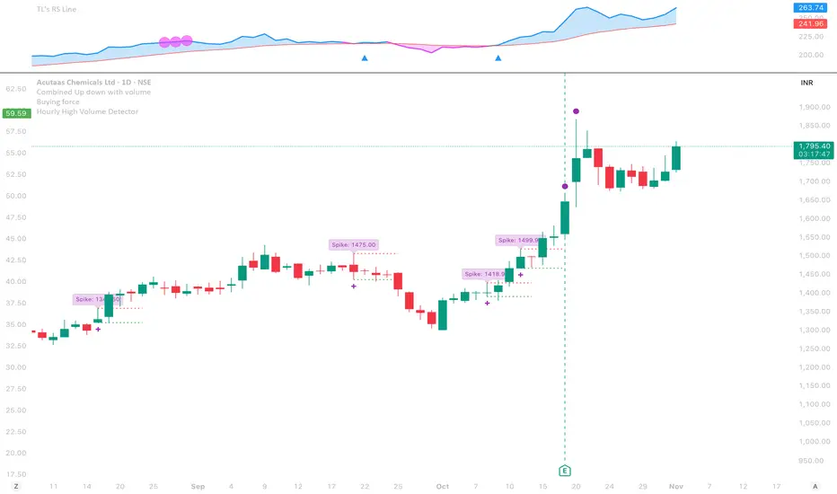
Hourly High Volume DetectorType: Multi-Timeframe Volume Spike Scanner
This script detects high-volume hourly candles inside each daily bar to highlight potential institutional activity or hidden accumulation days.
It automatically scans the last N days (configurable lookback) and plots a purple dot below daily candles where at least one hourly candle shows:
Volume significantly higher than the hourly average (Volume Multiplier × Avg Hourly Volume)
Positive price movement exceeding the minimum % threshold
🧠 Trend Filter
A built-in 5-day trend check ensures signals are shown only during non-downtrending phases, filtering out noise when the broader trend is weak.
⚙️ Parameters
Lookback Days: How many recent daily bars to scan.
Volume Multiplier: Defines what counts as a high-volume spike.
Min Price Change %: Minimum % gain within the hourly candle to qualify.
Debug Mode: Enables small green/orange markers for internal logic visualization.
🟣 Signals
Purple Dot (Below Candle): Strong hourly accumulation signal within the day.
(Debug) Green Dot: Hourly condition passed.
(Debug) Orange Triangle: Signal suppressed due to downtrend filter.
⚠️ Notes
Must be used on the Daily timeframe (will warn if not).
Ideal for spotting smart money accumulation, pre-breakout setups, or volume-price anomalies hidden in intraday structure.
Rolling Pivot RibbonRolling Pivot Ribbon
This indicator displays historical and developing pivot levels across multiple days,
creating a dynamic "ribbon" effect as pivots roll forward through time.
DESIGNED FOR: Intraday timeframes (≤1D). Shows warning on higher timeframes.
USE CASE: Identify key support/resistance levels, track pivot evolution, and spot
price interaction zones with enhanced visual clarity.
WHY?
There comes a time in every Pinescript developer's evolution, they feel compelled to write a script that draws many lines, possibly triangles, into the future. This is mine. It's both totally useless, and a constant source of comfort to me.
KEY FEATURES:
• Multiple pivot calculation methods (Classic, Camarilla)
• Historical pivot tracking with configurable lookback period (default 4 days)
• Real-time "developing" pivots that update intraday based on current day's HLC
• Gradient fills between adjacent pivot levels for visual depth
• 13 pivot levels: PP, R1-R6, S1-S6
TASTY MODE (Advanced):
• Intelligent filtering: only shows lines that price has recently intersected
• Dynamic transparency: opacity adjusts based on intersection frequency
• Auto-cleanup: removes stale lines that haven't been touched in X days
• Smart extensions: lines that see more action project further into the future
• Focus mode options to reduce chart clutter
VISUAL CONTROLS:
• Toggle individual pivot levels on/off
• Customizable colors and transparency for lines and fills
• Flexible label positioning (left-align or right-align)
• Adjustable projection length for pivot lines (defaults to 1. Set to 0 for just a ribbon)

NSR Dynamic Channel - HTF + ReversionNSR Dynamic Channel – HTF Volatility + Reversion
(Beginner-friendly, pro-grade, non-repainting)
The NSR Dynamic Channel builds an adaptive volatility envelope that compares current price action to a statistically-derived “expected” range pulled from a user-selected higher timeframe (HTF).
Is this just another keltner variation?
In short: Keltner reacts. NSR anticipates.
Keltner says “price moved a lot.”
NSR says “this move is abnormal compared to the last 2 days on a higher timeframe — and here’s the probability it snaps back.”
The channel is not a simple multiple of recent ATR or standard deviation; instead it:
Samples HTF volatility over a rolling window (default: last 2 days on the chosen HTF).
Expected Range
HTF Volatility Spread = StDev of 1-bar ATR on the HTF
Scales this HTF range to the current chart’s volatility using a compression ratio :
compRatio = SMA(High-Low over lookback) / Expected Range
This makes the channel tighten in low-vol regimes and widen in high-vol regimes .
Centers the channel on a composite mean ( AVGMEAN ) calculated from:
Smoothed Adaptive Averages of the current timeframe close
SMA of close over the user-defined lookback ( Slow )
The three means are averaged to reduce lag and noise.
Draws two layers :
HTF Expected Channel (gray fill) = PAMEAN ± expectedD
Dynamic Expected Band (inner gray) = HTF Expected Range
Adds a fast 2σ envelope around AVGMEAN using the standard deviation of close over the lookback period.
Core Calculations (Conceptual Overview)
HTF Baseline → ATR on user HTF → SMA & StDev over a defined number of days
Compression Ratio → Normalizes current range to HTF “normal” volatility
Expected Band Width → Expected Range × CompressionRatio
Bias Detection → % change of composite mean over 2 bars → “bullish” / “bearish” filter
Overextension % → Position of price within the expected band (0–100%)
How to Use It (3 Steps)
Apply to any chart – defaults work on futures (NQ/ES), stocks (SPY), crypto (BTC), forex, etc.
Price is outside both the fast 2σ envelope and the HTF-scaled expected band
Expect some sort of reversion
Enable alerts – two built-in conditions:
NSR Exit Long – bullish bias + high crosses upper expected edge
NSR Exit Short – bearish bias + low crosses lower expected edge
Optional toggles :
Show 2σ Price Range → fast overextension lines
Expected Channel → HTF-based gray fill
Mean → MEAN centerline
Why It Works
Context-aware : Uses HTF “normal” volatility as anchor
Adaptive : Shrinks in consolidation, expands in breakouts
Filtered signals : Only triggers when both statistical layers agree
Non-repainting : All calculations use confirmed bars
Happy trading!
nsrgroup

SJ WaveTrendWaveTrend Indicator – Full English Brief for TradingView
Description:
The WaveTrend Oscillator (WT) is a momentum-based indicator originally developed by LazyBear, designed to identify overbought and oversold market conditions with high precision. It is conceptually similar to the RSI and Stochastic Oscillator but uses a wave-based mathematical approach to detect turning points in price action earlier and more smoothly.
⸻
🔍 How It Works
WaveTrend analyzes the difference between price and its moving average (typically the exponential moving average of the Typical Price).
It then applies multiple layers of smoothing to filter out noise and produce two oscillating lines — WT1 (fast) and WT2 (slow).
The crossing points between WT1 and WT2 are used to identify momentum shifts:
• When WT1 crosses above WT2 from below the oversold zone → Bullish signal
• When WT1 crosses below WT2 from above the overbought zone → Bearish signal
⸻
⚙️ Core Formula Concept
The WaveTrend calculation typically follows this process:
1. Compute the Typical Price (TP) = (High + Low + Close) / 3
2. Calculate the Exponential Moving Average (EMA) of TP over a short length
3. Determine the Raw Wave (ESA) and De-trended Price Oscillator (DPO)
4. Apply double smoothing to produce the final WT1 and WT2 values
These smoothed waves behave like energy waves that expand and contract based on market volatility — hence the name WaveTrend.
⸻
📈 Interpretation
• Overbought Zone: WT values above +60 to +70
• Oversold Zone: WT values below -60 to -70
• Crossovers: WT1 crossing WT2 signals a potential trend reversal
• Divergence: When price makes a new high/low but WT does not, it signals momentum weakening
⸻
🧠 Trading Insights
• Best used on higher timeframes (H1 and above) for trend confirmation, and on lower timeframes (M15–M30) for precise entries.
• Combine with ADX, EMA Cloud, or Volume Filters to confirm real momentum shifts and avoid false signals.
• You can highlight WT Diff (WT1 - WT2) to visualize momentum expansion and contraction; large positive or negative differences often precede strong reversals.

KVS-FF-AA-2-FibThis indicator combines an EMA (Exponential Moving Average) cloud with advanced Fibonacci levels. It displays EMA's from three different timeframes (Daily, Weekly, Monthly) to help you track primary trends across various periods. It also generates a dynamic cloud for a user-defined timeframe.
The integrated Fibonacci tool offers four different calculation modes: Static, Dynamic, ATH/ATL, and Price. Additionally, you can select from four Fibonacci level types: Standard, Percentage, FF-AA, and FF-AA-2. This tool automatically determines the trend direction and plots the Fibonacci levels on either a logarithmic or linear scale.

Ichimoku + Multi-Trend DashboardIchimoku + Multi-Trend Dashboard
A professional multi-indicator trend analyzer that fuses Ichimoku Cloud with volume, momentum, and price-based confirmations — all visualized in a dynamic dashboard.
🔍 Overview
The OSPL Ichimoku + Multi-Trend Dashboard is a comprehensive market-structure and momentum visualization tool built for serious traders who value clarity, precision, and confirmation.
It combines the powerful Ichimoku Cloud system with VWMA, SuperTrend, RSI, and VWAP to provide a 360-degree view of market direction, trend strength, and trade zones.
This indicator allows traders to instantly read multi-indicator alignment through a color-coded dashboard, helping filter out noise and improve timing for entries and exits.
⚙️ Core Features
🟢 1. Ichimoku Cloud Framework
Displays all major Ichimoku elements: Tenkan-Sen, Kijun-Sen, Senkou Span A & B (Kumo Cloud).
Detects Bullish and Bearish Tenkan-Kijun Crossovers.
Identifies Cloud Trend Bias (price above, below, or inside the Kumo).
Marks Buy / Sell / Wait Zones automatically based on price structure and line alignment.
⚡ 2. Multi-Indicator Confirmation Layer
Enhance trend validation using:
VWMA (Volume-Weighted Moving Average): Measures volume-driven price trend.
SuperTrend: Uses ATR to confirm trend direction and detect reversals.
RSI (Relative Strength Index): Gauges market momentum — above 50 indicates bullish bias, below 50 bearish.
VWAP (Volume-Weighted Average Price): Tracks institutional and fair value price zones.
Each of these indicators contributes to a synchronized dashboard view that instantly reveals market bias.
📊 3. Interactive Dashboard Display
Clean, modern bottom-right table summarizing indicator values and their current trend status.
Color-coded trend map:
🟢 Green = Bullish 🔴 Red = Bearish 🟡 Yellow = Neutral / Wait
Quick visual reference — ideal for active traders who rely on multiple confirmations before taking trades.
🌥 4. Kumo Visualization
Smoothly shaded Ichimoku Cloud fill highlights dominant market phase (bullish or bearish).
Dynamic transition coloring enhances visibility of potential breakouts or reversals.
🎯 How to Use
Use the dashboard as a trend alignment and confirmation tool:
Bullish Confluence Example:
Price above Kumo Cloud
Tenkan-Sen > Kijun-Sen
RSI > 50
SuperTrend below price
VWMA and VWAP trending upward
Bearish Confluence Example:
Price below Kumo Cloud
Tenkan-Sen < Kijun-Sen
RSI < 50
SuperTrend above price
VWMA and VWAP trending downward
When most indicators align in the same direction, the system provides high-probability trade zones.
It can be used across all timeframes, from intraday scalping to multi-day swing trading.
🧩 Why Use This Indicator
✅ Filters false signals by combining multiple trend tools.
✅ Eliminates the need to switch between multiple indicators.
✅ Offers an at-a-glance visual assessment of overall market bias.
✅ Adaptable to any asset: stocks, indices, forex, commodities, or crypto.
✅ Ideal for traders using trend-following, momentum, or confirmation-based strategies.
🧠 Professional Tips
Combine the dashboard signals with price action and volume breakouts for enhanced accuracy.
Use higher timeframe Ichimoku structure as a directional filter (e.g., check the 1-hour trend while trading on 15-minute).
Apply ATR-based stop loss and multi-timeframe confluence to further strengthen entries.
Works exceptionally well with Heikin Ashi candles for smoother visual trends.
💡 Suggested Use Cases
Intraday & Swing Trading
Trend Continuation & Reversal Identification
Multi-Indicator Confirmation System
Dashboard-Style Strategy Testing and Backtesting
⚠️ Disclaimer
This indicator is designed for educational and analytical purposes only.
It is not financial advice and does not guarantee profitability.
Always perform independent analysis and apply prudent risk management before executing trades.

OSPL Ichimoku + Multi-Trend DashboardOSPL Ichimoku + Multi-Trend Dashboard
A professional multi-indicator trend analyzer that fuses Ichimoku Cloud with volume, momentum, and price-based confirmations — all visualized in a dynamic dashboard.
🔍 Overview
The OSPL Ichimoku + Multi-Trend Dashboard is a comprehensive market-structure and momentum visualization tool built for serious traders who value clarity, precision, and confirmation.
It combines the powerful Ichimoku Cloud system with VWMA, SuperTrend, RSI, and VWAP to provide a 360-degree view of market direction, trend strength, and trade zones.
This indicator allows traders to instantly read multi-indicator alignment through a color-coded dashboard, helping filter out noise and improve timing for entries and exits.
⚙️ Core Features
🟢 1. Ichimoku Cloud Framework
Displays all major Ichimoku elements: Tenkan-Sen, Kijun-Sen, Senkou Span A & B (Kumo Cloud).
Detects Bullish and Bearish Tenkan-Kijun Crossovers.
Identifies Cloud Trend Bias (price above, below, or inside the Kumo).
Marks Buy / Sell / Wait Zones automatically based on price structure and line alignment.
⚡ 2. Multi-Indicator Confirmation Layer
Enhance trend validation using:
VWMA (Volume-Weighted Moving Average): Measures volume-driven price trend.
SuperTrend: Uses ATR to confirm trend direction and detect reversals.
RSI (Relative Strength Index): Gauges market momentum — above 50 indicates bullish bias, below 50 bearish.
VWAP (Volume-Weighted Average Price): Tracks institutional and fair value price zones.
Each of these indicators contributes to a synchronized dashboard view that instantly reveals market bias.
📊 3. Interactive Dashboard Display
Clean, modern bottom-right table summarizing indicator values and their current trend status.
Color-coded trend map:
🟢 Green = Bullish 🔴 Red = Bearish 🟡 Yellow = Neutral / Wait
Quick visual reference — ideal for active traders who rely on multiple confirmations before taking trades.
🌥 4. Kumo Visualization
Smoothly shaded Ichimoku Cloud fill highlights dominant market phase (bullish or bearish).
Dynamic transition coloring enhances visibility of potential breakouts or reversals.
🎯 How to Use
Use the dashboard as a trend alignment and confirmation tool:
Bullish Confluence Example:
Price above Kumo Cloud
Tenkan-Sen > Kijun-Sen
RSI > 50
SuperTrend below price
VWMA and VWAP trending upward
Bearish Confluence Example:
Price below Kumo Cloud
Tenkan-Sen < Kijun-Sen
RSI < 50
SuperTrend above price
VWMA and VWAP trending downward
When most indicators align in the same direction, the system provides high-probability trade zones.
It can be used across all timeframes, from intraday scalping to multi-day swing trading.
🧩 Why Use This Indicator
✅ Filters false signals by combining multiple trend tools.
✅ Eliminates the need to switch between multiple indicators.
✅ Offers an at-a-glance visual assessment of overall market bias.
✅ Adaptable to any asset: stocks, indices, forex, commodities, or crypto.
✅ Ideal for traders using trend-following, momentum, or confirmation-based strategies.
🧠 Professional Tips
Combine the dashboard signals with price action and volume breakouts for enhanced accuracy.
Use higher timeframe Ichimoku structure as a directional filter (e.g., check the 1-hour trend while trading on 15-minute).
Apply ATR-based stop loss and multi-timeframe confluence to further strengthen entries.
Works exceptionally well with Heikin Ashi candles for smoother visual trends.
💡 Suggested Use Cases
Intraday & Swing Trading
Trend Continuation & Reversal Identification
Multi-Indicator Confirmation System
Dashboard-Style Strategy Testing and Backtesting
⚠️ Disclaimer
This indicator is designed for educational and analytical purposes only.
It is not financial advice and does not guarantee profitability.
Always perform independent analysis and apply prudent risk management before executing trades.

Multi Pivot Trend [BigBeluga]🔵 OVERVIEW
The Multi Pivot Trend is an advanced market-structure-driven trend engine that evaluates trend strength by scanning multiple pivot breakouts simultaneously.
Instead of relying on a single swing length, it tracks breakouts across ten increasing pivot lengths — then averages their behavior to produce a smooth, reliable trend reading.
Mitigation logic (close, wick, or HL2 touches) controls how breakouts are confirmed, giving traders institutional-style flexibility similar to BOS/CHoCH validation rules.
This indicator not only colors candles based on trend strength, but also extends trend strength and volatility-scaled projection candles to show where trend pressure may expand next.
Pivot breakout lines and labels mark key changes, making the trend transitions extremely clear.
🔵 CONCEPTS
Market trend strength is reflected by multiple pivot breakouts, not just one.
The indicator analyzes ten pivot structures from smaller to larger swings.
Each bullish or bearish pivot breakout contributes to trend score.
Mitigation options (close / wick / HL2) imitate smart-money breakout confirmation logic.
Trend score is averaged and translated into colors and extension bars.
Neutral regime ≈ weak trend or transition zone (trend compression).
🔵 FEATURES
Multi-Pivot Engine — tracks 10 pivot-based trend signals simultaneously.
Mitigation Modes :
• Close — breakout requires candle close beyond pivot
• Wicks — breakout requires wick violation
• HL2 — breakout confirmed when average (H+L)/2 crosses level
Dynamic Color System :
• Blue → confirmed bullish rotation
• Red → confirmed bearish rotation
• Orange → neutral / transition state
Breakout Visualization — draws pivot breakout lines in real-time.
Trend Labels — prints trend %.
Trend Volatility-Scaled Extension Candles — ATR/trend strength based candle projections show momentum continuation strength.
Gradient Pivot Encoding — higher pivot lengths = deeper structure considered.
🔵 HOW TO USE
Use strong blue/red periods to follow dominant structural trend.
Watch for color transition into orange — possible trend change or consolidation.
Pivot breakout lines help validate structure shifts without clutter.
Wick mitigation catches aggressive liquidity-sweep based breaks.
Close/HL2 mitigation catches cleaner market structure rotations.
Extension bars visualize trend pressure — large extensions = strong push.
Best paired with volume or volatility confirmation tools.
🔵 CONCLUSION
The Multi Pivot Trend is a structural trend recognition system that blends multiple pivot breakouts into one clean trend score — with institutional-style mitigation logic and volatility-projected trend extensions.
It gives traders a powerful, visually intuitive way to track momentum, spot trend rotations early, and understand true structural flow beyond simple MA-based approaches.
Use it to stay aligned with the dominant swing direction while avoiding noise and false flips.

チャットGPTimport yfinance as yf
import pandas as pd
import requests
from bs4 import BeautifulSoup
# 株たんのスクリーニング結果URL(例:200日線以下)
url = "https://kabutan.jp/warning/?mode=3_1"
r = requests.get(url)
soup = BeautifulSoup(r.text, "html.parser")
# 銘柄コードと企業名を抽出
stocks =
for link in soup.select("td a "):
code = link .split('=')
name = link.text.strip()
if code.isdigit():
stocks.append({"code": code, "name": name})
results =
for stock in stocks : # ←テスト用に10銘柄まで
ticker = f"{stock }.T"
df = yf.download(ticker, period="1y", interval="1d")
# EMA200
df = df .ewm(span=200, adjust=False).mean()
below_ema200 = df .iloc < df .iloc
# 株たんの個別ページからPER・成長率を取得
stock_url = f"https://kabutan.jp/stock/?code={stock }"
res = requests.get(stock_url)
s = BeautifulSoup(res.text, "html.parser")
try:
per = s.find(text="PER").find_next("td").text
growth = s.find(text="売上高増減率").find_next("td").text
except:
per, growth = "N/A", "N/A"
results.append({
"銘柄コード": stock ,
"企業名": stock ,
"200EMA以下": below_ema200,
"PER": per,
"売上成長率": growth
})
# 結果をCSV出力
df_result = pd.DataFrame(results)
df_result.to_csv("割安EMA200以下銘柄.csv", index=False, encoding="utf-8-sig")
print(df_result)

YUSUF DMSmart liquidity-based supports and resistances,
t can adapt to the market and identify areas of peaks, troughs, and liquidity to draw support and resistance lines.

Session Highs and LowsShows the current and previous session highs and lows for the New York, London and Asian sessions

Awesome SuperTrend Zone Dynamic Alerts// created by © OmegaTools, upgrade to v6 and alert condition added
//@version=6
Awesome SuperTrend Zone Alerts with dynamic alerts
