OPEN-SOURCE SCRIPT
Economic Cycle Signal (USA)
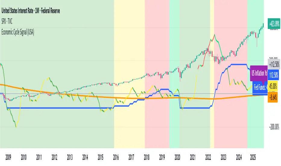
📊 Economic Cycle Signal (USA)
This indicator overlays both the U.S. Federal Reserve Funds Rate (Fed Funds) and the U.S. Inflation Rate YoY directly onto your stock market chart (e.g., S&P 500). It visually connects monetary policy and inflation dynamics with equity market performance, helping traders and analysts understand how macroeconomic shifts impact risk assets.
🔹 Key Features
• Plots the monthly U.S. Fed Funds Rate alongside your chart.
• Overlays the U.S. Inflation Rate YoY, offering a direct and realistic view of inflation pressure instead of CPI.
• Shades the background to reflect different economic cycle phases (recovery, recession, expansion, late cycle).
• Highlights how the stock market reacts during shifting monetary and inflationary conditions.
• Provides a clear traffic-light style signal for quick macro interpretation.
• Now includes dynamic inflation color logic based on the Fed’s 2% target and 5% threshold (explained below).
🔹 Inflation Line Color Logic (New)
The inflation line now changes color dynamically to show whether inflation is within or outside the Federal Reserve’s comfort zone, and whether it’s rising or falling:
Inflation Condition Interpretation Line Color
Inflation > 5% and Rising Inflation overheating (well above target) 🔴 Red
Inflation > 5% and Falling Cooling off from high levels 💚 Lime
Inflation < 5% and Falling Disinflation / stable price environment 🟢 Green
Inflation < 5% and Rising Early inflation rebound 🟡 Yellow
This color-coded logic mirrors the interest rate phase colors, giving traders an instant visual cue about inflationary pressure and possible policy turning points.
🔹 How Traders & Analysts Can Use It
• Visualize the interaction between U.S. monetary policy and inflation cycles in real time.
• Identify historically supportive phases when low or easing rates follow moderate inflation.
• Detect tightening cycles when inflation spikes first and the Fed reacts, signaling potential equity headwinds.
• Use as a macro compass to anticipate inflation pressure, policy changes, and market regime shifts.
• Combine with technical analysis, fundamentals, or leading indicators for deeper macro insights.
🔹 Color Legend (Economic Phases)
🟩 Light Green → Recovery (Early Cycle)
• Rates: low or falling
• Inflation: low/stable
🟩 Green → Recession (Down Cycle)
• Rates: cut aggressively
• Inflation: falling
🟨 Yellow → Expansion (Mid Cycle)
• Rates: rising gradually
• Inflation: moderate
🟥 Red → Overheating (Late Cycle)
• Rates: high / rising fast
• Inflation: high
🔹 Inflation Context
• Inflation typically leads the policy rate cycle, offering early insight into future Fed actions.
• The U.S. Inflation Rate YoY provides a direct measure of consumer price changes compared to the same month last year — a clearer gauge of inflation pressure than CPI.
• The new color logic helps visualize whether inflation is accelerating or cooling, relative to the Fed’s 2% target and 5% upper threshold.
• This dual-overlay makes it easy to interpret the cause (inflation) and effect (interest rate policy) in one synchronized chart.
⚠️ Disclaimer
This script is for educational and informational purposes only. It does not provide financial advice or trading signals. Always combine it with your own research, proper risk management, and professional judgment.
Script de código abierto
Fiel al espíritu de TradingView, el creador de este script lo ha convertido en código abierto, para que los traders puedan revisar y verificar su funcionalidad. ¡Enhorabuena al autor! Aunque puede utilizarlo de forma gratuita, recuerde que la republicación del código está sujeta a nuestras Normas internas.
Exención de responsabilidad
La información y las publicaciones no constituyen, ni deben considerarse como asesoramiento o recomendaciones financieras, de inversión, de trading o de otro tipo proporcionadas o respaldadas por TradingView. Más información en Condiciones de uso.